| THIS WEEK'S ARTICLES |
| ChartWatchers |
| Identifying Intermediate Buying Opportunities with the Hourly Special |
| by Martin Pring |
Sometimes, when I mess around with the charts, I discover an entirely new approach that I had not thought of before. Last week saw one of those breakthrough moments when, for the first time ever, I applied the Special K to hourly charts and came up with some interesting results.
By way of background, I devised the Special K (SPK), which you can read about here, many years ago as a momentum indicator that could help identify primary trend changes relatively close to their turning points. It is calculated by adding a short to an intermediate to a long-term KST and expressing the result as one series on a daily chart. About 70% of the time, it does turn with the price, which is easy to spot with the benefit of hindsight. In real time, we have to use trendlines, peak and trough progression and moving averages to give us a more objective feel, as I discussed here earlier in this month.
Last week, for some reason, I found myself playing with the Special K in the hourly charts. I discovered that the indicator does not have much to say for a lot of the time. However, there are periods when, in conjunction with a reversal confirmation by the price, it identifies timely signals from an intermediate perspective. In this instance, I am assuming that an intermediate trend lasts on average between 6 weeks to as long as 9 months.
US Sectors
We start off with the iShares Russell 2k (IWM) ETF. Its SPK has just broken out of a six-month base, which suggests that the price will resolve its 2021 trading range with a break to the upside. All that's required is confirmation from the price with a new 2021 high, say, to $234.
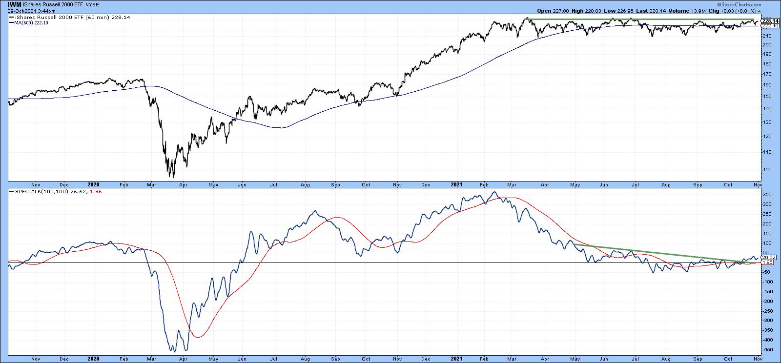 Chart 1Chart 2 features the XLF. Since we are monitoring intermediate trends, it's important to see that trendlines or bases extend for three months or longer. In the case of financials, we can see that the SPK has broken out from a 3-month base. This positive action has also been confirmed by the price, as it has managed to push through a 5-month resistance trendline. The chart also shows a sell signal in late May using this same trendline approach. Because the overall market advance had been so strong, subsequent intermediate correction took the form of a gently rising consolidation pattern, rather than a decline. Chart 1Chart 2 features the XLF. Since we are monitoring intermediate trends, it's important to see that trendlines or bases extend for three months or longer. In the case of financials, we can see that the SPK has broken out from a 3-month base. This positive action has also been confirmed by the price, as it has managed to push through a 5-month resistance trendline. The chart also shows a sell signal in late May using this same trendline approach. Because the overall market advance had been so strong, subsequent intermediate correction took the form of a gently rising consolidation pattern, rather than a decline.
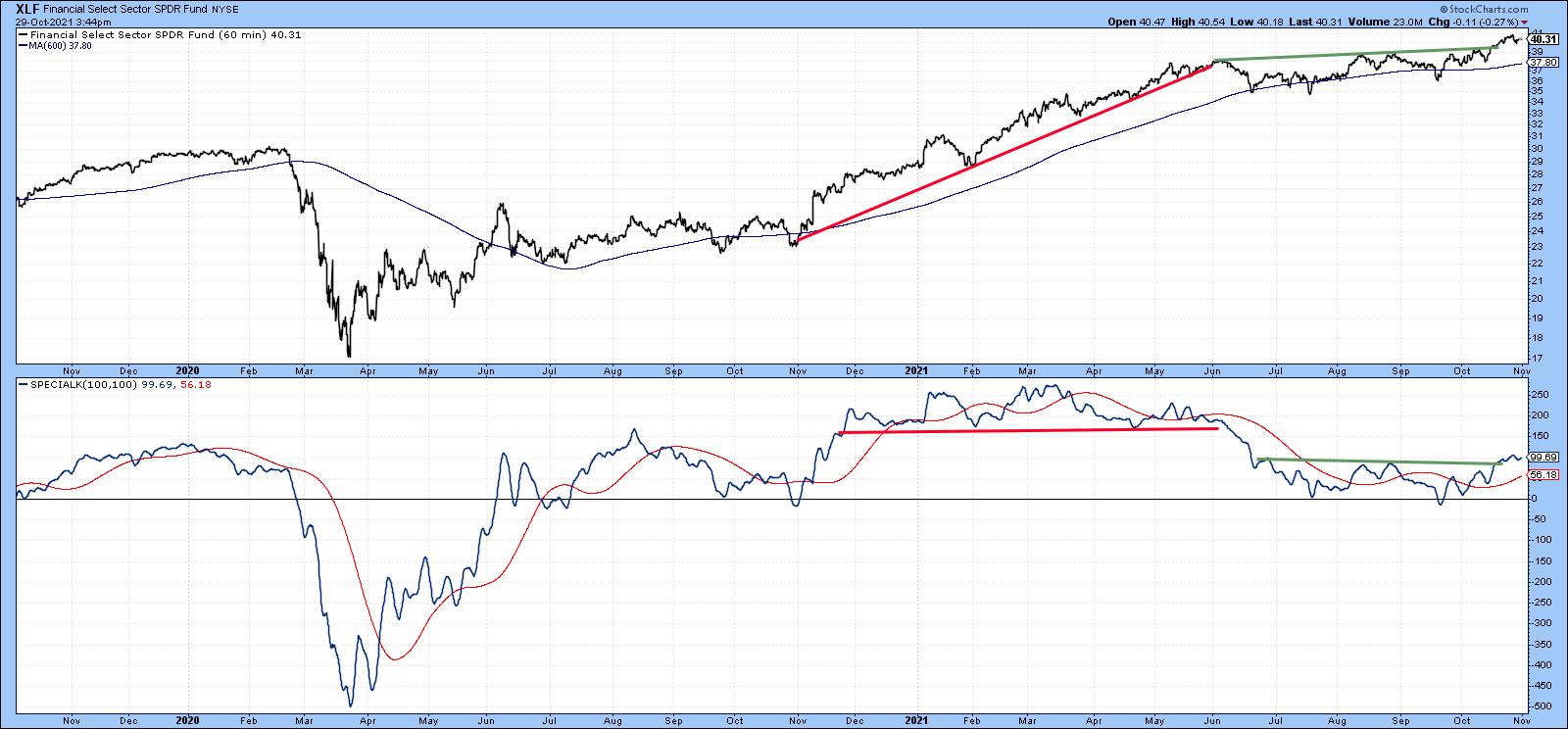 Chart 2International Markets Chart 2International Markets
Chart 3 looks at the iShares MSCI Europe Australia Far East ETF (EFA), literally the world ex the US. Here we see a down trendline that began at the start of this year. It's worth monitoring because the SPK and price are pretty close to an upside breakout.
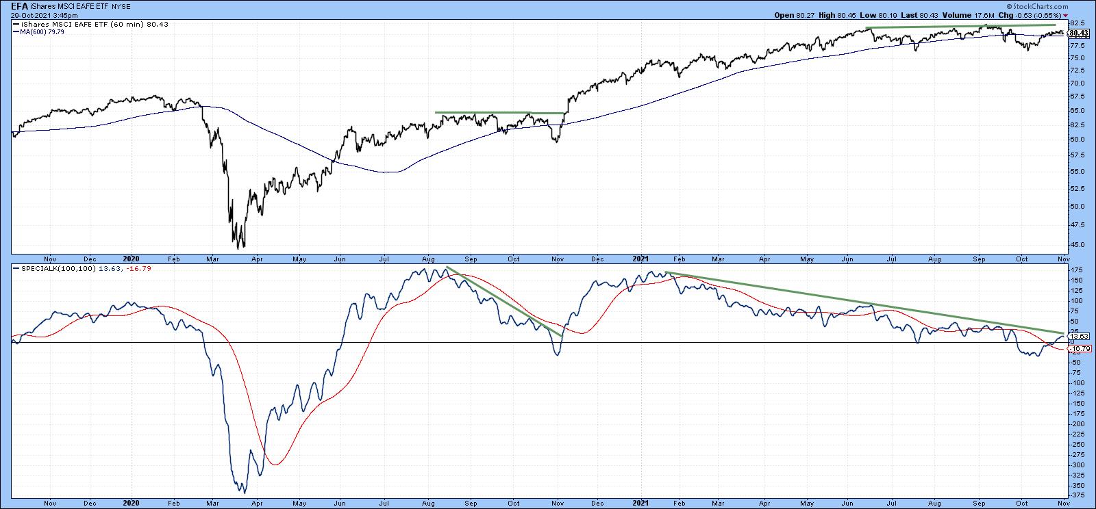 Chart 3One international ETF that has already broken to the upside is the iShares MSCI Pacific ex Japan (EPP). It has already violated two equivalent 2021 intermediate down trendlines. The SPK is also above its signal line, but that should not weigh as an important factor since it has triggered several false breaks recently. Chart 3One international ETF that has already broken to the upside is the iShares MSCI Pacific ex Japan (EPP). It has already violated two equivalent 2021 intermediate down trendlines. The SPK is also above its signal line, but that should not weigh as an important factor since it has triggered several false breaks recently.
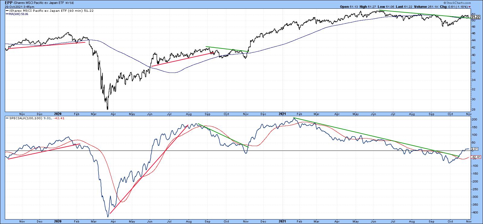 Chart 4Chart 5 shows that the iShares Singapore ETF (EWS) has been going sideways since the late spring. It experienced an SPK breakout a week or so ago and one more recently by the price itself. Chart 4Chart 5 shows that the iShares Singapore ETF (EWS) has been going sideways since the late spring. It experienced an SPK breakout a week or so ago and one more recently by the price itself.
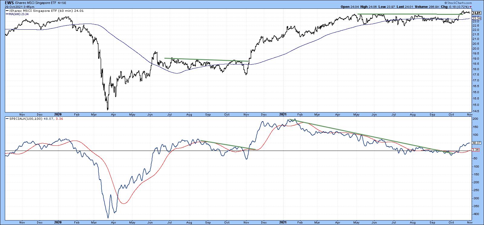 Chart 5The SPK for the iShares Brazil Capped ETF (EWZ) has experienced more volatile intermediate price movements than most other country funds. In that respect, the dashed green and red arrows flag the eight intermediate price movements that have developed since late 2019. Chart 6 shows that its SPK has been contained by a 4-month down trendline and is now somewhat oversold. The signal line has also called the last six intermediate reversals without a whipsaw, so the fact that the trendline and signal line for the SPK are in the same vicinity indicates how important they are as a resistance point. Chart 5The SPK for the iShares Brazil Capped ETF (EWZ) has experienced more volatile intermediate price movements than most other country funds. In that respect, the dashed green and red arrows flag the eight intermediate price movements that have developed since late 2019. Chart 6 shows that its SPK has been contained by a 4-month down trendline and is now somewhat oversold. The signal line has also called the last six intermediate reversals without a whipsaw, so the fact that the trendline and signal line for the SPK are in the same vicinity indicates how important they are as a resistance point.
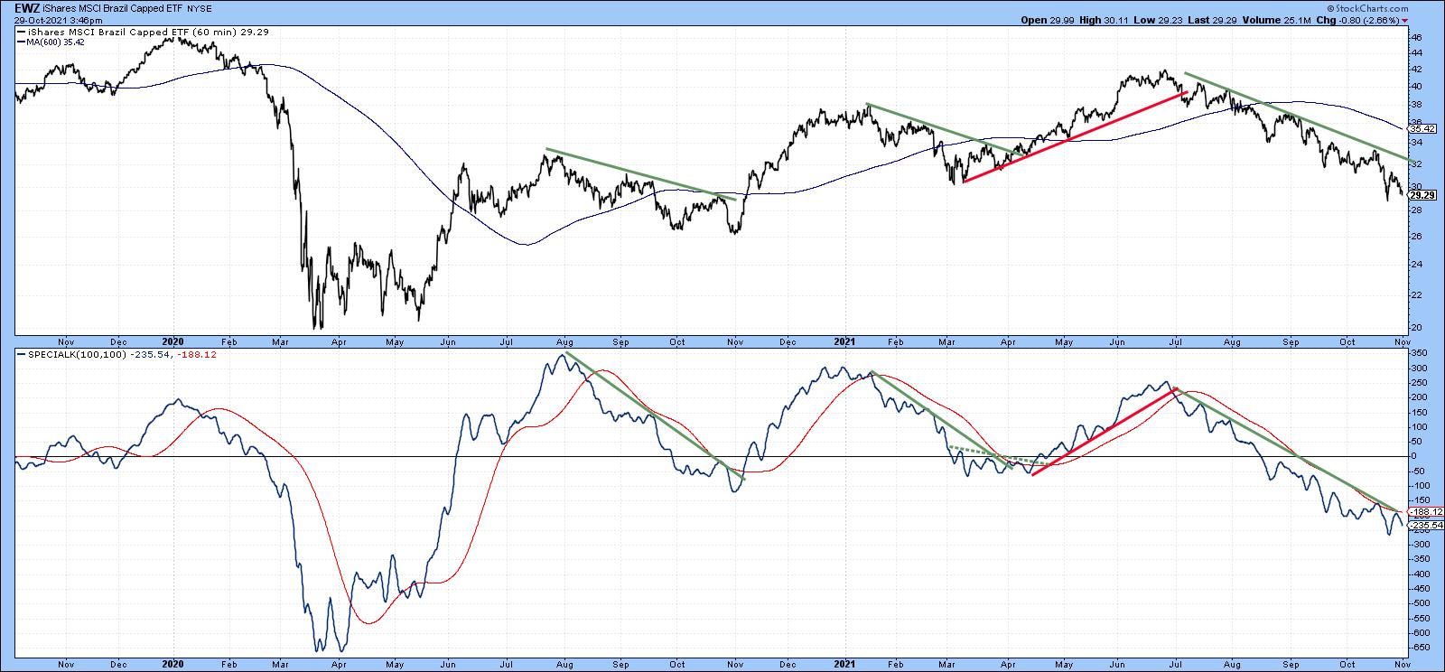 Chart 6Commodities, Gold and the Dollar Chart 6Commodities, Gold and the Dollar
Chart 7 presents us with a potential breakout for the Invesco DB Agricultural Fund (DBA). The price itself is caught between two converging trendlines, as is its SPK. The green momentum trendline is more significant than the red one due to its greater length and the fact that it has been touched or approached on numerous occasions. Note also that the red up trendline for the price is intersecting with the 200-day hourly MA. Whichever way this ETF breaks is likely to determine the direction of the next important move. My expectation is for a continuance of the bull market, but, as always, let's allow the market to return a final judgment.
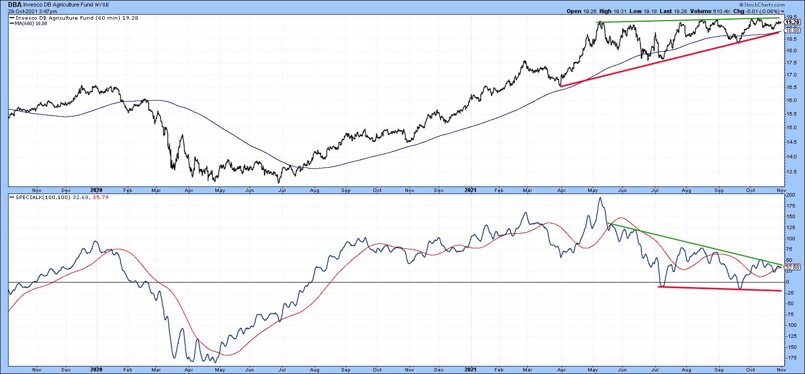 Chart 7The SPDR Gold Shares (GLD), Chart 8, could be in the process of making a recovery. If we ignore the false June upside break, the GLD has busted through its 2020-2021 corrective trendline. The price has not yet done so and needs to close above that $170 level in order to confirm momentum action. Chart 7The SPDR Gold Shares (GLD), Chart 8, could be in the process of making a recovery. If we ignore the false June upside break, the GLD has busted through its 2020-2021 corrective trendline. The price has not yet done so and needs to close above that $170 level in order to confirm momentum action.
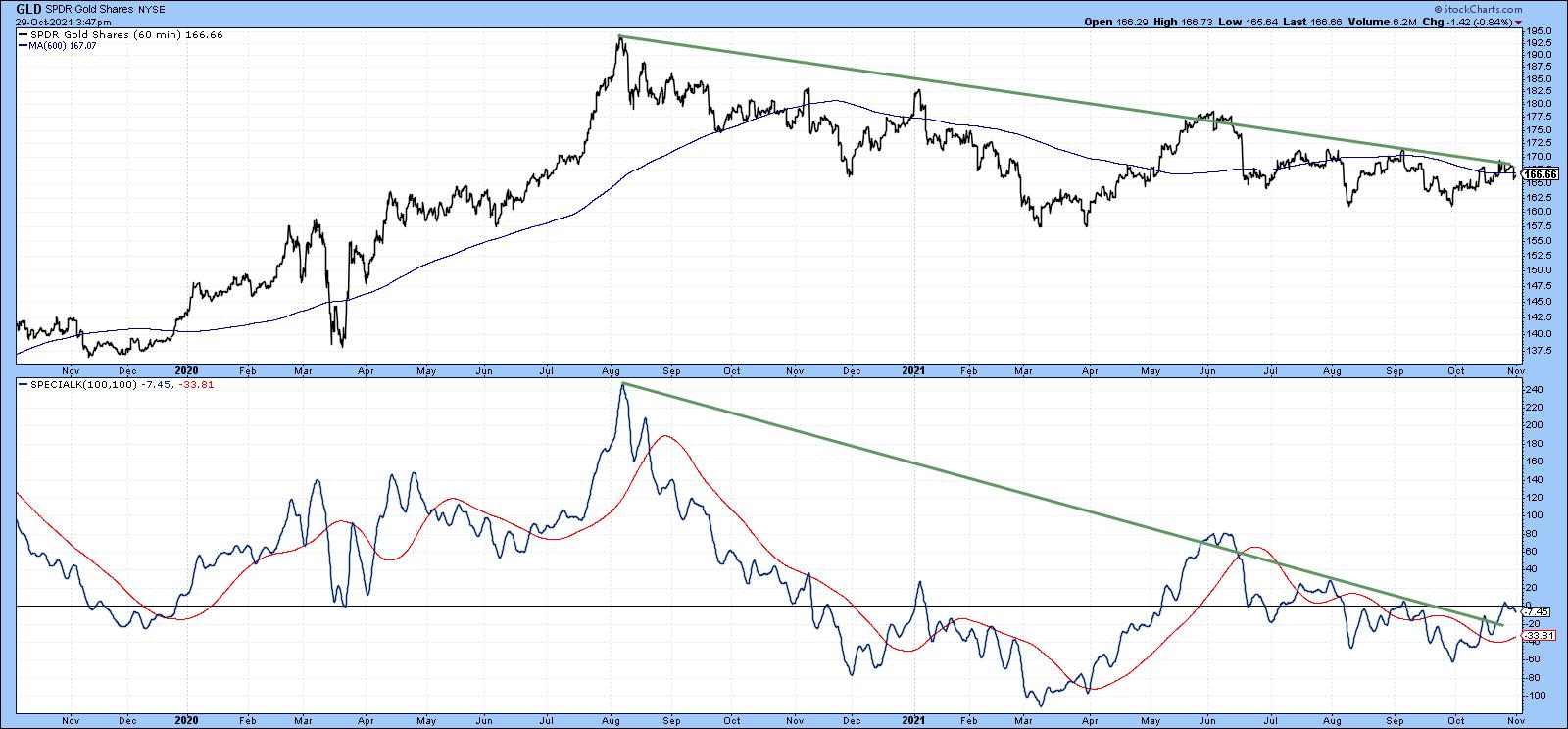 Chart 8Chart 9 puts us in a quandary, because the Invesco DB US Dollar Bullish Fund (UUP) is sporting an uptrend. That seems inconsistent with a rising gold price. However, there have been limited periods when they have both risen together. Indeed, a Global Gold Index, which I calculate from euro, yen and dollar measures, is currently bullish. The implication is that gold and the dollar may be able to rally simultaneously for a while. Nevertheless, the UUP is at a fairly critical point, as it and the SPK are both resting on a key up trendline. If they are decisively violated, it would suggest that the Dollar Index had begun a period of re-accumulation or an actual decline. Chart 8Chart 9 puts us in a quandary, because the Invesco DB US Dollar Bullish Fund (UUP) is sporting an uptrend. That seems inconsistent with a rising gold price. However, there have been limited periods when they have both risen together. Indeed, a Global Gold Index, which I calculate from euro, yen and dollar measures, is currently bullish. The implication is that gold and the dollar may be able to rally simultaneously for a while. Nevertheless, the UUP is at a fairly critical point, as it and the SPK are both resting on a key up trendline. If they are decisively violated, it would suggest that the Dollar Index had begun a period of re-accumulation or an actual decline.
Remember, any of these charts may be updated by simply clicking on them. They are not recommendations, but should be reviewed for additional investigation.
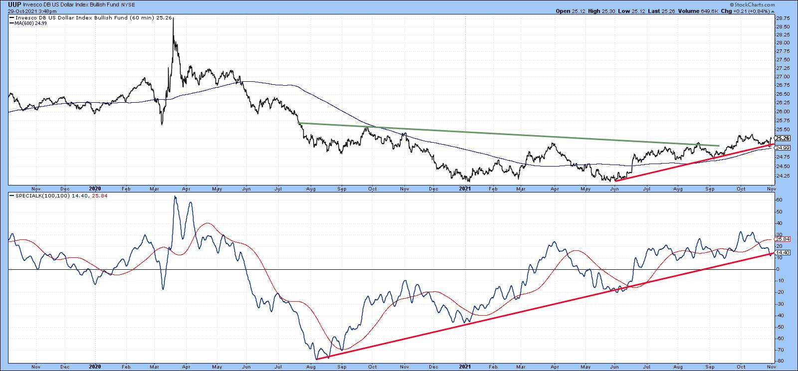 Chart 9Good luck and good charting, Chart 9Good luck and good charting,
Martin J. Pring
This article is an updated version of an article previously published on Thursday, October 28th at 12:20pm ET in the member-exclusive blog Martin Pring's Market Roundup.
The views expressed in this article are those of the author and do not necessarily reflect the position or opinion of Pring Turner Capital Group of Walnut Creek or its affiliates.
|
| READ ONLINE → |
|
|
|
| ChartWatchers |
| Trend Indicator Turns Bullish for IWM: What should we Expect? |
| by Arthur Hill |
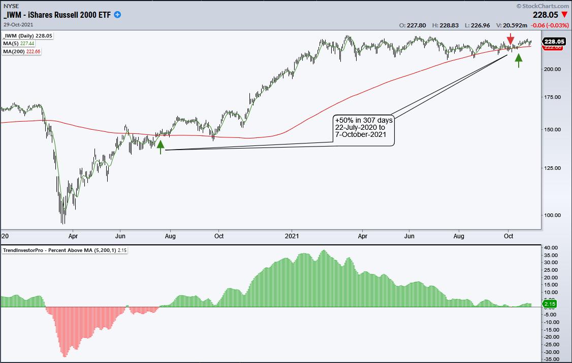
 Moving averages are classic trend-following indicators and the 200-day SMA is perhaps the most widely used long-term moving average. This article will put the 200-day to the test using the Russell 2000 ETF (IWM). Moving averages are classic trend-following indicators and the 200-day SMA is perhaps the most widely used long-term moving average. This article will put the 200-day to the test using the Russell 2000 ETF (IWM).
The ETF just came off its best "trend" trade ever using the 5/200 cross. However, we cannot pass judgment on an indicator or signal without looking at dozens of trades over a longer timeframe. IWM can indeed produce some big trends, but it is also prone to periods of whipsaw.
Here is a signal example. The chart below shows the 5-day SMA moving above the 200-day SMA on 22-July-2020 and remaining above for over a year (307 trading days). The 5-day crossed back below the 200-day earlier this month to complete the trend signal. Overall, IWM was up around 50% for the completed signal. The indicator window shows the percentage difference between the 5-day SMA and 200-day SMA in histogram format. Note that this indicator is part of the TIP indicator edge plugin for StockCharts ACP.

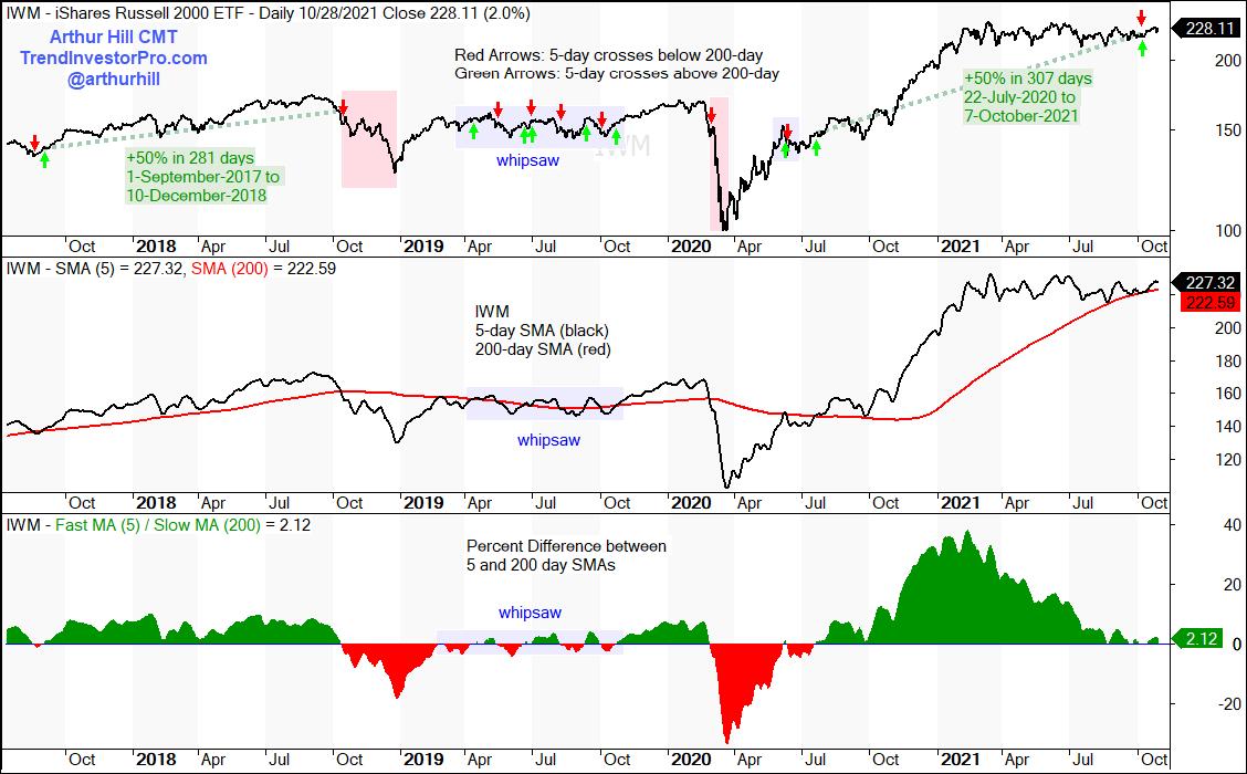
I will next turn to Amibroker and test the 5/200 cross over the last twenty years (1-Nov-2001 to 29-Oct-2021). The 5-day SMA crossed the 200-day 78 times during this period and there were 39 trades. 16 were winners for an average gain of 13.77% and 23 were losers for an average loss of 4.18%. Thus, just 41% of the signals resulted in a winning trade, which is actually normal for a trend-following signal. This is a long-only test and the system was invested 70% of the time. This means 30% of the time the 5-day SMA was below the 200-day SMA. All told, the system generated a 4.85% Compound Annual Return (without dividends). This is ok, but not that great. For reference, SPY generated a 6.8% Compound Annual Return (sans dividends) using the 5/200 cross during this same period with 13 winners and 14 losers. SPY is clearly more "trendy" than IWM.
The chart below highlights the trades from summer 2017 until October 2021. The top window shows the buy/sell signals with the green/red arrows. The green dashed lines show two really good trends, the red zones show sell signals that would have avoided sharp declines and the blue shading shows the whipsaws (losing trades). With 59% of the trades resulting in losses, trend-follower can expect more whipsaws than big trends. However, trend-following strategies have positive expectancy because a few good trends pay for the whipsaws. Note that the 5-day SMA crossed back above the 200-day SMA on October 8th and the uptrend signal is back in play for IWM.

Interested in more trend-following? Stay tuned because I will be hosting a special on StockCharts TV on November 6th at noon ET. Details to follow in an Art's Charts post later this week. This show will cover the theory, expectations and reality of trend-following strategies. We will put different indicators to the test and show some techniques to improve performance. In the meantime, check out TrendInvestorPro.com for the latest trend signals, bullish continuation setups and the state of the stock market.
Click here to take your analysis to the next level!
----------------------------------------------------------
|
| READ ONLINE → |
|
|
|
| DecisionPoint |
| Is Market Melt-Up Possible? |
| by Carl Swenlin |
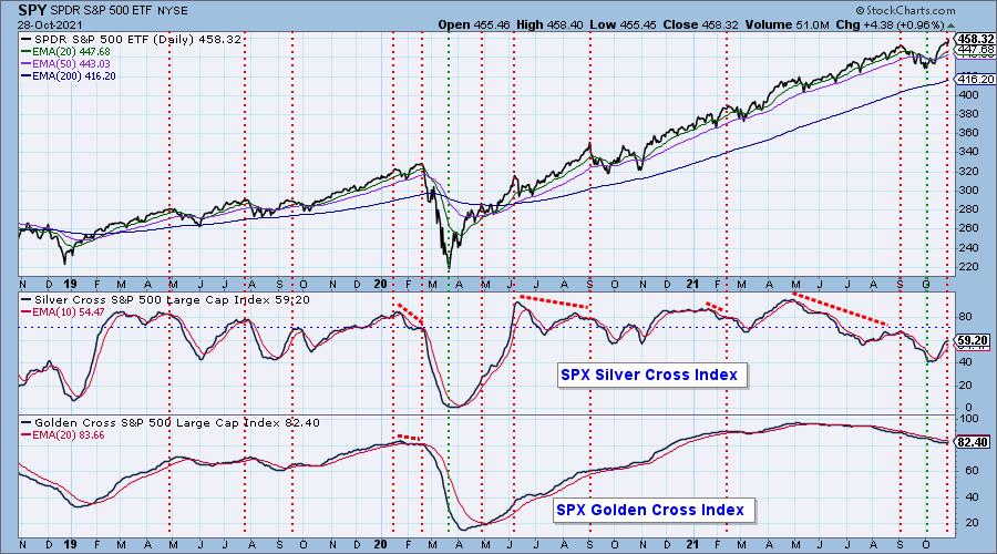
Lately I have been seeing many TV pundits predicting a market melt-up, so let's take a look at participation and see if there is a set-up compatible with that notion. Surely, the rally from the early-October lows is a good start on a melt-up, but the recent new highs have barely exceeded the September top. Is there any gas left in the tank? Our Golden Cross and Silver Cross Indexes give us a clear view of market participation and the potential for future price performance.
The Golden Cross Index (GCI) shows the percentage of S&P 500 stocks that have their 50EMA above their 200EMA, which gives a picture of long-term particiption. Since the GCI high earlier this year, it has dropped down to 82.4%. This leaves it in the overbought part of its range and still strong, and it has plenty of room to expand upward.


For the intermediate-term assessment we'll use the Silver Cross Index (SCI). It shows the percentage of stocks with their 20EMA above their 50EMA, and gives a compelling view of participation. The SCI deteriorated significantly since its April top, dropping from about 95% to 40% earlier this month -- 60% of stocks showing intermediate-term weakness! Frankly, I thought we were in real trouble at that point, but the October rally began and drove prices to all-time highs, and the SCI to back up to 59.2%. That is not spectacular participation, but it should be sufficient to support prices. More importantly, it is barely into the overbought range and has plenty of room to expand upward.
CONCLUSION: The SCI and GCI are a long way from where an overbought condition would interfere with the continuation of the rally. The potential for the rally to continue is also strong based upon the potential for seasonal pressures (Santa Claus rally). Whether it will be a "melt-up" remains to be seen, but internals should permit continued positive price action.

Click here to register in advance for the recurring free DecisionPoint Trading Room! Recordings are available!
Technical Analysis is a windsock, not a crystal ball.
--Carl Swenlin
(c) Copyright 2021 DecisionPoint.com
Helpful DecisionPoint Links:
DecisionPoint Alert Chart List
DecisionPoint Golden Cross/Silver Cross Index Chart List
DecisionPoint Sector Chart List
DecisionPoint Chart Gallery
Trend Models
Price Momentum Oscillator (PMO)
On Balance Volume
Swenlin Trading Oscillators (STO-B and STO-V)
ITBM and ITVM
SCTR Ranking
DecisionPoint is not a registered investment advisor. Investment and trading decisions are solely your responsibility. DecisionPoint newsletters, blogs or website materials should NOT be interpreted as a recommendation or solicitation to buy or sell any security or to take any specific action.
|
| READ ONLINE → |
|
|
|
|
|
| ChartWatchers |
| A Key Technical Indicator That Could Make You Money |
| by John Hopkins |
Like many traders, I have a few "go to" technical indicators I rely on when making trading decisions. One that I have found to be extremely useful over the years is the Relative Strength Index, better known as the "RSI".
Investopedia says, "The Relative Strength Index is a measurement used by traders to assess the price momentum of a stock or other security." The RSI is plotted on a scale of 0 to 100, so, in theory, the lower the RSI, the more oversold a stock is, while the higher the RSI, the more overbought a stock is. In my experience, once the RSI on a stock dips below 30, it is considered oversold, while a RSI above 70 indicates it is overbought.
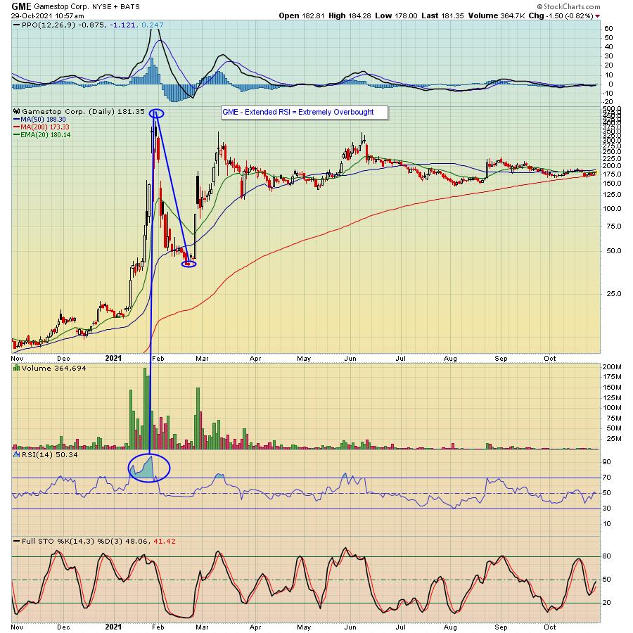
For an example of a stock that became extremely overbought, take a look at the chart below on Gamestop (GME), a stock well known to a lot of people when it went from $20 to $483 over the course of a few weeks earlier in the year.

In the case of GME, the RSI exceeded 90 when the stock hit its peak in late January, and I point your attention to what I like to refer to as a "Blue Cloud" that showed how violently overbought the stock had become. As a result, the stock fell from the peak of $483 to back to the $38 range in just a few weeks.
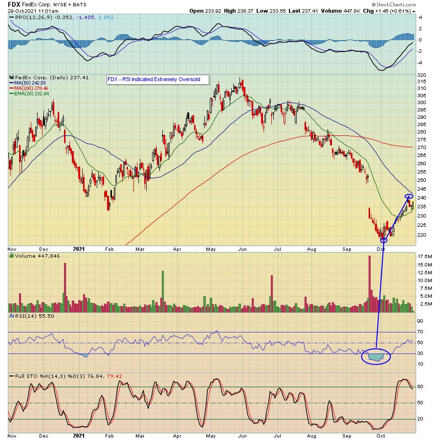
On the flip side, take a look at the chart below on FedEx Corp (FDX), which fell as low as $216 earlier this month. Notice the Blue Cloud where the RSI fell close to 15, showing an extreme oversold condition, with the stock finally reversing to the upside.

I want to point out that a stock can stay oversold or overbought for an extended period of time. But, when the Blue Cloud reaches extreme levels -- below 20 (oversold) or above 80 (overbought) -- it can be a time to start a long or short position. And if you tend to be more conservative, perhaps consider averaging in once you decide to take the plunge.
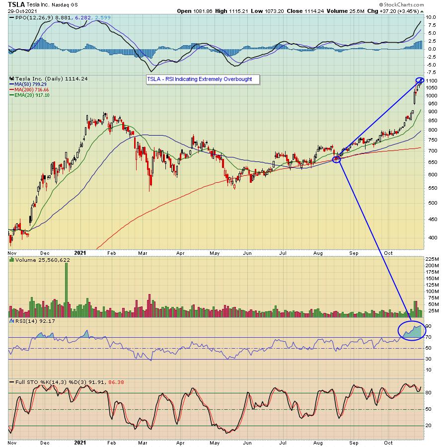
Like all technical indicators, nothing is 100% guaranteed, especially when you have a stock that has great momentum and is in favor. For example, take a look at the chart below on Tesla (TSLA) that recently reported strong earnings and has exploded to the upside.

As you can see, the Blue Cloud is showing TSLA has reached extreme overbought levels. Does this mean it's a short? Maybe, but you need to weigh the reward to risk, especially given the current momentum.
But I have had a lot of success on both the long and short side by trading those stocks where the RSI got to extreme levels. Even better is when you have stochastics that confirm an oversold/overbought condition. So, in the case of GME above, stochastics were also extended, while in the case of FDX, stochastics were extremely low. Hence the significant move in both stocks. In the case of TSLA, stochastics are flashing overbought as well.
I want to point out again that I personally have found the RSI to be a reliable technical indicator. Each trader has their own favorites. So you can decide if you want to add this particular indicator to your trading toolbox. In the meantime, if you would like to keep up with important earnings and market developments, sign up for our FREE newsletter, the "EarningsBeats Digest" featuring timely information from our Chief Market Strategist Tom Bowley. Just click here to get started.
At your service,
John Hopkins
EarningsBeats.com
|
| READ ONLINE → |
|
|
|
| ChartWatchers |
| The EV World Lights Up on Tesla's Order |
| by Greg Schnell |
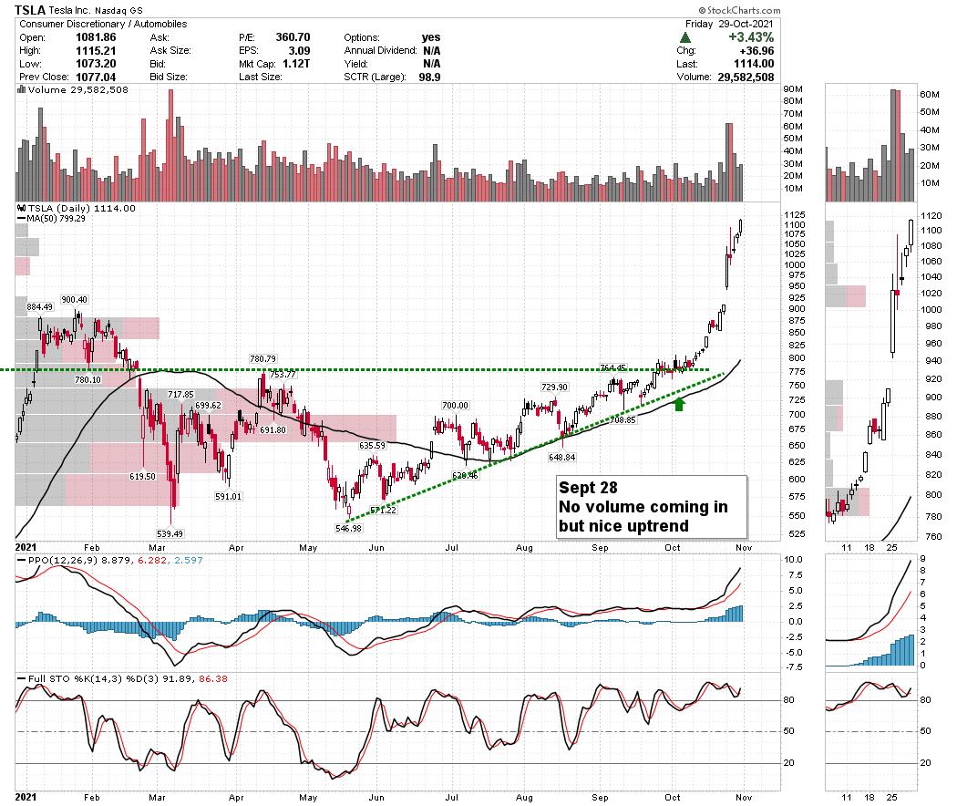
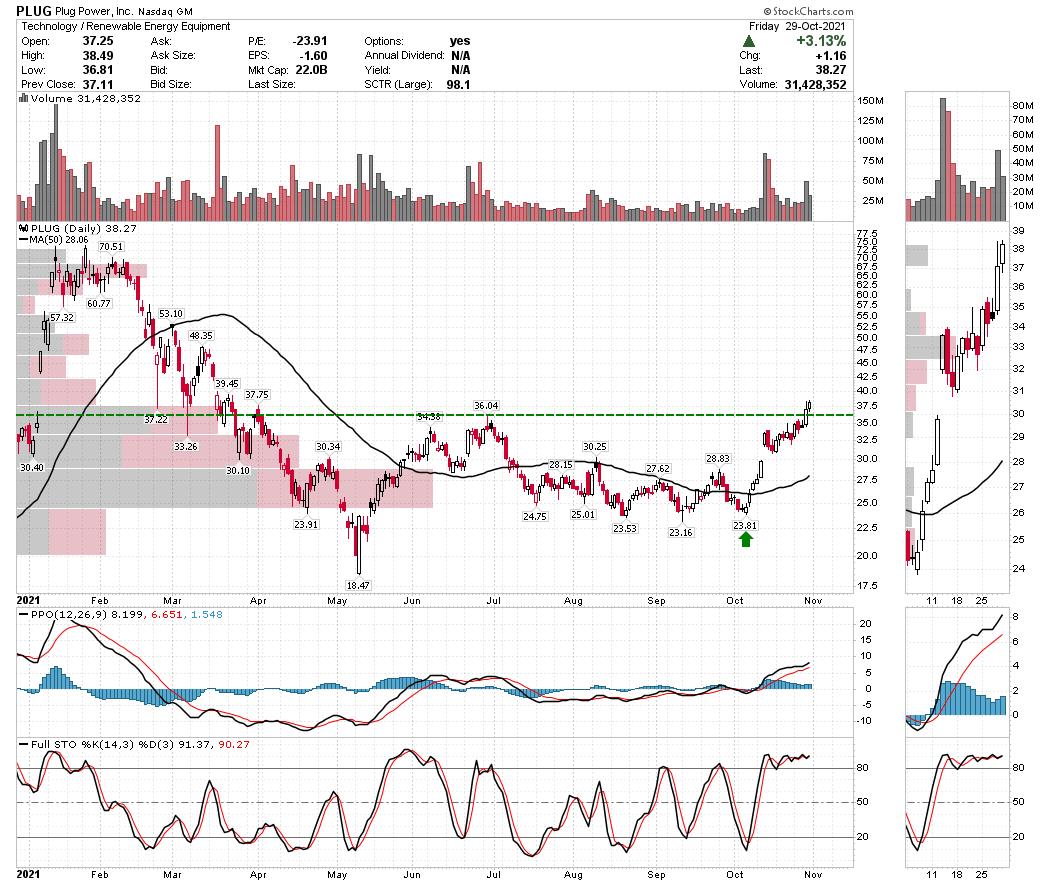
Hertz and Tesla signed an order for 100,000 vehicles this week. The Tesla stock chart (TSLA) migrated from $800 to $1100 in October and the rental car order was just adding throttle for the chart!

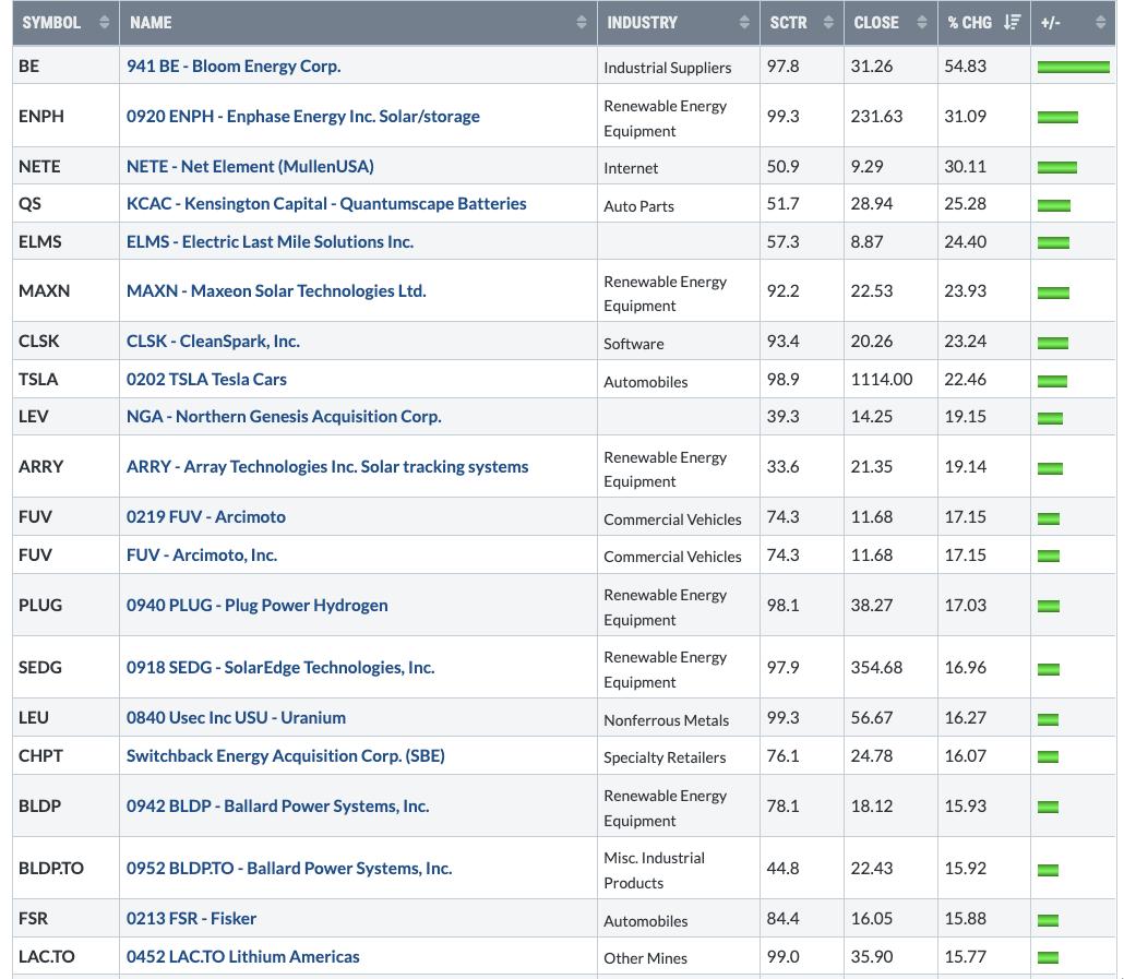
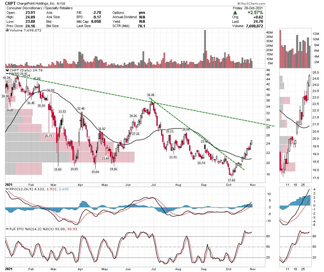
However, the announcement also lit the fuse on the entire electric vehicle space. Check out the size of some of the moves just within the week 😳 !

A lot of the stocks were drifting sideways after an abrupt drop in the spring. In hindsight, as Tesla was breaking out, this PLUG chart started to climb. Charts like PLUG turned up nicely to break out of the base.

Some of the other charts that started to move were the charging station companies. If this is going to be an industry-related surge, it makes it easier to be invested as new institutional investors are hunting for targets.

With the move in Tesla, it's alerting investors across the electric vehicle space. It might be a good place to charge a portfolio! Happy Hallo'ween!
|
| READ ONLINE → |
|
|
|
|
|
| The Mindful Investor |
| The Best FANMAG Stock Through Year End |
| by David Keller |
Investors often think of the FAANG stocks as one basket of names. Either the mega cap tech and communication trade is working, or it isn't. But, as a review of the charts will reveal, these stocks can actually be differentiated using their price and relative profiles.
So which of the FAANG stocks is best poised to outperform through the end of 2021?
(I should note that from here on out, I'll refer to this group of stocks as the FANMAG stocks: FB, AMZN, NFLX, MSFT, AAPL and GOOGL. Plenty of names could be included on this list, including TSLA, TWTR or even some of the China internet names, but I feel this is a good representative list.)
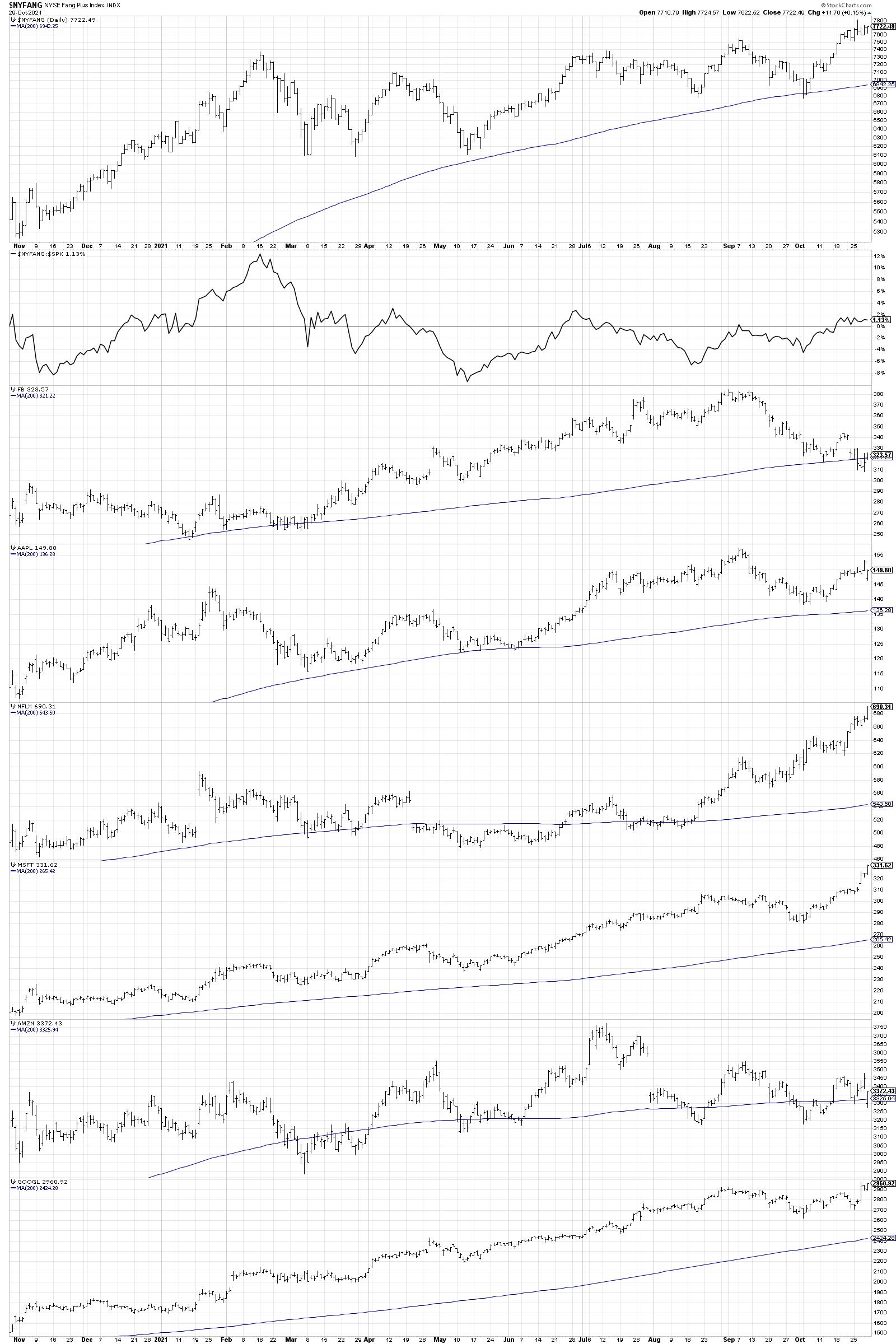
First, let's look at the price behavior of the six stocks.

At the top, we are looking at the NYSE Fang Plus Index, which includes a number of FAANG and "FAANG-like" stocks including TWTR. You can see that the index is making consistently higher highs and higher lows over the last six months, which is the sign of a strong uptrend.
The second panel down shows the relative strength of this index (we'll get more into relative strength signals later!), which illustrates that the index has essentially been a market performer over the last 12 months. That is, your return for owning this index would have been about the same as owning the S&P 500 index.
Now we have the six FANMAG stocks showing their individual price bars for the last 12 months. Note how the first three data series have very different paths in the last six months! Let's review them all.
FB was in a consistent uptrend through early September, but has since broken down through its 200-day moving average (the only of the six names to do so). Next is AAPL, which had a choppy week around Thursday's earnings release and is rangebound between $138 and $157. Then we have NFLX, which was in a sideways consolidation pattern for the first two thirds of the chart, and then rotated higher to break out of the base en route to new all-time highs this week.
Clearly these stocks are on three very different paths! The chart is either bullish with a new all-time high, rangebound with clear support and resistance levels or breaking down through support and failing to hold the 200-day moving average. This is not a homogenous group of names with similar price patterns, as has often been assumed.
The next three charts reveal that MSFT and GOOGL have also made new highs this week, although Microsoft is much more extended than Alphabet. Finally, AMZN is in a consolidation pattern of lower highs and higher lows. Next steps here are uncertain, as price lacks upside or downside momentum.
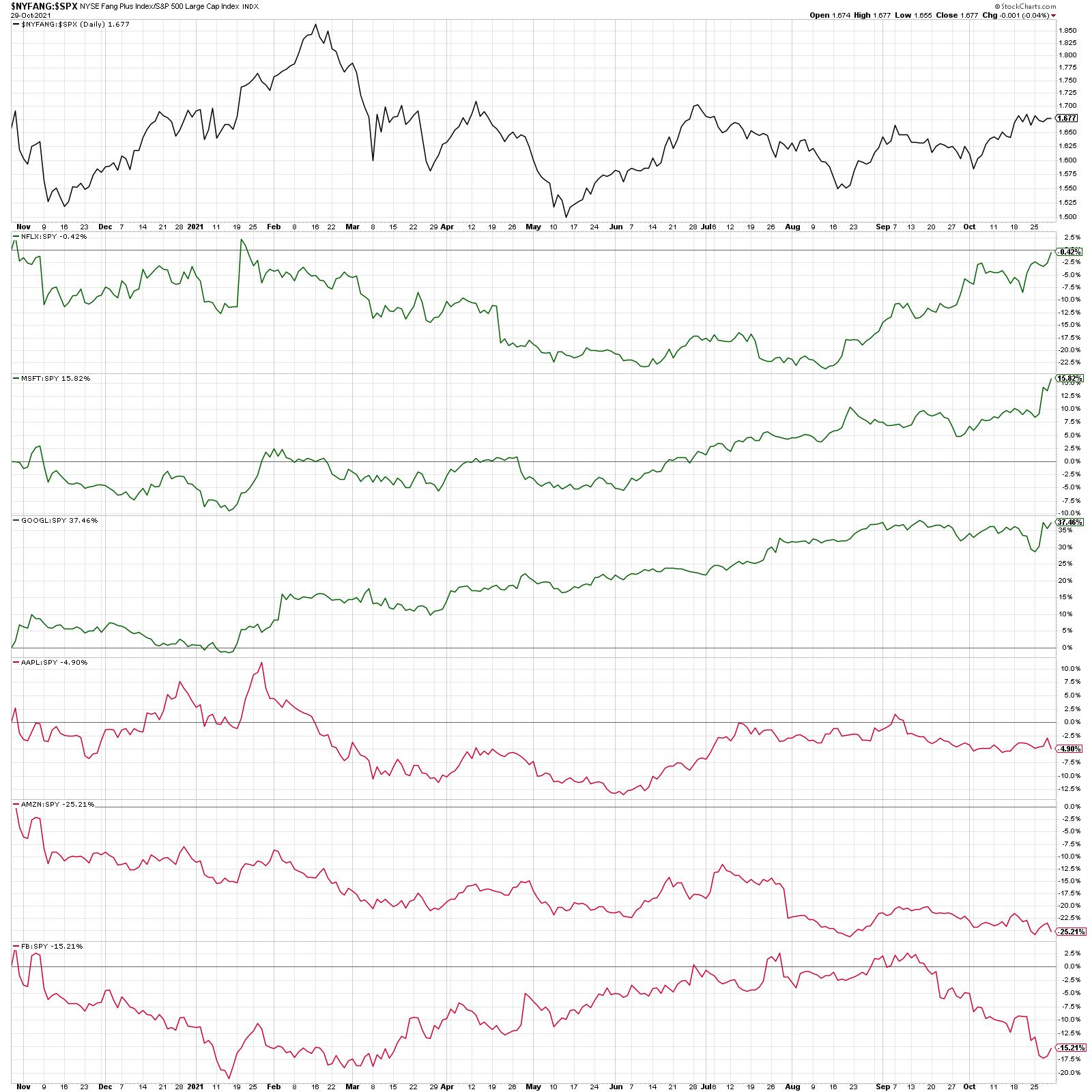
Now let's take a look at the relative strength of these six names.
Our second chart begins with the ratio of the NYSE Fang Plus Index versus the S&P 500 Index. Then we have the six stocks, in a different order, showing the relative performance of each name versus the S&P 500 ETF.

Now I've grouped these names into buckets: outperformers and underperformers. In the first bucket we have NFLX, MSFT and GOOGL. These are three names making new relative highs this week, or, in the case of Alphabet, very close to doing so.
Technical analyst John Roque used to ask, "If you're managing the Red Sox and you're trying to beat the Yankees, would you put your best players on the field?" Putting our best players into our portfolios gives us the best chance to outperform, and that means names demonstrating strong relative strength!
The next three stocks - AAPL, AMZN and FB - are all showing negative relative strength trends, with all three near new relative lows this week. One of the best ways to consistently underperform the S&P 500 is to own stocks where the relative lines are going down! So that leads us to the most important question: Which of these six names is best poised to outperform through year end?
I would have to start with the three outperformers - NFLX, MSFT and GOOGL. MSFT is tempting because it has been a consistent outperformer with a proven history of generating positive returns. However, I'd consider this the most overextended of the six names with profit taking a real possibility. So MSFT is out. GOOGL is also quite tempting, and I think the recent pullback in September means that a new group of buyers likely came in to push the price back to test all-time highs.
But I would have to go with Netflix. What most impresses me about this chart is the 13-month basing pattern, where the chart was sideways from July 2020 through August 2021. Then something different happened. The break to new highs in September, followed by a pullback the breakout level and upside reversal, suggested a new accumulation phase. The relative strength was negative for the first six months of this year, but has now turned higher as the stock has made successive new highs.
Remember that even if stocks tend to be grouped together based on their business models or sectors, that does not mean they will have the same performance characteristics. A deeper dive into price and relative strength can be a fantastic way to differentiate names and identify opportunities!
To digest this article in video format, here are two to review. The first one discusses the price patterns of these six names, while the second goes into more detail on their relative strength characteristics.
RR#6,
Dave
P.S. Ready to upgrade your investment process? Check out my free course on behavioral investing!
David Keller, CMT
Chief Market Strategist
StockCharts.com
Disclaimer: This blog is for educational purposes only and should not be construed as financial advice. The ideas and strategies should never be used without first assessing your own personal and financial situation, or without consulting a financial professional.
The author does not have a position in mentioned securities at the time of publication. Any opinions expressed herein are solely those of the author, and do not in any way represent the views or opinions of any other person or entity.
|
| READ ONLINE → |
|
|
|
| John Murphy's Market Message |
| A LONGER TERM LOOK AT OIL |
| by John Murphy |
A LONGER TERM LOOK AT OIL... Energy inflation is grabbing a lot of headlines these days and for good reason. Energy prices are hitting the highest level in years. That includes natural gas and crude oil. Today's message will focus on the next potential upside target for oil. The monthly bars in Chart 1 plot Light Crude Oil over the last twenty years. Two things are most notable on the chart. The first is that this year's rally broke a major resistance line extending back to 2008. The second is the fact that WTIC has risen above its 2018 high to reach the highest level in seven years. That suggests the strong probability for even higher prices. The chart also raises the possibility for an eventual price rise to the 2013 high around $112. That would be good for energy shares.
 Chart 1 Chart 1
ENERGY SPDR TESTS MAJOR RESISTANCE LINE... Energy shares are the year's strongest part of the stock market. And their uptrend should continue along with price of oil and other energy markets. But there's a hurdle that they have to clear first. The weekly bars in Chart 2 show the Energy Sector SPDR (XLE) reaching the highest level in six years and looking capable of moving higher. The chart, however, shows prices now testing a major resistance line drawn over its 2014-2016 peaks. That may be enough to cause some short-term profit taking. But if and when it's exceeded, the next potential upside target for the XLE would be its 2018 peak near 65.
 Chart 2 Chart 2
|
| READ ONLINE → |
|
|
|
| Dancing with the Trend |
| Maybe not what you want, but probably what you need. |
| by Grant Morris, Greg Morris |

Investing successfully for the long term requires a balance between give and take, choosing the pros and the cons of different investment approaches, taking the good with the bad, and accepting the risks with the rewards of investing. In other words, you can't have it both ways. You can't have your cake and eat it too; you will have to make some tradeoffs between what you want and what you need. Some investors expect to have all of the good without any of the bad, to get the rewards but not take the risks, to participate in all the upside and avoid all the downside. That is not possible and never will be. Chasing investments or investment strategies that promise the reward without the risk is foolish and will always lead to disappointment. It is much better for you to make an honest assessment of what tradeoffs you can tolerate and invest accordingly.
If you are the type of investor that likes to have your investment accounts at all-time highs whenever the market is making all-time highs, you should probably just be a passive index fund investor. You can do this with low-to-no-cost ETFs that give you exposure to the same market indices discussed on the financial news networks every day. When the news proclaims the market is at all-time highs, if all of your money is in an S&P 500 index ETF, then you will feel great that your account is also at all-time highs. Of course, when the S&P 500 is in a bear market, your account will be too.
It is important to realize, though, that choosing to be a passive investor tied to a particular index doesn't free you from having to make tradeoffs with your investments – you are still accepting the good and bad of passive investing and making a tradeoff with all the other ways one could invest. The "good" is the long-term returns of the index, the strong bull market periods, never underperforming the market, and having your account at all-time highs when CNBC is lauding the market highs. The "bad" is that you will never beat the market, you'll have high volatility, you'll have periods of sheer terror when massive drawdowns occur during bear markets, and there will be long periods of time spent just recovering losses after a bear market has bottomed with a drawdown of 30%, 40%, or 50%.
If you want the "good" listed above, you have to be willing to accept the "bad" too. You can't have one without the other.
People often choose to invest differently from a passive, index-based portfolio, in hopes of having their allocation change drive some outperformance to the market. It takes effort to do things differently, so unless there is an expected benefit, why else would one attempt it? The reasons could be numerous, but at the end of the day, if you do anything different than passive index investing, you are implicitly (or explicitly, for some) making tradeoffs in these good and bad aspects to investing. You are changing what risks you are willing to accept for the returns you seek.
If you are an investor with a typical benchmark 60% stock (SPY) and 40% bond (AGG) allocation, you have many portfolio-construction levers to pull (i.e., tradeoffs to make) in your effort to "beat the market". You may stay passive and chose to incorporate allocations to other index ETFs, such as the Nasdaq Composite or to the Russell 2000, because you think they'll outperform the large-cap stocks of the S&P 500. That outperformance could come from larger upside returns or smaller downside returns. Some tradeoffs you just made are that you may not be at all-time highs at the same time as the S&P 500 but you may have lower volatility because your portfolio is more diversified. You could also change your bond allocation away from AGG by incorporating longer- or shorter-duration bonds, or higher or lower credit quality, etc. These are all tradeoffs you are making with the "free and easy" benchmark portfolio, and you should be aware of them and why you are willing to make them.
Maybe instead of passive investing you move to a more active strategy that involves stock picking, like trying to invest in a subset of S&P 500 stocks that will outperform the index. Stocks could be selected based on fundamental analysis, technical setups, or factor-based screening. You are still trading benchmark performance, with its specific risk and reward profile, for a different investment approach that may or may not have better returns or risks. One should assess if the new risk and reward profile is desirable and justifies the difference from the benchmark. One also should understand the tradeoffs made and if they are acceptable – i.e., if the difference from the benchmark is tolerable by the investor.
We think it is very important to have a good understanding of why you may want to be invested differently and the tradeoffs that are being made with the different allocation. Knowing and understanding how and why your portfolio will behave differently than the benchmarks is key to having the discipline often required to stick with something that is different.
We choose to invest differently because we know that the "bad" that comes with passive investing is just not acceptable to the vast majority of investors. We primarily manage strategies that are rules-based and 100% tactical. This means that we can move from being 100% invested in the stock market to being 0% invested in the stock market (100% defensive) based on the rules of our tactical ETF strategies. Why do we choose to manage money this way? For two main reasons: (1) the math of compounded returns, and (2) we believe it is what clients NEED, whether they recognize it or not.
#1, The Math of Compounded Returns
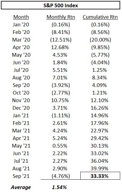
Let's use a real-world example to illustrate. The US stock market had its first bear market in more than 11 years during 2020, due to the global pandemic. Here are the monthly returns of the S&P 500 since 2020, and the average and cumulative compounded returns during these years.

The S&P 500 has an average return each month of 1.54%, while the cumulative compounded return over this time period is 33.33%.
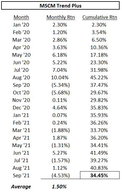
As mentioned in previous articles, our Trend Plus strategy did very well at getting out of the way of the COVID bear market and avoided all of the drawdown that occurred during the first half of 2020. Below are the results of Trend Plus over the same time period.

Trend Plus has an average return each month of 1.50%, while the cumulative compounded return over this time period is 34.45%.
Trend Plus had a smaller average monthly return than the S&P 500 but the compounded return on Trend Plus is greater – and compounded returns are what matter to investors. This result is what we mean by the "math of compounded returns." If you can avoid large negative months (or quarters, or years), your returns can compound at a higher rate over time since large negative numbers destroy compounding – it's just math. Same as the trend-following truism that says, if you are able to miss most of the bad times, you don't have to participate as much on the upside to still come out ahead.
#2, What Clients Need
For reason #2, we have found that most clients cannot tolerate large drawdowns. They NEED an investment approach that focuses on risk management rather then what they say they WANT, which is typically to achieve outsized returns. Most investors cannot successfully ride the bear market down 33.9% (like we saw the S&P 500 drop in 2020) and continue to hold onto their position until the market fully recovers. In theory, this type of investor must exist (academic finance is entirely based on their existence), but in practice, we never find them. The losses in bear markets are far too great to withstand. This is especially true for investors that are nearing retirement or already retired. Bear market losses can completely devastate your retirement plans when time isn't on your side to wait for a recovery. Thus, clients NEED risk management and a way to avoid the devastation of bear markets, while still getting "good" returns during bull markets.
Over the same months shown in the tables above, when the S&P 500 suffered the 33.9% drawdown, the Trend Plus maximum drawdown was only 10.7%. This happened in October 2020 just after the S&P 500 had fully recovered from the bear market (notably, our drawdowns occur at different times than the market's). We firmly believe that drawdown is the best measure of risk (as discussed in previous articles), and so our Trend Plus strategy was able to deliver higher compounded returns over this time period while taking significantly lower risk – that is why we invest differently.
There is no such thing as an investment strategy that gets it right all the time or has all the good without any bad. People always look for the holy grail of investing, something that provides the upside returns of the S&P 500 and somehow avoids the downside. It doesn't exist. What can exist is an acceptance of which risks and "bad" results you can tolerate, then find the strategy that provides the best returns based on accepting those risks.
The tradeoffs we make to manage money through our tactical strategies are numerous, and we have to fully accept the "bad" aspects of our approach. We suffer whipsaw trades and often underperform the benchmark portfolios, we frequently are not at new highs in our strategy when the market is making all-time highs, we have down days and months when the market is up, etc., etc. We are willing to make all of these tradeoffs in order to achieve the results that we and our clients NEED, even if it's not always what we WANT.
For tactical strategies, like the ones we manage at McElhenny Sheffield Capital management (mscm.net/strategies/), we think it is better to understand what market environments will cause underperformance and accept that "bad" as a tradeoff for the "good" that we provide at other times. Namely, when the major corrections and bear markets come, we typically do very well and tend to come out ahead.
If you are interested in using our trend following or other tactical strategies, you can reach out to Grant directly by email (grant@mscm.net). Grant manages various tactical strategies at MSCM for individual investors and other registered investment advisors, and Greg is a senior advisor to the firm.
Dance with the Trend,
Greg Morris
Grant Morris
|
| READ ONLINE → |
|
|
|
| MORE ARTICLES → |
|
 Chart 1Chart 2 features the XLF. Since we are monitoring intermediate trends, it's important to see that trendlines or bases extend for three months or longer. In the case of financials, we can see that the SPK has broken out from a 3-month base. This positive action has also been confirmed by the price, as it has managed to push through a 5-month resistance trendline. The chart also shows a sell signal in late May using this same trendline approach. Because the overall market advance had been so strong, subsequent intermediate correction took the form of a gently rising consolidation pattern, rather than a decline.
 Chart 2International Markets
 Chart 3One international ETF that has already broken to the upside is the iShares MSCI Pacific ex Japan (EPP). It has already violated two equivalent 2021 intermediate down trendlines. The SPK is also above its signal line, but that should not weigh as an important factor since it has triggered several false breaks recently.
 Chart 4Chart 5 shows that the iShares Singapore ETF (EWS) has been going sideways since the late spring. It experienced an SPK breakout a week or so ago and one more recently by the price itself.
 Chart 5The SPK for the iShares Brazil Capped ETF (EWZ) has experienced more volatile intermediate price movements than most other country funds. In that respect, the dashed green and red arrows flag the eight intermediate price movements that have developed since late 2019. Chart 6 shows that its SPK has been contained by a 4-month down trendline and is now somewhat oversold. The signal line has also called the last six intermediate reversals without a whipsaw, so the fact that the trendline and signal line for the SPK are in the same vicinity indicates how important they are as a resistance point.
 Chart 6Commodities, Gold and the Dollar
 Chart 7The SPDR Gold Shares (GLD), Chart 8, could be in the process of making a recovery. If we ignore the false June upside break, the GLD has busted through its 2020-2021 corrective trendline. The price has not yet done so and needs to close above that $170 level in order to confirm momentum action.
 Chart 8Chart 9 puts us in a quandary, because the Invesco DB US Dollar Bullish Fund (UUP) is sporting an uptrend. That seems inconsistent with a rising gold price. However, there have been limited periods when they have both risen together. Indeed, a Global Gold Index, which I calculate from euro, yen and dollar measures, is currently bullish. The implication is that gold and the dollar may be able to rally simultaneously for a while. Nevertheless, the UUP is at a fairly critical point, as it and the SPK are both resting on a key up trendline. If they are decisively violated, it would suggest that the Dollar Index had begun a period of re-accumulation or an actual decline.
 Chart 9Good luck and good charting,

 Moving averages are classic trend-following indicators and the 200-day SMA is perhaps the most widely used long-term moving average. This article will put the 200-day to the test using the Russell 2000 ETF (IWM).