| THIS WEEK'S ARTICLES |
| John Murphy's Market Message |
| STOCK INDEXES MAINTAIN UPTRENDS |
| by John Murphy |
STOCK INDEXES MAINTAIN UPTRENDS... Stocks are ending the week trying to make up some losses from Wednesday's sharp selloff after the CPI annual inflation report of 6.2% was the highest level in thirty years. Chart 1 shows the Dow Industrial staying above its 20-day moving average. Charts 2 and 3 show the S&P 500 and Nasdaq 100 doing the same. All three indexes are down for the week. So far, however, those losses haven't been enough to reverse the market's continuing uptrend. Most sectors also lost ground on the week with four exceptions. Materials, healthcare, industrials, and technology ended the week in the black. Let's take a closer look at materials.
 Chart 1 Chart 1
 Chart 2 Chart 2
 Chart 3 Chart 3
CHEMICALS LEAD MATERIALS HIGHER...Chart 4 shows the Materials Sector SPDR (XLB) ending the week in record territory. It was the only sector to do that. Copper and aluminum stocks contributed to its gains. Chemical stocks, however, were the sector's standout performers. Chart 5 shows the Dow Jones Specialty Chemicals Index ending in record territory; while Chart 6 shows Dow Jones Commodity Chemicals Index close to doing the same.
 Chart 4 Chart 4
 Chart 5 Chart 5
 Chart 6 Chart 6
TREASURY YIELDS AND GOLD CLIMB ON INFLATION REPORT...Bond yields rose sharply this week following the strong inflation report. Chart 7 shows the 10-Year Treasury yield rising 12 basis points during the week to end at 1.58%. Interest rates usually follow inflation higher. Gold had a strong week as well. Chart 8 shows the Gold Shares SPDR (GLD) rising to the highest level in five months. Long viewed as an inflation hedge, gold has remained relative flat over the past few months as inflation pressures were growing stronger. This past week's gains in the yellow metal suggest that gold may finally be returning to its traditional role as a hedge against rising inflation.
 Chart 7 Chart 7
 Chart 8 Chart 8
|
| READ ONLINE → |
|
|
|
| ChartWatchers |
| The 10-yr Treasury Yield and Relative Performance for Small-caps |
| by Arthur Hill |
 The surge in the 10-yr Treasury Yield is the talk of the town this week, and last week it was the breakout in the Russell 2000 ETF and relative strength in small-caps. Is there a correlation between small-cap relative performance and Treasury yields? Today's commentary will look at the relationship between the 10-yr Treasury Yield and the IWM:SPY ratio because these two have a pretty strong positive correlation. The surge in the 10-yr Treasury Yield is the talk of the town this week, and last week it was the breakout in the Russell 2000 ETF and relative strength in small-caps. Is there a correlation between small-cap relative performance and Treasury yields? Today's commentary will look at the relationship between the 10-yr Treasury Yield and the IWM:SPY ratio because these two have a pretty strong positive correlation.
Ratio charts measure relative performance, and only relative performance. The ratio rises (relative strength) when the numerator (IWM) increases more than the denominator (SPY). Conversely, the ratio falls (relative weakness) when the denominator increases more than the numerator.
The chart below shows the IWM:SPY ratio (black line) and the 10-yr Treasury Yield (red line). Notice that these two lines move in the same direction, for the most part. Both rose from September to March, which means IWM outperformed SPY when the 10-yr Treasury Yield rose (large green area). The lines fell from April to July, which means IWM underperformed SPY when the 10-yr Treasury Yield fell (red shading). Most recently, the lines have been rising as IWM outperforms and the 10-yr Treasury Yield rises. Who knew lines could be so fascinating!
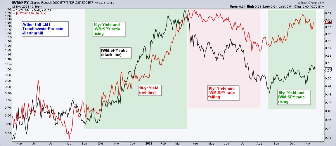
The current evidence is bullish for small-caps as the Russell 2000 ETF (IWM) broke out of a big range last week and is starting to outperform SPY. The rise in the 10-yr Treasury Yield also creates a bullish tailwind for relative performance. Ratio charts are interesting, but they tell us nothing about absolute performance so keep your eye on the actual price chart for trading decisions.
This week at TrendInvestorPro, I also look at the relationship between the 10-yr Treasury Yield and the Regional Bank ETF (KRE) as well as the Nasdaq 100 Next Gen ETF (QQQJ). Do rising yields influence stocks with high valuations? This week's reports also cover the recent breakouts in copper-related ETFs, long-term breakouts in old economy ETFs and the recent breakout in gold. Get all this and more with immediate access (click here). Also check out our Trend Composite signal table for S&P 500 stocks.
----------------------------------------------
|
| READ ONLINE → |
|
|
|
| ChartWatchers |
| Watch the Metal; It May Soon Be Time to Pedal |
| by Martin Pring |
The gold price zig-zagged its way down between August of last year and April of this one. Since then, it's really been in a trading range and now looks as if it is breaking out.
I'll start off by taking a look at the longer-term picture. In that respect, Chart 1 compares the price (on a quarterly basis) to its Coppock Curve. The green-shaded areas flag periods when the Coppock is in a rising mode, a condition that, since the 1970s, has enabled gold to participate in every major rally, except the early 1977 and 2009-2011 advances. Equally as important, this technique has avoided all major declines. Despite the 2020-2021 correction, the indicator remains in a rising and therefore bullish mode. It is also above its 9-quarter MA.
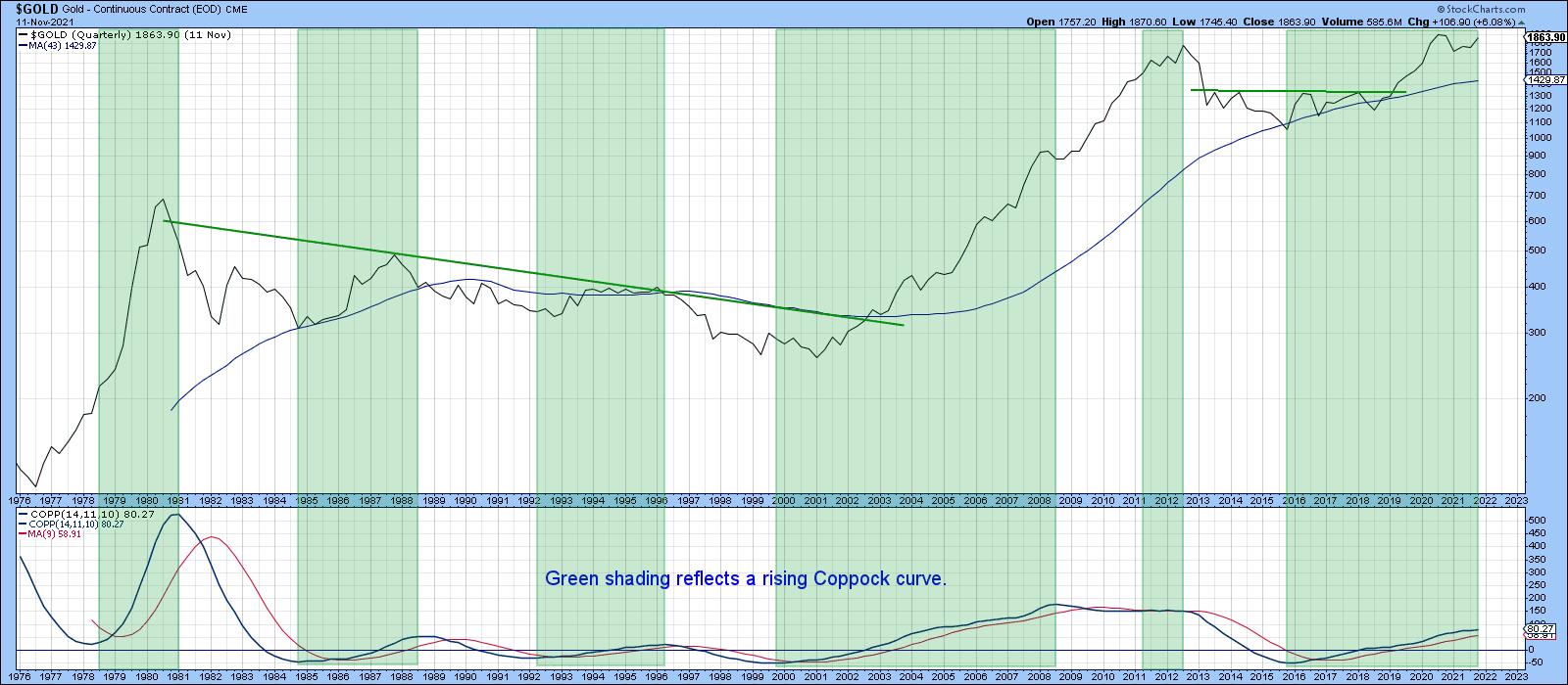 Chart 1Chart 2 features another long-term indicator, a PPO, using the 6- and 15-month parameters. This oscillator is bullish for gold when it is above zero (i.e. the 6-month EMA is above its 15-month counterpart). This approach also captures the majority of the advances and sidesteps serious trouble. One of its joys is that it has only experienced three whipsaw signals since 1977. They have been flagged by the two red arrows and one green one. The oscillator is above zero at present, but barely so. It has, though, tentatively penetrated the 2014-2021 up trendline, which could prove to be a problem should its condition worsen. The oscillator's overall technical position is therefore still bullish, but definitely in need of an imminent rebound. Chart 1Chart 2 features another long-term indicator, a PPO, using the 6- and 15-month parameters. This oscillator is bullish for gold when it is above zero (i.e. the 6-month EMA is above its 15-month counterpart). This approach also captures the majority of the advances and sidesteps serious trouble. One of its joys is that it has only experienced three whipsaw signals since 1977. They have been flagged by the two red arrows and one green one. The oscillator is above zero at present, but barely so. It has, though, tentatively penetrated the 2014-2021 up trendline, which could prove to be a problem should its condition worsen. The oscillator's overall technical position is therefore still bullish, but definitely in need of an imminent rebound.
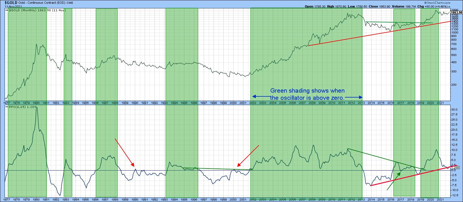 Chart 2 Chart 2
Gold vs. The CPI
Chart 3 shows that, if the price breaks to a new CPI-adjusted high, that could be a very big deal as far as inflation is concerned. That's because the price recently touched a trendline joining the 1980 and subsequent highs. The line's 40-year length means that it represents very significant resistance. From a technical perspective, a successful upside penetration would suggest that a major rally had begun. Given gold's penchant for discounting future inflation, it would be a very worrying development. I am not predicting that it will happen, as there is insufficient evidence at present to come to such a conclusion. However, it's certainly something worth watching.
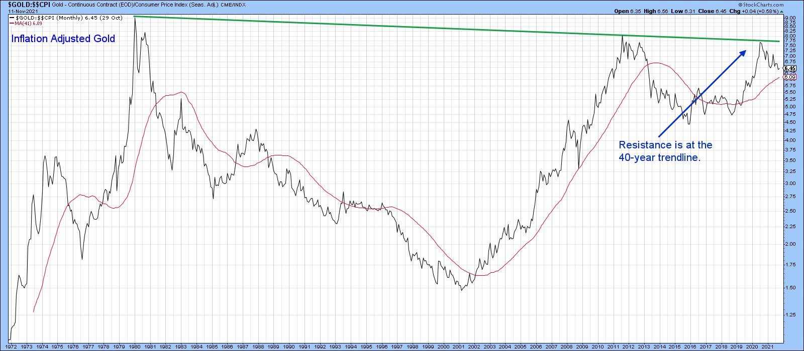 Chart 3 Chart 3
Gold vs. Commodity Prices
The arrows in Chart 4 show that gold has a strong tendency to lead commodity prices at major turning points. The problem is that those leads vary considerably. Additionally, it is possible for the magnitude of these to diverge considerably. Look at the relatively small gold drop in 2008 compared to the devastating bear market that the CRB Composite experienced. It seems that this relationship is useful for predicting the direction rather than magnitude of a move. Nevertheless, that can be a very useful piece of information.
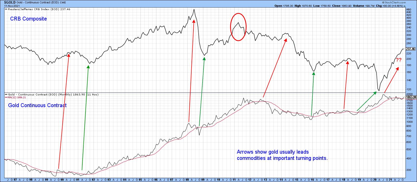 Chart 4 Chart 4
That's where the relationship between gold and commodities comes in. For example, the arrows in Chart 5 approximate points where the KST of the ratio crosses above its MA, thereby indicating that gold has started to outperform the CRB. Note that, in the vast majority of situations, these crossovers are followed by a gold rally. That was not the case in 1990 and 1998, nor for a short period in 2015. By and large, though, the odds favor firmer gold prices when the ratio is moving in gold's favor. Currently, the KST is still declining, but it is starting to stabilize.
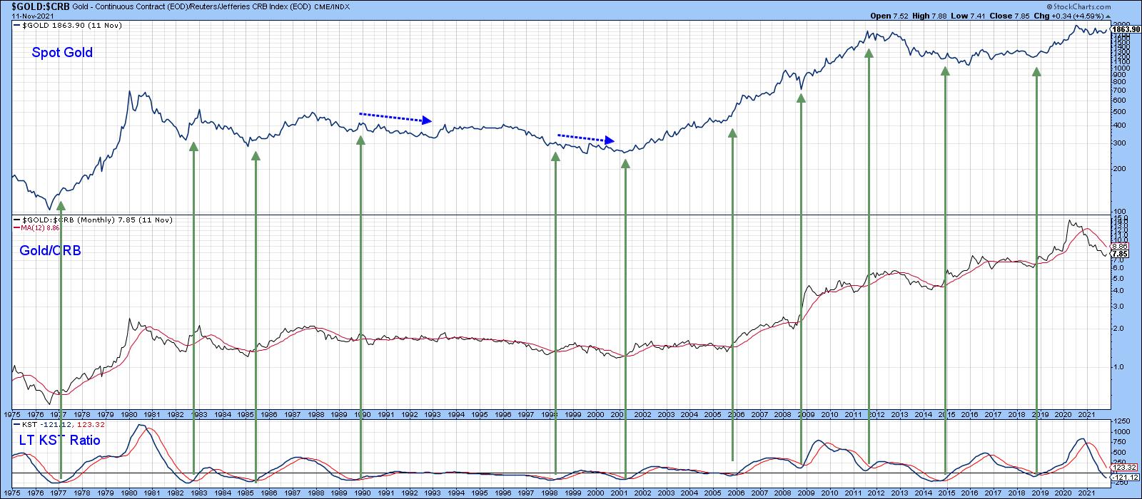 Chart 5 Chart 5
Chart 6 says that negative condition could be about to improve, as the ratio between the SPDR Gold Trust and the DB Commodity ETF (GLD/DBC) is right at its 2021 down trendline. The gold price itself has already cleared its 2020-2021 correction down trendline. The green arrows show that similar setups, when completed by both series, were followed by a gold rally of intermediate significance.
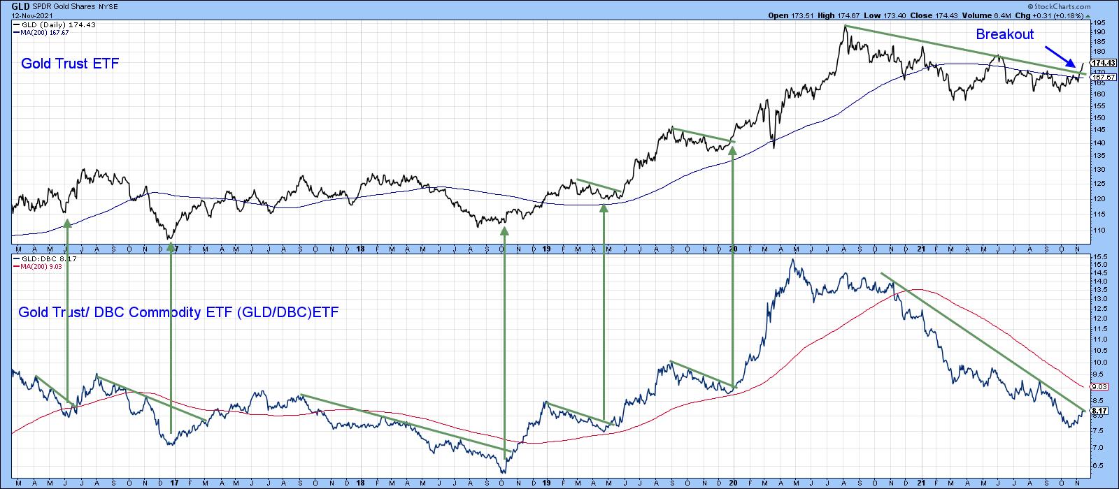 Chart 6 Chart 6
Gold and the Dollar
Most of the time, gold and the dollar move in opposite directions. At the moment, the Dollar Index is bullish, as it is above its 12-month MA and its long-term KST is rising. That could be a problem for gold. Nevertheless, there are some periods when these two markets move in the same direction. When that direction is up, it simply means that gold rallies in other currencies, but less so when expressed in dollars. That may well be the case currently, as Charts 7 and 8, featuring euro- and yen-based gold, have broken decisively to the upside.
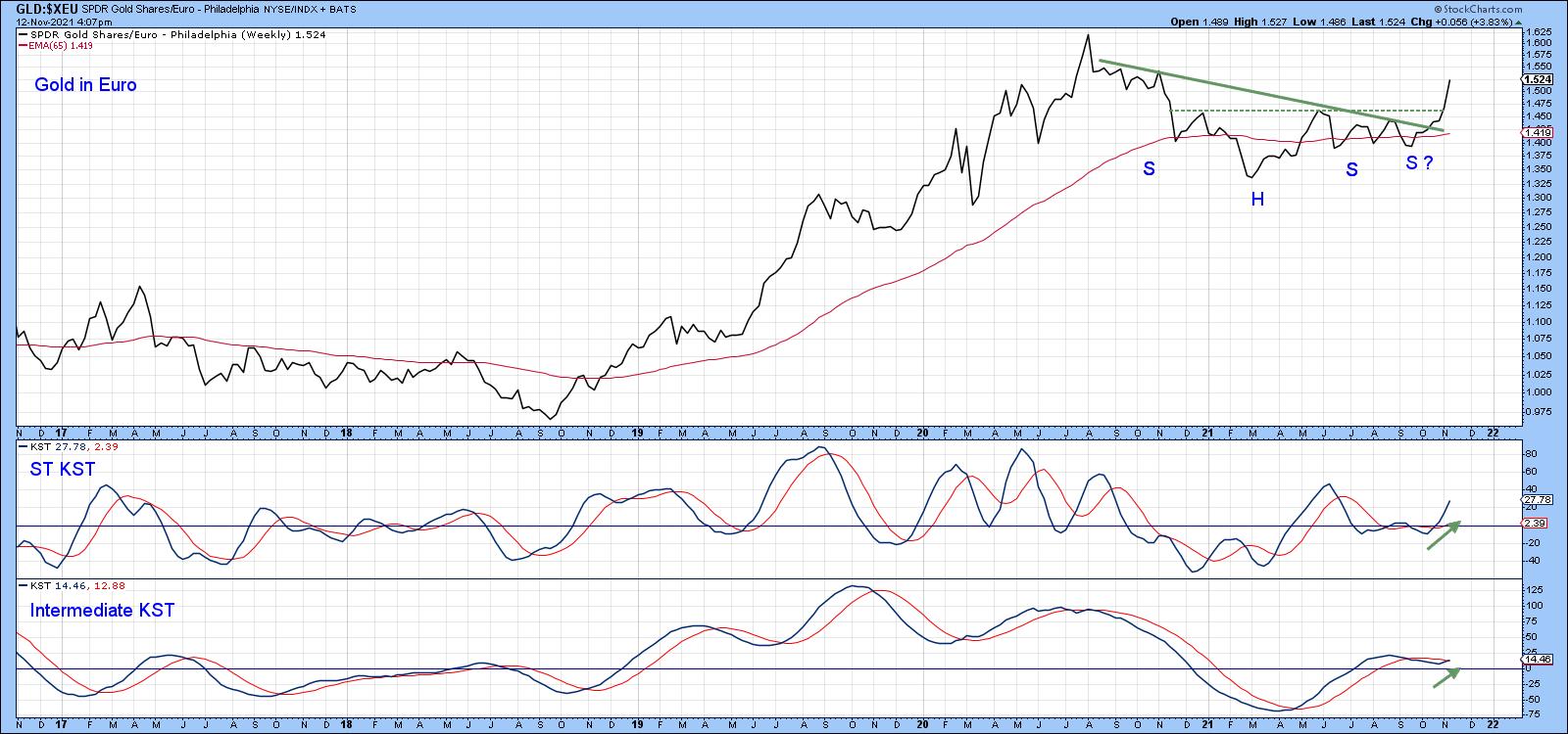 Chart 7 Chart 7
Euro gold (Chart 7) is well above the green correction trendline. It has also surpassed the neckline of a potential reverse head-and-shoulder pattern. The rising short- and intermediate-term KSTs suggest there is more to come.
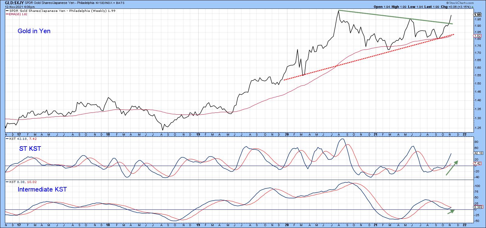 Chart 8Positive momentum is also a factor for gold expressed in yen, as the price has completed a symmetrical triangle formation. Chart 8Positive momentum is also a factor for gold expressed in yen, as the price has completed a symmetrical triangle formation.
This article is an updated version of an article previously published on Thursday, October 28th at 12:20pm ET in the member-exclusive blog Martin Pring's Market Roundup.
Good luck and good charting,
Martin J. Pring
The views expressed in this article are those of the author and do not necessarily reflect the position or opinion of Pring Turner Capital Group of Walnut Creek or its affiliates.
|
| READ ONLINE → |
|
|
|
|
|
| ChartWatchers |
| Commodities Swing Wildly, But Higher |
| by Greg Schnell |
Much has been made of the oil trade this year, and we have seen other commodities swing wildly, but higher. It continues to be a strong area for swing traders to outperform. Some of the tech names have been rocking it to the upside too. It's not a one-trick-pony type of market; there are opportunities out there and, right now, the trend is higher. The $SPX is up 6.5% since the start of this chart, but is up 7.5% from one month ago. It has been a fast-moving ride to the high side. The indexes are performing very well and breadth has been wide and positive.
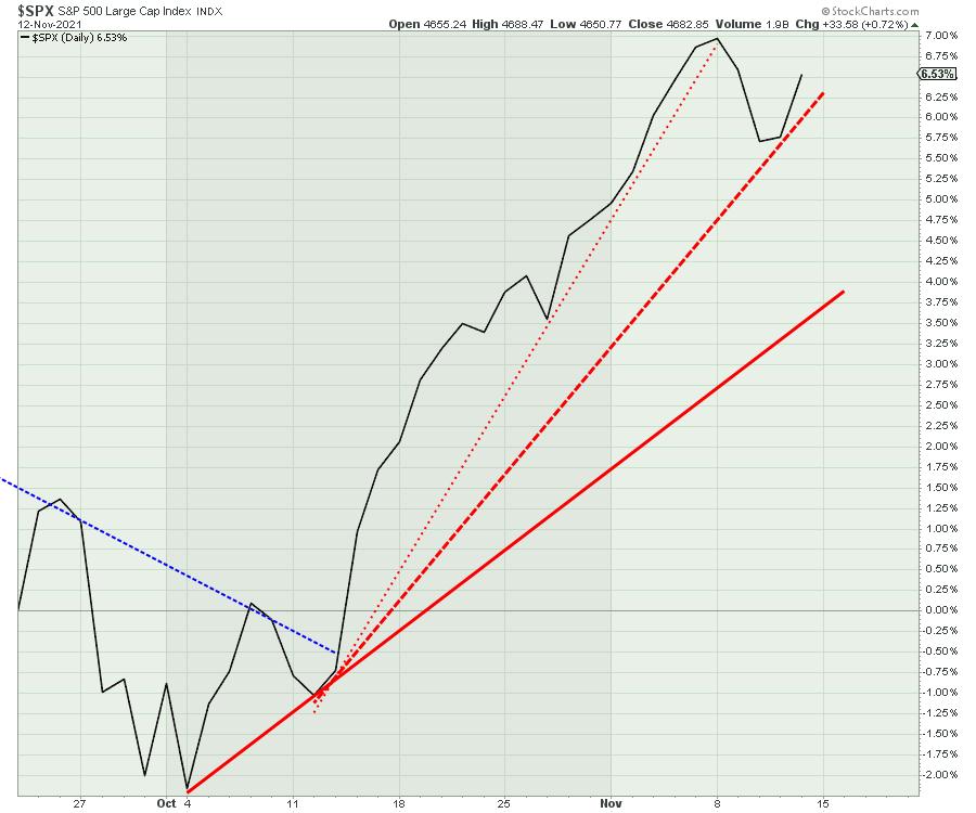
I look at the steep uptrend line and it has been one for the record books; 9.5% in a month from October 4 to November 5. The second trend line is still very steep; it represents a fast-moving market with a wiggle this week. Using the October 4th low and the October 11th row to generate the solid red line, it would still be a fabulous monthly gain of 5%.
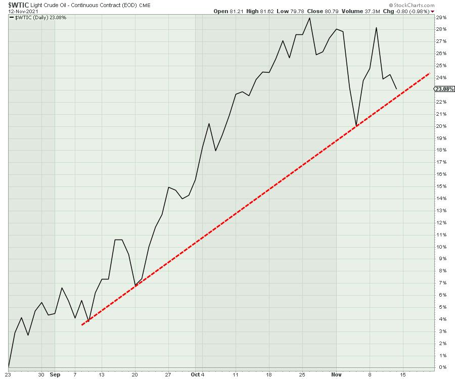
Crude oil, with the last three months shown below, has been a strong move higher, but it has rolled over in recent weeks. The percentage gain is still huge, but the chart is relaxing a bit currently.
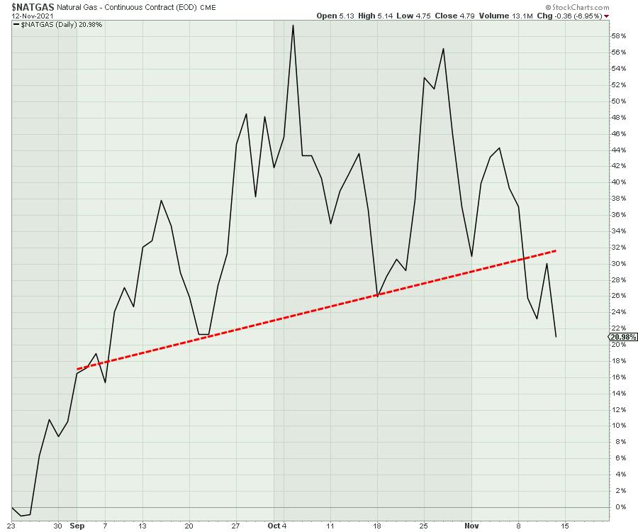
Natural Gas has also waned a bit. The seasonally strong period for natural gas is ending and it is not surprising to see it unwind a little. With the low level of supply pressures on Europe and Asia for Natural Gas, LNG tankers will be taking all the Natural Gas they can to move this around the world where prices are much higher. But the chart is still topping out for now.
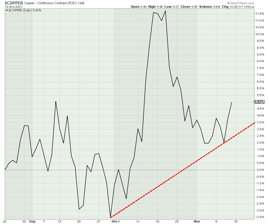
Copper has been correcting since May and started to move higher in October with other commodities. The next few weeks should tell us if this rally continues to push to the upside meaningfully or if it can't hold this rally and it breaks down here. The copper chart has definitely been a more difficult chart to trade.
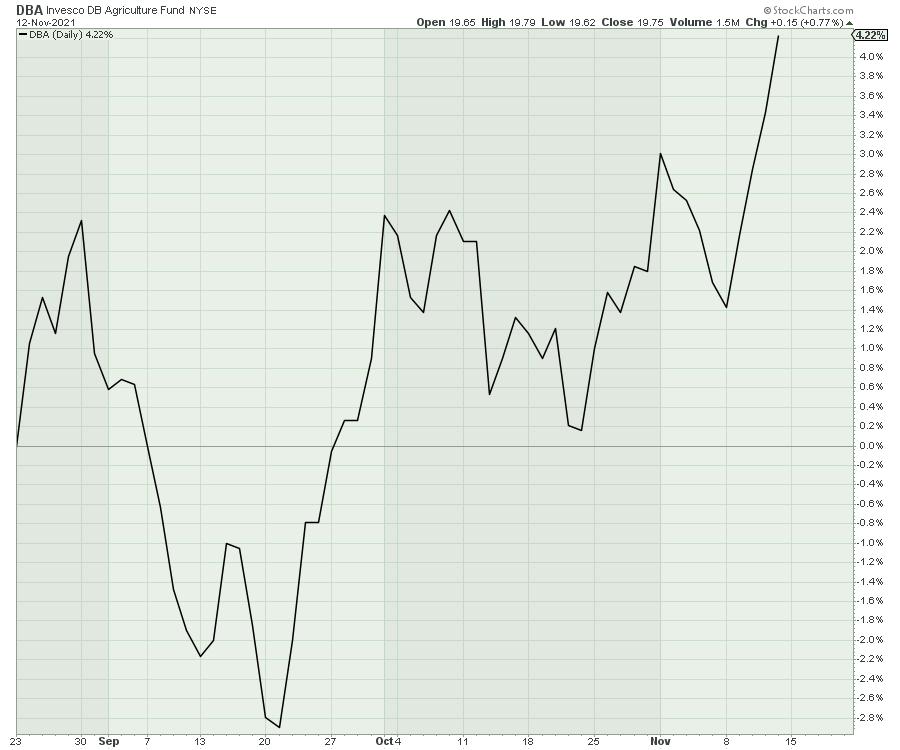
One of the bigger commodity-related opportunities would appear to be in agricultural commodities. The easiest way to see that area is through the DBA ETF, which started to rally in September.
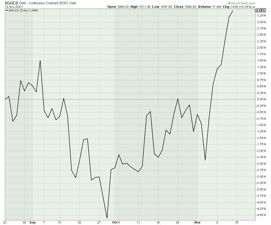
Most of you will have been alerted to the moves in Gold and Silver this week. The gold chart is clearly accelerating higher, now 6 weeks off the low. Gold made a nice clean breakout this week.
Silver shimmered as well and it has been rallying for 6 weeks.
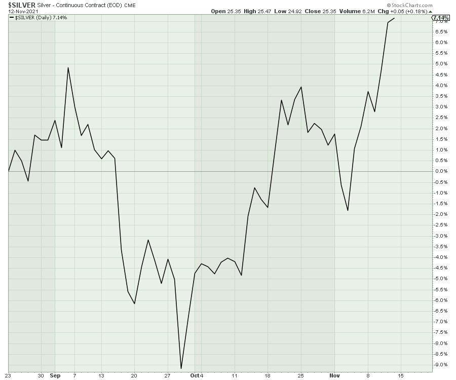
So there appears to be a changing of the guard right now. The wild outperformance of Natural Gas and Crude Oil seems to be changing to agriculture, gold and silver. I am trying to stay with what is working. We'll need more information from the copper chart to see if it is going to keep moving higher with the precious metals charts.
Head on over to GregSchnell.com/explore to find more trading ideas and join our community there.
|
| READ ONLINE → |
|
|
|
|
|
| ChartWatchers |
| 4 of My Favorite Earnings Reports This Quarter |
| by Tom Bowley |
I spend hundreds of hours during each quarterly earnings season researching earnings reports, deciphering which beat revenue and EPS estimates and then annotating every one of those charts. It's what makes up our Strong Earnings ChartList (SECL), a ChartList that we update every 1-2 weeks for our EarningsBeats.com members. Some companies stand out more than others based on the subsequent market reaction and their leadership roles. I like to focus on companies in leading industries that show excellent relative strength and strong AD (accumulation/distribution) lines. It's my "leading stock in leading industry group" theory that dominates our portfolio selection process.
If you're interested in trading and your goal is to beat the S&P 500, it's important to stick with what's working in terms of momentum and relative strength. Personally, I've never been able to time bottoms consistently. That doesn't work for me. Instead, I look to leaders. We have plenty of leaders to choose from, but here are 4 companies that recently reported excellent results and that I believe could be solid performers over the next few months:
Enphase Energy (ENPH)
Industry: Renewable Energy ($DWCREE)
Quarterly results:
- Revenues: $351.52 mil (actual) vs. $343.15 mil (estimate)
- EPS: $.60 (actual) vs. $.48 (estimate)
- Guidance: Raised
Market reaction:
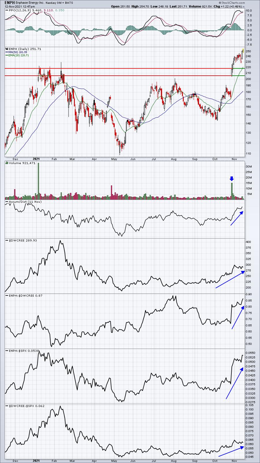
ENPH is overbought, but so is just about every leading stock. If they weren't overbought, they wouldn't be a leader. There's a reason why money pours into certain stocks and not into others. Wall Street makes choices and they do so after considering a lot more information than we'll ever see. The bottom panel of the ENPH chart shows renewable energy stocks ($DWCREE) gaining ground vs. the S&P 500. That tells us that money is rotating INTO the group. Then the rise in the ENPH:$DWCREE ratio tells us we have leading stock in an area of the market getting more than its fair share of money.
Unity Software (U)
Industry: Software ($DJUSSW)
Quarterly results:
- Revenues: $286.33 mil (actual) vs. $264.62 mil (estimate)
- EPS: ($.06) (actual) vs. ($.07) (estimate)
- Guidance: Raised
Market reaction:
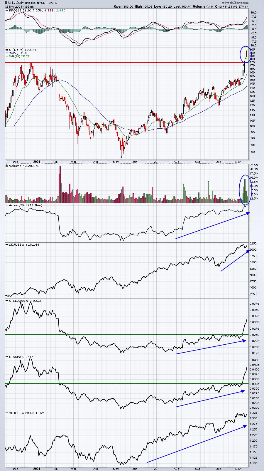
There are a lot of great software names to choose from after several stellar quarterly reports were delivered recently. I really like the move made by U, however, as its relative strength and AD line have exploded to the upside. And check out the volume on this breakout. Great action.
Airbnb (ABNB)
Industry: Travel & Tourism ($DJUSTT)
Quarterly results:
- Revenues: $2.24 bil (actual) vs. $2.04 bil (estimate)
- EPS: $1.22 (actual) vs. $.75 (estimate)
- Guidance: Reiterated
Market reaction:
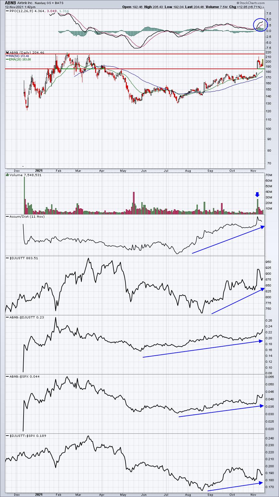
The DJUSTT has just recently begun to show relative strength, and a break above 0.20 would add to this relative bullishness. Meanwhile, ABNB appears headed for an inevitable price resistance test just beneath 220. I believe we'll see a breakout sooner rather than later, given the rapidly-accelerating relative strength and substantial increase in volume that accompanied its last earnings report. The top of the gap should provide excellent support during any period of weakness.
Wolfspeed (WOLF):
Industry: Semiconductors ($DJUSSC)
Quarterly results:
- Revenues: $156.60 mil (actual) vs. $149.17 mil (estimate)
- EPS: ($.21) (actual) vs. ($.23) (estimate)
- Guidance: Raised
Market reaction:
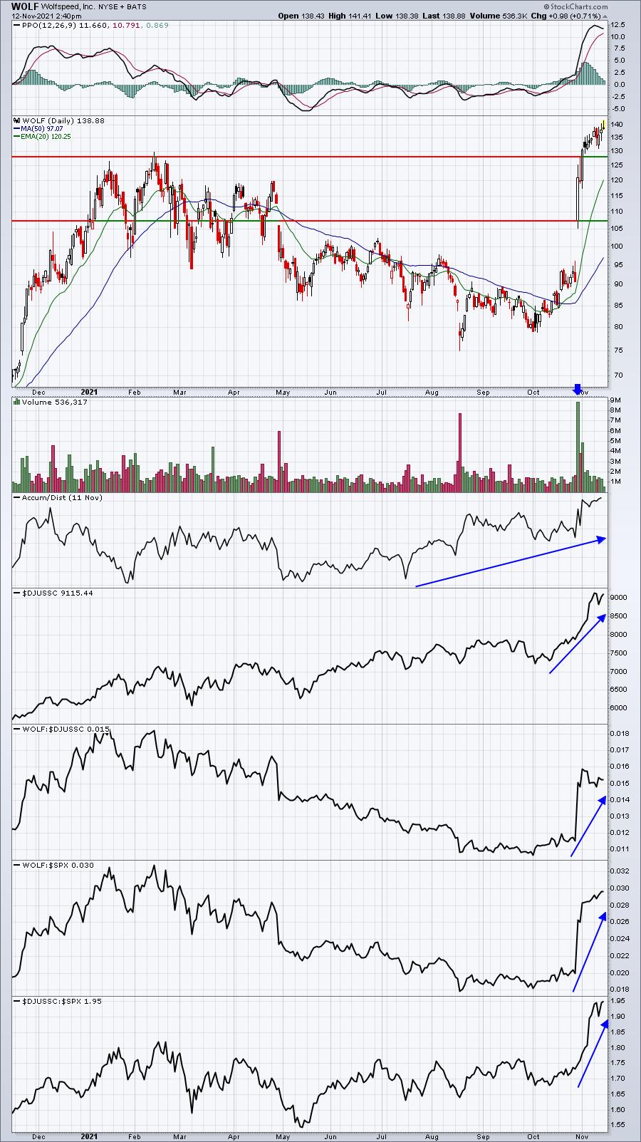
WOLF completely changed its direction on the chart when it crushed revenue and EPS estimates, then raised guidance. The AD line was trending higher while prices kept moving lower in the 3 months leading up to earnings. Now WOLF has become one of the hottest stocks in perhaps the hottest industry group. Both revenues and EPS guidance for next quarter were raised substantially, so I'd look for the recent strength to continue -- with pullbacks along the way, of course.
Sneak Preview Event: Q4 Stock Portfolio "Draft"
On Saturday, November 13, 2021 at 10:00am ET, I'll be hosting our latest Sneak Preview of our Q4 Stock Portfolio "Draft". I always view the building of a portfolio similar to the NFL Draft, with one MAJOR difference: we own ALL of the draft picks. During this event, I'll describe the process I go through in determining which 10 equal-weighted stocks will be included in our 4 portfolios for the next 90 days. Our portfolio results have been stunning since their respective inception dates. Here's where they stood as of Thursday's close:
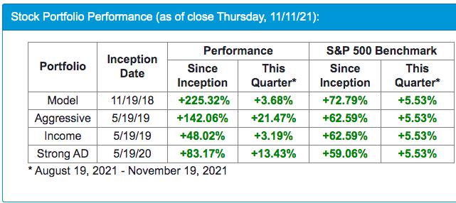
In addition to walking everyone through our process, I'll highlight a few dozen stocks that have reported better-than-expected results recently, discussing possible entry points for those who like to trade. If you'd like to join me at this event, simply click on this room link AFTER 9:30am ET.
The webinar will begin promptly at 10:00am ET and we'll make sure that anyone not currently subscribed to our FREE EB Digest newsletter is added.
I'll also be providing one stock that will be in one of our portfolios in our Monday EB Digest. If you're interested in receiving that stock, simply CLICK HERE to register by entering your name and email address. We'll also send a recording of the Saturday webinar to everyone in our EB Digest community.
Happy trading!
Tom
|
| READ ONLINE → |
|
|
|
| The Traders Journal |
| Supercharge Your Routines With This Simple Yet Powerful Organizational Trick |
| by Gatis Roze |
 Academic research has proven that the profitability of investors and traders is directly linked to the quality of their organizational routines and their discipline to follow those routines. Academic research has proven that the profitability of investors and traders is directly linked to the quality of their organizational routines and their discipline to follow those routines.
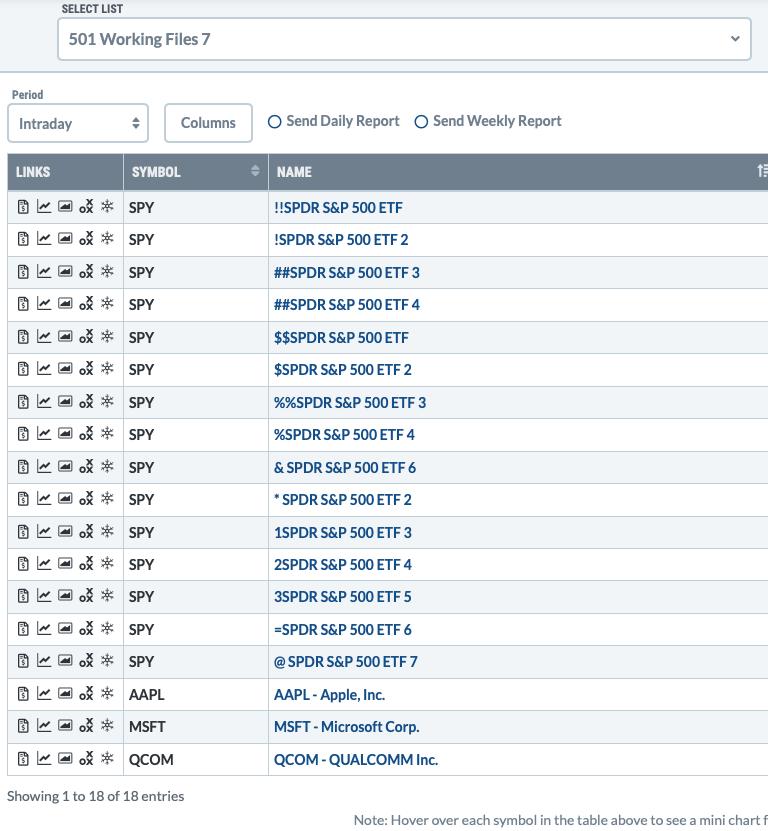
One of the most delicious tools we have in our organizational arsenal is using different symbols as prefixes for equities in our ChartLists and thereby organizing them into the sequence which works best for each of us. In other words, understanding the hierarchy of the symbols used as prefixes yields exactly the sequence we desire within our ChartLists.
Much like playing Bridge, you must know which card trumps another card to be an effective player. This blog is all about disclosing this trumping hierarchy within the StockCharts world of ChartLists.
For over a decade now, thousands of subscribers have jumped the wall to profitability aided by the Tensile Trading ChartPack. The hierarchy of these symbols is a cornerstone of the totally revised and updated ChartPack which Grayson and I have been rebuilding for months now. More on that very soon... Stay tuned!
We both have grown as investors over the past 10 years, and in using new tools now available at StockCharts, we wanted to incorporate them into a dramatically updated ChartPack. One that truly removes the veil and exposes the mysteries of the stock market in a manner for all investors to both understand and profit from.
Hence, we offer you "The Hierarchy of Ten". Placing any of these symbols as a prefix to the name of your equity will sequence your ChartList entries in a predictable manner. For example, the symbol "!" will be placed ahead of the symbol "#" . Placing two of the same symbols moves the equity ahead of just one — i.e. "$$" is placed ahead of "$" in the Chartlist hierarchy. It's obvious when you review the ChartList. Please review this for reference.

Use these prefixes to sequence items in your ChartList. Here's the "Hierarchy of Ten":
!
#
$
%
&
*
Numbers (1, 2, 3, etc.)
=
@
Letters of the Alphabet (A, B, C, etc.)
So there you have it. When you see the new ChartPack, you'll see how we've used this hierarchy to organize the ChartLists. Keep an eye out for the upcoming release very soon!
Trade well; trade with discipline!
- Gatis Roze, MBA, CMT
StockMarketMastery.com
|
| READ ONLINE → |
|
|
|
| DecisionPoint |
| Potential Upside for Crude Oil |
| by Carl Swenlin |
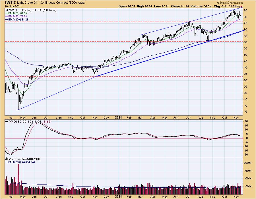
Earlier this week I filled my gas tank at a cost of $4.65 per gallon, up $0.25 from the last fill-up. That's the way it is in Redlands, California, and it got me to wondering how high prices might go. That, of course, depends mostly upon crude oil prices. Let's look at WTIC (West Texas Intermediate Crude). From the pandemic low of 6.50/bbl it has advanced to 85.00/bbl, so it is certainly moving higher at a rapid pace; however, this time frame is too short to project future upside potential.


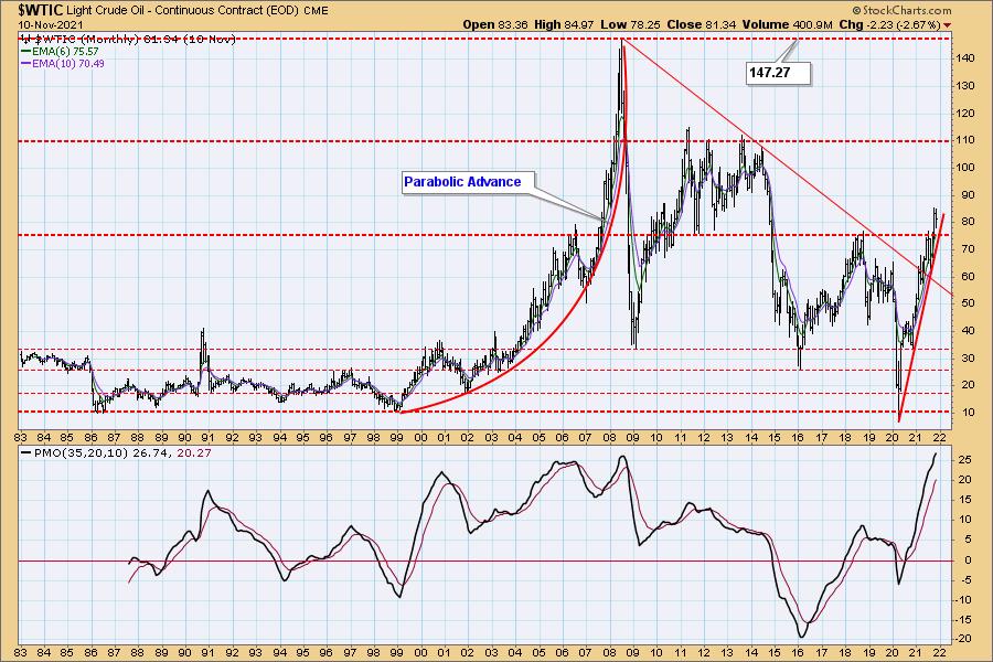
Normally, I would move to a weekly chart, but the monthly chart covering almost 40 years presents a much better perspective. First, we see the 'good old days' of the 1980s and 1990s with a relatively quiet range of 10/bbl to 40/bbl, but forget that. The 2000s gave us a parabolic advance up to over 147/bbl, then a crash back down to about 35/bbl, which I think will represent the bottom of the range going forward.

As the Biden administration considers closing a second pipeline, price has already broken through the resistance line drawn across the 2018 top, and has reached a new high of 85/bbl. The next clear line of resistance is at 110/bbl, and I think that level is well within reach after a period of consolidation. In more normal times I might see 110 as the probable top of the range, but now I'm not so sure. Whether or not a run to 147 is possible remains to be seen, but with no reasonable actions being taken to curb raging inflation, it is not out of the question.
CONCLUSION: The long range chart gives us an idea of where the price of crude oil might go, based upon where it has already been. Unfortunately, the extreme volatility of last 20 years is likely to be the model for the foreseeable future.

Click here to register in advance for the recurring free DecisionPoint Trading Room! Recordings are available!
Technical Analysis is a windsock, not a crystal ball.
--Carl Swenlin
(c) Copyright 2021 DecisionPoint.com
Helpful DecisionPoint Links:
DecisionPoint Alert Chart List
DecisionPoint Golden Cross/Silver Cross Index Chart List
DecisionPoint Sector Chart List
DecisionPoint Chart Gallery
Trend Models
Price Momentum Oscillator (PMO)
On Balance Volume
Swenlin Trading Oscillators (STO-B and STO-V)
ITBM and ITVM
SCTR Ranking
DecisionPoint is not a registered investment advisor. Investment and trading decisions are solely your responsibility. DecisionPoint newsletters, blogs or website materials should NOT be interpreted as a recommendation or solicitation to buy or sell any security or to take any specific action.
|
| READ ONLINE → |
|
|
|
| RRG Charts |
| "Finally...." Tech is Breaking Out! |
| by Julius de Kempenaer |

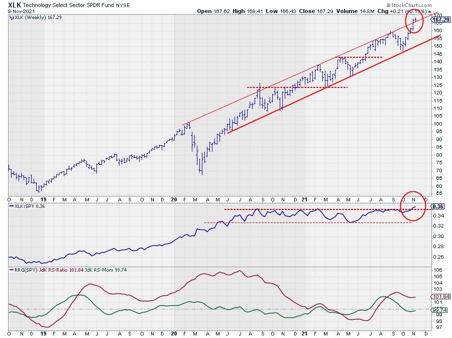
This may seem an odd title because, you might say, "tech broke out ages ago." While that is true with regard to price, it certainly was not the case for relative strength.
The (raw) RS-Line peaked back in August 2020 and has moved sideways in a narrow range since then. This does/did not make Technology a bad sector -- price was nicely rising in a channel, so no complaints there. But what it did mean is that the rise in price for the technology sector was in-line with the market and tech was not OUTperforming that market.
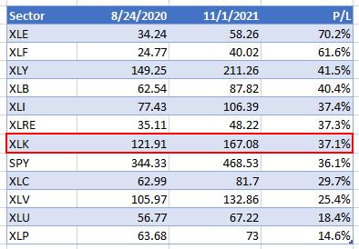
This is best illustrated by the following table, which lists the performances per sector from 8/24/2020 to 11/1/2021.

The technology sector only ranks 7th in that list at 37.1%, just 1% above the benchmark (SPY) that came in at 36.1%, hence "a performance in line with the benchmark" and therefore a more or less horizontal/sideways relative strength line.
With the upward break of relative strength out of that sideways range, that period has now come to an end. Unless we are getting tricked by the market and RS falls back into the range in the next week or so, that is, but the simultaneous upward break on the price chart supports a further improvement.
Very often, when price breaks upward out of an already rising channel, we see an acceleration in the rally.
In yesterday's episode of Sector Spotlight, I showed my newly adopted breakdown as presented by Morningstar (thanks again Louis). In this breakdown, we not only divide between offensive and defensive/cyclical sectors, but also "sensitive" sectors. Technology/XLK is one of these sensitive sectors. In the same show, I also looked at how current sector rotation is playing out in Equal-Weight sectors as well as Small-Cap sectors.
For this article, I want to highlight the rotations for the tech sector in all three segments.
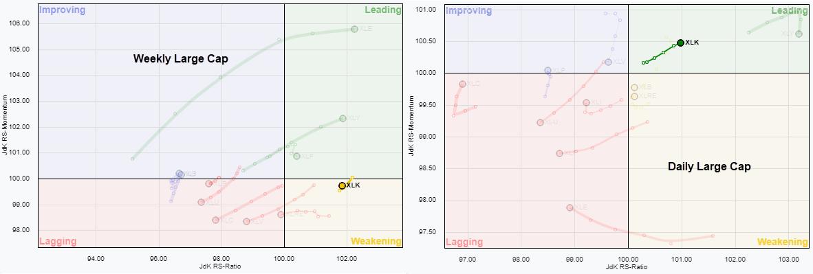
Large Cap

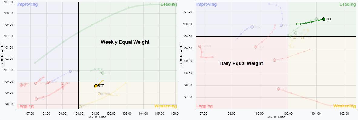
Equal Weight

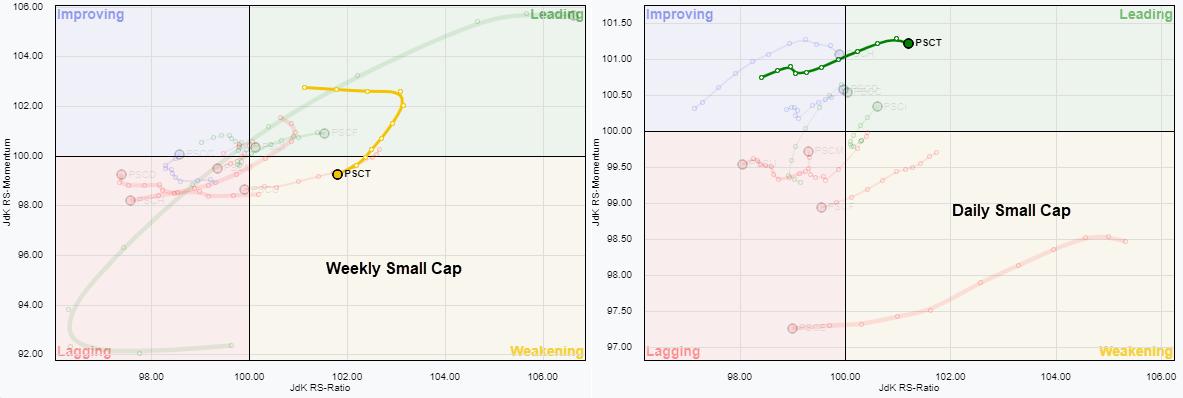
Small Cap

When you click anywhere in one of the graphs above, it will open up a new window with a live version of the RRG. If you would like to save a copy of this setup for your own use, you can bookmark the URL. This will allow you to bring up the RRGs for these universes from your bookmarks, saving you the effort of setting them up each time.
What Can We Learn from these RRGs?
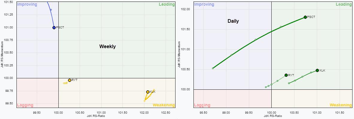
First of all, all three sets of weekly vs daily rotations are looking quite similar. The weekly tails are all inside the weakening quadrant. Although it's quite hard to see on the images, when you open the live version and zoom in on the technology tail, it's very clear XLK and RYT have already "hooked" back up, which we know is a strong sign. PSCT, in the small-cap universe, is not there yet.
The daily tails are all inside the leading quadrant and moving higher on the Jdk RS-Ratio axis. Given the high reading for tech in each segment, the big picture takeaway is that, based on JdK RS-Ratio, the technology sector is already in a relative uptrend, which is going through a setback. A rotation for the weekly tails back into the leading quadrant will be the confirmation that a new up-leg in that relative uptrend is underway.
The RRGs above are all plotted against their respective benchmarks, so large-cap vs. SPY, Equal Weight vs. RSP and small-cap vs. $SML.
The RRGs below show all three tech tails vs, SPY which IMHO, makes the picture pretty clear.

The hooks on XLK and RYT inside weakening are clearly visible, while the short-term improvement for all three sector equivalents becomes visible in the daily RRG.
Price Pays, So Always Check the Price Chart
The chart for XLK is already at the top of this article, but I am adding it again for easy reference.

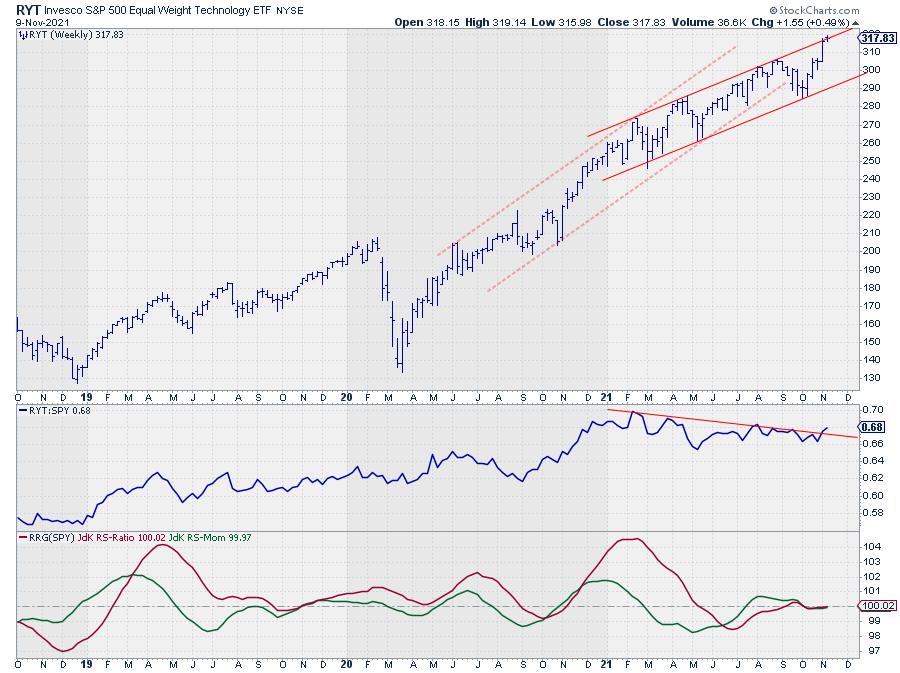
RYT lost some of its pace (momentum) at the start of this year, which resulted in the RS-line declining to a lower level and stabilizing there. Here, we also see an upward break of (falling) resistance and both RRG-Lines around the 100-level, but both rising and ready to push into the leading quadrant.
Last week, RYT broke above its previous high and is now bouncing against the upper boundary of the newly formed channel. An upward break would be very strong, but even remaining inside the channel will be positive.

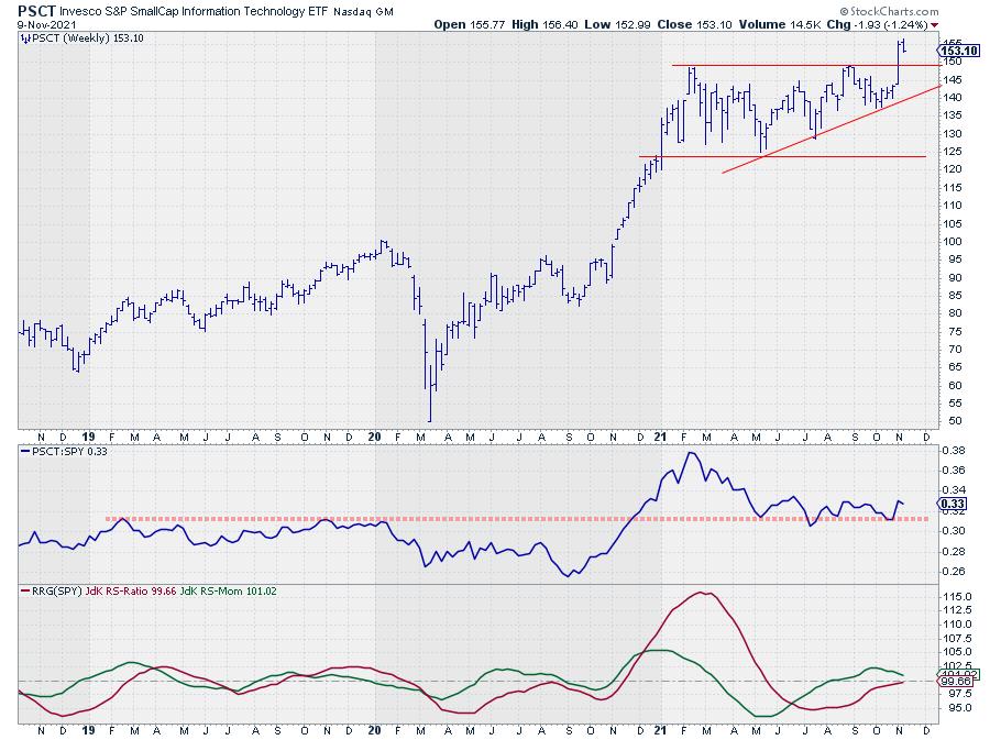
PSCT probably has the weakest RS-line/RRG configuration at the moment but the strongest price chart. Last week, PSCT managed to break above horizontal resistance, which kept it capped since February. That hurdle has now been taken and the breakout level (~150) will now very likely start to act as support. If that holds, the RS-Line will most likely bounce of its support area, where it currently is, which will turn the RRG-Lines back up and make the tail on the RRG rotate towards the leading quadrant (weekly chart).

All in all, I think the Technology sector is back on track, which will very likely have a positive effect on the S&P 500 as well.
#StaySafe, --Julius
|
| READ ONLINE → |
|
|
|
| MORE ARTICLES → |
|
 Chart 1
 Chart 2
 Chart 3
 Chart 4
 Chart 5
 Chart 6
 Chart 7
 Chart 8

 The surge in the 10-yr Treasury Yield is the talk of the town this week, and last week it was the breakout in the Russell 2000 ETF and relative strength in small-caps. Is there a correlation between small-cap relative performance and Treasury yields? Today's commentary will look at the relationship between the 10-yr Treasury Yield and the IWM:SPY ratio because these two have a pretty strong positive correlation.


 Academic research has proven that the profitability of investors and traders is directly linked to the quality of their organizational routines and their discipline to follow those routines.