| THIS WEEK'S ARTICLES |
| ChartWatchers |
| Bullish Two-Bar Reversal Patterns Suggest a Temporary Bottom for Some Sectors -- and Maybe the Market Itself |
| by Martin Pring |
Thursday's action was quite positive for several sectors, as they experienced positive two-day price formations. These patterns are only of a short-term nature and usually have an effect for between 5 and 10 days, so they do not represent major signals. However, since this action is coming off an oversold 9-day RSI, these positive implications could buy some time for both these sectors and the overall market. Think of its as a kind of reverse domino effect.
Three Turnaround Candidates
For example, Chart 1 shows that the SPDR Energy ETF (XLE) has experienced a bullish two-bar reversal. These patterns are formed after a decline. The first bar opens near its high and closes near its low, reaffirming that the sellers are in control. The second bar does the exact opposite by opening near its low, which is also near the previous close, but ending the session near its high. That action indicates that the buyers now have the upper hand. Both bars should be relatively wide, indicating a large battle between buyers and sellers. The two for the XLE are okay, but not impressively so. Finally, it's better (but not mandatory) for the volume to pick up on the second day of the pattern, which it does.
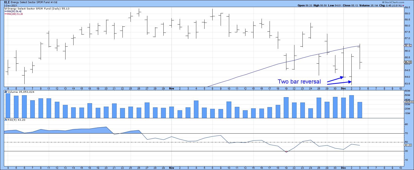 Chart 1 Chart 1
Chart 2 backs up this bullish action with the US Oil Fund (USO). In this case, the two-day pattern comes in candlestick format, with a pattern known as a bullish piercing white line. These are whipsaw-type formations, which occur when the opening price develops under the low of the previous candle, but closes more than halfway up its real body. Note also that the close developed just slightly above the red 200-day MA and that the RSI is deeply oversold. A little more strength from here would indicate that the downside MA crossover was a whipsaw.
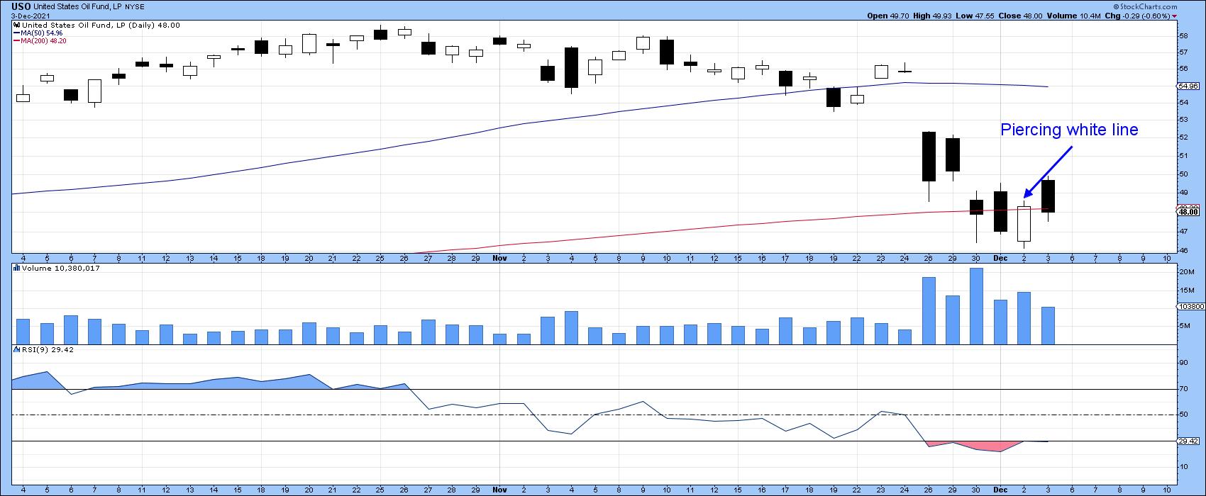 Chart 2 Chart 2
The SPDR Industrials are also sporting a bullish two-bar reversal coming off an oversold RSI. The three heavy volume bars this week are suggestive of a selling climax.
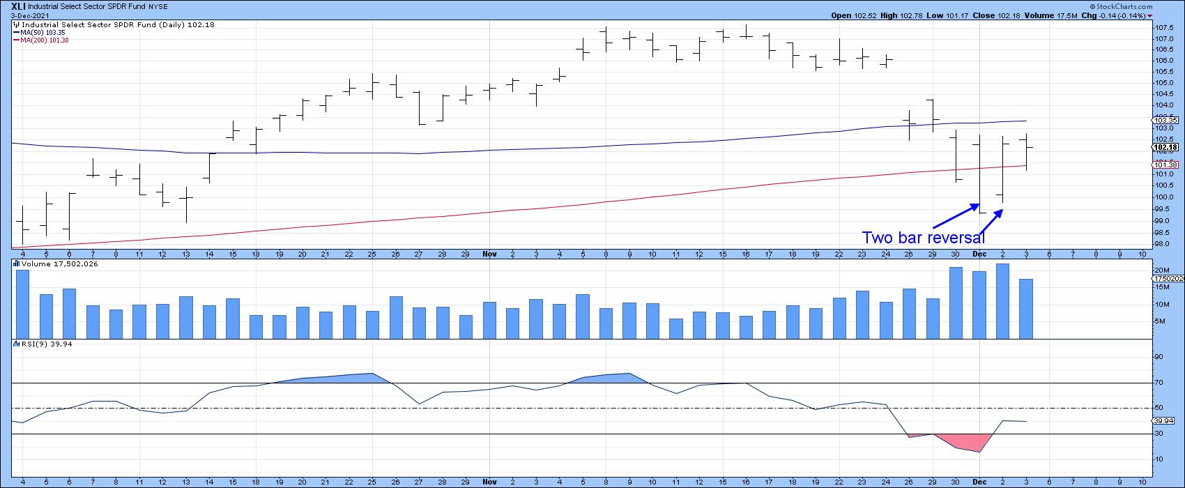 Chart 3 Chart 3
The SPDR Financial ETF (XLF) also has a mild case of a two-bar reversal, but Chart 4 features the iShares Broker dealers ETF (IAI), which is one of its components. This pattern is also forming with slightly higher activity on the second bar, as the RSI bounces off its oversold zone.
 Chart 4 Chart 4
Short-Term Market Indicators
To be sure, very few short-term market indicators have yet to show signs of life. Take the 10-day EMA of the NYSE Percent of Stocks Above their 200-day MA. It has fallen to a new low under its October bottom. That's not a good sign. The NYSE Composite itself is close to its red support trendline, so, unless it continues to bounce, things could turn ugly again.
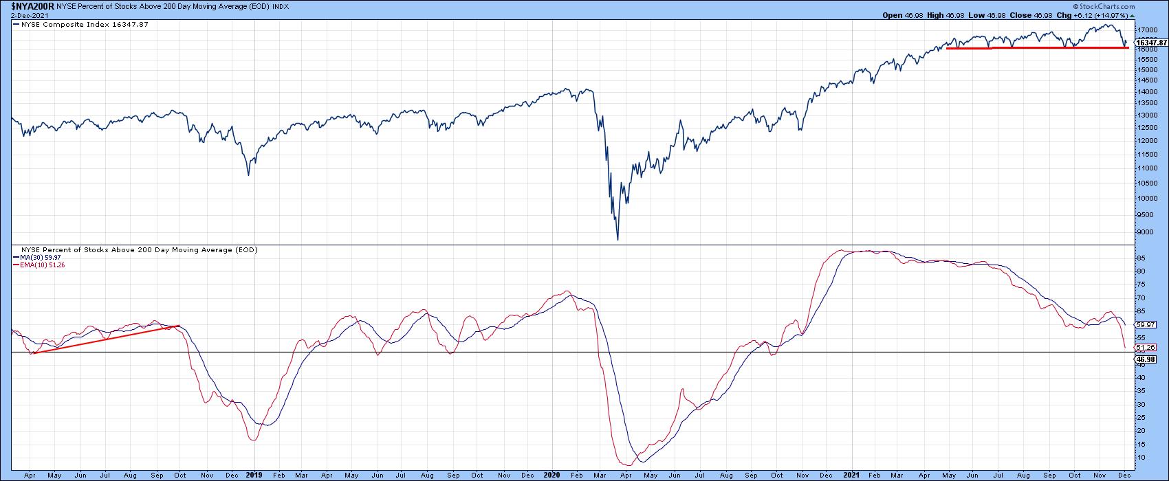 Chart 5 Chart 5
On the other hand, some shorter-term indicators are deeply oversold and, therefore, look more likely to reverse to the upside. In this respect, Chart 6 shows that the 10-day EMA of the NYSE common stock McClellan Volume Oscillator has fallen below the green horizontal line marking the buying zone. It's therefore likely to turn up at any point. Note that most previous reversals have been followed by a nice rally. A reversal hasn't happened yet, of course, but it's possible that those two-bar reversals will buy enough time to enable that to happen.
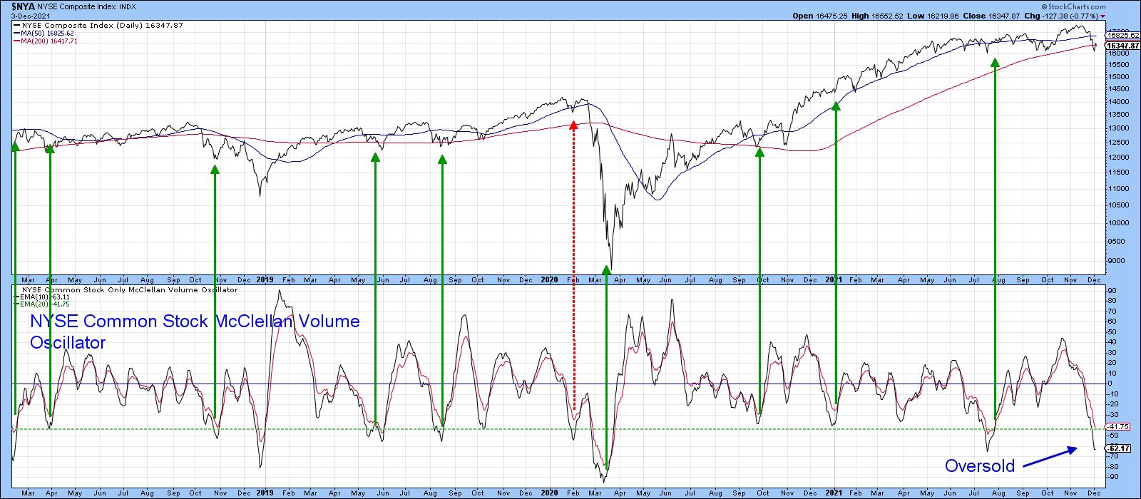 Chart 6 Chart 6
Chart 7 shows that this week's action has resulted in a selling climax for the DJIA ETF (DIA). In this instance, the arrows show when the price volume oscillator (PVO) is overbought and the RSI is oversold. Except during extremely weak technical positions, such as that of February 2020, such action is positive.
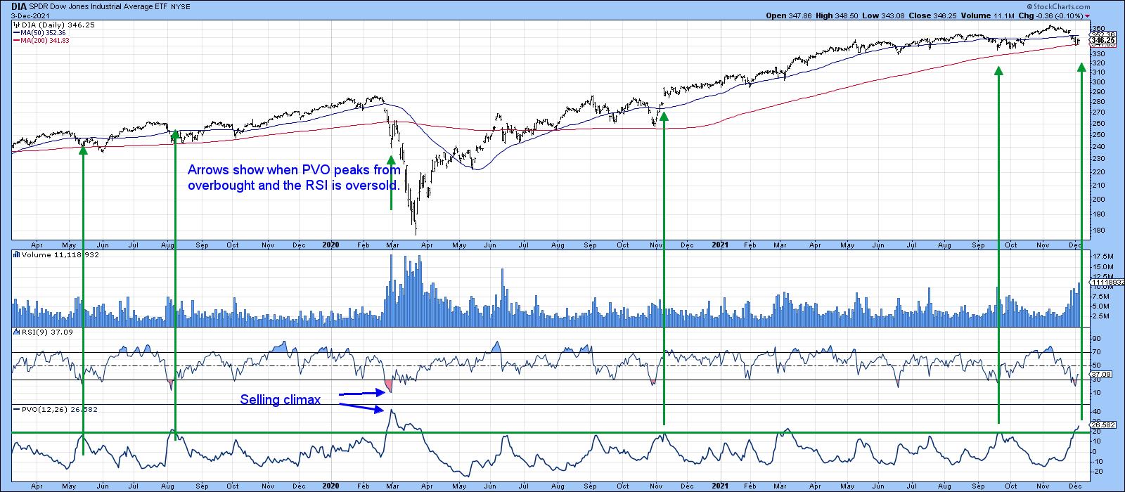 Chart 7 Chart 7
Finally, Chart 8 features a 10-day ROC of the VIX. Previous reversals from a position above the +25% line have usually resulted in a rally. If the positive indications being given from the three positive sectors are valid, then that should mean that the VIX ROC has peaked again.
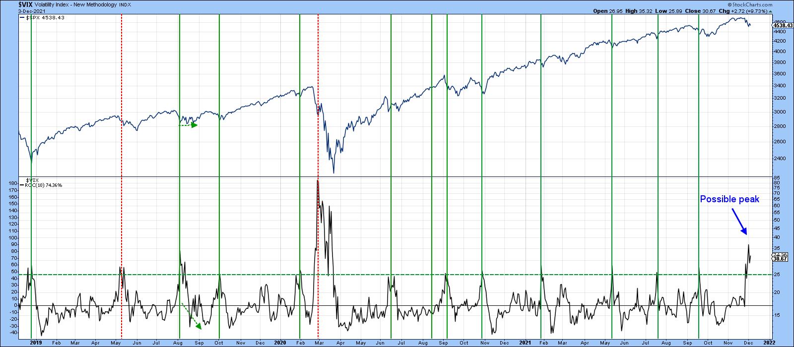 Chart 8 Chart 8
Conclusion
After a nasty short-term drop, several indicators are showing signs of bottoming. So far, these indications are tentative, but, since it's a bull market until proven otherwise and we are entering the positive year-end period, there is a pretty good chance that the worst may be over. If, on the other hand, the market immediately takes out these two-bar reversals, all bets of a bottom forming would be off. Even worse, a rally to a new high with little conviction, followed by a move below last week's lows, would represent a characteristic usually found in bear markets.
This article is an updated version of an article previously published on Thursday, December 2nd at 7:05pm ET in the member-exclusive blog Martin Pring's Market Roundup.
Good luck and good charting,
Martin J. Pring
The views expressed in this article are those of the author and do not necessarily reflect the position or opinion of Pring Turner Capital Group of Walnut Creek or its affiliates.
|
| READ ONLINE → |
|
|
|
|
|
| ChartWatchers |
| Are Valuations Too High? Here are the Three Primary Ingredients to Tell |
| by Tom Bowley |
I practiced in public accounting for 20 years and was involved in a number of company valuations. I worked very little with public companies, but did have to value private companies on occasion. Most of the valuation metrics that I used in the 1980s and 1990s remain absolutely the same today. Some industries present few obstacles in determining an approximate value; others can be extremely difficult and judgment can vary greatly from one valuation analyst to another.
Utilities, for instance, have fairly steady earnings, which is why you don't see the volatility associated with utilities that you see with other sectors, whose earnings can accelerate or contract very quickly with the economy. When you're performing valuations, there are really three key drivers: (1) future earnings/cash flows, (2) rate of earnings growth and (3) interest rates. Valuations are complex, so I can't go into everything to consider, but using some arbitrary price earnings (PE) multiple is a MAJOR mistake. Some might say that an overall S&P 500 PE multiple of 20 is a fair valuation. That is just plain WRONG, in my opinion.
One of the key valuation metrics is interest rates. The 10-year treasury yield ($TNX) was 6.5% at the beginning of this century. Today, it's less than 1.5%. That alone will send equity valuations much, much higher. You will pay much more for a company that's growing its earnings 20% a year in a 1.5% rate environment than in a 6.5% rate environment. That is a FACT.
Here are the last 25 years of the TNX:
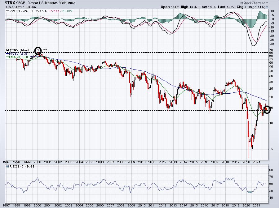
If earnings and earnings growth are exactly the same in 2000 and 2021, valuations will differ immensely. Why? Because the lower interest rate environment will "value" those earnings and growth rates much, much higher. The problems begin when growth companies warn about slowing revenue and earnings growth ahead. We want to own companies that are beating revenue and earnings estimates and raising forecasts.
Because these companies tend to outperform over time and are less likely to provide warnings, we keep ChartLists at StockCharts.com to organize our research. We have one ChartList to track companies that beat revenue AND earnings forecasts -- our Strong Earnings ChartList (SECL). We also have a second ChartList to track companies that have raised guidance -- revenues and/or earnings -- and we keep those in our Raised Guidance ChartList (RGCL). Wall Street also has a much better chance of identifying companies that will beat and raise estimates as they meet with company management teams throughout the quarter. In addition to rising prices, a rising AD line (accumulation/distribution) can signal to us companies that Wall Street is accumulating. We track those companies in a third ChartList, our Strong AD ChartList (SADCL).
When a company is on each of these 3 ChartLists, I believe there's a much better chance to justify its valuation (market cap), so I created a fourth ChartList, our Bullish Trifecta ChartList. This is a ChartList of all companies that appear on each of our other three ChartLists. It's a powerful list of companies that, quite honestly, are being trashed with the rest of the market right now, but I'd keep an eye on their AD lines during this period of selling. If those AD lines remain strong, I believe these companies will be among the best performers when the stock market rebounds.
This Bullish Trifecta ChartList is updated on our site periodically, but once our EarningsBeats.com members have the first three ChartLists, they can run a scan against these ChartLists to find the common stocks on the three. Currently, there are 59 companies on this list, of which more than half (31) have SCTR scores of 90 or better. Only 4 have SCTR scores less than 50. The top SCTR score (99.7) belongs to ON Semiconductor (ON), which is one of the few growth stocks that has been largely unaffected by the selloff the past 10 days or so. Check out ON's chart:
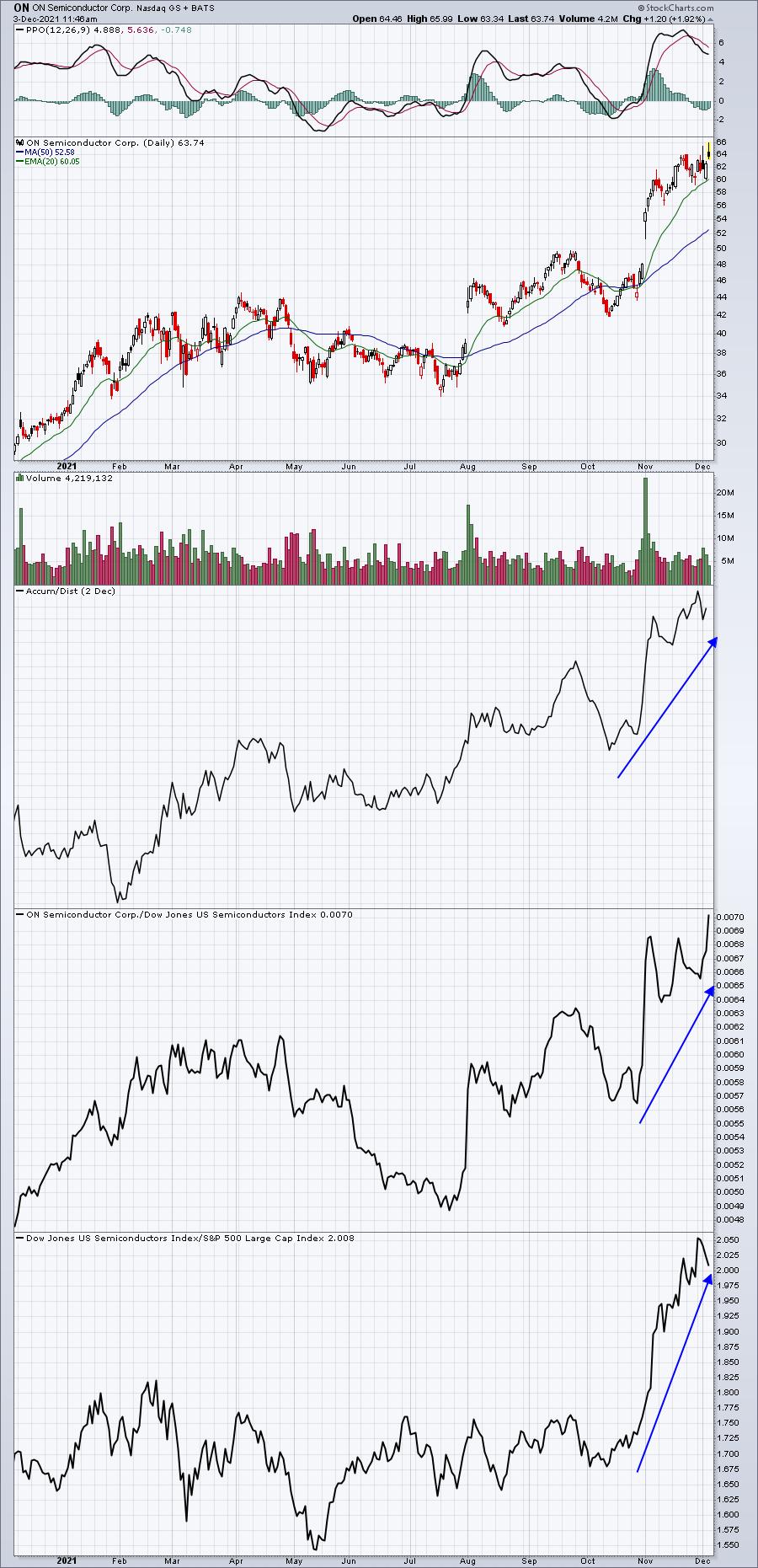
ON has been an excellent absolute and relative performer and could certainly see some profit taking soon, but there's little doubt about its leadership. Part of that reason is that Wall Street loves the fundamentals here and is able to justify a high market valuation based on its continuing increasing earnings and positive revisions.
For one day only, I will provide our Bullish Trifecta ChartList to everyone in our EarningsBeats.com community. Members already receive this ChartList periodically, but on Monday I'll provide it to everyone on our FREE EB Digest subscriber list. It's 100% free with no credit card required. Simply CLICK HERE to provide your name and email address to subscribe. You can unsubscribe at any time. I'll send you the link to this powerful list in our EB Digest on Monday!
Happy trading!
Tom
|
| READ ONLINE → |
|
|
|
| The Mindful Investor |
| Spike in Volatility Bearish for Stocks? |
| by David Keller |
The VIX spiked above 30 this week, making that the highest level since January 2021. But is a rapid rise in volatility necessarily bearish for stocks?
In my conversation with Marc Chaikin earlier this week on The Final Bar, we talked about the move higher in the VIX and how that relates to previous pullbacks in 2021.
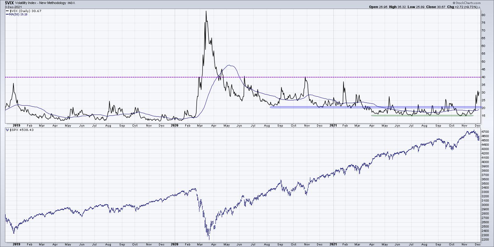
For much of this year, the VIX has been rangebound between 15 and 25. Readings above 25 have ended coinciding with buyable pullbacks in the S&P 500. In fact, this pattern worked every month from May through September, with brief selloffs in the major averages followed by continued upside. But this week, the VIX moved above 30 and now is in line with the elevated levels we saw back in 2020. Selloffs in the first 12 months after the March 2020 saw the VIX rising up to 40. These spikes in volatility lined up well with market pullbacks.
As we can see, the problem is that the VIX does not really have a defined ceiling. Considering a reading of "elevated" depends very much on the context. A VIX level of 20 was high for 2021, but quite low for 2020! Due to the inverse relationship between the VIX and SPX, I think that showing the VIX inverted can better illustrate the interplay between these two series.
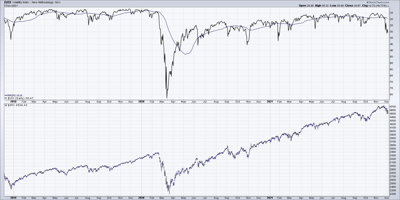
Now you can see the clear relationship between the price of the S&P 500 and the VIX, which is basically showing the implied volatility of options on the S&P 500 index. What's notable here for me is that the VIX has spiked much higher than the September peak. It's interesting that the VIX has far eclipsed its September level, while the S&P 500 itself has not yet broken that price support around 4300.
What also stands out on this chart is how far the VIX increased in February and March 2020. So, while the current rise is sudden and notable, it would have to move much further to line up with more significant market corrections.
So the answer is "it depends".
The VIX is known as the "fear gauge", but I like to think of it as more a measure of uncertainty than fear. Does a spike in the VIX line up with buyable pullbacks over the lasts 18 months? Absolutely. Does a spike in the VIX also line up with the beginning of much deeper bear market phases? Also yes.
In the end, the rapid increase in volatility simply indicates an increase in uncertainty. That means this is an ideal time to clearly define your risk, focus on "lines in the sand" of support on your charts and let the charts help you manage potential further downside for stocks.
Want to digest this article in video format? Here we go:
RR#6,
Dave
P.S. Ready to upgrade your investment process? Check out my free course on behavioral investing!
David Keller, CMT
Chief Market Strategist
StockCharts.com
Disclaimer: This blog is for educational purposes only and should not be construed as financial advice. The ideas and strategies should never be used without first assessing your own personal and financial situation, or without consulting a financial professional.
The author does not have a position in mentioned securities at the time of publication. Any opinions expressed herein are solely those of the author, and do not in any way represent the views or opinions of any other person or entity.
|
| READ ONLINE → |
|
|
|
| ChartWatchers |
| Americans are Buying Food and Booze -- But No Cigarettes |
| by Julius de Kempenaer |
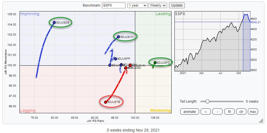
The S&P 500 is still holding up inside the boundaries of its rising channel, but the market is nervous, which resulted in a VIX reading above 30. That hasn't happened since February.
Nervous markets, or rather their participants, usually mean that people start checking out defensive sectors. The Consumer Staples Sector is one of these defensive sectors and, in this article, I want to take a look at the rotation of the various groups that are part of that index.
The Relative Rotation Graph above shows the rotation of these groups against the S&P 500 ($SPX). What can we learn from this chart?
First of all, all groups, but one, are positioned on the left side of the chart, indicating a relative downtrend.
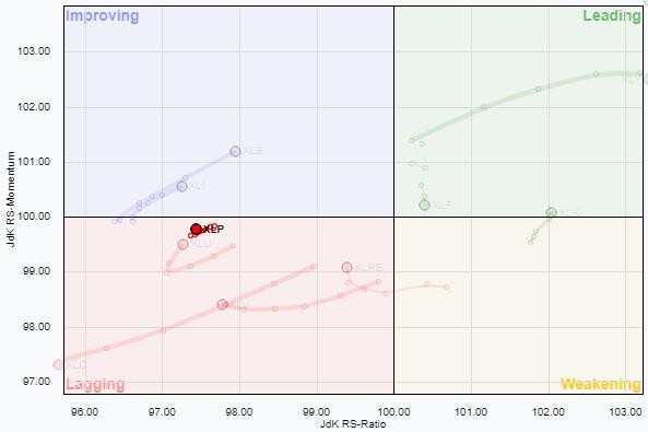 With the sector index, XLP, positioned inside the lagging quadrant just below 100 on the JdK RS-Momentum axis, it is not surprising to also find the majority of the groups on the left side of the chart. And, just like XLP, most of these groups have short tails, which indicates that they are in stable relative downtrends. With the sector index, XLP, positioned inside the lagging quadrant just below 100 on the JdK RS-Momentum axis, it is not surprising to also find the majority of the groups on the left side of the chart. And, just like XLP, most of these groups have short tails, which indicates that they are in stable relative downtrends.
But that does not go for all groups. In the RRG at the top, I have highlighted a few groups that have long tails and/or are in interesting positions on the RRG.
Food Retailers & Wholesalers
First of all, the only group inside the leading quadrant is the Food Retailers and Wholesalers Index ($DJUSFD).
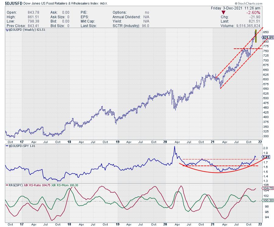
This group is in a nice rising channel and briefly managed to break above the upper boundary, but is falling back into the channel this week. Usually, that means a further drop to the bottom of the channel, which means that there is some short-term risk for this index.
The relative strength chart, however, is showing a big rounding bottom that continues to move higher, and the resulting RRG-Lines seem to be bottoming, which is positive. This is causing the tail on the RRG to rotate back up towards and into leading from weakening, which marks a new up-leg within an already rising relative trend. This makes the Food Retailers & Wholesalers Index the strongest group inside Consumer Staples.
Distillers & Vintners
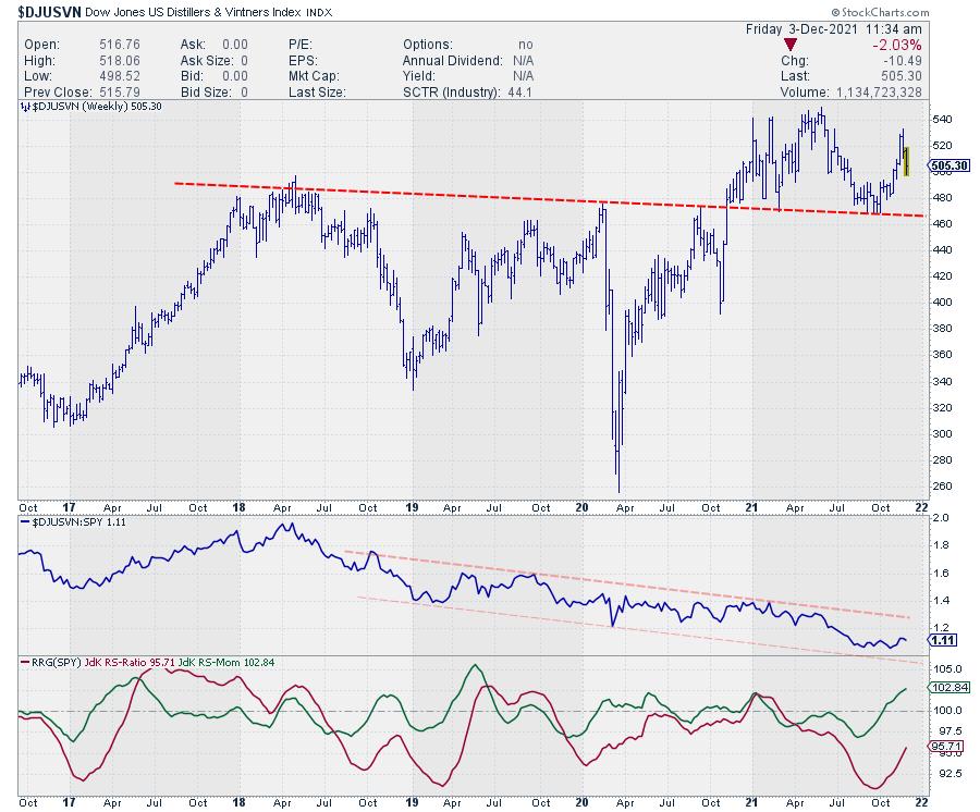
This group broke above major resistance at the end of 2020, with a follow-through rally that peaked in June and then tested the old resistance area as support. Out of that recent low, the group has started to pick up again.
From a relative strength perspective, the improvement is in the very early stages, if there is any improvement at all. The long-term relative downtrend, which started at the start of 2018, is still in play, but recently the RS-Line started to flatten, causing the RRG-Lines to improve and send the tail into the improving quadrant.
We need to wait and see how far this improvement can continue but, in the near term, there is quite a bit of room towards the upper boundary of that falling channel. If the price chart can hold up above that old breakout level and continue its improvement, then more gains for relative strength can follow.
Brewers
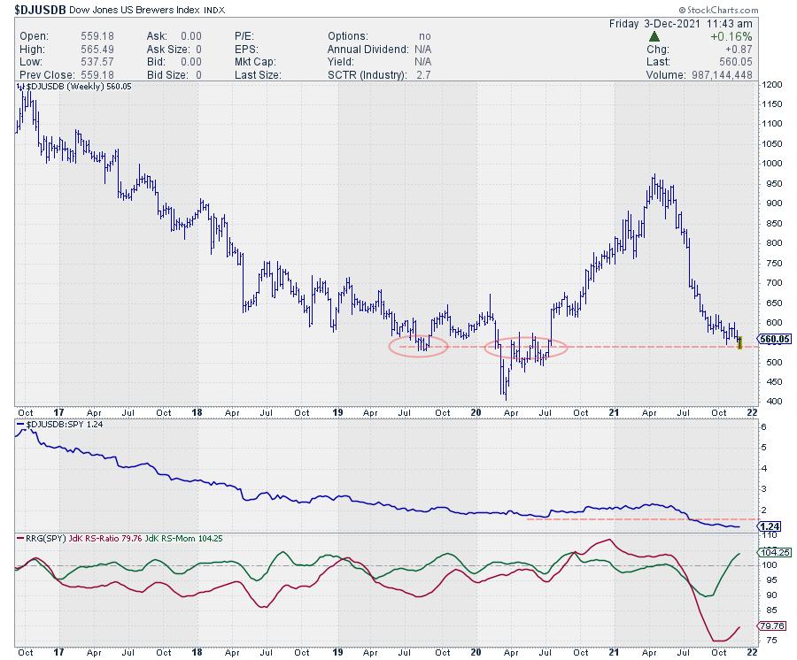
Brewers is a very small group. Within the S&P 1500, there are only two stocks classified in this group, which are SAM and TAP.
After a strong rally from early 2020 to April 2021, the index dropped back just as fast and is now trading around H1-2020 levels. The improvement in relative strength, and therefore the rotation into the improving quadrant, is the result of a slowdown in the decline of relative strength. This means that there still is a good amount of risk for this tail to roll over within the improving quadrant and come down to lagging before entering the leading quadrant. For this group, just like Distillers & Vintners, there is a bit more risk involved for long positions.
Given the fact that Distillers & Vintners are quite a bit higher on the RS-Ratio scale, that makes them the preferred group over Brewers, at least in the near term.
Tobacco
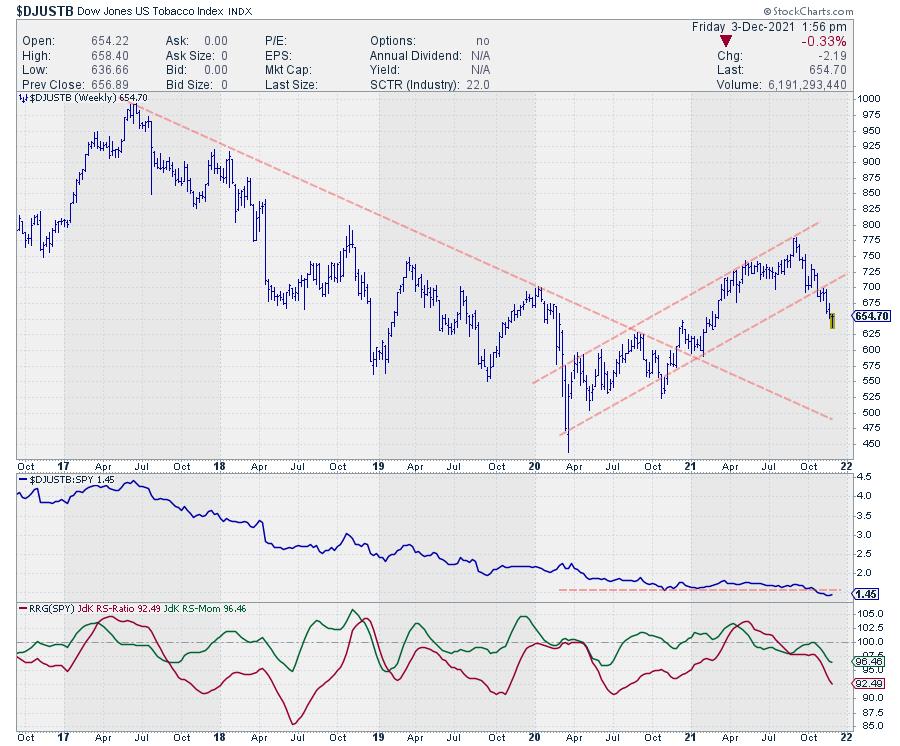
Inside the lagging quadrant, there is one group that deserves attention, which is the Tobacco group. It is well inside the lagging quadrant on a negative RRG-Heading and a relatively long tail, which indicates there is power behind this negative rotation.
On the price chart above, we can see that price broke out of a rising trend (channel) a few weeks ago and is still continuing lower. Relative strength also broke lower after a period of sideways movement, causing an acceleration lower that is pushing the RRG-Lines lower and the tail deeper into the lagging quadrant.
Conclusion
The Consumer Staples Sector is still in a relative downtrend vs. SPY, but we know people start looking at defensive stocks when markets get nervous. Within the Staples Sector, the group Food Retailers and Wholesalers is the strongest while Distillers & Vintners, along with Brewers, could offer (short term) opportunities inside the improving quadrant. Tobacco is best avoided as it continues deeper into the lagging quadrant.
So it looks as if Americans are buying food and booze, but no cigarettes.
My regular blog is the RRG Charts blog. If you would like to receive a notification when a new article is published there, "Subscribe" with your email address.
|
| READ ONLINE → |
|
|
|
| ChartWatchers |
| Risk-Off Market Environment Opens Door to These Uptrending Stocks! |
| by Mary Ellen McGonagle |
The S&P 500 closed the week below its key 50-day moving average as investors sold stocks in the face of omicron and inflation fears. The Nasdaq also dropped in a move that pushed this Index below key support as well and into negative territory. In a true indication of a risk-off environment, small-cap stocks plummeted 4.4% — pushing these stocks further into a downtrend.
Not all areas of the market suffered last week, however, as Staples, Utility and REIT stocks were flat or posted gains. In addition to being defensive, investors were attracted to the yields. Even if higher inflation persists, as Fed Chair Powell is suggesting, dividend stocks have a built-in advantage over other yield-paying instruments — notably, their ability to put through dividend increases that exceed the rate of inflation.
With that backdrop, I screened the 65 Dividend Aristocrat stocks for candidates that are currently able to buffer the downtrend occurring elsewhere.
Dividend Aristocrats are companies that are in the S&P 500 and not only consistently pay a dividend to shareholders, but have posted an increase in their yield for at least 25 years in a row. Below are companies that are a part of this elite group and, in addition to being in defensive areas that are currently holding up in the face of selling elsewhere, are posting solid growth numbers that should continue to support any moves higher.
DAILY CHART OF PEPSI (PEP)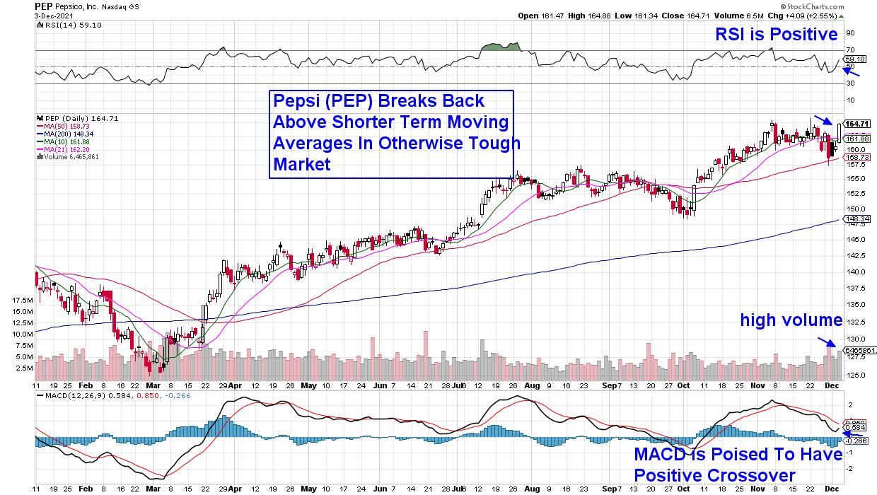
First up is Pepsi (PEP), which has been posting dividend increases for the longest of all Aristocrats — 68 years, to be exact. The beverage and snack manufacturer just reported third-quarter earnings that were ahead of estimates and, in October, announced another price increase in the face of higher supply costs.
Consumer Staples stocks have an easier ability to raise prices, as their products tend to stay in demand despite rockiness elsewhere. PEP is now in a position to trade higher after breaking back above its shorter-term moving averages, while its momentum indicators are in a positive position.
DAILY CHART OF McCORMICK & CO. (MKC)

Next up is another Staples company that's gained increased revenues, as individuals continue to cook at home despite a recent reopening of restaurants across the country. McCormick & Company (MKC) is a maker of seasonings, spices and herbs, and the stock has been in an uptrend following analyst upgrades to earnings in the face of increased sales.
MKC's recent break back above its 200-day moving average on volume has confirmed its uptrend, while a recent golden cross signal helps confirm it. MKC offers a 1.7% yield and, last week, they announced an increase in their quarterly dividend. With the momentum indicators in positive territory, the stock is poised for further upside despite weakness elsewhere.
DAILY CHART OF PROCTER & GAMBLE CO. (PG)

Last up is personal care company Procter & Gamble (PG), which has been increasing their dividends for 64 years in a row. The manufacturer of beauty care, tissues and diapers has also been able to raise prices in the face of increased costs. The 2.3%-yielder has seen no slowdown in sales, with analysts raising earnings estimates for both this year and next.
Last week, the stock had a 3-day rally into the end of the week while many other stocks struggled. The move pushed PG to a new high in price on increased volume and, with its RSI and MACD in positive territory, the stock is poised for further near-term upside.
Outside of the stocks mentioned above, it's been a very difficult period for the markets. Subscribers to my MEM Edge Report have been kept up to date with the weakening conditions and, if you'd like to be alerted to when the markets turn positive, be sure and use this link to receive a 4-week trial at a nominal fee. In addition to any shift in market conditions, you'll also be advised of the best stock candidates that will outperform when a new uptrend takes place.
On this week's edition of The MEM Edge, I review current market conditions and what to be on the lookout for to turn positive. I also reveal pockets of strength in growth areas that are ideal for your watch-list, as well as risk-off candidates.
On this week's edition of Chartwise Women, Erin Swenlin and I discuss the cycle of market emotions and how they're affected by current events. We share what they've learned about investor sentiment and the tools used to gauge it.
Warmly,
Mary Ellen McGonagle
President, MEM Investment Research
|
| READ ONLINE → |
|
|
|
| John Murphy's Market Message |
| STOCKS INDEXES REMAIN UNDER PRESSURE |
| by John Murphy |
MOVING AVERAGE LINES ARE BEING THREATENED... A combination of factors are pushing stocks lower again today to extend weekly losses. A weak jobs report this morning, fears of accelerated Fed tightening to fight inflation, and worries about the Omicron coronavirus are keeping stocks on the defensive. Ånd moving lines are being threatened. Chart 1 shows the Dow Industrials testing its 200-day moving average and potential chart support along their September/October lows. Chart 2 shows the S&P 500 in danger of ending the week below its 50-day average. And Chart 3 shows the Nasdaq 100 in danger of doing the same. Nine of eleven sectors are losing ground. Defensive consumer staples and utilities are holding up better; while consumer discretionary, technology, and financials are suffering the biggest losses. Money is moving into bonds and gold; while volatility is also rising.
 Chart 1 Chart 1
 Chart 2 Chart 2
 Chart 3 Chart 3
BOND YIELDS TUMBLE IN FLIGHT TO SAFETY AS VIX SURGES... Chart 4 shows the 10-Year Treasury yield tumbling 10 basis points to 1.34% which is the lowest level in more than two months. Chart 5 shows the CBOE Volatility (VIX) Index jumping to the highest level in ten months. Rising volatility is usually associated with falling stock prices.
 Chart 4 Chart 4
 Chart 5 Chart 5
|
| READ ONLINE → |
|
|
|
| Wyckoff Power Charting |
| QQQ Teetering + Point & Figure Workshop TV Special |
| by Bruce Fraser |
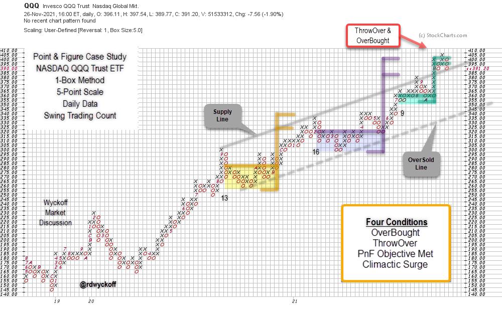
 The Point and Figure charting engine at StockCharts.com is an outstanding tool. It provides incredible flexibility to draw many varied types of PnF charts. Navigating the PnF chart controls is easy once they are understood. The Point and Figure charting engine at StockCharts.com is an outstanding tool. It provides incredible flexibility to draw many varied types of PnF charts. Navigating the PnF chart controls is easy once they are understood.
Wyckoffians use these charts to estimate price objectives using a horizontal counting method. There are many additional analytical techniques that Technicians employ with great effect. To read more about the many varied uses of PnF charts please read the excellent ‘Point & Figure Charting' article in ChartSchool (Click Here).
For readers who are new to PnF charting, and those who would like a refresher on PnF Chart construction. I have recorded a two part Point & Figure Workshop video series (see video links below).

The Invesco QQQ Trust (QQQ) chart above, is plotted using the 1-Box reversal method and 5-Point scaling, both are user defined choices. It captures an upward trend that reaches back to 2018. Three horizontal trading ranges are identified from late 2020 to the present. Each horizontal range generates a price objective estimate. The most recent two counts are ‘Stepping-Stone Confirming Counts' with upper estimates of $400 for the QQQ. This PnF chart analysis is a demonstration of how Wyckoffians use these charts.
Chart Summary
- Three Swing Trading structures identified and counted since 2020.
- Upward Trend Channel contains the advance of the trend.
- Most recent two PnF structures are ‘Stepping-Stone' Reconfirming Counts with similar objective ranges near $400.
- ThrowOver of the Channel produced an OverBought condition and simultaneously reached and exceeded, the uppermost ‘Stepping-Stone' count objective. The recent upward surge into an OverBought condition has the character of a Buying Climax (BC). Any sharp and sudden reaction back toward the $355 area reverses the BC and the likely start of a new Reaccumulation structure, or possibly Distribution. Only time will tell.
- Friday's weakness has placed the ETF back at the ‘Supply Line' from above and thus further weakness threatens to return QQQ back into the trend channel. Lower support appears to be near $355 and $340 (at the Over-Sold Line).
- Reversal back into the trend channel from an OverBought and ThrowOver condition often results in near term volatility and weakness. Finding and holding support near the Supply Line could prove critical to the continuation of the uptrend in force.
Roman Bogomazov and I will be conducting a ‘Wyckoff Market Discussion' Open-Door Session on Wednesday December 1, and you are invited. We will evaluate these markets from a Wyckoffian perspective and consider strategies and tactics. If there is ever a WMD event to attend, this is the one, as we consider the market action following Friday's sharp reversal. To learn more about WMD (CLICK HERE). To register for free access to this event (CLICK HERE).
All the Best,
Bruce
@rdwyckoff
Disclaimer: This blog is for educational purposes only and should not be construed as financial advice. The ideas and strategies should never be used without first assessing your own personal and financial situation, or without consulting a financial professional.
Power Charting TV. Point & Figure Construction Workshop Parts 1 & 2
Point & Figure Construction Workshop Special, Part 1
Point & Figure Construction Workshop Special, Part 2
|
| READ ONLINE → |
|
|
|
| Top Advisors Corner |
| An Oversold 10% Trend of Daily A-D |
| by Tom McClellan |

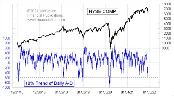
This week's chart is one of many that show the oversold situation that has appeared just recently. The 10% Trend of the daily A-D difference dipped all the way to -579 on Dec. 1, which is officially "pretty darned oversold."
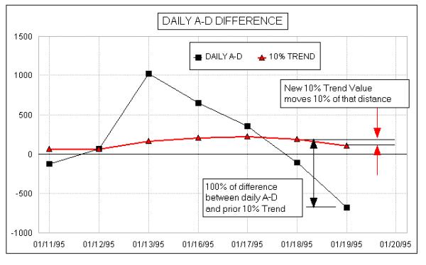
The 10% Trend of daily A-D is one of the components for calculating the McClellan Oscillator. The other is the slower 5% Trend. That percentage reference is known as the "smoothing constant" for the calculation of the exponential moving average. To understand this principle, here is an illustration from some of our old instructional material.

Each day, we calculate the difference between the daily A-D number, also known as the "daily breadth", and yesterday's 10% Trend value. The new 10% Trend value moves by 10% of that difference. So if it is a big difference, the 10% Trend will move more. To get the 10% Trend up or down to a really extreme reading requires a lot of days of extreme daily breadth readings.
My parents, Sherman and Marian McClellan, took up the use of the 10% Trend and the 5% Trend of daily A-D in the late 1960s because they were followers of the late P.N. "Pete" Haurlan. He was an actual rocket scientist at the Jet Propulsion Laboratory (JPL) in Pasadena, California, back in the 1960s, who worked on the gravitational slingshot calculations for getting space probes like Voyager out to the far reaches of the solar system. In his spare time, he coded the JPL computers after hours for tracking stock prices, the first person west of the Mississippi to use a computer for stock market analysis.
Haurlan introduced the world to the use of exponential moving averages (EMAs) for tracking stock prices, a bit of math which had only been first contemplated in 1957. See this for some of the history. He advocated using round number smoothing constants like 5%, 10%, 20%, etc., because he knew that most of his followers were doing their EMA calculations by hand on scratch paper, and using round number smoothing constants made the math easier. He even used the 10% Trend of daily A-D in his Trade Levels newsletter, calling it the "Haurlan Index" without divulging publicly what it was based on. That newsletter would feature the EMA values of daily A-D numbers and other indices on their own.
The key insight that my parents came up with in 1969 was to look at the difference between two EMAs, the 10% and 5% Trend of daily A-D, which came to be known as the McClellan A-D Oscillator. Interestingly, 1969 was also when another analyst named Gerald Appel, in Great Neck, NY, also thought to look at the difference between two moving averages, leading to his "Moving Average Convergence-Divergence" or MACD indicator. There was no communication between them; it was just a little bit of technical analysis serendipity across 3000 miles' distance.
Exponential moving averages respond faster to trend changes than simple moving averages (SMAs). In an EMA, the most recent data are weighted more heavily, whereas in a SMA all data points in the lookback period are weighted equally. See this for more about that difference in calculations.
Turning back to this week's chart, a deep reading like this is a good indication of an oversold condition. But just knowing that the market is oversold is not enough. The market can always get more oversold, if it wants to. And even when an oversold low does matter, it may not be the final word. There can be a relief bounce, followed by even more selling. It would be nice if the market would serve up nice clean answers all the time, but that is not the market we get to play in. It usually takes a 10% Trend reading a lot lower than what we have just seen to mark an exhaustive bottom for stock prices.
|
| READ ONLINE → |
|
|
|
| Top Advisors Corner |
| Time to "Buy the Dip" Again? 3 Ways to Tell |
| by John Kosar |
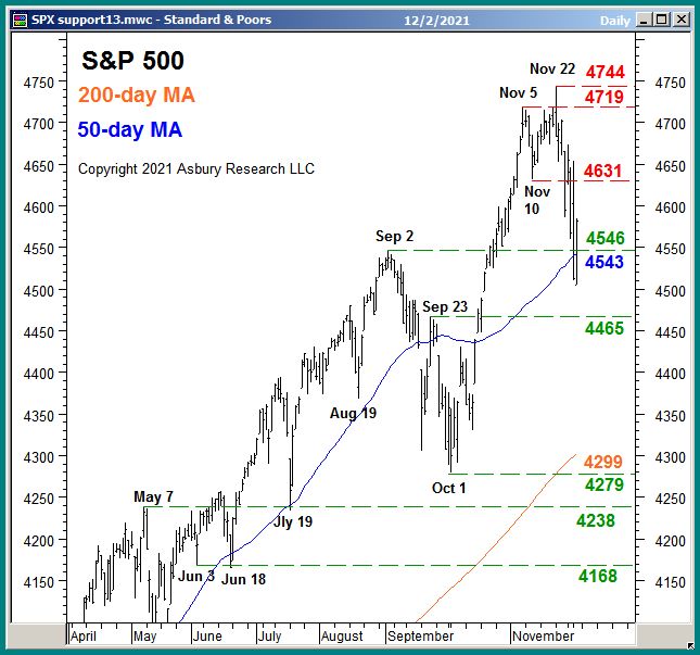
This has been quite a year for the S&P 500 (SPX). The US benchmark index has been up by as much as 26.3% for the year at its November 22nd highs — and has risen by an unbelievable 116.4% from the March 2020 COVID-19 lows. This year, the S&P 500 has been characterized by a very strong "buy the dip" mentality: that is, whenever the index declines to its 50-day moving average, you just buy it. And, thus far, this strategy has been extremely successful. The 50-day moving average in the S&P 500 has been tested 10 times this year, including the test that's taking place right now as shown in Chart 1 below, and eight of them have triggered the resumption of the larger bullish trend. In fact, the biggest decline from any minor peak that SPX has had all year has been 5.2%. On the surface, that seems like a pretty calm market, and an easy year to invest.

But, below the surface, 92% of the S&P 500's constituent stocks have had at least a 10% decline, with the average decline being 19%. This means, like a duck on the water, the part that we can easily see looks calm and sedate while there is frantic churning going on below the surface.
In a market that has been trained all year long to "buy the dip", how do we know if this is just another minor pullback — and a new buying opportunity into the traditional Santa Claus Rally — or the start of a real (and very overdue) corrective decline?
The following three metrics are what we are watching at my firm, Asbury Research, as critical "under the hood" metrics to make this important determination.
#1: Market Internals
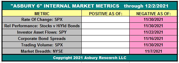
The table below displays our Asbury 6 risk management model. The "A6" consists of six diverse market metrics that we have combined to look beyond the day-to-day, up-and-down noise of the stock market to determine its actual health — in much the same way as a doctor first checks the patient's vital signs during an office visit. It helps us to identify real, sustainable market advances or declines from computer-driven traps for investors — the latter of which are often generated by algorithmic (computerized) trading.

The table displays the current status of the Asbury 6 through the close on December 2nd, which is Negative, or bearish. The model has been on a Negative status since November 30th, from a Positive one on October 14th. Four or more metrics in one direction, either Positive (green) or Negative (red), indicate a tactical bias. The dates in each cell indicate when each individual constituent of the A6 turned either positive (green) or negative (red).
Until four of the six constituent metrics turn back to green or positive, the model's bias will remain Negative — warning that the US stock market is vulnerable to a deeper decline.
#2: Market Volatility
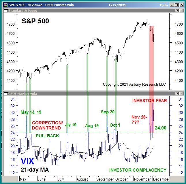
The lower panel of Chart 2 below plots the CBOE Volatility Index, better known as the VIX, daily since May with its 21-day moving average, the latter which indicates the monthly trend. A rising VIX indicates increasing investor fear. A declining VIX indicates investor complacency. The upper panel displays a corresponding chart of the S&P 500.

The green highlights show that 6 previous rises to and quick declines from a 24.00 or higher reading in the VIX coincided with the past 6 near-term bottoms in the S&P 500. The rightmost red highlights, however, show that the VIX has now been above 24.00 for the past six sessions. We are closely watching 24.00 in the VIX as a line of demarcation between a market pullback, during which the VIX would quickly decline back below 24.00, or a correction in which the VIX would remain above 24.00. Right now, recent movement in the VIX is signaling an emerging correction.
#3: Investor Asset Flows
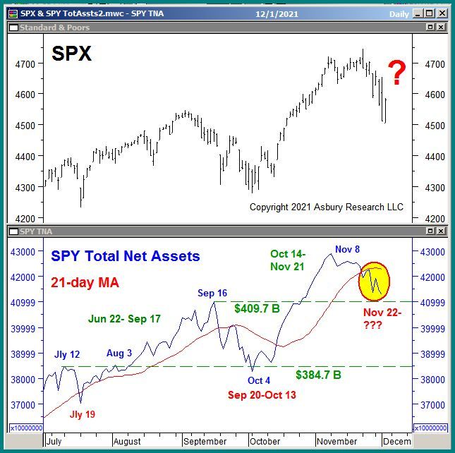
Chart 3 below plots the S&P 500 daily since July in the upper panel, with a corresponding chart of the total net assets invested in the SPDR S&P 500 ETF Trust (SPY, which tracks the S&P 500) in the lower panel. Investor asset flows measure investor conviction in a price move. This data series measures monthly investor conviction, or the lack of it, in the US broad market via a 21-day (monthly) moving average.

A quick look at the chart shows that periods of monthly asset expansion coincide with ("fuel" is a more accurate description) a rising S&P 500, and monthly asset contraction coincides with a declining SPX. The rightmost red highlights show that these assets have been in a trend of monthly contraction since Nov. 22nd, which is negative for the market.
It would take a shift back to a trend of monthly expansion in these assets, as most recently occurred between Oct. 14th and Nov. 21st, to indicate that enough bullish conviction has returned to the marketplace to support the resumption of the S&P 500's larger 2021 advance.
Conclusion
The benchmark S&P 500 is currently testing its 50-day moving average as underlying support, a level that has already triggered a "buy the dip" response from investors eight times this year. The next significant directional price move in the US broad market average, either up or down, is likely to begin from this tactical inflection point. This time, however, weak market internals, elevated market volatility and contracting investor asset flows warn that "buy the dip" will not work, and the US stock market will slip into an overdue and potentially nasty corrective decline.
Sign up for Asbury Research's free Bi-Weekly Stock Market Update by Clicking Here. Learn more about our investment management approach by Clicking Here.
John
John Kosar, CMT
Chief Market Strategist, Asbury Research
|
| READ ONLINE → |
|
|
|
| MORE ARTICLES → |
|
 Chart 1
 Chart 2
 Chart 3
 Chart 4
 Chart 5
 Chart 6
 Chart 7
 Chart 8


 With the sector index, XLP, positioned inside the lagging quadrant just below 100 on the JdK RS-Momentum axis, it is not surprising to also find the majority of the groups on the left side of the chart. And, just like XLP, most of these groups have short tails, which indicates that they are in stable relative downtrends.


 The Point and Figure charting engine at StockCharts.com is an outstanding tool. It provides incredible flexibility to draw many varied types of PnF charts. Navigating the PnF chart controls is easy once they are understood.