| THIS WEEK'S ARTICLES |
| John Murphy's Market Message |
| THIS WEEK'S REBOUND SUGGESTS SHORT-TERM STOCK BOTTOM IN PLACE |
| by John Murphy |
WEEKLY S&P CHART SHOWS OVERSOLD CONDITION... Stocks are having their best week in two months which suggests that a short-term bottom may be in place. Before looking at daily charts, however, it's worth checking a weekly chart to keep things in perspective. The weekly bars in Chart 1 show the S&P 500 bouncing off its 38% Fibonacci retracement line (green arrow) measured from its 2020 bottom to this year's top. That's not usual because those retracement lines often provide some support. That's especially true if the market has reached an oversold condition -- which it has. The upper box shows the 14-week RSI bouncing from an oversold condition near 30 (black arrow). In addition, the weekly MACD lines in the lower box have reached potential suppport near their 2020 low. Those weekly indicators suggest that stocks have reached a level where a short-term rally would not be surprising. The bad news, however, is that weekly moving average lines remain bearish with the blue 10-week average still trending below its red 40-week average. In addition, stock prices remain well below both moving average lines. All of which suggests that this week's rebound should still be viewed in a bearish context. The big question is how far can the market rally.
 Chart 1 Chart 1
UPSIDE RESISTANCE BARRIERS...The daily bars in Chart 1 show the S&P 500 exceeding its mid-May peak to turn its short-term trend higher. In addition, its 14-day RSI line in the upper box has rallied to 50, and its daily MACD lines in the lower box have turned positive for the first time in nearly two months. Both momentum indicators also support a short-term rally. Stocks, however, have a lot of overhead resistance barriers to deal with. The red horizontal lines measure Fibonacci retracement lines measured from their late March peak to their May bottom. Those three lines should now act as overhead resistance barriers. The SPX has already reached the lower line at 38%. More substantial resistance is likely at the two higher lines at 50% and 62%. Moving average lines should also act as overhead resistance. That's especially true of the blue 50-day average which may be tested (blue circle).
Charts 3 and 4 apply those same overhead resistance lines to the Dow Industrials and the Nasdaq 100 (QQQ). There again, stocks may reached their 50-day averages which coincide with one of the Fibonacci retracement lines.
 Chart 2 Chart 2
 Chart 3 Chart 3
 Chart 4 Chart 4
|
| READ ONLINE → |
|
|
|
| The Mindful Investor |
| Why Bear Market Rallies Are So Seductive |
| by David Keller |
2022 has been a clear bear market phase for risk assets, particularly the equity markets. The signs were building in January, seemed validated by a new low in February, then were absolutely confirmed with the failed breakout above 4600 in late March.
Somewhere in the first three months of the year, investors appear to have widely transitioned from the "disbelief" phase ("There's no way this market is going lower.") to the "acceptance" phase ("Oh my, this is definitely a bear market!"). The challenge at this point? Bear market rallies, like the one we experienced this week.
Countertrend rallies in bear markets can be usually described as sudden, severe and seductive. They happen suddenly, with the market making new swing lows one day and then ripping back to the upside immediately after. This particular rally was punctuated by hammer candles, along with other bullish candlestick patterns. They are also usually severe, meaning they make up lots of ground in a relatively small amount of time. And why do they tend to bounce higher so quickly?
That's the seductive nature of these quick countertrend rallies. The "FOMO" is palpable as investors are afraid of missing the bottom. As if 200 S&P points would be the difference between an amazing year and a mediocre year when you look back at 2022!
Once this sudden influx of buyers has done their buying, the market sort of wakes up to the fact that conditions really haven't changed much in the last couple weeks. All of the headwinds that have caused stocks to broadly decline from January into May are still there.
The Fed has transitioned from an accommodative policy to a policy much less ideal for risk assets. Inflation is still an issue that impacts consumers, as evidenced by the number of companies in the past couple weeks that have stressed its influence on their outlooks.
So what is actually happening here? To be honest, this week's rally just makes sense. The S&P 500 reached the 38.2% retracement of the March 2020-January 2022 uptrend almost exactly. I would have been incredibly surprised if we had not rallied off the 3815-3820 level.
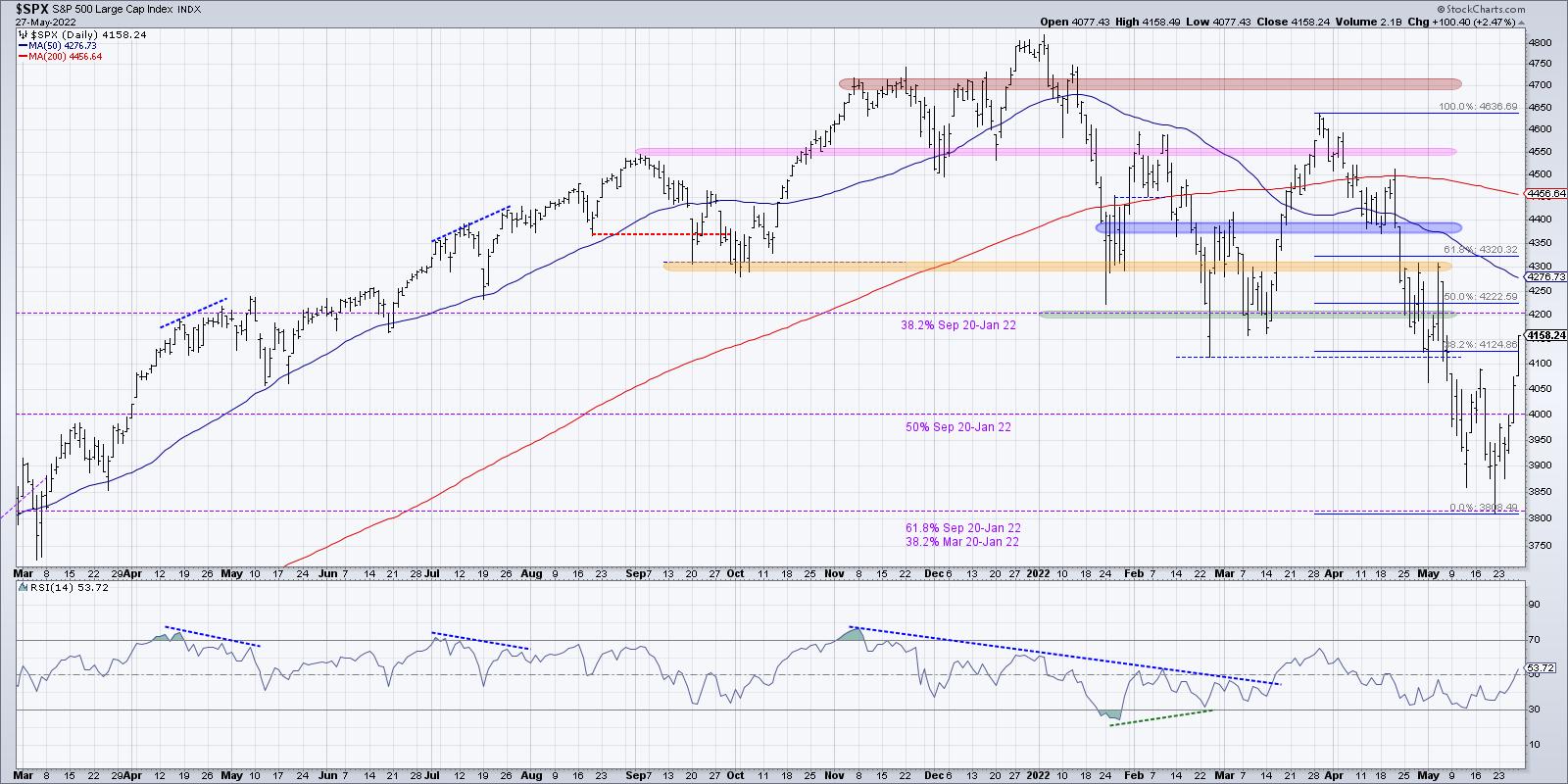
How do we differentiate a bear market rally from the beginning of a more meaningful recovery for the S&P 500? First, we would need to see the SPX break above key resistance levels. And I would have to admit that Friday's close above 4125 is quite impressive, as it takes the index above a 38.2% retracement of the March to May downtrend.
Now I am focused on the 50-day moving average (around 4275) and the 61.8% retracement level (4320). If we see the S&P 500 close break above 4320, then I believe you'd have to label this wave as something other than a bear market rally.
Second, I would have to see an influx of positive momentum. While this week ended on a high note, the daily RSI still sits below 54 for the S&P 500. During bear market phases, the RSI tends to stall out around 60 in a rally phase. The peak from late March is a great example of what tends to happen. So a break above the previously-mentioned resistance, along with the RSI reaching above the key 60 level, would confirm enough upside momentum that a more bullish outlook could be warranted.
Finally, you would have to see an improvement in breadth conditions. When I look at the cumulative advance-decline lines for the major equity averages, I can't help but notice that the S&P 500 A-D line was the only one that did not make a new low in May.
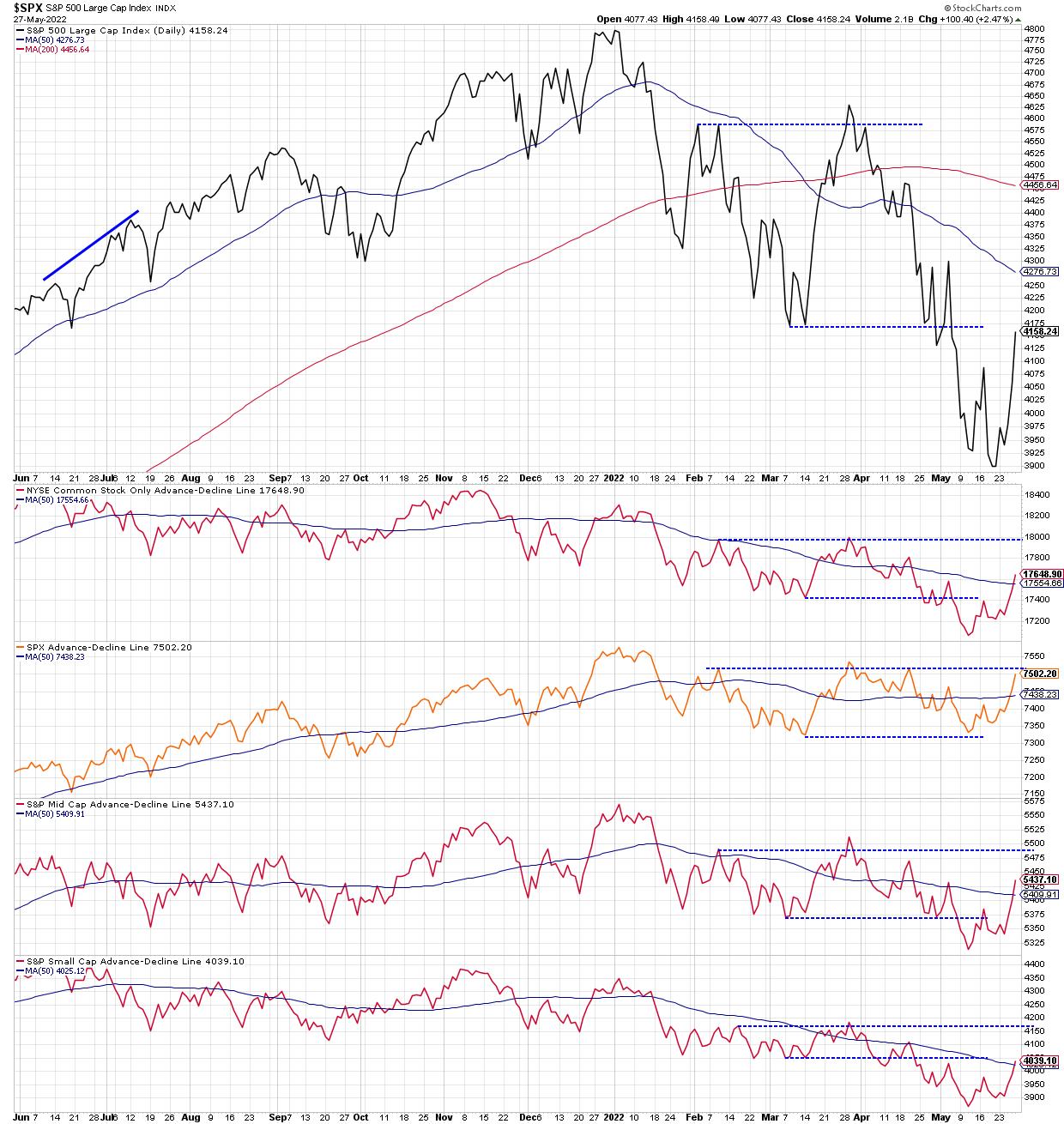
Now, this large cap breadth indicator is threatening to eclipse its higher from February and March. If these four advance-decline lines can make new swing highs, then we can say that this is a broader advance and not just a quick upside reversal.
Bear market rallies can be challenging. Just remember, make short-term decisions using short-term data, and long-term decisions using long-term data!
RR#6,
Dave
P.S. Ready to upgrade your investment process? Check out my YouTube channel!
David Keller, CMT
Chief Market Strategist
StockCharts.com
Disclaimer: This blog is for educational purposes only and should not be construed as financial advice. The ideas and strategies should never be used without first assessing your own personal and financial situation, or without consulting a financial professional.
The author does not have a position in mentioned securities at the time of publication. Any opinions expressed herein are solely those of the author, and do not in any way represent the views or opinions of any other person or entity.
|
| READ ONLINE → |
|
|
|
| Art's Charts |
| Palladium: A Trend Changing Event or Correction Overshoot? |
| by Arthur Hill |
 There are two commodity ETFs with falling wedge patterns working. One falling wedge resulted in a deep pullback and the other in a shallow pullback. Either way, I view these falling wedges as corrections within uptrends and am watching for breakouts. This article will look at the deep pullback in the Palladium ETF (PALL). There are two commodity ETFs with falling wedge patterns working. One falling wedge resulted in a deep pullback and the other in a shallow pullback. Either way, I view these falling wedges as corrections within uptrends and am watching for breakouts. This article will look at the deep pullback in the Palladium ETF (PALL).
The falling wedge is a classic pattern that often forms as a correction within a bigger uptrend. First, there is some sort of uptrend present and/or a powerful move that signals the start of an uptrend. Second, there is a pullback that retraces a portion of the prior move and holds well above the prior low. Sometimes the pullback is deep and sometimes shallow. The correction ends when price breaks out of the wedge. This signals a resumption of the bigger uptrend and argues for further gains.
The chart below shows PALL with a ~100% advance that broke above the October-November highs and hit a 52-week high in March. The ETF then embarked on a ~40% decline that retraced well more than 2/3 of this advance and did not hold near the January breakout zone. A normal correction would retrace around 50% and hold the prior breakout. This one did not, but I still think it is a correction within a bigger uptrend because the prior 105% advance was also atypical. In other words, a big advance deserves a big correction. Such is the nature of subjective analysis.
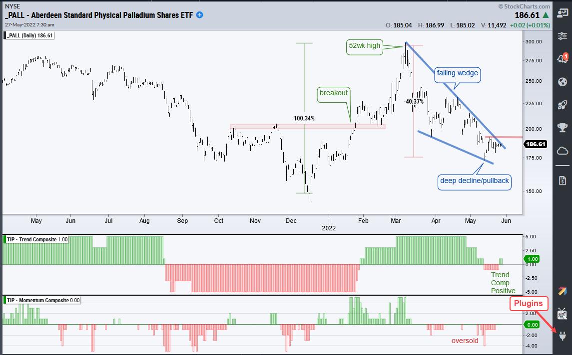
The first indicator window shows the Trend Composite turning negative for two weeks and the Momentum Composite dipping to -5 (oversold) on May 12th. The Trend Composite flipped back to positive this week and I am now watching for a wedge breakout. A break above last week's high could provide the first clue that this correction is ending and the immediate downtrend is reversing. The second commodity ETF with a falling wedge is reserved for subscribers.
This week at TrendInvestorPro we covered the new signals in the Latin America 40 ETF (ILF), Gold SPDR (GLD) and Agribusiness ETF (MOO). There are chart-packed ETF Reports on Tuesdays and Thursdays, a comprehensive video on Wednesdays and a market regime update on Wednesdays. Click here for immediate access.
In this week's Next Level Charting video (here), I showed how to use the Trend Composite and the ATR Trailing Stop as part of a trend-following strategy. We also looked at relative strength in XLV and MOO, and showed how to pick a level to prove your trade wrong.
The Trend Composite, Momentum Composite, ATR Trailing Stop and eight other indicators are part of the TIP Indicator Edge Plugin for StockCharts ACP. Click here to take your analysis process to the next level.
---------------------------------------
|
| READ ONLINE → |
|
|
|
| Martin Pring's Market Roundup |
| It's Time for a Rally, But that Comes with a Catch |
| by Martin Pring |
The stock market's recent sell-off has made the front pages and top headlines in TV broadcasts, and CNN's famous Fear and Greed Index has fallen to an extreme level of fear. My contrarian bones say it's time for a rally. Is that right? Yes -- but! The big question is whether it's the end of a mini-bear market or, more likely, a short-term or intermediate relief rally. I am leaning towards the latter two possibilities, because the longer-term indicators are still pointing south.
Take Chart 1, for instance. It shows that the S&P is well below its 12-month MA and the long-term KST is bearish. To be sure, these indicators will give us a false sense of weakness should this bear market turn out to be something in the order of a 2011-12 or 2015-16 decline. Nevertheless, you can see that the big bears of 2000-2002 and 2007-2009 never experienced a positive 12-month MA crossover until they had completed their downward trajectory, and the KST was well below its equilibrium point. As long as the consensus of primary indicators I follow are negative, as well as showing no prospects of an imminent reversal, caution is usually the best policy.
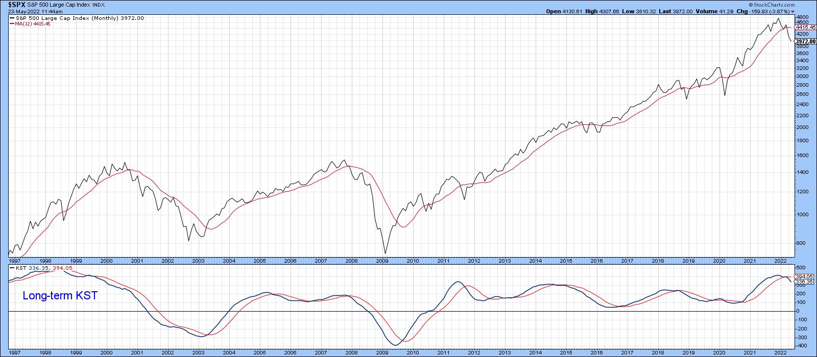 Chart 1 Chart 1
Market Due for an Oversold Bounce
There are a couple of indicators that reflect the market's current oversold condition. First, Chart 2 features the CBOE Options Total Put/Call Ratio, or, rather, its daily KST. A rising indicator reflects a trend of growing pessimism as market participants feel more and more comfortable in buying puts. However, when that trend starts to reverse, it usually coincides with some kind of a bottom. The dashed arrows flag reversals that take place from at or slightly above the blue horizontal line. The solid ones reflect greater pessimism, with reversals that develop at or above the dashed green line. All these situations were followed by a rally of some kind, rendering it a pretty reliable indicator. The fact that it has recently reversed from an extreme level is therefore encouraging.
That said, you can also see that the two red-dashed arrows were not followed by much of an advance, as these signals were triggered at the start of the 2022 decline. When a normally reliable short-term indicator such as this triggers false positives, it is a sign of a bear market and a warning that future bullish signals may return a similar result.
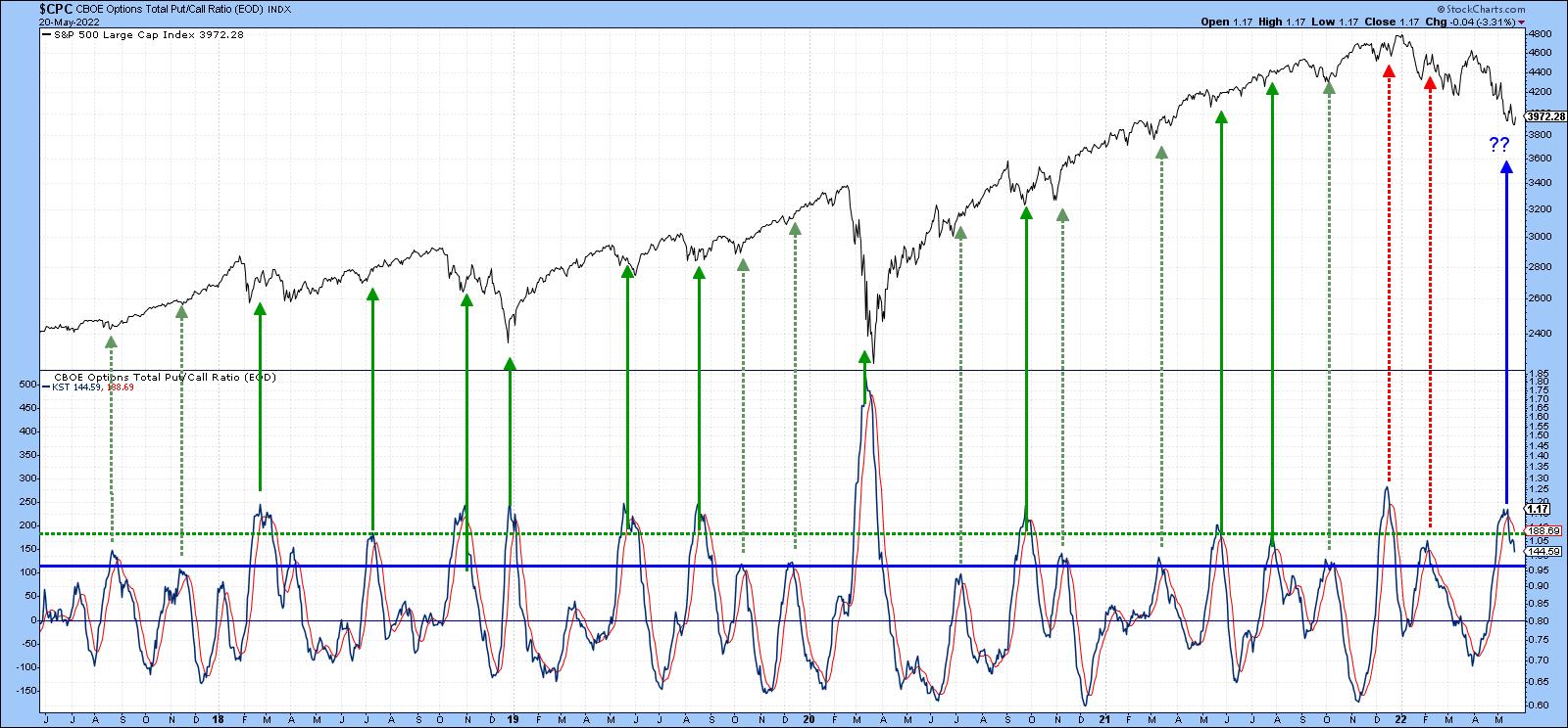 Chart 2 Chart 2
The same can be said for the Bottom Fisher (!PRBFISH) that you can read about here. It goes bullish when it reverses direction from a position under its horizontal green dashed line. Examples of buy signals have been flagged by the dashed green arrows. The "Fisher" has just gone bullish again, but comes once again with a caveat.
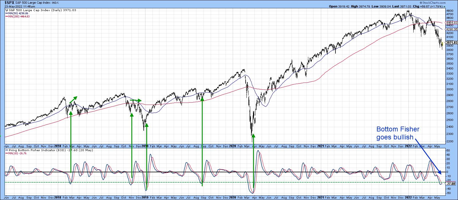 Chart 3 Chart 3
That's because Chart 4 shows how it operated during the 2007-2008 bear market. We can see a total of four signals being generated. Because this was a bear market, the first three were counter-cyclical in nature; only the one triggered in July 2008 was able to advance for as long as four weeks. The fourth signal, in March of 2009, was spot-on. That's because it developed a few days following the final low, i.e., in a primary bull market. At that time, of course, the long-term primary indicators, such as the KST, were oversold, not overbought as they are now.
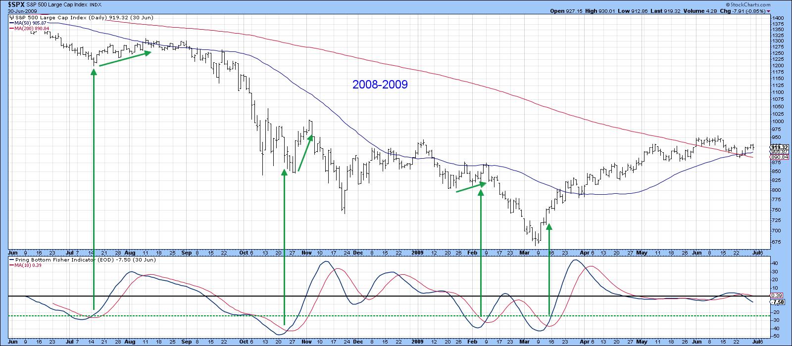 Chart 4 Chart 4
Bearing that in mind, Chart 5 shows that Friday's action proved to be a hammer candlestick. I think of these one-day patterns as normally having an effect for between 5-10 sessions. If that proves to be the case here, it would buy sufficient time to enable some of the other short-term indicators to turn positive as well. In this instance, it would enable the RSI to complete a small base, similar to its action earlier this year as it signaled the March rally. As to how far any advance might go, I am looking at a possible 61.8% retracement to the 50-day MA, and green trendline in the area of the late April/early May highs at 4,300.
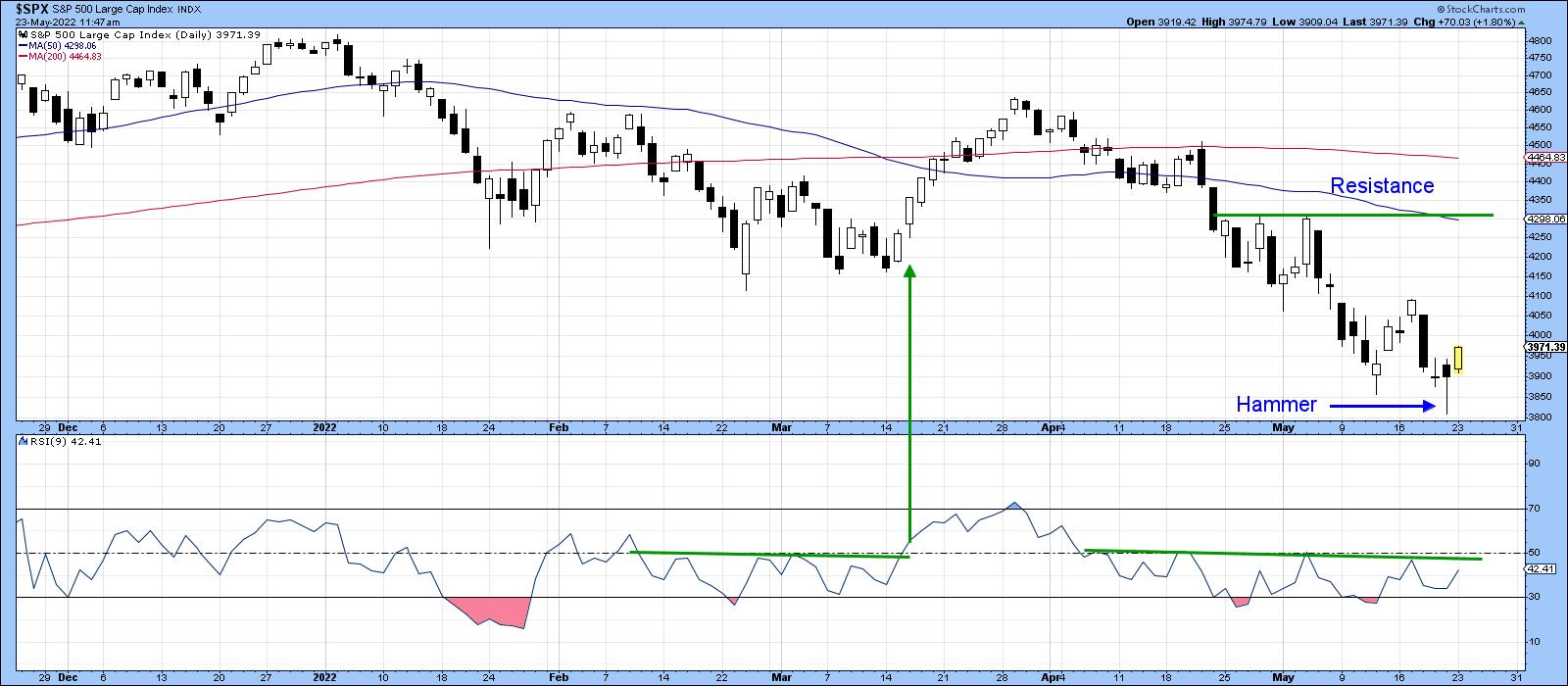 Chart 5 Chart 5
Such a rise would also take the average back to its imprecise late April breakdown point, as illustrated in Chart 6. That's not a prediction, merely a possibility.
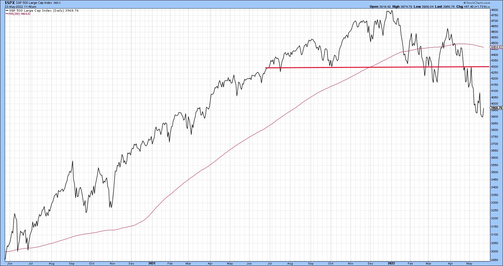 Chart 6 Chart 6
Market Turning Points Often Associated with a Change of Leadership
It is a fact that market turning points are also associated with a change in leadership. In the current situation, we can point to one possibility. In that respect, Chart 7 compares the US market, in the form of the S&P Composite, to the World and two "Rest of the World" ETFs. The long-term trend favoring the US remains intact, but it is evident that all series have violated their 2022 up trendlines. Since these ratios often move in a similar direction to the US Dollar Index, these breaks hint at a correction there as well.
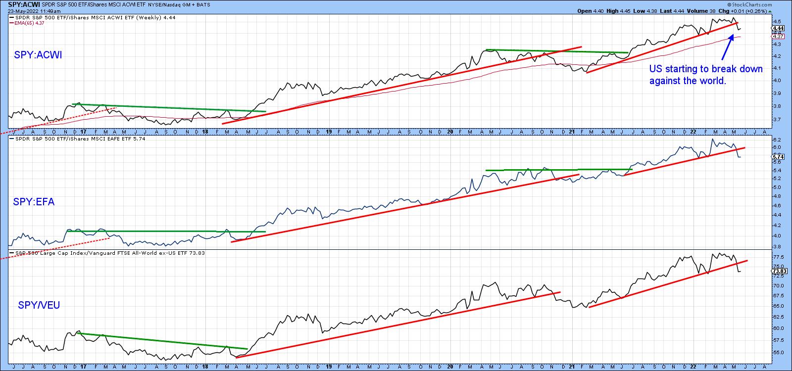 Chart 7 Chart 7
Good luck and good charting,
Martin J. Pring
The views expressed in this article are those of the author and do not necessarily reflect the position or opinion of Pring Turner Capital Group of Walnut Creek or its affiliates.
|
| READ ONLINE → |
|
|
|
| Dancing with the Trend |
| WHY Standard Deviation is a Poor Measure of Risk |
| by Greg Morris |
 I will attempt to show that high sigma is a much more frequent event than modern finance thinks it is. A few examples using the Dow Industrials back to 1885 on a daily basis are shown. Each begins with determining a look-back period to determine the average daily return and the standard deviation, and then a look-forward period is determined to see if the look-back data continues into the look-forward data. Figure A is an attempt to help visualize this process. A look-back period is determined (in-sample data) and a look-forward period is also determined (out-of-sample data). The look-back period is used to determine the average daily return and the standard deviation of returns. From that data, a range of three sigma about the mean is determined. Then in the look-forward data, the number of daily returns outside the +/- three sigma band are tallied with the total being displaying as a plot; any point on the plot represents the data used in the look-back and the look-forward periods. I will attempt to show that high sigma is a much more frequent event than modern finance thinks it is. A few examples using the Dow Industrials back to 1885 on a daily basis are shown. Each begins with determining a look-back period to determine the average daily return and the standard deviation, and then a look-forward period is determined to see if the look-back data continues into the look-forward data. Figure A is an attempt to help visualize this process. A look-back period is determined (in-sample data) and a look-forward period is also determined (out-of-sample data). The look-back period is used to determine the average daily return and the standard deviation of returns. From that data, a range of three sigma about the mean is determined. Then in the look-forward data, the number of daily returns outside the +/- three sigma band are tallied with the total being displaying as a plot; any point on the plot represents the data used in the look-back and the look-forward periods.

Figure A
In Chart A, a look-back period of 1260 days (5 years) is used to calculate an average daily return and the standard deviation of returns. On 10/24/2002 (last peak on Chart A) the average return over the past 1260 days was 0.07%, and the standard deviation over the same period was 0.71%. Therefore a 3 sigma move up was up to 2.21%, and a 3 sigma move down was -2.06%. The look-forward period, also 1260 days, is counting the number of days in which the returns were outside of the look-back range. There were 49 days with returns greater than 2.21% and 69 days with returns less than -2.06%, for a total number of days with returns outside the +/- 3 sigma range (based upon the previous 5 years) equal to 118. Table A puts this into another format.
 Table A - Table Showing data in Chart A Table A - Table Showing data in Chart A
For a +/- 3 sigma event the expected number of observations should be 1.7, whereas there were 118, which is 59 times more than expected (events must be in whole numbers so used 2 for the expected number). Chart A shows the 1260 day rolling total number of days outside the +/- 3 sigma range. As of 12/31/2007 the total is 116, with an expectation of only 1.7. This is over 58 times more returns outside the +/- 3 sigma band than expected. Of those 116 days outside the three-sigma band, 54 were above 2.45% and 62 were below -2.37%.
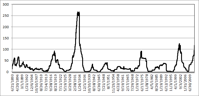 Chart A - Five Year Look-back and Five Year Look-Forward Days outside +/- 3 Sigma Chart A - Five Year Look-back and Five Year Look-Forward Days outside +/- 3 Sigma
Reducing the look-forward period to one-year (252) days while maintaining the five-year look-back period yields Chart B of rolling number of days outside a +/- 3 sigma (standard deviation) event. Remember that the determination of +/- 3 sigma is determined by the previous five years of data at any point on the chart. For a one year look forward there is only an expectation of 0.34 events (days) outside the sigma band.
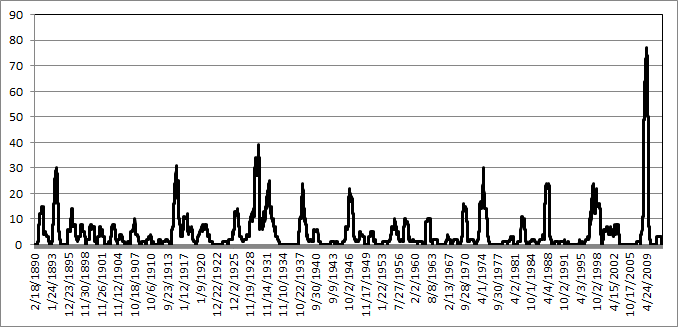 Chart B - Five Year Look-back and One Year Look-Forward Days outside +/- 3 Sigma Chart B - Five Year Look-back and One Year Look-Forward Days outside +/- 3 Sigma
Keeping the look-forward period to one year and expanding the look-back period to twenty years (5020 days) is shown in Chart C. Extrapolating the past into the future always has its surprises. Keeping the look-forward period the same (one year) and increasing the look-back period does not significantly affect the rolling returns outside the sigma range.
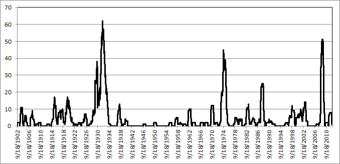 Chart C - Twenty Year Look-back and One Year Look-Forward Days outside +/- 3 Sigma Chart C - Twenty Year Look-back and One Year Look-Forward Days outside +/- 3 Sigma
Bottom Line: Gaussian (bell-curve) statistics are not appropriate for market analysis, yet modern finance is totally wrapped up in using standard deviation as volatility and then saying that is risk. There are actually two big problems; one is the use of standard deviation to represent risk and two is that past standard deviation has very little to do with future standard deviation. The first problem does not account for the fact that standard deviation (sigma) is also measuring both upside moves and downside moves with no attempt to separate the two. Clearly, upside volatility is good for long only strategies. The second problem was covered in this article showing how inadequate standard deviation is from the past in predicting how it would be in the future. I apologize for this nerdy article, but too many confuse normally distributed data with stock market prices. Please don't or you will forever wander in confusion.
Dance with the Trend,
Greg Morris
|
| READ ONLINE → |
|
|
|
| The Canadian Technician |
| It's All About a Base |
| by Greg Schnell |
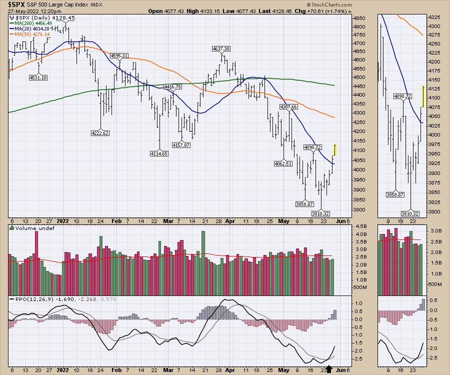
The market seems to be holding in this area for the last few weeks. Our chart of the $SPX marks a break of one of the moving averages that the indexes have been staying below. The 20-day moving average in blue is behind us now and a move up to the 4450 level would get us back to the 200-DMA moving average.

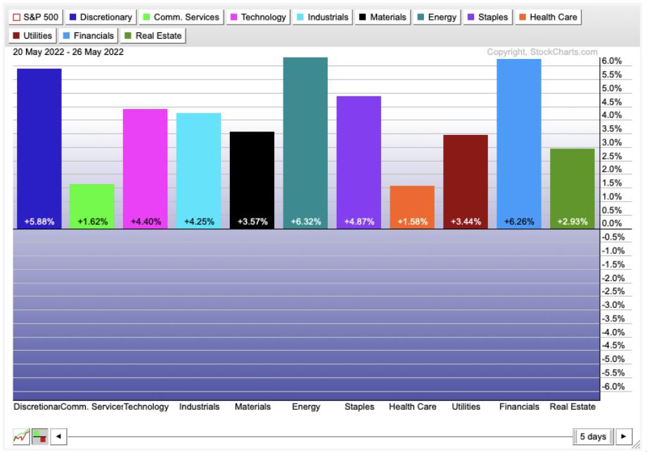
The best-performing sector this month continues to be the energy sector. The histograms below show the broad breadth of the rally over the last five days, with every sector turning higher since the Options Expiration day.

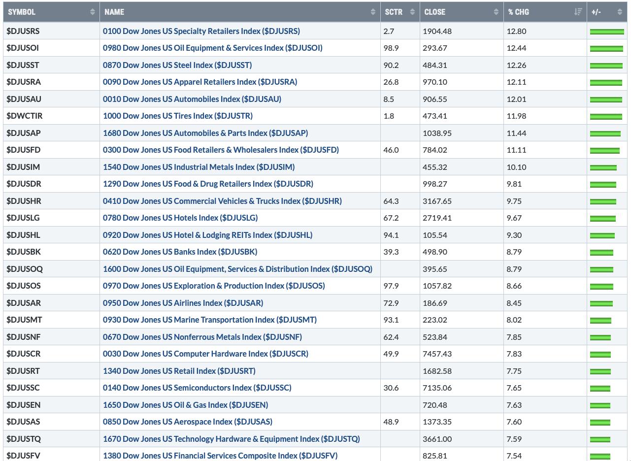
Consumer Discretionary was beaten down the most, and it has been one of the strongest during the bounce. Below are the biggest industry bounces this week. The steel, industrial and non-ferrous metals indexes were a surprise for me. Also, we see a lot of automobile industry relationships listed.

The charts are changing!
I'll be producing a weekend video and newsletter for clients with the full market review as this rally starts firing up. We'll also be hosting the OspreyStrategic monthly conference call on Monday. If you are interested in finding some great ideas at an opportune time, consider the $7 monthly trial at OspreyStrategic.org this weekend.
|
| READ ONLINE → |
|
|
|
| DecisionPoint |
| "Those Who Do Not Learn from History . . . |
| by Carl Swenlin |
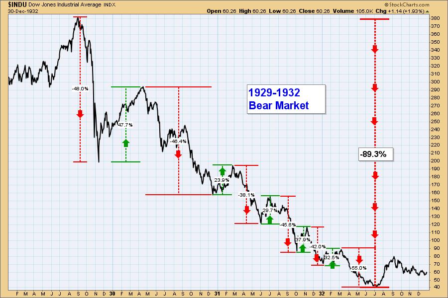
. . . are doomed to repeat it." The essence of that pithy observation is generally attributed to writer and philosopher George Santayana. I don't think it is usually applied to the stock market, but it should be, and looking at historical charts is the best way to learn from history.
I have looked at the 1929-1932 Bear Market chart many times over the last 40 years, but it was always with an emphasis on the 1929 Crash and the nearly -90% decline into the 1932 bottom. Recently, I realized that there was something else just as interesting and added new annotations to the chart. If we assume that a decline of over -20% is a bear market, and an advance of over +20% is a bull market, it is shocking how to realize how confusing that period must have been for investors. The decline from the 1929 top to the 1932 bottom was a secular bear market, but also within that period there were six cyclical bear markets and five cyclical bull markets. Eleven reversals in 32 months!

Do I think we're in for a thrashing of this magnitude? Well, remember that during the 2000-2002 Bear Market the Nasdaq Composite declined about -80%, and the Nasdaq 100 (QQQ) about -85%. Nobody knows what is really going to happen, but the Nasdaq Composite and Nasdaq 100 are already down -32%, and it is well to remember that, depending one's exposure, catastrophic losses are not just myths relegated to the bad old days. As for whiplash reversals like those on the chart, it is too soon to tell, but the 2020 Bear Market demonstrates that it is not out of the question.
-- Carl Swenlin

Technical Analysis is a windsock, not a crystal ball. --Carl Swenlin
(c) Copyright 2022 DecisionPoint.com
Helpful DecisionPoint Links:
DecisionPoint Alert Chart List
DecisionPoint Golden Cross/Silver Cross Index Chart List
DecisionPoint Sector Chart List
DecisionPoint Chart Gallery
Trend Models
Price Momentum Oscillator (PMO)
On Balance Volume
Swenlin Trading Oscillators (STO-B and STO-V)
ITBM and ITVM
SCTR Ranking
Bear Market Rules
DecisionPoint is not a registered investment advisor. Investment and trading decisions are solely your responsibility. DecisionPoint newsletters, blogs or website materials should NOT be interpreted as a recommendation or solicitation to buy or sell any security or to take any specific action.
|
| READ ONLINE → |
|
|
|
| Top Advisors Corner |
| Focus on Companies That Beat Earnings Expectations |
| by John Hopkins |
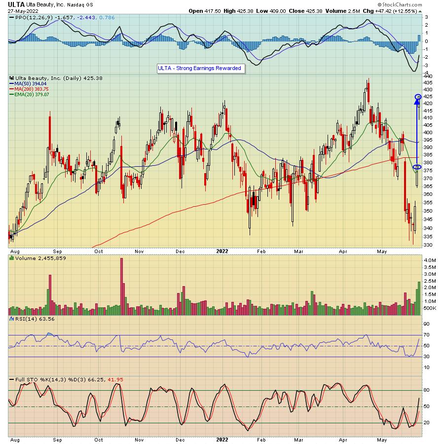
When the market is in turmoil, you need to look for any advantage you can get to help you make successful trades. This includes zeroing in on those companies that beat both top- and bottom-line expectations and also guide higher. An example of this is Ulta Beauty (ULTA), which reported its numbers on Thursday and included a positive outlook, with the stock getting a nice bump higher after its earnings release.

As you can see, the stock rose by over 16% from the prior day low to its high the day after earnings were released, showing traders are more than happy to reward those companies that exceed expectations.
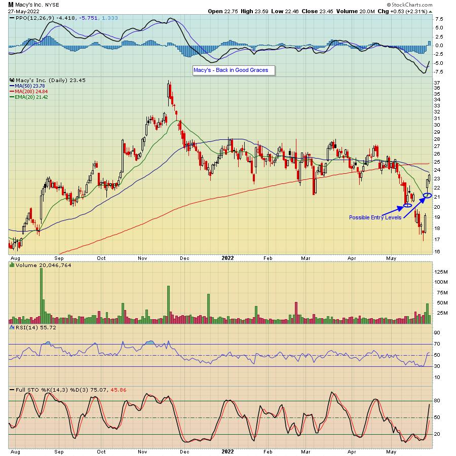
Another stock that rose sharply on its earnings report was Macy's (M), which surprised the market with its better-than-expected numbers.

In the case of M, the stock has risen by almost 35% from the prior day low to its high in just two days after earnings were released.
Those companies that not only beat top and bottom line expectations, but also guide higher, become targets of traders who are looking for any edge they can get in times of uncertainty. This includes looking for entry levels on pullbacks that could pay off if a stock resumes its upward movement after any selling. For example, in the case of Macy's, a pullback to the 20-day moving average (currently at $21.42) and then again near $20 would represent sizable discounts to the current price.
Right now, we're seeing an oversold market relief rally, but there's no guarantee the gains will hold. Thus the importance of identifying those companies that exceed expectations so you can be in a position to take advantage of lower prices if profits are taken. In fact, we regularly provide our members with our Strong Earnings ChartList (SECL), which currently contains 469 companies that have beaten Wall Street Consensus estimates as to both revenues and earnings, are liquid and have solid technical charts. If you would like to get access to all 469 companies, just click here to sign up for our FREE EarningsBeats Digest (EBD) and we will include a link to the SECL in our next EBD, which will be published this upcoming Wednesday.
Hope you enjoy the holiday weekend!
At your service,
John Hopkins
EarningsBeats.com
|
| READ ONLINE → |
|
|
|
| RRG Charts |
| Value Knocks Out Growth |
| by Julius de Kempenaer |

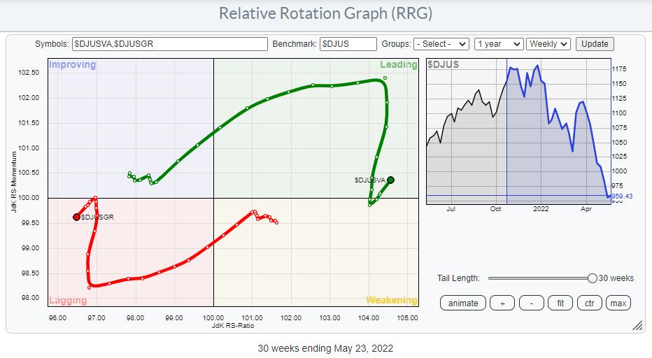
The RRG below shows the tails for the DJ Growth and -Value indexes against the DJ US index.
The crossing over of the Value tail into the leading quadrant and, at the same time, Growth into the lagging quadrant happened in January of this year.

After a strong stint, the tails started to roll towards each other in March signaling a recovery for the beaten-down growth stocks. This lasted until 3-4 weeks ago when the tails very sharply hooked back into their original direction of travel. This move underscores the current strength of Value over Growth.

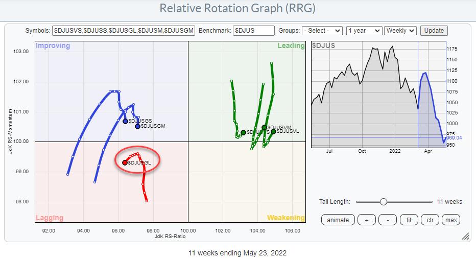
The second RRG above basically shows the same rotation of Growth vs Value but now both groups are broken down into Large-, Mid-, and Small-Cap.
On this chart, we can make the interesting observation that on the value side all three segments of market capitalization are moving more or less in sync and are following similar rotational paths. On the growth side, however, there is a clear disconnect between the rotation of Growth Large-Cap and the Small-, and Mid-cap segments.
Large-Cap Growth is leading the way lower, followed by the Mid- and Small-cap Growth segments while all value segments just rotated back into a positive RRG-Heading and are now traveling further into the leading quadrant.

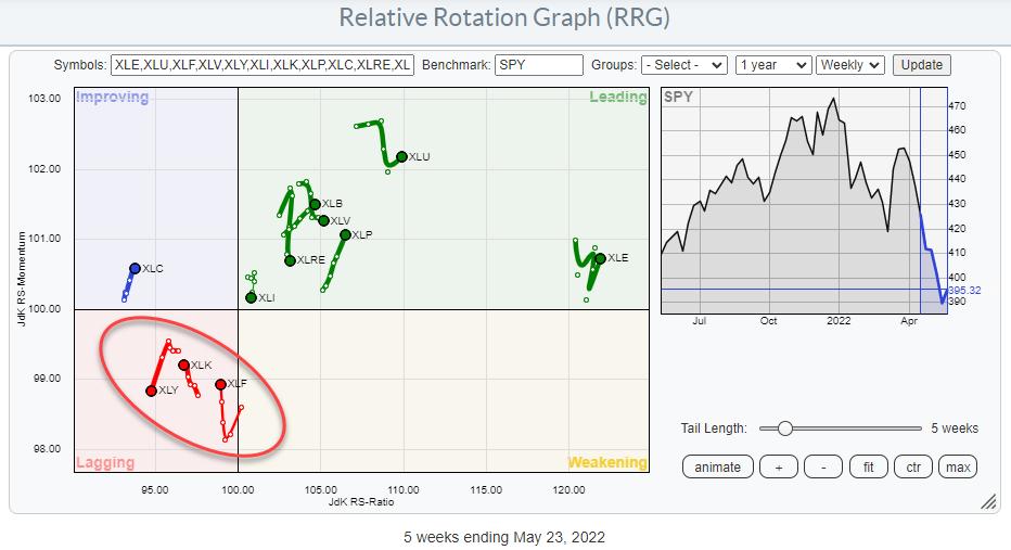
This observation also lines up with the weak picture for the offensive (Growth) sectors inside the S&P 500. Consumer Discretionary, Information Technology, and Financials are all inside the lagging quadrant. Clearly a lot of mega-cap stocks in that cross-section of Growth sectors.
Large-Cap Growth

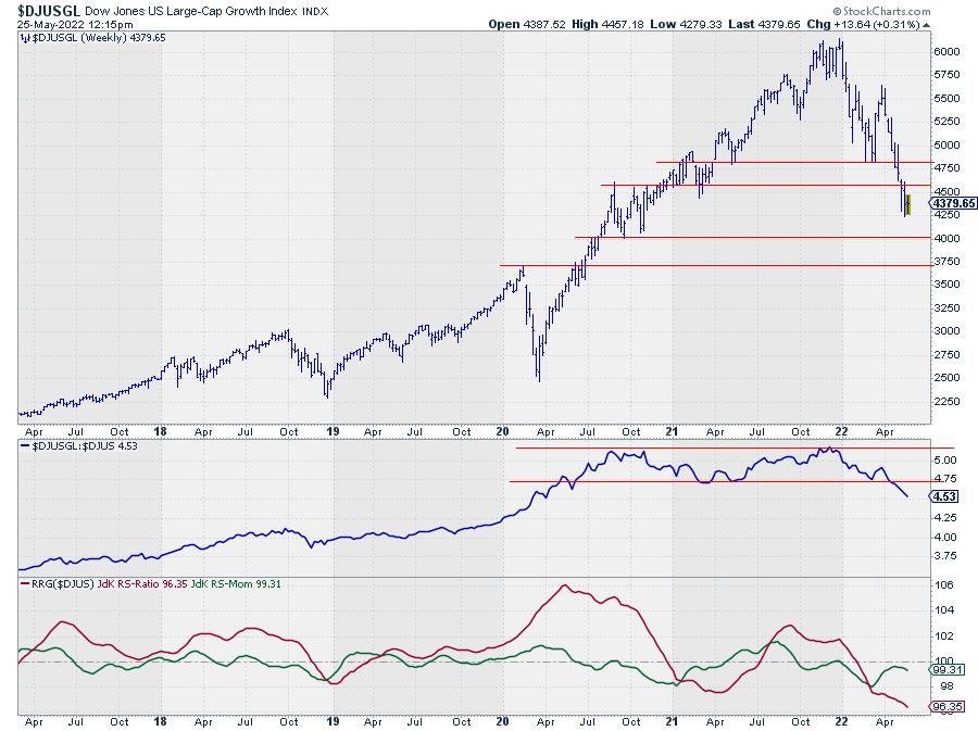
On the price chart for $DJUSGL the breakdown from the highs that were set at the end of last year is clearly visible. And so is the rhythm of lower highs and lower lows.
But maybe even more important is the crisp and clear break from the sideways range in relative strength, which is just about now starting to accelerate. This combination makes the outlook for Large-Cap Growth stocks very weak in the coming weeks.
Upside potential in both price and relative terms is very limited for Large Cap Growth stocks while there is considerable downside risk.
Large-Cap Value

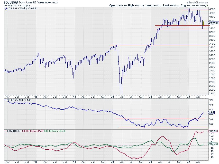
The Value index (Large) shows a very different picture. In price terms, the index is still holding up well above horizontal support between 3800-3900.
The resulting Relative Strength chart is the opposite of what we just saw in Growth. An upward break from a long base with an acceleration just getting underway.
For this segment in the market, the risk is fairly limited (to the lower boundary of the range near 3800-3900) while there is quite a bit of upside potential within the boundaries of the trading range. In relative terms the former top of the trading range should start to act as support while the long-term downtrend has turned up, creating plenty of upside potential for the RS-Line to rise further.
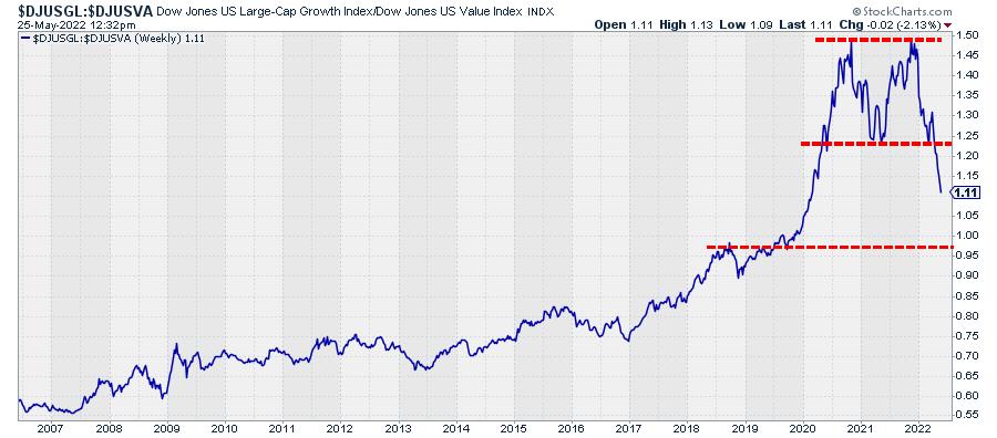
This Is The Knock-Out Chart

Plotting the 1-1 comparison between Growth and Value gives the chart above. For me, that is one massive double top that just got completed when the ratio broke below its early 2021 low.
The completion of this major top formation marks the end of a very long period of Growth dominance. But also the clear boundaries of the formation allow us to peg a (minimum) target from the breakout which is around 0.25 (the height of the formation) projected below the breakout level. That comes out just below 1.00 which is still quite a bit lower from current levels.
All in all, I'm afraid that Value has knocked out Growth for the time being and that there are a few more punches left to deal with. And if and when this fight slows down and settles it will take quite a bit of time for Growth to recover.
Be careful out there!! #StaySafe, --Julius
|
| READ ONLINE → |
|
|
|
| Top Advisors Corner |
| Gasoline Consumption Rebounding, But Still Down |
| by Tom McClellan |

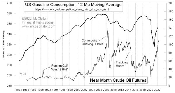
When we were all locked down for COVID in April 2020, total gasoline consumption in the U.S. fell to a low rate that month of 228 million gallons per day. That is the lowest single month reading in the EIA's dataset, which dates all the way back to 1983.
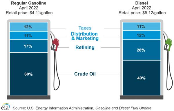
Consumption has rebounded since then, of course. This week's chart shows a 12-month moving average of that gasoline consumption data, with a comparison to crude oil prices. Not surprisingly, there is an inverse relationship between oil prices and gasoline consumption, although oil price changes over time do not explain all of the variation in gasoline use. And the recent rise in crude oil prices has still not yet stopped the rebound in gasoline usage, as Americans get back out to work and shop again. This is in part due to the point that crude oil is not the only cost factor in what we pay at the pump.

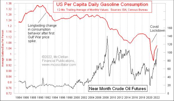
The change in consumption over time starts to look even more dramatic when we adjust for population growth in the U.S. Here is a chart showing the per capita daily gasoline consumption. I used a 12-month moving average to smooth out the annual seasonality.

The raw gasoline consumption rate for the entire U.S. peaked back in 2005. But on a per capita basis, the peak was in 1990. The doubling of oil prices that year when Iraq invaded Kuwait seems to have triggered the start of a long downward trend in the consumption data, as U.S. drivers modified their driving habits, switched to more fuel-efficient cars and now, more recently, have moved to a small degree into rechargeable electric cars.
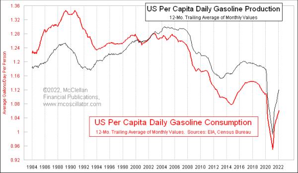
One final point worth noting from the EIA data is that U.S. refiners are actually producing surpluses of gasoline, over and above what Americans use. The excess gets exported.

It used to be that the U.S. imported not only some of the crude oil that we use, but also refined gasoline. That began to change in the early 2000s, and now the U.S. is a net exporter of gasoline. This is due in part to the advantage the U.S. has in terms of cheaper natural gas prices, which helps bring down the cost of the distillation and refining processes. The production is still not back to the levels of a few years ago, in part because some refineries have been idled. Bloomberg reported this week that the White House is reaching out to oil companies to see about whether some of those mothballed refineries can get back into production again.
The March 2022 single-month reading for total U.S. gasoline consumption of 344 million gallons per day was just a hair above the 343 million gallons a day in March 2021, a year earlier. So we may soon be seeing U.S. consumption start to roll over, as the high oil prices start to bite and Americans get convinced to conserve even more.
|
| READ ONLINE → |
|
|
|
| MORE ARTICLES → |
|
 Chart 1
 Chart 2
 Chart 3
 Chart 4


 There are two commodity ETFs with falling wedge patterns working. One falling wedge resulted in a deep pullback and the other in a shallow pullback. Either way, I view these falling wedges as corrections within uptrends and am watching for breakouts. This article will look at the deep pullback in the Palladium ETF (PALL).


 I will attempt to show that high sigma is a much more frequent event than modern finance thinks it is. A few examples using the Dow Industrials back to 1885 on a daily basis are shown. Each begins with determining a look-back period to determine the average daily return and the standard deviation, and then a look-forward period is determined to see if the look-back data continues into the look-forward data. Figure A is an attempt to help visualize this process. A look-back period is determined (in-sample data) and a look-forward period is also determined (out-of-sample data). The look-back period is used to determine the average daily return and the standard deviation of returns. From that data, a range of three sigma about the mean is determined. Then in the look-forward data, the number of daily returns outside the +/- three sigma band are tallied with the total being displaying as a plot; any point on the plot represents the data used in the look-back and the look-forward periods.
 Table A - Table Showing data in Chart A
 Chart A - Five Year Look-back and Five Year Look-Forward Days outside +/- 3 Sigma
 Chart B - Five Year Look-back and One Year Look-Forward Days outside +/- 3 Sigma
 Chart C - Twenty Year Look-back and One Year Look-Forward Days outside +/- 3 Sigma