The Canadian Technician March 26, 2013 at 09:06 AM
I've been nagging about how weak the commodities have been for a while. Some serious price levels are on the charts. It's timely to review the big picture. My personal list of the major commodity countries are Australia, Brazil, Canada and Russia... Read More
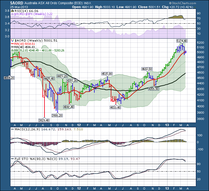
The Canadian Technician March 25, 2013 at 08:36 AM
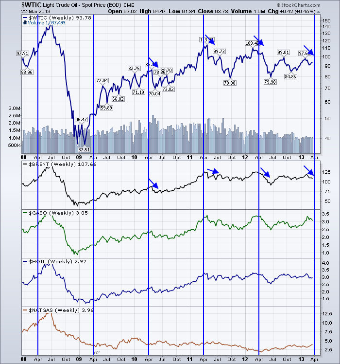
As we sit here on the Equinox weekend for 2013, its time to look at the behaviour of black gold. We have multiple ways to look at crude. We can do the futures curve. We can do the spot price. We can do $BRENT. We can do $GASO. What we can not do is ignore the data... Read More
The Canadian Technician March 21, 2013 at 05:38 AM
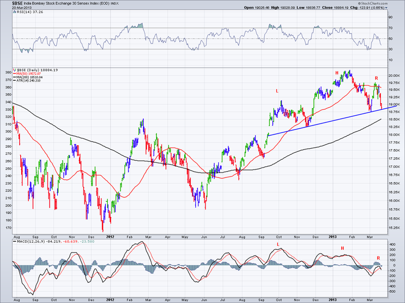
The other day I posted a red/green chart of the stock indexes above the 20 Month Moving Average. I noted that 3 of the 4 BRIC countries had fallen below the 20 Month MA level. Shanghai (China), Russia and Brazil... Read More
The Canadian Technician March 19, 2013 at 02:54 PM
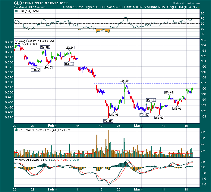
Lets look at 3 charts: Here is Gold. We will use GLD as I can get 60 minute data to compare to the GDX 60 minute chart below. Notice how it has broken above 11 day highs. Back in January February it was not able to break out above the $163.04... Read More
The Canadian Technician March 18, 2013 at 02:08 PM
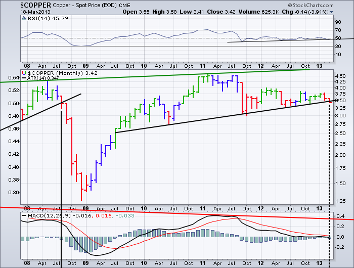
Today I want to review two charts. First is Copper. The chart below is a MONTHLY chart. This support area is critical. The huge gap down on a daily chart puts $COPPER on notice as breaking a huge 4 year Head/Shoulders Pattern... Read More
The Canadian Technician March 14, 2013 at 03:21 PM
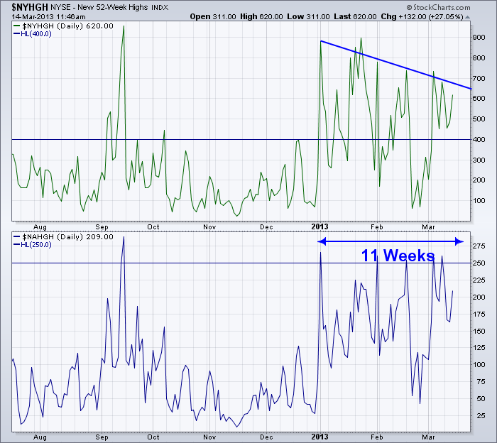
Here is the chart of the Nasdaq and NYSE New 52 Week Highs. Since January 1, we have had a surge of new highs. I have marked up the charts with a couple of pieces of information. 1) The Horizontal lines at 400 and 250 are interesting levels on a long term basis... Read More
The Canadian Technician March 12, 2013 at 11:19 AM
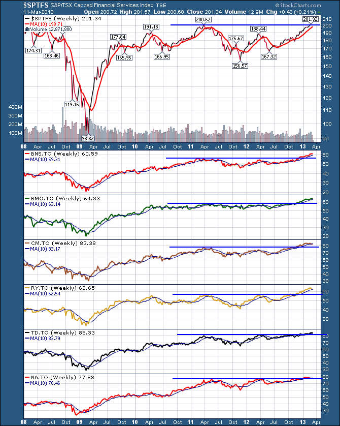
The $TSX is really an interesting study these days. The defensive sector charts are outperforming and the commodity sector charts look terrible. I focus on the commodities but here is the bank sector. NICE! All of the banks have broken out to 5 year highs... Read More
The Canadian Technician March 08, 2013 at 02:23 PM
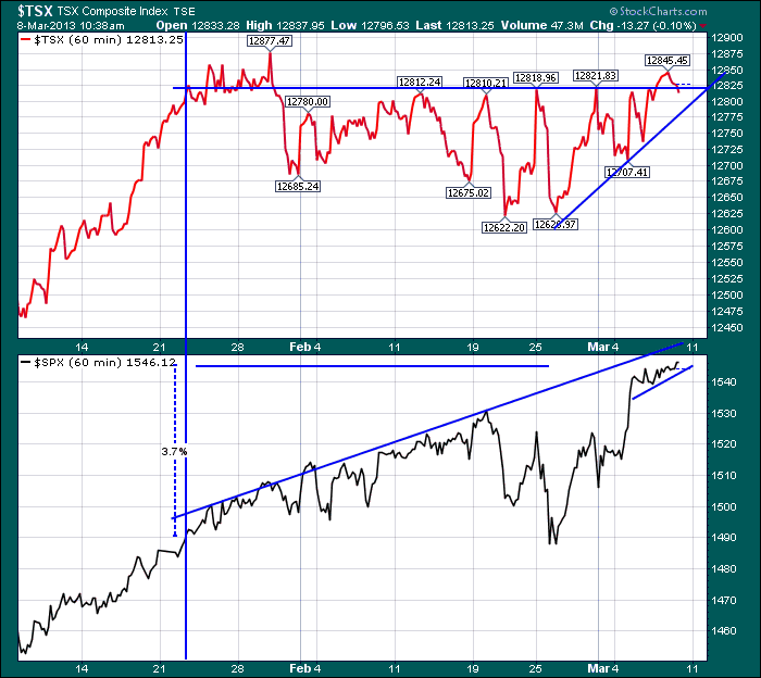
One of these things is not like the other. Looks like the Canadian market has been sitting in Tim Horton's for a coffee break, but the US market has been drinking Red Bull for the morning shot. The charts below all have different number of dates... Read More
The Canadian Technician March 07, 2013 at 05:03 AM
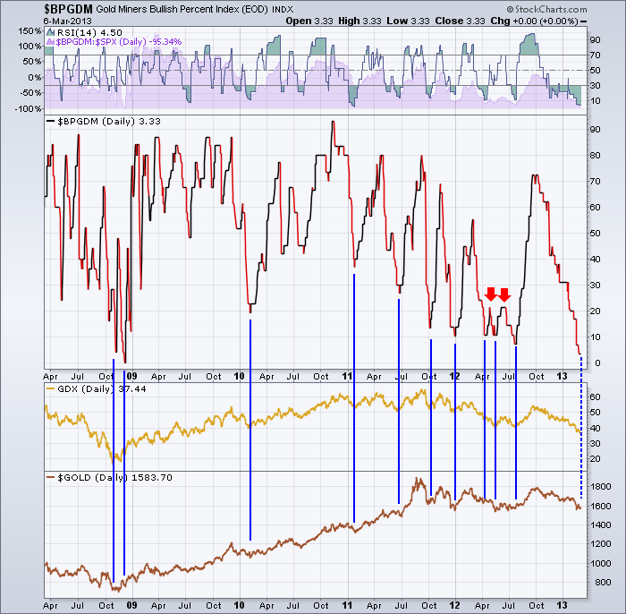
One of the more interesting indexes that Stockcharts creates is the Bullish Percent Index. For more information from the Chart School click on this Bullish Percent Link... Read More
The Canadian Technician March 03, 2013 at 04:01 AM
Over and over, the lesson in the markets is "Don't Fight The Major Trend". Over and over, technicians keep watch for a change in the major trend. The reason that stays true, is by the time the major trend is so obvious, the technicians are looking for the next one... Read More
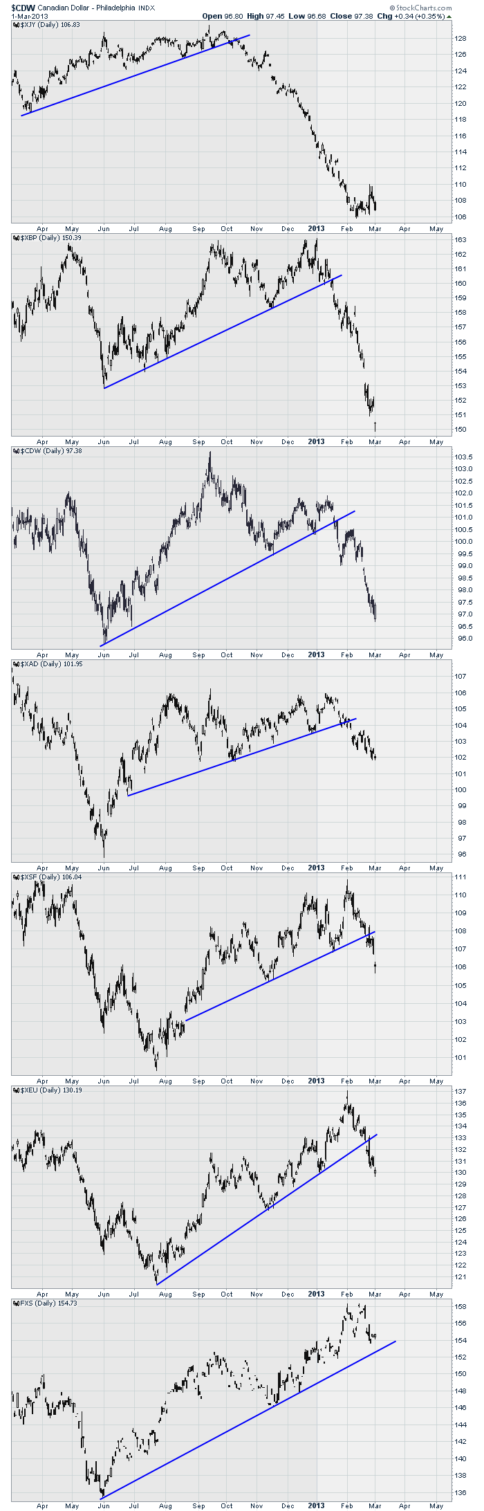
The Canadian Technician March 01, 2013 at 05:10 AM
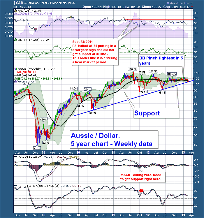
Here is the Aussie Dollar Chart. Does it remind you of the Yen chart and the Canadian Dollar Chart at inflection points just a few months earlier? See my Wiley E. Coyote Blog if you missed them. The Australian Dollar just lost both the 40 WMA and the 10 WMA... Read More