|
|
Here's a hint: Nothing.
If there is anyone out there that wants to use Donchian Bands on their charts, they can just use the "Price Channel" overlay - it is the same thing.
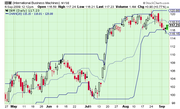
Donchian Bands consist of three lines that overlay a price chart. The upper line represents the highest high during the specified period of time. The lower line represents to lowest low during that same time. The middle line is the vertical mid-point between the upper and lower lines.
That description is identical to the "Price Channels" overlay that you'll find on our SharpCharts. Here's an example:


