|
|
Here's an article from back in 2010 that is just as relevant today as it was back then. Enjoy! - Chip
As we try to roll out recent improvements to our site, we are getting some feedback from users that we did not expect. Basically, some users are reporting that they prefer the pop-up version of ChartNotes because it is in a bigger window than what their web browser can show them.
While I understand and sympathize with this perspective to a certain degree, I also need to clarify that we - and the rest of the web - are moving quickly towards a model where you manipulate your charts from entirely within the regular web page - not from inside a popup window. It will take us a while to get there, but that is the long-term direction.
Given that long-term direction, the real issue here is "How can I see more of my chart and the SharpCharts workbench on my screen?" Or, more generally, "How can I get more useful information from any web site onto my screen?"
VERTICAL PIXELS ARE THE KEY
The vast majority of computer displays out there have more dots (pixels) horizontally than they do vertically. That's unfortunate because many charts (and web pages in general) are taller than they are wide. This fact means that vertical pixels are precious and should only be "spent" if absolutely necessary. The more vertical pixels you can use for web browsing, the more useful information you will typically see on your screen.
If you are serious about charting stocks, you really need to spend some time on setting up your computer display so that it maximizes the useful space on your screen. I'm going to show you a couple of ways to do that which you might be unaware of. Some are easier than others - and the best one is very simple - but they are all worth looking into and can potentially revolutionize how you use your computer.
First, I'm going to talk about configuring your computer screen itself, then I'll talk about optimizing your web browser's display. While this post is a little long, if you stick with it I'm willing to bet that at least one of these suggestions will improve your ability to view our charts.
USING THE CORRECT SCREEN RESOLUTION
Many people have their screen resolution set incorrectly. Serious chart watchers want their screen resolution set as high as their computer supports. To find out what your current screen resolution is set to you can visit http://www.whatismyscreenresolution.com.
Currently, our website is designed to be used effectively by computers with screen resolutions of 1024 by 768 or higher.
To increase your screen resolution, click on one of the following links and follow the instructions:
- Windows XP: Video version Text version
- Windows Vista: Video version Text version
- Windows 7: Video version Text version
- Mac OSX: Text version
By definition, increasing your screen resolution will decrease the physical size of items on your screen - your computer is displaying more dots in the same physical space, thus the size of each dot must get smaller and thus many things (such as text) will appear smaller. If, after increasing your screen resolution, things are too small for your taste, there are three things you can do:
- Increase size of the fonts that your program uses -
Look for items like "View", "Font Size" or "Zoom" in the program menus. - Get a larger computer monitor -
Don't rule this out too quickly. High quality 24" monitors are now selling for as little as US$189. Isn't better charting worth that cost? - Switch back to a lower resolution -
There might be an intermediate resolution that works better for you and is still an improvement over your original setting.
OPTIMIZING YOUR BROWSER'S DISPLAY
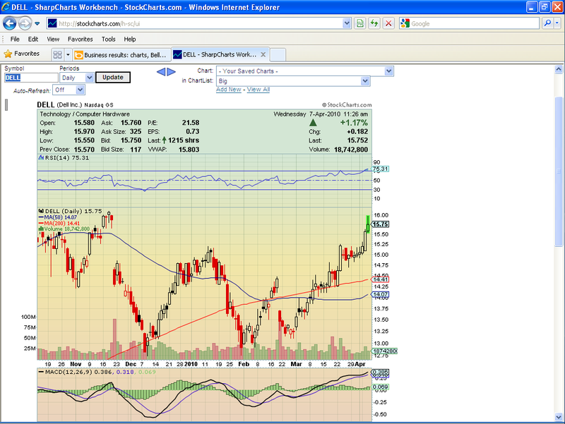
Now that your screen is set to the highest screen resolution you are comfortable with, we need to make sure that we are "spending" those valuable vertical pixels wisely. Here is a screenshot that is similar to what we frequently see from some of our users:
This screenshot shows Internet Explorer 8 running in a maximized window on a 1024 x 768 display. Look familiar?
The good news is that the window is maximized. Real ChartWatchers usually use maximized windows to view their charts. The bad news is that there is way too much vertical space "spent" on browser buttons and toolbars. Of the 768 vertical pixels available on the screen, only 433 are being used to display the web page! That means that the web browser and its add-ons are permanently taking almost 50% of the available vertical space here.
Let me be clear - you cannot do any kind of serious chart analysis with this kind of set up and we are not going to design our website to accommodate this kind of configuration.
Obviously, in situations like this, a pop-up annotation window will work better than an in-page annotation tool, but again, that misses the point. The point is to get all of that junk out of your way so you are see as much of the charting page as possible!
There are two solutions here - one that's super easy and one that's harder at first but better in the long run.
Solution #1: Press F11
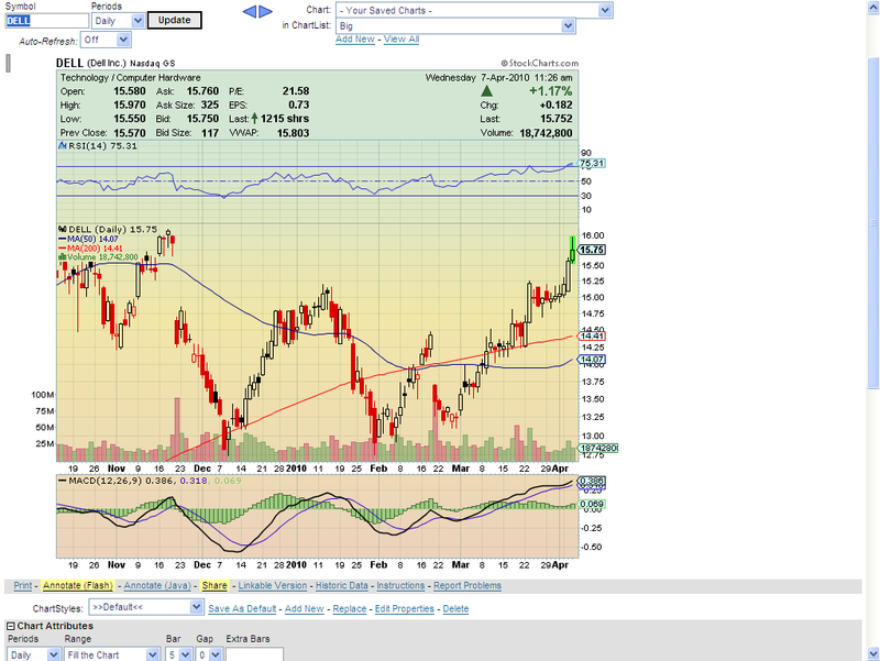
On a Windows computer, pressing the F11 key puts both IE8 and Firefox into what is called "Full Screen mode." In full screen mode, ALL of your vertical pixels are used to display web content. All of those toolbars and menus and buttons and JUNK disappears and you are left with a wonderfully clean web page to look at and use. Here's an example:
Compare the amount of chart that we can see in this screenshot with the previous one.
THE TRICK IS TO REMEMBER TO PRESS F11 AGAIN WHEN YOU WANT TO LEAVE.
If you take away one thing from this post, hopefully it will be to use F11 when working with our charts. (On a Mac, use the "Command-Shift-F" keystroke.)
Solution #2: Spring Cleaning!
"Do you really need it?" I'll give you a hint - the answer is "No" - especially when it comes to browser toolbars. They rarely give you something that your browser doesn't already provide and they eat way too many vertical pixels. The toolbars that come with the browsers are bad enough but the third party toolbars are downright criminal. Unless you are 100% sure that you need a toolbar, remove it. Even if you think you need it, remove it anyway and see if you can live without it for a day. If you survive, don't look back.
With just a little effort, I was able to get the top screenshot looking like this:
That's now up to almost 90% of the screen being used for actual web content! Even so, I still have a search box. I still have tabbed windows. I still have my favorites (as a popup menu under the "Favorites" button). I put my Windows taskbar on "Auto-Hide" and it will popup when I move my mouse to the bottom of the screen. Frankly, I could probably remove the menu bar and not miss it too much - right-clicking gives me access to most things.
Most of this was accomplished by turning thing off using IE's "View/Toolbars" and "View/Explorer Bars" commands. Firefox users can do similar things with its "View/Toolbars" command. (To auto-hide the Windows taskbar, right-click on it and select "Properties".)
CONCLUSION
The payoff for freeing up your screen may be subtle at first, but it will grow over time. Cherish your vertical pixels and only "spend" them when absolutely necessary. It will greatly improve your web experience not only on StockCharts, but on almost every other web site you visit.
- Chip


Posted by: Arturo E. Alvarado April 07, 2010 at 11:43 AM
Posted by: Kevin M April 08, 2010 at 12:10 PM
Posted by: Ken Wilson April 08, 2010 at 12:48 PM
Posted by: James P hartman April 10, 2010 at 08:57 AM