|
|
(Here's a repeat of an article I wrote in 2010. The information is still relevant today - and the controversy still rages... - Chip)
Yesterday, we received a question about our Detrended Price Oscillator (DPO) calculations. The reader wanted to know why our DPO values for SPY where completely different from the DPO values provided to him by two competing websites - FreeStockCharts.com and VectorVest.
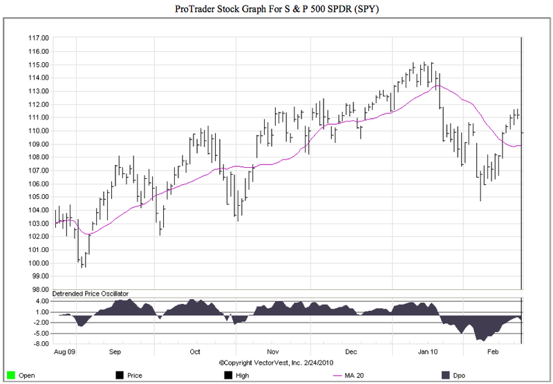
The reader was nice enough to provide pictures of the charts he was looking at and sure enough the DPO values were very different from ours. Not only that, but the entire indicator line looked completely wrong.
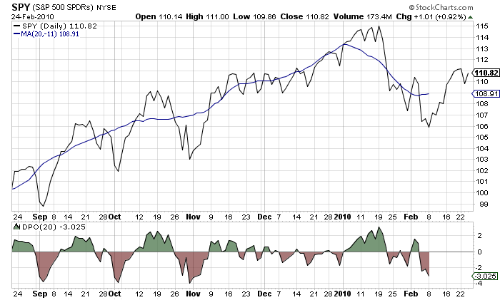
Here's our chart of SPY with the 20-period DPO:
and here's the VectorVest one:

(The FreeStockCharts.com chart was very similar to the VectorVest one.)
As you can see, from mid-November until mid-January, the VectorVest DPO line doesn't drop below the zero line which, in contrast, our DPO line is constantly jumping above and below zero. What is going on?
As veteran ChartWatchers know, our "Bible" for indicator calculations is the book "Technical Analysis from A to Z" by Stephen Achiles, the founder of Equis, the company behind the popular desktop charting program "MetaStock." Stephen's book is also online - click here to see his entry for the DPO.
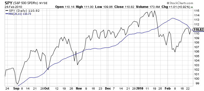
Basically, Achiles calculates the DPO by taking a Simple Moving Average (SMA) with the specified parameter (20 in this case), shifting that SMA to the LEFT by the parameter divided by 2 + 1 (i.e., 11) periods, and then subtracting the shifted SMA's value from the stock's closing price.
You can look back up at the first chart in this article to see the relationship between SPY, the left-shifted SMA and the DPO.
Using that definition, there should always be some (11 in this case) missing bars on the right edge of the chart because the SMA was shifted to the LEFT and is thus undefined for the last 11 periods. You can clearly see that gap in the chart that accompanies Achiles' online DPO article.
The fact that the VectorVest chart has a DPO that extends all the way to the right edge of the chart was suspicious to us. On a hunch, we tried shifting the SMA to the RIGHT instead of the left and got the following chart:

Now, you have to use your imagination somewhat but if you mentally "flatten" the blue line and look at the difference between that blue line and the black price line, you'll notice that it matches the DPO line on the VectorVest chart.
So that explains what is going on - they are shifting the MA line in the wrong direction - but it doesn't explain "Why?" Both VectorVest and Warden Brothers (the folks behind FreeStockCharts.com) have been around for many years. Why are their DPO calculations wrong?
After doing more research, the best explanation we could find was provided in the Worden Brothers website on this forum thread. Towards the end of that thread, they state that the DPO formula is "controversial" and that there are "serveral ways to calculate the DPO."
We don't agree with that statement. Here's why:

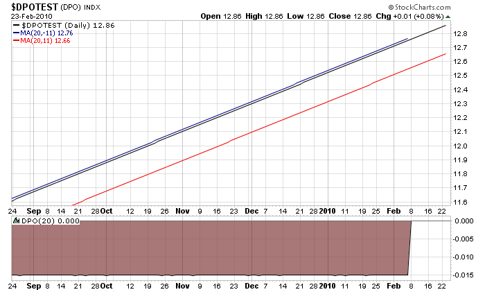
This is a chart of a fake symbol we just created called $DPOTEST (the black line on the chart). The values for that symbol increase by $0.01 every day which means that it is in a constant uptrend. Conceptually, if you "detrend" this symbol, you should get a horizontal line that is at (or really close to) zero.
The blue line on that chart is a 20-period SMA that has been shifted to the left by 11 periods. The red line is a 20-period SMA that has been shifted to the right by 11 periods. Clearly the blue line is much closer to the stock's black price line. Thus a DPO calculated from the blue line will be much closer to zero than one calculated from the red line. Therefore we believe that shifting the Moving Average to the LEFT like Achelis advocates is the correct thing to do.
We can only speculate that shifting to the right was done to eliminate the gap between the end of the DPO and the right edge of the chart. While that gap is problematic for active traders, completely changing the calculation is not the solution in our opinion. If you must get rid of the gap, we suggest shifting the entire DPO itself to the right by 11 positions by using "20,11" as the DPO parameter.
We welcome any feedback on this issue.


Posted by: Kip Lubcke February 25, 2010 at 12:57 PM
Posted by: Gord Greer September 13, 2012 at 09:25 AM