Don't Ignore This Chart! February 25, 2009 at 11:09 PM

Click here for a live version of this chart. Apple has been bouncing around $90 since October. Is that support going to hold? One way to gauge the strength of a support level is to use the "Vol by Price" overlay - the horizontal histogram on the left side of this chart... Read More
Don't Ignore This Chart! February 23, 2009 at 10:50 PM
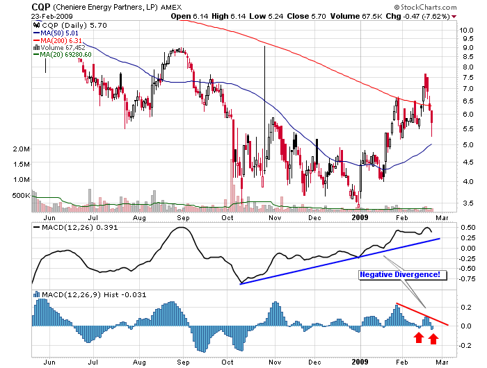
Click here for a live version of this chart. The MACD Histogram shows the change in momentum of the MACD Line. The MACD Line - in turn - shows the change of momentum in the underlying stock... Read More
Don't Ignore This Chart! February 19, 2009 at 10:52 PM
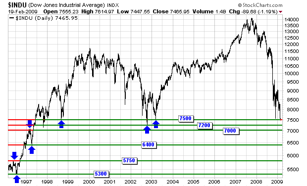
Click here for a live version of this chart. Today the Dow Jones Industrials closed below its 6 year low just under 7500. What's the next important support level? What's the one below that? (and, gulp, the one below that?) Here you go... Read More
Don't Ignore This Chart! February 19, 2009 at 12:57 AM
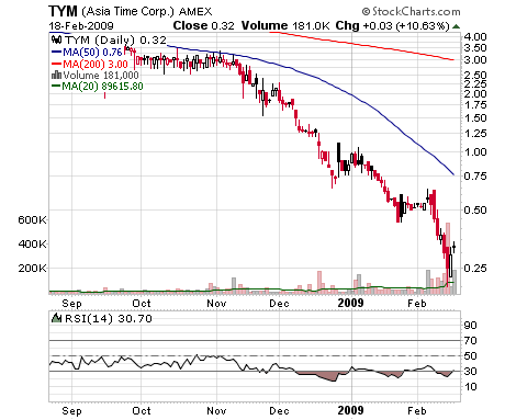
Click here for a live version of this chart. Trying to catch a "falling knife" like Asia Time (TYM) is extremely risky in any market. Doing it in today's market is pure folly. And yet..... Read More
Don't Ignore This Chart! February 18, 2009 at 12:45 AM
Click here for a live version of this chart. Based on the statistical concept of Standard Deviations, Bollinger Bands graphically illustrate how "far away" prices are from their "average" value. Traditionally, 2... Read More
Don't Ignore This Chart! February 13, 2009 at 04:00 PM
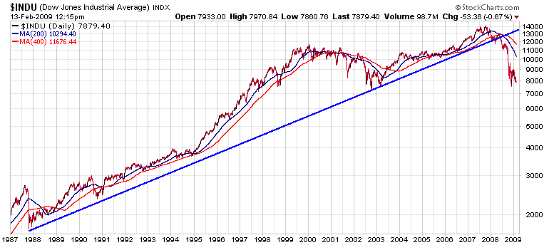
How bad is it? How big was the Internet bubble? How does the current decline compare to the 1987 crash? It's all here in black and white (and red and blue)... Read More
Don't Ignore This Chart! February 12, 2009 at 08:46 PM
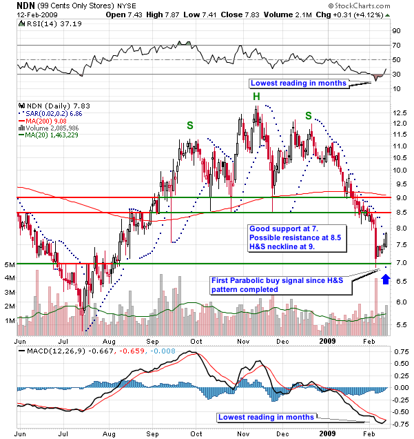
NDN has been falling after completing a classic Head & Shoulders chart pattern back in January. Today was the first set of positive technical signals for the stock in quite a while - a bullish MACD crossover, a rising RSI line and a bullish Parabolic SAR signal... Read More
Don't Ignore This Chart! February 10, 2009 at 10:29 PM
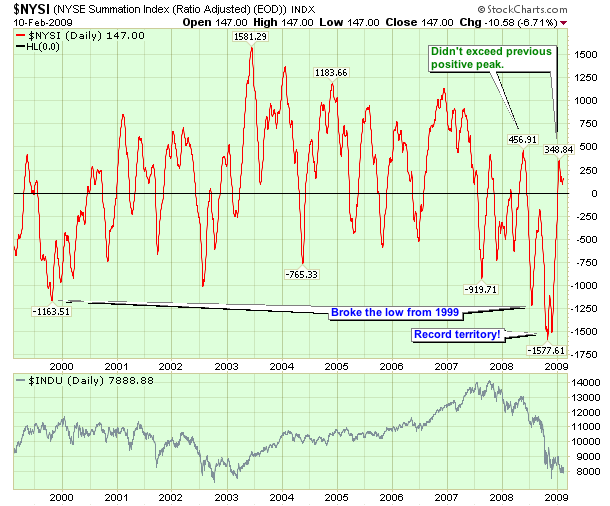
Click here for a live version of this chart. The McClellan Summation Index is a great market indicator that recently set some all-time record lows back at the end of last year... Read More
Don't Ignore This Chart! February 10, 2009 at 03:10 AM
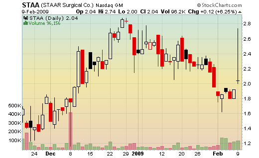
STAA put in a huge Doji on its daily chart today. Technically, a doji is a candlestick where the open and the close are the same. The huge upper shadow and relatively small lower candle makes STAA's Doji especially striking... Read More
Don't Ignore This Chart! February 06, 2009 at 09:11 PM
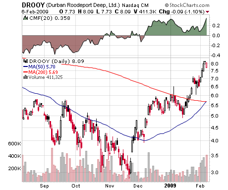
(Click here for a live version of this chart.) Durban Roodeport Deep (DROOY) is a major gold mining company in South Africa. Their stock jumped in late November generating a "buy" signal from the standard 20-day Chaiken Money Flow (CMF) in early December... Read More
Don't Ignore This Chart! February 05, 2009 at 10:49 PM
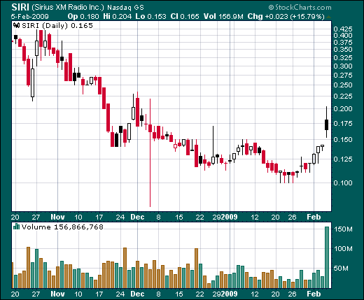
( Click here for a live version of this chart.) SIRI gapped up on the open and moved higher from there today on strong volume. Very nice turnaround play with resistance at 0.225. When a stock that is already in an uptrend gaps up like this, it is called a "Runaway Gap... Read More
Don't Ignore This Chart! February 04, 2009 at 11:05 PM
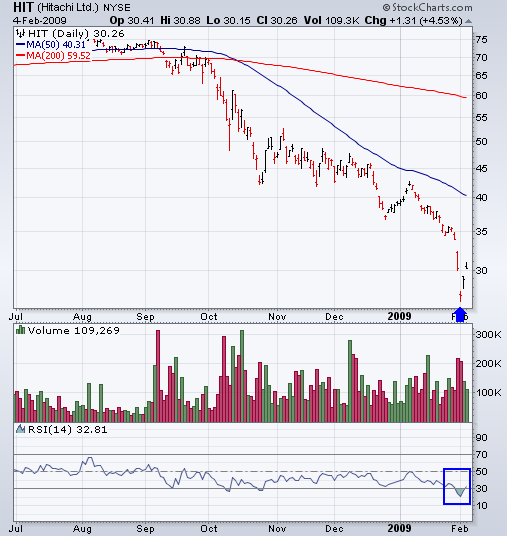
( Click here for a live version of this chart.) Hitachi's RSI indicator moved back above 30 today after sinking down around 20 two days ago. This big jump indicates that an important rebound is underway and has a good chance of continuing at least until the RSI crosses 50 again... Read More
Don't Ignore This Chart! February 04, 2009 at 04:28 AM
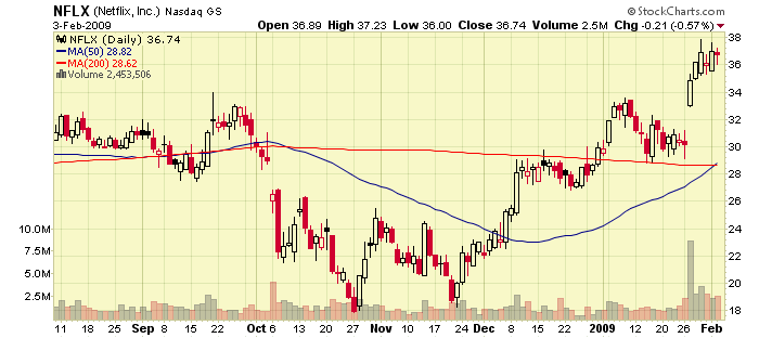
The 50-day Simple Moving Average for NetFlix moved above the 200-day Simple Moving Average today in a very convincing manner confirming the stock's gains over the past couple of days... Read More
Don't Ignore This Chart! February 03, 2009 at 02:26 AM
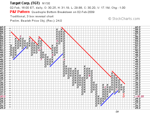
( Click here to see a live version of this chart.) Target Corp's Point and Figure chart broke below the bottom of the Quadruple Bottom Pattern that it had put in over the past 5 weeks. See the 4 "O's" in the boxes at 32? Those "O's" formed the bottom of the pattern... Read More