MailBag March 30, 2012 at 06:39 AM
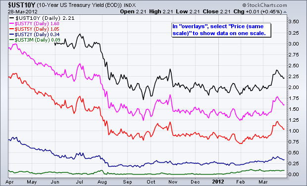
SharpCharts users can use the “Price (same scale)” feature to shows different securities on one scale. This works best for securities that are based on the same scale, such as interest rates or the Bullish Percent Indices. The chart below shows five different US treasury yields on the same scale, which ranges from 0 to 3.5%. As expected, the 10-year Treasury Yield ($UST10Y) has the highest yield, while the 3-month Treasury Yield ($UST3M) has the lowest. Also notice how the yields get progressively higher as the maturity increases. Click “continue reading” to see a table with the treasury Read More
MailBag March 23, 2012 at 12:09 PM
Chartists can follow commodities using ETFs/ETNs, spot prices or special indices. Spot prices, which represent the “real McCoy”, are clearly the purest way to follow a commodity. ETFs and ETNs can be good trading vehicles, but some have serious drawbacks, especially over the long-term. ETFs and ETNs backed by the physical commodity, such as the Gold SPDR (GLD), track the price of gold quite well. ETFs and ETNs composed of futures contracts, such as the US Natural Gas Fund (UNG), do not track the underlying commodity so well. It is, therefore, advisable to check on the underlying commodity Read More
MailBag March 16, 2012 at 10:41 AM
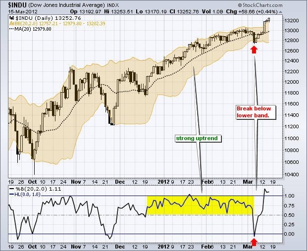
%B reflects the location of the closing price relative to the Bollinger Bands. A %B reading below zero means price closed below the lower Band. A %B above 1 means price closed above the upper band. In this manner, %B can be used in scans to identify securities that have recently broken a Bollinger Band. %B readings between .80 and 1 suggest that prices are near the upper band, while %B readings between .20 and 0 indicate that prices are near the lower band. The chart above shows the Dow Industrials with narrowing Bollinger Bands in early March. After a brief close below the lower band Read More
MailBag March 09, 2012 at 10:08 AM
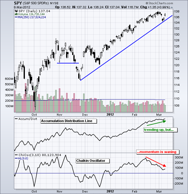
In short, the Chaikin Oscillator measures the momentum of the Accumulation Distribution Line. Developed by Marc Chaikin, this indicator applies the MACD formula to the Accumulation Distribution Line, which makes it an indicator of an indicator. The Chaikin Oscillator is the difference between the 3-day EMA of the Accumulation Distribution Line and the 10-day EMA of the Accumulation Distribution Line. The indicator is positive when the 3-day EMA is above the 10-day EMA and negative otherwise. Like other momentum indicators, this indicator is designed to anticipate directional changes in Read More
MailBag March 02, 2012 at 11:14 AM
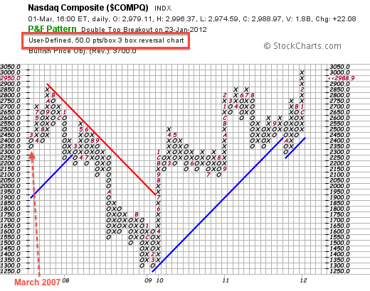
Because Point & Figure charts are based on price movements and do not take time into consideration, chartist must change the box size or reversal amount to adjust the lookback period. X-Columns reflect rising prices, while O-Columns reflect falling prices. Each box represents a specific value and the columns reversal when there is directional price change of at least three boxes. The higher the box value, the bigger the price movement required for a column extension or reversal. The chart below shows the Nasdaq Point & Figure chart based on 50-point boxes and a 3-box reversal Read More