MailBag February 24, 2012 at 10:54 AM
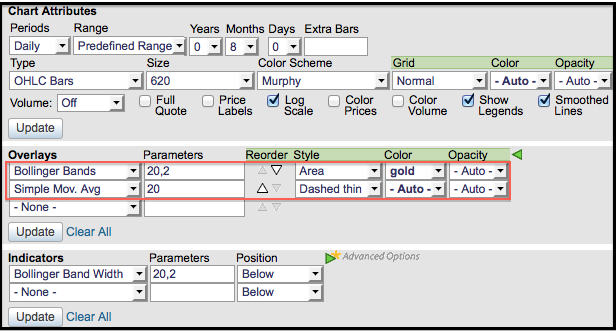
Bollinger Bands can be plotted as a normal indicator with simple lines for the upper and lower bands. SharpCharts users can enhance these bands by choosing “area” as the indicator style. This will shade the area between the two bands in the color of your choice. Sometimes the 20-day SMA, which is the middle band, is hard to see with the shading. Users can then choose a different color to make it stand out. The “area” style can also be used with Moving Average Envelopes, Keltner Channels and Price Channels. The chart below shows Goodyear Tire & Rubber (GT) walking down the lower band Read More
MailBag February 17, 2012 at 09:13 AM
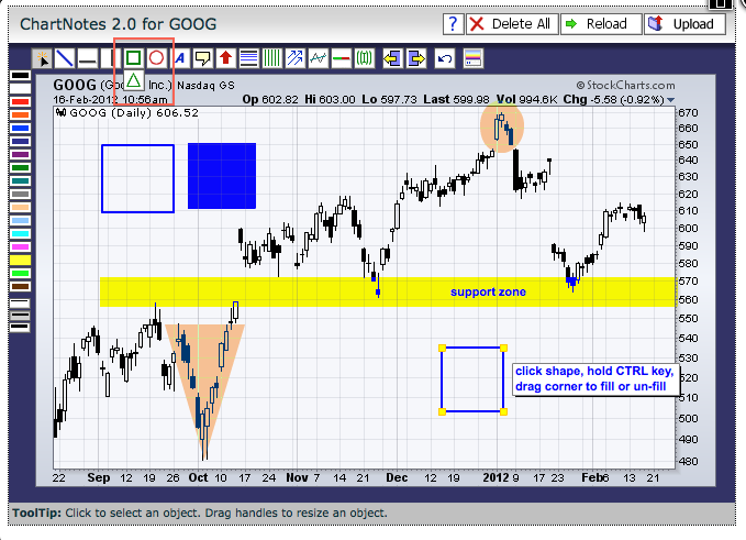
Before explaining the details, note that all the features available on the ChartNotes Annotation Tool can be found on our support page under “How to Use Our Charting Tools”. No need to go there just yet because I will explain the process. Keep this in mind to answer future questions. A shaded area can be created by using the square, circle or triangle features in the drawing tool bar at the top of the Annotations Page. Note that the triangle feature is located behind the square. Here are the steps: 1. Select the appropriate shape with a left mouse click2. Select a color with a left mouse Read More
MailBag February 10, 2012 at 10:54 AM
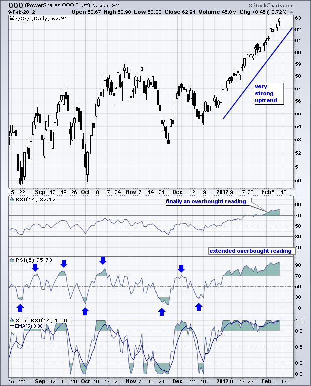
Momentum oscillators can be used to identify overbought and oversold conditions in stocks and other securities. However, some momentum oscillators do not reach extremes during strong trends. For example, RSI is a great momentum oscillator, but it does not always reach overbought or oversold levels when used with the default settings (14 periods). Chartists can increase the sensitivity by decreasing the number of periods. 5-period RSI, for example, will reach overbought and oversold levels more often than a 14-period RSI. The chart above shows the Nasdaq 100 ETF (QQQ) with RSI(14) never Read More
MailBag February 03, 2012 at 10:22 AM
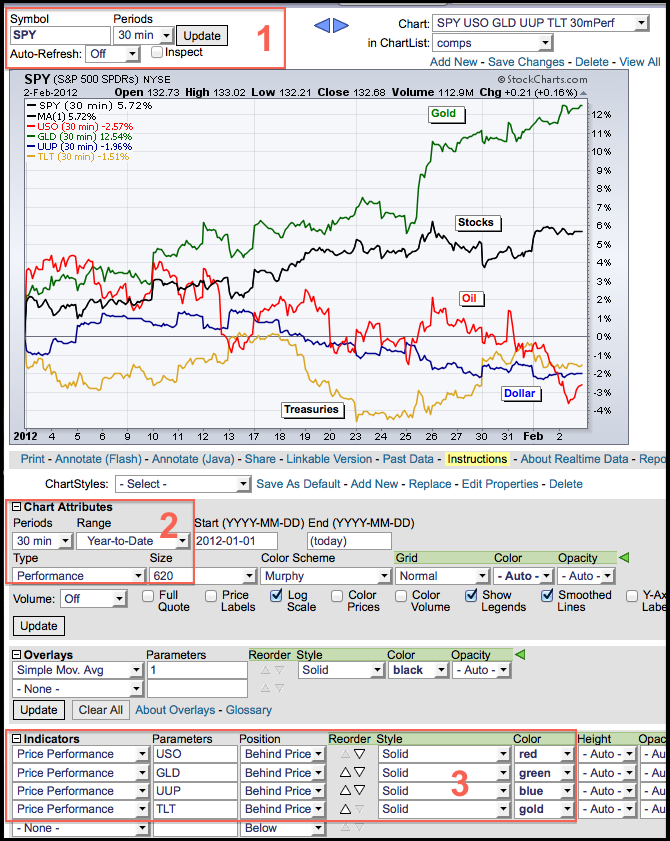
Performance charts can be created with SharpCharts using “Performance” as the chart type and “Price Performance” as an indicator. For the first steps, enter a symbol, select the periods and then choose “Performance” under chart attributes/type. In the example below, I entered SPY and it will show in the main window. Second, go to “Chart Attributes” and choose the intraday period of choice, the date “Range” and the “Type”. In this example, I choose a 30 minute line chart that shows the year-to-date performance, which is the percentage change since December 31st. The remaining securities Read More