|
|
Chartists can use Renko, Kagi and Three-Line Break charts to reduce noise and volatility on a price chart. Like P&F charts, these three charting styles focus exclusively on price moves and ignore time. This means the X axis (time) will not be uniform. All three techniques come from Japan and are featured in Steven Nison's book, Beyond Candlesticks.
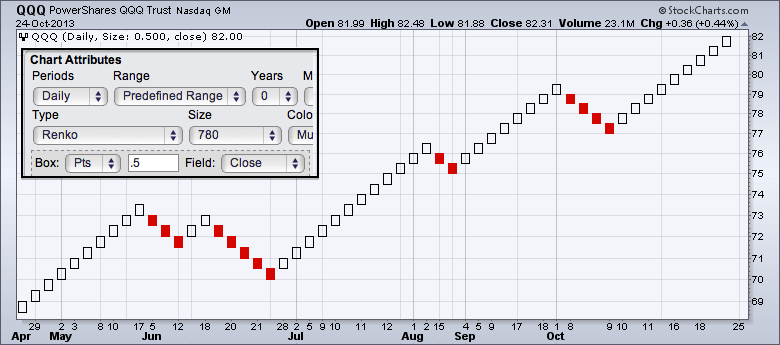
The first chart shows a Renko plot for the Nasdaq 100 ETF (QQQ). The word "Renko" comes from "Renga", the Japanese word for "brick". The filled and hollow squares that make up a Renko chart are often referred to as bricks. Notice how the bricks simply extend during strong trends. This Renko plot is based on closing prices. Chartists looking for more detail can choose the high-low range.
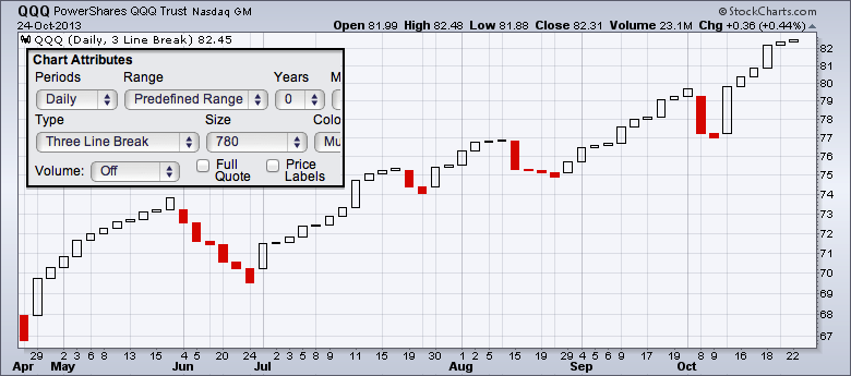
The second chart shows three Line Break charts for QQQ. The white lines represent rising prices, while red lines portray falling prices. Prices continue in the same direction until a reversal is warranted. A reversal occurs when the closing price exceeds the high or low of the prior two lines.
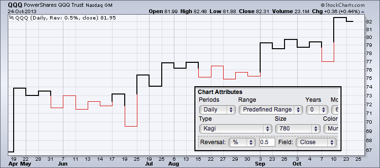
The third chart shows a Kagi price plot with thick and thin vertical lines connected by short horizontal lines. Just like P&F charts, Kagi charts only add a new vertical line when prices have reversed enough to cancel the current uptrend or downtrend. Until such a reversal occurs, a Kagi chart will only move up (or down) in its current column. You can also read more about these charting styles in our ChartSchool.


Posted by: Chris Pritchard October 27, 2013 at 14:21 PM