|
|
Chartists can show the performance for several symbols on one SharpChart by entering a comma-separated list (spy,xly,xlk,xli,xlf). Note that free users can chart up to five symbols on one chart, Basic and Extra members can chart up to six symbols and Pro members can chart up to ten symbols. Click here to see the different subscription packages.
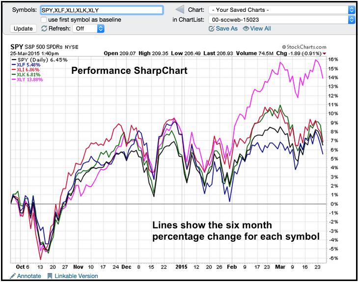
Simply enter these symbols in the symbol entry box and click go to create a performance SharpChart. The example below shows the performance for SPY and four sector SPDRs over the last six months. All five are up, but one is clearly up more than the others. The Consumer Discretionary SPDR (pink) is up over 13% and the clear leader. The Finance SPDR (XLF) is up less than 5% and the clear laggard. SPY is up around 6.5%.
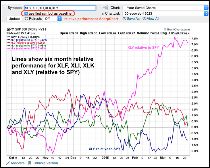
Chartists can also create a relative performance chart by checking the box at the top left to set the first symbol as the benchmark. In this example, SPY is the benchmark and the chart shows relative performance for the four SPDRs. Relative performance is simply the change in the SPDR less the change in SPY. Relative performance is positive when the SPDR is up more than SPY (relative strength). Relative performance is negative when the SPDR is up less than SPY (relative weakness). In this example, XLY shows the most relative strength and XLF shows relative weakness.


