Hello Fellow ChartWatchers!
We are half-way through 2014 and so far it has been a positive year for stocks with the S&P up 5.5%, the Nasdaq up 3.5% and the Dow up 2.1%. Small-Caps haven't participated nearly as much as their larger counterparts however. The Russell 2000 is only up 0.1% over that same period of time. Utilities is the best performing sector for the first half of the year (up 9% relative to the S&P) with Energy and Health Care also doing well. Consumer Cyclicals is the big loser, underperforming the S&P by over 5% so far this year.
Against that backdrop, StockCharts has also grown significantly during the first half of the year - possibly more than it has since it first debuted back in 1999. Last month, I cataloged 30(!) important new features that have appeared since January 1st. There are now several more things we can add to that impressive list including:
- SMS/Text Message-based Technical Alerts (details)
- A Completely Revamped Historical Chart Gallery (details)
- Four more Market Indicators from Martin Pring (details)
- Our new Facebook page (details)
With all those new features, we've heard that things may be a bit overwhelming now. Where to begin? "Any recommendations, Chip?" Well, yes. Out of all the new things we've added this year, here's my list of Top 5 Things That All StockCharts Users Should Make Sure To Try presented in "Late Night with David Letterman" style:
#5 - Martin Pring's New "Market Roundup" Blog and Videos
Most of us learned more about technical analysis from Martin Pring. His books are legendary and his insights into what is currently driving the markets are invaluable. Martin is now posting his thoughts exclusively on StockCharts.com in his new "Market Roundup" blog area. If you are a member of StockCharts, you really need to subscribe to Martin's posts. (To subscribe, click here, then click on "Email updates" and enter your email address.) His addition to our commentator line-up is a huge gain for all members.
#4 - The DecisionPoint Blog
Our acquistion of DecisionPoint.com earlier this year has resulted in a huge number of new features and the new "DecisionPoint" blog is the thing that ties them all together. Erin and Carl, the team behind DecisionPoint, are now able to post detailed articles about the markets and the various new DP features. This is another blog that you really should subscribe to. Click here to get started.
#3 - The Online version of John Murphy's book "Charting Made Easy"
Here's a great way to save/make $20 for free - just read the new, free on-line version of John Murphy's classic book "Charting Made Easy" which is now part of our ChartSchool area. Click here to get started.
#2 - Our "ChartWatchers" Certification Exam & Study Guide
Now members can double their loyalty discount for life simply by answering a few questions. Sign up, read the study guide and then pass this "open book" quiz. What could be simpler? In addition to becoming a more knowledgeable user, you will also get yearly coupons worth 2% off of your renewal orders for every year you have been a member (as opposed to the 1% per month discount that regular members get). Click here to get started.
and the Number One Thing That All StockCharts User Should Make Sure To Try:
#1 Our Interactive "Ranger" Date Control
Just change the "Range" settings on your chart to "Select Start/Stop" and prepare to be amazed. After making that change, our "Ranger" slider will appear. It's an interactive slider you can use to zoom in and out and change the start and end dates for any chart. Click here for more information on how it works.
or wait... sorry. I've changed my mind. There's just so much to choose from!
and the new Number One Thing That All StockCharts User Should Make Sure To Try:
#1 The DecisionPoint Chart Gallery!
The new DP Chart Gallery is a completely new area of our site that could also be called "The Best of DecisionPoint.com" since it contains just the charts that Carl and Erin cannout live without. They use these charts - and you can too - to quickly determine the health of the markets using their special market indicators and long-term data. The great thing is the page also contains easy-to-understand information about each indicator making it easy to interpret the market's short and intermediate-term direction.
It has been very hard to select just five features that are "the best" - because all of our new features are very exciting including Gatis Roze's "Traders Journal" novella, our $SECTOR/$INDUSTRY symbols, and the new "Top Advisors Corner" newsletter samples to name just a few more), Despite that, the five (six really) features listed above should really help you become a better investor with a minimum of additional work on your part.
Please let me know how it goes,
- Chip
SITE NEWS
RECENT ADDITIONS TO STOCKCHARTS.COM
- LAST CHANCE FOR CHARTCON 2014 EARLY-BIRD PRICING! - Did you know that it normally costs over $2400 to see just one of our ChartCon speakers talk at a non-ChartCon event? Did you know that an upcoming industry conference with a speaker line-up similar to ChartCon's costs over $1600 (and that is their early registration price)? The point here is that ChartCon is a unique bargain. People that have been to previous events will tell you that it is unlike any other investing conference out there. The knowledge you'll gain is practical, useful and plentiful and the people you'll meet are helpful, friendly and just like you.
Do not miss out on this amazing opportunity to hear from an amazing collection of industry titans. We seriously doubt that we'll be able to put together such a wonderful line-up for such a low price ever again.
Register today - now! - and you will still receive our early bird pricing (which, in theory, expired last Wednesday). Register tomorrow and it will cost you $100 more. Do - not- delay. Click here to learn more. We really want to see you in Seattle in August.
.
- ATTENTION FACEBOOK USERS: WE BADLY NEED YOUR HELP! - Please click here and "Like" our new Facebook page! Why? Because three months ago, Facebook shut off our access to our old Facebook account. Despite over 40 messages to them, they have not given us any explanation for that action and we remain unable to update that old page. Of course, Facebook remains a very popular way to communicate with our users, so we have decided (begrudgingly) to create a new Facebook page with a slightly different name and use that page to tell people about our latest updates. Unfortunately, that means we've essentually lost all 60,000+ "Likes" that our old page had. We want them back! If you are a Facebook user, please come visit our new page and click the "Like" button to stay up-to-date with StockCharts. Oh, and please "Unlike" our old page. It's dead to us.
.
- NEW HISTORICAL CHART GALLERY - We have just rolled out our new Historical Chart Gallery for everyone to see. This was quite literally "History in the Making." Our old historical chart gallery was, quite frankly, pretty lame. This new one is much bigger, much more informative and much more exciting. For example, it contains charts of all four of the major markets for every President's term of office going back to Teddy Roosevelt! And we're not done yet either - watch for even more historical charts to appear soon. Click here to see the gallery.
.
- SUBSCRIBE TO YOUR FAVORITE BLOGS - Who is your favorite StockCharts author? Art Hill? Greg Schnell? Martin Pring? Erin Heim? Make sure that you don't miss another one of their articles by subscribing to their blogs! When you subscribe to a blog, we'll send you a short email message everytime another article is added to that blog. It's the perfect way to ensure that you don't miss out on something. To subscribe simply click on the "Blogs" tab at the top of any of our webpages and then select the Blog you are interested in from the dropdown on the right side of the page. Finally, click on the "Email updates" link on the right side of the page and enter your email address. And Presto! You are now a subscriber!
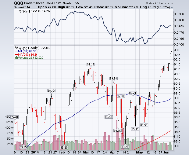
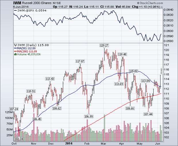
This week's strong chart action in the Nasdaq market and small caps has lent more support to large cap stock indexes that have been setting new record highs. Chart 1 shows Powershares QQQ Trust breaking out to a new recovery high this week. Its relative strength ratio (above chart) has also been rising. Relative weakness in the Nasdaq between February and April had been one of the drags on the rest of the market. The same is true of small caps. Chart 2 shows Russell 2000 iShares (IWM) climbing to a two-month high and ending well above its 50-day moving average. Small caps actually did better than large caps during the week. That's reflected in its relative strength ratio (top of Chart 2) which bounced this week. The RUT/SPX ratio has been stabilizing over the last month after falling sharply from March to May.
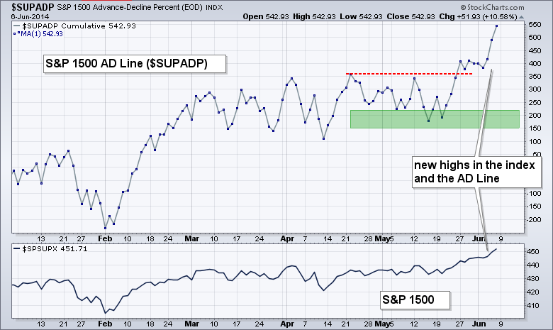
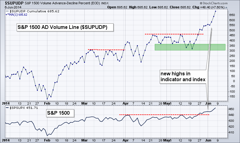
The AD Line and AD Volume Line are aggregate measures of participation. The AD Line favors small and mid-caps because an advance equals +1 and a decline equals -1, regardless of market cap. This means an advance in Apple ($556 billion market cap) counts the same as an advance in Digital River ($475 million market cap). The AD Line is a summation of net advances (advances less declines) for each day. An uptrend in the AD Line indicates broad participation in an advance. In contrast to the AD Line, the AD Volume Line favors large-caps because large stocks usually have the most volume. Apple trades an average of 11.7 million shares per day and Digital River trades an average of 250,000 shares per day. An up day in Apple will count for much more up volume than an up day in Digital River. The AD Volume Line is a summation of net advancing volume, which is advancing volume less declining volume. A new high in the AD Volume Line indicates that more volume (money) is behind advancing issues than declining issues. Put another way, buying pressure is stronger than selling pressure.
Click this image for a live chart
I like to use the AD Line and AD Volume Line for the S&P 1500 because this is a broad-based index that includes the S&P 500, S&P Small-Cap 600 and S&P MidCap 400. It also includes stocks from both the NYSE and the Nasdaq. Breadth indicators for the S&P 1500 combine large-caps, mid-caps and small-caps to give us a picture of the market as a whole. The chart above shows the S&P 1500 AD Line ($SUPADP) moving sideways from early March to mid May and then surging to a new high over the last two weeks. A new high in the AD Line confirms the new high in the underlying index (S&P 1500) and shows broad participation in the advance. There are no signs of underlying weakness in this indicator and there is certainly no negative divergence. The chart below shows the S&P 1500 AD Volume Line ($SUPUDP) breaking out in late May and hitting new highs this week. Confirming highs in both of these indicators affirms the uptrend in stocks and increases the odds that this uptrend will continue.
Click this image for a live chart
Good weekend, good investing and go Novak!
Arthur Hill CMT
Natural Gas ($NATGAS) has been moving higher every week for three weeks now. As we head into the cooling season for air conditioning, it might be timely to stay in tune with the producers of Natural Gas.
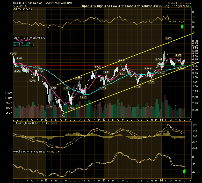
A few things make this particular turn compelling. While the RSI is back above 50 and the long period Full Stochastics have crossed the signal line, there is one more feature on the chart that is compelling.
After having a significant moon shot on the chart in February, the Natural Gas chart pulled back. The best part was it found support at the previous resistance line shown in red and this has now become support - green!
The summer weather forecast I heard this week was for the three coastal regions to have above average heat and the interior like Montana and the Dakotas to have more moderate temperatures. If that is true, then the low inventory levels shown below on Natural Gas makes the story more compelling. The air conditioning draw on Natural Gas can be huge especially if the major population regions are all experiencing higher than average energy use.
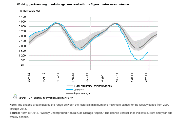
Source: US Energy Information Administration.
We are almost 900 Billion cubic feet under the 5 year average for storage levels, and well behind last years as well. Higher prices will focus the energy sector on drilling for Natural Gas and bringing in online quickly. The above average cooling season demand should help moderate that inventory recovery making the stimulus for Natural Gas production more compelling than normal.
Natural Gas reservoirs deplete quite quickly so it is a consistent challenge to stay ahead of last years production as each year old wells produce less on average. So you need to have new wells coming on stream to stay even and you need to drill lots of new wells to make up a big North America wide inventory shortfall. This should also help the drillers and frackers with demand for their services.
Good trading,
Greg Schnell, CMT
WEEKLY PMO READINGS INSIGHTFUL
by Erin Heim | DecisionPoint.com
In many cases, we all spend a lot of time looking at daily charts and varying indicators. The Price Momentum Oscillator (PMO) using daily, weekly and monthly data to create a unique value for the chart you're looking at. The daily PMO may be reacting quite differently in comparison to the weekly PMO and both can be very different from the weekly PMO.
I spent some time today looking at the weekly charts for many of the indexes, sectors and ETFs that we cover on the DecisionPoint Alert Daily Report. Some of these charts show the PMO either just crossing over or changing directions, which doesn't happen that often on a weekly chart.
Here are few interesting charts.
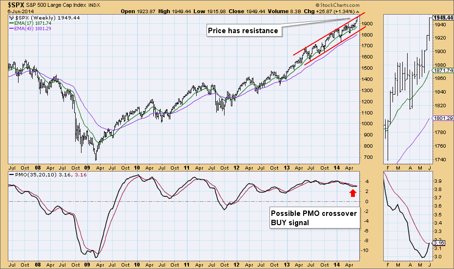
Price just resistance on the weekly chart for the SPX and we have the PMO on its EMA. There probably was a crossover, but we don't have the ability to look at thousandths of a point.
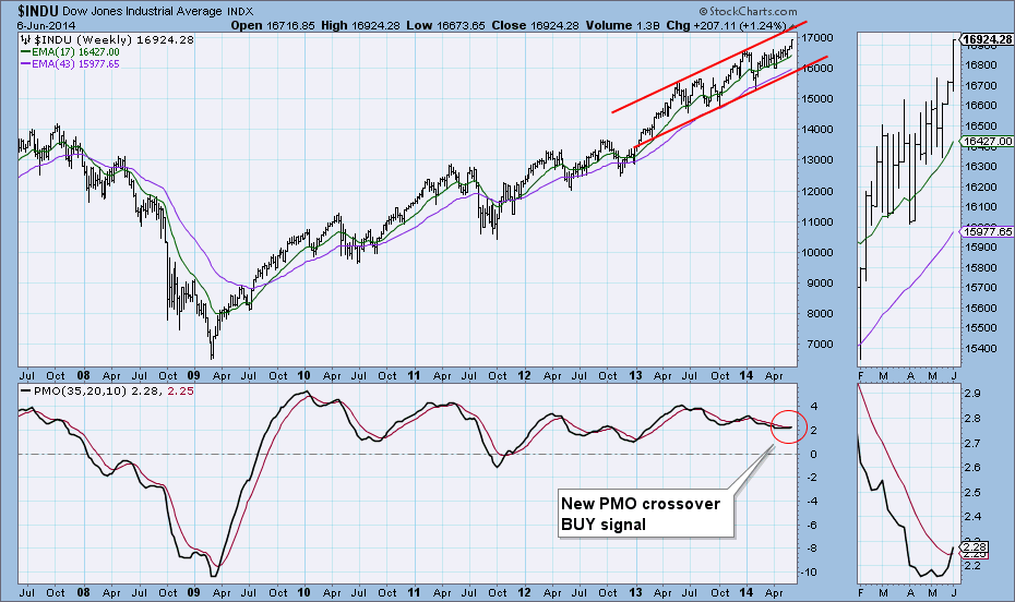
The Dow has room before price hits resistance at the top of the rising trend channel and Friday there was a new PMO crossover BUY signal.
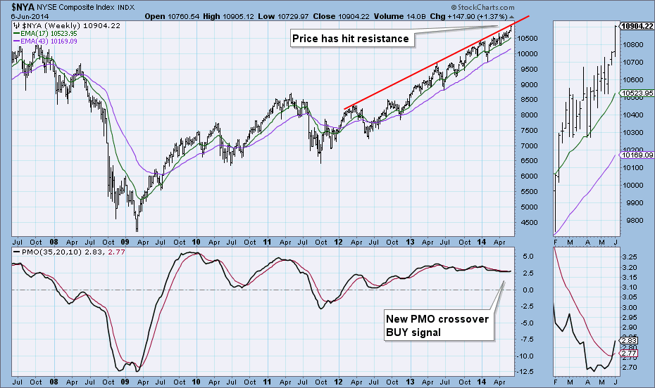
The NYSE Composite weekly chart is similar but price has hit overhead resistance. The weekly PMO generated a BUY signal on Friday.
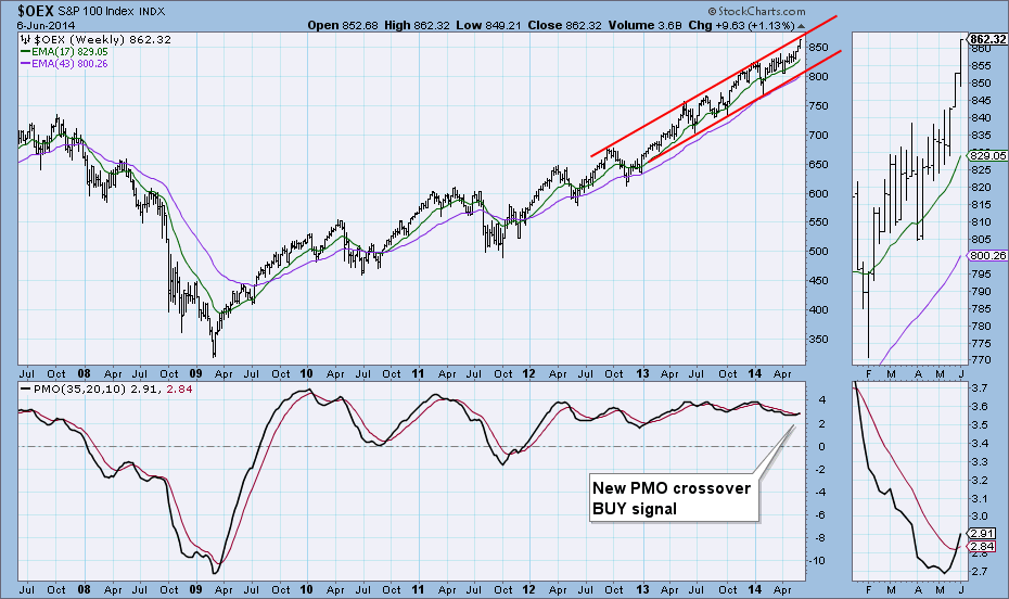
The S&P 100 had a new PMO crossover BUY signal appear on the weekly chart Friday as well. Price is in a rising trend channel, but it has hit resistance at the top of the channel.
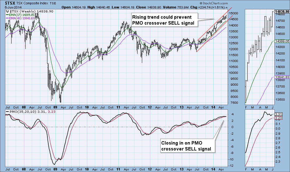
The TSX is in a steep rising trend channel, but with price staying rather 'neutral' in the middle, momentum has been shifting back and forth. The PMO has been caught in that but does look like it is leaning toward a negative crossover its EMA. It could be prevented if price starts to make a move toward the top of the channel.
Happy Charting!
Erin
In my last article, I posted a chart of the Russell 2000, identifying a potentially bearish head & shoulders pattern. This pattern, however, requires a high volume breakdown to confirm the likelihood of future weakness. That breakdown never occurred and small cap bulls used historical bullish tendencies from late May and early June to send small caps spiraling higher. From the May 15th low to Friday's high, the Russell 2000 delivered spectacular gains - rising 7.64% in just three weeks! The question now becomes, "Can small caps sustain their recent rally?" That's where it gets interesting.
First let's take a look at the updated technical outlook:
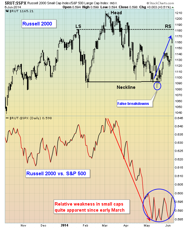
The blue arrow shows the price spike over the past few weeks, but note that the blue circle shows that, on a relative basis, the Russell 2000 still has a LONG way to go to regain its leadership role. That is somewhat bothersome. It's more bothersome when you realize what a lagging small cap market can mean to future equity prices. Check out this relative chart going back 10 years:
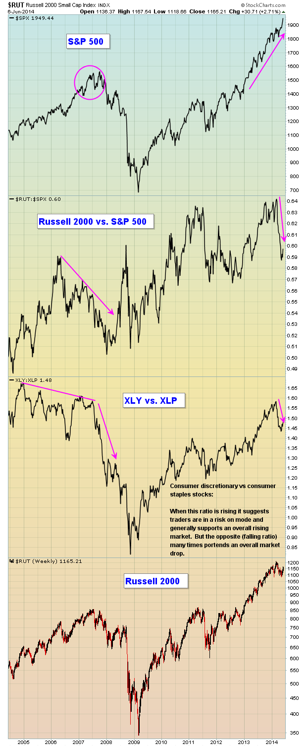
In 2007, money began flowing away from the aggressive Russell 2000 BEFORE the S&P 500 actually topped. That same defensive money flow took place in consumer stocks as the XLY:XLP ratio never printed a new relative high in 2007. Again, market participants were posturing in defensive names PRIOR to the bull market top. Fast forward to 2014. The S&P 500 keeps setting all-time highs, which on the surface appears to be quite bullish. But under the surface, there's been considerable deterioration in a couple of key indices/ratios that question the duration of this advance. I'm not saying that equity prices cannot go higher because many times bull markets rage on much longer than any of us would think possible. Clearly, however, there are question marks regarding this advance. Over the past several weeks, there's been a massive rotation in consumer stocks with staples (defensive) names in demand. Their discretionary counterparts have been very weak on a relative basis and that needs to change to improve the chances for sustainability of the current bull market. Also, the Russell 2000's recent performance has been strong, but there's much more relative work to do before declaring this bull market in full swing again.
The European Central Bank (ECB) came to the defense of global equity markets on Thursday, lowering key interest rates and spurring across-the-globe buying. Fund manager David Tepper appeared on CNBC, suggesting that the ECB's actions help alleviate some of his concerns about equities. That combination helped equity prices climb steadily the balance of the week right up to Friday's close.
Personally, I'd still approach the stock market with a great deal of caution. Year-to-date, the S&P 500 is up 5.47% and we still have the historically bearish summer months ahead of us. And despite the S&P 500's modest gains, the other major indices have not fared as well with the Russell 2000 up just 0.13% for 2014. So if you've remained cautious in 2014, you really haven't missed much.
On Wednesday, June 11th, I'll be hosting a 4-5 hour trading webinar with emphasis on using many of the features here at StockCharts to identify high reward to risk trading candidates. For more information on this webinar, CLICK HERE.
Happy trading!
Tom Bowley
Chief Market Strategist
Invested Central

This is a continuation of last week's popular blog about how individual investors can outperform institutional money managers. For many novice investors, it's all about their egos. For us seasoned investors, it's all about stocks that can make us money. We'll use any and every advantage we can find. So if Fidelity offers us this sort of advantage, we'll take it. It's...
Read More


 This is a continuation of last week's popular blog about how individual investors can outperform institutional money managers. For many novice investors, it's all about their egos. For us seasoned investors, it's all about stocks that can make us money. We'll use any and every advantage we can find. So if Fidelity offers us this sort of advantage, we'll take it. It's...

