Hello Fellow ChartWatchers!
Several indexes including the Dow and the S&P 500 hit new all-time highs on Friday before pulling back slightly before the close. People who have been waiting for the market to correct are still waiting. This is a great time to be a technical analyst because T/A removes the burden of "Why?" from your mind. Most of the "Why?"-based investors pulled out of this market a long time ago and are stuck on the sidelines waiting for their predicted pullback. In contrast, technicians can stay in the market knowing that "Why?" is not nearly as important as the strength and direction of the trend. Trend conquers all.
KNOW YOUR BROWSER
How well do you know the features of your browser? Every day, our customer support team gets several questions about our website that are really about the user's web browser. Your web browser is a CRITICAL tool in your investing toolbox. It deserves your attention. I promise that time spent learning about your browser and how it works is TIME WELL SPENT! Using all of your browser's features effectively will help you with all websites you visit, not just StockCharts.
So, given that, what things should you focus on? Here are several browser features that everyone needs to understand:
Multiple Browser Windows
Did you know that you can have multiple browser windows open at the same time? I'm not talking about browser tabs - which can only be seen one at a time - but additional browser windows that can be resized and positioned side-by-side or overlapped. Typically, using the "File/New Window" (or pressing Ctril-N) opens up a new window which you can then resize and reposition on your screen. (Understanding how to resize windows and switch between them is also super important - see your O/S documentation for help with that.)
Saving Bookmarks/Favorites
Browsers have the ability to save the address (the URL) of any web page that you visit in a list of "Bookmarks" (also called "Favorites"). Having an effective, useful list of bookmarks can greatly increase your effective use of the Internet. In addition, some browsers allow you to group collections of bookmarks in folders and then open all of those bookmarks with a single mouse click. This can make setting up your screen for investing much easier. Make sure you understand how to save and use bookmarks and then, if you haven't already, spend some time creating USEFUL collections of bookmarks that make it very easy to get the information you need quickly.
Vertical Space Stealers
Most computer screens are wider than they are tall. That means that vertical space is at a premium on your screen. Make sure that all of things that take up vertical space on your screen are useful. If they aren't, get rid of them! I'm refering to things like toolbars, bookmark bars, big icons, status bars, etc. We've seen screenshots from users that have 5 or more(!) toolbars added to their browser windows resulting in huge "deserts" of unusable space on the screen. Take time to review your browser's plug-ins and disable/remove any of them that you don't use frequently especially the toolbars - just say no!
As an example, most browsers allow you to access your bookmarks via a popup menu. That means that a bookmark bar - which eats some of your precious vertical pixels - is not really necessary. Just saying...
Managing Your Browser's Cache
All web pages are really just collections of different files that are downloaded from the Internet each time you visit the page. In order to increase speed and reduce bandwidth usage, all web browsers wiill store most of those files on your computer hard disk in a place called the Temporary File Cache. Those cached files are then used later to make things faster when you revisit those pages later. 99% of the time, caching files is a very good thing and really speeds things up. Unfortunately, from time to time, the file cache can cause problems. If a file isn't downloaded successfully but the web browser caches it, future visits to the page won't look right or work properly.
To solve that probably, you need to periodically clear your browser's temporary file cache. This is a standard, common, normal process that all successful Internet users perform on a regular basis. If you are not clearing your cache regularly, you will have problems eventually.
The steps needed to clear your browser's cache differ significantly from browser to browser. Click here to visit a website that has instructions for all of the different browsers. Note that some browsers can be configured to automatically clear their cache everytime the browser is shut down.
Managing Your Browser's Cookies
Interactive websites like StockCharts need to store data on your computer in order to work their magic. They do that by storing that data in items called "Cookies." In general, cookies are harmless because each cookie can only be read by the website that created them. (Websites that are "universal" such as Google may be able to theoretically abuse cookies - but they have many other ways of doing similar things.) Your web browser has several settings that allow you to control what your browser does with these cookies. (Cookies can also be controled by your computer's security software as well.) Make sure that you understand your cookie settings.
If your browser is ignoring cookies from StockCharts.com, our website won't work correctly. If your browser is deleting our cookies, things that used to work will suddenly stop working. Many of the "strange" problems that users report to our customer support team can be tracked back to non-standard cookie settings. We strongly recommend using your browser's default cookie settings. If you have to change those settings, make sure to add "stockcharts.com" to the list of websites that don't have their cookies modified.
Have a Backup Browser (or two or three)
Firefox, Google Chrome, Safari, and Internet Explorer (and Opera!) - There are lots of great web browsers available these days. It is worth taking the time to install and test all of these great tools. Test them out and pick the one that works for you. Once you've picked your favorite, do not delete the other ones. Keep them available in case your primary browser stops working for some unknown reason. Each browser has its own cache and its own collection of cookies. If your primary browser stops working correctly, run a test with one of your backup browsers. If the backup browser works, then you know the problem is related to your primary browser's configuration.
Automatic Updates
Hopefully, in this day and age, I don't need to remind you of the importance of keeping your browser (and your Operating System) up-to-date with the latest security patches. Unfortunately, we still see lots of outdated browsers using our website every day. Don't be one of those exposed people - configure your browser to update things automatically and then check periodically to make sure that is really happening.
My main message this week is to spend time understanding your web browser. It is time well-spent that will greatly increase your use and enjoyment of all Internet websites (including ours!).
Take care,
- Chip
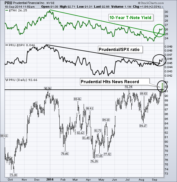
Financial stocks are starting to show upside leadership at the same time that bond yields are starting to rise. Banks usually benefit from rising bond yields because they can charge higher rates for their loans. Two other financial groups have actually done better than banks this week. They include investment services (brokers) and life insurance. Let's start with life insurance. The black bars in Chart 1 show Prudential Financial (PRU) surging today to a new record high. It's the strongest stock in that group. The black line shows the stock's relative strength ratio turning up this month to a new three-month high. The green line on top shows the 10-Year T-Note yield also climbing this month. A correlation can be seen between the two lines. Prudential underperformed the market between January and May as bond yields were falling. It has been outperforming during September as yields have started to rise. The same analysis is true of other life insurance leaders like Lincoln National (LNC) and Metlife (MET). There's a good reason why insurers benefit from higher rates. They invest three-quarters of their premiums in Treasury bonds. As a result, they receive lower income payments when bond yields are low. Higher yields allow insurers to reinvest maturing bonds in their portfolio in higher yielding bonds.
Today's article will show how the use the Raff Regression Channel to define the trend and identify reversals using the Internet ETF (FDN). I am particularly interested in FDN because internet stocks represent the appetite for risk. An uptrend in FDN signals a strong appetite for risk and this is positive for the technology sector. A downtrend in FDN signals a weak appetite for risk and this is negative for the technology sector.
The middle line of the Raff Regression Channel is a linear regression, which is the line of best fit for closing prices. The outer lines are set equidistant from the furthest high or low. The first step to using the Raff Regression Channel is to identify the beginning and ending of a move. An advance begins with the closing low and ends with the highest closing high. A subsequent higher closing price would warrant an upward extension of the channel. A decline begins with the closing high and extends to the lowest closing low. A subsequent lower closing price would warrant a downward extension of channel.
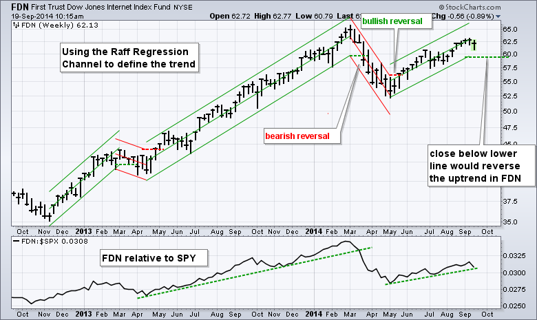
The chart above shows the Raff Regression Channel extending up from the May closing low to the September closing high, which was last week. Should the ETF close above this high in the coming weeks, I would extend the Raff Regression Channel further. I am most interested in the lower line because a close below this line would signal a trend reversal. The channel is rising for the moment and this means FDN is in an uptrend. Hence, the appetite for risk is strong and this is positive for the technology sector.
Good trading and good weekend!
Arthur Hill CMT
Bullish Percent Indexes ( BPI's) are helpful in telling us the underlying sentiment of a group of stocks.
Here is the Bullish Percent Index for the Nasdaq Composite ($BPCOMPQ). The chart is a little busy, but follow along.
The gray area with the pink line is the Nasdaq Composite.It is very close to recent highs. The blue large squiggle line is the main title of the chart so the scale for that is shown on the right side of the chart.
As the market is moving higher, the percentage of stocks on a PnF buy signal ($BPCOMPQ) is waning. I have put two red lines and a shaded area between them on the chart. When the Percentage is above the top line we are in a strong bull. When we oscillate down to the lower area we are still in a strong area to expect support as in 2009 and February 2014. When it falls well below the red zone, it is a weak market. Usually dips into the 50% level are buys. However, when you are at new highs in the market and this level is the best you can get, you are probably near an intermediate term top, rather than a buying opportunity. We dropped almost 2% this week as the market was pushing higher every day. When I look to the left on this chart, if it can not get back above the lower red line, that is a time to be more cautious in the market. An example would be 2005, 2006, 2007. The real concern comes when each push up is less successful. The last time that sort of behaviour happened, the Fed stepped in like in 2012.
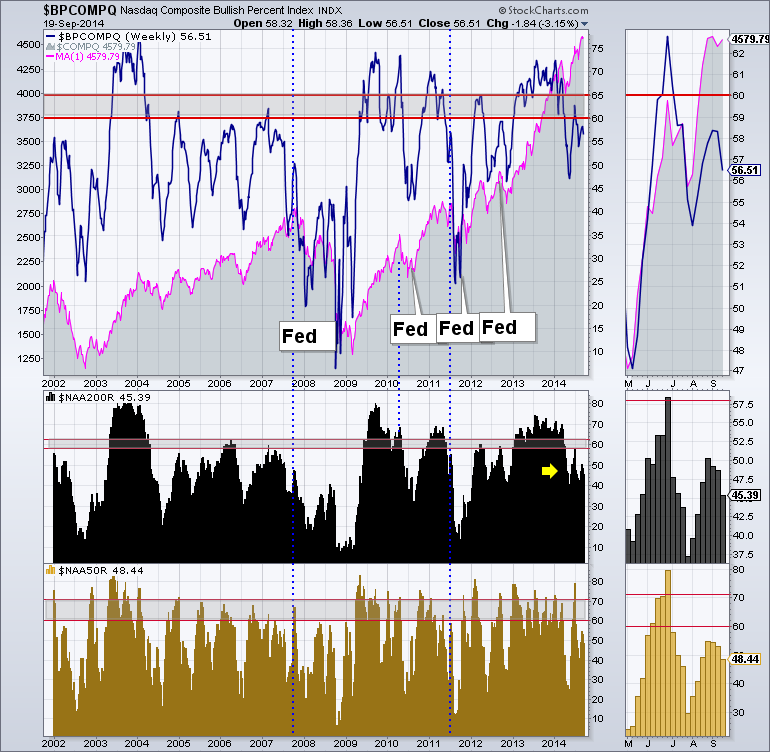
On the lower part of the chart is the percentage of stocks above the 200 Day Moving Average ($NAA200R). You can see we are near levels where the market topped before as shown in the blue dotted lines. Those levels show up after the market has been stronger, pulls back and then less stocks rise back above the 200 DMA. I would currently estimate we are similar to the 2007 top and below where the market rolled over in 2010 and 2011 as indicated by the dashed blue lines. The gold area at the bottom is the percentage of Nasdaq stocks above the 50 DMA. ($NAA50R). It is below 50 currently. So less than half the stocks are above the 50 DMA but we are making higher highs with fewer stocks. The market is getting weak. When this is the level as the markets still climbing into, it usually indicates a larger pullback is coming. So you are not buying the dips at this level (because the market is near the highs not the lows) as you are seeing that these are the levels when the market tops historically.
Here is the same chart for the New York Stock Exchange. We can see the $BPNYA is having trouble getting back above the 65 level. At this point it is important to note. The diminishing peaks going back into 2013 makes this more concerning. I would suggest that if it continues to struggle here, the market will roll over. So even though we had a higher intraday all time high for the Dow and the $SPX, the broader market of stocks on the NYSE are significantly weaker.
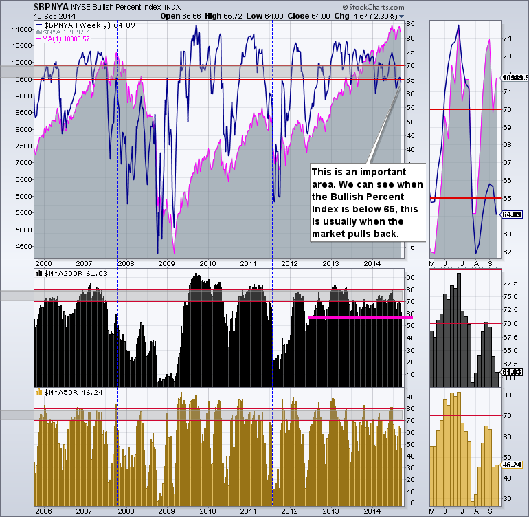
We can see the bold pink line on the New York Composite Percentage Of Stocks Above The 200 DMA ($NYA200R). The recent push up against 70% was important. This was a level where the markets failed from in 2011. In 2007, it was closer to 60%.
The percentage of stocks above the 50 DMA ($NYA50R) is only 46% even though the market pushed higher almost every day.
All this adds up to caution and an expectation for a larger pullback. Here are the links to the charts for the $BPSPX and $BPNDX . They are more bullish. These large cap stocks are holding the indexes up. If they start to breakdown, the market will be rolling over.
Good trading,
Greg Schnell, CMT
This afternoon while going over the DP Tracker Report for the S&P 500, I checked the new Price Momentum Oscillator (PMO) BUY signals on the SPX-Plus Tracker to see if there were any signals that looked promising. There was one--Monsanto (MON).
First glance at the thumbnail, we see the positive PMO crossover its EMA which generated the PMO BUY signal. What are the other positives about this chart? There is a positive PMO divergence, meaning that while price was making a lower price bottom, the PMO bottoms were rising. A PMO bottom in oversold territory is also favorable.
The bullish double-bottom formation was the other positive. This looks like a textbook start to a double-bottom formation. The neckline is what will take part in executing the pattern. Should price break above the neckline in a significant way, the expectation would be that price would rise the same amount that it did from the bottoms. In this case it would be about $10 which translates into a minimum upside target of approximately $131.
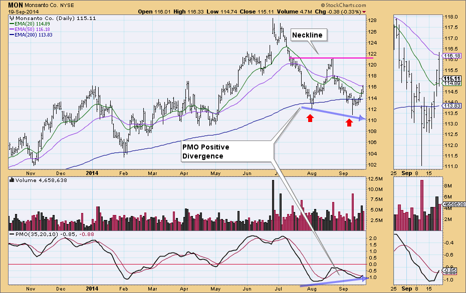
What are the negatives on this chart? The configuration of the 20/50/200-EMAs is not optimum. When the 20-EMA crossed below the 50-EMA at the end of July, that generated an Intermediate-Term Trend Model Neutral signal. It wasn't a SELL signal because the 50-EMA is above the 200-EMA which implies MON is in a long-term bull market. Good news is that price is above the 20-EMA so it is rising.
Happy Charting!
Erin
You should know by now that I'm a HUGE fan of the Moving Average Convergence Divergence (MACD) indicator. Other than the combination of price/volume and the use of candlesticks, it's probably my "go-to" indicator. As a case study for this weekend, let's take a look at the Dow Jones U.S Home Improvement Retailers Index ($DJUSHI). Let's take a look at the bigger picture via a weekly chart:
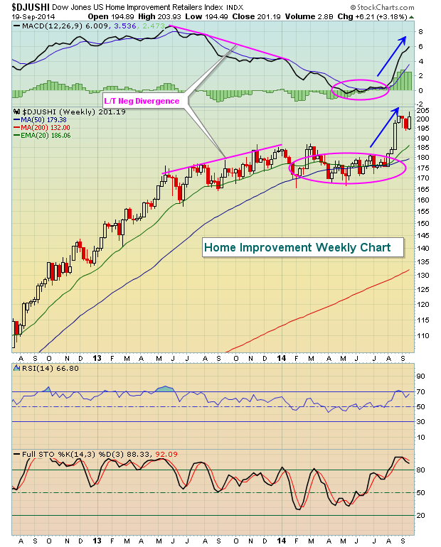
The first thing that catches my eye here is that home improvement stocks began to labor in the second half of 2013. The long-term negative divergence that appeared is NEVER a guarantee of price weakness ahead, but it's definitely a warning sign that risks of a more significant decline (or an extended period of consolidation) have increased. Managing risk is a critical component to successful trading. At the first sign of the negative divergence in July 2013, the DJUSHI was close to the 175 level. Do you notice that one year later, the DJUSHI remained at 175? It went nowhere while the S&P 500 gained approximately 25%. To visualize this a different way, let's take another look at the weekly chart, but this time let's look at the DJUSHI relative to the S&P 500:
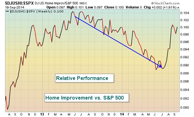
The relative underperformance of home improvement stocks was quite dramatic and the MACD provided us that clue AHEAD OF TIME.
Home improvement stocks are on much better ground now technically, but many view the MACD as a lagging indicator when it actually provides us hints about the future through analysis of momentum. The DJUSHI hit short-term resistance and failed on Friday just above the 200 level so we may see a pause in the group, especially if the overall market weakens in the near-term. But any pullback to rising 20 week EMA support (from the initial chart above) at 186, which also marks price support and the rising 50 day SMA would likely provide a solid reward to risk entry into this industry group and many of its component stocks.
One month ago, I made an offer to all of you for a FREE video series on the MACD and I had a strong response. For those of you that missed it, I'm offering it once again. There's no obligation. For more details, simply CLICK HERE.
Happy trading!
Tom Bowley
Chief Market Strategist
Invested Central


 Sometimes the things that need to be said can't be said any better than they were said in the past. I'm a big fan of Gerald Loeb (1899-1974), the man Forbes called the most quoted man on Wall Street. I've written about this extraordinary investor before.