Hello Fellow ChartWatchers!
The US markets continue to s-l-o-w-l-y roll over with the Dow Industrials leading the way. Despite the fact that $INDU moved 100 points higher this week, the intermediate to long-term trend is clearly down. Lots of people talked about the "Death Cross" that occurred on the Dow's daily chart on Monday when the 50-day simple moving average moved below the 200-day average, but that should come as no surprise to any reasonably-attentive ChartWatchers. Here's why:
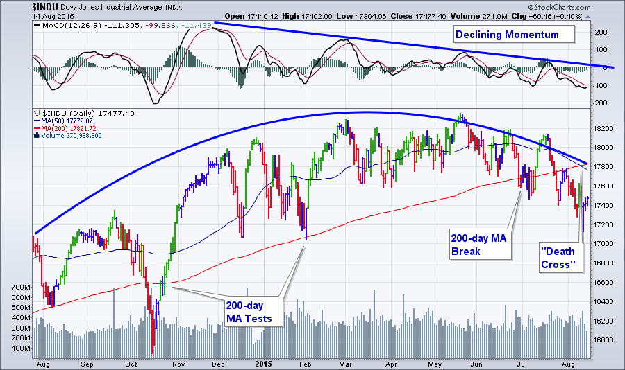
When a market rolls over slowly like this, the first thing to go is the uptrend's momentum and, yes, we see that as the MACD has been moving lower for months. The next thing to happen is increased interaction with the 50-period moving average. Next up are tests of the 200-period moving average and it draws closer and closer. Then comes a definitive break below the 200-period average and then finally the "Death Cross" occurs - which is where we are at with the Dow.
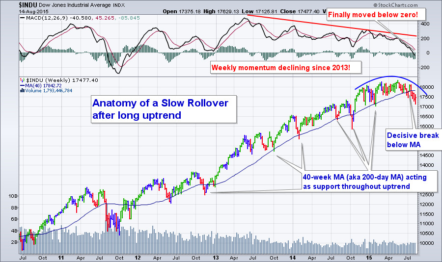
A longer-term weekly chart shows the slow roll-over more clearly. It really is a "text book" rollover:
The S&P 500 hasn't rolled-over quite yet but its chart looks very similar to the chart above back in June. The Nasdaq chart offers some hope with the price bars remaining above the 200-day MA for now but something significant needs to change if it is to avoid this same fate.
For more thoughts on the market - including the current breadth and sector situation - be sure to watch the recording of this weekend's ChartWatchers LIVE webinar. Just click here to get started.
As I say towards the end of that recording, there are still stocks out there with positive momentum and great relative strength - you just need to work a little harder to find them and then watch them closely for signs of weakness.
Take care everyone!
- Chip
SITE NEWS
RECENT ADDITIONS TO STOCKCHARTS.COM
- ARE YOU MISSING OUT OF THE BEST FREE PART OF STOCKCHARTS? - We provide 6 free webinars each week - six! - focused on the markets and chart analysis. Have you had a chance to watch them? Most of them contain content that goes way, way, way beyond what we have on our website AND you can interact with the presenters during the broadcasts! Did you ever want to know why Arthur Hill uses the indicator settings he uses? Do you need to know Tom Bowley's opinon on your latest stock pick? ATTEND ONE OF OUR FREE WEBINARS THIS WEEK AND FIND OUT! To attend any of our webinars, simply review the schedule in the "What's New" area of our homepage.
.
- ARE YOU UNABLE TO ATTEND OUR FREE WEBINARS LIVE? - No worries mate. WE RECORD ALL OF THEM! You can find them on our webinar archives page. And they are still free!
.
- KAUFMAN ADAPTIVE MOVING AVERAGE ADDED - What's that? You say you need a "smarter" moving average that adapts to changing market conditions. We've got you covered.
.
The Market Message
John Murphy is on hiatus this time. Please visit The Market Message for more articles by John Murphy.
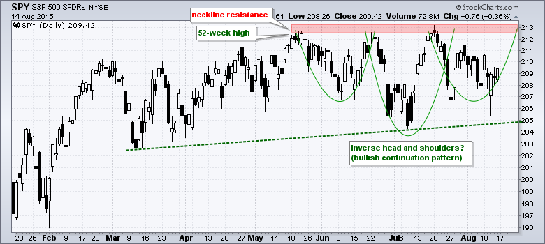
The S&P 500 SPDR remains largely range-bound since March, but a pair of potentially bullish patterns emerged and signs of accumulation are appearing. First, note that SPY hit new 52-week highs in May and July, and the overall trend is still up. The ETF is trading within 2% of its July high, but also in the middle the tightest range in decades. Chartists must, therefore, look inside this range for clues on the next directional move.
For the first pattern, note that an inverse head-and-shoulders pattern could be taking shape since late May. With an overall uptrend, the inverse head-and-shoulders represents a consolidation within an uptrend and a bullish continuation pattern. A break above neckline resistance would confirm the pattern and target further gains. Typically, the height of the pattern (213 - 204 = 9) is added to the breakout for an upside target (213 + 9 = 222).
Click this image for a live chart.
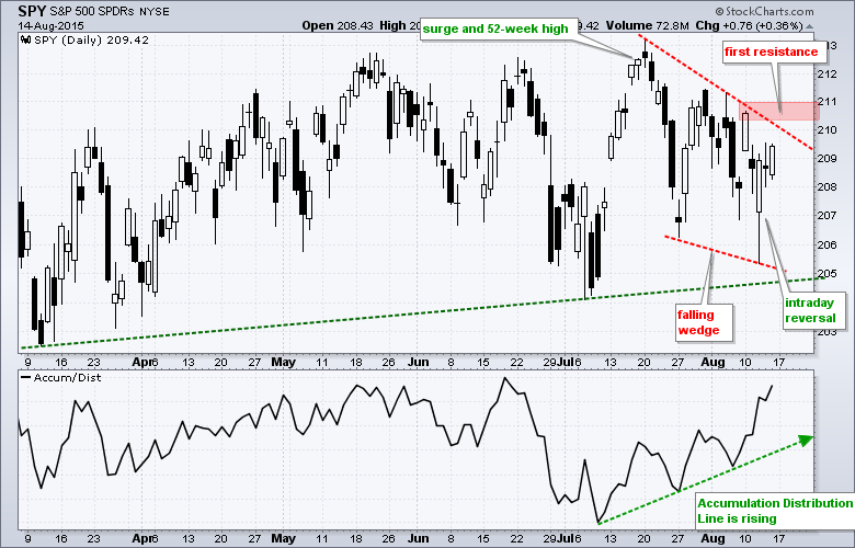
The right shoulder looks like a falling wedge, which is typical for corrections after sharp advances. SPY surged from 204.5 to 213 in mid-July and then pulled back with a falling wedge the last few weeks. There was a big intraday reversal on Wednesday, but not much follow through on Thursday and Friday. Look for a close above 211 to break wedge resistance and confirm Wednesday's intraday reversal.
Click this image for a live chart
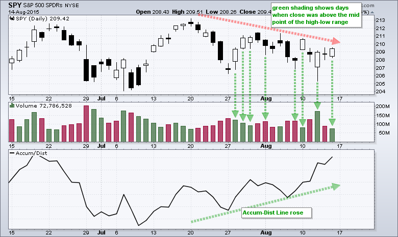
What are the odds of a breakout? The indicator window shows the Accumulation Distribution Line (ACDL) bottoming in early July and moving higher the last four weeks. Note that this indicator moved higher even as the falling wedge formed. This suggest accumulation within the wedge and increases the chances for an upside breakout.
So why did the Accumulation Distribution Line (ACDL) rise over the last three weeks? This volume-based indicator is based on the level of the close relative to the high-low range. A close in the upper half of this range results in a positive volume multiplier (accumulation) and a close in the lower half results in a negative volume multiplier (distribution). Thus, the closer the close is to the high, the more accumulation. The green shading on the chart below shows the days when the close was in the upper half of the high-low range. Notice that SPY closed near the high of the day for four of the last six days.
Click this image for a live chart
Thanks for tuning in and have a great weekend!
--Arthur Hill CMT
BOND ETF'S ARE BUILDING STRENGTH
by Greg Schnell | The Canadian Technician
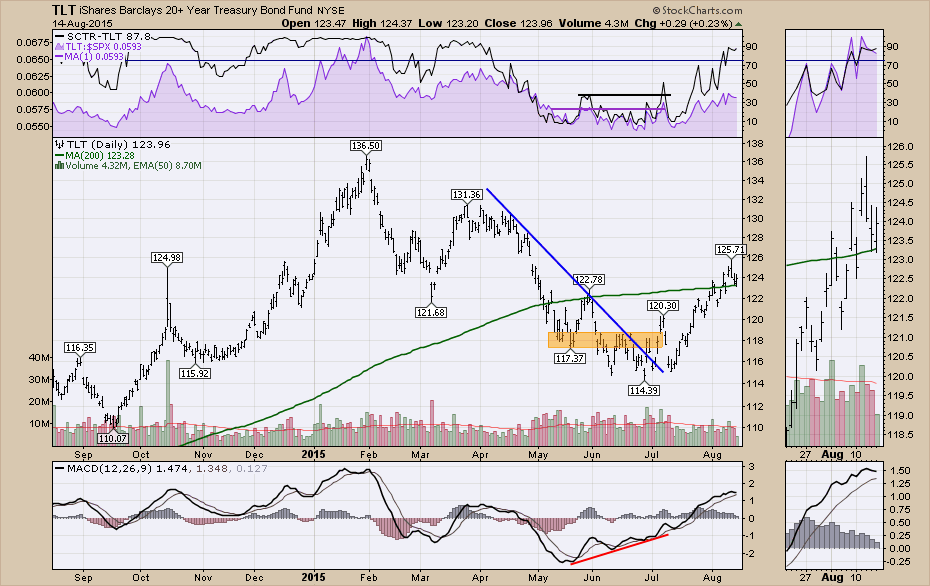
A few weeks ago on the July 16th webinar, I talked about the bond markets and the chart view was looking bullish to get long TLT. Well, that actually played out nicely. But now the MACD looks like it wants to roll over. The SCTR has just pushed above 75.
I like to look and see if there is support showing up in other areas of the Bond market rather than just the long bonds represented by the TLT. When I originally talked about the TLT, the rest of the bond ETF's were not as bullish. This is a screenshot from my ETF chartlist of ETF's with an SCTR above 70. Notice the municipal bonds and shorter term instruments are also moving higher on the SCTR ranking. Having the whole group participate is important if this is going to be a sustained move.
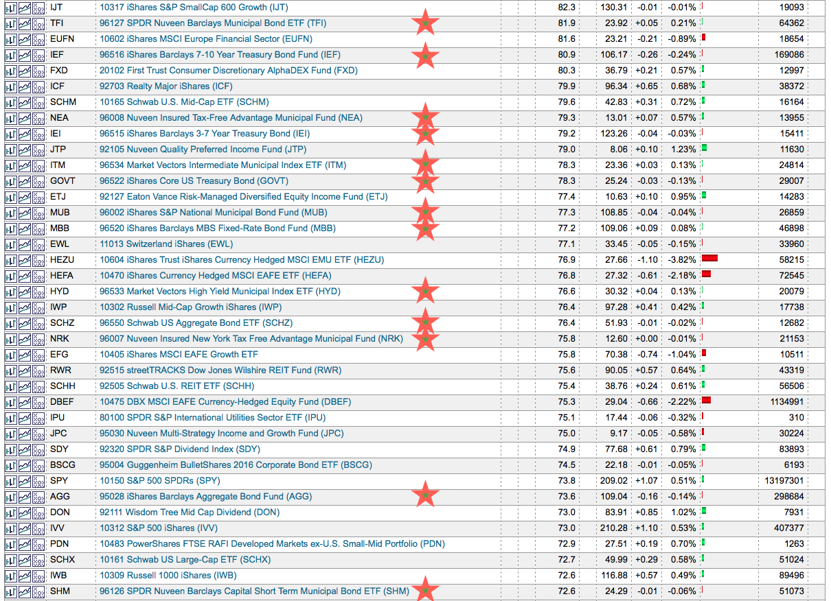
Everything with a star is a Bond related ETF on this list sorted by SCTR strength. A month ago, the SCTR rankings were not this strong. To see this entire group move higher and become some of the top quartile stocks is an important trend change. We can also see some Utility and REIT ETF's gaining strength here. This looks like a defensive posture and investors might want to watch for rotation away from other stocks that were leading the market.
Good trading,
Greg Schnell, CMT
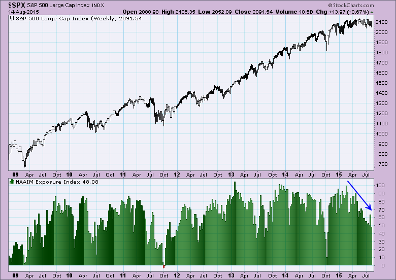
 There are many sources that DecisionPoint uses to develop the DP Sentiment charts. You'll find two of them in the free DecisionPoint Gallery: American Association of Individual Investors (AAII) Sentiment and Rydex Asset Ratio. I'm going to review the AAII, National Association of Active Investment Managers (NAAIM) and Rydex Cashflow charts from the DecisionPoint Market Indicator ChartPack and DecisionPoint Rydex Funds ChartPack (available for download to Extra and above members). With market action and indicators sliding into neutral, sentiment charts are very helpful in determining the current health of the market. The sentiment indicators I'm reviewing today, with the exception of the AAII chart, take into account what actual money managers are objectively doing with their funds. This can be much more enlightening than a subjective survey.
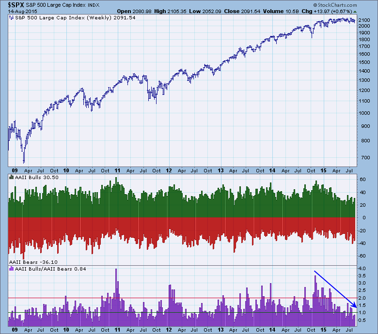
However, less start with the subjective AAII chart. AAII takes a weekly survey by asking its members if they are bullish, bearish or neutral. These results are usually available at StockCharts on Thursday evenings. The bull/bear ratio is decreasing in value, this means that bearish sentiment outweighs bullish sentiment.
NAAIM is a professional group that reports its exposure to US stocks on a weekly basis. The exposure index reflects the average exposure of NAAIM members. This data is updated by Thursday evening. I like this indicator because it tells us exactly how exposed real money managers are to the market. Notice that exposure continues to decline. It hasn't hit extremes yet, so I find this bearish.
The Rydex Cash Flow Ratio uses an estimate of money that has been committed to bull and bear funds, so it is a fairly accurate reflection of actual psychological extremes. Notice that money is flowing away from bullish positions and into bearish positions. The Cash Flow Ratio is still showing more bullish participation than bearish (when the denominator is larger, the ratio is less than one), but looking at where the cash is going, I find these indicators bearish.
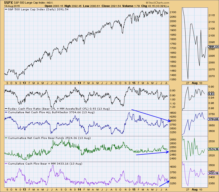
Conclusion: You'll find DecisionPoint sentiment charts in the free DecisionPoint Chart Gallery, or you can get the complete suite of indicators by downloading the DecisionPoint Market Indicators ChartPack and the DecisionPoint Rydex Funds ChartPack. The sentiment indicators I reviewed above suggest that money is being removed from the market; and in the case of the Cash Flow Ratio, bear funds and money markets are gaining support. Remember with sentiment, when bearish extremes are met, it is actually contrarian and tells us to look for a bottom. Extremes have not yet been hit, so I find the results above to be bearish.
Technical Analysis is a windsock, not a crystal ball.
Happy Charting!
- Erin
Bears are awaiting price breakdowns in key areas of the market, but thus far they remain highly disappointed. Last week they had their chance to take down the small cap universe on two fronts and both failed. This isn't meant to say that the bulls are out of the woods, but at least for now, support has won out. Multi-month price support held mid-week last week as bullish hammer, then engulfing candlesticks printed. Take a look:
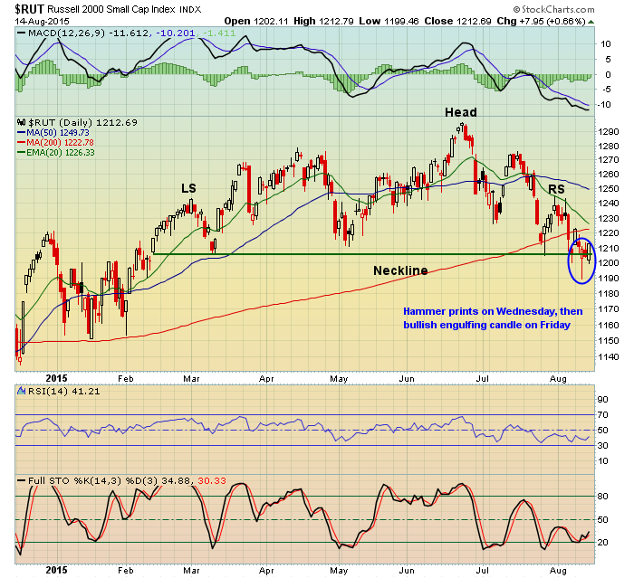
The reversing candles were important on a number of technical levels, one of which is that they saved the Russell 2000 from a confirmed head & shoulders breakdown. Small caps were not only able to avoid this bearish technical development, but also finished on a very strong note on Friday closing at its high. We'll want to watch the 1200 price support level closely in the days and weeks ahead. While a close below doesn't guarantee anything, it certainly begins to put the bulls on the defensive and could trigger much more technical selling.
On the weekly chart, it could be argued that this summer selling was expected. Generally speaking, while momentum remains strong, I look for rising 20 week EMA support to hold. But once negative divergences emerge, I look for the increased likelihood of a 50 week SMA test to "reset" the MACD at or near its centerline support. Check out how the negative divergence on the Russell 2000 weekly chart has played out:
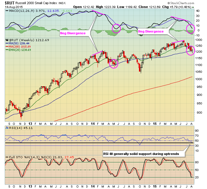
While the action this summer has been quite choppy, it would be wise to at least respect the short- and intermediate-term reversing candles that printed last week because of the significance of the support levels. The bulls do still have to withstand the historical headwinds that the calendar months of August and September present, but the kick save last week helped to extend the battle that's been taking place over the past several months.
Happy trading!
Tom
HOW TO AVOID GETTING SLAUGHTERED
by John Hopkins | InvestEd Central
There are differing opinions on whether or not it makes sense to hold stocks into earnings reports. One camp argues that you stand to make a big score if a company beats its numbers. Another camp - the one I'm in - says it's way too risky because you can never predict how the market will respond to an earnings report. I have two very specific examples that support both sides of the argument.
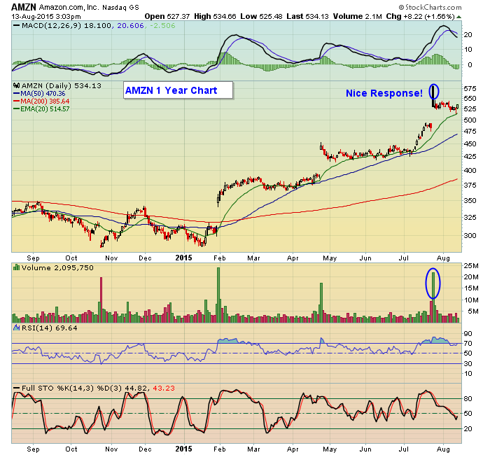
First up is Amazon that beat expectations handily in its most recent earnings report and you can see in the chart below that the stock was nicely rewarded:
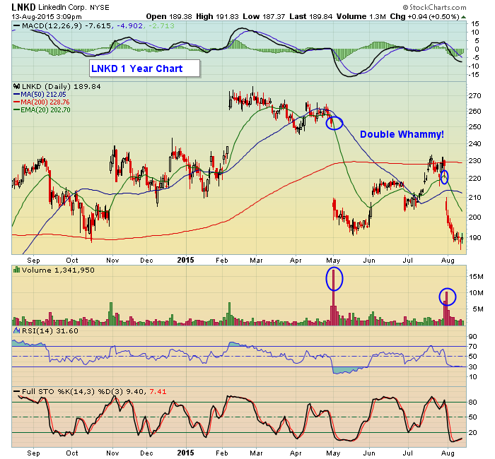
Next up is LinkedIn, a stock I have featured in the past - but it's worth showing again - because it illustrates the heavy risk of holding a stock into its earnings report:
Now, if you held AMZN into its most recent earnings reports you were rewarded with an almost $100 pop, or a 20% gain from the prior day's close to the high the following day. Who wouldn't like that? Well, try those who were short the stock into the earnings report.
On the other hand if you held LNKD into its most recent earnings report, you would have suffered an almost 12% loss from the prior day's close to the low the following day. And even worse, if you had held the stock into the previous earnings report, you would have suffered a 20%+ loss in just one day.
I've always been a big believer that holding a stock into its earnings report is a crap shoot, a 50-50 proposition at best. BUT...and here's the big difference...while no one likes to see an "opportunity" lost, it's much, much worse taking an actual loss. So in the two examples above, if you held AMZN you had more money that you did not have in your pocket than the prior day but in the case of LNKD you actually would have lost a lot of money had you held the stock into either of its past two reports.
Bottom line? If you like to gamble, maybe holding stocks into earnings reports is for you. On the other hand, if you would rather minimize the risk associated with an unknown market response, it's best to stay on the sidelines. And I will be discussing this topic as well as the power of combining companies with strong fundamentals (earnings) and strong technicals (charts) in a FREE webinar next week. If you care to join me in the webinar just click here.
At your service,
John Hopkins
President
EarningsBeats.com

Be careful where you sit. I shared a table at Starbucks last week with two investors who became very animated and energized when I disclosed that I was a full-time stock investor. What a coincidence, they said, so were they. They retired in 2004 and bought large positions in the hot names of the day back then, stocks like Cisco and Yahoo. They proudly told me that they...
Read More


 There are many sources that DecisionPoint uses to develop the


 Be careful where you sit. I shared a table at Starbucks last week with two investors who became very animated and energized when I disclosed that I was a full-time stock investor. What a coincidence, they said, so were they. They retired in 2004 and bought large positions in the hot names of the day back then, stocks like Cisco and Yahoo. They proudly told me that they...