| THIS WEEK'S ARTICLES |
| Market Roundup |
| Three Charts That Could Signal a Significant Extension to the Equity Rally |
| by Martin Pring |
Editor's Note: This article was originally published in Martin Pring's Market Roundup on Monday, September 16th at 6:04pm ET.
First of all, Chart 4 features the NASDAQ bullish percentage. You can see how it has been gradually working its way lower since early 2018, having fallen from a heady reading of 70% to a more modest current reading around 50%. That now leaves plenty of unrealized upside potential before becoming overstretched. This indicator has already managed to clear its 20-day MA, but the barrier that I am really interested in is that green downtrend line, which is quite lengthy and has been touched on numerous occasions. Consequently, its penetration would represent a powerful signal of market strength. Such a break would suggest that the number of stocks in a positive trend would expand. That kind of condition almost invariably translates into a higher NASDAQ as well.
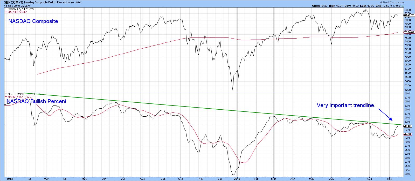
Chart 4
By way of encouragement, Chart 5 shows that the McClellan Oscillator for the NYSE has already broken above an equivalent downtrend line.
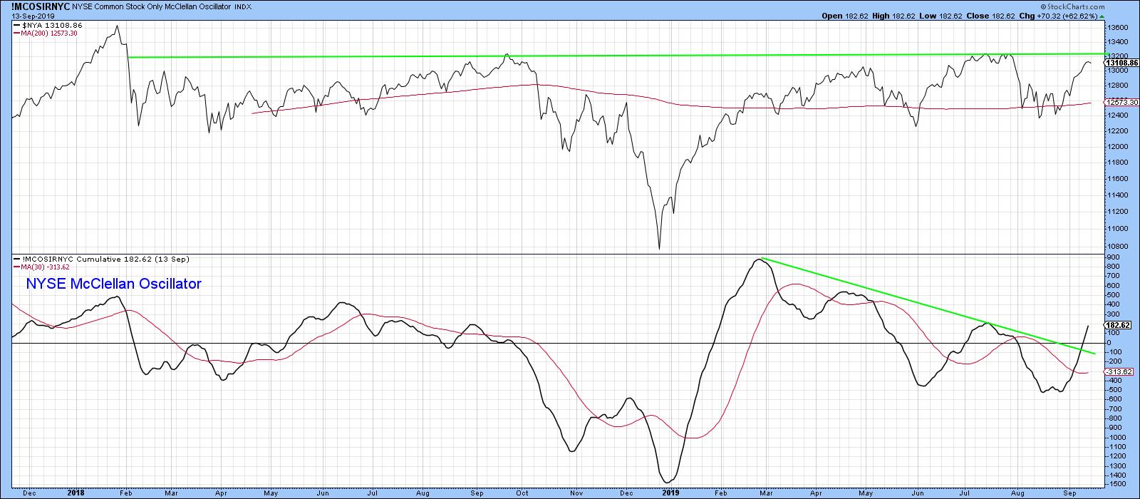
Chart 5
The next chart worth following is the ratio between the SPDR Technology and Consumer Staples (XLK/XLP), which is a proxy for identifying swings in investor sentiment. When the indicator is rising, it tells us that traders are becoming more confident, as they are bidding up the more speculative technology stocks against their defensive consumer staple counterparts.
When this relationship is rising, the overall market is usually stronger as well. Using the benefit of hindsight, the green-shaded areas represent the major rallies in the ratio itself. You can see that such periods were generally pretty positive for the S&P Composite. Note also that the ratio broke out of a huge base some time ago and has yet to achieve the upside objective called for by that pattern. More recently, ratio has been moving in a narrowing trading range bounded by the two converging trend lines. In the late summer, it teased the red line, subsequently bouncing in a current attempt to surpass the green one. The unrealized upside objective from the giant base suggests that the break, when it comes, will be on the upside. A positive short-term KST backs up this view. Given the strong and close relationship between the ratio and the market itself, I am watching this one very closely.
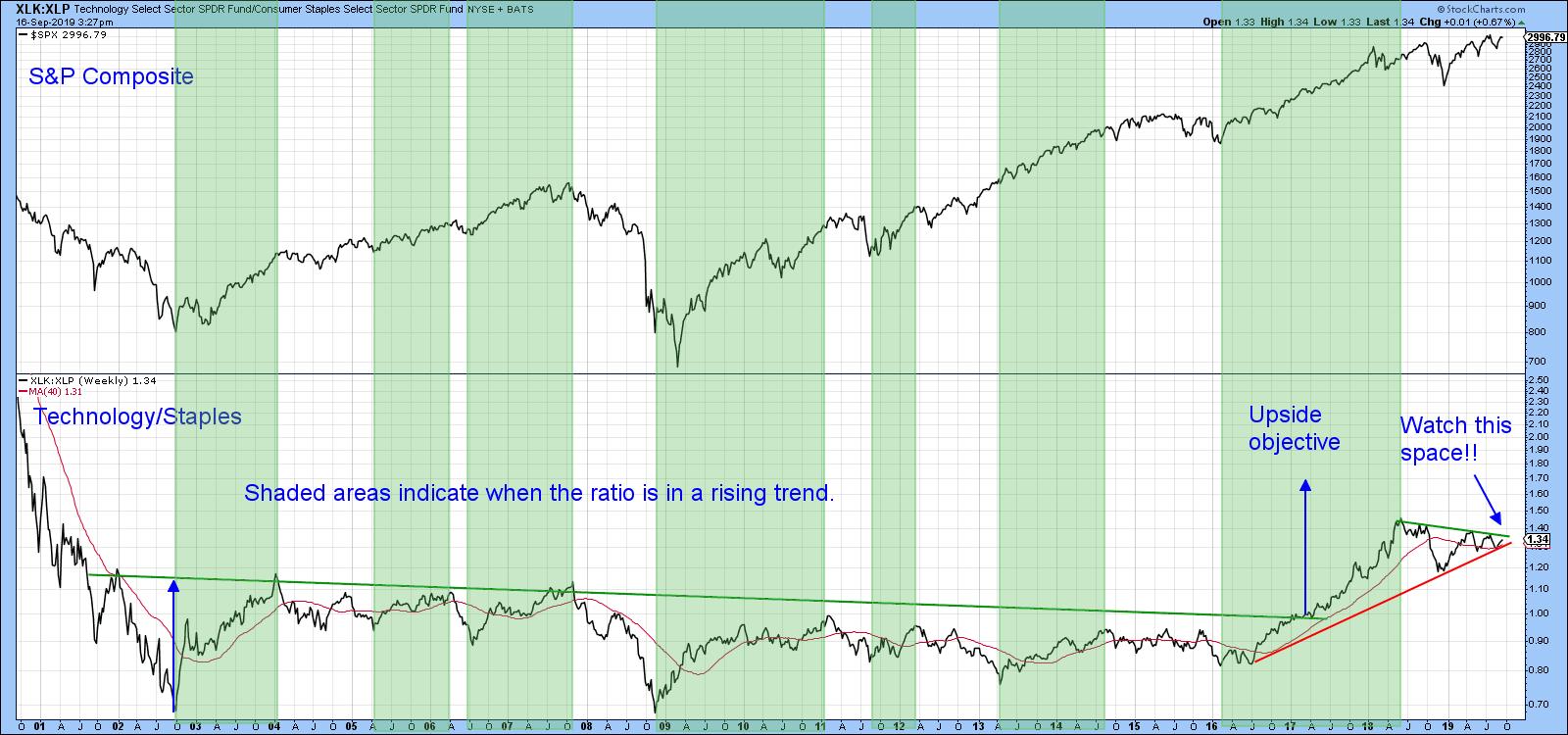
Chart 6
Our third watchable chart is more of a global one, as it compares the Dow Jones World Index to a global ratio between junk and government-issued paper. A rising relationship indicates growing confidence amongst global bond market participants, which usually translates into stronger equity prices. The green arrows point up the fact that lows in the ratio often correspond with equity lows. That means that, if it can reassert its upward breakout above the green downtrend line, it ought to generate a spurt of confidence sufficient to propel the Index itself above its green downtrend line.
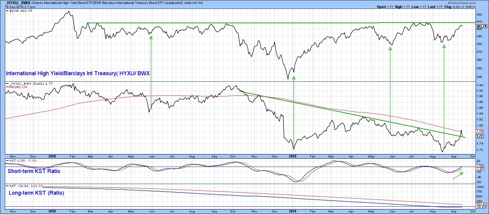
Chart 7
Good luck and good charting,
Martin J. Pring
The views expressed in this article are those of the author and do not necessarily reflect the position or opinion of Pring Turner Capital Group of Walnut Creek or its affiliates.
|
| READ ONLINE → |
|
|
|
| SPECIAL EVENT ANNOUNCEMENT |
| Attention investors and traders alike! Don't miss StockCharts contributor Brian Livingston at the upcoming Philadelphia MoneyShow, September 26th - 28th. The event is free to register and attend, and you'll have the chance to hear Brian and many other fantastic market experts share their analysis of the current financial climate. Click the banner below to learn more. |
 |
| LEARN MORE → |
|
| Art's Charts |
| Capturing Mean-Reversion Signals and Trend Direction with One Indicator - Facebook Example |
| by Arthur Hill |
 Mean-reversion signals provide a great way to trade in the direction of the bigger uptrend after a pullback. The trick is to identify the bigger uptrend and then capture mean-reversion setups. Mean-reversion setups materialize after a pullback within the uptrend. The strategy is based on the assumption that prices will "revert" back to the uptrend because it is the dominant force at work. This article will show how to identify mean-reversion signals and identify the trend with one indicator. Mean-reversion signals provide a great way to trade in the direction of the bigger uptrend after a pullback. The trick is to identify the bigger uptrend and then capture mean-reversion setups. Mean-reversion setups materialize after a pullback within the uptrend. The strategy is based on the assumption that prices will "revert" back to the uptrend because it is the dominant force at work. This article will show how to identify mean-reversion signals and identify the trend with one indicator.
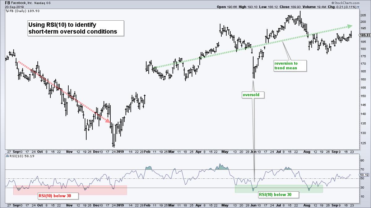
The chart below shows Facebook (FB) with 10-day RSI. I will first show the mean-reversion signals and then show when to pay attention to these signals. First and foremost, note that I am only interested in bullish mean-reversion signals based on short-term oversold conditions. The default setting for RSI is 14 days, but this setting does not always generate oversold conditions (<30) so I increased sensitivity by setting the parameters to 10.

As the chart above shows, RSI(10) dipped below 30 several times over the past year. The first set of signals, from September to December 2018, triggered in a downtrend because the stock continued lower (until the big reversal in December). There were then two oversold signals in early June and early August. The stock reverted to the mean after the June signal and is in the process of a mean-reversion after the early August signal.
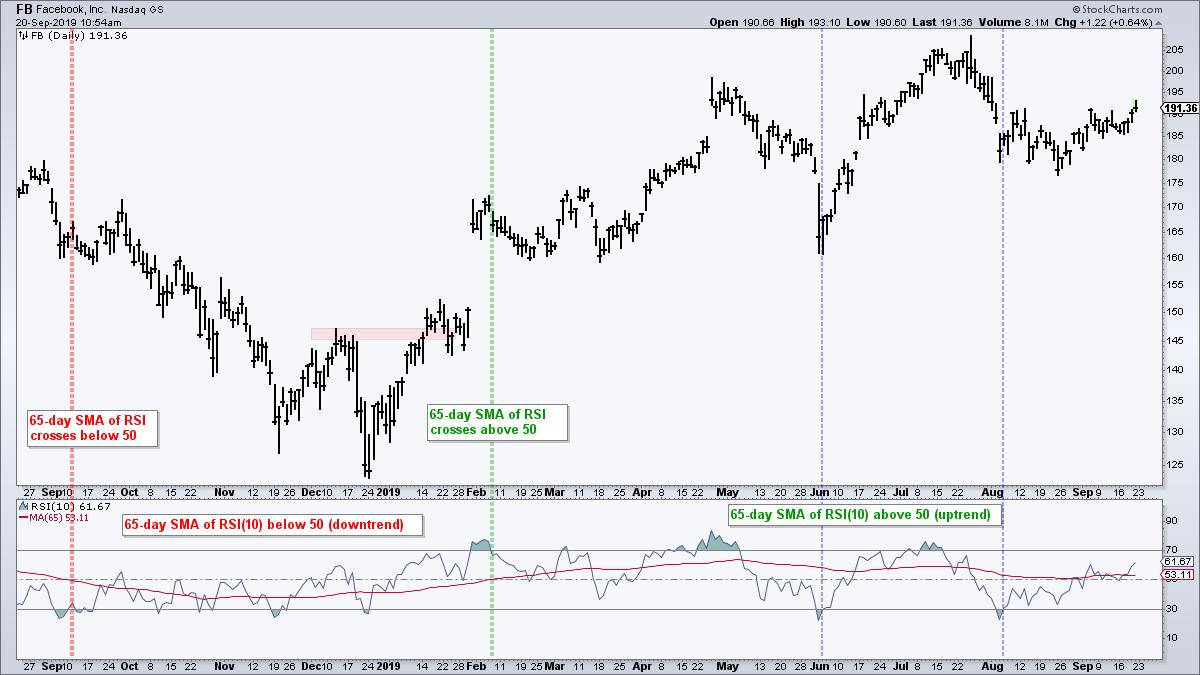
The strategy is to trade in the direction of the bigger trend by avoiding oversold signals when the trend is down and considering oversold signals when the trend is up. So how do we quantify the trend? Simple. Just open the advance indicator settings on SharpCharts and add a 65-day SMA to RSI, which is around three months. The trend is down when this 10-day SMA is below 50 and up when above 50.

The chart above shows the 10-day SMA of RSI crossing below 50 in mid September and remaining below 50 until early February, when it crossed above 50. This SMA has been above 50 for seven months and we can confirm the uptrend just by looking at price action. Notice that Facebook has been zigzagging higher the last seven months. The blue vertical lines show when RSI(10) moved back above 30 during this uptrend and triggered a bullish mean-reversion signal.
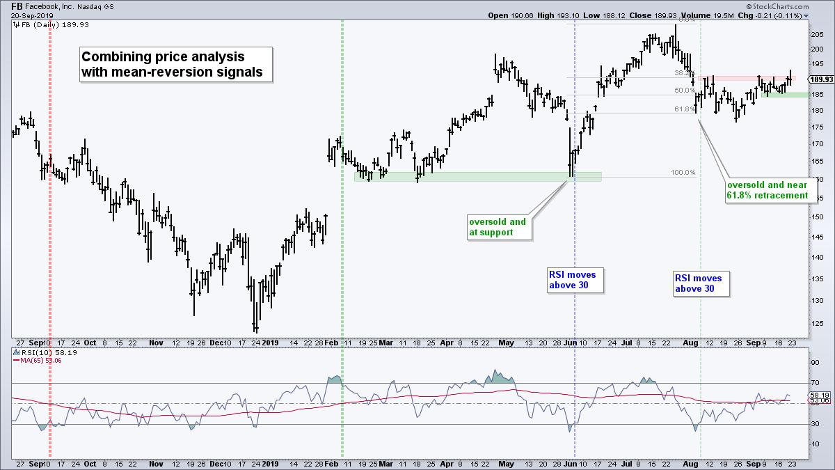
Chartists can also combine mean-reversion signals with price analysis. Notice that Facebook was testing support when RSI(10) dipped below 30 in early June. The combination of a bigger uptrend, support test and oversold condition provided a very nice setup.

The early August signal is still open. Notice that Facebook became oversold near the 61.8% retracement in early August and bounced in mid August. However, the stock fell back below the early August low a three weeks later. These setups are not perfect and do not always call the exact low. Sometimes we need to allow a little wiggle room.
The stock bounced again over the last four weeks and is now trying to break the August highs (red zone). Overall, the short-term trend is up with the mid September lows marking support. A close below 184 would call for a re-evaluation.
|
| READ ONLINE → |
|
|
|
| The Canadian Technician |
| A Rough Week Is Behind Us - But What Is Ahead? |
| by Greg Schnell |
I have been very bullish on the markets recently and they have continued to perform pretty well until this week. With global markets breaking out to new highs, some promise in emerging markets and a rebound in the commodities, it has been a quick run up from the August lows. Now, with the OPEC meeting, the Federal Reserve meeting and the Options Expiration (OE) over, the markets are setting up for the 4th quarter earnings.
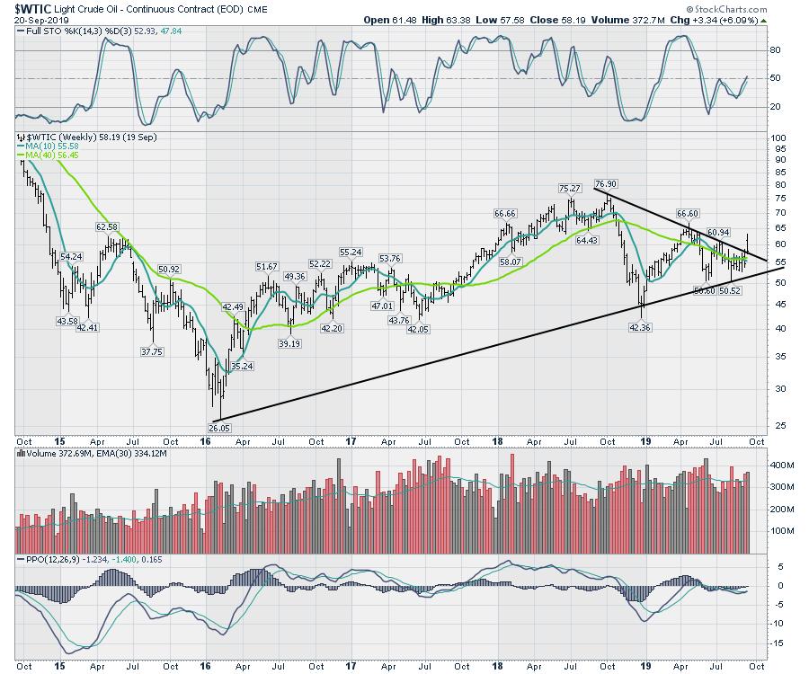
Quite frankly, I was very disappointed that the Chinese trade delegation left early on Friday afternoon, as it was one of the key pillars of what appeared to be happening in the markets. The Shanghai market had turned up on the weekly chart and commodity markets have been accelerating. Oil closed the week up 6%, but near the bottom of the range and right back at the trend line, which took away some of the bullish tone. Both the full stochastic and the PPO momentum indicator turned up, but we still have to see how the oil inventories are affected over the next few weeks from the attacks on the Saudi oilfields.

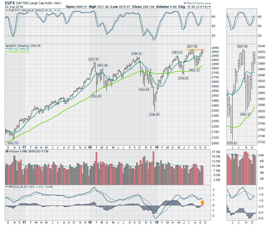
Technically, the market is in a very tender place in terms of momentum. While all of the indexes have turned the PPO momentum indicator up, the $SPX PPO indicator is currently in a position where it is making lower lows and similar highs in momentum. We like higher highs and higher lows in momentum, not lower lows in momentum.
This recent turn higher was very bullish but, as of Friday's close, the PPO has not crossed the signal line. Additionally, the price bar had a higher low and a slightly higher high this week, but we closed in the bottom half of the bar, putting the market's ability to break out into question. There were a lot of industries trending higher the week of September 9, so this sudden lull with the Fed and the OE is concerning.

A sudden thrust down next week would be extremely bearish.
What makes this market analysis more difficult currently are the noticeably wild waves on the PPO, which are literally flipping every month. While that might make the critics of technical analysis happy, looking left shows this to be the choppiest period in three years. Looking all the way back to 2012, there are other periods that are as difficult, but the amplitude of these waves are extra large in comparison.
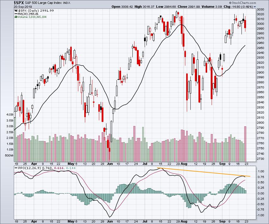
I will spend a lot more time discussing this over the weekend, and I would encourage you to view the upcoming Canadian Technician video for a lot more detailed discussion. I did cover some of this on the Market Buzz show Friday morning (the video is titled Oil After The Attack!). We always have to wait for the close on a weekly chart, but the weak finish on Friday gave us 4 out of 6 down closes on the daily chart below, including last Friday. All of those came after we tested the 3020 level last week; the price could not close at the 3020 level, despite trying again and again. The best we could do was to close near 3010. I have placed a yellow line on the PPO noting some divergence, but we don't have a top on the current wave until it crosses the signal line.

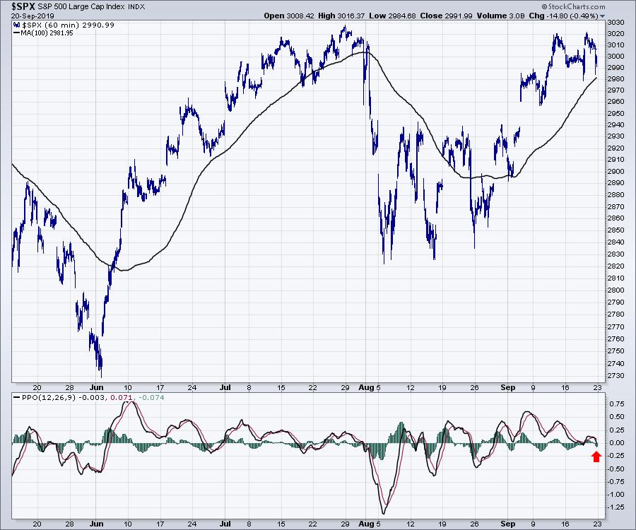
To get even more granular, the hourly chart is starting to fail. While the 1-hour chart is not my go-to chart, we can see how the momentum this week has collapsed by looking at the PPO, which closed in negative territory for the week. The last time that happened was August; we can see the same "weak" PPO momentum at the late July top.

Heads up - I might have to become a bear again. Lots more on this weekend's Canadian Technician video. You can find it near the bottom of the StockCharts YouTube page.
|
| READ ONLINE → |
|
|
|
| ChartWatchers |
| Cash Is King Right Now; Join Us TODAY For A Big Event |
| by John Hopkins |
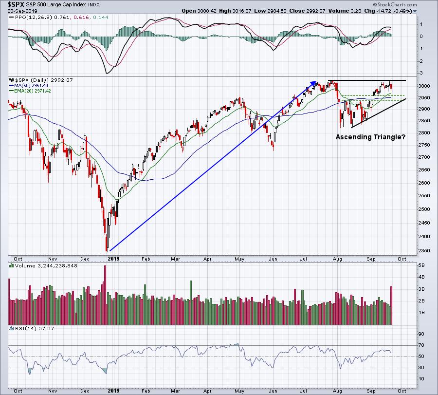
Technically, it makes sense to lessen stock exposure any time a major price resistance level is challenged. The all-time high close on the S&P 500 is 3025.86, set on July 26, 2019. On Thursday, the S&P 500 hit 3021.99, less than 4 points from that key level. It was also quad witching day on Friday, and it's not at all unusual to see a pickup in the Volatility Index ($VIX) around such days. Right on cue, the VIX surged 9%, while the S&P 500 saw selling pressure. Here's a chart of the S&P 500:

It was great having Tom Bowley rejoin EarningsBeats.com this past week. A powerful Daily Market Report was developed by Tom and it's been getting rave reviews from our members. You can CLICK HERE to review Friday's report.
Throughout the week, I marveled at Tom's ability to find and share golden nuggets of technical information with our community. Here were just a few samples:
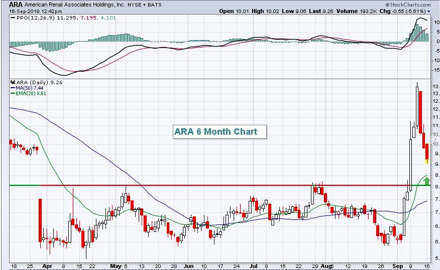
American Renal Associates (ARA):

This was ARA's chart on Monday at noon. Tom's comments, in part, were "An intraday move down closer to 8 is possible, but a 20-day EMA test would provide a ton of upside. It's not for those who are risk-averse, however, as ARA carries an inordinate amount of risk."
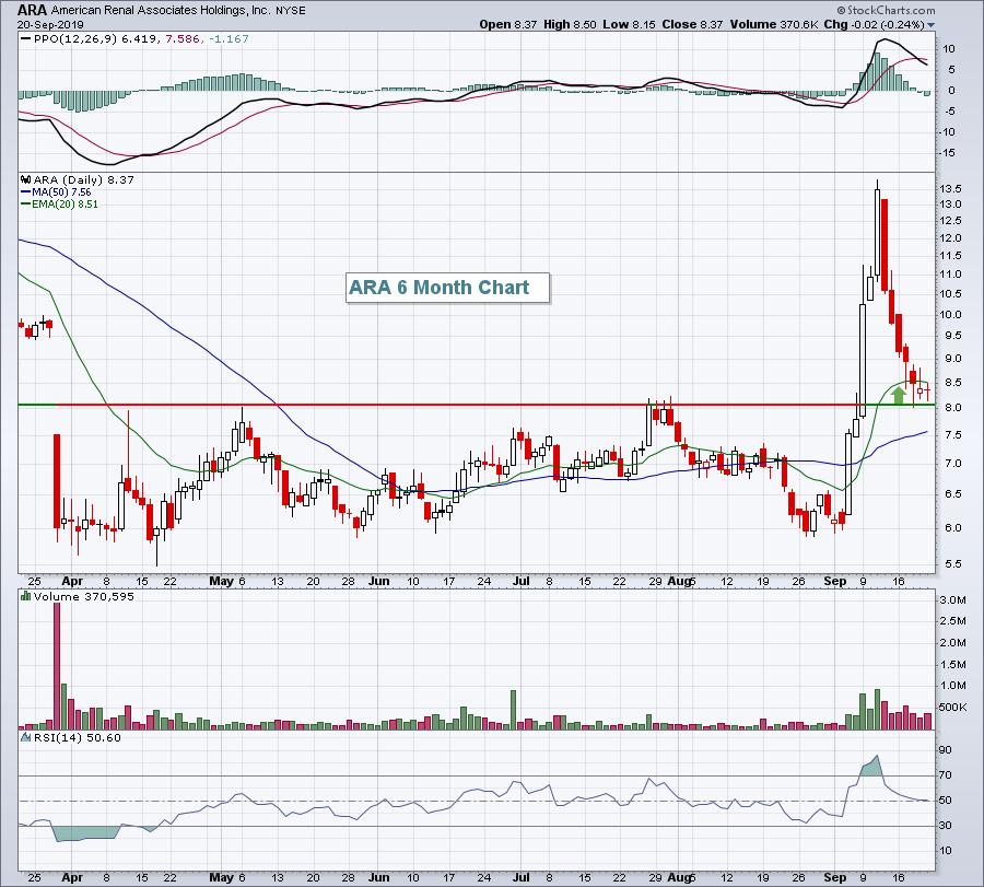
Then, this happened:

ARA was at 9.26 on Monday when the Daily Market Report was sent out, with Tom encouraging patience for the stock to settle back to close to 8.00. Wednesday's low was 8.02. I don't know where ARA will go next week, but I do know that buying a stock close to 8.00 is cheaper than 9.26 and would have saved a bundle.
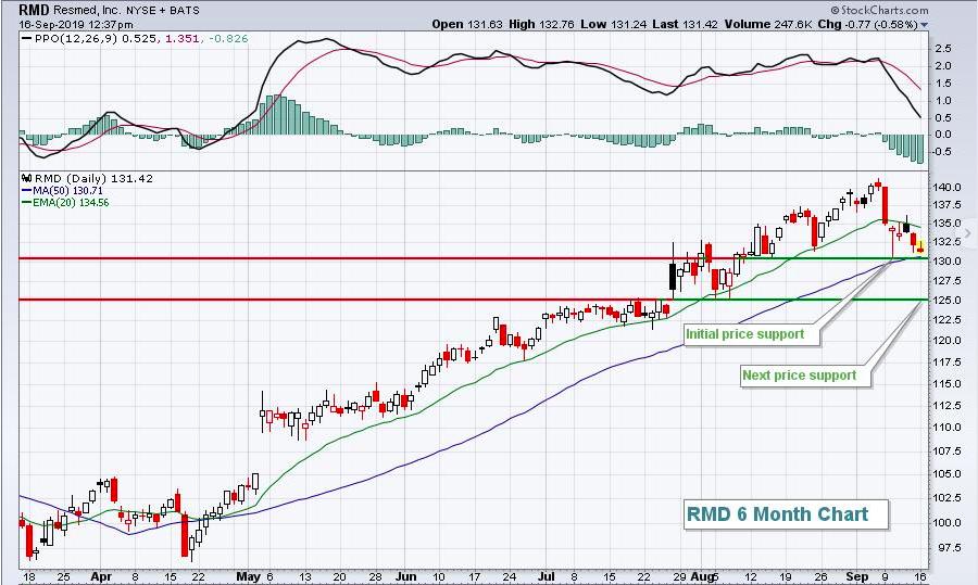
Tom also provided his usual Monday setup, which this past week was Resmed, Inc. (RMD). The stock looked like this on Monday:

At Friday's close, RMD was at 134.53, a gain of 3.11, or roughly 2.3%. Not bad, given the fact that the S&P 500 was down approximately 0.50% over the same period.
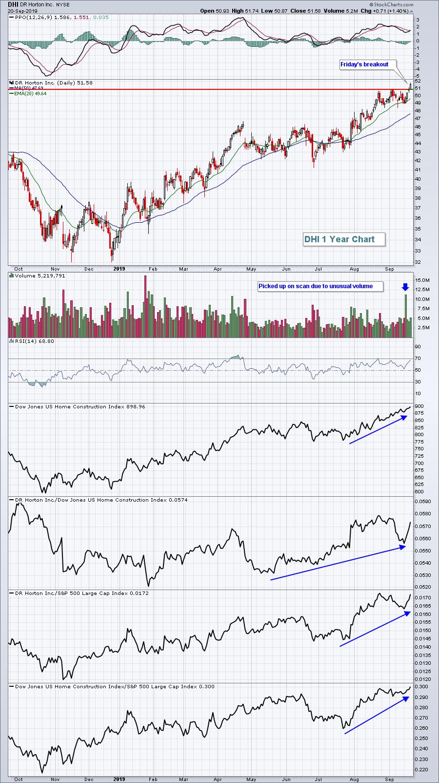
Tom's ability to find trading gems using the StockCharts.com Scan Engine shone through on Tuesday. Using a high volume scan, DR Horton, Inc. (DHI) was dissected with the following comment:
"DR Horton (DHI) is in that home construction space that I mentioned above and it's currently bouncing off its 20-day EMA. 48.00 should be solid price support on any further selling/consolidation, but it's beginning to show leadership again, so I think we'll see another breakout here sooner rather than later."
Then, the breakout happened:

DHI traded higher by more than 4% following Tom's posting on Tuesday. Needless to say, it's great to have Tom back full-time at EarningsBeats.com in his role as Chief Market Strategist.
Occasionally, we have news that hits and can change the overall trading landscape. The Fed's latest policy statement hit the wires on Wednesday afternoon and we've been dissecting the stock market's performance and leadership ever since. We want to share our observations with everyone live via a webinar TODAY at 11:00am EST. We believe it's THAT important. We are likely to see a major shift in equity performance in Q4 and it'll be extremely important to know what to look for and what areas to trade. Our webinar room will open up at 10:30am EST and the webinar will begin promptly at 11:00am EST. If you'd like to join me and Tom for this special event, simply send an email to "support@earningsbeats.com" and put "Webinar" in the subject line. We'll send you instructions on how to join the webinar. If, for some reason, you cannot make the live event, no worries; we'll record the event and send you a link to the recording!
We hope to see you there!
At your service,
John Hopkins
President, EarningsBeats.com
"Better Timing. Better Trades."
|
| READ ONLINE → |
|
|
|
| The Traders Journal |
| The Crisis of Complexity: A Solution |
| by Gatis Roze |

Here’s an important lesson I’ve learned. I’ll call it the “crisis of complexity”. There is something about most investors that makes them have an insatiable appetite for complexity. In reality, complexity is not the hoped-for portfolio accelerator — it is instead the detonator.
It takes years for smart educated investors to embrace the fact that consistent profits flow when simplicity and hyper-focus replace complexity. In other words, you don’t need three more fundamental data inputs or four more technical indicators.
For more than twenty years now, I’ve warned about the “paralysis of perfectionism” and its negative consequences. In the markets, you never have one hundred percent of the information. Get used to it!
That is why I know for a fact that consistent profitable investing is more about focused restraint. The chaos and complexity of the markets can overwhelm you if you let it. That is why I am constantly encouraging investors to return to the basics. Have a plan, a roadmap and a methodology.
The basic architecture of investing is presented, for example, in our book about the ten essential stages of stock market mastery. Organized simplicity can be deceptive. It’s the framework that provides clarity for investors by digesting the market’s chaos and enabling investors to see actionable opportunities — thereby facilitating the confidence needed to pull the trigger.
Profitable investing requires an action orientation on your part. Yes, simplicity may be a compromise. But understanding and knowing one hundred percent of the market’s changing intricacies will never be possible. Understanding probabilities and stacking them in your favor is how to win the game.
The bottom line is that, for over 25 years, I’ve devised a personal philosophical attitude towards my investing that’s not overly complex but that is consistently profitable. When I follow my ten stages, apply my tools, adhere to my methodology and discipline my mind, it becomes MY market!
Let’s call it TINA (There Is No Alternative).
Trade well; trade with discipline!
- Gatis Roze, MBA, CMT
StockMarketMastery.com
|
| READ ONLINE → |
|
|
|
|
|
| DecisionPoint |
| SPX and OEX Log Intermediate-Term BUY Signals, But NDX IT Momentum Moves South |
| by Erin Swenlin |
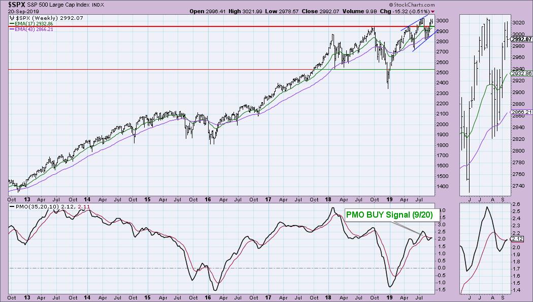
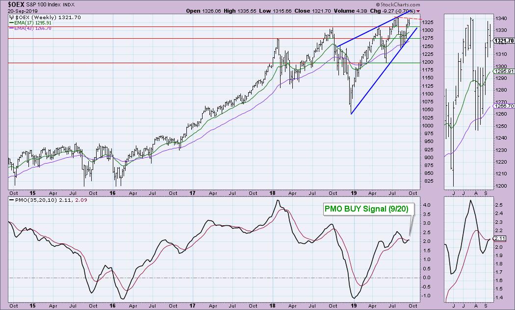
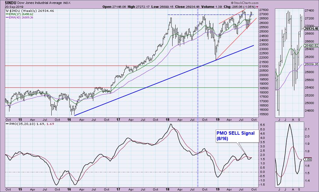
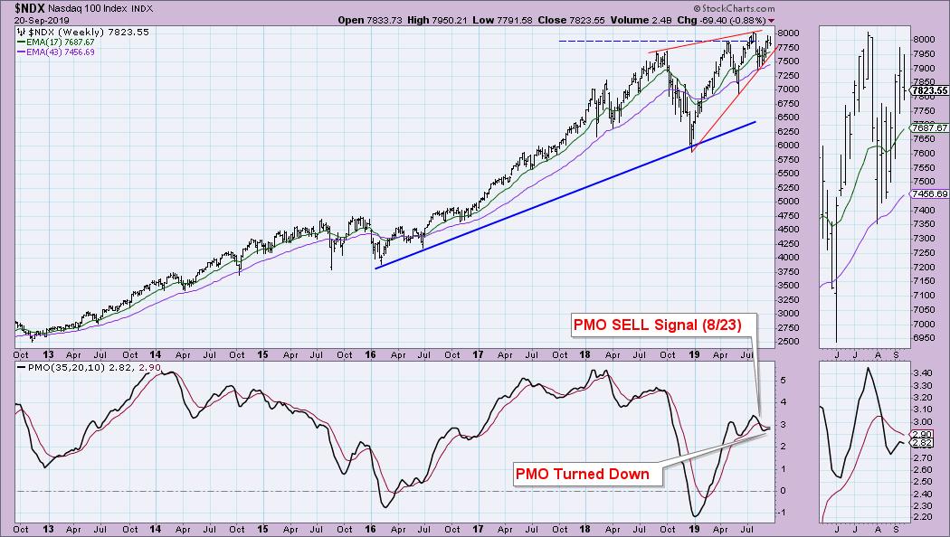
After challenging the all-time highs, the market has continued to chop along. In spite of a lackluster few weeks, the weekly Price Momentum Oscillator (PMO) managed to cross above its signal line on both the SPX and OEX, while the Dow is just about there. The surprise to me was seeing the weekly PMO on the NDX top before the IT BUY signal. With an aggressive area of the market showing negative momentum in the intermediate term, I wouldn't count on these new BUY signals sticking around for very long.
I recommend you check out Carl's Weekly Wrap when it is published Friday night to get the full analysis picture of the SPX. As noted, the PMO crossed above its signal line. One thing to note and compare with the next three charts is that the SPX still hasn't logged a top, as the intra-week high is above the previous week's. I see bearish rising wedges on all the charts. While we got this positive crossover, we are seeing a lot of market weakness with our indicators (see the Weekly Wrap).

The OEX did log a top, with this week's OHLC bar top falling below the previous week's. You can see the familiar bearish rising wedge. Also, note that while the PMO did have a positive crossover, it is decelerating.

I will be surprised if the Dow and the NDX log a new weekly PMO BUY signal by the end of the week. The PMO is decelerating on the Dow and, if we see more downside (which I believe we will), it could very well turn down like the NDX. The Dow formed a declining tops trend line with the July top and this current top. Price is also in the familiar rising wedge.

Below is the chart that concerns me. The big technology names are dragging down the NDX, with the gravity pull of this week's price decline managing to yank the PMO downward. I suspect this will happen on the indexes above. In my DecisionPoint Daily Diamonds Report yesterday, I mentioned that, when I ran my bullish PMO scan, I got 19 results. When I ran the inverse of the scan, I got 70 results! This is really tells me to stay where I am. As I mentioned at the end of the Diamonds report, I remain 60% cash. The positions I do own are in mostly defensive areas of the market (Staples, Utilities and Real Estate). Don't miss the Diamond reports in the DecisionPoint blog! I will be presenting five "diamonds in the rough" symbols that I analyze and pick from my DP scan results.

Watch the latest episode of DecisionPoint with Carl & Erin Swenlin LIVE on Fridays 4:30p EST or on the StockCharts TV YouTube channel here!
Technical Analysis is a windsock, not a crystal ball.
Happy Charting! - Erin
erinh@stockcharts.com
Helpful DecisionPoint Links:
Erin's PMO Scan
DecisionPoint Chart Gallery
Trend Models
Price Momentum Oscillator (PMO)
On Balance Volume
Swenlin Trading Oscillators (STO-B and STO-V)
ITBM and ITVM
SCTR Ranking
**Don't miss DecisionPoint Commentary! Add your email below to be notified of new updates"**
|
| READ ONLINE → |
|
|
|
|
|
| MORE ARTICLES → |
|


 Mean-reversion signals provide a great way to trade in the direction of the bigger uptrend after a pullback. The trick is to identify the bigger uptrend and then capture mean-reversion setups. Mean-reversion setups materialize after a pullback within the uptrend. The strategy is based on the assumption that prices will "revert" back to the uptrend because it is the dominant force at work. This article will show how to identify mean-reversion signals and identify the trend with one indicator.