| THIS WEEK'S ARTICLES |
| The Market Message |
| Consumer Discretionary SPDR Pulled Lower by Travel and Entertainment Stocks |
| by John Murphy |
Yesterday's message showed bond yields falling (and bond prices rising) in a flight to the safety of government bonds. And further suggested that fears of the Chinese virus spreading was most likely behind that more defensive tone. Bond yields are falling even further today as that defensive mood continues, and is starting to cause some nervous selling in stocks. But not just any stocks. Stock groups being hit the hardest today are the most vulnerable to the fallout from the Chinese virus. They include airlines, cruise ships, gambling stocks (with close ties to Macau), and hotel stocks (with big exposure to China). Those last three groups are weighing heavily today on cyclical stocks.
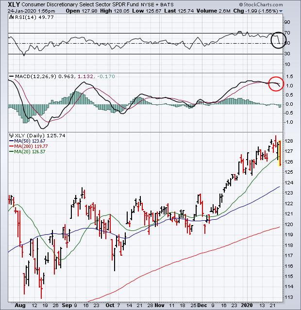
Chart 1 shows the Consumer Discretionary SPDR (XLY) being one of today's weaker sectors; and in danger of falling below its 20-day average (green line) for the first time in nearly two months. The two top boxes show its 14-day RSI line also weakening; and its MACD lines turning negative. Those are warning signs of more profit-taking to come in this economically-sensitive sector. Which may also be spreading to the broader market.
Chart 1
Editor's Note: This is an excerpt of an article that was originally published in John Murphy's Market Message on Friday, January 24th at 1:46pm ET. Click here to read the full article, which includes Charts 2-5.
|
| READ ONLINE → |
|
|
|
| SPECIAL EVENT ANNOUNCEMENT |
| Don't miss your chance to hear David Keller, Chief Market Strategist at StockCharts.com! David will be a featured presenter at the upcoming Orlando MoneyShow conference, February 6th - 8th. The event is free to register and attend, and you'll have the chance to hear David speak alongside a long list of other industry legends and market experts. Click the banner below to learn more. |
 |
| LEARN MORE → |
|
| Market Roundup |
| Dollar Index Reaches a Crucial Technical Juncture Point |
| by Martin Pring |
The Dollar Index has been rising in the last few sessions following its December decline, which has put it at a crucial technical juncture. Whichever way it breaks will have implications for commodities, gold and the relative performance of international equities to the US. A rising currency would have negative effects on all three, whereas a falling one would represent a bullish factor for them.
Chart 1, for instance, shows that the Index is above its 24-month MA. Historically, this MA has acted as a reliable dynamic level of support and resistance. You can see that from the various green and red arrows, which have turned back numerous rallies and reactions in the last 25 years or so. Also worth noting is the fact that the red neckline of a potential head-and-shoulders top is just a tad above the 24-month MA. That means that a decisive month-end close below that average, at 95.73, would likely tip the balance of the long-term evidence to the bearish side.
Another aspect of the chart lies in the fact that the 9-month RSI bounced off an oversold condition at the start of 2018, which is characteristic of a primary bull market. Since then, it has failed to register an overbought reading that would be consistent with bull market behavior for this indicator. Just compare recent action with that which occurred between 1997-2001, when the RSI consistently and persistently maintained an overbought condition, and you'll see what I mean. Current action, by contrast, looks to be more characteristic of a bear market or trading range.
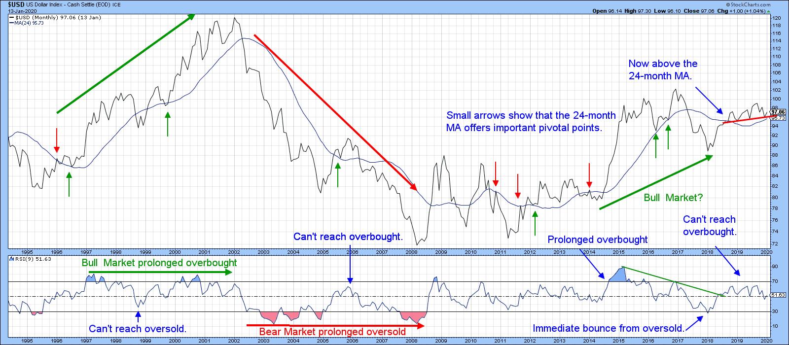
Chart 1
Chart 2 offers a mixed picture. The Index is below its 12-month MA, but the KST is comfortably above its MA.
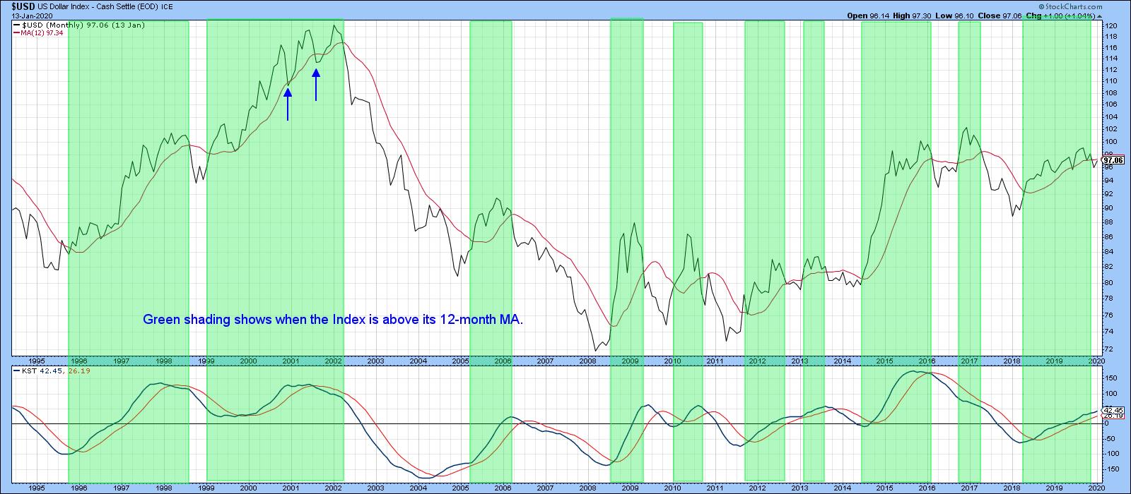
Chart 2
Chart 3 utilizes daily data and compares the Index with my currency diffusion indicator (!PRDIFCUR). This series monitors a universe of cross-dollar rates that are in a positive trend. The green arrows point up periods when it has reversed from an oversold reading. Usually, such events are followed by a dollar rally of some kind. When the Index is in a primary bear market, signals tend to be weaker. This is evident from the action in the pink-shaded area. Right now, the indicator is oversold but still declining. That means it could be close to a buy signal, unless the currency is in a bear market, where prices are far less sensitive to oversold conditions. We can also see that the blue 50-day MA has reached the oversold zone. Previous instances have been flagged by the small dashed-green arrows. Here again, this kind of event has triggered a rally when the primary trend has been bullish, but not so when it has been bearish.
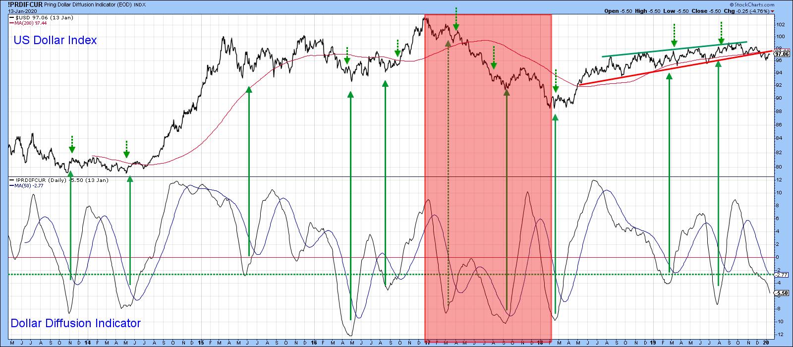
Chart 3
Editor's Note: This is an excerpt of an article that was originally published in Martin Pring's Market Roundup on Tuesday, January 14th at 3:47pm ET. Click here to read the full article, which includes Charts 4-5 and further discussion on Chart 3.
Good luck and good charting,
Martin J. Pring
The views expressed in this article are those of the author and do not necessarily reflect the position or opinion of Pring Turner Capital Group of Walnut Creek or its affiliates.
|
| READ ONLINE → |
|
|
|
| Art's Charts |
| A Moment of Truth for the Russell 2000 ETF |
| by Arthur Hill |
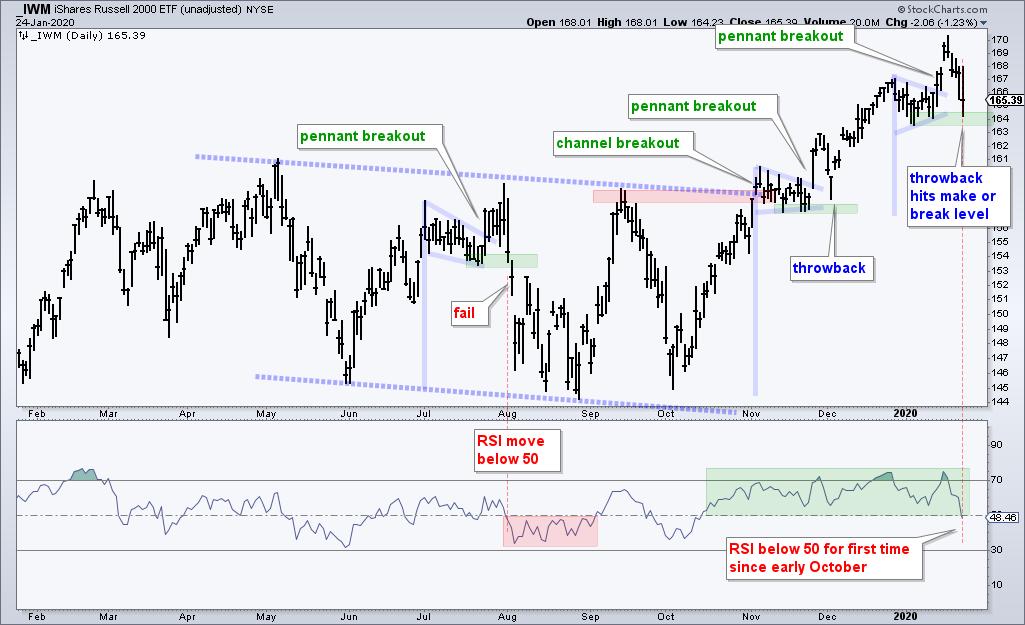
 The Russell 2000 ETF (IWM) broke out of a pennant formation last week and then fell sharply this week. This puts the ETF back in the pennant and near its make or break level. The Russell 2000 ETF (IWM) broke out of a pennant formation last week and then fell sharply this week. This puts the ETF back in the pennant and near its make or break level.
Flags and pennants are short-term continuation patterns that form after a sharp move. Bullish versions represent the pause that refreshes and an upside breakout signals a continuation of the prior advance. Not all breakouts lead to higher prices and some breakouts fail. Today we will look at three pennants in the Russell 2000 ETF (IWM) over the last six months: a failure, a success and a work in progress.
Let's first look at the longer-term picture, the chart below shows IWM trending lower with a falling channel from May to October. The ETF broke out of this channel with a move above the September high in early November. IWM extended on this breakout and hit its initial 52-week high in late November. This small-cap ETF recorded more new highs throughout December and January. The long-term trend is up with the channel breakout and new highs.

Now let's look at the pennants in July, November and January. The first pennant failed as IWM broke out, failed to hold the breakout and moved below the flag low. Note that this flag formed while IWM was within the falling channel. Thus, the bigger downtrend overruled the pennant breakout. The second pennant formed near the channel breakout. Notice how IWM broke out and then fell back with a sharp three day decline. This is called a throwback and can sometimes offer a second chance to partake in the breakout. The throwback held well above pennant lows and prices then moved substantially higher.
The most recent pennant formed here in January and IWM broke out with a surge on January 14th. This surge did not last long as the ETF fell sharply the last four days and is back near the pennant lows, which offer support. This puts IWM at its make or break level. Either it holds for a successful throwback or fails and breaks down. A breakdown at this stage would be short-term bearish and target a move towards the early November breakout zone (159-160 area). Such a move, however, would not enough to affect the long-term uptrend.
What are the odds of a successful support test here at 164? I would say not very good. First, IWM advanced some 15% from early October to mid January and is entitled to a corrective period. Second, RSI already moved below 50 and the RSI break below 50 in early August led to a deeper pullback.
TrendInvestorPro.com follows IWM and 59 other ETFs on a regular basis. Subscribe today for immediate access to the following: weekly ETF report, ETF ranking tables, market timing models, ETF ChartBook, weekend video, Saturday stock setups and more. Click here to subscribe today!
----------------------
|
| READ ONLINE → |
|
|
|
| The Mindful Investor |
| Healthy Prognosis for Health Care |
| by David Keller |
While sectors like Technology of received much of the praise for leading the recent market upswing, the Health Care sector is comprised of a group of five industries that all have fairly attractive chart setups. (Earlier this week, on my daily closing bell show The Final Bar, I conducted a deep dive on the Health Care sector to demonstrate the strength in the industry charts and to highlight the potential upside for this emerging sector.)
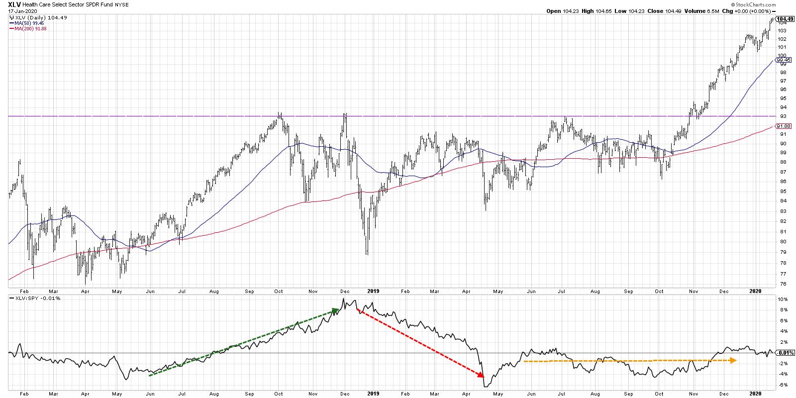
The Health Care sector ETF (XLV) established a resistance level in late 2018 around the $93 level. This price ceiling held in December 2018 and again in summer 2019. In November of last year, the XLV finally broke above this key price level before continuing on to higher highs through the beginning of 2020.

The relative strength line shows the strength in Health Care during the second half of 2018, as the XLV outperformed the S&P 500 through the market bottom in December 2018. The first four months of 2019 saw the XLV underperform as other sectors rebounded much better from the 2018 market low.
The remainder of 2019 saw Health Care as a market performer with a flat relative strength line. As of mid-January 2020, the XLV has as 0% relative return vs. the broader equity markets for the last two years. Looking deeper at the industries that comprise the Health Care sector highlights the dispersion of returns within the sector - and also shows some potential opportunities.

There are five industries within the sector, including Biotechnology, Health Care Providers, Medical Equipment, Medical Supplies and Pharmaceuticals. Let's look at each of these industries in descending order of their Industry SCTR ranking:
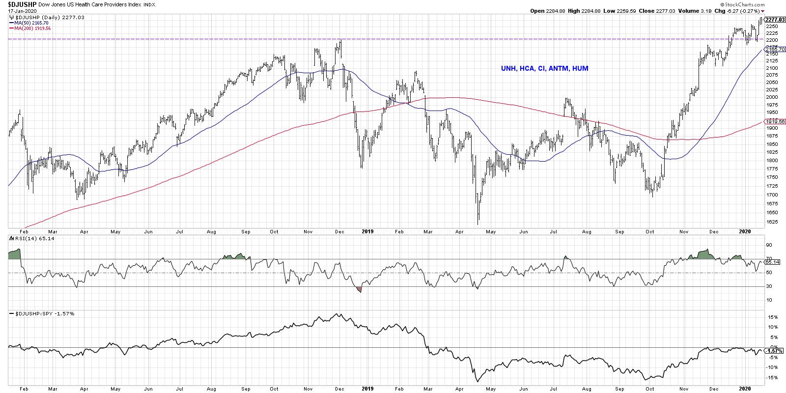
1) Health Care Providers
This industry includes HMOs and other health care provider firms, such as UNH, HCA, CI, ANTM and HUM.

The industry has finally returned to significant price resistance from December 2018 and has once again pushed to new highs. If there's any concern here, it's the potential bearish divergence, with higher highs in price and lower peaks in RSI. Overall, the trend remains positive.
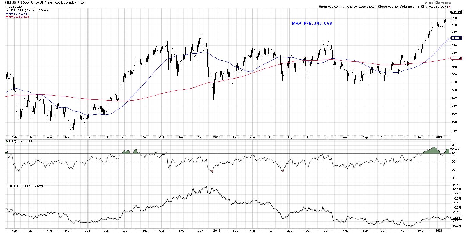
2) Pharmaceuticals
The big pharma names included here are JNJ, MRK, PFE and CVS.

Here we see a bit of a flatter base than the Health Care Providers group, but a similar pattern, with a successful retest of resistance before a break higher. This group is extremely overbought, with an RSI above 80. This usually suggests further upside after a brief pullback due to the very positive momentum.
3) Biotechnology
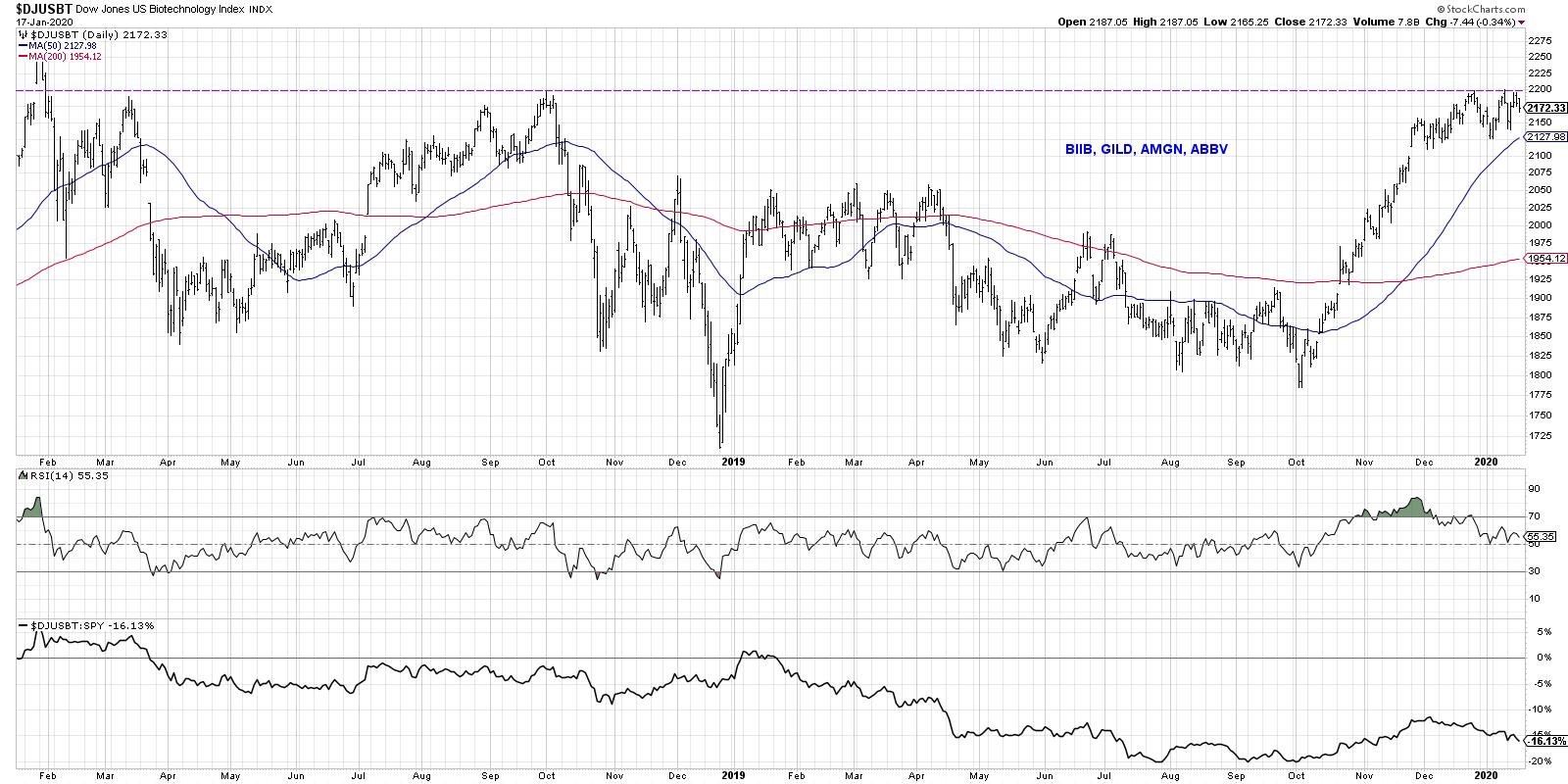
The biotech sector consists of stocks like BIIB, GILD, AMGN and ABBV.

I would argue this is the most important chart in the space, as it is a key group up against a significant resistance level. Either the biotech industry breaks above the 2200 level and continues in a position of strength, or it fails at resistance and settles back into the previous range. Either way, I would not be surprised if the broader market follows the general direction of this group.
4) Medical Equipment
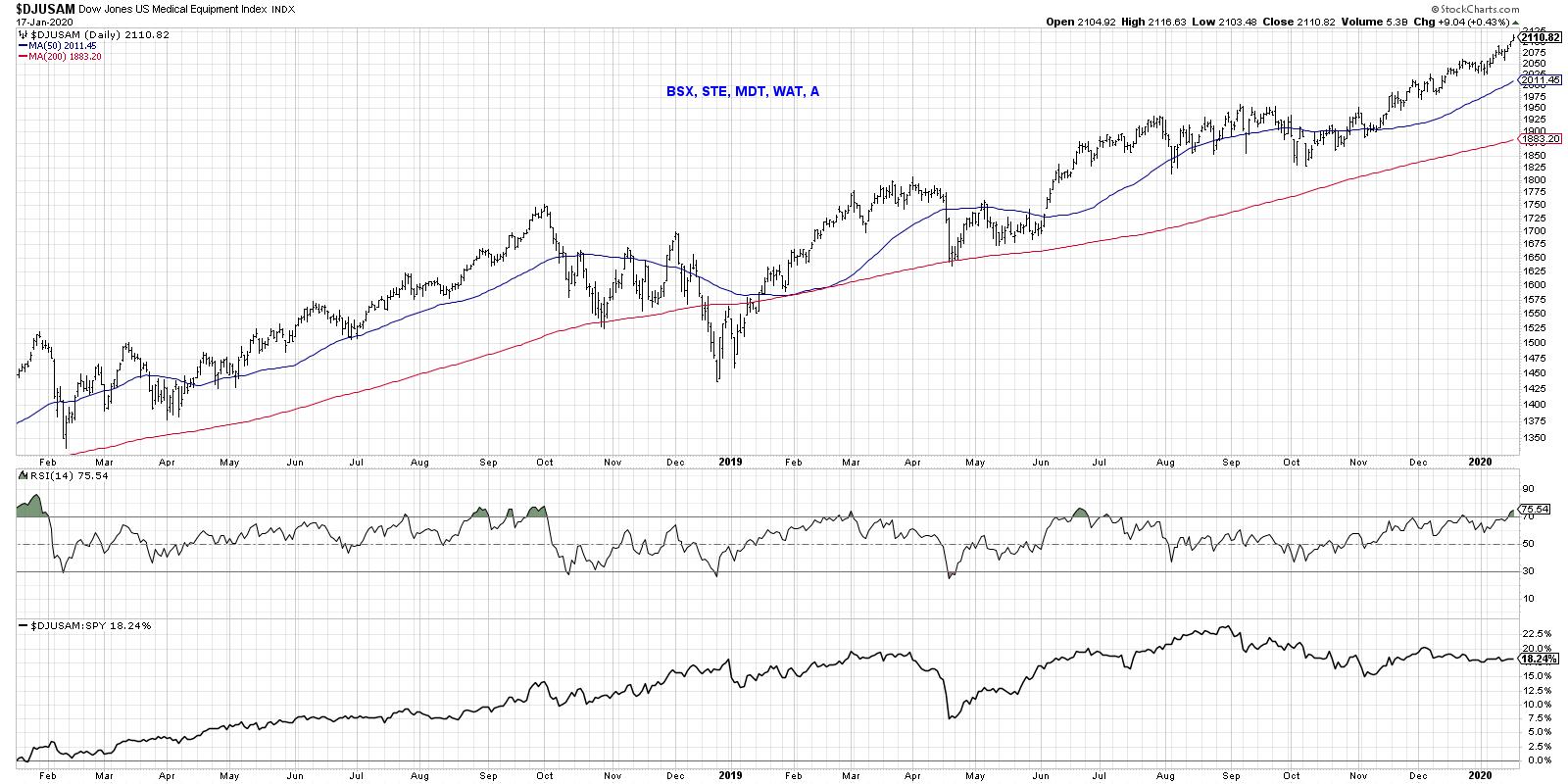
This group includes stocks like BSX, STE, MDT, WAT and A.

Now we finally see a group with a very different return profile than the other groups we've reviewed thus far. If you covered up the tickers, you might expect this to be an industry within Technology! While the relative strength has not been incredibly impressive, the price trend has been consistently positive, keeping pace with the broader equity markets.
5) Medical Supplies
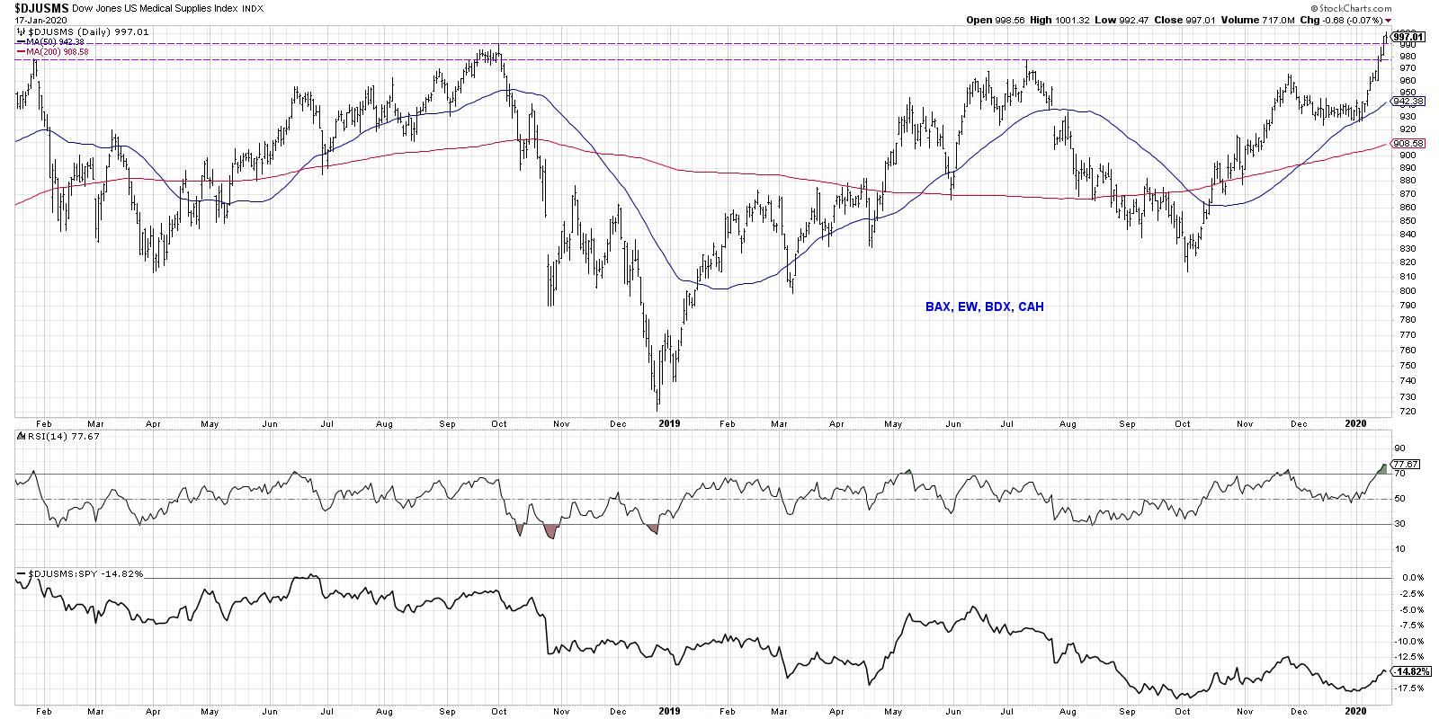
This industry is comprised of names like BAX, EW, BDX and CAH.

Medical Supplies are potentially the most actionable idea out of these five charts. The last two years look like a "cup-with-handle-with-handle" pattern, with a broad rounding bottom followed by a series of more shallow pullbacks. In the last couple weeks, this industry has broken to a new high, eclipsing a huge resistance level going back to September 2018. The RSI is almost extremely overbought, which would suggest further upside after a brief pullback.
With the strong uptrend in the Health Care sector chart, it's well worth considering the movements of the five industries that comprise the sector. By following these charts in the coming weeks and months, investors should have a better sense of the strength of this sector, as well as implications for the equity markets as a whole.
RR#6,
Dave
David Keller, CMT
Chief Market Strategist
StockCharts.com
David Keller, CMT is Chief Market Strategist at StockCharts.com, where he helps investors minimize behavioral biases through technical analysis. He is also President and Chief Strategist at Sierra Alpha Research LLC, a boutique investment research firm focused on managing risk through market awareness. He is a Past President of the Chartered Market Technician (CMT) Association and most recently served as a Subject Matter Expert for Behavioral Finance. David was formerly a Managing Director of Research at Fidelity Investments in Boston as well as a technical analysis specialist for Bloomberg in New York. You can follow his thinking at MarketMisbehavior.com, where he explores the relationship between behavioral psychology and the financial markets.
Disclaimer: This blog is for educational purposes only and should not be construed as financial advice. The ideas and strategies should never be used without first assessing your own personal and financial situation or without consulting a financial professional.
The author does not have a position in mentioned securities at the time of publication. Any opinions expressed herein are solely those of the author and do not in any way represent the views or opinions of any other person or entity.
|
| READ ONLINE → |
|
|
|
| The Canadian Technician |
| Commodities Euphoria Gets Hit by a Stun Gun |
| by Greg Schnell |
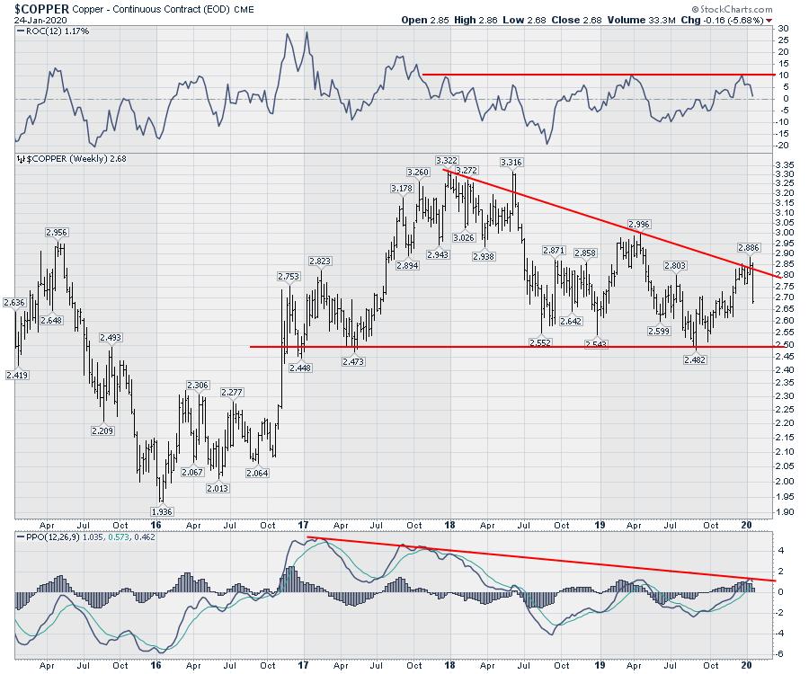
One of the bigger themes this year has been the belief that a global pick-up in growth is underway. The USA/China tariff tennis slowed growth in commodities worldwide. The industrial metals index topped out in January 2018 as the tariffs roiled the markets. Copper has been in a slow decline, as an example, but we could add steel, lithium and rare earth metals as other examples.

I was on The Final Bar with David Keller this past week, where I pointed out that the Baltic Dry Index was falling. That does not usually bode well for $COPPER and other industrial metals.
Here is the chart I used, which had not broken the 4-year uptrend as of Tuesday evening. Now, however, it has, which suggests copper could pull back even more here, despite the fact that it is just starting a move down.

It's an important dynamic to watch to see if the global growth story can continue. Unfortunately, commodities do a good job of representing that, and they seem to be breaking down fast and hard since the phase one trade agreement was signed. Perhaps it is a whipsaw lower, but it is definitely concerning.

If we are counting on global growth improving, these charts have to start moving meaningfully higher. The false breakout on $COPPER suggests more pain ahead. Stay tuned and stay cautious.
|
| READ ONLINE → |
|
|
|
| Trading Places |
| The Masses are Growing Too Bullish; I Smell a Short-Term Top |
| by Tom Bowley |
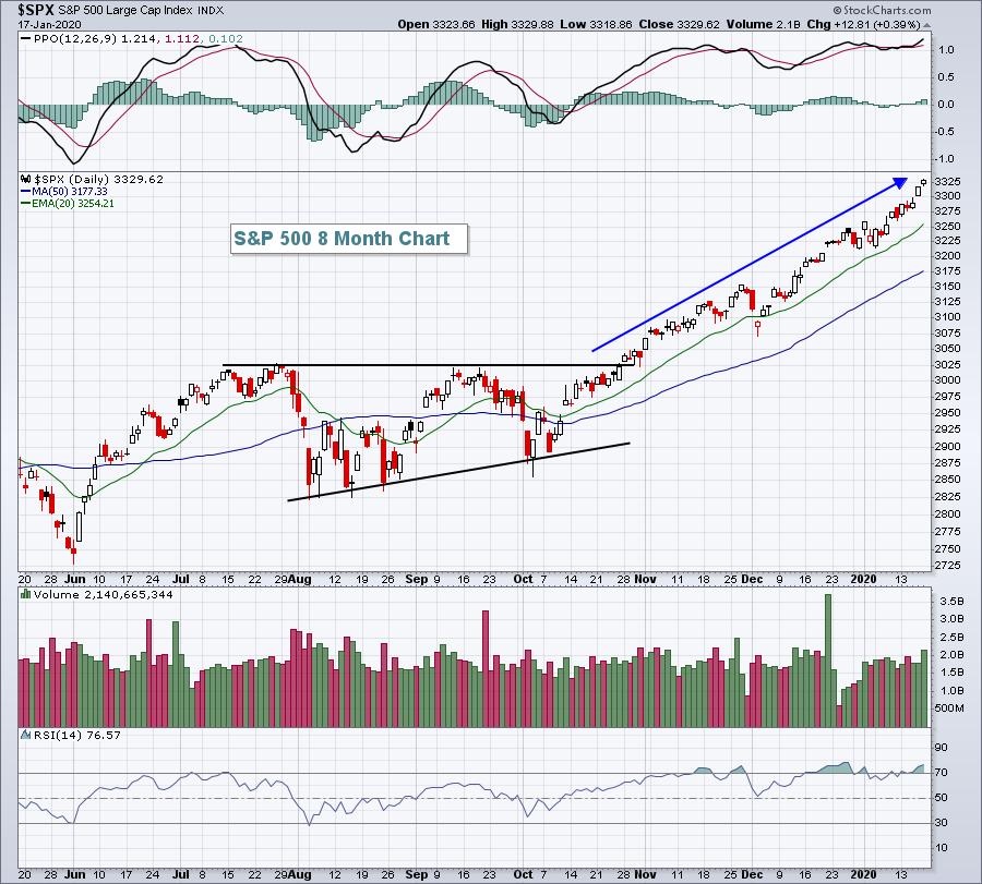
Calling tops in a secular bull market advance is not typically a wise thing to do, because it rarely works. But it's very difficult to ignore sentiment readings that border on the absurd. Three months ago, the S&P 500 broke out of a bullish ascending triangle that measured another 7% higher. At the time, I suggested we'd see it by December 31st.... and we did. I received a number of emails questioning my rationale of moving up so quickly, what with the trade war, economic contraction in manufacturing, the political environment, etc. The beauty of the charts is that all known information is already priced in. I can make my calls based on the price action; I don't need to always look over my shoulder at the news headlines. We're now higher by more than 10% from that breakout above 3025:

In case you haven't seen it, I've made a prediction that the S&P 500 will see 4000 before this year ends. It may have looked really crazy 6 months ago, but it's not quite so crazy anymore. It won't be straight up, however. We'll have our normal ebbs and flows with short-term greed and fear helping to direct traffic. Currently, greed is taking over. No one wanted to buy U.S. stocks when the headlines centered on the trade war. We were doomed! 500 points later and now everyone is speculating and buying calls. That's how the market works. The masses usually arrive late to the party.
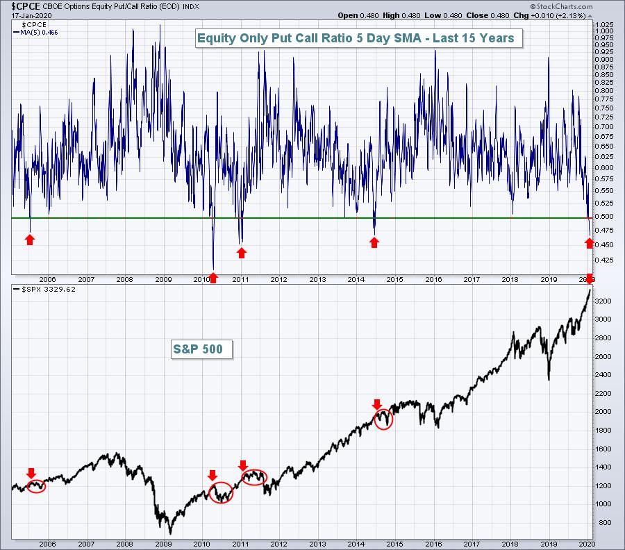
Hey, I'm as bullish as anyone out there, but I also recognize when a good short-term thing has gotten too good. Have you noticed the equity-only put call ratio ($CPCE)? I like to look at it on a 5-day SMA in order to get a feel for investor sentiment. Everyone is CRAZY bullish right now and that can be a scary thing. The 5-day SMA has fallen to .48 and there's only been 2 lower readings in the past 15 years. Everyone is buying calls. Now, all of a sudden, no one believes the market can go down, which is why we need to prepare for exactly that possibility:

Notice those red arrows don't suggest a crash. But, in each of those cases, we saw sideways consolidation or a brief correction. We could use another one right now. Also, the S&P 500's best historical period of the year - by far - has been from the October 27th close to the January 18th close. This is based on data spanning 7 decades. During this period, the S&P 500 has produced an annualized gain of 20.76%, more than twice that of the average annual return of 9% over the same 70-year period. That bullish period ended today.
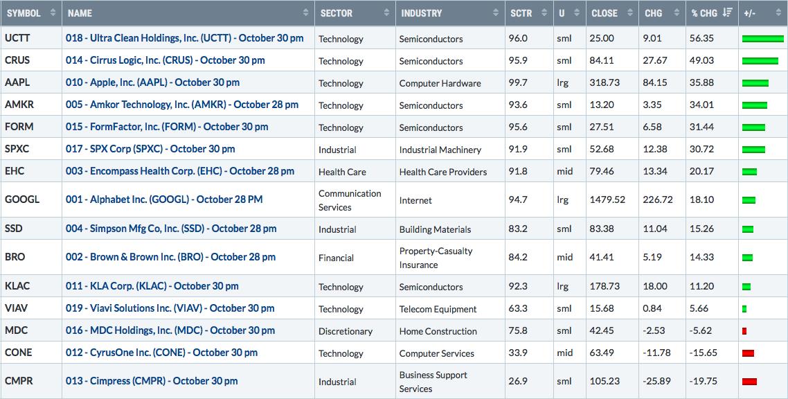
While I don't expect any kind of major selloff, a rotation most definitely could kick in. In the meantime, Wall Street is giving us a new set of leaders for the quarter ahead, if we'll only listen. Relative strength tells us who Wall Street is betting on. Three months ago, I gave EarningsBeats.com members 15 stocks before they reported their earnings. These companies looked great technically and were showing tremendous relative strength. Take a look at how these 15 companies performed over the last 90 days:

I'd say they easily outperformed the S&P 500. On Tuesday at 4:30pm EST, I'm going to give the EarningsBeats.com community a new list of 15 companies - companies that I believe are poised to deliver great quarterly earnings over the next couple of weeks. If you'd like to be part of this event, both paying subscribers of EarningsBeats and free EB Digest subscribers will be invited. Simply SIGN UP HERE and we'll send you room instructions for the event on Tuesday!
Happy trading!
Tom
|
| READ ONLINE → |
|
|
|
| RRG Charts |
| Brazil and Russia are Both Showing Promising Tails on Relative Rotation Graphs, But Russia Wins |
| by Julius de Kempenaer |
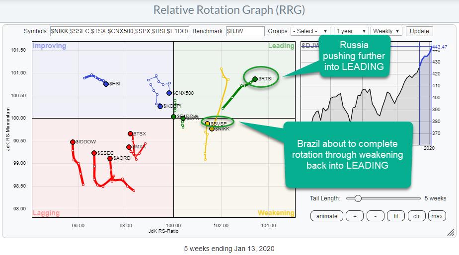
 Weekly RRG showing international stock market rotation Weekly RRG showing international stock market rotation
In my last article for the RRG blog, I wrote about the process of how to get from an idea, whether based on RRG analysis or something else, to a position in your portfolio. That post was geared towards the observation that Growth stocks are outperforming Value stocks and focused on how to get such a view into a real position in a portfolio. Another area where "tradable instruments" are needed to get exposure to a certain part of the market are international stocks.
For a lot of people, it is not that straightforward to trade international stocks. Sometimes (US) brokers often do not offer the service, sometimes it may be restricted by a government, sometimes it may require a different type of account, etc. It's often a hassle. But the good news is that, for a lot of the major foreign markets, ETFs are now available, which brings diversification into markets outside the US within reach for many more (retail) investors and traders.
An RRG with the rotation for some major international stock markets is available under the predefined dropdown groups on the RRG page. That RRG is printed at the top of this article.
As you may notice, the securities on the RRG are INDEXES, NOT ETFs!!! The reason for using indexes on the ETF for analysis is that they show the true performance for these markets. The tradable ETFs that US investors can use to create exposure to these markets are (very often) quoted in US dollars, which brings another variable to the game: the relationship between the currency of a particular (stock) market and the US dollar.
For a pure and unbiased analyses of international markets, I prefer to use the indexes instead of the ETFs. Once it comes to the implementation of a view into a portfolio, the ETFs come into play.
Looking at the RRG for these international markets, two tails attract my attention. The first one is $RTSI, the Russian market, and the second one is for $BVSP, the Brazilian market.
$RTSI - Russian Trading System (RTS) Index

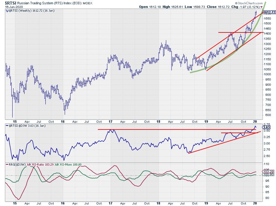
Over the last two months, $RTSI started to accelerate its rising trend and even managed to break above the upper boundary of the rising channel. Breaking an already rising resistance line is a strong sign, at least IMHO. The acceleration of the rally is annotated using the curved green line. This improvement of the rally has caused the relative strength of $RTSI vs. the DJ Global index to improve further and take out the relative high of January 2017.
$RTSI moved into the leading quadrant back in October 2018 and has completed two rotations from leading through weakening into leading. The last one in October 2019. That move is now still underway and the break to new relative highs, in combination with the break above rising resistance in price, makes Russian stocks attractive at the moment.
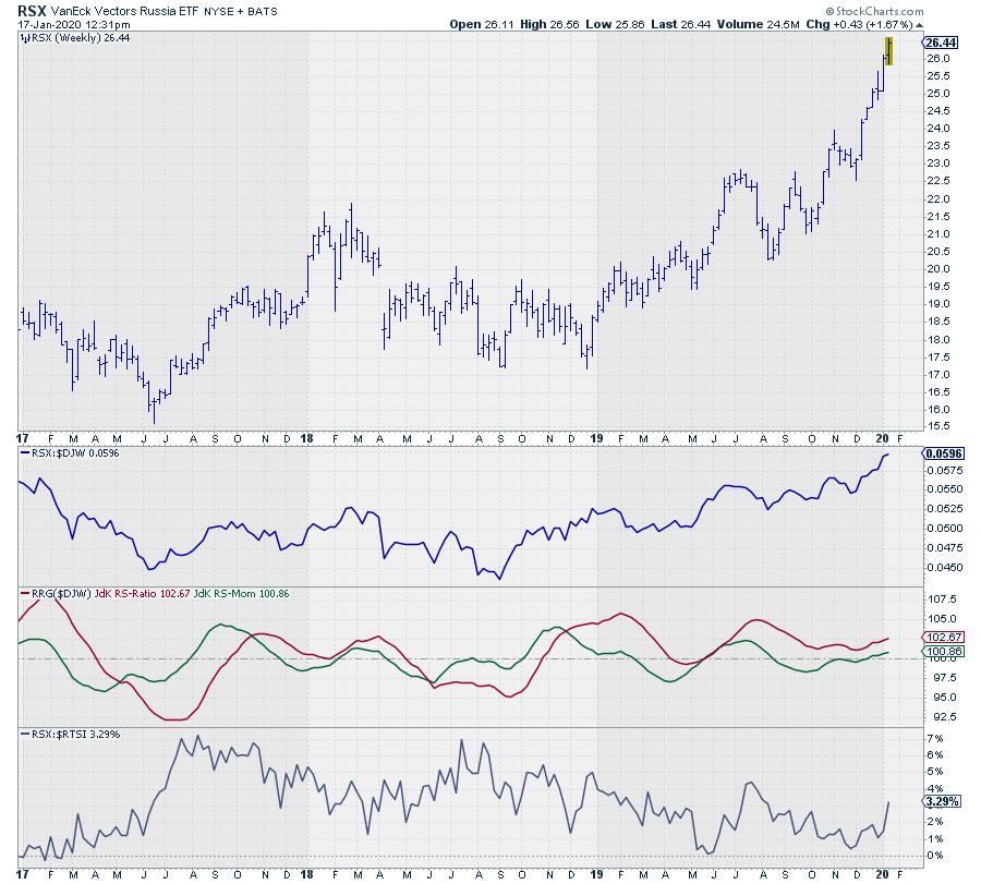
To get involved and get a position in Russian stocks, there are a few ETFs available. One of these is RSX, the VanEck Vectors Russia ETF traded on NYSE.
RSX - VanEck Vectors Russia ETF

This chart shows the development of RSX in price and vs $DJW for the relative strength and the RRG-Lines. As you can see the moves are largely the same, as one would expect...
The graph in the bottom pane shows the relationship, in performance, between RSX and $RTSI. The chart is zoomed in from the $RTSI chart to show the last three years; you can see that the difference in performance between these two roughly moves between 0% and 7%.
This difference is due both to the fact that RSX tracks a slightly different index than $RTSI (though the two are highly correlated) and, more importantly, to the currency exchange rate between the Russian Ruble and the US dollar. This is something that you need to be aware of as an investor when you use these ETFs covering foreign markets.
$BVSP - Brazilian Bovespa Stock Index

The Brazilian market is a slightly different story.
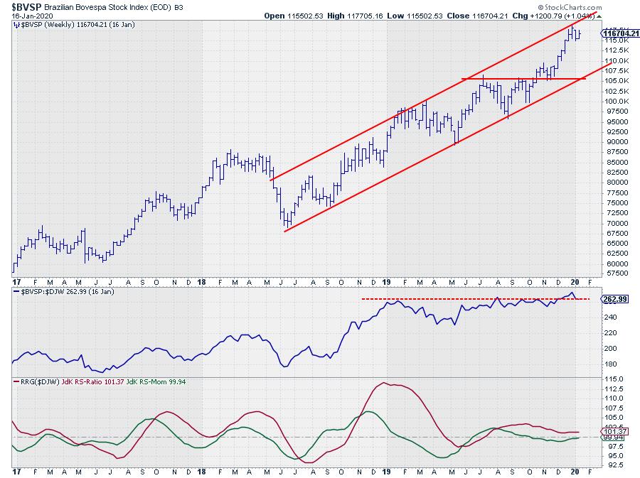
$BVSP has been moving inside a rising channel since mid-2018. From a relative point of view, the second half of 2018 was very strong but, during the course of 2019, relative strength flattened and started to move sideways. Against the DJ Global index, $BVSP managed to hold up, with the JdK RS-Ratio remaining above 100, but the dip of JdK RS-Momentum below 100 caused a short rotation through weakening.
With both RRG-Lines very close to 100, things become a bit unclear; I would like to see a bit more confirmation either from a relative or a price perspective before making any decisions on the long side.
The relative strength line is attempting to break above the early 2019 relative high. When that convincingly happens, things will likely improve further for Brazil. On the price chart, $BVSP is pushing against the rising resistance line, while there is quite a bit of room for a decline within the channel without breaking the trend. If $BVSP manages to break this upper boundary like $RTSI did, then things will turn for the better immediately. If not, we may need to wait for a correction within the channel and look for buying opportunities at lower levels.
As for the instruments needed to create exposure to the Brazilian market in a portfolio, there are again a few ETFs, the most popular one probably being EWZ.

Wow!!!!! ;)
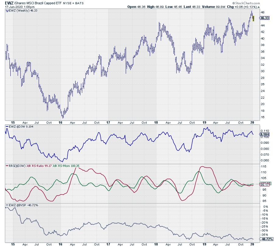
As you can see, the price pattern for EWZ is significantly different from $BVSP. Again, one of the reasons is the fact that this ETF tracks the MSCI Brazil index, but the real kicker in this case is the BRL/USD exchange rate.
The lower pane again shows the difference between EWZ and $BVSP. Over the past few years, depending on where you start, these have been some serious double digit declines. To be clear, the US dollar gained significantly against the Brazilian Real.
Thus, an investment in EWZ made, let's say, at the bottom in 2018 would have returned $46:$30=1.53, or 53%. The underlying market $BVSP over the same time moved from 70k to 117k, which equals roughly 67%. That's a serious difference and something to take into account as a USD-based investor.
Concluding
Both tails for $RTSI and $BVSP show promising rotations, but, with $BVSP just below overhead resistance and a shaky FX relationship, $RTSI via RSX seems to be more promising.
--Julius
My regular blog is the RRG Chartsblog. If you would like to receive a notification when a new article is published there, simply "Subscribe" with your email address.
Julius de Kempenaer
Senior Technical Analyst, StockCharts.com
Creator, Relative Rotation Graphs
Founder, RRG Research
Want to stay up to date with the latest market insights from Julius?
– Follow @RRGResearch on Twitter
– Like RRG Research on Facebook
– Follow RRG Research on LinkedIn
– Subscribe to the RRG Charts blog on StockCharts
Feedback, comments or questions are welcome at Juliusdk@stockcharts.com. I cannot promise to respond to each and every message, but I will certainly read them and, where reasonably possible, use the feedback and comments or answer questions.
To discuss RRG with me on S.C.A.N., tag me using the handle Julius_RRG.
RRG, Relative Rotation Graphs, JdK RS-Ratio, and JdK RS-Momentum are registered trademarks of RRG Research.
|
| READ ONLINE → |
|
|
|
| DecisionPoint |
| Gold Miners on Fire! |
| by Erin Swenlin |
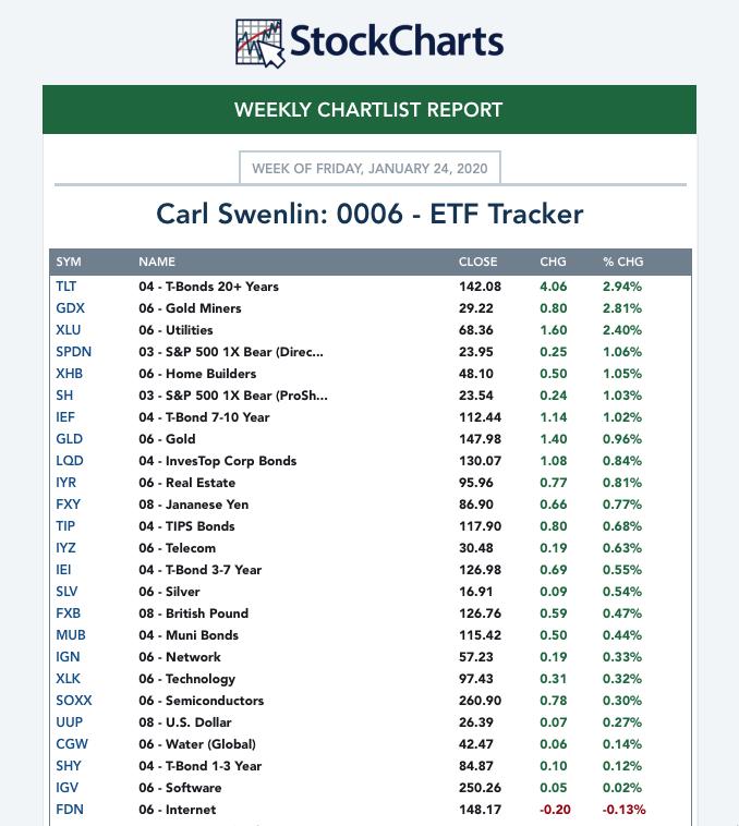
Gold Miners have been on fire this week! Each Friday, I get a Weekly ChartList Report on the ETF Tracker ChartList that Carl and I have developed. If you would like it, you'll find it in the DP Trend and Condition ChartPack (free to Extra members and above!). Nearly every day, I have seen Gold Miners near the top, so it wasn't surprising to see it at the top on the Weekly Report. DecisionPoint has developed a "Golden Cross Index" (GCI) and "Silver Cross Index" (SCI) which tell us how many stocks in those indexes or groups have 50-EMAs above their 200-EMAs (GCI) and how many have 20-EMAs above their 50-EMAs. We have the GCI and SCI for Gold Miners, so I thought I'd share some extra insight.


As investors, we want to accomplish two basic things: (1) determine the trend and condition of the market, and (2) select stocks that will ride that tide. The DecisionPoint Alert helps with the first step; DecisionPoint Diamonds helps with the second. Go to DecisionPoint.com and SUBSCRIBE TODAY! (Charter Subscriber Discounts Available!)
Below is the daily chart for GDX, the Gold Miners ETF that we track. The chart shows a textbook "cup and handle" chart pattern. It began to execute this week, with the breakout from the declining tops trend line that is the "handle" of the pattern. The PMO is confirming this breakout as it rises to likely give us a crossover BUY signal. Another plus on the daily chart is the positive divergence between OBV rising bottoms and declining price lows.

We are seeing a pullback on the Silver Cross Index, as well as a drop below the signal line. I find this healthy and appropriate right now, given how overbought this group was. It still is at a healthy reading of 80, meaning 80% of the Gold Miners in this ETF have 20-EMAs above 50-EMAs. Now, as price breaks out from the handle, we do want to see the SCI begin to turn back up to confirm; it isn't right now, which could be a problem if this rally is to be sustained. On the other hand, the Golden Cross Index looks great, albeit overbought. It is rising and, as you can see, since the end of summer it has maintained mostly above 80. Overbought conditions can persist in a bull market rally.

Below is a weekly chart of GDX. Here it looks as though a flag has executed. The big area of overhead resistance lies close, at $31. The weekly PMO has turned up after this week's rally.

Conclusion: Overall, I'd say Gold Miners have the potential to continue higher. The Silver Cross Index is pulling back and overhead resistance is pretty close, but the daily and weekly PMO are confirming and not overbought, the chart pattern is very bullish and I like the positive divergence of the OBV on the daily chart. If you haven't checked out our new website DecisionPoint.com, I invite you to come see it and sign up for our free email newsletter!
Technical Analysis is a windsock, not a crystal ball.
Happy Charting! - Erin
Email: erin@decisionpoint.com

Erin Swenlin will be presenting at the The MoneyShow Las Vegas May 11-13, 2020! You'll have an opportunity to meet Erin and discuss the latest DecisionPoint news and Diamond Scans. The conference is free to attend or view online!
Helpful DecisionPoint Links (Can Be Found on DecisionPoint.com Links Page):
Erin's PMO Scan
DecisionPoint Shared ChartList and DecisionPoint Chart Gallery
Trend Models
Price Momentum Oscillator (PMO)
On Balance Volume
Swenlin Trading Oscillators (STO-B and STO-V)
ITBM and ITVM
SCTR Ranking
|
| READ ONLINE → |
|
|
|
| The MEM Edge |
| Are Small-Cap Stocks Ready for their Day in the Sun? 3 Stocks to Bank on if the Rally Continues |
| by Mary Ellen McGonagle |
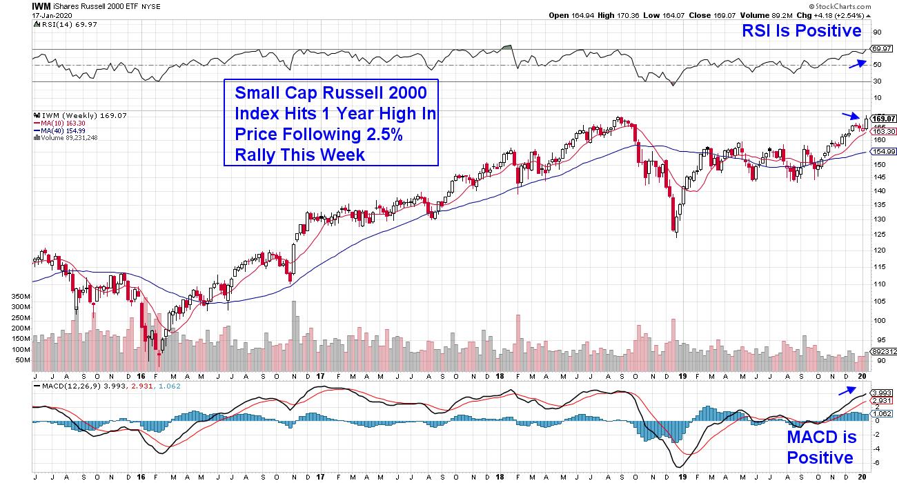
Last week, small-cap stocks were the highest performers, with the Russell 2000 gaining 2.5%. While the biggest gainers were upgraded Healthcare stocks following Wall Street's largest Medical conference, there were plenty of other areas that saw money flows signaling continued outperformance among these lower-market-cap companies.
With every other major market Index hitting a new high in price, investors are ready for smaller stocks to join the party. This is particularly true if the economy continues to show solid growth, which will help lift these riskier stocks higher. This week's move put the Russell within 2% of an all-time high.
WEEKLY CHART OF RUSSELL 2000 ETF
Today, I'll be reviewing three small-cap stocks that are in strong industry groups and have bright growth prospects going forward.
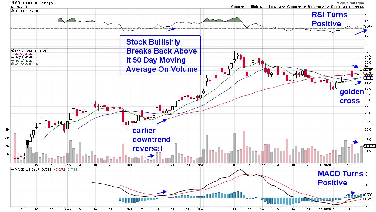
DAILY CHART OF INMODE LTD. (INMD)
This first stock is a recent IPO that's in the Medical Equipment area. Unlike most IPO's, InMode (INMD) went public last summer with actual earnings on the table and interest in their minimally invasive skin-tightening and fat-cell-destroying products pushed the stock up over 100% within its first week of trading. The stock exploded much higher before peaking in price in late November.
Since then, InMode has pulled back 40% before its recent downtrend reversal, when the stock broke back above its key 50-day moving average on heavy volume.
As you'll see, the RSI is positive and the MACD just turned positive. The bullish signals with these momentum indicators, as well as the golden cross formation with the 10-day simple moving average crossing above the 21-day sma, point to more near-term upside for INMD. And while the stock is clearly volatile, investors, using these same signals in late October, were able to enjoy gains of over 70% before that late November peak in price.
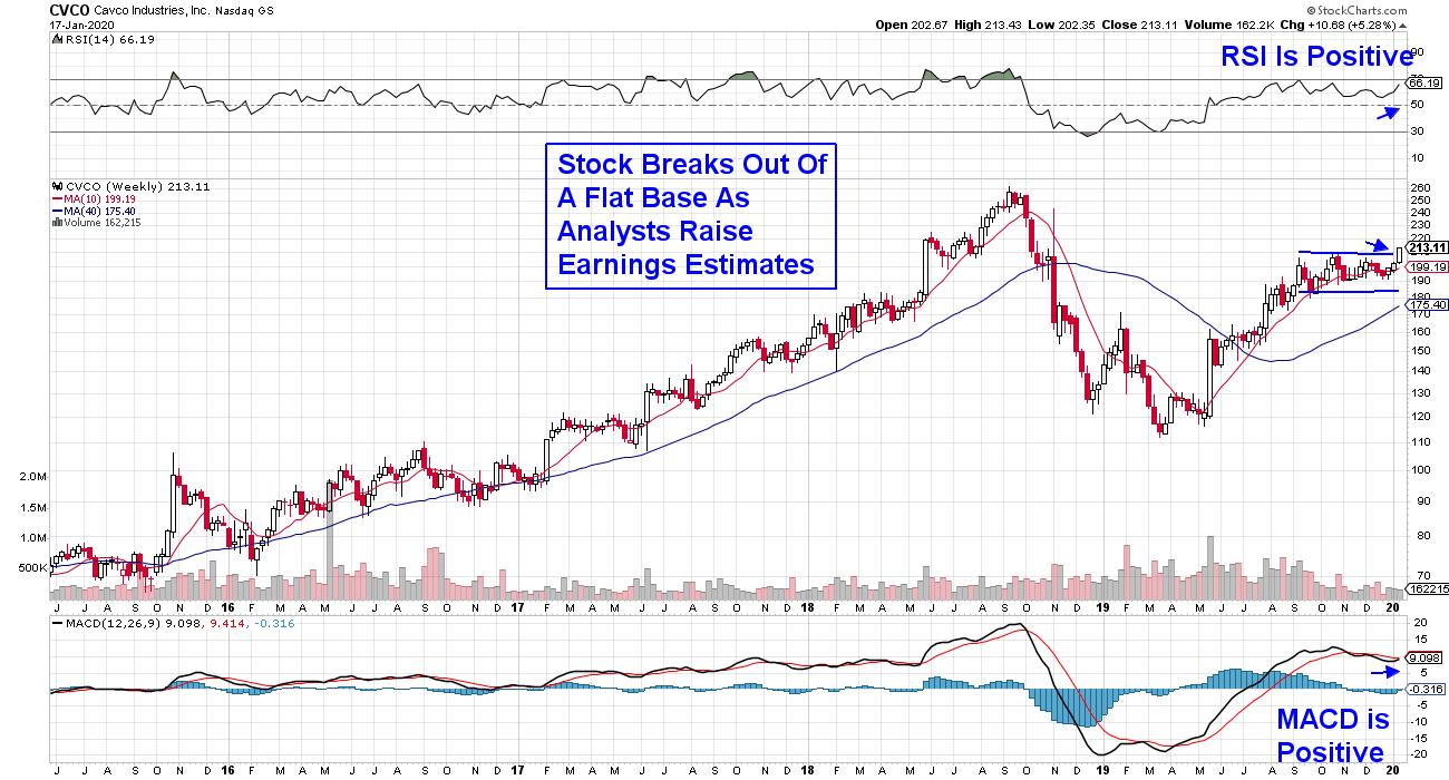
WEEKLY CHART OF CAVCO INDUSTRIES, INC. (CVCO)
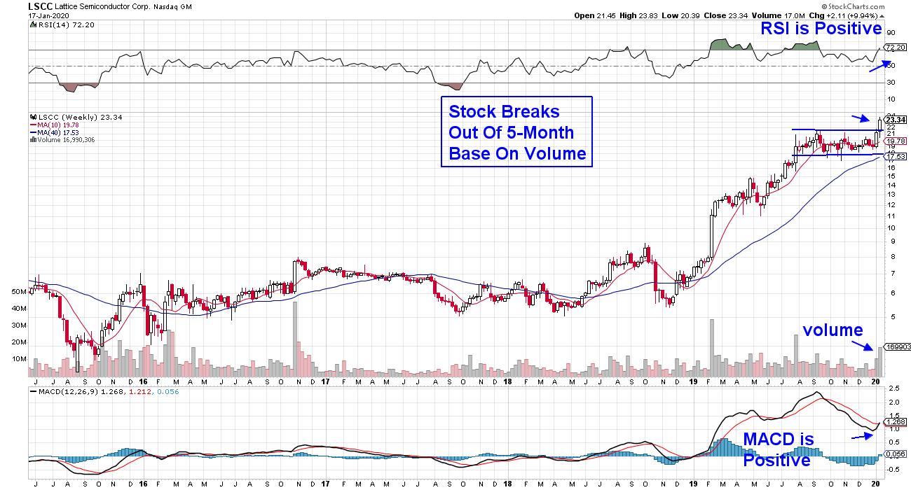
The next company with an improved outlook is Manufactured Homebuilder Cavaco (CVCO), which broke out of a flat 4-month base on volume. The RSI and MACD are also in bullish positions. The company's advance came on the heels of a Wall Street upgrade, as well as news that their CEO is retiring. Today's economic report that showed the largest increase in December housing starts in 13 years is also a boost for this home builder.
CVCO is in the process of potentially reaching its prior high in price, which was achieved over 16 months ago following a particularly robust period of growth. The company's recent acquisitions and reported backlog of orders has put them on track for 18% earnings growth this year - a number that's also being boosted by the company's revenues from mortgage loan originations as well.
WEEKLY CHART OF LATTICED SEMICONDUCTOR CORP. (LSCC)
This last stock not only had the largest move for the week, but is also the most attractive. While Lattice Semiconductor (LSCC) rallied 10%, it's 5-month flat base breakout on volume points to further upside. In addition, the stock is in one of the strongest industry groups - Semiconductors - which is a key component to its continued upside advance. The RSI and MACD are also in positive territory, with a bullish signal crossover poised to take place on the MACD should the black line cross above the red signal line.
Lattice Semiconductor provides low-power programmable solutions in many growing fields, such as computing, industrial, automotive and consumer markets, and with the company on track for 76% earnings growth for 2019 and analysts raising estimates for this year, its one of the fastest growers in its group.
With small-cap stocks poised to join the rest of the markets in hitting new all time highs, it's an exciting time to be investing in the markets. For those who'd like to be alerted to when this current uptrend has ended, you'll want to trial my MEM Edge Report for a nominal fee.
Not only do we uncover high quality stocks poised to outperform the markets, we alert you to when it's time to sell. This alert goes for the broader markets as well. Our system has helped many subscribers preserve their gains and limit losses. Click here now for updated outlooks on top stocks, as well as the broader markets.
Warmly,
Mary Ellen McGonagle,
MEM Investment Research
|
| READ ONLINE → |
|
|
|
| ChartWatchers |
| In a Volatile Market, Focus on the Best of the Best |
| by John Hopkins |
It's no secret that the market has reached frothy levels with virtually no relief since the beginning of October 2019. Thus, it makes sense that the VIX spiked on Friday, as it moved above all key technical intraday levels and many traders moved to the sidelines.
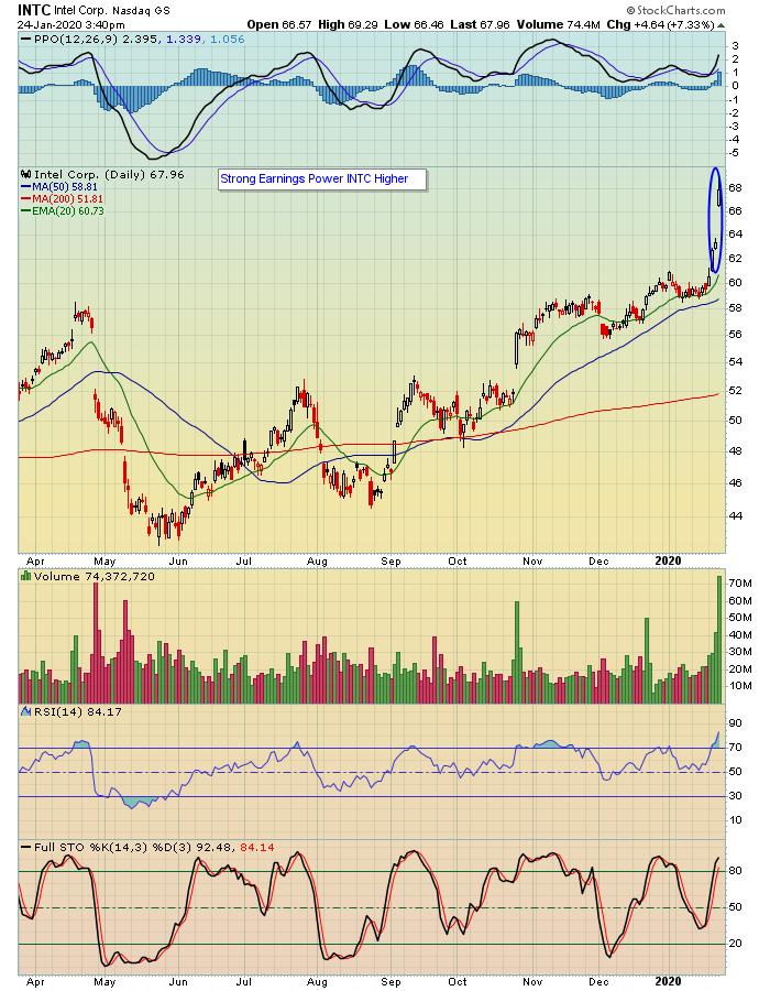
While the heavy selling was gong on, two stocks had reported their earnings on Thursday after the bell: Intel (INTC) and Atlassian Corp (TEAM). I bring these two stocks up as they held up quite nicely in spite of the selling on Friday, with INTC gaining over 7.5% and TEAM gaining over 9% by day's end.

In fact, in the chart above, you can see that Intel started out on a positive note and never looked back, hitting and closing at its all time high. Not too shabby given a market in turmoil.
I bring these two stocks up as there's about to be an earnings frenzy starting next week, with thousands of companies set to report their numbers over the next several weeks. This is the time to try to identify those stocks that might (or might not) shine, keying in on those that beat earnings expectations (like INTC and TEAM) and power higher - and could ultimately be prime trading candidates once the dust settles. As a matter of fact, we will be conducting our quarterly earnings season webinar, Q4 Earnings Season, this Monday, January 27. During this event, EarningsBeats.com Chief Market Strategist Tom Bowley will be discussing stocks that have recently reported, as well as those scheduled to report over the next few weeks that could be potential long/short trading candidates. If you want to join us, just click here to learn more. It promises to be a VERY educational event that we hope everyone can attend.
At your service,
John Hopkins
EarningsBeats.com
|
| READ ONLINE → |
|
|
|
|
|
| MORE ARTICLES → |
|


 The Russell 2000 ETF (IWM) broke out of a pennant formation last week and then fell sharply this week. This puts the ETF back in the pennant and near its make or break level.