| THIS WEEK'S ARTICLES |
| John Murphy's Market Message |
| STOCKS RESUME SELLING AFTER FED RELIEF RALLY |
| by John Murphy |
STOCK SELLING RESUMES... Stocks are being sold heavily today and are totally reversing yesterday's Fed relief rally. Stocks have given back all of Wednesday's price gains and look poised to fall further. Chart 1 shows the Dow Industrials falling sharply today after meeting resistance at their blue 50-day line. The other two major indexes are experiencing bigger percentage losses. Chart 2 shows the S&P 500 losing nearly -3.9%. The Nasdaq is the day's biggest percentage loser with a -5% loss. A big jump in bond yields is taking a bigger toll on technology stocks and the Nasdaq market.
All eleven sectors are in the red with the biggest losses in consumer discretionary, technology, communication services, materials. and industrials. More defensive stocks are showing smaller losses. They include utilities, staples, real estate, and healthcare. Bond yields are nearing a test of their 2018 high.
 Chart 1 Chart 1
 Chart 2 Chart 2
 Chart 3 Chart 3
BOND YIELD NEARS TEST OF 2018 HIGH... The yield on the 10-year Treasury bond has risen well above 3.00% and is trading at the highest level in more than three years. The weekly bars in Chart 4 show the TNX heading toward a test of its late 2018 peak near 3.25%. That will be the next major test of the uptrend in bond yields.
 Chart 4 Chart 4
|
| READ ONLINE → |
|
|
|
| ChartWatchers |
| The Stock Market May be on the Edge of a Cliff, but This Chart Says It May Not Fall Off |
| by Martin Pring |
Chart 1 reflects the fact that some market averages are on the edge of a cliff, in the form of major support trendlines marking the lower edges of potential top formations. Another, such as the Russell 2000, has already completed a top and is edging below a subsequent trading range.
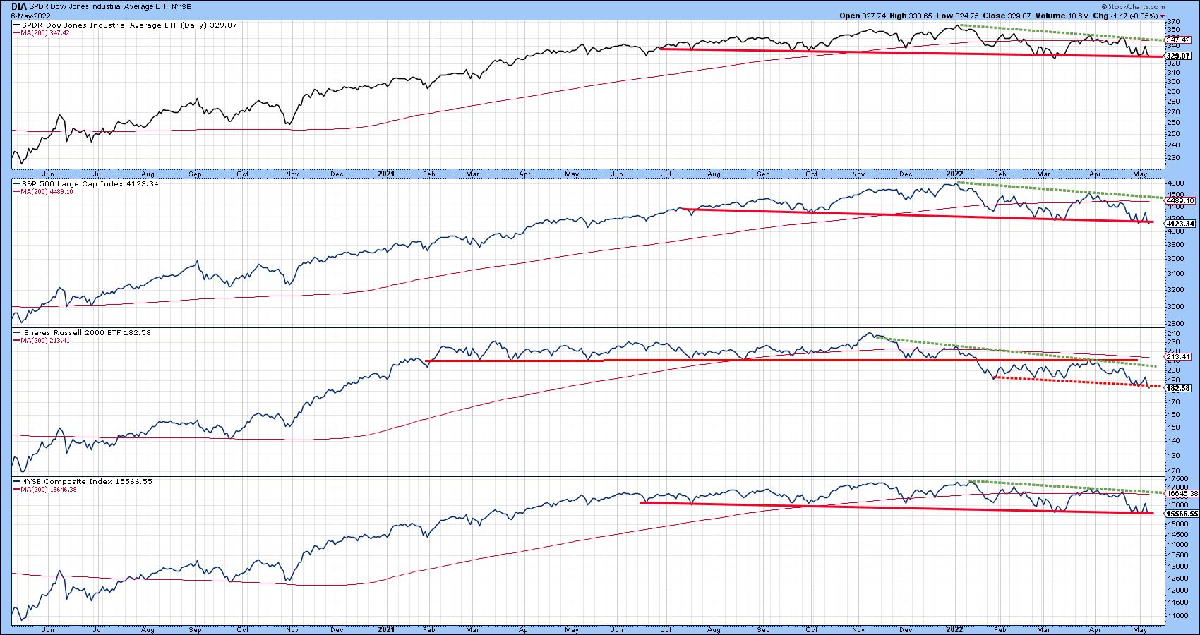 Chart 1 Chart 1
Most egregiously of all, the NASDAQ Composite has completed an eighteen-month head and shoulders formation, with a solid Friday close under the neckline. The two blue arrows suggest that if the break is valid (and does not turn out to be a whipsaw), the indicated minimum ultimate downside objective would call for a drop to around 10,000. The word "if" has been emphasized because sentiment has definitely moved to the bearish side.
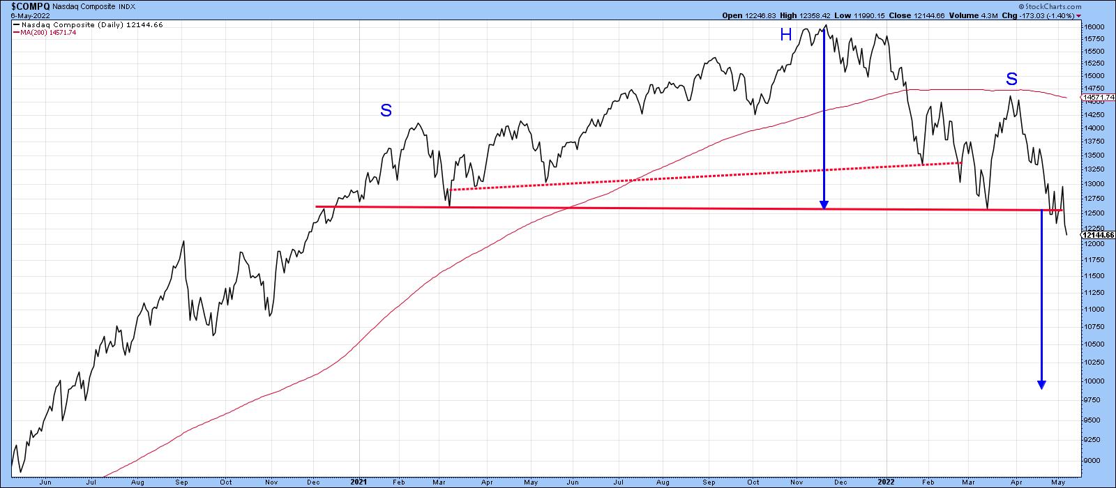 Chart 2 Chart 2
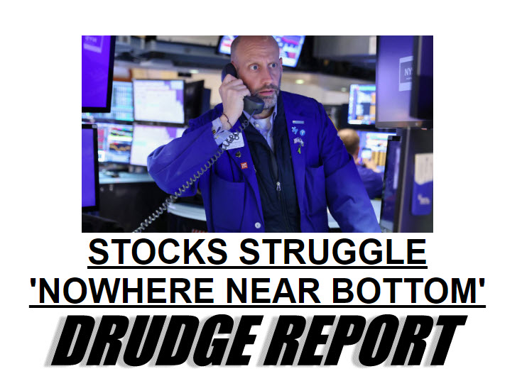
As testimony, take a look at today's headline for the Drudge Report: "Stocks Struggle: 'Nowhere Near Bottom'". When the stock market is featured in a general purpose media outlet, it usually means two things. First, that fear in the exchanges has percolated to just about everyone. Second, dissemination of that news has given all investors the opportunity to get off the railroad tracks, if they choose, before the "financial crash" train arrives. Consequently, the vast majority of the bad news has already been factored into prices. From a contrarian aspect, that could mean that those breaks that have already materialized fail to elicit further downside action, while those that have not bounce to the upside.
That possibility is also reflected in Chart 3, which shows that the 4-week MA of American Association of Individual Investors bulls has reached a record low reading. The arrows show that previous reversals from an overstretched level have consistently been followed by a rally. Last week, the indicator ticked up a little, but not enough to conclude that a reversal has taken place. You can always click on the chart next week, when new data becomes available, to see if it does.
Note that only one signal failed prior to 2022; it has been flagged by the dashed arrow and developed in the 2007-2009 bear market. February's failed reversal signal could be interpreted as a bear market characteristic; however, the record low reading does indicate a very high level of pessimism is already baked into the cake. That could mean significantly lower prices will be more difficult to achieve than the recent breakdowns suggest. Alternatively, those indexes that have not yet broken could receive a new lease on life by reversing to the upside and avoiding the cliff entirely. Either way, we are likely to find out in pretty short order.
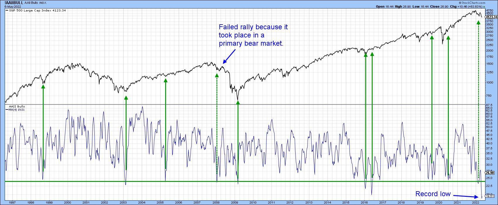 Chart 3 Chart 3
For more insights from Martin Pring, subscribe to read his expert analysis in the member-exclusive blog Martin Pring's Market Roundup.
Good luck and good charting,
Martin J. Pring
The views expressed in this article are those of the author and do not necessarily reflect the position or opinion of Pring Turner Capital Group of Walnut Creek or its affiliates.
|
| READ ONLINE → |
|
|
|
| The Mindful Investor |
| The Most Important Chart of the Day |
| by David Keller |
Some of my most painful experiences as an investor have come when I have been undisciplined. I would get away from my daily and weekly routines, act rashly when I noticed a compelling chart, and usually end up regretting that decision in a big way. I learned that, by going through the same routine every morning, I would be able to better recognize changes in trend and would in general just increase my overall market awareness.
I knew that my Morning Coffee Routine should begin with a long-term chart of the S&P 500 index. One of my biggest challenges as a long-term investor has been to remain focused on the long-term. If my goal is to do well 1-3 months down the road, I should be less focused on the flickering ticks of short-term market movements and more focused on the long-term trends and how they evolve.
I started with a weekly S&P 500 chart, simply showing the weekly open-high-low-close (OHLC) for the last five years, along with some basic momentum indicators. Nothing special. Over time, I found that, every day, I would look at that first chart and try to answer three questions:
- What is the long-term trend (over one year)?
- What is the medium-term trend (one to three months)?
- What is the short-term or tactical trend (a couple days to a couple weeks)?
I quickly settled on a Market Trend Model that was based on weekly exponential moving averages. I experimented with the moving averages and found that I could define those three time frames using different combinations.
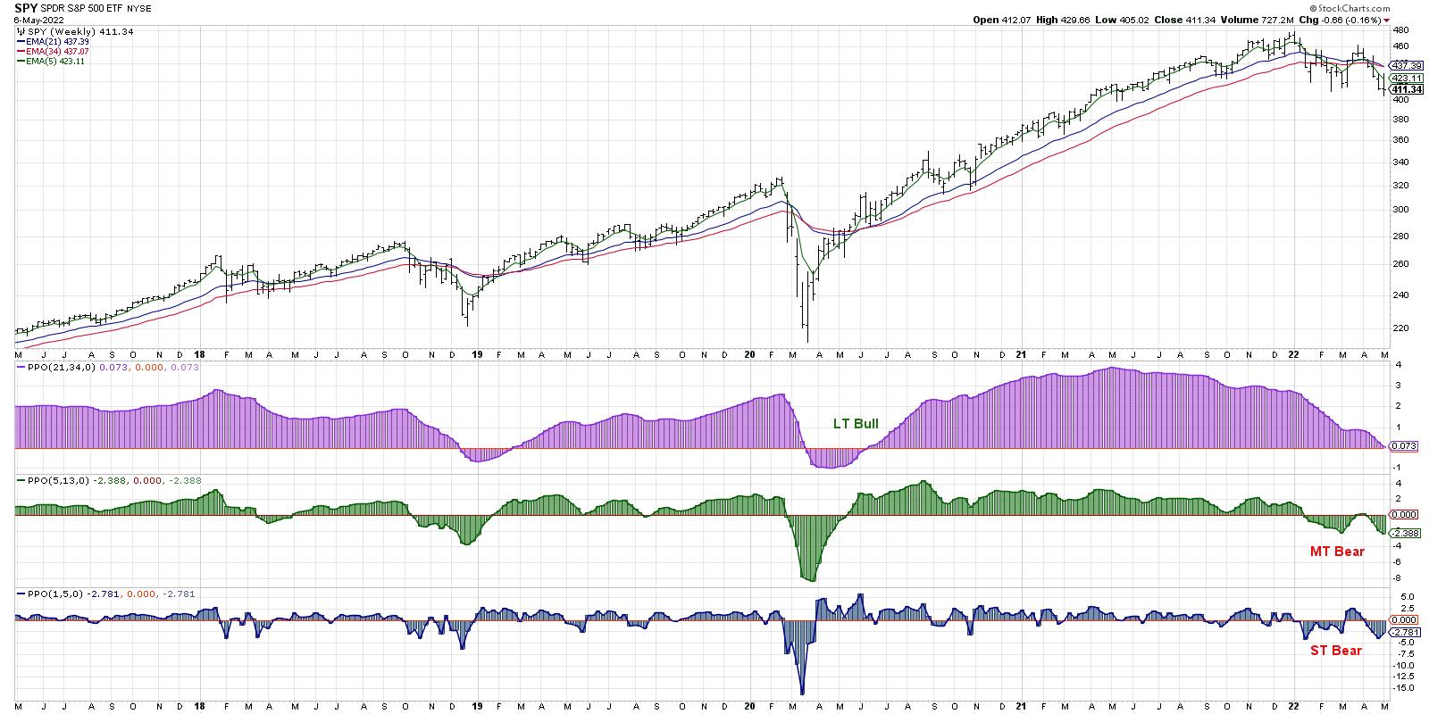
For the long-term trend, I ended up using the 21- and 34-week exponential moving averages. Every Friday, I'd simply compare the two moving averages and determine the trend. 21-week MA > 34-week MA? Bullish. 21-week MA < 34-week MA? Bearish.
I found other combinations that worked well for the other two time frames as well. For the medium-term, it's the 5 and 13-week MA, and the short-term is just the current price versus the 5-week MA. Simple.
This one chart has helped me to remain patient, as a short-term trend occasionally reverses, yet the medium-term and long-term remained unchanged. It has reminded me that there is no one time frame on which all market participants actually participate. Most importantly, it has helped me keep my focus on the time frame in which I'm most interested.
My Morning Coffee Routine goes from there into the daily S&P 500 chart, followed by other major US equity indices and global stocks as well. Then, it's on to other asset classes like commodities and currencies, then finally into US sectors, styles and themes.
At the end of that whole process, I'm then clear to check the current market conditions, as well as my own portfolios. I've first evaluated the market environment and improved my market awareness, before I'm then able to make a proper assessment on current positions and potential trades.
Where do many novice investors go wrong? They have the right steps but in a very wrong order. If you start your day looking at live market update, or tuning into financial television, or checking your current positions, you are priming yourself to make rash decisions based on short-term data.
I was taught to make short-term decisions with short-term data and long-term decisions using long-term data. By beginning the morning with a view of the long-term trends, I'm anchoring my thinking to the long-term. And I will better appreciate how today's short-term movements relate to the long-term trends under which they operate.
Mindful investors recognize that it's not just about having the right inputs into your investment process, but it's also about the order operations. Go macro to micro, big to small, long-term to short-term. The most important chart of the day is the one you start with. Make it a good one!
Want to digest this article in video format? Just head over to my YouTube channel!
RR#6,
Dave
P.S. Ready to upgrade your investment process? Check out my YouTube channel!
David Keller, CMT
Chief Market Strategist
StockCharts.com
Disclaimer: This blog is for educational purposes only and should not be construed as financial advice. The ideas and strategies should never be used without first assessing your own personal and financial situation, or without consulting a financial professional.
The author does not have a position in mentioned securities at the time of publication. Any opinions expressed herein are solely those of the author, and do not in any way represent the views or opinions of any other person or entity.
|
| READ ONLINE → |
|
|
|
|
|
| ChartWatchers |
| There's 1 Missing Ingredient for a Market Bottom, and It's The Scariest One of All |
| by Tom Bowley |
As we closed out 2021, I began discussing sentiment and its need for a "reset." We had moved higher for the better part of two years, and the U.S. stock market had picked up a lot of new "post-pandemic" investors and traders. Unfortunately for this new crew, they had only experienced success and a rising market. It was one of my warning signs that I discussed at MarketVision 2022 on January 8th, 2022.
You don't just flip a switch to generate the kind of bearishness that it takes to mark major bottoms; it evolves over time. The problem, however, is that the generation of this extreme bearish sentiment only occurs after one thing: a period of falling equity prices and one final the-market-will-never-go-up-again type of market calamity.
We're not there yet - not even close, actually. And that's what scares me.
On Thursday, the day after we saw a post-Fed surge in U.S. equities, we lost all of those Wednesday gains and much, much more. But did you see the equity-only put-call ratio ($CPCE)? It was .63.
Let me give you some context with respect to this reading. Every significant market bottom this century has occurred with a 5-day moving average of the equity-only put call ratio at .75 or higher. Nearly every one has occurred with this 5-day moving average at .80 or higher. And on Thursday, one of the worst days we've seen in a very bearish 2022 prints a .63 reading. In a nutshell, that's the reason why we haven't bottomed yet. Traders continue to believe that the market is suddenly going to surge right back to new highs. They've been "trained" to believe this by the last two years.
The following S&P 500 chart has the 5-day moving average of the equity-only put call ratio in the panel beneath it:
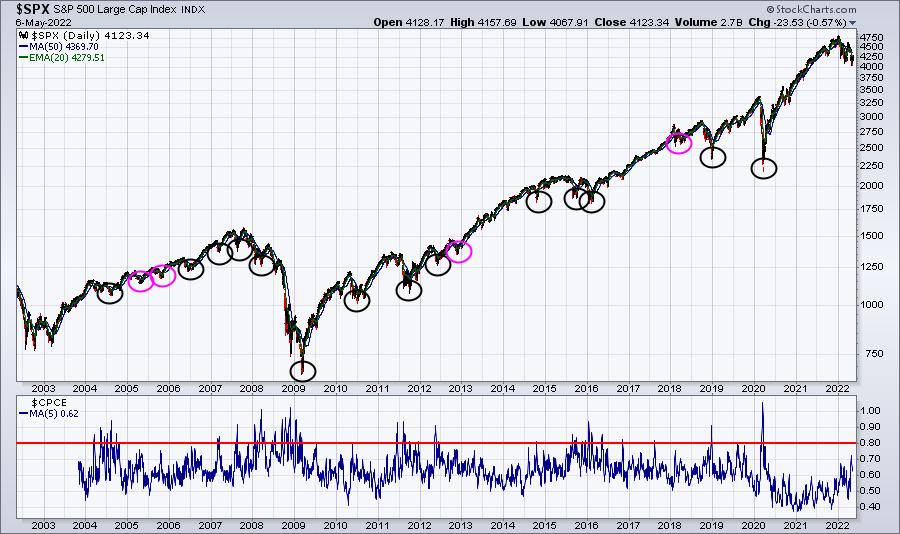
I circled all the key price bottoms over the past two decades. There were 18 of them. 15 saw the 5-day moving average of the equity-only put call ratio peak at .80 or higher (black circles). The other 3 saw it peak at .75 (pink circles). There are no other key bottoms on this chart. Will the 2022 bottom be different from all the others? I doubt it.
So how do we get this moving average to .75 or .80 when Thursday's reading, on one of the most bearish days of the year, was only .63? This moving average is just .62 right now. To see this moving average jump to at least .75 will likely require much more bearish market behavior. But here's the scary part. The 5 days leading up to the market bottom are usually among the worst throughout the entire downtrend. Look at this 5-year S&P 500 chart:
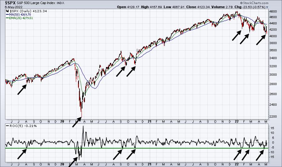
The bottom panel highlights the 5-day ROC (rate of change). Note how steep the selloffs are to mark these market bottoms.
I do remain firmly bullish long-term. And I believe the low and upcoming market bottom in 2022 will provide a tremendous opportunity for patient investors and traders. That is the exact same thing I said at the end of 2021 and I believe nothing different now.
Get ready to buy, but not just yet. Stay tuned.
In the meantime, I want to invite all of you to subscribe to our FREE EB Digest newsletter, which is published 3x per week on Mondays, Wednesdays, and Fridays. There is no credit card required and you may unsubscribe at any time. Everyone on this newsletter receives an automatic invitation to all of our free webinars. CLICK HERE to sign up with your name and email address. We do not share your information with any outside third parties.
Happy trading!
Tom
|
| READ ONLINE → |
|
|
|
| ChartWatchers |
| USD Strength Continues with EUR/USD Arriving at Critical Junction |
| by Julius de Kempenaer |
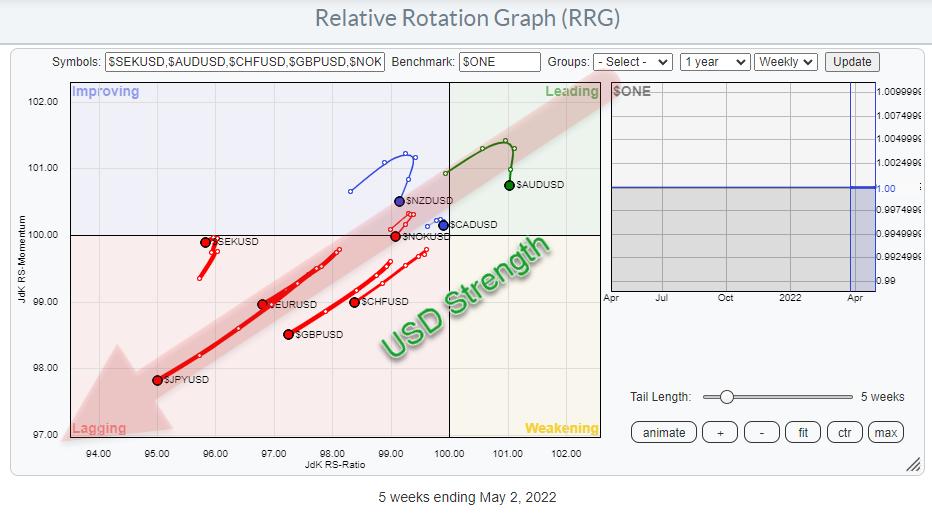
The Relative Rotation Graph that shows the rotation for currencies against the USD as the base is sending us a very clear picture!
USD Strength
The graph holds the G10 currencies. As we are plotting against the USD base, it means that there are nine tails on the canvas and the USD is the center of the chart.
The message coming from this image is pretty clear; all nine tails are at a negative RRG-Heading, which means that they are losing on both the JdK RS-Ratio and the JdK RS-Momentum scales. This makes the USD the strongest currency in this universe at the moment.
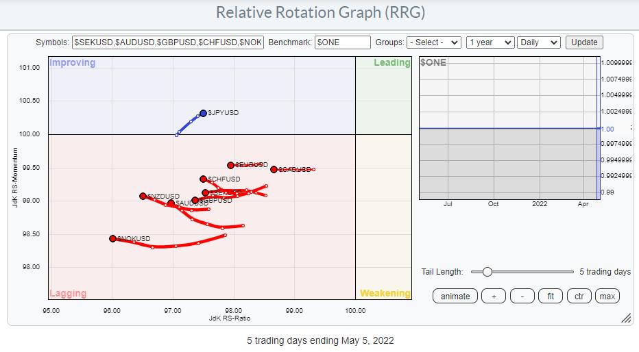
Running the same group of currencies on a daily RRG underscores what is happening on the weekly picture above. All currencies are to the left of the benchmark (USD) and moving lower on the RS-Ratio scale, i.e. losing (relative) strength vs the USD.
$JPYUSD is the only exception inside the improving quadrant. Looking at the weekly tail for $JPYUSD, which is deep inside the lagging quadrant at the longest tail, suggests that the rotation through improving on the daily RRG is temporary in nature and that a return towards lagging, without hitting leading, is likely.
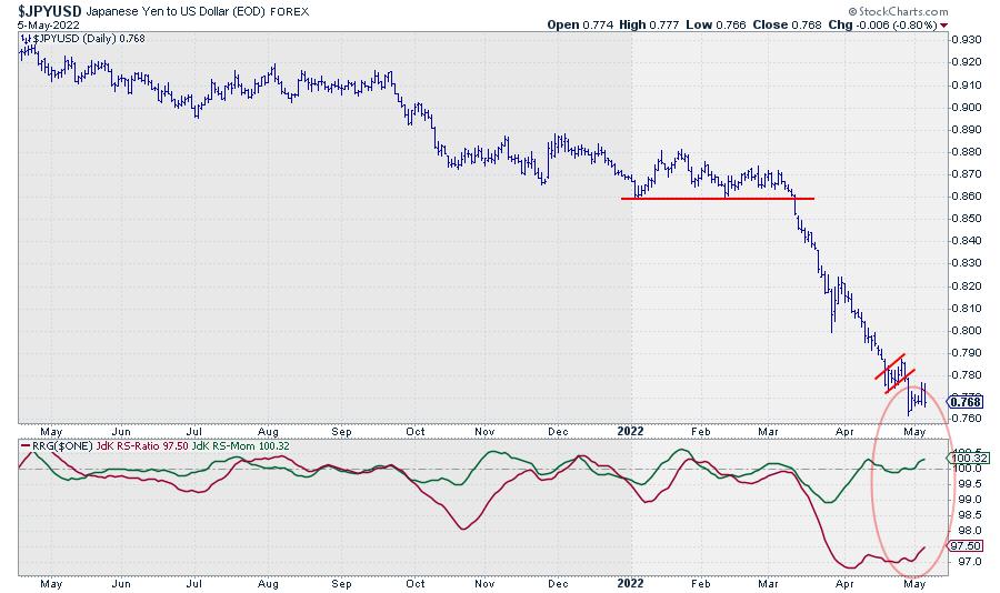
The price chart of $JPYUSD shows the deceleration in the decline, which causes relative momentum, followed by relative strength, to pick up. The trend itself is still very clearly down. It will take time and quite a bit of JPY buying power to turn this thing back up.
When you play the animation on the RRG chart over the past year, you can see that this USD strength has been in play for quite a few months already. It all started when a large H&S top-formation was completed in the EUR/USD graph in August 2021.
In my Sector Spotlight show every Tuesday on StockCharts TV, I assess the rotation of asset classes, including the USD, on a regular basis, including a look at the EUR/USD chart from time to time. For this occasion, I want to pull up a very long-term chart of EUR/USD, as we are again nearing crucial levels.
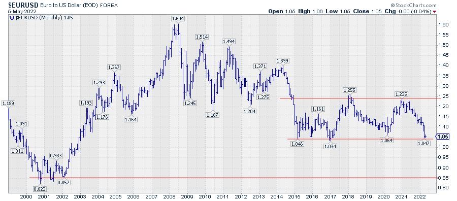
The monthly EUR/USD chart above shows a wide trading range between roughly 1.04 and 1.25, which started after the first dip to 1.046 at the beginning of 2015. The recent decline has taken EUR/USD back very close to this level.
Obviously, this is a major level of support. Two things can happen -- either the market holds up here, and we will see a bounce and the range remains intact, or this support level will be broken, and we will see an acceleration lower.
Based on the height of this 7-year range (~0.20) we may project this amount below the breakout level to get a potential target price. This comes out around 0.85 which is exactly the area where EUR/USD bottomed in 2001/2002.
We have to wait and see, but it is clear that EUR/USD is in a critical phase.
Because of the importance of the levels, good trading opportunities will likely arise in both scenarios. When support holds, there is roughly 20 cents upward potential towards the top of the range with support nearby. When support breaks, there is roughly 20 cents downward risk towards 0.85, with old support turning into resistance just a notch higher.
Have a great weekend and #StaySafe, --Julius
My regular blog is the RRG Charts blog. If you would like to receive a notification when a new article is published there, "Subscribe" with your email address.
|
| READ ONLINE → |
|
|
|
| ChartWatchers |
| Are the Markets Poised to Trade Much Lower? Keep Your Eye on This One Chart |
| by Mary Ellen McGonagle |
It's been an extremely tough period for the markets over the past 2 weeks, with oversold rallies giving way to major selling. This uptick in volatility highlights investors concerns as we head into a period of rising interest rates amid what many consider to be an economic slowdown.
There are many factors currently driving price action in the markets, such as a higher dollar, rising oil prices and inflation at a 40-year high; however, investors' response to 1st quarter corporate earnings reports has been one of the most impactful drivers of individual price action in stocks.
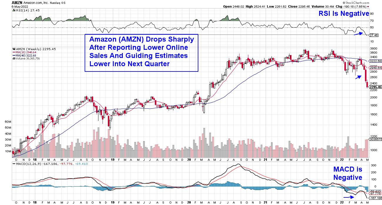
Amazon (AMZN)'s decline since the release of their 1st quarter results is a prime example. The company reported their first quarterly loss since 2015 due to lower online sales. Even more impactful was their lower sales forecast going into next quarter, due to macroeconomic conditions and Russia's invasion of Ukraine. Investors headed for the exits, with AMZN dropping 21% on heavy volume since the report. With even a well-managed company such as Amazon guiding their revenue estimates lower, investors can only wonder what a less-buffered company may be experiencing.
WEEKLY CHART OF AMAZON (AMZN):
Netflix (NFLX) has fared even worse, with a drop of over 50% since reporting reduced subscribership amid increased production costs.
According to Factset, many companies in the S&P 500 are reporting earnings above estimates; however, it's single-digit earnings growth, which hasn't been seen since the 4th quarter of 2020, when the U.S. was still in the throes of the pandemic. The lower results are being attributed to both a difficult comparison to an unusually high earnings growth rate during Q1 2021 and continuing macroeconomic headwinds.
With strong earnings being the hallmark of a bullish market, current single-digit earnings growth points to a broader market that may be headed lower, as tougher comparisons for earnings will continue into next quarter. At this juncture, I'm paying close attention to the longer-term monthly chart of the S&P 500 for guidance.
Below is a marked-up chart and, as highlighted, when both the RSI and Stochastics turned negative during a period when the S&P 500 was already trading below its 6-month moving average, further downside occurred for the S&P 500.
MONTHLY CHART OF S&P 500 INDEX
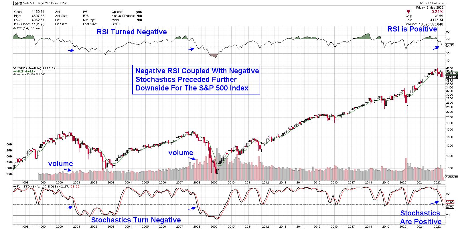
In both 2000 and 2008 (shown above), the negative turn in the RSI and Stochastics indicators occurred when the S&P 500 was already down ~13%. The S&P 500 is currently 13.3% below its high in price. As for the further downside beyond the 13% in the S&P 500 in 2000, the Index went on to lose 38% more until hitting a late-2002 low in price. During the 2008 period, the S&P 500 went on to decline 45% more beyond its original 13% loss. To be fair, both bear markets mentioned above occurred during extraordinary conditions, with the 2008 banking collapse being the worst financial disaster since the Great Depression. The 2000-2002 bear followed the sharpest rise in Technology stocks in history, with valuations of Tech stocks ballooning to well-above normal.
While most of the eleven sectors in the S&P 500 are in downtrends, not all areas are headed lower. Subscribers to my MEM Edge Report experienced a 20% increase in Energy stock Devon (DVN) last week, which we highlighted as a buy in last Sunday's Report and reiterated as a buy in our Midweek Report.
If you'd like to be alerted to when the negative signals outlined above are triggered, trial my MEM Edge Report for 4 weeks for a nominal fee. There are other factors that will determine if the broader markets are headed much lower and you'll want to be aware of them as well.
On this week's episode of StockCharts TV's The MEM Edge, I review where the markets stand following last week's volatile price action. I also share areas that are bucking the downtrend and whether they're poised to trade higher.
Warmly,
Mary Ellen McGonagle, MEM Investment Research
|
| READ ONLINE → |
|
|
|
| The Canadian Technician |
| Is This the Equity Markets' Problem? |
| by Greg Schnell |
The stock market is stuck and many investors are having trouble understanding why it can't bounce from here. The purpose of this article is to shed a little light on the problems in the bond market and how they are influencing the other markets.
First of all, what is going on with the US yields? The 30-year yield is up 8% in two days. That is speeding right along. It's the rate of change that puts so much pressure on everything.
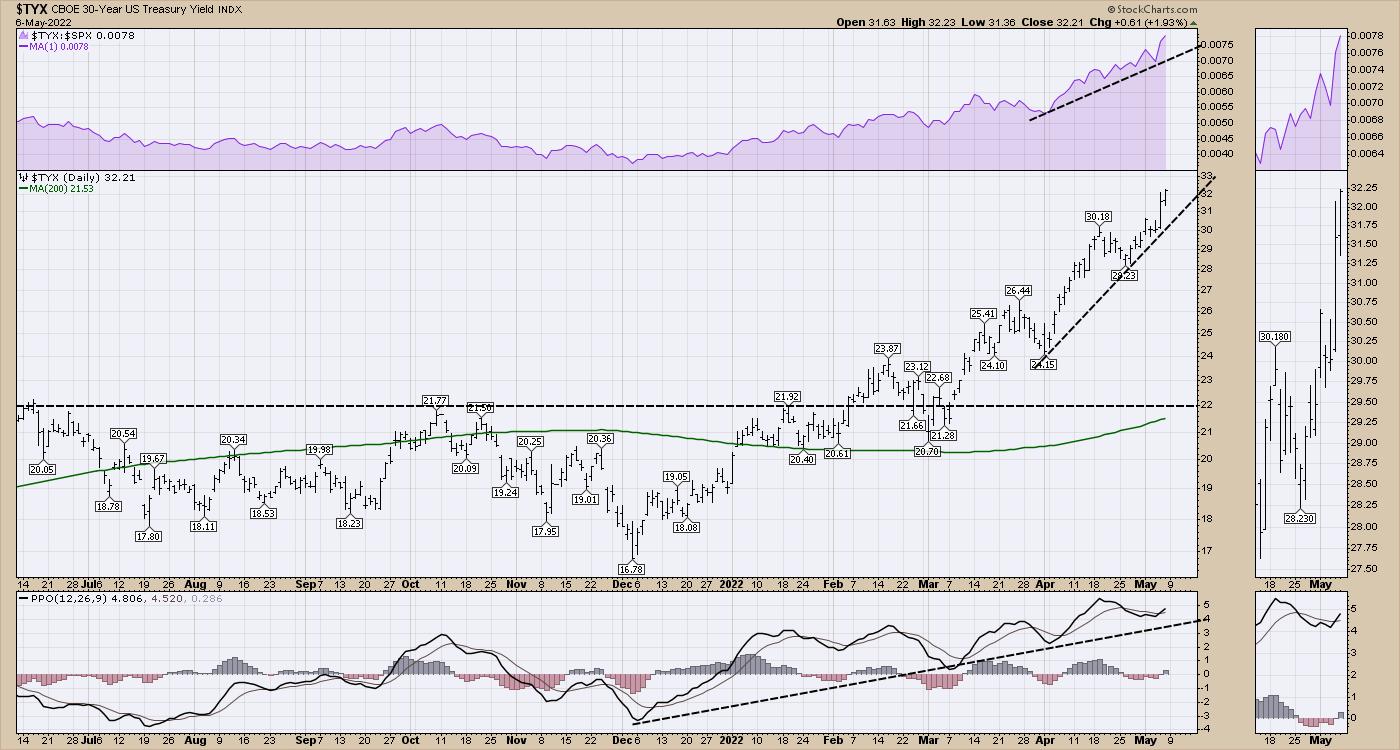
While this is going higher, the US 10-Year is rising. This increase in borrowing costs changes many of the base levels in the USA and some around the world. The USA has a lot going for it, including having many of the largest companies in the world based in its tax realm. However, other countries in the world can't afford to have their interest rates soar, so they are trying to hold them down. One example is Japan.
Japan
Japan's percent of Debt to GDP is one of (if not the) highest in the world, so it's important for them to keep their interest rates extremely low. This debt level as a ratio is more than double the US Debt ratio. If interest rates spiraled out of control, this would be an economic time bomb. It is on my radar and I have been discussing this in my client newsletters since April 9th.

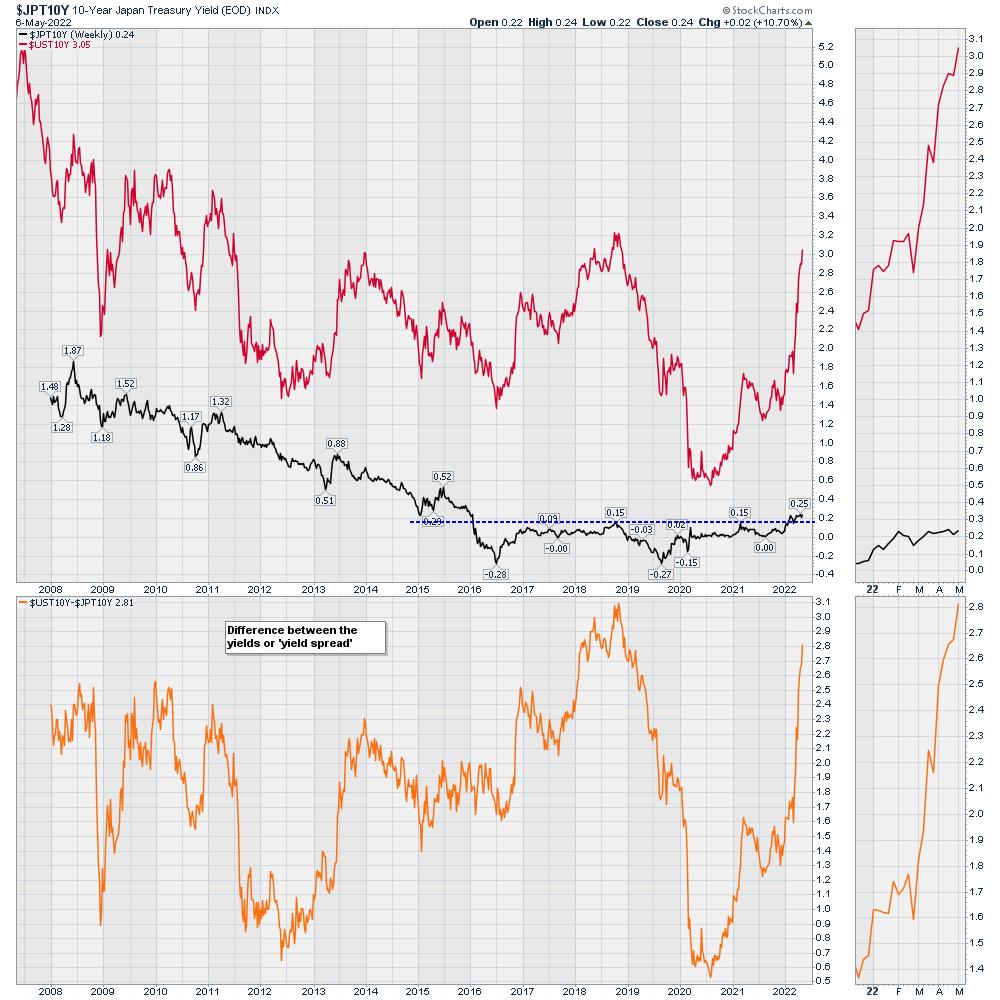
When we chart the situation, it creates a graph that is getting very stretched. The chart below shows the Japanese 10-Year at the bottom inside the first panel and the US 10-Year in red. They were slightly more stretched apart in 2018, but now we have soaring inflation, so the rapid moves up on the US chart are putting extreme pressure on Japan. We have had a spread this wide (Orange lower panel) before, but only once. The Fed came to the rescue to fix it then.
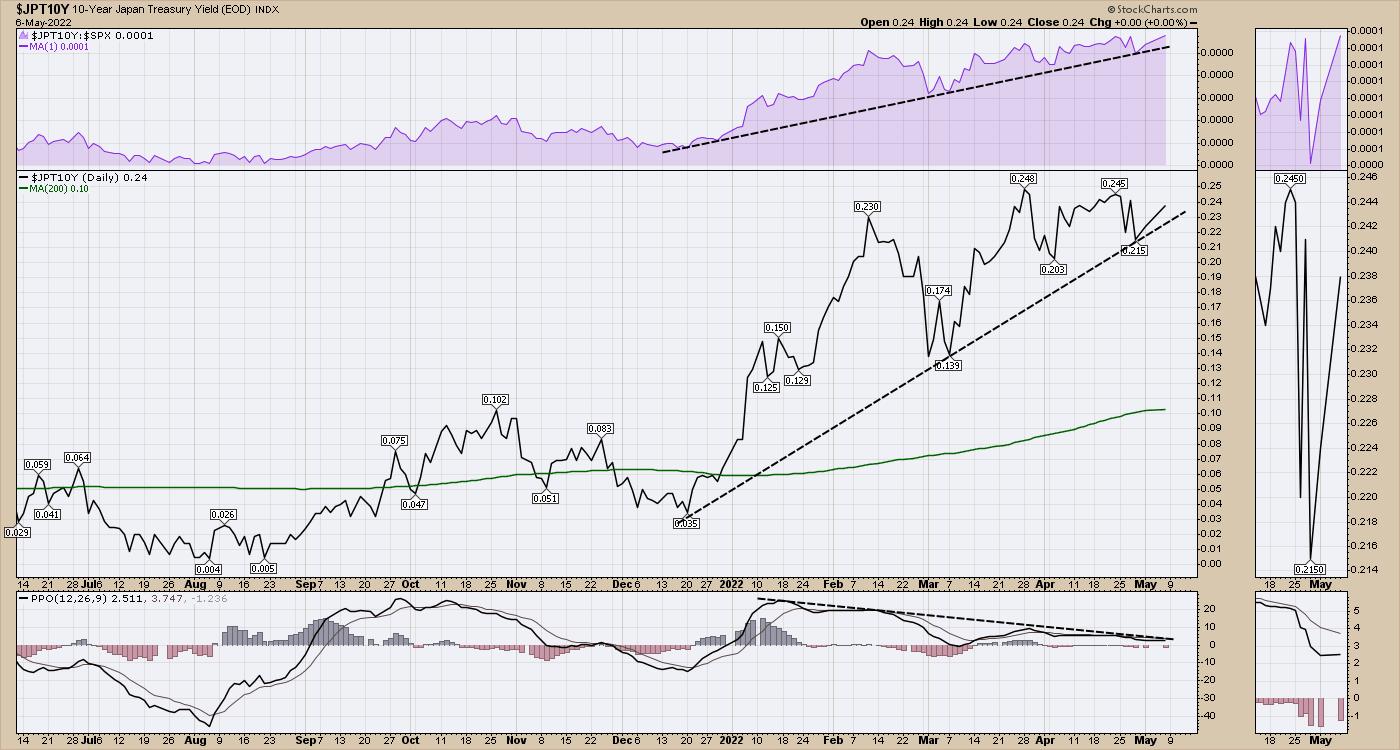
The chart below is the same black Japanese 10-Year as the chart above, but the computer changes the scale to fill the whole panel. The real question is, can the Japanese Central bank maintain the large spread by holding the yield at 0.25% or less? Or will the pressure to let it rise in an inflationary environment become too great?
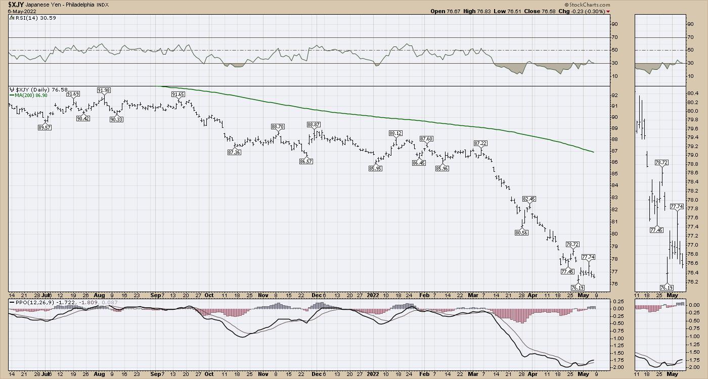
If they don't let the yield rise, then the Yen falls, which makes everything the country imports that is priced in US Dollars more expensive for Japan, and the Yen continues to fall. I have plotted this as the Yen to the dollar to be consistent with other currency charts in this article.
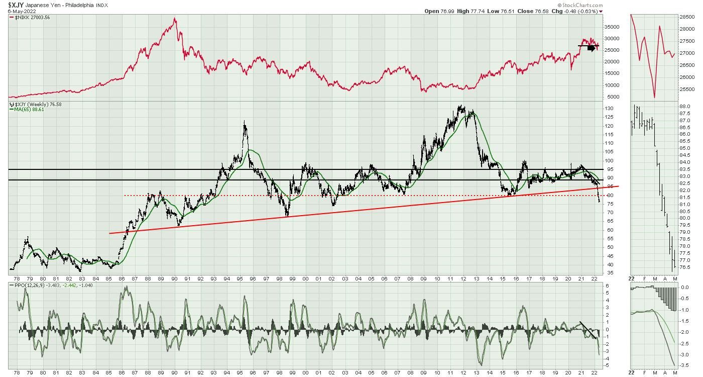
The long view on the Yen is that it broke the 35-year uptrend earlier this year, and has now fallen below a 20-year support level. It's dropping like a stone.
Euro and other currencies
When I look at other major currencies, they are falling hard as well. The Euro, the British Pound and the Chinese Yuan are all dropping like stones. The Canadian Dollar in green is falling hard as well, but the fall is just getting started.
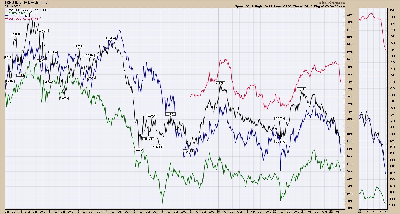
The US Dollar
Obviously, the other side of all these currency pairs is the US Dollar. The issue is that, as the other currencies fall, the dollar rises. This quarterly (3-month) chart below is breaking a 36-year downtrend. There was a brief surge during the COVID kickoff, but it quickly retraced. Closing out June above the 104 level would be 19-year highs and create a series of higher lows and higher highs on the long time frame. Investors all over the world recognize how much the war in the Ukraine will affect future trade. If the costs for goods are going to soar around the world as the retraction of global trade occurs, this is inflationary. When items are priced in US Dollars, it is very inflationary when your currency is dropping and the price of goods are rising.
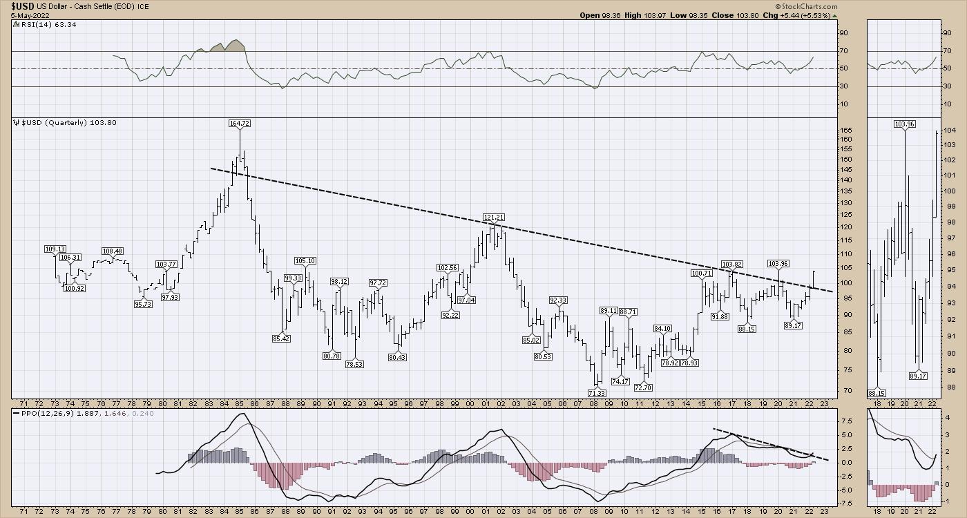
With the rapid, long-term significant changes in both bonds and currencies, it is no surprise that the stock market is also showing signs of major changes. On May 6, 2022, I narrated a 10-minute Your Daily Five video for StockCharts TV that covers these charts more thoroughly.
Your Daily Five -- May 6, 2022
Conclusion
As these major changes are forcing companies and governments to reprice and reposition their approach to the new economic conditions, all of these charts are snapping important long-term trend lines. Soaring inflation is a problem. The high-yield bond ETF (HYG) and the corporate bond ETF (LQD) are both dropping in a garden hose waterfall similar to the daily Yen chart above. Either we find support soon, or more assets start to go over the waterfalls.
A simple example of how extreme things are is the move in the US 30-Year bond interest over the last 2 days (0.22%), which is almost a double of what the Japanese interest rate is being held at. Just imagine if Japanese debt payments started to double, and that's where everything starts to come off the rails. What if those debt payments have to triple? Or quadruple? Until it falls apart, it is nothing, but once it starts, the vibration through the financial system would be large.
If you would like to check out more of our work, click on over to OspreyStrategic.org. We also have a trial for $7 for the first month there.
|
| READ ONLINE → |
|
|
|
| DecisionPoint |
| What the Heck Just Happened?!! |
| by Carl Swenlin |
Yesterday's monster rally was not expected by most people, me included, and it left me a little disoriented. For weeks the Fed has been expected to raise interest rates by 50 basis points, and the realization of that expectation should have caused the market to sell off, shouldn't it? About 3:00 A.M. this morning an old Wall Street saying came to me: Buy the rumor, sell the news, which I have known, like, forever. In a bull market buying the rumor gets you in early. When the rumor finally becomes news, the last buyers come in, and a correction is likely.
We're in a bear market, so the opposite of buy the rumor, sell the news would be, sell the rumor, buy the news. What happened ahead of yesterday was that people were shorting the market based upon the expectation of a 50 basis point rate increase. When the news was announced, the shorts were eaten up in a massive short-covering rally because there were no sellers left.
I had just about talked myself out of writing this article (just a little late, Carl), but watching the financial news, there were, of course, no stories addressing the technicals. So here I am.
At DecisionPoint we have a set of indicators that we use for climax assessment. A climax is a one-day event when market action generates very high readings in, primarily, breadth and volume indicators. We also include the VIX, watching for it to penetrate outside the Bollinger Band envelope. The vertical dotted lines mark climax days -- red for downside climaxes, and green for upside. Climaxes are at their core exhaustion events; however, at price pivots they can be seen to be initiating a change of trend.
On Tuesday there was an upside initiation climax, which we normally expect will initiate a short-term rally. On Wednesday we got a rally, but there were also massive climax readings. Since Tuesday was an initiation, Wednesday's climax was identified as an upside exhaustion climax, which could mean that the rally was exhausted. As of this writing the market is down over -3.5%, far worse than we might have expected.
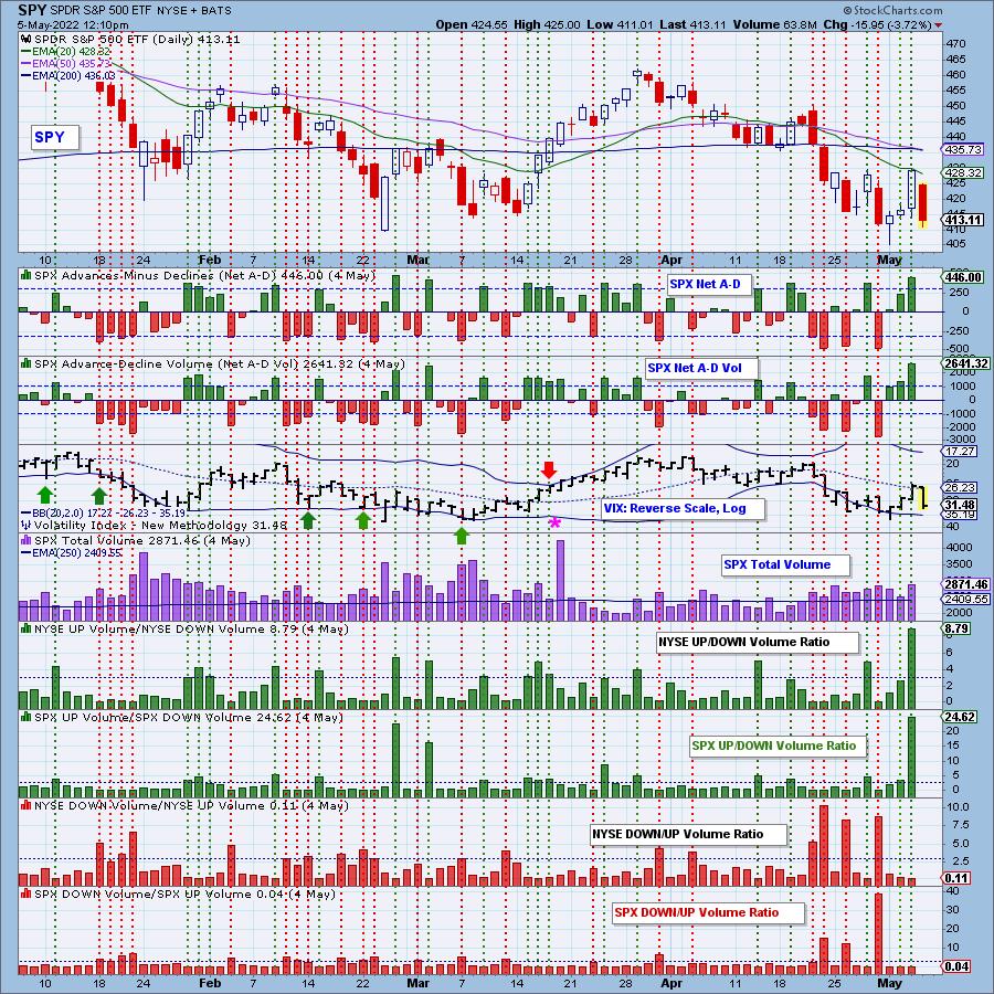
Note: These indicators will not update until after today's close.
Conclusion: Yesterday was a one-day short-covering event. In hindsight we can assess the March rally as a short-covering event, while not nearly as fast and dramatic as yesterday's. Each of these rallies was a reaction to too many people being on one side of the boat. I don't know where the market will close today. I don't even know where it will be five minutes from now, but I strongly believe we are in a major bear market, and that we won't see the bottom of it for a long time.

Click here to register in advance for the recurring free DecisionPoint Trading Room! Recordings are available!
Technical Analysis is a windsock, not a crystal ball. --Carl Swenlin
(c) Copyright 2022 DecisionPoint.com
Helpful DecisionPoint Links:
DecisionPoint Alert Chart List
DecisionPoint Golden Cross/Silver Cross Index Chart List
DecisionPoint Sector Chart List
DecisionPoint Chart Gallery
Trend Models
Price Momentum Oscillator (PMO)
On Balance Volume
Swenlin Trading Oscillators (STO-B and STO-V)
ITBM and ITVM
SCTR Ranking
Bear Market Rules
DecisionPoint is not a registered investment advisor. Investment and trading decisions are solely your responsibility. DecisionPoint newsletters, blogs or website materials should NOT be interpreted as a recommendation or solicitation to buy or sell any security or to take any specific action.
|
| READ ONLINE → |
|
|
|
| Dancing with the Trend |
| Bear Markets and Drawdowns |
| by Greg Morris |
I thought this article that I wrote over three years ago on January 11, 2019 is quite appropriate for today. If you have read my blog you know that I use the Nasdaq Composite as my measure of the market and it is down significantly as I write this. Enjoy!
The month of December 2018 was a bad month for the market; the rally in the last week of the month was nice but small compared to the month's decline. 2019 has so far continued the upward move, so I thought it was time to show some data on market drawdowns. If you have been reading my scribblings for long you hopefully recall that I view drawdowns as the best measure of risk. Unlike modern finance that says volatility is risk and volatility is defined by standard deviation. Hey, if you use standard deviation, then you are also agreeing that the markets are random and normally distributed. In other words, they can be measured using Gaussian statistics and distributions. If you truly believe that, you must not believe a thing I have ever written in this blog. Furthermore, that belief is also aligned with believing that investors are rational, and all investors always agree on returns, risk, and correlations. Again, this is just the nonsense of modern finance and hopefully a good technical analyst will understand why.
The following describes the nomenclature used in Chart A. Drawdown Magnitude is the percentage that price has moved down from its previous all-time high. Drawdown Decline is the amount of time the market declined from an all-time high to the trough. Drawdown Duration is the amount of time that it took the price to recover to is previous all-time high. Drawdown Recovery is the time it took from the trough to get back to an all-time high.
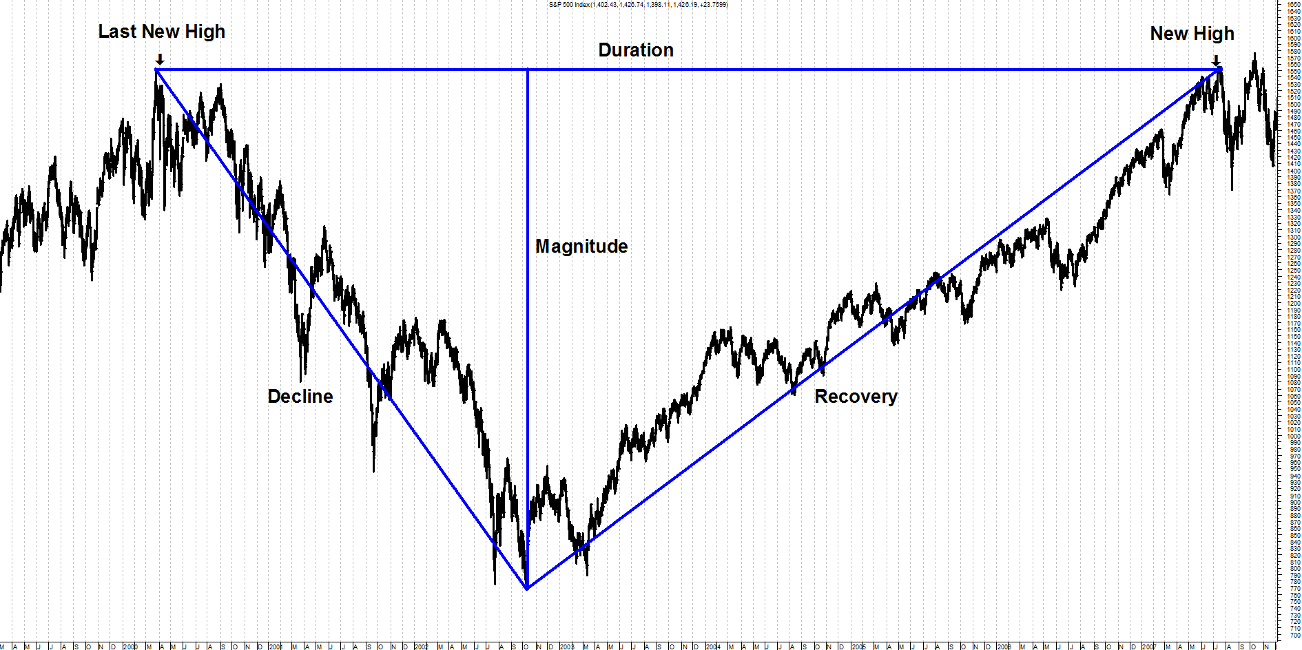 Chart A Chart A
While the terminology for drawdowns is subjective, I'll stick with the ones that Sam Stovall (Standard and Poors) uses, as they are as good as any. I have often thought one more term for bear markets greater than -40% would be good, such as Super Bear, but I have other battles to fight.
 Table A Table A
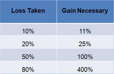
Recovering from a severe drawdown takes an extraordinary return just to get back to where you were. This is sometimes referred to as equivalent return and is represented by this formula:
Percent Drawdown / ( 1 – Percent Drawdown)
If you don't have a calculator or table handy, just divide the percent decline by its complement (100 – percent), and then mentally place the decimal in the appropriate place. This is best done in privacy and not on a stage in front of many people.
From Chart B you can see that if you lose 50%, then it takes a 100% gain to get back to even. When was the last time you doubled your money? A 100% gain is the same as doubling your money. The recent bear market that began on October 9, 2007 dropped over 55%, you can see that to recover it takes a gain of over 122% to get back to even. One thing the graphic clearly shows is that the larger the loss, the gain required to recover becomes even greater.
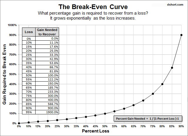 Chart B Chart B
Chart C is an example of cumulative drawdown. The line that moves across the tops of the price data (top plot) only moves up with the data and sideways when the data does not move up; in other words, it is constantly reflecting the price's all-time high value. The bottom plot is the percentage decline from that all-time high line. Whenever that line is at the top it means that price in the top plot is at its all-time high. As the line in the bottom plot declines it moves in percentages of where it was last at its all-time high price. In the example shown, a new all-time high in price is reached at the vertical line labeled A. The bottom plot shows that as prices move down from that point, the drawdown also moves in conjunction with price. The horizontal line that goes through the lower part of the drawdown plot is at -10%. You can't read the dates at the bottom, but it took almost 6 months before the prices recovered to point B and then moved above the level, they had reached at point A. This is an example of Drawdown that had a magnitude of -17% shown by the lowest point reached on the drawdown line in the bottom plot. The drawdown also lasted almost 6 months as shown by the time between line A and line B.
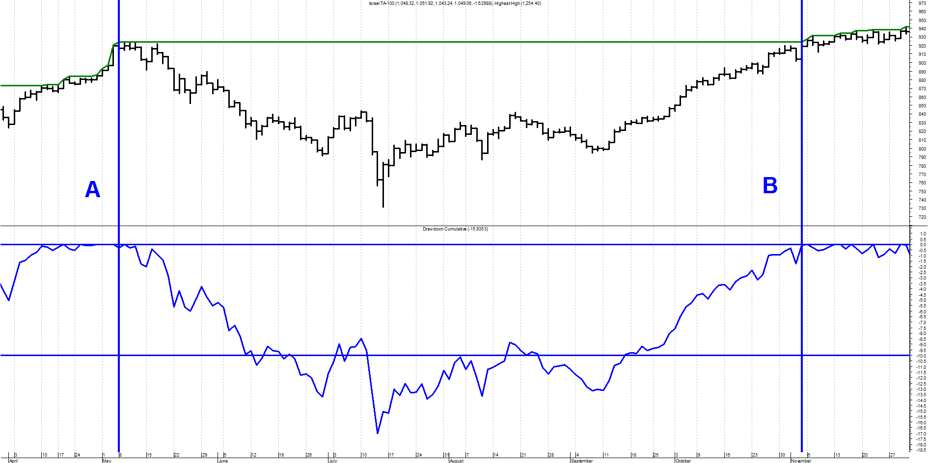 Chart C Chart C
Chart D shows the percentage of drawdown over the entire history of the Dow Industrials since 1885. The top portion is the Dow Industrial Average plotted using semi-log scaling and the bottom plot is the drawdown percentage. The darker horizontal line through the bottom plot is the mean or average of the drawdown over the full time period since 1885. Its value is -21.1%. The other horizontal lines are shown at zero (top line), -20%, -35%, -50%, and -65%, I think the things that stands out from this chart is that the period from 1929 through 1954 suffered an enormous drawdown not only in magnitude but also in duration. The low was on June 28, 1932 at -88.67%. The equivalent return to get back to even from that point was a gain of over 783%. That is why it took almost 25 years to accomplish.
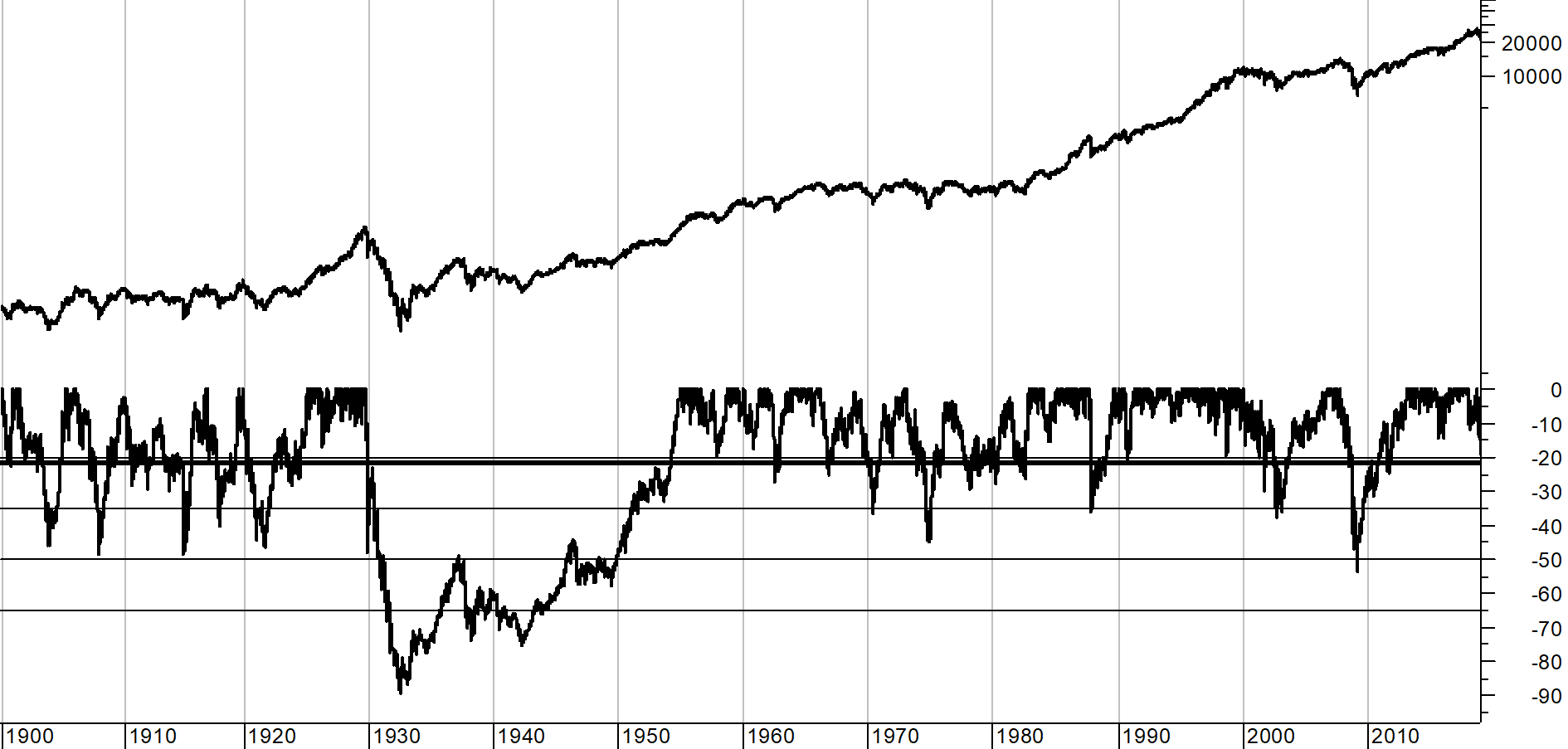 Chart D Chart D
Because the depression era drawdown distorts the other drawdowns, Chart E shows exactly the same data since about 1954, eliminating the scaling affect from the -88% depression era drawdown. The drawdown in 2008 clearly stands out as the biggest in modern times at -53.78% on March 9, 2009. It should be noted that all of the time that the drawdown line in the bottom plot is not back up to the top (0%), the market is in a "state of drawdown" which is noted by the duration, not just the amount of the decline which is the magnitude.
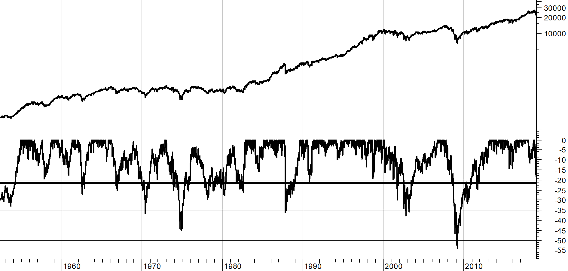 Chart E Chart E
Remember: Every bear market ends, but rarely when you are still trying to pick the bottom.
I'm sure many will think I'm writing about drawdowns and bear markets because I believe we are about to have a bear market. Well, no, but we are in a sizable drawdown.
I'll expand on this in a future article with more data, tables, and charts. I'm not a big fan of the Dow Industrials for analysis, but it does offer the most daily data – back to 1885.
Dance with the Trend,
Greg Morris
|
| READ ONLINE → |
|
|
|
| Wyckoff Power Charting |
| Is the Trend About to Bend? |
| by Bruce Fraser |
 When studying the markets chartists can tend to become myopic and close in on smaller and smaller timeframes (certainly that is the case for this Wyckoffian). Meanwhile, the tsunami of monster trends can engulf portfolios with unexpected reversals. A powerful antidote to this vulnerability is awareness of the major price trends. When a large trend takes hold, it can persist for very long periods of time. The trend is not only a chartist's friend, it is what makes technical analysis work! Richard D. Wyckoff taught a method of trend analysis that is unique, effective, and original. This technique has been studied extensively in this blog (links to some of these posts are below). When studying the markets chartists can tend to become myopic and close in on smaller and smaller timeframes (certainly that is the case for this Wyckoffian). Meanwhile, the tsunami of monster trends can engulf portfolios with unexpected reversals. A powerful antidote to this vulnerability is awareness of the major price trends. When a large trend takes hold, it can persist for very long periods of time. The trend is not only a chartist's friend, it is what makes technical analysis work! Richard D. Wyckoff taught a method of trend analysis that is unique, effective, and original. This technique has been studied extensively in this blog (links to some of these posts are below).
Here are some notable trend studies of the epic and decade long trends that have been unfolding and continue to be mostly in-force. Does this very long trend in financial assets still have life? What conclusions can we draw from the present position of the indexes within their trends? Can these trend studies inform our current trading and investing tactics?
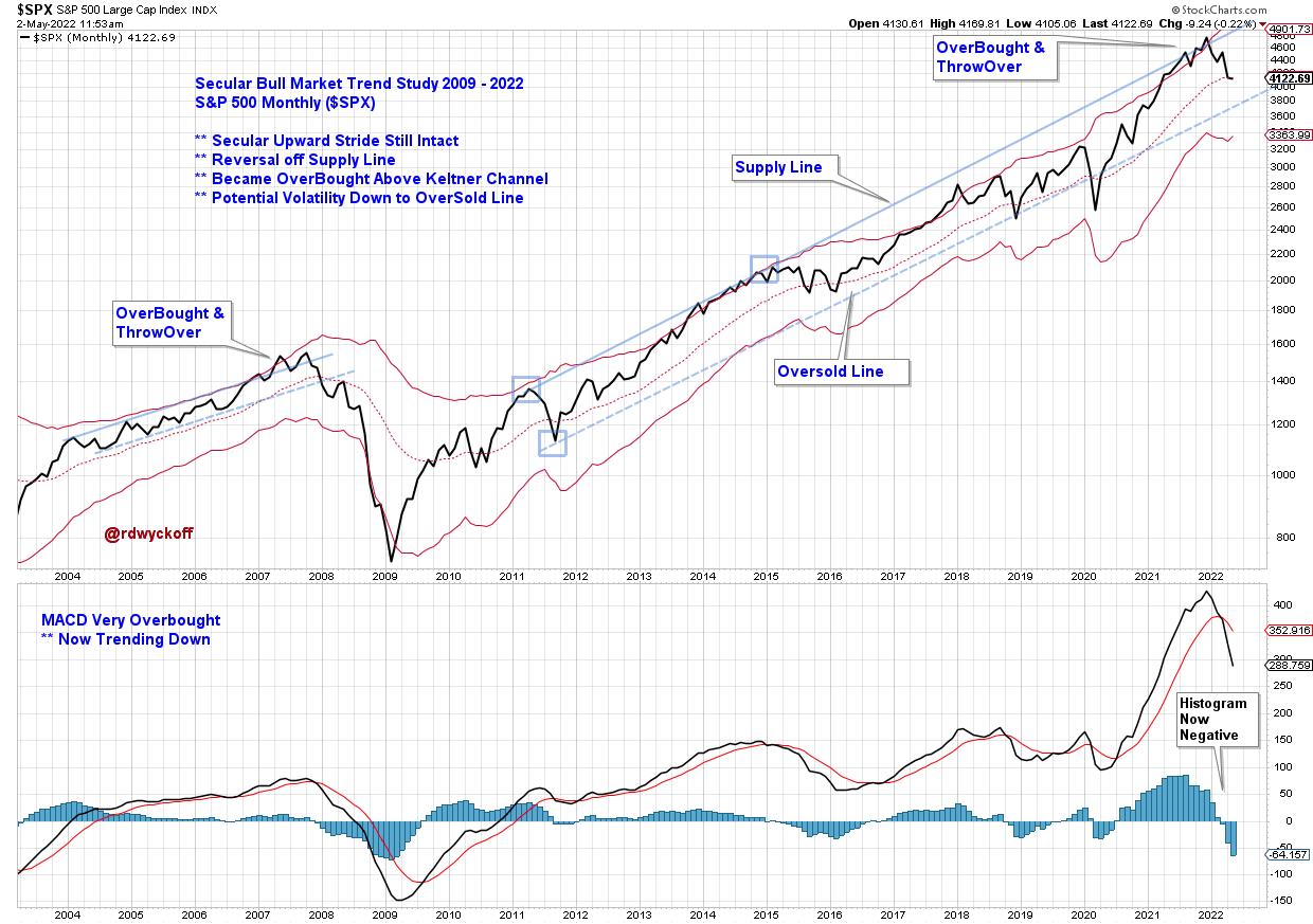
S&P 500 (2003-2022)Two trends (2004-08 and 2009 to the present) are illustrated with trendline studies and a Keltner Channel. Price plots are monthly. The current upward trend stride is remarkably long in duration. An overbought condition can be defined by a throwover of either the Supply Line or the Keltner Channel. This occurred in 2015 and 2021. An Overbought status can persist in long term uptrends and we see, in both cases, the index ‘rides' along the upper trendline and channel for a number of months. The MACD Histogram flips negative almost simultaneously with the downward turn of the index below the ‘Supply Trendline' and into an index price decline. The scale of the upward trend and the width of the trend channel is large and meaningful. Price declines to the lower trend channel line often takes months, even when the primary trend remains upward and intact. How would you manage your portfolio risk in an environment defined by this overbought condition during an ongoing uptrend? Each investor and trader would have a unique answer to this question. On to some additional examples.
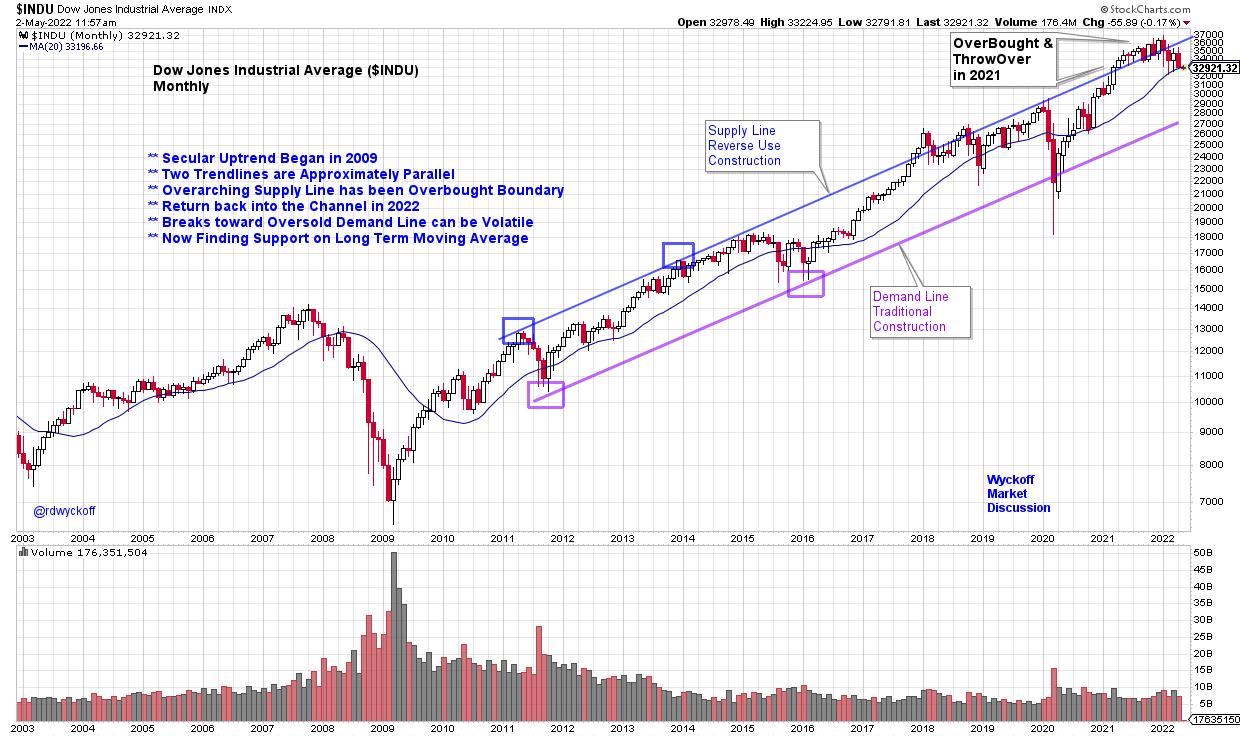
Dow Jones Industrial Average ($INDU) Trend Study and Chart Notes:
- Stride set by ‘Reverse Use Trendline' in 2011-12.
- Demand Line follows the same upward stride.
- 2021-22 Index becomes overbought above the channel. Rides top trendline for 10 months.
- Back into the channel in 2022. Vulnerable to downward volatility once it falls back into channel.
- Demand Line is strong support during 2020 decline.
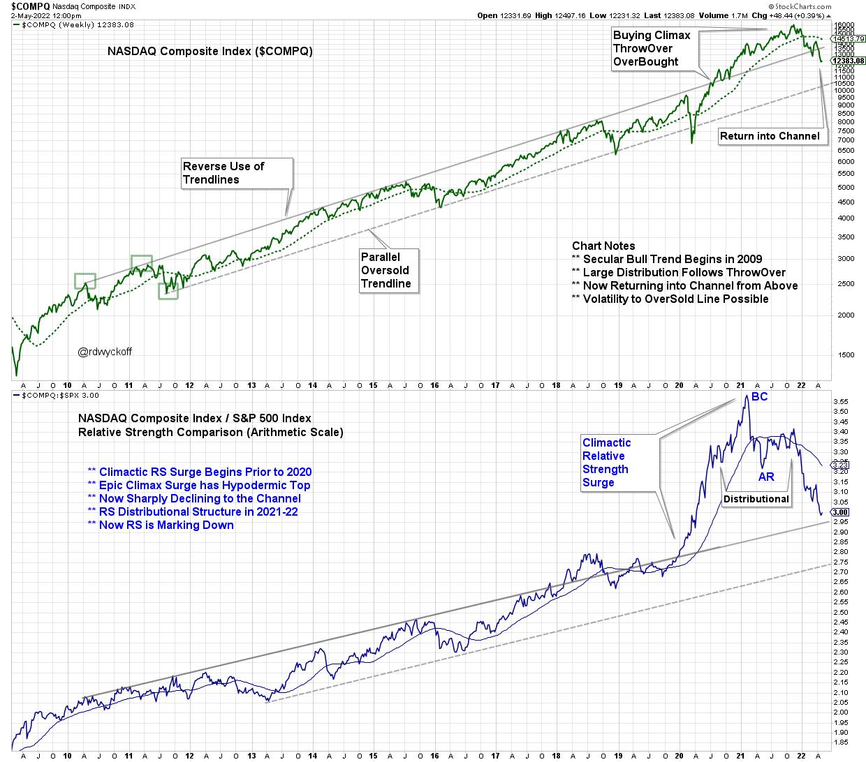 NASDAQ Composite with Relative Strength (2009-2022) NASDAQ Composite with Relative Strength (2009-2022)
NASDAQ Composite ($COMPQ) Trendline Study with Relative Strength
Chart Notes:
- Stride set in 2010-11 with Reverse Use Trendline. Very well defined channel for 10 years.
- At the 2020 price lows Relative Strength is already breaking above the channel and $COMPQ establishes strong leadership.
- Distribution appears to be forming in price and Relative Strength during 2021-22.
- Buying Climax (BC) and Automatic Reaction (AR) is pronounced on the Relative Strength study in 1st Qtr of 2021. This event signals the conclusion of the decade long leadership of NASDAQ stocks.
- Price has recently returned into the channel from above.

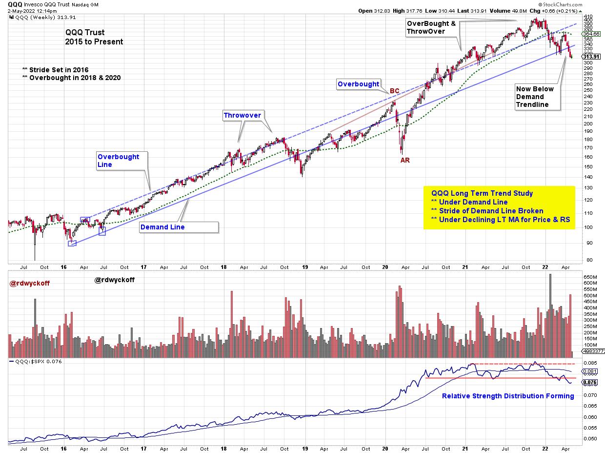
Invesco QQQ Trust (QQQ) with Relative Strength (2015-2022)
QQQ Trust ETF (QQQ) Notes:
- Stride set in 2016 on this weekly chart.
- Relative Strength has slowed ahead of price and has formed an Upthrust in late '21.
- Relative Strength became range-bound in 2020 in advance of price which peaked in late '21 with diminishing upward thrusts.
- Now below the RS neckline while price is resting on the lower channel trendline.
- A rally here is needed to defend this long term upward trend.
- The seven year trend is on the verge of failing.

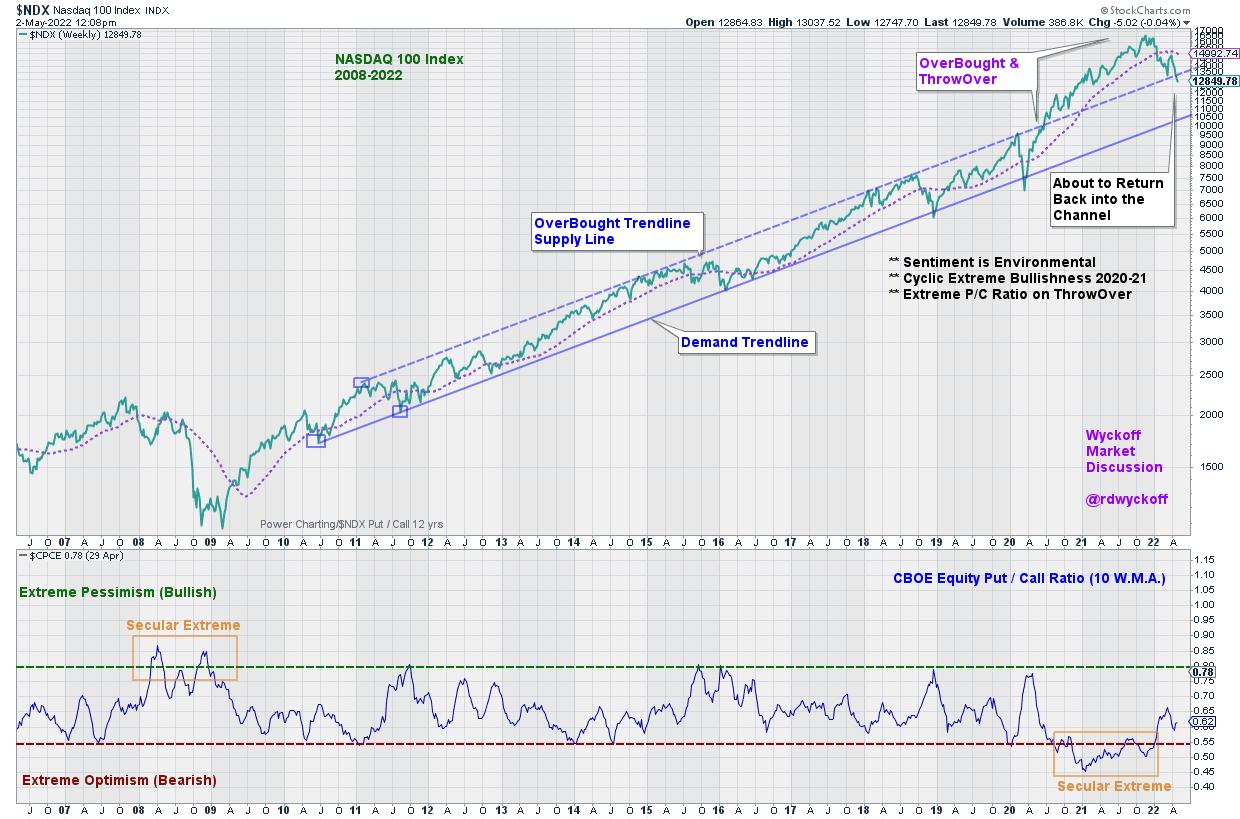
NASDAQ 100 Index ($NDX) with C.B.O.E. Equity Put / Call Volume (2006-2022)
NASDAQ 100 Trend Study (2006 to Present)
Chart Notes:
- Anchor Points of Demand Trendline in 2010 & 2011 set the stride of the Bull Market Secular Trend.
- OverBought parallel trendline is exceeded in 2020. Is this a Climactic 18-month surge?
- Now reversing back towards upper channel line. Will it act as Support?
- Secular extreme Put volume (high pessimism) in 2008 is notable and coincides with the ‘Great Recession' Bear Market.
- Extreme Call Volume (high optimism) activity in 2021 coincides with the Climactic run up and out of the channel. A possible psychological conclusion of the 13 year bull market advance.
The Wyckoffian method for trendline and trend channel construction is unique and illuminating. Trend technique is fractal and works in all timeframes. Mastery of Wyckoffian trend identification is a powerful trading tool. Stockcharts.com is a superior platform for annotating, analyzing, and saving your trend studies. The examples highlighted above are notable and illustrative while there are many more not covered here.
When analyzing a trend step out to the next larger timeframe to determine if a larger trend is at work. This larger trend could overwhelm and engulf the instrument you are evaluating, and possibly trading. The ebb and flow of the instrument being studied often has a rhythm within the channel as the larger trend is unfolding. Being aware of this trend heartbeat can improve patience in waiting for the best setup for a new surge in the direction of the primary trend being studied.
All the Best,
Bruce
@rdwyckoff
Additional Reading on Trend Analysis
Click (Here & Here & Here)
Announcement:
Dr. Gary Dayton, Psy.D. , Wyckoff trader and Peak Performance Trading Coach will present a 3-Part live workshop on May 3, May 10 & May 17. This is a must attend workshop for all Wyckoff Traders.
Workshop Title:
TRADE MINDFULLY
ACHIEVE OPTIMAL TRADING PERFORMANCE WITH
MINDFULNESS & CUTTING-EDGE PSYCHOLOGY
To Learn More and Register: (Click Here)
|
| READ ONLINE → |
|
|
|
| MORE ARTICLES → |
|
 Chart 1
 Chart 2
 Chart 3
 Chart 4


 Chart A
 Table A
 Chart B
 Chart C
 Chart D
 Chart E
 When studying the markets chartists can tend to become myopic and close in on smaller and smaller timeframes (certainly that is the case for this Wyckoffian). Meanwhile, the tsunami of monster trends can engulf portfolios with unexpected reversals. A powerful antidote to this vulnerability is awareness of the major price trends. When a large trend takes hold, it can persist for very long periods of time. The trend is not only a chartist's friend, it is what makes technical analysis work! Richard D. Wyckoff taught a method of trend analysis that is unique, effective, and original. This technique has been studied extensively in this blog (links to some of these posts are below).

 NASDAQ Composite with Relative Strength (2009-2022)