Volatility is clearly on the uptick with the S&P 500 SPDR (SPY) moving more than 1% nine times since July 31st. This follows a period from early June to late July when the 1-day Rate-of-Change exceeded 1% just once, and the market moved steadily higher. Ah, the good ole days. Elevated volatility is positive for short-term mean-reversion traders (see this August 6 article), but reflects above average uncertainty overall.
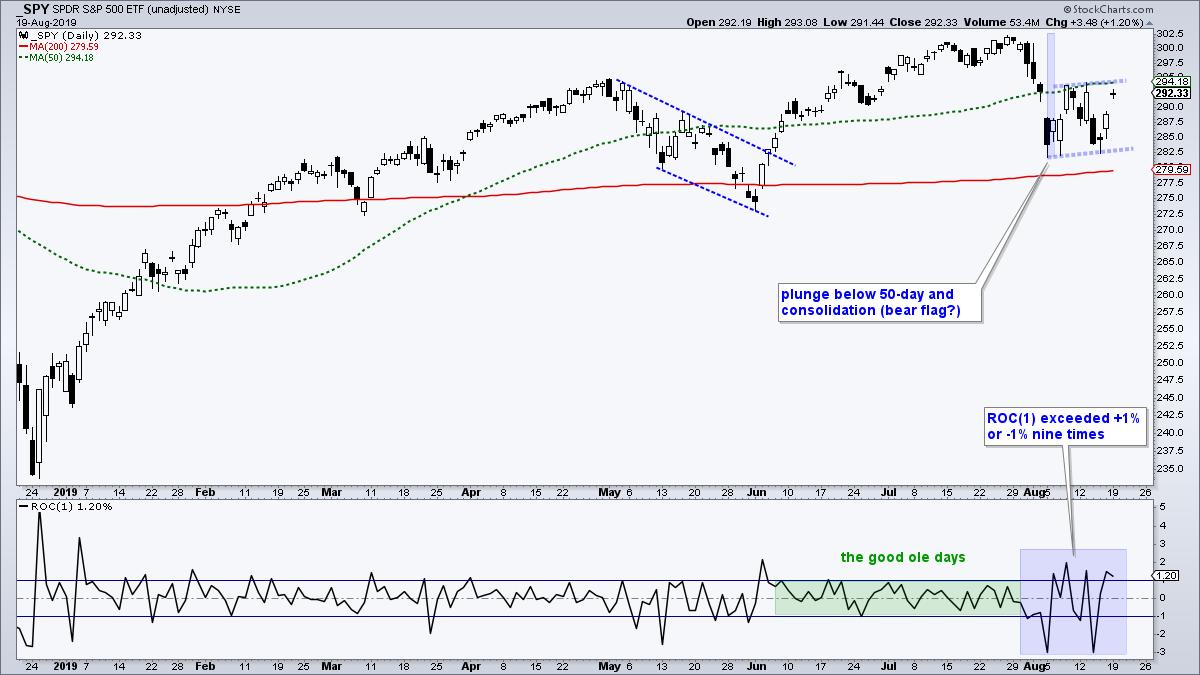
The chart above shows SPY with a sharp decline and break below the 50-day SMA (green line) in early August. The index then bounced between 282.5 and 295 the last two weeks. It is possible that a rising flag of sorts is taking shape and this is a bearish continuation pattern. The ETF is near last week's highs and the 50-day SMA, which are levels that could act as short-term resistance. A sharp decline from the 50-day SMA would increase the possibility of a flag break and the second shoe could then drop.
I would not entertain bearish thoughts if the index breadth model was net bullish and the sector breadth model showed broad strength. But they do not.
Technically, the S&P 500 is still in bull mode on the index breadth model, but mid-caps and small-caps are in bear mode. In addition, four of the five offensive sectors are in bear mode on the sector breadth model (finance, industrials, consumer discretionary, communication services). One could make the argument for a mixed market because technology, staples, utilities and REITs are holding up, and healthcare is flat. At the very least, I am NOT bullish on stocks at the moment so I will entertain bearish thoughts. This also means the the broadening formation in SPY is still active.
------------------------------------------------------------
Junk Bonds Seriously Underperforming Treasuries
Speaking of bearish thoughts, the next ratio charts show stocks and junk bonds underperforming Treasury bonds. On the chart below, the middle window shows the S&P 500 SPDR (SPY) relative to the 7-10 YR T-Bond ETF (IEF) using the SPY:IEF ratio. The lower window shows the High Yield Bond SPDR (JNK) relative to the 7-10 YR T-Bond ETF (IEF) using the JNK:IEF ratio. These lines rise when stocks and junk bonds outperform Treasury bonds, and fall when stocks and junk bonds underperform. Risk is "on" and favorable for stocks when these lines rise. Risk is "off" and unfavorable for stocks when these lines fall. The SPY:IEF ratio is below its January 2018 peak and this means stocks have been underperforming Treasury bonds for over 18 months (total return basis). This is important because we are supposed to earn extra return from higher risk stocks and we are not.
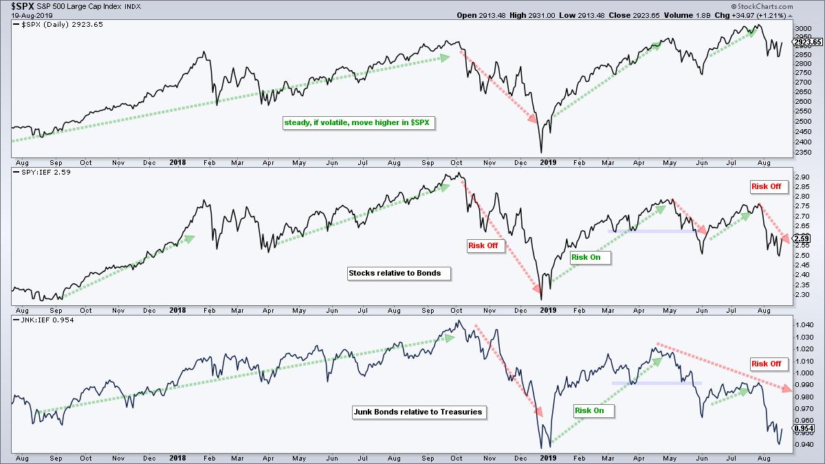
The bottom window shows the JNK:IEF ratio moving higher from August 2017 to September 2018. This reflected a risk-on period because high risk bonds (JNK) were outperforming low risk bonds (IEF). Investors were earning more return for taking more risk. This changed in October as the ratio plunged into December. The ratio moved higher from January to April as junk bonds outperformed for a few months, but turned back down and fell toward its December low in August. Junk bonds are seriously underperforming Treasuries and this reflects risk aversion in the financial markets.
------------------------------------------------------------
High Beta Underperforming Low Volatility
We can also measure risk tolerance within the stock market by comparing the S&P 500 Low Volatility ETF (SPLV) to the S&P 500 High Beta ETF (SPHB). SPLV consists of stocks with low volatility and lower risk. SPHB has stocks with high betas and higher risk. The sector weightings are shown on the chart for reference (source: invesco.com). Notice that utilities, REITs and consumer staples account for over 50% of SPLV. These three sectors are not even represented in SPHB. The technology sector accounts for 43% of SPHB, followed by healthcare (12%) and industrials (11.7%). These two ETFs could not be more different.
The chart below shows unadjusted SPLV (_SPLV) in the top window and unadjusted SPHB (_SPHB) in the middle window. I prefer unadjusted prices when comparing peaks and troughs, and when performing price chart analysis. Precede a symbol with an underscore (_XLU) to see unadjusted price data. Notice that SPHB did not record a new high in April and fell well short of its September high. The ETF did not break above the April high in July and fell back below its 200-day SMA last week. SPLV, on the other hand, moved back above its 200-day SMA in late January, hit a new high in February and continued to hit new highs into July. Low volatility is clearly stronger than high beta.
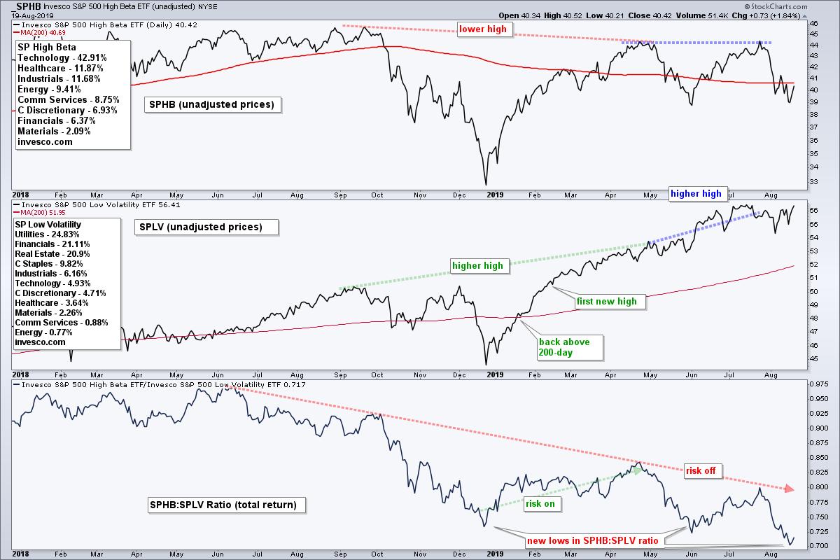
The bottom window shows the total-return ratio chart (SPLV:SPHB) in the lower window. I prefer total return data when comparing performance using a ratio (hat tip David Keller). This ratio peaked in June and fell rather sharply in the second half of 2018. This showed low volatility stocks outperforming high beta stocks. The ratio turned up from January to April and again in June-July, but formed lower highs and moved to lower lows with each subsequent dip. Low volatility stocks (utilities, REITs and staples) are outperforming high beta stocks (tech, healthcare, industrials).
------------------------------------------------------------
Industrials, Finance and Energy are Big Laggards
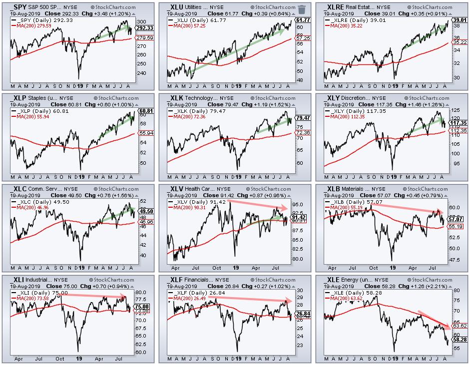
As we have seen in 2019, it is still possible for the S&P 500 SPDR (_SPY), Technology SPDR (_XLK) and Consumer Discretionary SPDR (_XLY) to hit new highs when low volatility is outperforming high beta. Risk aversion does not always affect the entire stock market. Remember, price is the final arbiter so we must always defer to the individual price charts before making broad assumptions. Notice that these three hit new highs in April and July. On the other side, the Industrials SPDR (_XLI), Financials SPDR (_XLF) and Health Care SPDR (_XLV) did not hit new highs. The CandleGlance charts below show unadjusted SPY with the 11 sector SPDRs (unadjusted). The green arrows show SPY and six sectors with higher highs from October to July. The red arrows show the lagging sector SPDRs with lower highs from October to July.
------------------------------------------------------------
Choose a Strategy, Develop a Plan and Follow a Process
Arthur Hill, CMT
Chief Technical Strategist, TrendInvestorPro.com
Author, Define the Trend and Trade the Trend
Want to stay up to date with Arthur's latest market insights?
– Follow @ArthurHill on Twitter


