MailBag November 27, 2009 at 05:50 AM
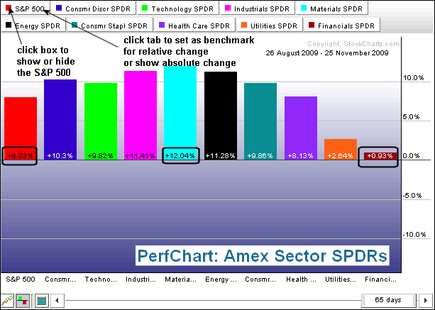
Interactive Perfcharts TM compare performance of up to 10 different securities over a given timeframe. For example, the Sector SPDR Perfchart compares the performance of the nine S&P Sector SPDRs against the S&P 500. This is one of the most popular PerfCharts. Performance can be measured on an absolute basis or a relative basis. This article will show how to change from relative performance to absolute performance and how to change the relative performance benchmark. Click this chart for details The first PerfChart shows absolute (actual) percentage change Read More
MailBag November 20, 2009 at 01:42 PM
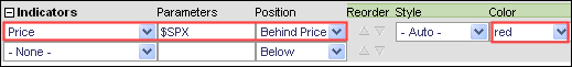
There are two ways to compare securities using SharpCharts. The first method is simply to analyze the price plots together, one overlaid on the other. Another security can be overlaid by choosing “price” in the indicator box, entering “$SPX” for parameters and choosing “behind price” for position. Any symbol can be entered here. I chose red for color contrast. The chart below shows General Electric (GE) in black and the S&P 500 in red. Both moved higher from July to September, but started to diverge in October and November. Notice that the S&P 500 recorded higher Read More
MailBag November 13, 2009 at 01:33 PM
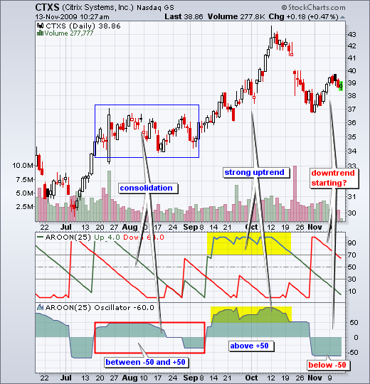
The Aroon Oscillator is simply Aroon(down) subtracted from Aroon(up). It is positive when Aroon(up) is greater than Aroon(down) and negative when Aroon(down) is greater than Aroon(up). The oscillator can be used as a stand alone indicator or in conjunction with Aroon(up) and Aroon(down). As noted in the chart school article, Aroon means “dawn’s early light” in Sanskrit. Tushar Chande, a serial indicator developer, created this indicator to determine the direction and strength of the trend. You can find formula details in the chart school article. A strong uptrend is Read More
MailBag November 06, 2009 at 01:11 PM
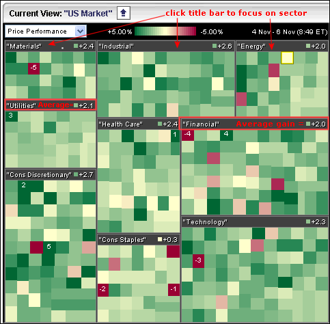
The Sector Carpet values reflect the average change for the stocks in that sector. First, let’s take a look at the default sector carpet. Nine sectors are represented. Each sector has a title box with its name and the average change for each stock. You can click on the title box to focus on a sector exclusively. Before leaving this image, notice that +2.1% is the average gain in the utilities sector. After clicking on the utilities title box, I am now focusing exclusively on the stocks in the utilities sector. Hover over the green boxes, right click the mouse and choose “show Read More