MailBag December 31, 2009 at 10:00 AM
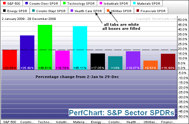
There are two ways to look at a PerfChart: absolute performance or relative performance. Absolute performance is straightforward. It is simply the percentage gain or loss over a given period of time. The first PerfChart shows the absolute change for the nine S&P Sector SPDRs and the S&P 500. Notice that all tabs are white and all boxes are filled. Click on the box to show/hide the S&P 500 or any other security in the PerfChart. A filled box shows the security, while a hollow box hides the security. Click this chart for details The second PerfChart shows Read More
MailBag December 24, 2009 at 02:50 PM
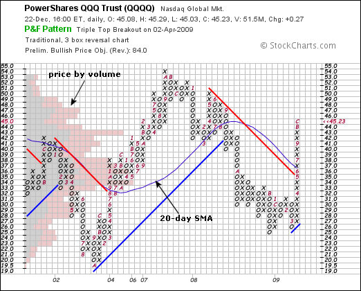
SharpCharts users can show trendlines, Bollinger bands, price-by-volume and moving averages on Point & Figure charts. The first step is to create a P&F chart. Under the P&F chart, one can choose the indicators in the “price overlays” section. In this example, I chose price-by-volume, trendlines and the simple moving average. Click “update chart” to apply these indicators. The indicators are based on the X and O levels on the Point & Figure chart. In other words, they are based on P&F prices, not on the daily price/volume of the actual security. Do not expect indicators Read More
MailBag December 18, 2009 at 05:21 PM
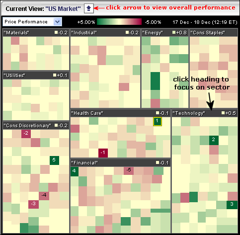
The MarketCarpet view can be changed by clicking the blue arrow at the top-left or by clicking the heading of each section. The image below shows the default S&P Sector Carpet. The nine S&P sectors are shown in big boxes and the individual stocks are represented with the small colored squares (green to red). Click on the blue arrow to see these sectors as a whole. The next MarketCarpet shows the sector view. Now the sectors are color coded from green to red. Also notice the numbers in each header. This tells us the average gain or loss for each stock within the Read More
MailBag December 11, 2009 at 01:46 PM
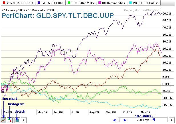
While Perfcharts are specifically designed to measure and compare performance, Sharpcharts can also be used for this purpose. First, let’s look at a Perfchart example using some key intermarket ETFs. This one shows the Gold ETF (GLD), S&P 500 ETF (SPY), 20+ Year Treasury ETF (TLT), DB Commodity Index Tracking ETF (DBC) and DB Dollar Bullish ETF (UUP). Performance covers the last 200 days, from February 27th until December 19th. With the buttons in the lower left corner, one can view this as a line chart, histogram or detach the chart. With the slider in the lower right corner, one can Read More
MailBag December 04, 2009 at 02:43 PM
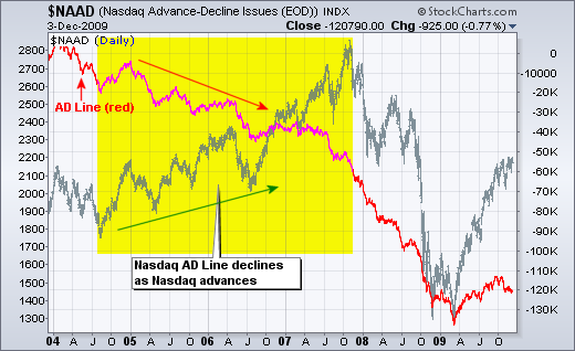
In short, the Nasdaq has easier listing requirements than the NYSE. This makes it easier for startups and high-risk companies to get a listing. Startups and high-risk companies can prosper in a strong bull market with plenty of liquidity. However, these companies suffer when liquidity is tight or during a bear market. Once listed, these companies must meet certain financial and reporting requirements or face the prospects of a delisting. The Nasdaq has many more delistings than the NYSE. Click this chart for details The first chart shows the Nasdaq AD Line over the Read More