MailBag June 27, 2014 at 05:01 AM
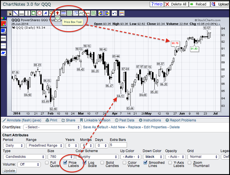
This article explains two options for adding price labels to a SharpChart. There is also a video at the end. For the first option, users can check the "price labels" box in the Chart Attributes section under the SharpChart. Click "update" and the chart will refresh with price labels on key highs and lows. A close-only chart will show price labels for the closing levels. A bar or candlestick chart will show price labels for the period high or low. These price levels make it easier to quantify support and resistance levels. Read More
MailBag June 20, 2014 at 04:49 AM
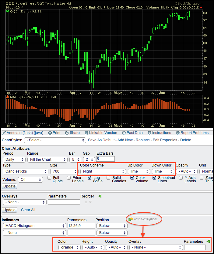
Chartists can change the overall color scheme on a chart as well as price and indicator colors. The first step is to select a "color scheme" from the drop down menu just below the SharpChart. There are over two dozen schemes available. The chart below shows "night", which is a black background. The second step is to change the price colors, which can be done with the drop down menus just to the right of the color scheme. Of the twelve color choices, I chose lime for both up and down candlesticks. This creates a florescent look and makes the prices really stand out. Note that you Read More
MailBag June 13, 2014 at 04:56 AM
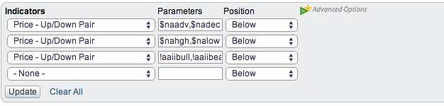
Some indicators come in bullish-bearish pairs. Examples include advances and declines, up volume and down volume, new highs and new lows, and percent bulls and percent bears. These bullish-bearish pairs can be plotted as an up-down pair using a special indicator (Price - Up/Down Pair). Select this indicator and then enter the two symbols separated by a comma. The first symbol will be up (green) and the second symbol will be down (red). The chart above shows the Nasdaq in the main window with three examples in the indicator windows. The first is Nasdaq Advances Read More
MailBag June 08, 2014 at 05:46 PM
Q: How do I create a list of ETFs sorted by their performance over the past 20 days? A: You can do that by using an Advanced Scan with our new "Rank By" feature. Here's what it looks like: [group is ETF] rank by [PctChange(20, close)] Note that when you run that scan, your results will be sorted by %Change. Also note that the %Change values are shown in the rightmost column of the results page. You can also add additional clauses to further reduce the number of results. Here's one that's a little more "real-world:" [country is Read More
MailBag June 06, 2014 at 04:58 AM
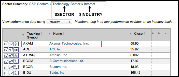
When charting a single stock, StockCharts users can view the corresponding sector and industry group by using the symbols $SECTOR and $INDUSTRY, respectively. The sector and industry group will correspond with the Sector Summary. The image below shows a screen shot from the internet industry group, which is part of the technology sector. Plotting the symbols $SECTOR and $INDUSTRY with Akamai (AKAM) would show the Technology SPDR (XLK) and the DJ US Internet Index ($DJUSNS). The chart below shows Akamai in the main window with $SECTOR as the first Read More