MailBag August 01, 2014 at 05:28 AM
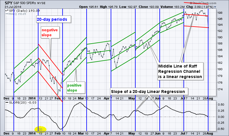
The Slope indicator measures the slope of a linear regression, which is the line of best fit for a data series. A 20-period Slope, therefore, measures the slope of a 20-day linear regression. As you may remember from your high school math, the slope is the rise over the run for a line. Chartists can plot a linear regression using the Raff Regression Channel on the price chart. Note that the middle line of the Raff Regression Channel is the linear regression. The chart below shows 20-period timeframes with the blue horizontal lines and Raff Regression Channels drawn during Read More
MailBag July 25, 2014 at 06:08 AM
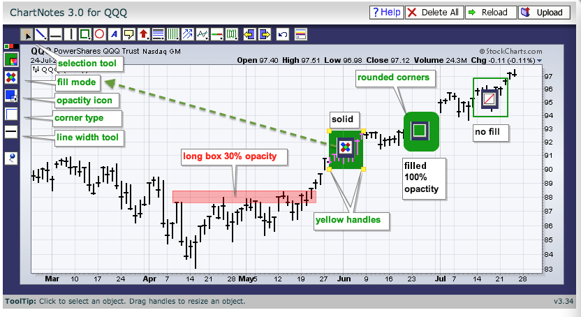
Chartists can draw filled shapes on a SharpChart with just a few easy mouse clicks. First, create a SharpChart and open the ChartNotes workbench by clicking the "annotate" link at the bottom. Second, hold down the CTRL key and drag out the desired shape. Chartists can choose the box, circle or square icons. Once drawn, you can change the fill mode and the opacity using the icons on the left. Fill mode can be solid, filled or no fill. All three options are shown with their relevant icon in the image below. Choose the filled option and then adjust the opacity Read More
MailBag July 18, 2014 at 05:33 AM
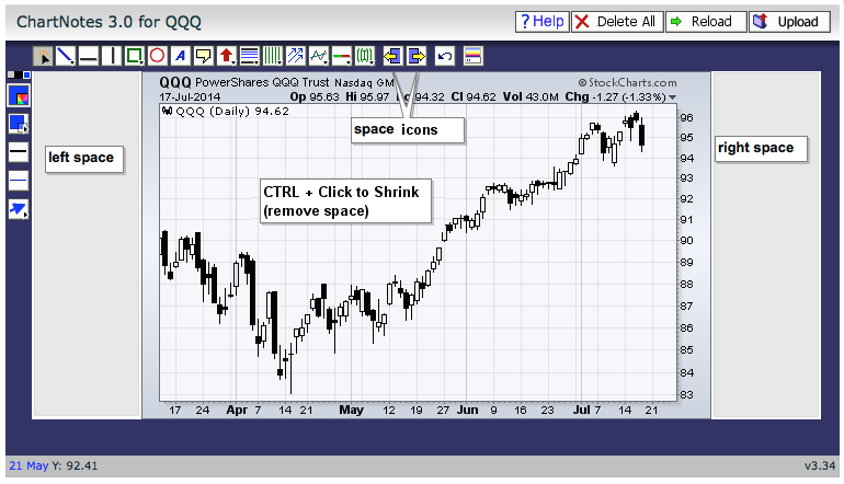
First, note that chartists can add time to the chart by using the "Extra Bars" function in the Chart Attribute section, which is just under the SharpChart. Adding 20 bars to a daily chart will extend the chart 20 days. Adding 10 weeks to a weekly chart will extend the chart 10 weeks. Chartists can also add blank space to a SharpChart when annotating. Click the "annotate" link below the SharpChart to open the ChartNotes workbench. Chartists will then see a row of annotation icons at the top. The two icon in the middle with the yellow areas can be used to add space to the left or Read More
MailBag July 11, 2014 at 04:37 AM
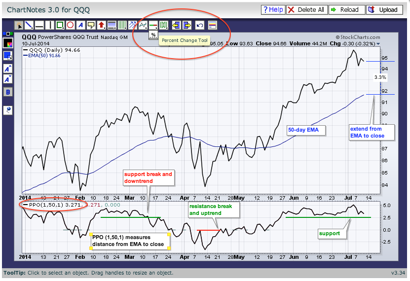
There are two ways to measure how far above or below the price is from a moving average. First, as Greg Schnell has shown us several times, chartists can use the "percentage change tool" when annotating a SharpChart. This tool can be found just under the icon with the green-red line (support-resistance tool). Click to select, move to the moving average and click-drag from the moving average to the price. The example above shows a 3.3% difference between the 50-day EMA and the closing price. Chartists can also plot the differential using the Percentage Price Read More
MailBag July 05, 2014 at 03:27 AM
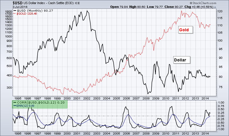
StockCharts users can chart the correlation between two asset classes using the Correlation Coefficient indicator. This tells us the degree of correlation between two symbols. A positive Correlation means the two move in the same direction, while a negative Correlation Coefficient means they move in opposite directions. The video is at the bottom of the article. The Correlation Coefficient can be added as an indicator and placed above or below the main chart window. Note that chartists can use the "Advanced Options" to add an indicator to the Correlation Coefficient, such as a Read More