MailBag January 30, 2015 at 05:00 AM
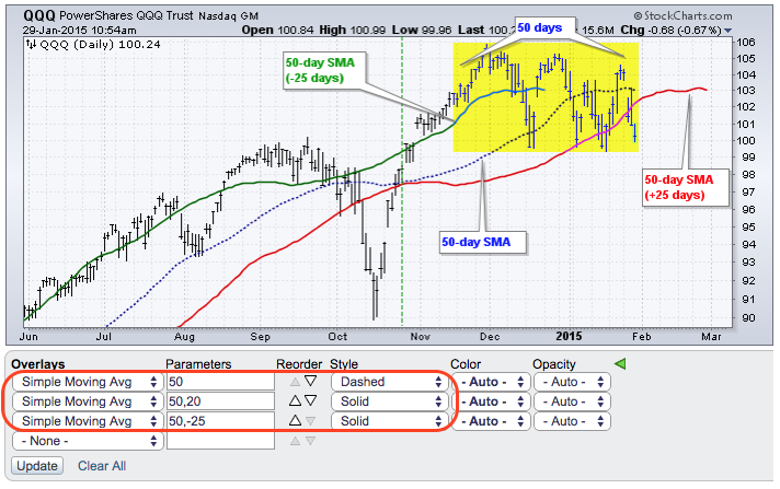
Shifting a moving average is not as crazy as it may seem. First, chartists may want to compare the current day's price against the prior day's moving average value. To do this, one needs to shift the moving average forward one period. Second, a 50-day moving average is the average of the last fifty days and some chartists like to show this value in the middle of that 50-day period. This is also known as a centered moving average. Chartists can shift (displace) a moving average forwards or backwards by adding a comma and number to the Read More
MailBag January 23, 2015 at 05:59 PM
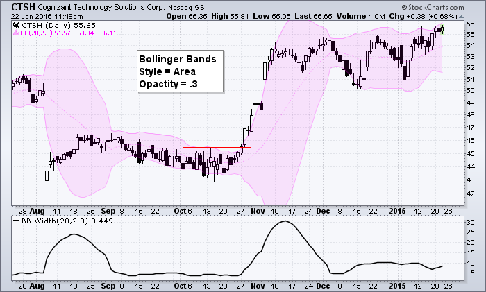
Bollinger Bands and Moving Average envelopes are indicators with two outer lines based on a moving average. Chartists can view these indicators as just lines or really make them stand out by setting the "Style" as "Area". This setting essentially shades the area between the outer lines and colors the indicator, which makes it really easy to see Bollinger Band contractions or breakouts. The example above shows Cognizant Technology (CTSH) with Bollinger Bands in pink. In addition, the opacity is set at .30 to make them a little more Read More
MailBag January 16, 2015 at 11:51 AM
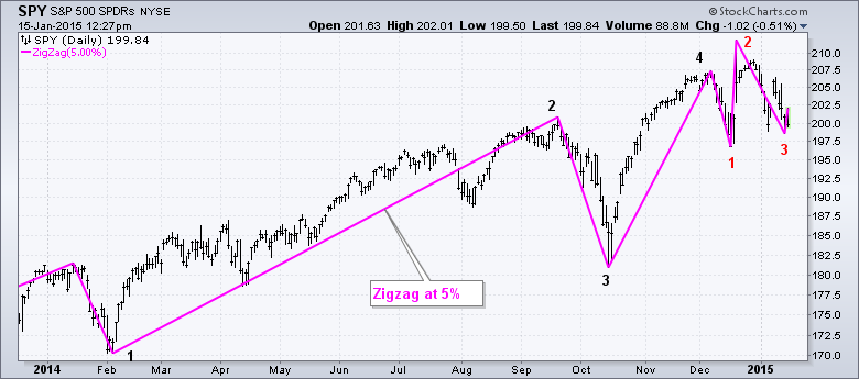
The stock market has been quite volatile in 2015 and this may be a good time to consider alternative charting techniques to filter out some of the noise. The chart below shows the S&P 500 SPDR with the zigzag indicator set at 5%, which filters out price swings that are less than 5%. There were four 5+ percent swings in the first eleven months of 2014 and three 5+ percent swings in December-January. Clearly, market volatility is heating up. While volatility may be fine for day traders, it can make the chart noisy for position traders and Read More
MailBag January 09, 2015 at 05:55 AM
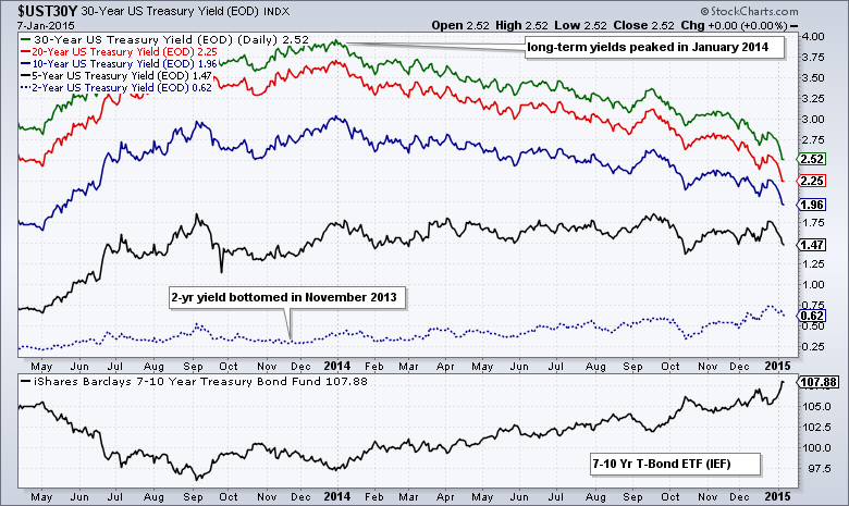
With lots of chatter regarding the 10-YR Treasury Yield and the yield curve, now is a good time to show chartists how to use the "Price (same scale)" feature to plot yields. This feature is good for plotting symbols that use the same scale, such as Treasury yields and the Bullish Percent Indices. The chart above shows the 30-year Treasury Yield ($UST30Y) as the main symbol. I then added the 20-year Treasury Yield ($UST20Y), the 10-year Treasury Yield ($UST10Y), the 5-year Treasury Yield ($UST5Y) and the 2-year Treasury Yield ($UST2Y) using "Price (same scale)" Read More
MailBag January 02, 2015 at 05:41 AM
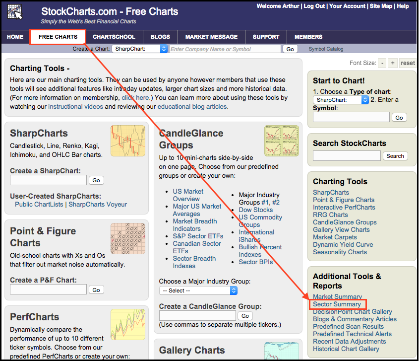
StockCharts users can use the Sector Summary to drill down into sectors and industry groups. This tool makes it easy to see the nine sectors, the industry groups within these sectors and the stocks within these industry groups. Users can find the sector summary in the additional tools section of the righthand navigation column on every web page. After clicking the Sector Summary link, you will be taken to the main page showing the nine sectors. From here, chartists can change the time frame, sort by clicking the column headings and open other charts Read More