MailBag March 28, 2015 at 09:41 AM
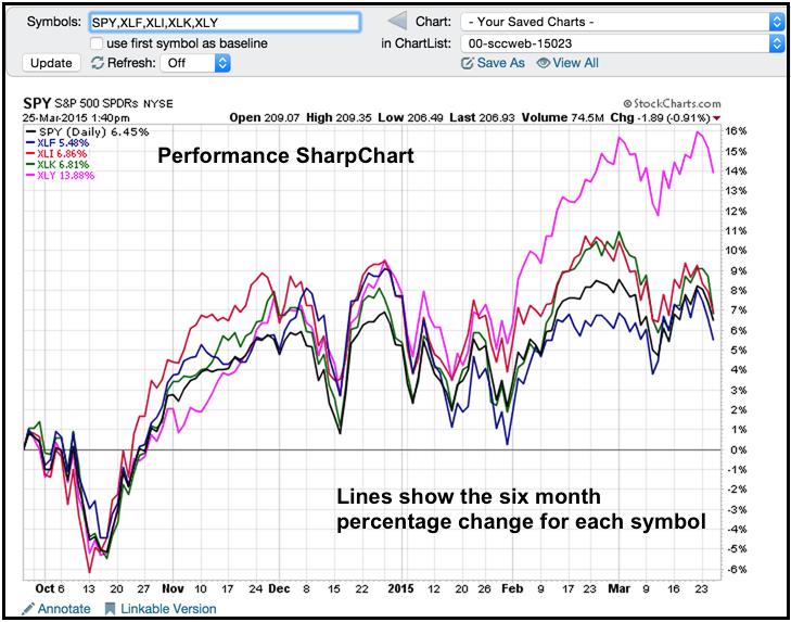
Chartists can show the performance for several symbols on one SharpChart by entering a comma-separated list (spy,xly,xlk,xli,xlf). Note that free users can chart up to five symbols on one chart, Basic and Extra members can chart up to six symbols and Pro members can chart up to ten symbols. Click here to see the different subscription packages. Simply enter these symbols in the symbol entry box and click go to create a performance SharpChart. The example below shows the performance for SPY and four sector SPDRs over the last six months. All five are up, but one Read More
MailBag March 20, 2015 at 07:26 AM
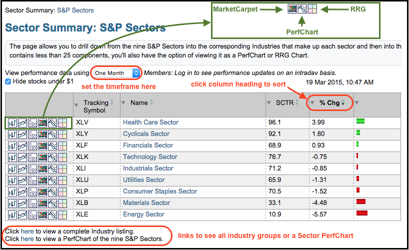
The Sector Summary page is designed to help chartists find the best performing sectors, industry groups and stocks. Using a top-down approach, users start with the sectors to see a break down of the broader market. Click on a sector to see the industry groups in that sector and click on the industry group to see the stocks in that group. Chartists can also adjust the timeframe, sort the various columns, apply PerfCharts, use MarketCarpets and use some symbol groups in a Relative Rotation Graph (RRG). The example below shows the landing page for the Read More
MailBag March 13, 2015 at 05:25 AM
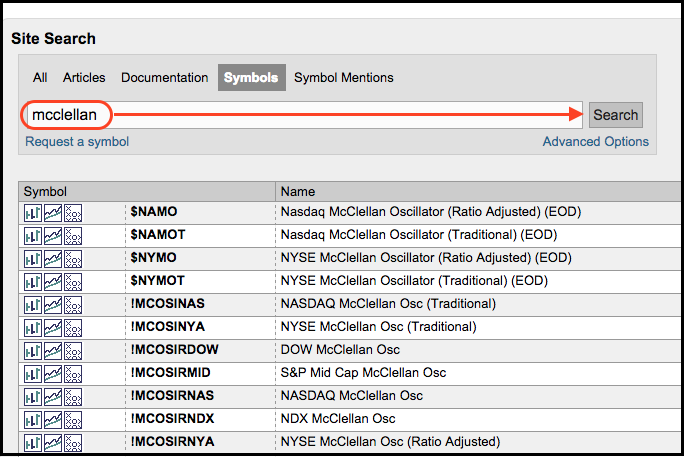
There is a little indicator "hack" that chartists can use to update the McClellan Oscillator during the day. First, note that StockCharts has end-of-day (EOD) symbols for the McClellan Oscillators. Simply search for the term "mcclellan" in the symbol catalog. The symbols beginning with an exclamation point (!) come from the DecisionPoint merger and these indicators are also updated after the close. The ratio-adjusted McClellan Oscillator uses the ratio of net advances [(advances less declines) divided by total issues]. The traditional McClellan Oscillator simply uses net advances Read More
MailBag March 06, 2015 at 08:01 AM
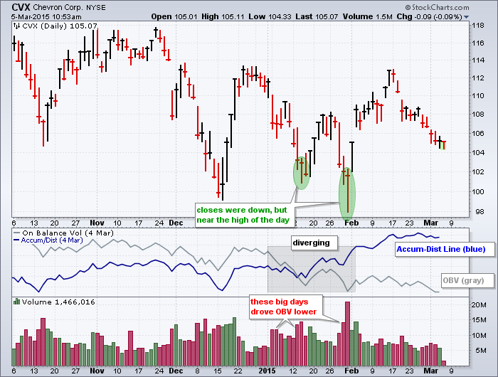
It does not always happen, but sometimes On Balance Volume (OBV) and the Accumulation Distribution Line (ACDL) diverge to paint completely different pictures. These two can diverge because they are calculated differently. First, note that both indicators use price and volume to detect accumulation and distribution. OBV, which was developed by Joe Granville, rises when the close is higher than the prior close and declines when the close is lower. On a daily chart, the period's volume is added on an up day and subtracted on a down day. Down days on big volume, therefore, will push the Read More