| |
|
|
|
|
| |
 |
ChartWatchers
the StockCharts.com Newsletter
|
|
|
|
|
|
|
|
Hello Fellow ChartWatchers!
Stocks rose this past week with the large-, mid-, and small-cap S&P indexes all finishing up around 3.2%. For the year, the S&P 500 is up over 12%, the mid-caps are up 7.98% and the small-caps are up only 3% however those numbers are misleading because, over the past 3 months we've see a surge in strength from the small caps. Since October 1st, small-cap stocks have outperformed mid-cap stocks by 2.2% and large-cap stocks by 3.0%. And, as Arthur Hill pointed out in yesterday's Market Message articles (which members can see here), micro-cap stocks (IWC) are currently leading things higher.
Arthur, John, Greg, Carl, and Tom will talk more about that in just a minute, but I wanted to take a minute a make sure everyone is aware of all the things we added (without raising prices) to StockCharts.com this year.
Why a StockCharts.com Membership is More Valuable Now Than It Has Ever Been
At StockCharts.com, our strategy is to continually increase the value of the website without increasing prices. That's how we remain competitive in the cut-throat world of the Internet. It's how we reward our loyal fan-base. Essentially, it is what we do. 2014 was no exception. In fact, we've added more content to our website in 2014 than in any previous year; something I'm very proud of. Here's a list of just some of the great things we added in 2014:
- Webinars! - Our two experimental webinar series have been HUGE successes. Have you attended one yet? So far, Arthur Hill is giving live webinars on Tuesdays at 1pm Eastern and Greg Schnell is doing his live webinar on Thursdays at 4:30pm Eastern. Hundreds of people have attended so far and the feedback from them has been incredibly positive. We plan on continuing these programs into 2015 and plan on expanding our webinar line up so that other authors and commentators can get involved too. Interested? Why not click here to register for Arthur's next webinar on this coming Tuesday?
- Martin Pring's Commentary - I still can't believe that Martin joined our commentary team this year. For no additional cost, members can now read (and hear) Martin's expert commentary in his "Market Roundup" blog and as a frequent guest during Thursday's "Market Roundup" webinars with Greg Schnell.
- Martin Pring's Market Indicators - Martin also brought with him his coveted collection of market indicators including the Pring Special K, the Pring Deflation Index, and the various Pring Diffusion indicators. To see a list of Martin's indexes, search for symbols starting with "!PR". For more information on how to use them, search ChartSchool for "Pring" (or just click here). And read Martin's blog for examples of how he uses them.
- Greg Morris - Greg is now in the process of updating his Market Breadth Indicators book using his new blog on our website. Anyone can now read Greg's updates for free. In addition, as part of updating Greg's book, we've added a large number of new breadth-based Market Indicators to our system.
- RRG Charts - These new charts are amazing and you can only find them live on the Internet here at StockCharts.com. Created by Julius de Kempenaar - who is also blogging about them exclusively on our site as well - RRG charts dynamically show you relative strength for any group of stocks/ETFs/indexes that you want. If you haven't seen them in action yet, check out this article from Arthur Hill and see how useful they can be.
- DecisionPoint Chart Gallery - Our merger with DecisionPoint.com was one of the highlights of 2014. As part of that merger, we created the DP Chart Gallery to give everyone easy access to the best charts that DecisionPoint had to offer - their "Greatest Hits" as it were.
- All the DecisionPoint Market Indicators - Over 400 additional indicators were added to our website as a part of our merger with DecisionPoint. We are still in the process of documenting them all!
- Carl & Erin's Free DecisionPoint Blog - As soon as the merger was announced, Carl and Erin began blogging on our website in the "DecisionPoint" blog. It's a great source of ideas for how best to use all of the new content that they brought to our site.
- DecisionPoint Reports, Trackers, and Spreadsheets - Did you know that each day StockCharts members can access more than 20 high-quality, expert-level reports about the technical condition of the stock market? These reports (and the corresponding spreadsheets) show you ALL of the important market timing signals and changes that DecsionPoint has used for over 20 years. They are a huge "hidden gem" on our website that all members should check out. They can be found in the DP Reports Blog and the DP Trackers Blog.
- John Murphy's First eBook - We purchased the rights to John's classic book "Charting Made Easy" and immediately re-released it on our website for free. Yep, free. Now anyone can read John's great introduction to chart analysis just by visiting this link.
- SCU Seminars - We presented live StockCharts University training seminars in 5 different locations to over 600 attendees.
- ChartCon 2014 - In August, we hosted over 400 people for our ChartCon 2014 conference. It was a terrific event with presentations over 2 days from experts like John Murphy, Martin Pring, Richard Arms, Alexander Elder, Arthur Hill, Gatis Roze, Tom Bowley and many others. The reviews from attendees were amazingly wonderful.
- ChartCon 2014 Videos - Couldn't make it to ChartCon? No worries - we video taped it for you! You can order the ChartCon videos from our online store.
- Pinnacle Breadth and Commodities Data - In October, we completed a deal with Pinnacle Data that allows us to use their amazing historical database of market breadth data and commodities data on our charts. All at no additional cost to you. No need to thank us. Just keep enjoying the best charting database available anywhere.
- Top Advisors Corner - Another "hidden gem" that we got in the DecisionPoint merger is the "Top Advisors Corner" blog that features free articles from subscription-based newsletter authors. For the price of a small sales pitch, you can now read even more technical content from even more great technical analysts.
- Greatly Improved Documentation - We've been rewriting all of our documentation. You can find the new version by clicking the "Help" link in the upper right corner of any of our pages. Very soon now, the old "Support" area will be disappearing in favor of this new documentation.
- Corporate Action Event Markers - Use the "Events" overlay on our SharpCharts to see when splits/dividends/distributions have affected the stock's price. Here's an example.
- "Difference" Symbols - Use a hyphen to subtract one symbol from another and chart the result. Here's an example.
- The "Ranger" Interactive Date Control - Interactively change the start and end dates for your chart by simply clicking and dragging.
- Expanded SCTR Coverage - we now rank over 5,000 different stocks and ETFs using our exclusive SCTR Ranking system.
- RANK BY Scans - These things are awesome. Members can now designate how they want their scan results to be sorted on the results page by adding a "RANK BY" clause to the end of their scan. This has the added benefit of giving you indicator values on the scan results page.
- Solid Candlestick Colors - Those of you that prefer candlesticks with different colors for up vs. down, your wish is our command.
- The New StockCharts Answers Network (s.c.a.n.) - In June we released a completely new version of our user-to-user help area called "The StockCharts Answer Network (s.c.a.n.)" Be sure to check out the results and register to participate if you have a question or you think you can help others.
- And there's more... Gatis Roze's amazing ChartPack updates, Greg Schnell's huge volume of great commentary, John Murphy's amazing October market warning, our charts in Alexander Elder's new book, our 15 year anniversary celebration, 5 new ChartPacks from DecisionPoint, sortable CandleGlance charts, over 11,000 Facebook followers...
- ...and much, much, much, much more!
Hopefully, you've been able to take advantage of many of the things we offer already. If not, I urge you to take some time over the holidays and explore some of these new features of our site. Hopefully you will agree that StockCharts.com offers an amazing amount of value in return for your subscription.
Speaking of subscriptions, our Holiday Special will be ending soon. If you are not a member, join now. If your account ends within in the next 6 months, you should definitely renew your account now and take advantage of our long-term pricing deals. 14 months of service for the price of 12 is our most popular offer. If you wait to renew, you may miss out of those savings.
Happy Holidays everyone!
- Chip
SITE NEWS
RECENT ADDITIONS TO STOCKCHARTS.COM
- DON'T MISS ARTHUR HILL'S HOLIDAY WEBINAR EXTRAVAGANZA! - OK, so it won't really be an "extravaganza" in the technical sense of the word, and it won't have much to do with the holidays per se, but it will still be great! This coming Tuesday at 1pm Eastern, Arthur will be reviewing the market's current direction and discussing where it may go during the final couple of weeks of 2014. Click here to register and join us for our final webinar of 2014!
- AS USUAL, CHIP STOLE ALL MY THUNDER - Just go read his article for a list of all the cool new stuff on the site, especially the part at the end about our Holiday Special ending soon. Sigh.
US STOCKS END WEEK ON A STRONG NOTE
by John Murphy | The Market Message
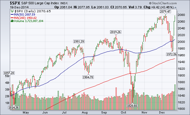
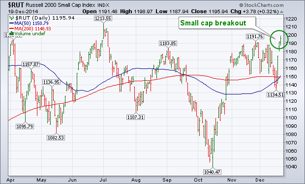
A combination of factors pushed U.S. (and global) stocks sharply higher during the second half of the week. One big factor was the Wednesday Fed statement that it would be "patient" in raising rates next year. Another was a bounce in a very oversold oil market late in the week which gave a big boost to energy shares (which make up 8% of the S&P 500). Energy shares rose 9.5% and were by far the week's strongest sector. Material stocks (led by copper and aluminum) came in second with a weekly gain of nearly 5%. All other sectors gained on the week as well. Chart 1 shows the S&P 500 rallying sharply and nearing a test of its December high. Small caps also had a strong week. Chart 2 shows the Russell 2000 Small Cap Index breaking out to a new six month high. I wrote on Thursday that small caps usually start to do better in mid-December in anticipation of the traditional January Effect. Traders were also buying in anticipation of the traditional yearend Santa Claus rally. [Friday's unusually heavy trading was due mainly to the quarterly expiration of futures and options]. Foreign shares also jumped.
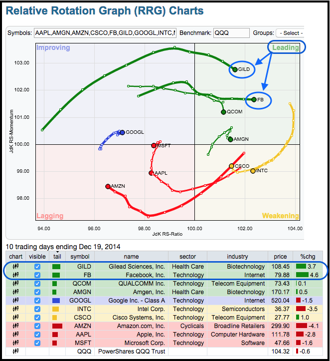
Chartists can improve their odds by looking for stocks that show relative strength and bullish price action. It is a two-pronged approach that has stood the test of time. I use relative strength to narrow the field and then look for charts with bullish signals. The first image shows a Relative Rotation Graph (RRG) with the top ten stocks in the Nasdaq 100 ETF (QQQ) and QQQ as the benchmark. Together, these ten stocks account for almost 50% of QQQ and can be considered the main drivers of the ETF. Interpreting the RRG chart is simple. Stocks in the green are leading and stocks in the red are lagging. Gilead, Facebook, QualComm and Amgen are showing relative strength. In particular, FB and GILD are in the top right of the RRG chart and at the top of the relative performance list just below the chart. Note that this is a daily RRG chart that covers the last two weeks, which can be considered short-term.
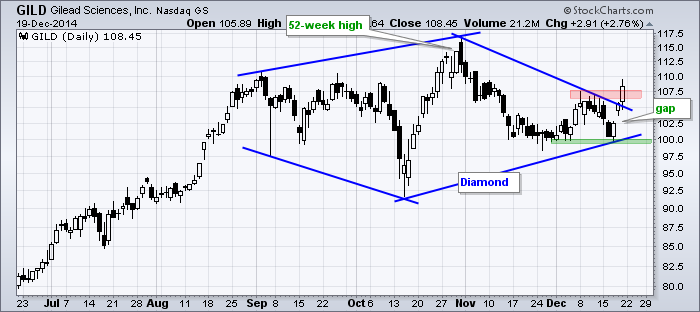
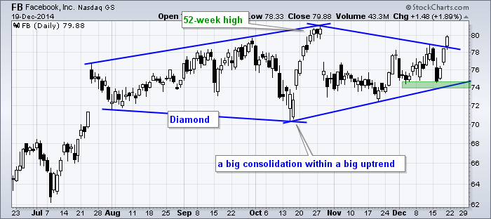
Even though the RRG chart is relatively short-term, Facebook and Gilead are in long-term uptrends and show promising breakouts this week. The charts below show both hitting new highs in October and then consolidating the next six weeks. The left half of the consolidation looks like a broadening formation and the right half looks like a symmetrical triangle. Taken together, we have a big diamond, which is just a big consolidation. A consolidation after an advance is typically a bullish continuation pattern that represents a rest within the uptrend. These stocks broke out this week and chartists can mark support at the December lows.
Thanks for reading and have a great weekend!
Arthur Hill CMT
Technicians are a serious bunch. When we get a trend line break to the upside or downside, it is very critical for us. It is our trigger. However, the way the data is displayed is very important as well.
Here is a chart of 4 related subjects on a performance chart which shows the movement in % terms. They rise and fall together over time but the percentage change is different. A one-to-one fit? No. The components are the Emerging Markets ETF (EEM), the Emerging Markets Currency ETF (CEW), Brent Crude Oil ($BRENT) and the Hang Seng Index for Hong Kong ($HSI). They have reasons to be correlated. Crude Oil is one of the worlds largest commodities and is used in every country. The Currency ETF of Emerging Markets is highly correlated to commodities. When commodities are doing well, so do emerging markets. Hong Kong is one of the largest business centres in the developing world.
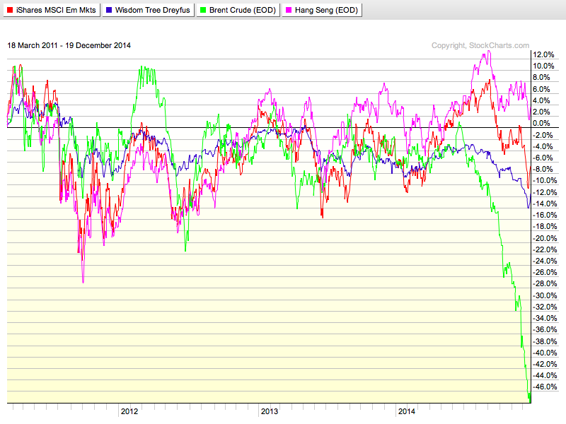
So the recent plunge in crude oil has also been showing up in the other 3 charts, but not to the same extent.
Let's stack the graphs and show in the information based on actual price.
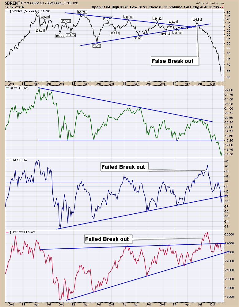
I left the annotation lines on the charts, but I changed the chart style to High-Low-Close bars.
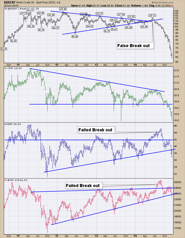
So we have two completely different charts to wrap up this week. On Brent Crude Oil ($BRENT), we have a stall in downward price momentum with it closing flat on the week after testing higher and lower. The line chart didn't display that very well. The Emerging Market Currencies (CEW) bounced off intra week support and closed higher, but the line chart looks a lot more ominous by showing no signs of an intra week support test. On the Emerging markets ETF (EEM) HLC chart, the size of the move below the trend line seems to be demonstrating that this is significant. We have a higher close that is back-testing the trend line on the HLC chart and we clearly show 2 weekly closes below the line on the HLC chart. The same is true on the EEM 'line' chart, but might not be thought about as 2 weekly closes below the trend. Definitely one to watch. The last is the Hang Seng ($HSI). With the inter market relationships between these components, it was very concerning to see the $HSI plunge below support mid week on the HLC chart ( and line chart at the time). By Friday, two dramatic back to back up days has everything looking ok with support holding. The line chart shows no damage on Friday's close! I mentioned in the last 2 weekly webinars that a break in the Hang Seng chart right now would pretty much confirm a global slowdown.
The bottom line is there is significant reason to be jumping in going long here at support, or jumping out expecting the inter market correlations to continue to break in a downward trend. If Crude Oil ($BRENT) has in fact found a bottom this week, it couldn't be a better time to get optimistic on all of these charts. If crude doesn't bounce but stagnates down here like it did at $88 and then rolled lower, will these charts all break down over the next month? Quite frankly the 2 day rally in equities was the largest in 6 years on what I would consider to be weak news that the Fed doesn't see the markets performing well enough to raise rates right away. Is a 5 % market pullback all it takes to change the Fed's direction? It doesn't matter what I think. We'll watch the markets response. The trend lines are holding on EEM and $HSI after a tough look intra-week. The next 2-3 weeks are pivotal for those charts.
For a more optimistic view of this weeks action, check out this chart. We had a serious 2 day reversal so that should be considered as optimistic. If we look for the bullish information on each chart, this would be the turning point. Check out Brent Crude Oil ($BRENT) bouncing off long term trend line support. The Emerging Market Currencies (CEW) are finding support at a prior low. That's bullish!
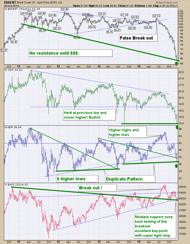
The Emerging Markets ETF (EEM) has 6 higher lows, 2 duplicate patterns and a series of higher highs and higher lows. It is currently in a three wave correction and ready to turn higher again. EEM is currently back-testing a 2 year major down trend line after breaking out. One of the best possible buy points. The Hang Seng ($HSI) is currently back-testing a 4 year trend line. By bouncing here at a multiple support zone (downward and upward trending trend lines), we couldn't be more bullish. We have been making higher lows for 3 years and this is an ascending triangle. The upside measurement is to 31000.
How we interpret the data is critical and we are definitely at a critical time. When I said EEM had 6 higher lows, so did crude before falling 50%. The plunge in crude below not only horizontal support but to a 50% drop leads me to believe they will all end up moving lower. That is my inter-market bias. Remember the stock market breaking down 20% in 2008 and crude ran up another 60% from there to all time highs at $149 saying everything was fine? Now the opposite is true. Crude has fallen 50% and the market is at all time highs. If the markets start to let go, I would not stand in the way of the polar express sending a chilling trend into the market. If the intra day volatility near a market high is at the same levels as a rebound in a collapsing market in 2008, is that a bullish or bearish signal? Increased volatility is usually associated with a market top after a long run up.
The reality is we are testing the bottom of everything on these charts and a market high on the $SPX. If these ticker symbols all break this support zone, its a worrying time for the primary trend. If the trend lines can hold and go higher here, so should our investment decisions. Feels like one of the major chapters in a great novel.
Good trading,
Greg Schnell, CMT
CREATING A WORKFLOW CHARTLIST
by Erin Heim | DecisionPoint.com
 With the release of several DecisionPoint ChartPacks (to learn more about them and how to install them click here), many users have expressed that they are overwhelmed by the quantity of quality indicator charts. This is not news to me, we had the same feedback from new users to the DecisionPoint.com website. The great news is that you can customize what you see on StockCharts.com, whereas on DecisionPoint.com you had to figure out the links and create a workflow from a static menu. You were limited to using browser bookmarks and favorites to save your charts and because of this, there was no 'click through' ability or annotations. With the release of several DecisionPoint ChartPacks (to learn more about them and how to install them click here), many users have expressed that they are overwhelmed by the quantity of quality indicator charts. This is not news to me, we had the same feedback from new users to the DecisionPoint.com website. The great news is that you can customize what you see on StockCharts.com, whereas on DecisionPoint.com you had to figure out the links and create a workflow from a static menu. You were limited to using browser bookmarks and favorites to save your charts and because of this, there was no 'click through' ability or annotations.
Many of you (like me) have your favorite or most important charts that you use consistently in your daily workflow. Rather than hunt for each of those charts within the DP ChartLists, why not find the ones you use regularly and create your own daily analysis ChartList. This will allow you to open up that ChartList and "click through" the charts you use one by one. Although this can take some effort to set up, the time you save will more than make up for the time used to set it up.
How do you start? First and foremost you need to quantify your daily routine. What do you look at first? Do you concentrate on one index or several? Do you go in-depth on one and then quickly review the high level charts on others? Here is a sample workflow that we will use to create a daily review ChartList. This workflow is the basis for the DecisionPoint Daily Blog (which will soon be coming to Stockcharts!).
Concentration/Review Order: SPX, Gold, Dollar (UUP), Oil (USO) and Bonds (TLT).
Analysis Breakdown: SPX - 10 min bar, daily bar, weekly bar, monthly bar; Gold - daily bar, weekly bar, monthly bar; Dollar (UUP) - daily bar, weekly bar; Oil (USO) - daily bar, weekly bar, monthly bar; and Bonds (TLT) - daily bar, weekly bar, monthly bar.
Indicators on charts: EMAs (as appropriate to timeframe), Volume (as applicable) and PMO
Indicator Charts: Volatile Short-term (CVI, Participation Index, Net Breadth/Volume); Short-term (STVO, STO-B, STO-V); and Intermediate-term (VTO, ITBM, ITVM)
First, I need to create and name my new ChartList. You'll find the "Create a New List" at the top of your ChartLists box on the "Members" page.

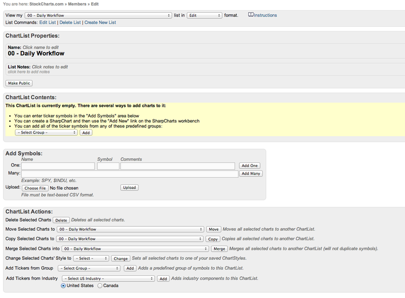
I'll call it "00 - Daily Workflow". I put the double zeros at the front to make sure that it will sort to the top and be my first ChartList. After clicking enter, I end up on this landing page that gives me options on how to populate the new list. Since my list is very specific, I'll need to call up each chart and save it to the list, so I won't use this page this time.
The first chart I need is the 10-min bar chart for the SPX. I know that chart is already pre-created and is a member of the DP Intraday ChartPack. So I go to the Intraday ChartList.
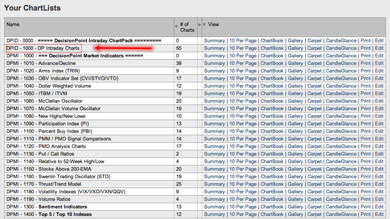
I find and click on the S&P 500 intraday chart.

After the chart is opened, I need to save it to my new ChartList "00 - Daily Workflow". So I click on "save as", select the ChartList and then name it. I chose "001" as the start of the name to ensure it shows up first within this ChartList.
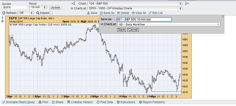
Now I need to find my next couple of charts. The SPX daily, weekly and monthly as well as the Gold, UUP, USO and TLT charts are in the DP Trend and Condition ChartPack, so I can open them from there.
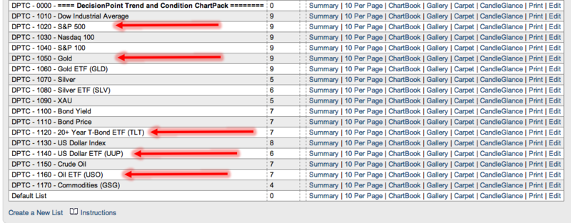
Within the "DPTC -1020-S&P 500" ChartList I see that the next group of charts are ready to go. I open each and following the procedure above, I save each in my new "00 - Daily Workflow" ChartList, making sure to name them in order "002" "003" etc. so that I can preserve the order that I like to review the charts in.
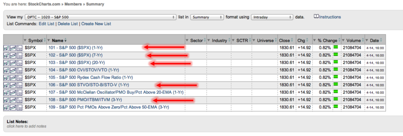
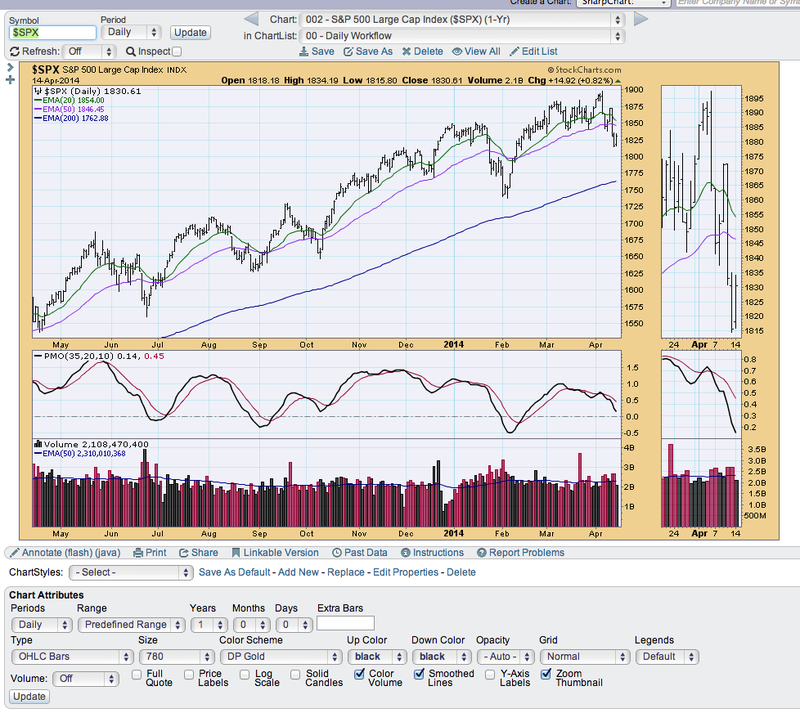
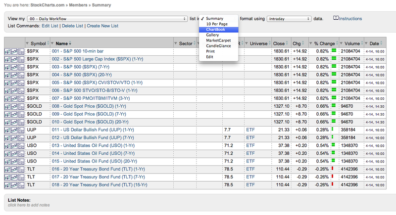
Once I've opened and saved all of the charts in my workflow, the completed "00 - Daily Workflow" ChartList summary looks like this:
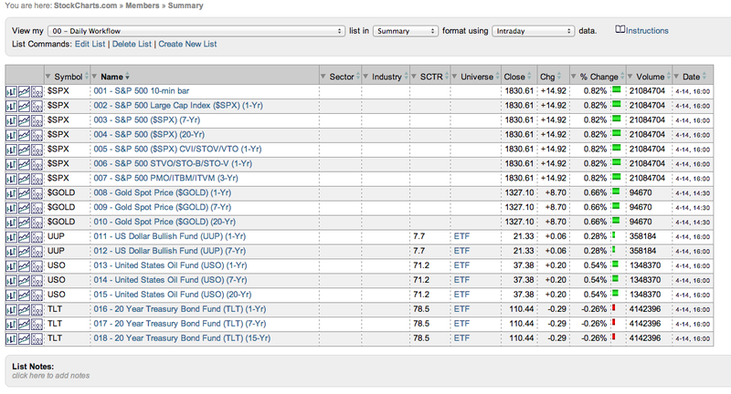
Now I can choose to view this list in ChartBook format and click through each chart quickly to do my regular analysis each day.
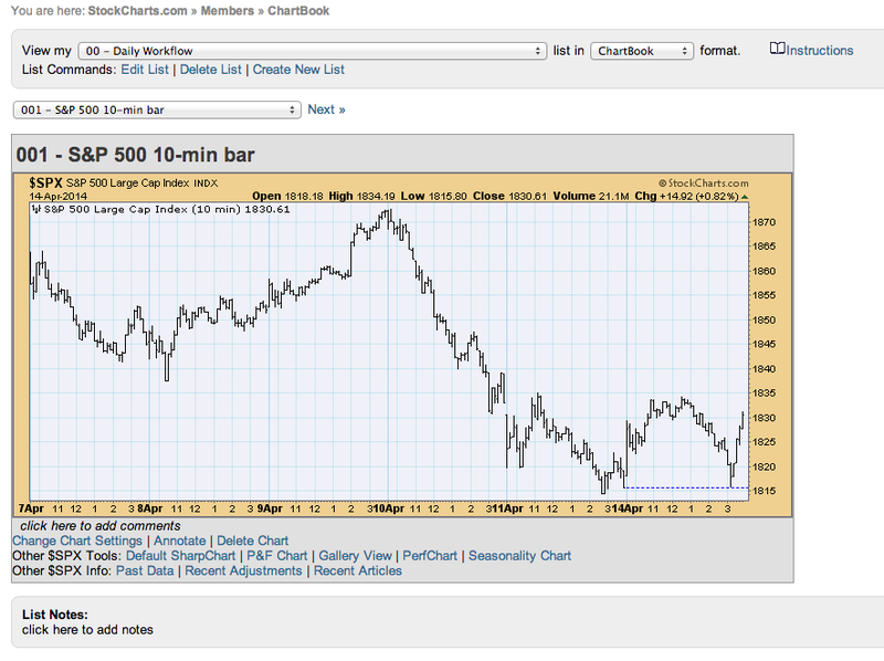
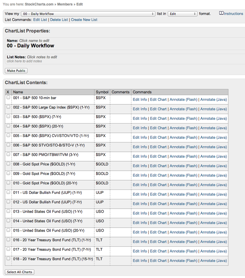
One of the other major advantages to creating a specialized workflow ChartList is that I can make annotations on these charts, save them and view them everyday with those annotations which will update along with the chart. Later if I want to add or subtract charts from my workflow ChartList, it is easy to do in the "edit" ChartList mode:
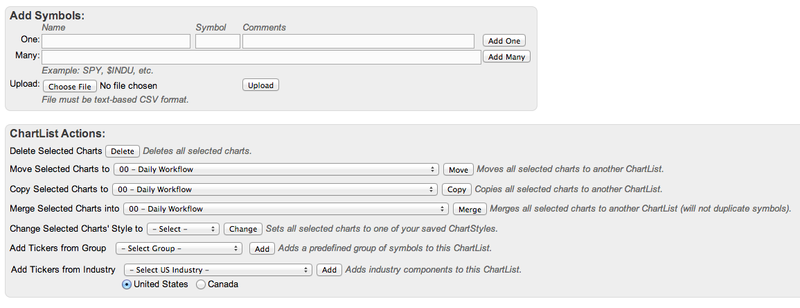
Creating specialized ChartLists will help you to easily find the charts you like to look at daily. It may seem difficult and time-consuming, but it doesn't have to be. If you look at the same charts almost everyday, you are already calling them up or maybe have them created in another ChartList. I find that quantifying your daily routine on paper first will make creating the workflow ChartList much easier.
A workflow ChartList will keep you focused on what is most important to you and will likely improve your analysis technique in the process.
Happy Charting!
Erin
Stock market action played out the past two weeks almost perfectly according to historical plan. In my last article, I discussed the bearish tendencies of equities from December 7th through December 15th and the S&P 500 promptly lost 85 points, or more than 4% during this period in 2014. But the historical faucet seems to turn from arctic cold to blistering hot overnight as December 16th is the trigger point for the bulls from an historical perspective. Right on cue over the past four trading sessions, the S&P 500 regained nearly every point that it had lost during the bearish period. The net result was almost nil, but traders that were aware of the historical pattern were able to take advantage of both sides of the trade. Pretty amazing, huh?
The good news is that the bullish tendencies don't typically end on December 19th. In fact, the stock market remains historically bullish through the first three weeks of January so I don't see the overall bullish action letting up any time soon. Where can we look for additional strength then? Well, I'd start with industry groups that are breaking out and outperforming on a relative basis. One obvious industry group that fits this criteria is the Business Support Services index ($DJUSIV). Check out the chart:
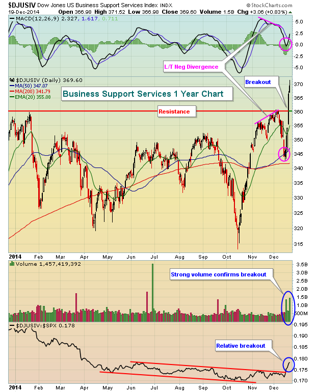
There are a ton of positive technical developments here. First, the DJUSIV has been in a base formation throughout 2014, so a breakout on heavy volume is a very bullish sign. Also, on its most recent high in early December, a long-term negative divergence printed with a price trip to the 50 day SMA and a MACD trip to centerline support more likely. That's exactly what we saw as the pink circles highlight. Perhaps most important, there was finally a break of the relative strength down channel that the DJUSIV had been in since the first half of 2014. So now we have a breakout on heavy volume after a long base with relative strength surging. It's probably not a bad time to consider exposure to the group, especially if the DJUSIV pulls back near 360 to retest its breakout level.
I've included a company within this business support services space as my Chart of the Day for Monday, December 22, 2014 to hopefully take advantage of future relative strength from this group. It's FREE so simply CLICK HERE to register and begin receiving your daily Chart of the Day.
Happy holidays and happy trading!
Tom Bowley
Chief Market Strategist
Invested Central
ONLY THE 58 NAVIGATORS MATTER
by Gatis Roze | The Traders Journal
 Of the approximately 6,000 stars visible to the naked eye, only 58 are considered navigator stars. Since antiquity, these essential stars have guided mankind to many new horizons. This wisdom came to me on a brokerage house Holiday card. If you have ever stood atop a mountain at night or lay on your back in a country field as the stars came out, you will not dispute the overwhelming... Read More
|
|
|
Recent StockCharts Articles You Might Have Missed
|
- The Canadian Technician - Solar Scanning using RRG Part 7 December 20, 2014
- Market Message - ENERGY SHARES LEAD U.S. STOCKS HIGHER -- SMALL CAPS BREAKOUT December 20, 2014
- DecisionPoint - DP Weekly Update: Market Digests Rally on Options Expiration - December 19, 2014 December 19, 2014
- Market Message Videos - Microcaps and RRG, Ranking HiLo Percent for Indices and Sector, Utilities Rock, Ignore Fed-speak December 19, 2014
- Top Advisors Corner - Martha Stokes: Divergences Between Quantity/Volume And Price Indicators December 19, 2014
- MailBag - Easy and Effective Methods to Measure Relative Performance (video) December 19, 2014
- Art's Charts - QQQ and SPY Gap thru Resistance - TLT Tumbles December 19, 2014
- Don't Ignore This Chart! - Google (GOOGL) Stops At The Last Gap Saloon December 18, 2014
- Martin Pring's Market Roundup - Equities still Look Vulnerable Notwithstanding a Possible Reflexive Bounce December 17, 2014
- RRG Charts - Relatively Rock Solid Real-Estate December 16, 2014
|
|
|
Are you new to StockCharts.com?
|
|
Here are some activities that will help you learn more about our website:
Do you know someone else that would appreciate this newsletter? Please feel free to forward this to other people interested in stock charting. Thanks!
|
|
|
|
|
|
|
|
|
|
|
|
|
| |
|


 Of the approximately 6,000 stars visible to the naked eye, only 58 are considered navigator stars. Since antiquity, these essential stars have guided mankind to many new horizons. This wisdom came to me on a brokerage house Holiday card. If you have ever stood atop a mountain at night or lay on your back in a country field as the stars came out, you will not dispute the overwhelming...