Hello Fellow ChartWatchers!
Wow, people are all over the place with their emotions right now. "Devastating Recession on the Way!" "Strong Tech Earnings Lead to Rally Mode!" "The Fed is Out to Kill the Economy!" and my personal favorite "Head and Shoulders Top Imminent!"
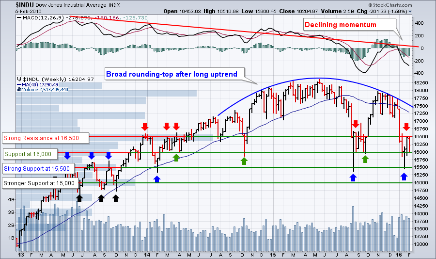
Let's calm down and back up a minute. The reality is that nothing has changed from a long-term technical perspective. Here's the actual technical situation:
 (Click on the chart for a live version)
Key Points:
- The stock market is slowly rolling over after a long uptrend. This is a "Rounding Top" reversal formation with a couple of sharp down-spikes in August and January. Don't be fooled - there are no volume spikes to confirm any kind of Head & Shoulders top scenario.
- Weekly momentum (as viewed by the MACD at the top of the chart) continues to decline as it has since mid-2013. Until that reverses and the red trendline is broken significantly, the stock market will continue to be weak and volatile.
- In the near-term, there is stong overhead resistance at 16,500. The long blue Volume-by-Price bar sticking out horizontally from the left edge of the chart depicts that resistance clearly as does the 5 red arrows. Last week, the market tried and failed to breakout above that limit. 16,500 marks the upper-edge of the current bull/bear battlefield.
- Based on looking at where things have bounced in the past, there is important support at 16,000 however, the corresponding Volume-by-Price histogram bar is not very impressive.
- 15,500 is now HUGE. Any break below 15,500 will cause lots of people to take notice. Again, the Volume-by-Price bar doesn't stick out much, but the big double-bottom on the chart can be seen for miles.
- Finally, while the support for 15,000 developed back in 2013, it did result in a significant amount of volume and so this level may also have a roll to play.
- Support levels below 15,000 are very old - probably too old to have any immediate impact.
Bottom Line: On the Dow chart, the bulls and bears are battling it out between 16,500 and 16,000 right now. The overall tone of the market is bearish (rounding top and declining momentum) but the 16,000 has provided important support for the Dow at many critical times in the past going back to the start of 2014. When the bull and bears battled in this range last August, the result was a sharp upside breakout. Will that happen again? I'm not expecting it to, but I can't rule it out either.
With the market moving lower generally, prudent ChartWatchers know that now is the most important time of all to pay close attention to the technicals. While all the talking heads cast around for theories and answers to the pointless question "Why?", savvy technicians can quickly spot and profit from reaction rallies and counter-trend moves by focusing on finding stocks with increasing momentum and great relative strength.
- Chip
P.S. I will be speaking to my good friends at the Long Island Stock Traders Meetup Group on Tuesday, February 16th in Plainview, NY starting at 6:45pm. If you are somewhere close to that location, please come see me. I'd love to "meet up!"
P.P.S. Please fill out our Investor Profile survey so we can continue to improve the website in ways that work for you. It is very quick to take. Click here to get started. Thanks!
SITE NEWS
RECENT ADDITIONS TO STOCKCHARTS.COM
- PLEASE HELP US IMPROVE THE SITE BY FILLING OUT OUR SURVEY! - It should only take you 60 seconds and it would really help us move things forward. Click here to get started. THANKS!!!
- SITE DESIGN IMPROVEMENTS CONTINUE - In case you missed it, we are continuing to slowly roll out our new site design. The most recent pages to get the upgraded look include the "Free Charts" page. Check it out and let us know what you think.
NASDAQ MAY BE ON VERGE OF BREAKDOWN
by John Murphy | The Market Message
It's never a good sign to see the Nasdaq leading the rest of the market lower, which it did this week. A -3% plunge on Friday (and a -5% loss for the week) made it the weakest of the major market indexes. Heavy selling in software and internet stocks were especially troubling. So is its chart pattern. The weekly bars in the chart below show theNasdaq Composite bearing down on its January and August lows. On a closing basis, the Nasdaq is already at the lowest level in more than a year. In addition, the Nasdaq/S&P 500 ratio (red line) on top of Chart 4 has fallen to the lowest level in a year. That's a bad omen for the rest of the market. Weekly MACD lines (below chart) have fallen to the lowest level since 2009. That greatly increases the odds that the Nasdaq will undercut its 2015 lows. That would complete a "double top" reversal pattern which would signal another downleg. If that happens, other other major stock indexes will most likely do that same. That would also confirm that the stock market has entered a bear market.
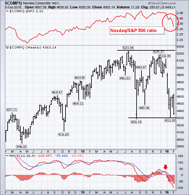
- John
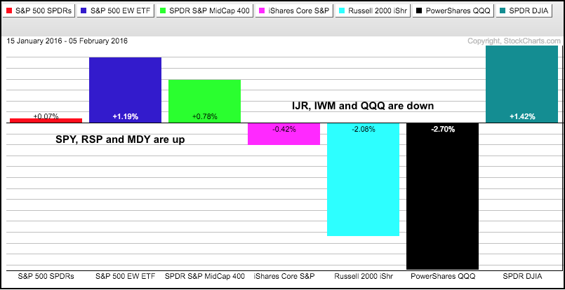
After sharp declines the first two weeks of the year, the stock market turned into one mixed up beast the last three weeks. The PerfChart below shows three-week performance for the seven major index ETFs. All seven were down 6+ percent the first two weeks of the year, but four of the seven are up the last three weeks. These include the S&P 500 SPDR, S&P MidCap SPDR, EW S&P 500 ETF and Dow SPDR. The S&P SmallCap iShares, Russell 2000 iShares and Nasdaq 100 ETF are the losers and these three represent the high beta, or riskier, end of the stock market. Relative weakness in these three tells us that the stock market is in risk avoidance mode. QQQ is the biggest loser with a 2.7% decline over the last three weeks and IWM recorded another 52-week low this week.
Equal-weight sector performance is also quite mixed over the last three weeks, but we can clearly see where broad market weakness is coming from. First, note that six of the nine sectors are actually up over the last three weeks. The EW Materials ETF (RTM), EW Energy ETF (RYE) and EW Utilities ETF (RYU) are leading the market with the biggest gains. These three account for 20% of the EW S&P 500 ETF. Of these three, only RYU is in a long-term uptrend. RTM and RYE are just getting big oversold bounces and remain in long-term downtrends.
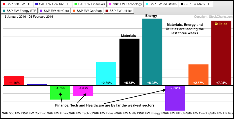 The EW Finance ETF (RYF), EW Technology ETF (RYT) and EW EW Healthcare ETF (RYH) are leading the market lower. The EW Consumer Discretionary ETF (RCD) is up fractionally, but it is underperforming its benchmark because it is up much less than the EW S&P 500 ETF. Note that these four sectors account for 57% of the EW S&P 500 ETF and this explains weakness in the broader market. Also note that it is especially bearish that the finance and technology sectors leading on the way down. Finance represents the health of the financial system and technology represents the high beta end of the stock market. Weakness in biotechs, another high beta group, is weighing on the healthcare sector.
****************************************
Thanks for tuning in and have a good weekend!
--Arthur Hill CMT
Plan your Trade and Trade your Plan
*****************************************
This bear market has ripped most portfolios apart. Some portfolios have been shredded. Recently, a money manager was on TV saying he really likes it when stocks are down this hard because there are so many bargains. I have two additional statements for that. He probably wishes he wasn't fully invested when it started falling, and he'll only be happy if the year 2016 ends higher, not lower.
One of the other market axioms is that 70% of the stocks follow the index. In bear markets, that correlation goes higher it seems. The S&P 500 closed down 3.1% from the previous Friday. I did a quick scan to see how many large cap stocks closed higher this week and the number was 197. (This is a larger group than just the S&P 500). As well, I scanned for large cap stocks that closed Friday 5% higher than last Friday. There were only 47. Lots of those stocks were just bounces off lows, but that small group outperformed the index by 8%. So how could we find the ones that at the very least did not go down before the week started? Let's see if we can find the majority of the group of 197.
The StockCharts Technical Ranking System (SCTR) ranks the price action of a stock against its peer group. So this indicator compares a large-cap stock against the large-cap group, a mid-cap stock against a mid-cap group etc. A stock with a ranking (SCTR) of 95% has price action better than 95% of its peers. This ranking uses time calculations that are predominantly 10-month,6-month, 3-month, 1 month and a few days to rank the stocks. The calculations rank the stock in real time, all day. The interesting thing is that different industry groups rise in the rankings somewhat together. Click here to learn all about the SCTR including how it is calculated.
Here is a current snapshot of the leading SCTR rankings for large cap stocks.
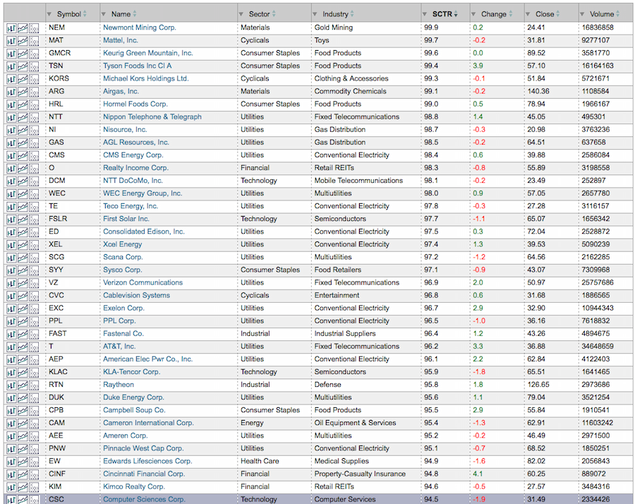 The list is dominated by Utility stocks. Let's zoom in by sorting on the Utility stocks. Within Conventional Utilities as an example, all but two have an SCTR ranking above 75. The SCTR column is to the right of Conventional Electricity, the next column has the change in the SCTR ranking today, then the closing price, then volume. There are even more Utility stocks, but this is a screenshot. You can get to the SCTR rankings by following this link. SCTR Rankings.
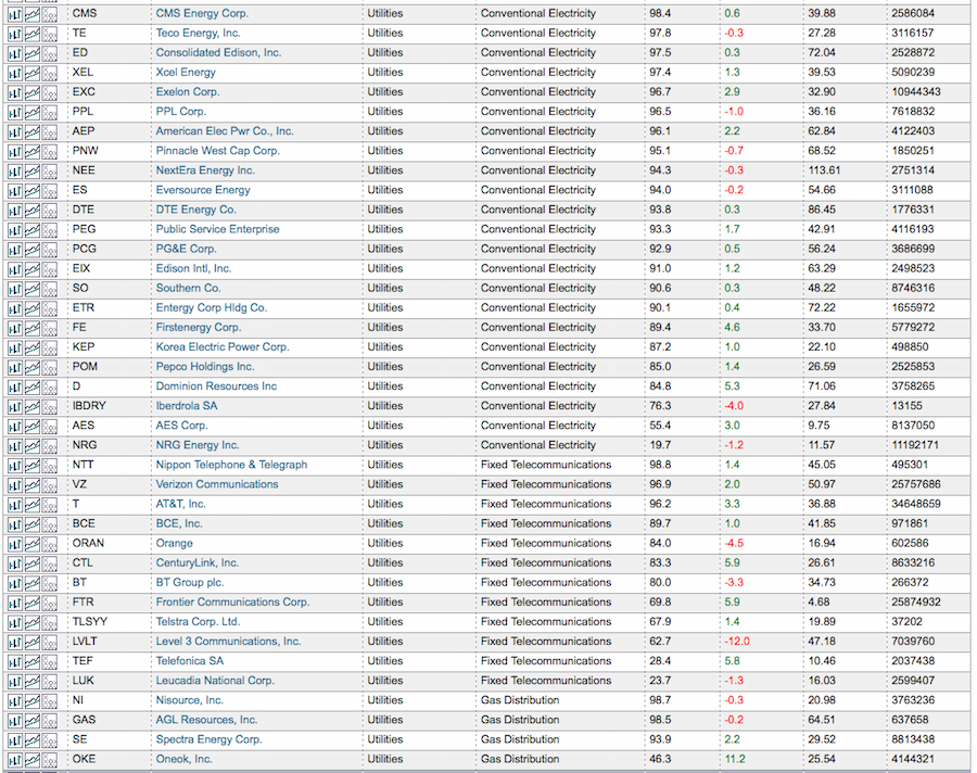 What is more interesting, is comparing the change in the SCTR from last week to this week. So the list above showed the change in the SCTR ranking from Thursday to Friday. The list below shows the change in the SCTR ranking for the last week. What I notice is that almost all of them had very little change. They were winners last week, and they still are.
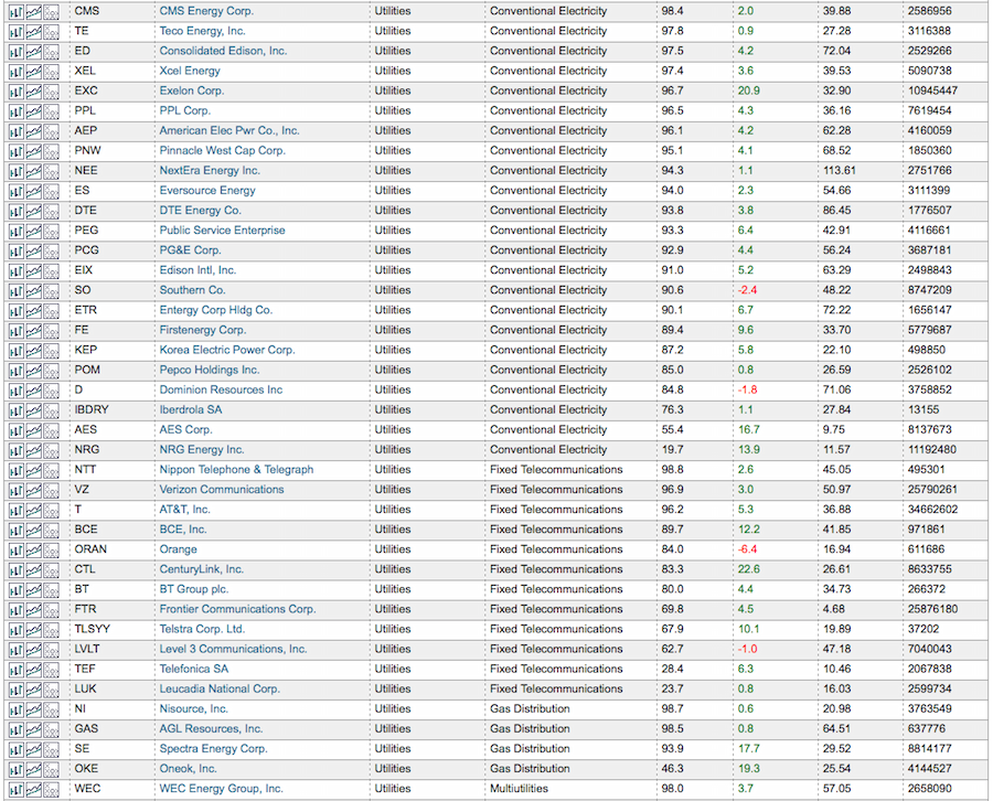 The SCTR can really help you stay on top of the best of the best. When this leadership starts to change into other industry groups or sectors, you can change your portfolio to only hold winners, week in and week out. The odd one drops like a stone, but that can happen at any time to any stock.
For more information on SCTR's, I try to use them extensively in my webinars. I'll be doing three webinars this week. The first one is on Monday as a guest of Tom Bowley on Trading Places. The second one is focused on the Canadian Stock Market on Tuesday as the Canadian Technician and the last one will be on Thursday for the Commodity Countdown.
If you have not tried to use the SCTR ranking, click on the links above to register. It is an incredibly valuable method of staying with winners. In each webinar, you can learn more about how to use the SCTR system. When the majority of your portfolio is holding winners week in and week out, the odds are much better that you won't be relying on luck to outperform the market. Click here to go to the SCTR Rankings. I like to use the drop down box at the top to look at different SCTR groups. I then click on the column headers in the following order. Click SCTR to make sure the 99% one is at the top, then click industry, then click sector. Scroll down and see which industry groups are really starting to shine.
You can follow me on twitter @schnellinvestor. You can also follow any StockCharts author by clicking the Yes button below their blog.
Good trading,
Greg Schnell, CMT
There has been renewed interest in the Percent Buy Index (PBI) ever since I spotlighted it during one of my webinars. The PBI is not related at all to the Bullish Percent Index (BPI). The PBI is Carl's creation, and it tracks the percentage of Price Momentum Model (PMM) BUY signals for the components in a given index. The Bullish Percent Index (BPI) is a breadth indicator based on the number of stocks on Point & Figure chart BUY signals within an index.
The PBI is part of the Thrust/Trend Model of yesteryears on DecisionPoint.com before we joined StockCharts.com. It uses a combination of the Trend Model and a Thrust component made up of our premier indicator, the Price Momentum Oscillator (PMO) and the PBI.
In a nutshell, the Thrust component triggers the BUY signals and the Trend Model confirms them. Once the BUY signal is set, we use the Trend Model "rules" to trigger the next signal, Neutral or SELL depending on the configuration of the 20/50/200-EMAs. (Read the details of the Trend Model here.)
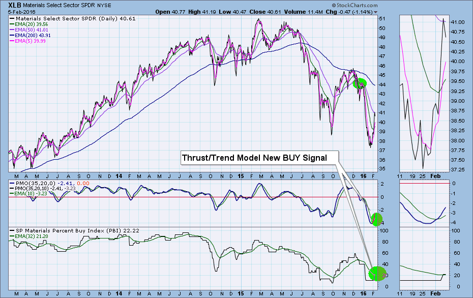
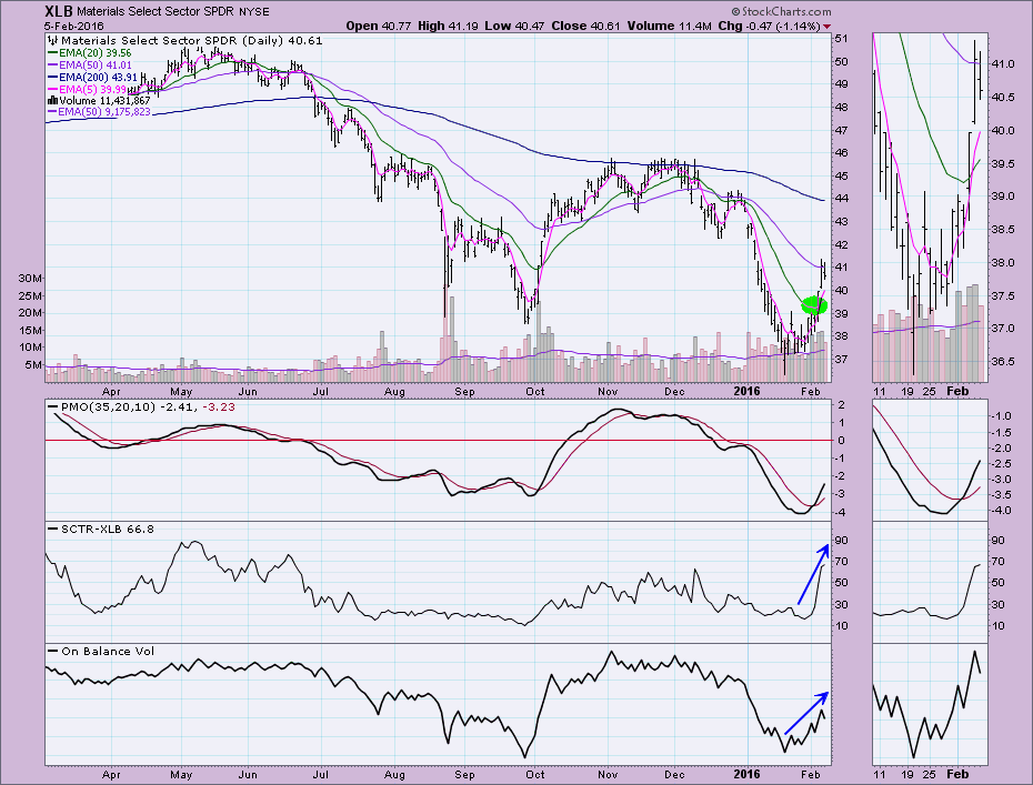
Now that we know the basics, let's look at the chart for XLB. Friday it triggered a new Thrust/Trend Model BUY signal. The PMO and the PBI had positive crossovers. Note that the Trend Model hasn't switched from its SELL signal to a BUY yet. A positive 20/50-EMA crossover generates the Trend Model BUY signal which will confirm the Thrust. Should the PMO or PBI have a negative crossover before the Trend Model confirms the BUY signal, the Thrust/Trend Model signal moves back to what it was previously, in this case a SELL signal. Using the Thrust/Trend Model, we got a jump on a BUY signal.
 A look at the daily chart confirms the bullish Thrust/Trend Model BUY signal. Note the Short-Term Trend Model moved to a BUY signal when the 5-EMA crossed above the 20-EMA. The SCTR is rocketing skyward and the PMO recently generated a BUY signal in oversold territory.
The PBI cannot be calculated for an individual stock because it is a market indicator and does require an index or sector with a "basket" of stocks to determine the percentage of stocks within that index or sector on PMM BUY signals. You'll find this chart and other Thrust/Trend Model charts in the free DecisionPoint Market Indicators ChartPack, or you can do a search on "PBI" in the "Create a Chart" box to get the symbols so you can add them to your chart. I don't recommend buying into a bear market, but using a smart combination of indicators (specifically DecisionPoint!), you should be able to limit your risk exposure.
Come check out the DecisionPoint Report with Erin Heim on Wednesdays and Fridays at 7:00p EST. The archives and registration links are on the Homepage under “What’s New”.
Technical Analysis is a windsock, not a crystal ball.
Happy Charting!
- Erin
There are no guarantees to this question, but we do have history and past technical indications to provide us a few guidelines. Trading strategies applied during a bull market simply won't work during a bear market. They may work on a few select industry groups and stocks, but the game has changed for most areas of the market and we have to change with it. So let's start with a few basic rules I follow:
1. High growth stocks become extremely dangerous to own on the long side
Netflix (NFLX) is a great example. During the 7 year bull market, NFLX rose from 5 bucks to its December 2015 high of 133. During the past two months, NFLX has lost nearly 40% and closed Friday at just 82. These high-flyers get crushed as money rotates to safer investments. If you're going to own stocks like NFLX during a weak or bearish market environment, you have to study the charts, find strong support levels and have the patience necessary to allow them to reach price support.
2. Keep tight stops in play, especially on the long side
Let's continue the discussion on NFLX. On a long-term chart, I see an interesting area of support where I'd consider trading NFLX on the long side. It's near 70, another 15% lower from Friday's close. We certainly could see a sizable bounce in NFLX prior to reaching the 70 level, but it's difficult to predict where that bounce could take place from. Therein lies the major risk. If you buy NFLX at 82 and find yourself down 7 bucks on it next week, emotional trading ramps up and then you're in big trouble. Oversold conditions can become more oversold in a bear market. Remember, this isn't a bull market any longer - at least not based on the signals I've been seeing the past few months.
So let's look at the NFLX chart:
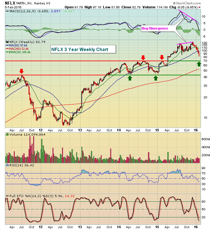 A negative divergence printed on the weekly chart on its most recent price high, a bearish sign in itself. That suggested buying momentum was waning and it certainly proved to be a solid warning signal. Looking back, however, we can see there was serious price resistance in 2014 and early 2015 near 70 that was cleared with a very heavy volume candle that coincided with earnings in the second quarter of 2015. We haven't tested that breakout level so that would be one interesting entry point for a short-term trade on NFLX. In a bear market, I'd study the charts of any aggressive stocks you like, then only pull the trigger if that key level is hit. After pulling the trigger, I'd then have a very tight stop in place, perhaps in the 68-69 area to guard against big losses. As we've already seen, these aggressive stocks sell off fast. Pain is inflicted as quickly as possible and that enables market makers to benefit from emotional trading.
3. Understand the limitations of the sectors you're investing in
Sticking with the NFLX theme here, you must understand you're trading a consumer discretionary (XLY) stock. Currently, this sector is getting trounced. Nowhere is it more evident than by comparing the XLY vs. the XLP (consumer staples). Check out this chart:
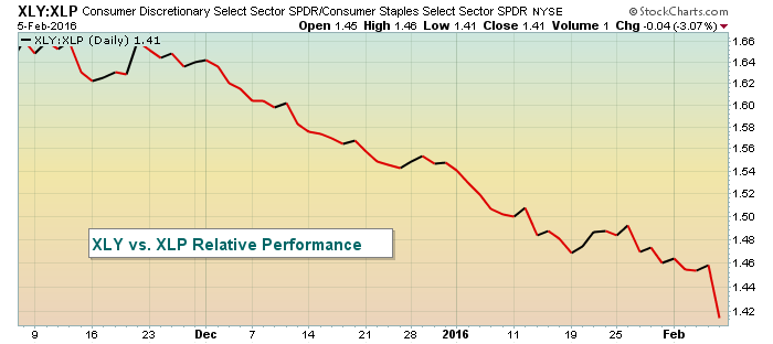 This should help to explain why stocks like NFLX are being crushed. Money is rotating very rapidly away from consumer discretionary stocks and into the more defensive consumer staples names. The market environment dictates that we do not want to own NFLX. Of course that can change from time to time, but buying the stock and hoping the reversal will happen right now is not a very good bear market strategy.
4. Beware key resistance on the major indices
During bull markets, price support and key moving averages rule in terms of where key price reversals generally take place. To understand bear markets, you simply need to turn your computer monitor upside down. Now it becomes price resistance and key moving averages. Let's look at the early stages of the last bear market that began in 2007 to illustrate:
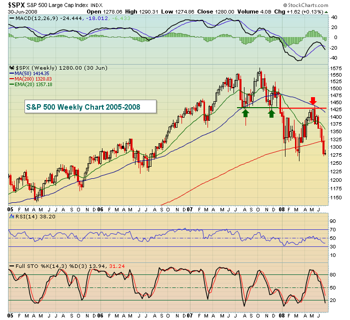 Prior support becomes resistance as the green arrows and red arrow demonstrate. Be careful expecting too much from rallies. Make the market prove that the bear market has ended, don't assume it. Check out the look of that weekly MACD as it fails to move above key centerline resistance and then rolls over. Now let's look at current conditions on the S&P 500 weekly chart as of Friday's close:
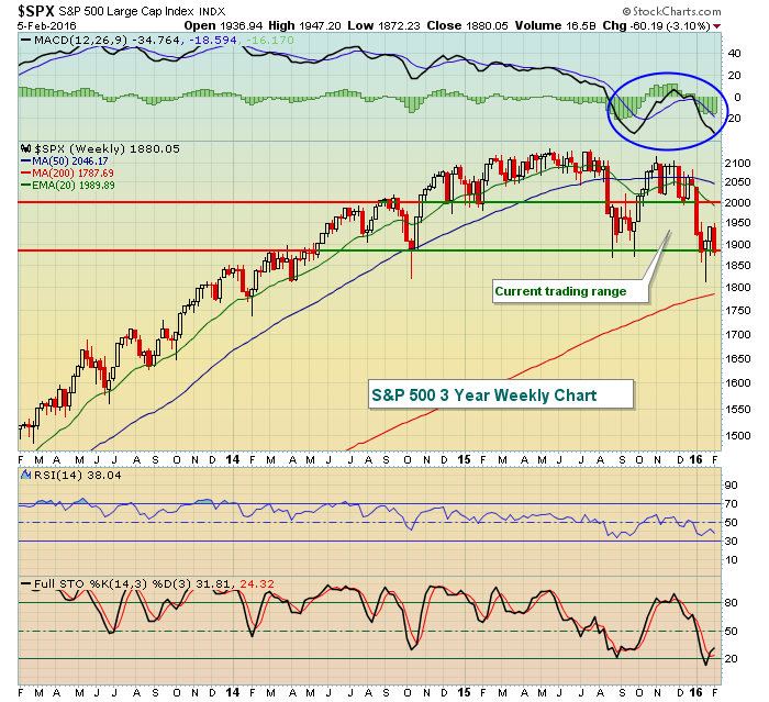 The good news for the bulls is that price support is still holding. Unfortunately, that's about where all the good news ends. Money keeps rotating toward defense and that suggests to me that it's only a matter of time before price support is lost. There's a chance that we remain in a 100 point trading range a bit longer, although I expect support will be lost before we reach 1995 price resistance in the range. Should support be lost, then the 1850-1900 price range will become price resistance while the declining 20 week EMA, currently at 1990, will provide the next line of defense for the bears should price resistance be cleared.
I believe the bear market has arrived. Job #1 during a bear market is capital preservation so try to remain objective about the big picture outlook and don't focus on the high volatility and big price swings we're likely to endure. That leads to emotional trading and, many times, losses.
Happy trading!
Tom
In the best of times companies see their stock prices rewarded or punished based on earnings results. Even when a company misses its earnings per share or revenue forecasts by just a small amount it can have a meaningful, negative impact on its stock price. But when the market is highly volatile and on pins and needles like the US market has been all year long, missing estimates or guiding lower for the future can be devastating for a company's stock price.
Look no further than Amazon and LinkedIn as prime examples of how unforgiving the market can be when there's zero room for tolerance. In the case of Amazon, they missed both their eps and revenue numbers with the stock down over 20% over the past week. And then there was LinkedIn (see chart below) guiding lower for the future and seeing its stock price fall by almost 44% in one day. Talk about falling off a cliff!
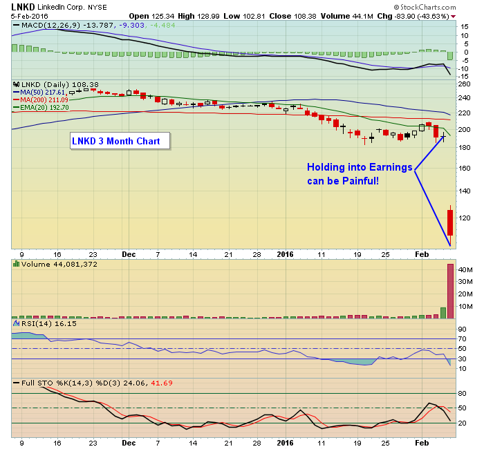 In neither case did traders have any warning that these stocks would fall so hard after they reported their numbers. But it does illustrate the risk of holding stocks into earnings report, no matter how loved a company might be. And it's why we wait until a company has reported its numbers before it has a chance of making our list of potential trading candidates. In fact, if we issue a trading candidate to our members, we make sure they know when that company will be reporting its numbers so they can exit the position prior to its earnings release, thus reducing unnecessary risk,
With peak earnings season nearing an end we will be scanning thousands of stocks to see which ones exceeded and which ones fell short of their forecasts. A select group will end up in our "Candidate Tracker" with some becoming long and some becoming short trading candidates. This will allow our members to key in on the strongest and weakest performers who have already reported their numbers, thus avoiding the repercussions that go along with holding a stock into its earnings report. If you want to get on our list to learn more just click here. In the meantime, make sure you know when companies you own stocks in will be reporting their earnings so you can take the appropriate action to avoid getting slaughtered.
At your service,
John Hopkins
EarningsBeats.com

I'm a big fan of pithy quotes. When I teach my college class "Tensile Trading", I use quotes extensively to help illustrate each of the essential 10 stages of stock market mastery. This week, I thought I'd have a guest blogger share his wisdom with respect to each of my ten elements for successful investing. These are some of my favorite quotes from Warren Buffett. Money...
Read More
 (Click on the chart for a live version)


 The list is dominated by Utility stocks. Let's zoom in by sorting on the Utility stocks. Within Conventional Utilities as an example, all but two have an SCTR ranking above 75. The SCTR column is to the right of Conventional Electricity, the next column has the change in the SCTR ranking today, then the closing price, then volume. There are even more Utility stocks, but this is a screenshot. You can get to the SCTR rankings by following this link.
  What is more interesting, is comparing the change in the SCTR from last week to this week. So the list above showed the change in the SCTR ranking from Thursday to Friday. The list below shows the change in the SCTR ranking for the last week. What I notice is that almost all of them had very little change. They were winners last week, and they still are.
 The SCTR can really help you stay on top of the best of the best. When this leadership starts to change into other industry groups or sectors, you can change your portfolio to only hold winners, week in and week out. The odd one drops like a stone, but that can happen at any time to any stock.


 I'm a big fan of pithy quotes. When I teach my college class "Tensile Trading", I use quotes extensively to help illustrate each of the essential 10 stages of stock market mastery. This week, I thought I'd have a guest blogger share his wisdom with respect to each of my ten elements for successful investing. These are some of my favorite quotes from Warren Buffett. Money...