Hello Fellow ChartWatchers!
After pausing 5 days to catch its breath, the Dow powered higher this week and is close to breaking overhead resistance from the peak set last November. In addition, the Dow's 50-day Moving Average looks set to move back above its 200-day Moving Average - a bullish signal that is sometime referred to as the "Golden Cross." Here's the longer-term weekly chart:
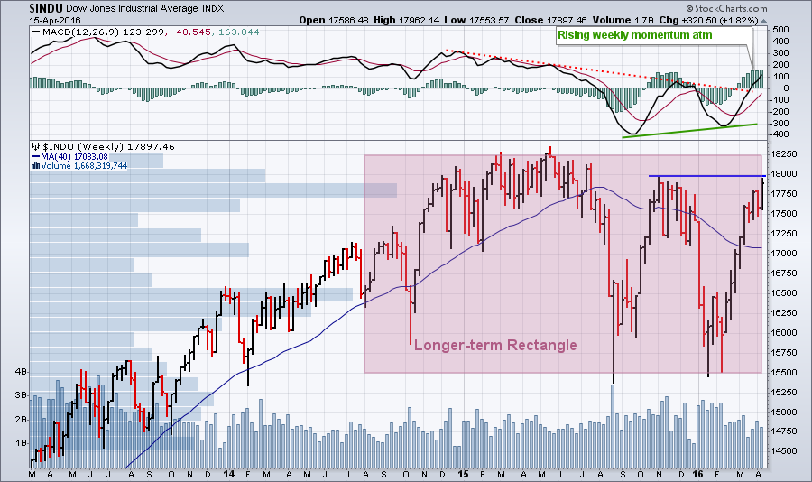 In the larger scheme of things, the Dow has essentially moved sideways - albeit with some huge price swings - since the collapse last August. This sideways movement is throwing off lots of long-term and intermediate-term trend signals (including the "Golden Cross" mentioned above) since there isn't really an intermediate-term trend right now. Yes, the short-term trends have been very pronounced - both up and down - but longer-term, a strong case could be made that the Dow is in a sideways channel (aka a "rectangle" pattern) with boundaries at 15,500 and 18,250.
If that is the case, we are now approaching the top of the channel which means things are very interesting indeed. Will the Dow bounce off the top and move lower like it did - rather viciously - in August and January? That's the big concern right now. Or will it break through and resume the long-term uptrend it was in back in 2014? Rectangle patterns are considered to be "continuation" patterns after all.
In the short-term, the Dow has to get above 18,000 in order for the bulls to have a case. It was unable to do that back in November. Doing so now would be impressive. Stay tuned!
Taking Note of the New ChartNotes Annotation Tool
Today, I am pleased to officially announce the release of our new HTML5-based annotation tool (which we call "ChartNotes"). In case you are unaware, the technology upon which our older version of ChartNotes is based (a platform called "Flash") is slowly being phased out by the major browser providers due to security and performance concerns. In its place, a newer platform called "HTML 5" is taking over. This is a good thing for many reasons including 1.) You don't need to install and maintain a plug-in for HTML5, it's built into the browser, and 2.) It works on more devices include smartphones and tablets.
Our new version of ChartNotes was created from scratch and upon first look it appears to be very different from the old version. For instance, instead of a line of tools along the top of the chart, the tools now appear on the left side of the chart. The color-chooser has been completely revamped. Etc., etc. But upon closer inspection, you begin to notice that most things are the same, just located in different - easier to find - locations. Here's a screenshot of the new look for ChartNotes:

It is important to understand that our current goal for this new version is to simply duplicate the capabilities of the previous Flash version. We are not intentionally adding or removing any functionality, just migrating stuff to HTML5 and the new User-Interface. In addition, we are trying to do things so that charts created in the new version are still editable in the old version.
At this point, the HTML5 version of ChartNotes is still being worked on. It is not 100% complete. There are still bugs that we are finding and fixing. It is in what programmers call "Beta Mode." That means we think that most of it works, but we need more people using it in order to find and fix the more difficult problems. That's where you come in!
To try out the new ChartNotes, simply pull up a chart on our SharpCharts workbench page and find the "Annotate HTML5 (Beta)" link located below the chart. Click on that link instead of the "Annotated (Flash)" link you are used to using.
Here are some key things to remember when using the new version:
- The drawing tools now appear on the left of the chart in several different menus. All of the tools should be easier to find now.
- When an item is selected, you can change its properties (color, etc) using buttons above the chart.
- The rest of the SharpCharts page should be greyed out and unavailable while using ChartNotes.
- When you change something on your chart, the "Save" icon on the left will turn red. Click it to save your changes into your account.
- Click the "Circled X" in the upper right corner of the chart to exit ChartNotes
- Unfortunately, the "XOR" fill mode for shapes is unavailable in HTML5 and has therefore been discontinued.
If you find any problems, please tell us about them using the form on this page:
http://stockcharts.com/support/techsupport.html
Remember that we are actively fixing problems and improving the HTML5 version of ChartNotes. If something doesn't work one day, it might start working the next day as our programmers continually make improvements.
We realize that change is often disconcerting. One of the hallmarks of StockCharts.com is that we try to evolve our website slowly over time so people can get used to new things without having a jarring experience. This new version of ChartNotes is a little jarring at first. Hopefully you'll see enough similarities however to give it a chance and soon it should feel as natural to use as our older version.
Take care everyone,
- Chip
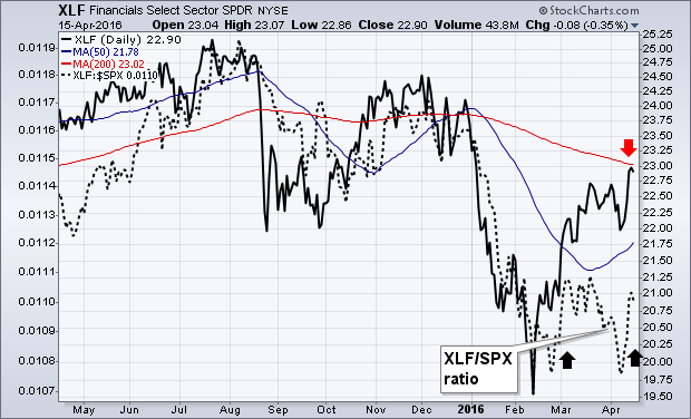
FINANCIALS HAVE A STRONG WEEK... Financials went from the year's weakest sector to the strongest gainer this past week. Chart 1 shows the Financials Sector SPDR (XLF) climbing to the highest level in three months and challenging its 200-day moving average (red arrow). The dotted line, which is the XLF/SPX relative strength ratio, jumped this week for the first time since February. Banks played a big role in the week's rally, as did brokers and life insurers. The market usually does better when financial stocks are helping.
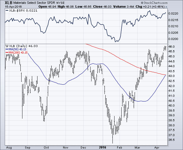
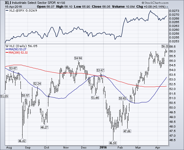
MATERIALS AND INDUSTRIALS ALSO LEAD... It's also encouraging that economically-sensitive materials and industrials are leading the market higher. Chart 2 shows the Materials Sector SPDR (XLB) closing above its fourth quarter high. Its relative strength line (top of chart) turned up in February. The XLB is being led by stocks tied to industrial commodities like aluminum, copper, and steel. That's a good sign for the global economy. Chart 3 shows the Industrials Sector SPDR (XLI) also closing above its fourth quarter high with a rising relative strength ratio. A 3% gain in transportation stocks contributed to the XLI performance. Consumer discretionary and energy stocks also showed relative strength, while defensive consumer staples and utilities underperformed. Staples were the only group to lose ground during the week. That shows a more optimistic market mood. Also encouraging are stronger gains in smaller stocks.
- John
It was a pretty good week for the stock market with the Russell 2000 iShares (IWM) and the Finance SPDR (XLF) showing upside leadership for a change. IWM gained 3.21% for the week and led the major index ETFs higher. XLF gained 4.60% and was the second strongest sector (behind XLE). Even though IWM and XLF do not share any components, there is a link because financials account for around 25% of the Russell 2000. Those looking for a more direct connection should note that the SmallCap Financials ETF (PSCF) gained 4.33% last week.
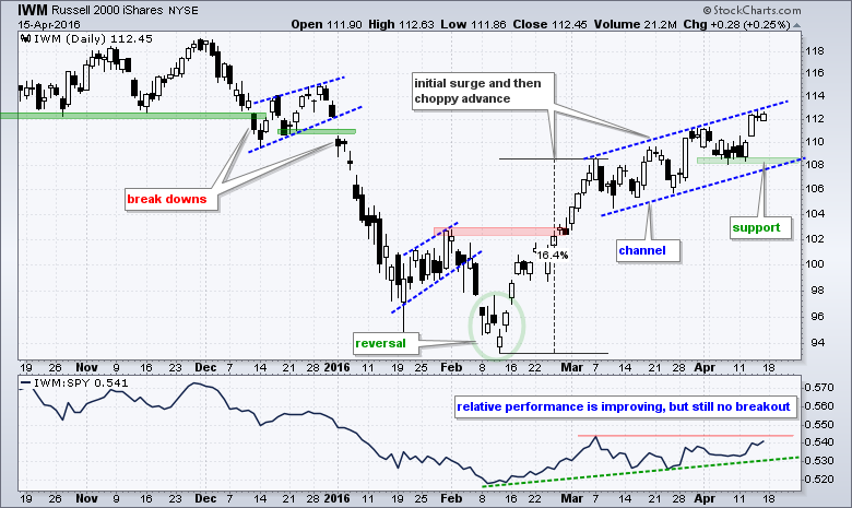
On the price chart, IWM has yet to show serious relative strength, but remains in a clear uptrend as a rising channel takes shape. The ETF surged some 16% from mid February to early March and then continued higher with a choppy advance. A small channel formed the last six weeks and chartists can watch support at 108 for the first signs of weakness. The indicator window shows the price relative (IWM:SPY ratio) forming a higher low in late March and turning up this week. A break above the March high would trigger a relative breakout in small-caps and this would signal some serious relative strength.
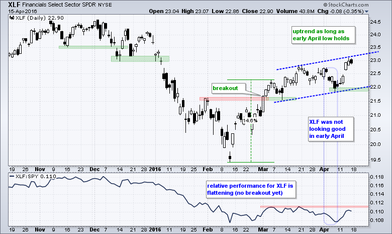 XLF was looking weak in early April, but the bulls stepped in and pushed the ETF above its mid March high. The blue outline highlights the first week of April when XLF fell to 22 and the price relative (XLF:SPY ratio) was near its February lows. The ETF made a remarkable recovery this week with a gap and move above the March high. With this move, chartists can now mark support with the early April low. Despite a strong week, we have yet to see a breakout in the price relative and XLF remains one of the weaker sectors overall. Again, the price relative needs to break the March highs for XLF to show some serious relative strength.
****************************************
Thanks for tuning in and have a good weekend!
--Arthur Hill CMT
Plan your Trade and Trade your Plan
*****************************************
Based on April performance alone over the past 20 years, the best industry groups to invest in have been the following:
$DJUSHL (Hotels & Lodging REITs) +12.4%
$DJUSAU (Automobiles) +10.3%
$DJUSRL (Retail REITs) +9.7%
$DJUSES (Real Estate Services) +8.9%
$DJUSTR (Tires) +7.9%
All five of these industry groups remain technically sound in the short-term and are poised to do well in the second half of April if the overall market continues to perform well.
So looking ahead, what performs well during the month of May? Well, here's the seasonality chart for the best performing industry group for month of May:
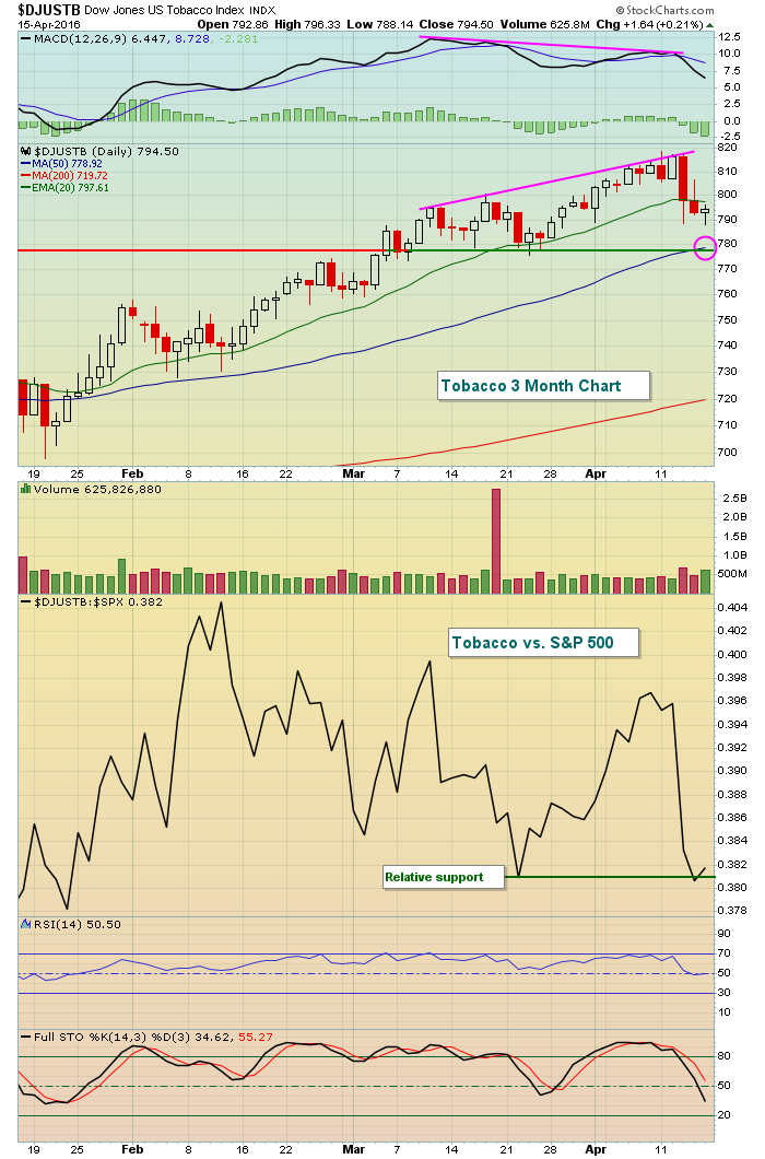
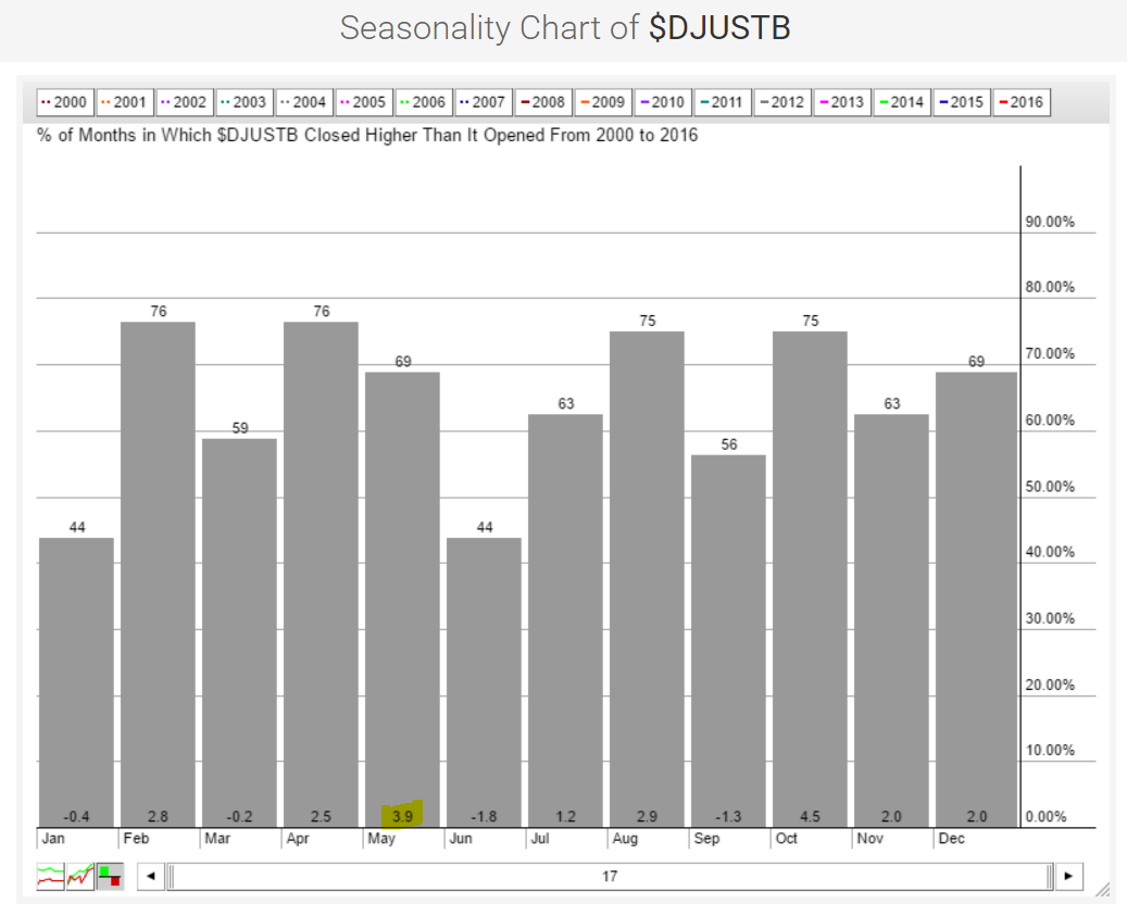 Outside of October, tobacco stocks enjoy their best month during May. Here's the current technical look at the DJUSTB:
 To review the other industry groups that perform exceptionally well, you can view my Friday webinar HERE. I spent much of the hour reviewing seasonal patterns that I believe you'll find useful. The last twenty minutes or so was answering individual stock questions.
Happy trading!
Tom
Alcoa reported its numbers after the bell last Monday which served as the kick off for first quarter earnings season. This was followed by a few big banks and then next week we'll get hundreds of more companies reporting their numbers.
Earnings season is important because when everything else is said and done what matters most is the bottom line. In other words, every trading day we are inundated with mostly useless information and noise but when it comes down to it investors want to know if companies they own stock in are making money or not.
The whole earnings process is fascinating because you never know how the market will respond to numbers. It starts with expectations, what the "Street" is expecting in earnings per share and revenues. Quite often when a company beats both EPS and revenues the stock will go higher and when they miss both EPS and revenues the stock will go lower. But that's not always the case because you never really know fully what the "whisper" numbers are, which could be higher or lower than what the overall market is expecting.
In fact, at EarningsBeats.com we do our best to make sure our members avoid holding stocks into earnings reports because its a crap shoot at best. In other words, there is a 50-50 chance that a stock will go higher or lower after they report their numbers and it can become painful very quickly if you are holding a position that gets clobbered.
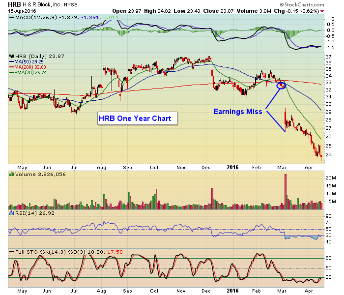
For example, you can see in the chart below on H&R Block the response to its last earnings report where they missed expectations. You wouldn't feel so great if you had held that stock into its earnings report.
 At EarningsBeats.com we keep track of companies that report earnings and key in on those that beat or miss expectations. From that we create a list, our exclusive "Candidate Tracker," which our members use to spot high reward to risk trading candidates. If you would like to see a sample of what the charts look like just click here.
At your service,
John Hopkins
EarningsBeats
 In the larger scheme of things, the Dow has essentially moved sideways - albeit with some huge price swings - since the collapse last August. This sideways movement is throwing off lots of long-term and intermediate-term trend signals (including the "Golden Cross" mentioned above) since there isn't really an intermediate-term trend right now. Yes, the short-term trends have been very pronounced - both up and down - but longer-term, a strong case could be made that the Dow is in a sideways channel (aka a "rectangle" pattern) with boundaries at 15,500 and 18,250.


 Outside of October, tobacco stocks enjoy their best month during May. Here's the current technical look at the DJUSTB: