| THIS WEEK'S ARTICLES |
| CHARTWATCHERS |
| Introducing "ChartList Reports" - Daily and Weekly Performance Summaries Sent Right To Your Inbox |
| by Grayson Roze |
|
I'll let you in on a little secret. My favorite feature on StockCharts, hands down, is ChartLists. Second only to my charts themselves, ChartLists are the thing I rely on most heavily by far.
As an active investor, I use ChartLists throughout every stage of my process. I have ChartLists that help me monitor the broader markets and their internals, all the way from the major indexes down through the sector and industry group levels. I have ChartLists for each of my portfolios, which help me monitor my open positions and keep a close eye on what I own. I have ChartLists for the stocks and funds I'm "stalking". I even have ChartLists for a wide array of market groups and types of ETFs, like the leveraged funds or specialized strategies.
I could go on and on all day here, but the point is, I use ChartLists for everything. They are not only the center of my StockCharts usage, but the center of my total investing process overall.
So this week, it brings me a great thrill to announce that your ChartLists are now even more powerful than ever.
Introducing ChartList Reports
On Thursday, we rolled out a helpful new feature for StockCharts members called “ChartList Reports”. With the simple click of a checkbox, you can now turn on daily or weekly ChartList Reports for any of your saved lists. After the market closes, we’ll automatically email you a performance summary for all the stocks, funds, indexes or other securities saved in that ChartList.
The concept is simple, but our team has already found it to be quite powerful. For instance, you can use these ChartList Reports to monitor your portfolio(s), track your own unique set of market indexes, follow specific groups like the S&P Sector SPDRs or Dow Industries, and much more. Anything you're watching in a ChartList could be a candidate for our new reports feature.
Especially if you’ve got your email on your phone – as most of us do these days – I've personally found that these new ChartList Reports are wonderfully helpful and seriously convenient. They're a time saver for sure, and in our endlessly busy world, these simple reports can help you stay true to your routines and never miss a beat in the market, even while you're out on the go.
How Our New ChartList Reports Work
To turn on daily and/or weekly ChartList Reports for any of your lists, first pull up the Summary View for the list. Just above the summary table, you'll now see two new checkboxes that say "Send Daily Report" and "Send Weekly Report". Click to turn 'em on – simple as that! You’ll start seeing report emails in your inbox the next day.
As you probably guessed, the daily report includes a performance summary for the most recent trading session, while the weekly report includes a performance summary for the most recent trading week.
Multi-Market Timing
When you first turn on a ChartList Report, you'll see a dialog box pop up that allows you to select the timing of your reports for that ChartList – i.e. US, Canada, UK, India. Reports for different ChartLists can be sent at different times, so if you have one ChartList focused on Canadian equities and another focused on the UK, the reports can be delivered at the appropriate hour. Good news there for all you global marketwatchers or international investors!
See How David Keller Is Using ChartList Reports
David Keller, Chief Market Strategist here at StockCharts, gave a full rundown of the new ChartList Reports feature on his Friday edition of The Final Bar. The quick clip below will give you a sense of how the new tool works and will provide some helpful insights into how David is using these reports for his own account.
As with any new feature, we'd love to hear your thoughts. Give these new ChartList Reports a shot and let us know what you think!
By the way, if this is sounding like it could be a helpful boost in your trading or investing, now is the ideal time to sign up for StockCharts and explore all that our members-only tools and features can do for you. Our Holiday Special is in effect this month, so you can get up to 3 FREE months of StockCharts when you sign up. You'll have access to more bigger, better, more advanced charts, the ability to save your charts to ChartLists AND get daily and weekly reports on them, create custom scans and technical alerts and much more.
The best is always reserved for our members, so sign up for a free 1-month trial now or jump in with a full subscription while our special holiday pricing is still around.
Chart On, My Friends.
Grayson Roze
VP of Operations, StockCharts.com
|
| READ ONLINE → |
|
|
|
| Market Roundup |
| It's Time To Watch For A Bottom In Commodities |
| by Martin Pring |
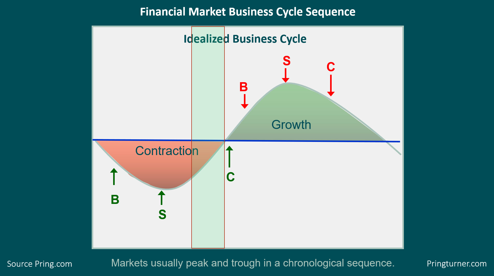
In my Monthly Market Roundup last week, I repeated a talk that I recently gave at the CMT Summit in Mumbai. The talk in question began with an outline of the approach we take at Pring Turner for our sub-advisory services and in the Intermarket Review, my monthly publication that analyses the the US and world markets from a long-term technical point of view. Figure 1, which portrays the growth path of the economy, sets the scene by pointing out that most US business cycles go through a set series of chronological events, as well as that the primary trend turning points of bonds, stocks and commodities fall into that sequential approach. We use this approach as a road map to help determine where we are in the cycle. In that way, we can optimize our asset allocations to favor bonds and interest sensitive equities at the start of the cycle and inflation-sensitive sectors as the cycle matures.
The sequence begins during a recession, when the Fed is adding liquidity to the system. This causes rates to peak and bond prices to bottom. Later, the players in the stock market begin to realize that lower rates will result in a recovery, so they start buying equities in anticipation of it. Then, when the economy does perk up, commodities bottom, so now all three markets are in a rising phase.
All good parties must come to an end, which means a peak in bond prices as credit demands pick up and the Fed is less accommodative. Rates may be rising, but profits are improving faster, so stocks continue to advance until they eventually begin to anticipate the next recession by entering a bear phase. Finally, commodities peak and the cycle begins again. Virtually all of my long-term indicators, including my consensus Bond, Stock and Commodity models are indicating that the current cycle is in the green-shaded rectangle. With bonds and stocks both in a primary bull market, the next event on the calendar to look for is a low in commodities.
"But wait," I hear you saying, "how can that be, as we are not coming out of a recession?"

Figure 1
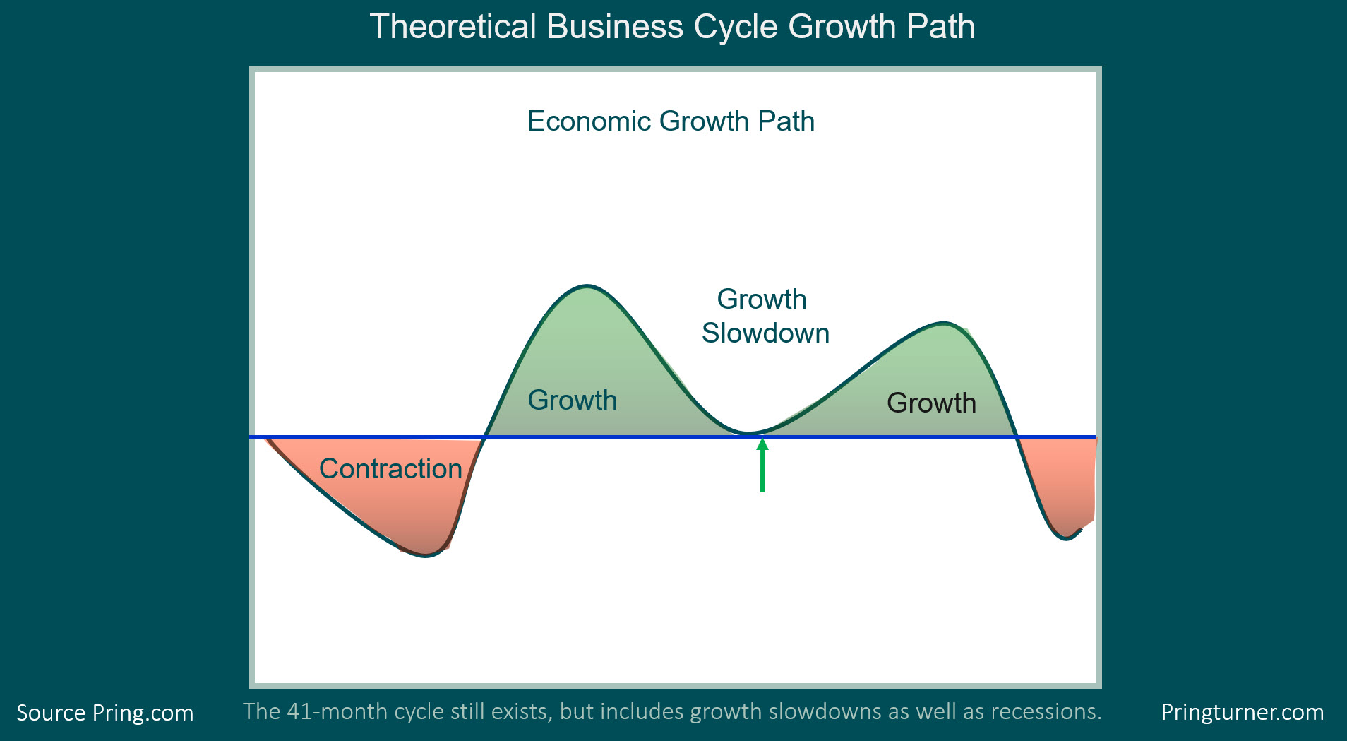
The answer is that, since 1960, there have been just as many slowdowns as recessions. Slowdowns develop when the growth rate of the economy declines (without seriously dropping below zero) but the sequential bond/stock/commodity relationship remains valid. The major difference is that the magnitude of equity and commodity bull markets is far lower. This concept is featured in Figure 2. My estimate, based on the trajectory of several long-term indicators, is that we are currently around the position of the green arrow. If that's the case, that elusive bear market bottom in commodities may not be far away.

Figure 2
Editor's Note: This is an excerpt of an article that was originally published in Martin Pring's Market Roundup on Friday, December 6th at 3:09pm ET. Click here to read the full article.
In this period of Cyber Monday and Black Friday sales, I would be remiss if I did not point out that we at Pring.com currently have a special on our already discounted Intermarket Review 3-month trial, provided you use the code "Trader1".
Good luck and good charting
Martin J. Pring
The views expressed in this article are those of the author and do not necessarily reflect the position or opinion of Pring Turner Capital Group of Walnut Creek or its affiliates.
|
| READ ONLINE → |
|
|
|
|
|
| The Mindful Investor |
| Stock Market Rallies Under Narrowing Sentiment |
| by David Keller |
During an interview I took part in for a podcast this week, I was asked to define technical analysis. I immediately provided John Murphy’s summary that technical analysis is the study of “market action” and is based on a visual analysis of price and sentiment.
After the interview, the idea of sentiment stuck with me. Later, I was a bit surprised to note that one of my favorite measures of investor sentiment was indicating more indecision than ever.

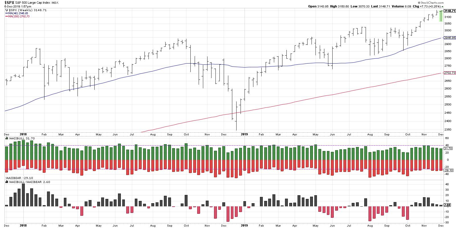
The American Association of Individual Investors (AAII) surveys a subset of its members every week and asks whether respondents are bullish, bearish or neutral on US stocks for the next six months.
Generally speaking, the weekly data supports the concept that individual investors tend to be overly bullish at market tops and overly bearish at market bottoms. In other words, they tend to be following trends and expect the recent market move to continue in the same direction.
This week’s data (which is released every Thursday) shows a rare narrowing of sentiment. Usually, if the percent of bullish respondents increases, then the number of bearish responses decreases, and vice versa. That is, most of the time, people tend to rotate from one extreme to the other.
During the past week, however, both the bullish and bearish percentages decreased. The difference between bullish and bearish responses is only 2.6%, which one of the lowest readings ever. This tells you that respondents are evenly split between bullish and bearish.
So what does this mean for the markets? Well, it tells you that there is indecision for market participants and that is certainly how this week has felt. Even though Friday’s session appears to be pushing things like Financials to new highs, this week overall has had plenty of up moves and down moves to digest.
If the market does rally from here, thus pushing the S&P 500 and Technology sector to new highs, I would expect the AAII bullish reading to increase as investors buy in to “risk-on” scenario going into year end. If we see a pullback next week, however, I could see the lack of conviction from the AAII survey data as an indication that investors will get very nervous very quickly. To put another way, the market is jittery, and a couple of down days is just enough to get people anxious. And anxious investors tend to be net sellers rather than net buyers.
RR#6,
Dave
David Keller, CMT
Chief Market Strategist
StockCharts.com
David Keller, CMT is Chief Market Strategist at StockCharts.com, where he helps investors minimize behavioral biases through technical analysis. He is also President and Chief Strategist at Sierra Alpha Research LLC, a boutique investment research firm focused on managing risk through market awareness. He is a Past President of the Chartered Market Technician (CMT) Association and most recently served as a Subject Matter Expert for Behavioral Finance. David was formerly a Managing Director of Research at Fidelity Investments in Boston as well as a technical analysis specialist for Bloomberg in New York. You can follow his thinking at MarketMisbehavior.com, where he explores the relationship between behavioral psychology and the financial markets.
Disclaimer: This blog is for educational purposes only and should not be construed as financial advice. The ideas and strategies should never be used without first assessing your own personal and financial situation, or without consulting a financial professional.
The author does not have a position in mentioned securities at the time of publication. Any opinions expressed herein are solely those of the author, and do not in any way represent the views or opinions of any other person or entity.
|
| READ ONLINE → |
|
|
|
| The Canadian Technician |
| 5 Dow Names Are Ready To Break Out! |
| by Greg Schnell |
The Dow is one of those lists of big companies that doesn't necessarily have the most aggressive names, but they are definitely some of the world leaders. After reviewing the Dow 30 this week on Market Buzz, I can say at least five names look ready to break out and take this market higher.
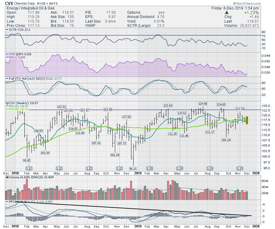
In order to get excited about Chevron (CVX), I would want to see a few things happen on the chart. First of all, a push through $123, with a weekly close up there, would mark a fresh new highs close. A break above the two-year consolidation looks wonderfully bullish. There has been a downtrend in momentum, as shown on the PPO. A break above this trend line would probably be a strong indication that the momentum was changing. A change in momentum (PPO) and the price breakout happening would also be a change in trend confirming each other. Stay tuned.

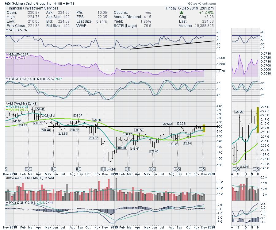
Goldman Sachs (GS) made a new 52-week high this week as well. A few weeks ago, Goldman managed to make a new 52-week high intra-week, but closed below the breakout level for the week. At the time of writing on Friday afternoon, it looks like GS is going to mark a new 52-week high!
I'd like the stock to get the SCTR up in the top 25% to help it attract more investors. Goldman hasn't been a top-performing stock for the two years on the chart. Ouch! It should also start to outperform in relative strength.

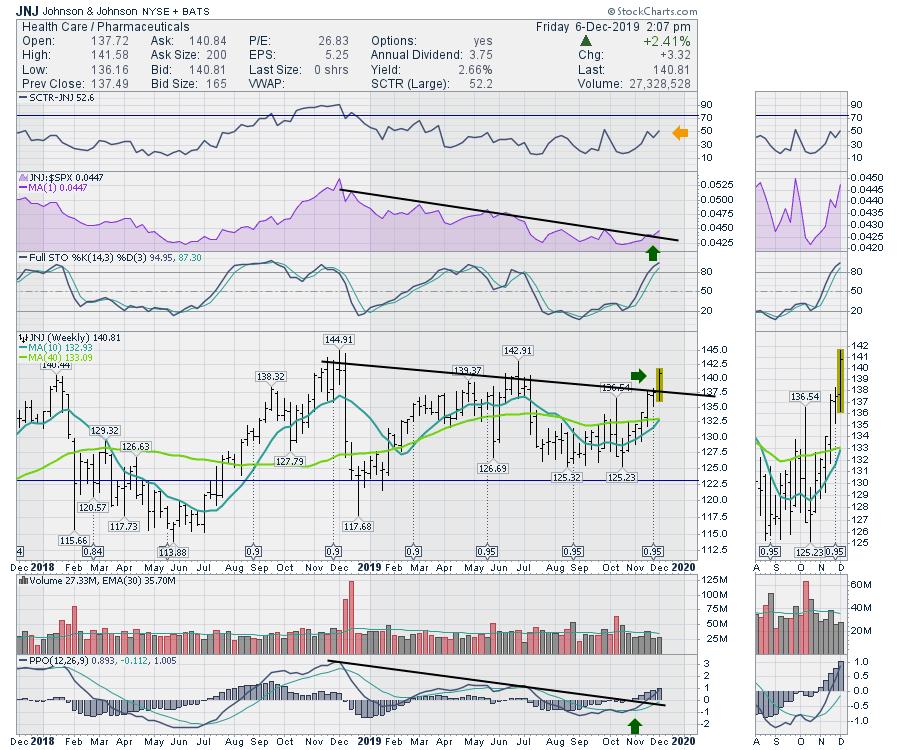
Johnson and Johnson (JNJ) has spent more time publicly in the courtrooms than in the lab this year, but the chart is showing a push above the downtrend, with the line placed where the weekly closes were. This change in trend looks good. Another weekly candle this big would push JNJ to new highs. The SCTR is at the top of the range it has been at, so a push here would suggest a change for the company as well. The relative strength downtrend is also breaking, which is good news. I also like that the downtrend in momentum has also been broken.

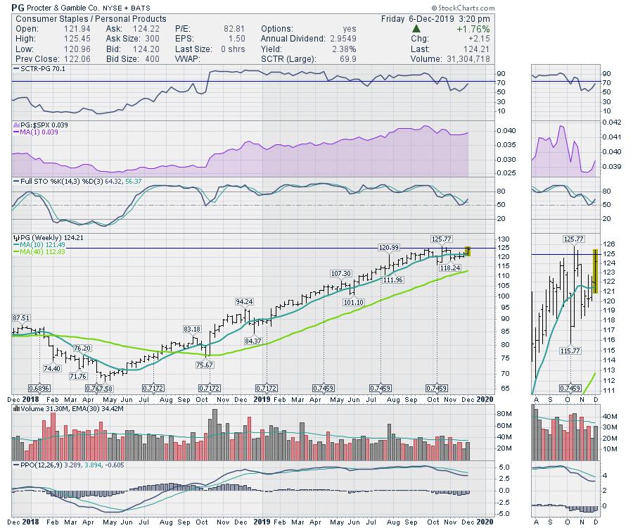
Proctor and Gamble (PG) is also trying to break out. The chart setup is nice. The full stochastic is bouncing where it should (50) to stay in bull market mode. The SCTR ranking has been positive for a whole year and has now started to pull back a bit. I would like to see the SCTR get back up into the leadership quadrant above 75. Momentum on the PPO is at a nice high level of 2.5% which can stay up here for a while. When it starts to make lower lows below 1%, I would be more sensitive to a drifting PPO.

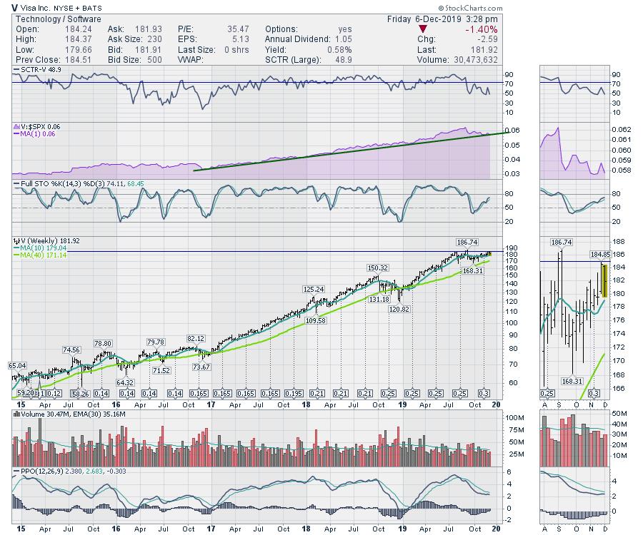
Lastly, there's Visa (V). This chart is a five-year chart, unlike the charts above, which were 2-year charts. I like the stock here. I have one reservation that is good to note, but the stock is still a buy right here. I do not want to see the relative strength line in purple start to break. When a strong stock that has outperformed for years starts to underperform, that will create selling by institutions. I would rather exit the stock, or at least protect my gains with options. If Visa started to turn down here, be sure to notice the divergence of a much lower PPO while price is at the same high.
This is a typical place to expect Visa to bounce and continue its uptrend, so you can have your exit signal nice and close. A break of that green trend line for two weeks would be a profit-taking signal for me if I already own the stock.

Verizon (VZ), Coca-Cola (KO) and Walmart (WMT) also look great here. Should these charts fail to keep going, that would make me more cautious. My research data suggests we are going to run higher. Last year, October, November and December all had run-ups into the start of the month and then fell away. In March, May and August of 2019, we had similar pullbacks at the start of the month. So I am not expecting a larger pullback just yet, but a 50% average in the recent history says be careful on early-month optimism.
Members of GregSchnell.com received my newsletter over the weekend suggesting the market could be starting to pull back, with one of my short-term indicators only 39% bullish. Well, that pullback happened and I suggested it was a dip to be bought. If you would like help spotting these timely setups in the market and are interested in becoming a member at GregSchnell.com, visit the private investors tab.
I'll be speaking at the Market Vision 20/20 conference on January 4th, 2020 with a host of other StockCharts analysts. For more information on the early bird special, follow this link: Market Vision 2020.
|
| READ ONLINE → |
|
|
|
| Trading Places |
| To Profit from Trading, You Must Allow Trades to Come To You; Don't Chase |
| by Tom Bowley |
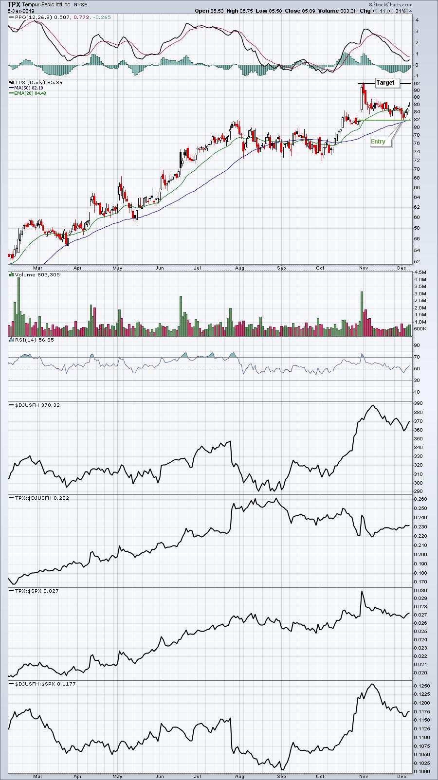
One of the great features of our service at EarningsBeats.com is maintaining a Strong Earnings ChartList (SECL) for our members and running scans against it daily to identify trade setups. I do a lot of research every quarter, tracking those companies that beat Wall Street consensus estimates as to both revenues and earnings per share (EPS). Companies that meet this fundamental filter (and also are liquid and technically sound) find their way onto our SECL, which is simply a very large annotated watchlist, awaiting trades to set up as prices gravitate toward support. An example of a current trade alert is Tempur-Pedic International (TPX), which pulled back to test key gap support early last week:

A push through 88 should set TPX up to revisit its high near 92, our price target. The idea with any trade is to minimize risk while maximizing potential returns.
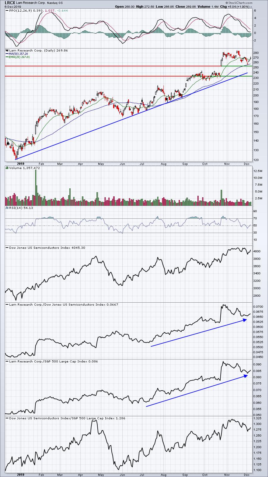
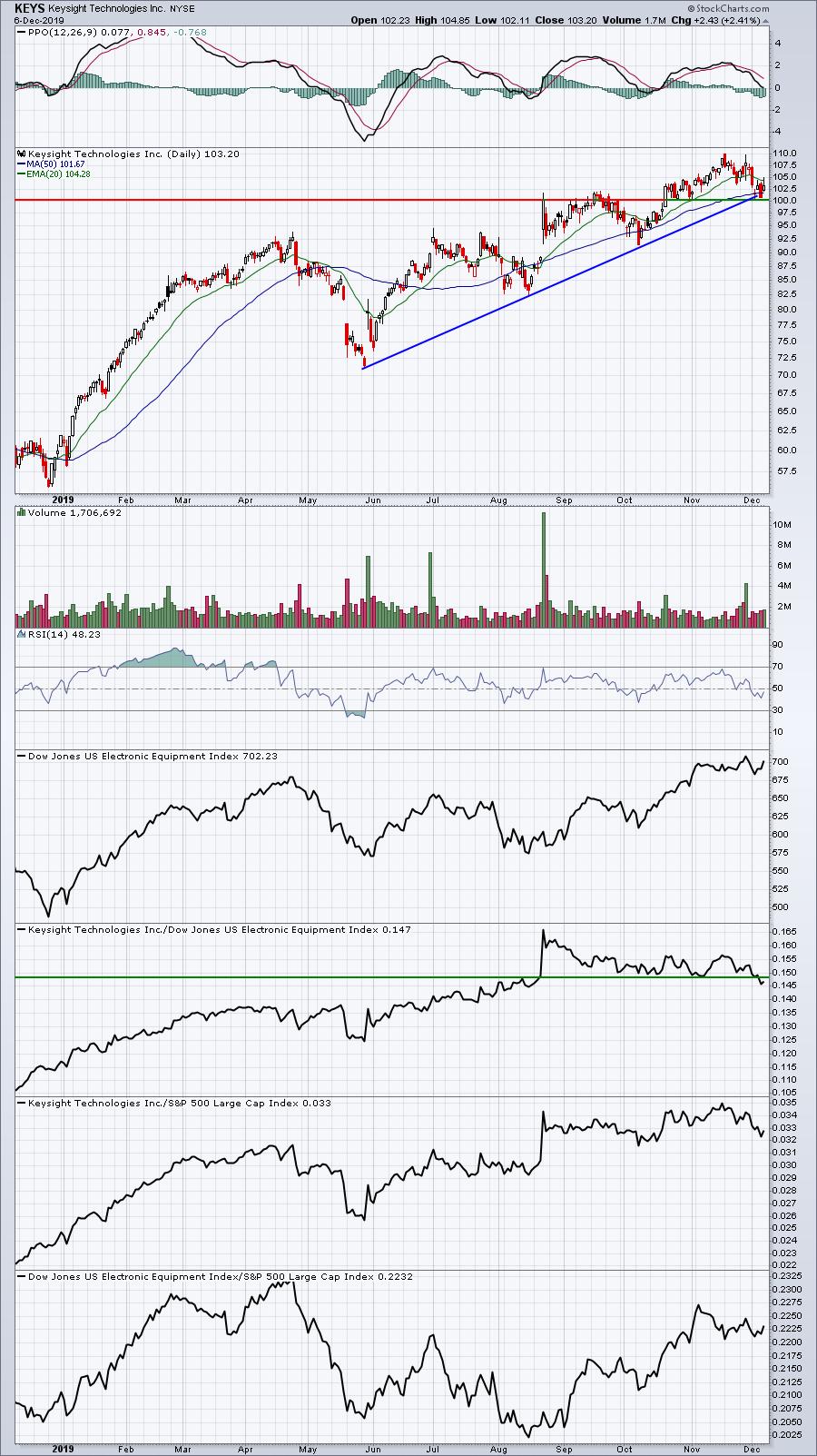
I also write a Daily Market Report (DMR), where I provide several trade ideas each day. On Monday, I ran a scan of the S&P 500, searching for stocks that had SCTR scores above 80 (strong relative performers) and RSIs beneath 50 (pullback candidates). 7 of the 500 stocks were returned in the scan, including Lam Research (LRCX) and Keysight Technologies (KEYS). I pointed out that LRCX in the mid-250s would represent a 10% pullback from its high and would also be approaching key gap support in the low 250s. KEYS was similar, as I was looking for key gap support close to 100. LRCX bounced very nicely right off of the mid-250s, while KEYS finally rebounded a bit on Friday from 100. Here are the two charts:
LRCX:

After Monday's call, LRCX hit 255 and change, though it turned on its 50-day SMA and just above gap support.
KEYS:

KEYS didn't quite reach 100, but it came close. Note that patience allowed an entry near 100, with a PPO back at centerline support. After its most recent rally to 110, KEYS was extended and overbought. The reward-to-risk on both of these stocks improved greatly by allowing them to fall back into an "accumulation zone."
On Monday, I'll be sending out 5 setups in my Daily Market Report similar to these two stocks. If you'd like to take out a $7 30-day trial, receive these setups and give our service a try, simply CLICK HERE!
Happy trading!
Tom
|
| READ ONLINE → |
|
|
|
| RRG Charts |
| Where Should You Go if You Don't Want to be 100% Invested in Stocks? |
| by Julius de Kempenaer |

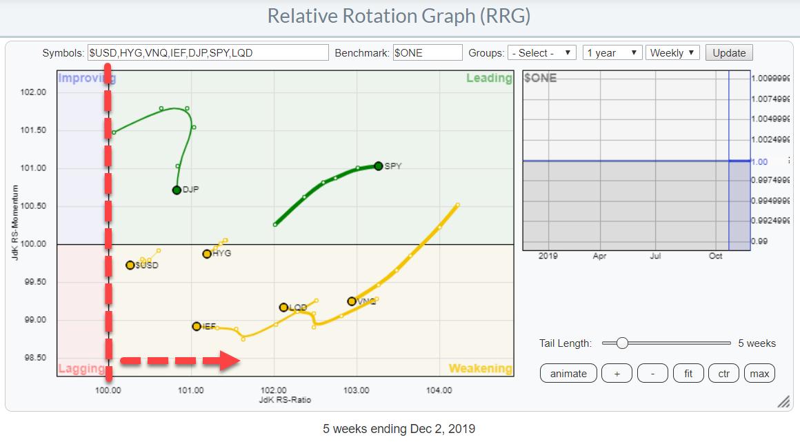
Last Wednesday, I published an article in the RRG blog titled "Stocks Remain The Only Asset Class Inside The Leading Quadrant Going into December". As the title suggests, that article is primarily looking at the rotation for asset classes, with an in-depth look into the long-term chart of SPY.
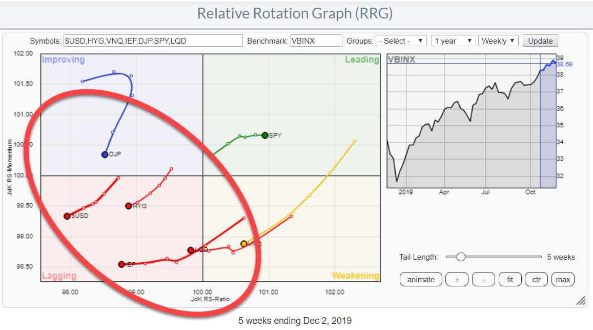
The Relative Rotation Graph above again shows the rotation (weekly) for asset classes. With SPY as the only one inside the Leading quadrant, what does that mean for other asset classes? Where do you go when you don't want to be 100% invested in stocks and would like to have some diversification in your portfolio?
In this graph, the benchmark is the 60/40 balanced portfolio (VBINX), which clearly shows that stocks are the best asset class from a relative perspective.
When we change the benchmark to $ONE, which shows us the trend in absolute terms ($ONE is a benchmark that never goes down), we see that all asset classes are at the right hand side of the RRG plot.

This means that the other asset classes, even though they are underperforming stocks, are still showing mildly positive trends. So they aren't as bad as it may seem at first sight.

Over the past five weeks, LQD and HYG are also showing a positive return. The worst returns have come from Real Estate and Commodities. In particular, LQD is showing an interesting chart at the moment IMHO.
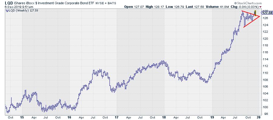
Adjusted Chart Shows Returns including Accrued Interest (dividends)

Above is the adjusted weekly chart for LQD, which shows the strong uptrend since the start of 2019 and the recent consolidation (pennant, triangle, etc.) which we are now leaving to the upside. That is good news, as it suggests a continuation of the uptrend.
As this is an asset class where a substantial portion of the return is coming from coupons (or dividends in the case of this ETF), I always, also, like to study the UNadjusted chart, as it shows the prices where people have actually traded this market.
That chart shows a very different, but also positive, picture.
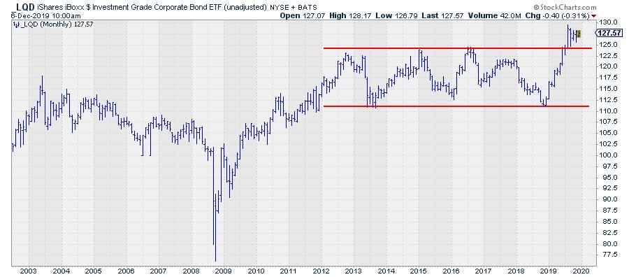
Unadjusted Chart Shows Actually-Traded Levels

This the monthly chart. As you can see, LQD has been trading in a range since 2012 and broke out of that range to the upside four months ago, where it has been consolidating since. This is the consolidation pattern that is also visible on the weekly chart using adjusted data.
The unadjusted chart illustrates the levels where people have actually been trading this market. In bond terms, these are the clean prices, as opposed to the dirty pricing where accrued interest is included (the adjusted price series).
For support and resistance levels, these are the levels I like to watch, as they represent what is in peoples' minds.
The break that is visible is significant, as it is a breakout from a long sideways range, meaning that a lot of tension had been built up at the edges of that range and this situation is now broken. Usually, that means an acceleration in the direction of the break, in this case upward.
The width of the range is around $12.50; to achieve a price target, we may project that figure at the top of the breakout level. This exercise leads to a price target somewhere between $135.00 - $137.50.
So despite the fact that LQD is lagging behind SPY (stocks), for the time being it can still serve as a diversifier in your portfolio if you do not want to have 100% exposure to stocks.
--Julius
My regular blog is the RRG Charts blog. If you would like to receive a notification when a new article is published there, simply "Subscribe" with your email address.
Julius de Kempenaer
Senior Technical Analyst, StockCharts.com
Creator, Relative Rotation Graphs
Founder, RRG Research
Want to stay up to date with the latest market insights from Julius?
– Follow @RRGResearch on Twitter
– Like RRG Research on Facebook
– Follow RRG Research on LinkedIn
– Subscribe to the RRG Charts blog on StockCharts
Feedback, comments or questions are welcome at Juliusdk@stockcharts.com. I cannot promise to respond to each and every message, but I will certainly read them and, where reasonably possible, use the feedback and comments or answer questions.
To discuss RRG with me on S.C.A.N., tag me using the handle Julius_RRG.
RRG, Relative Rotation Graphs, JdK RS-Ratio, and JdK RS-Momentum are registered trademarks of RRG Research.
|
| READ ONLINE → |
|
|
|
| The MEM Edge |
| Goldman Sachs has A Laggard Stocks Strategy for Early 2020 - I’ve Highlighted Some of the Better-Looking Charts |
| by Mary Ellen McGonagle |
For 17 years now, Goldman Sachs (GS) has been following a strategy at year-end of picking up battered stocks that have underperformed the markets and holding them into the first 3 months of the new year. This “laggard strategy” has outperformed the S&P 500 over 65% of the time since 2012.
While the outperformance varies year-to-year, it’s been as high as 4% last year and has an average of 1.4% overall. These results are for the basket of stocks; refining your selection among these battered stocks with an educated review of the charts could easily produce higher yields.
Here is Goldman’s criteria: in addition to being in the bottom-third of performers for the year, they recommend buying the laggards where their analysts have an out-of-consensus buy rating and an above-consensus growth estimate. To narrow the list even further, the bank also likes names with a price target is at least 5% above 2020 consensus.
The focused list from this screen has many stocks that are in confirmed downtrends or are in a weak sectors, such as Energy. However, I was able to uncover 3 interesting stocks worth taking a look at.
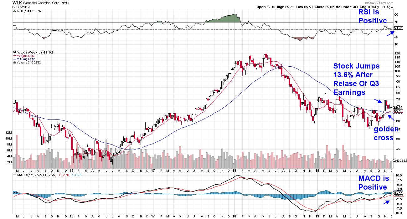
Weekly Chart of Westlake Chemical Corp. (WLK)

Westlake Chemical (WLK) is on its way to reversing a 50% downtrend since peaking in price in May 2018. The company recently reported 3rd quarter earnings that were 21% above estimates, which has analysts raising guidance for the 4th quarter. A close look at the chart shows that the sharp advance, in response to this positive surprise, pushed WLK above its key 200-day moving average on heavy volume.
In addition, the 50-day moving average then bullishly broke above the 200-day moving average in a golden cross formation, which can often precede a rally. Continued rallies on volume would support a continuation of the downtrend reversal.
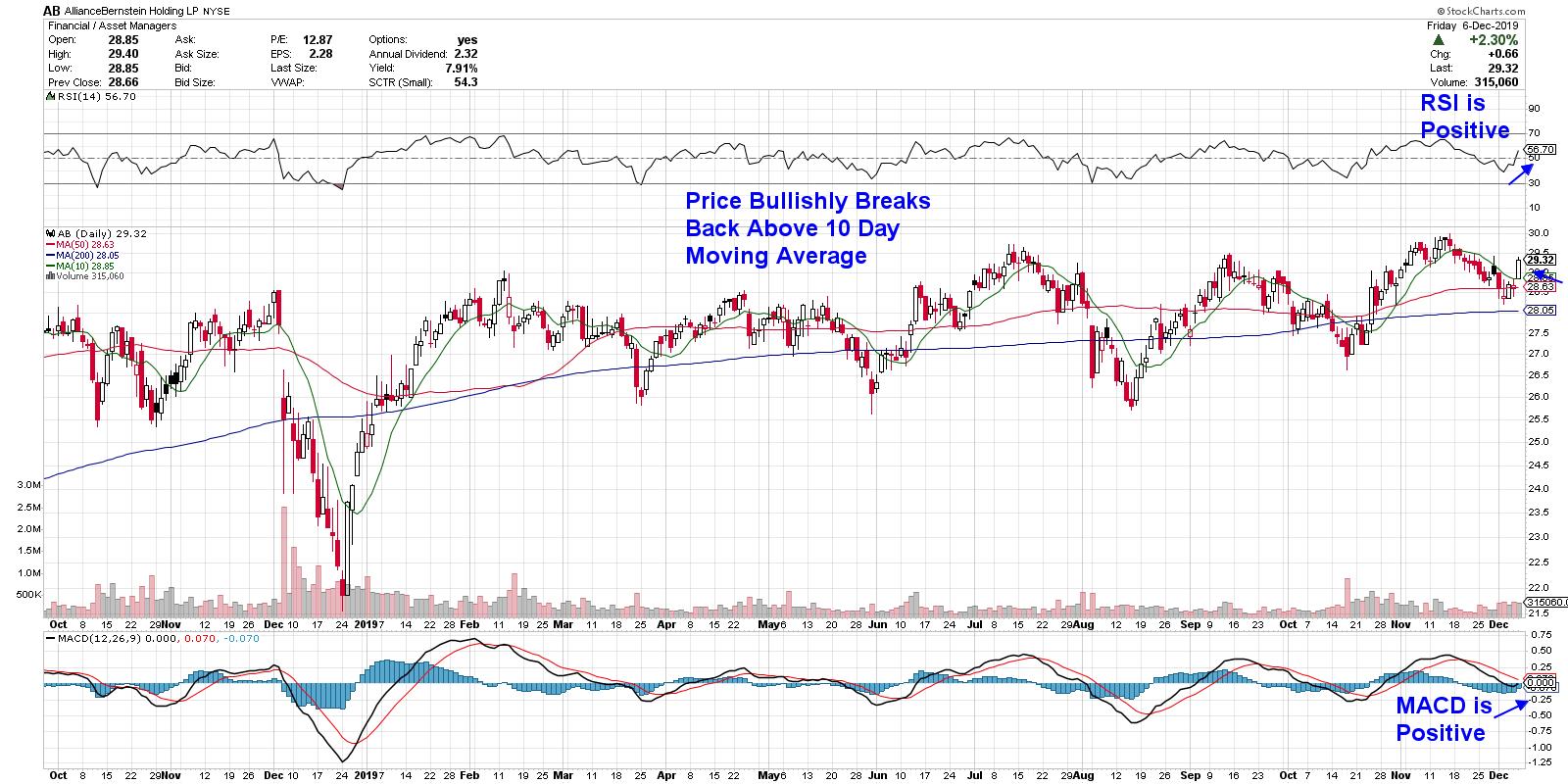
DAILY CHART OF ALLIANCE BERNSTEIN (AB)
Next up is high-yielding asset management firm Alliance Bernstein (AB), who saw assets under management continue to increase from $592 billion to $601 billion during the month of October. The uptick in aum has increased client fees; this, as well as the launch of new products, has analysts raising estimates for next year. In addition to analysts' bullish outlook, the stock offers a 7.9% yield.
As you can see in the chart above, AB is emerging from an oversold position as it bullishly breaks back above its shorter-term 10-day moving average. The stock is very close to a breakout from a 5-month base at $30.95, which would be quite positive.
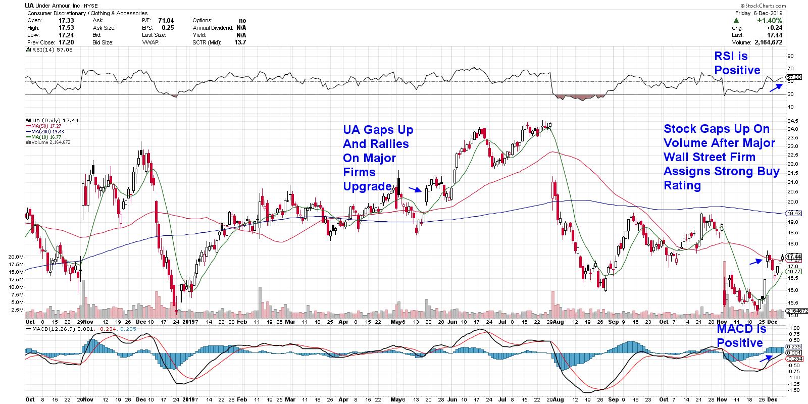
DAILY CHART OF UNDER ARMOUR (UA)

Last up is Under Armour (UA). While not the prettiest of charts, the stock is in the beginning throes of reversing a downtrend that began in early August, following the stock hitting a 2 ½ year high in price before declining significantly. Similar to UA’s mid-year rally, the recent positive price action was sparked by an upgrade from a major Wall Street firm.
If the current price breaks back above its 50-day moving average and the stock is supported by a golden cross with the 10-day crossing above the 50-day, this stock could easily see more near-term upside. While the next area of resistance is the 200-day moving average, as of today that would be an 11.5% increase.
My primary expertise is in uncovering high-quality growth stocks, as they're poised to take off. However, many of the same technical tools can be used in selecting down-and-out or value stocks, such as those above.
For those who'd like to be alerted to top-performing growth stocks just as they begin to move higher, while also getting in-depth analysis into the broader markets, I urge you to take a trial of my top performing MEM Edge Report using this link here. This highly regarded report is delivered on Sunday and Wednesday with intra-week alerts sent as the markets warrant. I hope you'll take advantage of this opportunity!
Warmly,
Mary Ellen McGonagle,
MEM Investment Research
|
| READ ONLINE → |
|
|
|
| MORE ARTICLES → |
|
