MailBag November 25, 2011 at 12:52 PM
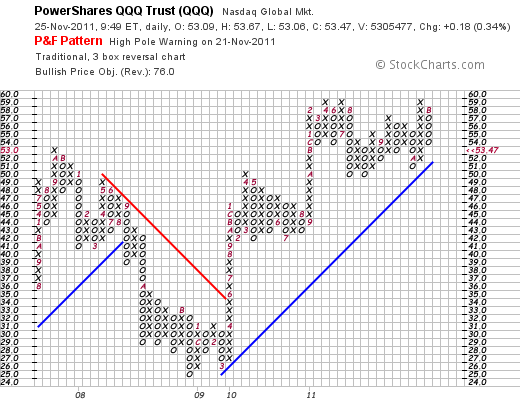
Traditional P&F trendlines are drawn at defined angles to represent a specific rate of ascent or descent. A rising trendline, which is called a Bullish Support Line, rises at a 45-degree angle. The trend remains up, and bullish, as long as prices remain above the rising 45-degree trendline. A break below indicates that buying pressure is not strong enough to maintain this rate of ascent. A falling trendline, which is called a Bearish Resistance Line, falls at a 135-degree angle, which is the opposite of a 45-degree angle. The trend remains down, and bearish, as long as prices remain Read More
MailBag November 18, 2011 at 09:05 AM
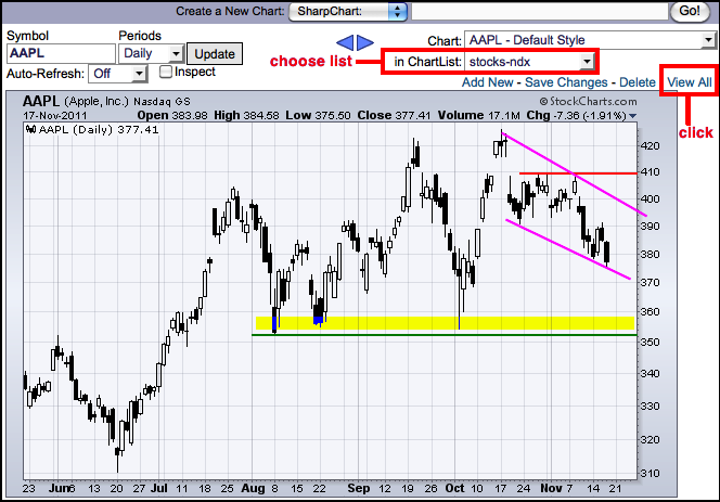
Scrolling through 100’s of charts is easy using the CandleGlance charts at StockCharts.com. It all starts with a favorites list (basic subscription required). For those without a basic subscription, pre-defined CandleGlance groups can be found on the Free Charts page. In the example below, I am using my favorites list with the stocks in the Nasdaq 100. The first step is to choose your chart list. The second step is to click “view all”, which is just to the right of the chart. Clicking “view all” will show 10 full size charts per page. The page will refresh and users can now use the drop Read More
MailBag November 11, 2011 at 11:22 PM
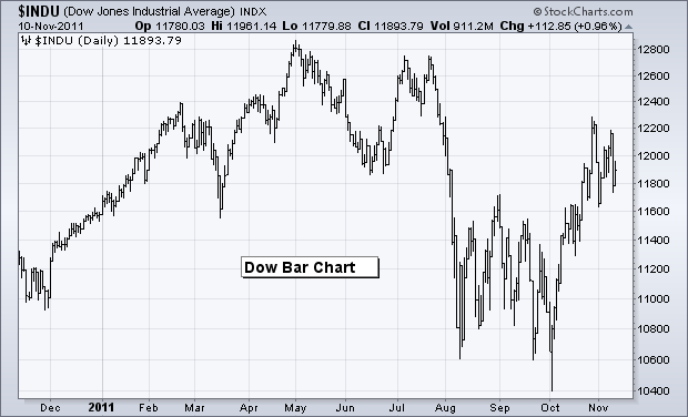
Volatility is picking up once again as the Dow produced at least three swings greater than 350 points in the last three weeks. The Dow surged from 11700 to 12231 in three days at the end of October. The senior Average then fell back below 11700 the two days ending November 1st and surged back above 12150 early this week. Not to be outdone, the Dow then plunged below 11800 with a sharp decline this past Wednesday. While volatility is not at the August-September levels, it is certainly heating up again. While we cannot eliminate volatility, chartists can use price-filtering charting styles Read More
MailBag November 05, 2011 at 03:42 PM
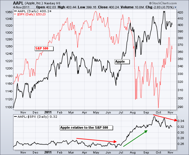
There are, at least, two ways to measure relative performance at StockCharts.com. Chartists can use PerfCharts to compare multiple securities or isolate two securities using the Price Relative. We talked about PerfCharts a few weeks ago with a sector rotation example. Today we are going to focus on the performance of a stock relative to a benchmark index. The Price Relative is a ratio plot that allows chartists to compare the performance of one security against another. Typically, chartists want to see how a stock, industry group or sector compares to the broader market. Is it Read More