If you were presented with a stock price and you found it to be indicative of trend change, would you change your investing style? Read the article before investigating the stock. I think it will be more valuable.

In the finance industry, we use references like 'bellwethers' to represent these iconic stocks. We see the stock name and it immediately creates an image in our mind. Then depending with how bullish or bearish we are, we discount it if it tells us a message we don't want to hear.
From Wikipedia:
A bellwether; one that leads or indicates trends.
The term is derived from the Middle English bellewether and refers to the practice of placing a bell around the neck of a castrated ram (a wether) leading his flock of sheep. The movements of the flock could be noted by hearing the bell before the flock was in sight.
Well, that description was rather harsh!
From Merriam-Webster:
bell·weth·er
noun \ËÂÂÂÂÂÂÂÂÂÂÂÂbel-ËÂÂÂÂÂÂÂÂÂÂÂÂwe-thÉÂÂÂÂÂÂÂÂÂÂÂÂr, -ËÂÂÂÂÂÂÂÂÂÂÂÂwe-\
: someone or something that leads others or shows what will happen in the future
So just taking a long term horizon and mounting a stock symbol on a chart, here is a chart with a few indicators. Regardless of whether or not it is a bellwether, you can make up your own mind. Did it rise and fall with the S&P 500 ($SPX) over the last 20 years? I think so. The bars on the chart are monthly.
Let's review a few of the lines on the chart. First of all, up in the top plot is the SPURS. We can see the stock had a trend of relative strength going during each of the three bull markets. When the stock broke the trend, it was significant. I marked three places where the stock actually broke the trend lines with a yellow arrow. It quickly snapped back above to get back on trend. Interestingly, all of those were roughly 1/2 way through the trend based on time in number of years. However, this stock has clearly broken the SPURS trend now in September 2014.
Moving along to the main plot, the price action is weaker than the $SPX. This stock has not taken out the 2000 or 2007 highs. Whenever the market experienced weakness over the last 20 years, this stock moved below its 10 month moving average shown as a blue line. I will tell you it is currently back above the 10 Month Moving Average after being below it in July and August for the first time since January 2012! Interestingly in 2005 and 2006, the stock oscillated sideways for 2 years but never broke down on the relative strength area shown in purple. This stock has not gone on to new highs this year with the $SPX. It made highs back in January.
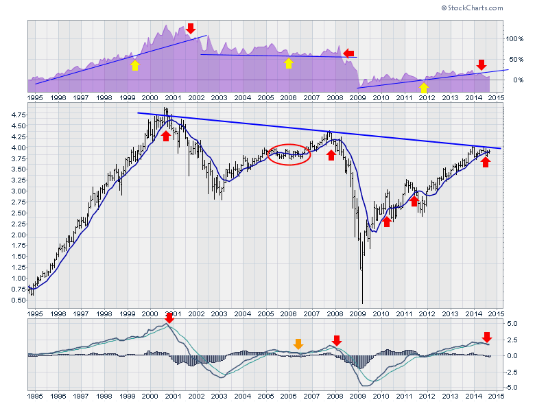
Finally, lets look at the MACD on the bottom plot. When the MACD line was above the monthly MACD signal line, it was a bull market. When the MACD fell below the signal line, it was a very concise signal. Only once in each rally did the signal fail. Roughly where the yellow arrow was on the SPURS. Waiting until the MACD crossed below zero was a pretty painful signal. You'll notice the 2005-2006 period was flat.
I put the scale on the left to wonder how many people would use that to help guide them. It is the monthly ATR scale for the stock. The line is invisible on the chart so the ATR scale is irrelevant. If this stock dropped less than 50 cents, all three signals would be in place for a bull market pullback of multi month duration. Would you take the signal or ignore it without knowing the name of the stock? Would you defend a bull market stance? Would you say it is no longer relevant because it is making lower highs than the $SPX?
So again, we'll list the signals:
- SPURS has broken down
- MACD has broken down
- Price broke down, but bounced back above our MA signal line. Today it sits just above the signal line.
Ok, so the chart has some rhythm, but is it a bellwether? What would make you agree or disagree? What would make you change your position on the bull market? A drug stock? A bank stock? A transport stock? A group of stocks? My point is looking at the data and ignoring it is very expensive. Looking at the chart and using it for Buy/sell signals is pretty powerful. Picking something we have not talked about like an Aroon oscillator, CMF, accumulation/distribution, Pring KST is also a valuable personal preference. Could you use the good bullish signal but not the bearish signal? Would you use the bearish signals but not the bullish signals? We made new highs last week. Shorting the market has been a game of fools. I can show you 20 charts that say to me go short, and another 20 to say go long. Do you have a signal to help you exit the bull market in a timely fashion? As long as you have a group of signals that push you in or out, you'll be on the right side of the market for the majority of months in your investing career.
What is the mystery stock? It is a bellwether. It is an iconic stock. It is broadly owned by every major fund in the world. It is across all factions of your life. Now will you use the signal if it triggers today? Will you wait for month end to confirm a monthly close bullish or bearish? Does that help you agree or disagree? I think it is timely to have a list of symbols that will kick you out in a close proximity to a top for your trading style. It may only be to help you place options positions to protect your portfolio so you don't have to sell. It may be a whipsaw but rules are better than wishing. What would you wait for? A Quitting Whistle? These are the tough questions that make trading more difficult. I wrote this article today because in the last few days I talked to numerous people who are getting more bullish than they have been in the last few years. While they are currently right in some markets, they do not have a line in the sand for exiting or protecting profits.
If you liked this article, feel free to forward it to investing friends and family. If you didn't like the blog, please send me a note on what I could do better. The chart is printable. It should also be clickable so that you can go look at the settings.
We try to keep our articles informative and entertaining. Make sure you check out the other blog writer articles in Mailbag, Chartwatchers, Traders Journal, DecisonPoint, Don't Ignore This Chart, Chip Anderson, Scanning Technically, and The Canadian Technician. Subscribers have access to more informative blog articles by Arthur Hill, John Murphy, Martin Pring and myself as well as the DecisionPoint Tracker and DecisonPoint Reports. Don't forget to look for the subscribe button for RSS feeds and email.
On the Blogs tab, you can also see the Top Advisors Corner in the right hand panel where other technicians post their work. If you are paying for newsletters all over the Internet, don't miss all the articles here that are included!
In case you are a free charts user, you can click here for a chart with a short time frame view of the stock shown above. My Mystery Chart Regular members can click on the chart above.
Good trading,
Greg Schnell, CMT