Don't Ignore This Chart! March 27, 2009 at 05:50 PM
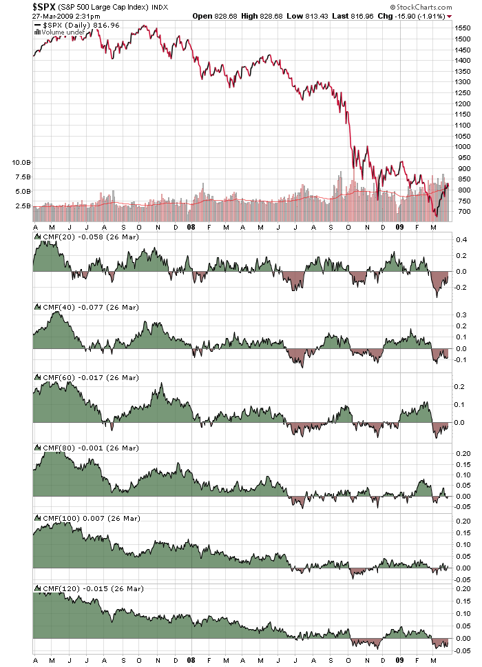
Click here for a live version of this chart. Often we get asked "What settings should I use on my indicators? What's the best?" and our answer is the always infuriating "It depends." The chart above shows why "It depends" is always going to be our answer... Read More
Don't Ignore This Chart! March 25, 2009 at 02:01 AM
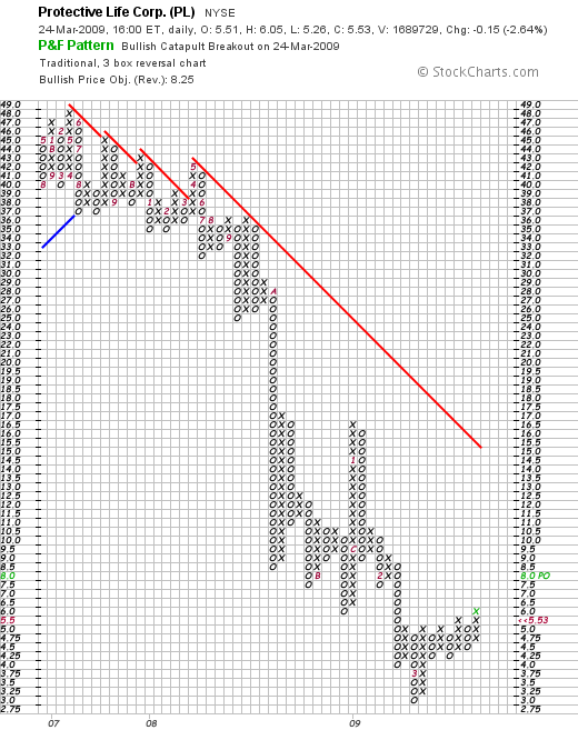
Click here for a live version of this chart. The "Bullish Catapult" P&F pattern is a great way to find stocks that are breaking out above resistance. Today, Protective Life Corp. (PL) was the only high volume stock to create a new Bullish Catapult pattern when it moved above 6.0... Read More
Don't Ignore This Chart! March 20, 2009 at 10:26 PM
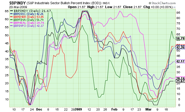
Click here for a live version of this chart. Click here for a live version of this chart. Bullish Percent indexes show the percentage of stocks in a given group that have a "Buy Signal" on their P&F chart... Read More
Don't Ignore This Chart! March 19, 2009 at 07:59 PM
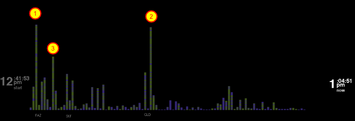
Click here to start watching Ticker Rain This is not your typical stock chart. This is what you see after running our Ticker Rain program for a while. It can show you what tickers are popular on StockCharts.com. More importantly, it can show you what everyone else is looking at... Read More
Don't Ignore This Chart! March 18, 2009 at 09:32 PM
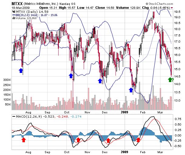
Click here for a live version of this chart How are your money management skills these days? Here's a real test for you: Over the past 10 months, MTXX has been bouncing up and down between roughly 14 and 19... Read More
Don't Ignore This Chart! March 14, 2009 at 05:24 PM
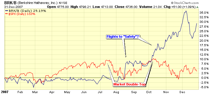
Click here for a live version of this chart. Continuing to look for "leading" technical signals that pointed to the market's recent crash. It's always interesting to see how the country's "best" investor did... Read More
Don't Ignore This Chart! March 13, 2009 at 02:55 AM

Click here for a live version of this chart. The S&P 500 Index (yellow line) hit its most recent high in early October of 2007 (red arrow). Since then it's been all downhill... Read More
Don't Ignore This Chart! March 12, 2009 at 03:35 AM
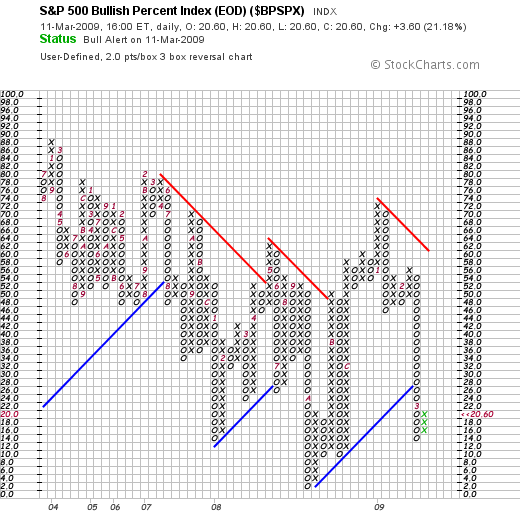
Click here to see a live version of this chart. Bullish Percent charts track the percentage of stocks in a specified group that have a P&F "Buy Signal" on their charts... Read More
Don't Ignore This Chart! March 09, 2009 at 10:17 PM
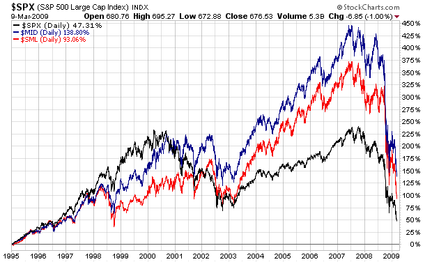
Click here for a live version of this chart. Long term answer: Mid caps... Read More
Don't Ignore This Chart! March 07, 2009 at 07:43 PM
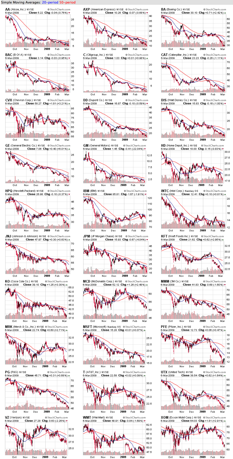
Click here for a live version of these charts. OK - I apologize for the size of the image above, but it's worth the extra time needed to download I promise! These are 6-month candlestick charts of the 30 stocks that make up the Dow Jones Industrial Average... Read More
Don't Ignore This Chart! March 04, 2009 at 10:11 PM
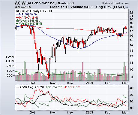
Click here for a live version of this chart. Only one Nasdaq stock began a new uptrend today. Well... began a new uptrend as defined by the ADX indicator... Read More
Don't Ignore This Chart! March 04, 2009 at 02:02 AM
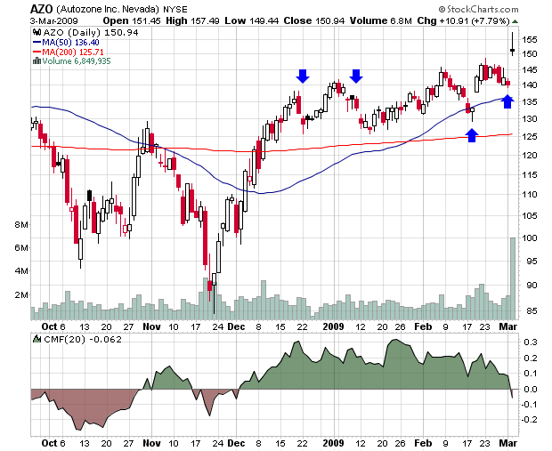
Click here for a live version of this chart After gapping down during December and January, AutoZone gapped up significantly in mid February and zoomed upwards today hitting a high of 157 at one point... Read More
Don't Ignore This Chart! February 28, 2009 at 09:55 PM
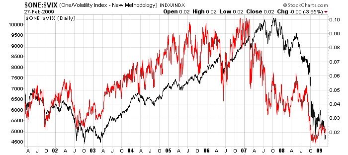
Click here for a live version of this chart The VIX is the Volatility Index published by the Chicago Board Options Exchange (CBOE). It measures the "implied volatility" of a hypothetical SPX option created from a weighted average of several actual SPX options... Read More