MailBag October 26, 2012 at 08:54 AM
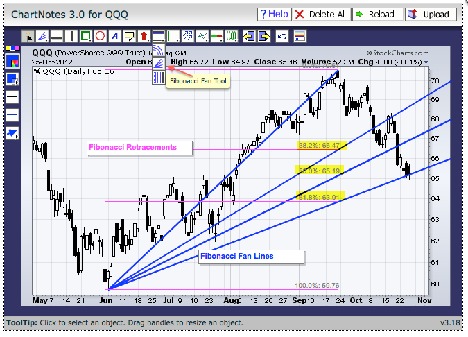
The Fibonacci Fan Tool can be used when annotating a SharpChart. Three Fibonacci tools can be found in the middle of the icon row at the top. The first vertical icon (horizontal lines) is the Fibonacci Retracements Tool. The second icon (trend lines) is the Fibonacci Fan Tool. The third icon (vertical lines) is the Fibonacci Time Zones Tool. Click the preferred icon and add it to the chart by moving the mouse to the starting point, click-hold the left button, drag to the end point and release. The chart above shows the Fibonacci Fan Lines in blue. These are like Read More
MailBag October 19, 2012 at 09:18 AM

The Zigzag (retrace) indicator can be used to measure the length of a retracement and filter out insignificant moves. First, note that the Zigzag indicator simply highlights price moves that meet a minimum requirement for percentage change. When selecting the Zigzag indicator in SharpCharts, the parameters box will be blank. This is because StockCharts.com uses an algorithm to compute the Zigzag based on the volatility of the underlying security. The Zigzag setting can be seen in the upper left of the chart window. As the example below shows, the default Zigzag for QQQ is 3.75%. For Read More
MailBag October 12, 2012 at 10:08 AM

There are two ways to draw a filled shape when annotating a SharpChart. The first method uses the CTRL key. Chartists simply hold down the CTRL key, click the desired shape and draw it on the price chart. This method was used to draw the shaded rectangle in July. Mac users should click the CMD key instead of the CTRL key. The second method is to edit an existing outline shape. After drawing a shape, click the select tool in the upper left and then click on the outline of the shape. Options will then appear on the left side of the annotation window. Users can click Read More
MailBag October 05, 2012 at 09:00 AM

CandleVolume charts allow chartists to see candlestick patterns and relative volume levels using one plot because the width of the candlestick is based on volume. Narrow candlesticks indicate low volume. Wide candlesticks indicate high volume. Chartists can combine candlesticks and volume to validate candlestick patterns. The example below shows Starbucks (SBUX forming a bearish engulfing in mid September. Notice that the candlestick is wide because volume surged. The second example shows Arch Coal (ACI) consolidating with narrow candlesticks on low volume and then surging with a wide Read More