MailBag February 28, 2014 at 08:02 AM

Do you have any ready made groups for PerfCharts and CandleGlance charts? Yes, 14 key groups are posted below, but first an overview of how to use these two tools. PerfCharts allow chartists to compare performance for a group of securities over various timeframes. Chartists can use up to ten symbols and view performance in absolute or relative mode. Absolute mode simply shows the percentage gain/loss over a time period. Relative mode shows the performance relative to a benchmark, such as the S&P 500. The Sector SPDR PerfChart below shows performance for the nine sectors relative to Read More
MailBag February 21, 2014 at 06:15 AM
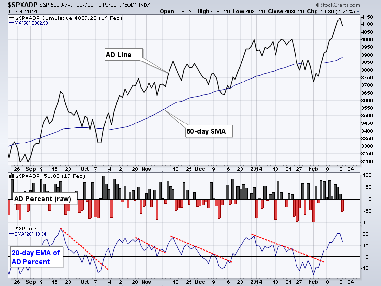
There are several different ways of viewing advance-decline data and this article will highlight three of the most popular methods. In this example, we will look at different ways to analyze S&P 500 AD Percent ($SPXADP), which is advances less declines divided by total issues. For example, if 300 S&P 500 stocks advance and 200 decline, AD Percent would be +20% ((300 - 200)/500) = +100/500 = +.20 or +20%). This number is positive where there are more advances than declines, and negative when there are more declines. AD Percent is a breadth indicator that measures the degree of Read More
MailBag February 14, 2014 at 02:44 AM

Chartists can add symbols from a csv file in four easy steps. First, create a csv file using Excel, Numbers or another spreadsheet program. Place the symbols in the first column and the names in the second column. Save the file as a CSV file. The second step is to choose an existing ChartList of create a new ChartList. In this example, we will create a new ChartList. Users can manage their Chartlists by clicking the Members tab at the top of any web page or clicking the "edit list" link above any Read More
MailBag February 11, 2014 at 05:08 PM

I recently received an email asking why some of the annotations didn't track properly. Here is a chart of a cumulative chart type with annotations. I want to point out a few things. Because the chart is calculated as "cumulative" the annotations do not track. You will notice the 2 red lines are not in line with the price action they are overlaying. This is normal on a cumulative chart. The other thing to notice is when you use the angle line tool, the lines will only remain at the length you originally drew them. They will not continue to extend to the right as the chart updates. A Read More
MailBag February 05, 2014 at 02:04 PM
StockCharts recently acquired all of Decision Point's Charting tools. Only about 1/2 the tools have been converted onto the StockCharts platform, but more and more will arrive shortly. One of the tools now available is so nice. You can look at a longer term chart and have a thumbnail that zooms in on the last time frame. What makes this so powerful, is it takes the entire vertical height of the 8 month chart and focuses it on the last month in my example below. This really helps put the most recent price action into perspective! Here is a US listing of Suncor. Why Suncor? It broke out Read More
MailBag February 03, 2014 at 08:28 PM

I received an email from a strong technical analyst regarding coffee. He sent it to me last week. But what a move today. Just a shout out to Dominic G. for a great call. However, this chart makes more sense when we see the affect on the Coffee shops. The call was to go short coffee shops and long "Jo" which is the coffee tracking ETF. So the related weakness in these companies is probably not the retail malaise, the lack of people shopping in the mall Read More