MailBag November 28, 2014 at 10:13 AM
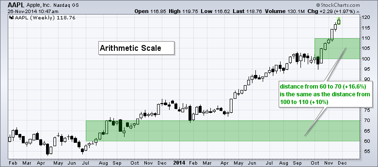
The difference between a logarithmic and arithmetic chart scale can be seen on the vertical axis, which is the y axis. An arithmetic scale shows equal spacing between the chart units. In the example below, horizontal lines are spaced every 5 Dollars and they are equally spaced from top to bottom. A ten Dollar change from 60 to 70 looks the same as a ten Dollar change from 100 to 110. A semi-logarithmic scale, on the other hand, is set up to measure price distances in percentage terms. This means a 10% advance from 60 to 66 looks the same as a 10% advance from 100 Read More
MailBag November 20, 2014 at 12:10 PM
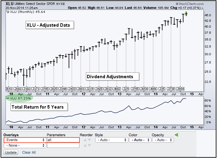
First, note that StockCharts users can chart adjusted data and unadjusted data. By default, stock and ETF symbols show adjusted data, which means the data have been adjusted for dividends, splits and other events. When a stock goes ex-dividend, the dividend amount is subtracted from the stock price. StockCharts adjusts the data by adding the dividend back into the stock price, which provides users with a picture of the total return (price change plus dividends). On a total return basis, the Utilities SPDR (XLU) is up some 87% over the last five years. Not bad for old boring utility Read More
MailBag November 14, 2014 at 05:49 AM
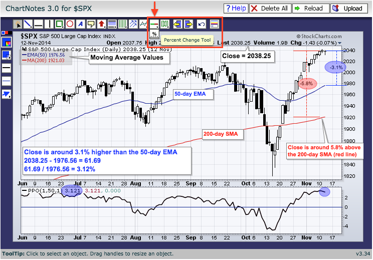
There are two ways to measure the distance between a price point and a moving average. First, chartists can simply use the "percentage change" tool when annotating a chart. This tool can be found right under the "auto support-resistance" tool. Note that you can hover over any icon with a small triangle in the right corner to reveal other icons. Select the percentage change tool, move to the moving average, click and drag the tool to the price point. The example below shows the percentage change tool extending from the 200-day simple moving average and the 50-day exponential moving Read More
MailBag November 07, 2014 at 05:41 AM
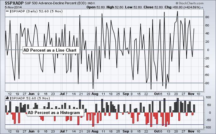
Daily breadth data often looks erratic because it flips from positive to negative on a regular basis. Chartists can turn this erratic data into a readable format using three different chart functions. This article will show how to chart breadth data as a histogram, an AD Line and an oscillator. The chart above shows just how erratic AD Percent for the S&P 500 looks as a simple line chart (main window). We can still spot the big moves that exceed +80% and -80%, but it is hard to determine what is happening in between these levels. The solution is to plot Read More