| |
|
|
|
|
| |
 |
ChartWatchers
the StockCharts.com Newsletter
|
|
|
|
|
|
|
|
THINGS OVERHEARD AT CHARTCON 2014
by Chip Anderson | ChartWatchers
Hello Fellow ChartWatchers!
First off, thanks again to everyone that attended ChartCon 2014 last weekend in Seattle. From my perspective the conference was a huge success with lots of great speakers, great presentations, great discussions, great food, and great weather. For those of you that weren't able to attend I have some good news - we were able to video tape this year's conference and we are in the process of reviewing and editing that footage right now. Our goal is to make it available either online or via DVD in the coming months. Stay tuned!
Things Overheard at ChartCon 2014
Here, in no particular order, are some of the many things I remember overhearing (or saying) at ChartCon 2014:
- "Hi, I'm Chip. Welcome to ChartCon!"
- "Next up is the presentation I've most been looking forward to - with the exception of all the other presentations at the conference."
- "Hey Chip, the conference so far has been wonderful!"
- "I've learned so much - it's like drinking from a firehose."
- "This hotel is much better than the last one."
- "I thought they said it always rains in Seattle."
- "I'd like to respectfully disagree with my good friend Martin."
- "Gatis, that was Mr. Fidelity on the phone. He has some hired goons outside who would like to have a word with you."
- "What do you mean the flash drive is hidden inside the lanyard?"
- "You just answered my question - 'What's the next step?' - when you told us about the new TSAA Certification Exam."
- "I think I'll sit on a stool out in the middle of the audience. Would that be OK?"
- "Chip already stole all of my thunder, but I'll show you RRG charts anyway."
- "Scanning for a three way crossover is easy! um.... hmmm.... hang on..."
- "Wow, why is Tom Bowley's talk so crowded?"
- "What's a super moon? Oh wow!"
- "I'm so glad we were able to squeeze you in for the SCU seminar."
- "Richard Arms has given us 100 free copies of his new book. They are in the bookstore area. Please do not kill each other scrambling for them."
- "Wow, that live demo actually worked!"
- "I'd like to respectfully disagree with my good friend John."
- "This side is definitely my new favorite side of the audience - except for everyone else."
- "Greg's talk on SCTRs was amazing. Definitely going to check them out."
- "Hello, this is Arthur Hill and you are tuned in to a live version of the Market Message coming to you from ChartCon 2014."
- "Kellie did everything - I'm just taking credit for her hard work."
- "Chip, I know that I'm supposed to start in 5 minutes, but could you please add just one more slide to my presentation?"
- "I'm amazed by all the new content you've added, especially the DecisionPoint reports - those look very interesting."
- "Hey Chip! When's the next ChartCon?"
Again, according to everyone I talked with, it was a very fun and very informative event. Thanks again to everyone that came!
- Chip
P.S. One of the attendees posted a more in-depth write up on many of the talks. Click here to read it.
SITE NEWS
RECENT ADDITIONS TO STOCKCHARTS.COM
- RRG Chart Links on the Homepage - Members now have a new set of links on the StockCharts homepage in the 6 "Top Ten" boxes. The links are labelled "RRG" and allow you to see RRG charts for whatever collection of 10 ticker symbols you are currently looking at!
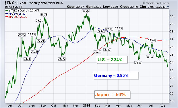
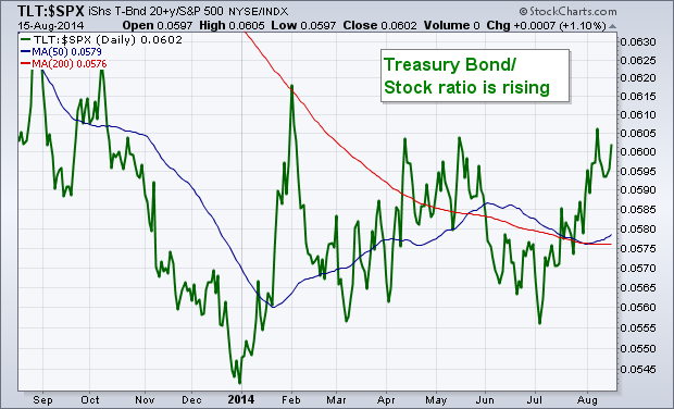
The yield on the 10-Year Treasury Note fell to 2.34% this week which is the lowest level in fourteen months. Heavy buying of Treasury bonds in an apparent flight to safety was a big reason for the yield plunge. A bigger reason may have signs of economic weakness overseas, mainly in Europe and Japan. Japan's economy had a very bad second quarter, which kept pressure on its central bank to keep monetary policy very loose. Japan's 10-Year yield is the lowest in the developed world at .50%. Bad economic news also came from Europe's three biggest economies. France GDP growth is stagnant, while Germany's contracted. Italy slipped back into a recession. Weak inflation news also increased pressure on the ECB to take more aggressive approach to monetary policy, which would include quantitative easing. Expectations of that pushed the eurozone bond yields to record lows. The German bond yield slipped below 1% for the first time in history. With eurozone yields plunging, that puts downward pressure on U.S. Treasury yields. Compared to Europe and Japan, U.S. Treasury yields are a relative bargain. It does seem strange to see global funds pouring into the safety of bonds at the same time that the stock market is trying to recover from its recent correction. Something doesn't seem right here. It's usually not a positive sign when Treasury prices are rising faster than stocks. The second chart shows a ratio of the T-Bond 20+year iShares (TLT) divided by the S&P 500 trading near a six month high. That doesn't seem like a vote of confidence in the market or the economy.
- John
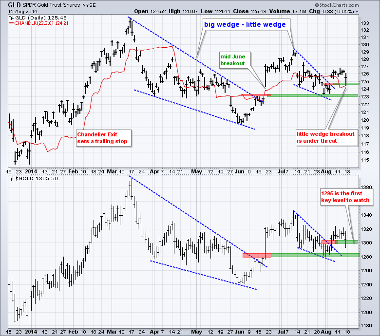
Gold broke out with a surge in early August, but stalled the last eight days and failed to follow through. Despite lack of follow through, the breakout is holding and has yet to be proven other wise. Let's see what it would take to prove this bullish signal wrong. The chart below shows the Gold SPDR (GLD) breaking out of the big wedge in mid June and holding this breakout with the bounce off 123 in early August. The ETF then broke out of the little wedge and the breakout line turns first support in the 124.5 area. At this point, I think a close below 124 would negate the little wedge breakout and increase the odds of a bigger break down at 123. The red line shows the Chandelier Exit, which acts as a trailing stop-loss. Using this indicator, traders going long on the mid June breakout and using this indicator to set a stop would have been stopped out in mid July. Traders going long on the early August breakout would still be in with a stop-loss just below 124.21, which is the Chandelier Exit value. You can read more about this indicator in our ChartSchool. And finally, ChartCon 2014 was outstanding and it was great to meet many of our members.
Good weekend and good trading!
Arthur Hill CMT
The SPDR Regional Bank Tracking ETF (KRE) is at a significant tradable decision point. So is the SPDR Bank ETF (KBE). While banks are not associated with the growth part of the market, they usually smell trouble before most of the other industry groups. On a chart, we consider the last bar of information the most important because its tradable. The rest is just history! Good history but it is the shoulda-woulda-coulda part of the chart. Digging in on the two SPDR Bank ETF's is timely this week because its a potential trade.
First the Regional Banking SPDR ETF (KRE) which is composed of 100% regional banks. Starting at the top, since the inception of QE in 2012 the SPURS line has been trending up. This recently changed with lower lows and highs. We can see that we are making new lows on that indicator. The RSI is still in bull mode by staying above 40. A breach of that level would be very concerning.
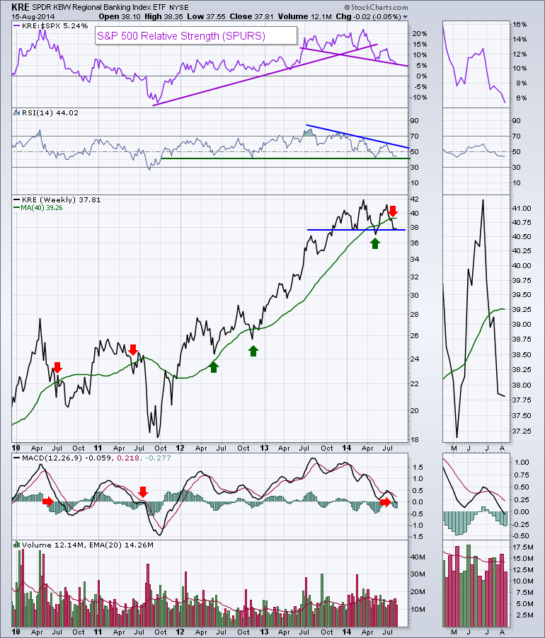
Moving onto the price chart, the 40 WMA has been support for over two years. We recently tested the 40 WMA in March, fell well below and bounced. We are now back below the 40 WMA indicated by the red arrows and have been for four weeks. We can see a significant topping structure building on the right hand side. Will it complete? I think the MACD might have the answer for us. While the breach of the 40 WMA had some whipsaws, when it was combined with a MACD below zero it was an important signal. All of the breaches were near the end of respective QE efforts by the Fed. As we can see on the zoom panel, the MACD black line moved into negative territory this week. That would appear to confirm the sell signal.
With a brief study on volume, we can see the average volume is declining. While the volume was below average this week, it is more concerning because it was also options expiration week. On the most recent high (the right shoulder of this topping pattern), in the zoom thumbnail you can see the last high had very low volume. The lack on interest then, the light volume on this OE week, multiple sell signals and a price sitting on a support line suggests a protective posture. That is for the regionals, lets look at the SPDR with the diversified Banks and other financial providers.
The Banking SPDR ETF (KBE) which is composed of 71% regional banks,29% other is shown below. The charts are very similar. The volume profile is different on the chart as this one pales in comparison in volume. The SPURS trend is making new lows, the RSI is still in bull mode and the topping pattern is almost identical. The volume on the zoom panel is very revealing. At the highs in June, it was also very weak. This weeks volume was slightly higher than the June volume but this was also options expiration. The low volume level for this week was last seen at the right shoulder high, and then its back to August 2012 other than Thanksgiving and Christmas weeks.
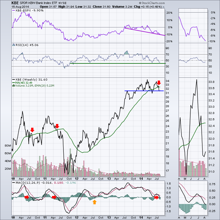
I think the most critical piece of information resides on the MACD in concert with the 40 WMA. Even the big diversified banks are not able to change the profile of this price and momentum action. Maybe this is the low point as the Hamptons empties out and Manhattan fills back up. But the trend seems the same on the regional banks as well so I don't think that will come into play here. The biggest change coming is the end of QE unless Janet Yellen's speech in Jackson Hole changes the trend on this chart.
How did this chart look at the 2007 top?
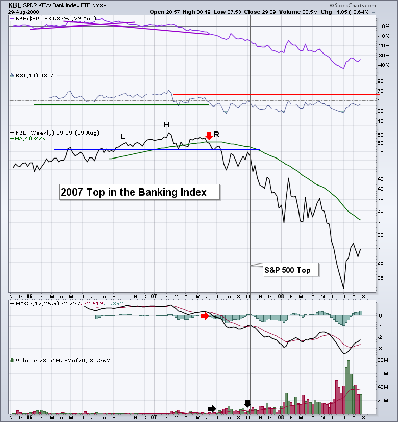
This ETF only started in late 2005. Things look 'photocopy' similar. While it looks like a 'riverside bank' at this point on Charts 1 and 2, there is nothing suggesting it can't be more cliffside either. The tops of 2010, 2011 and 2007 all have the same price action. So far I would suggest the MACD moving below zero with a price below the 40 WMA to be trouble. While the volume was increasing as the 'new' ETF in chart 3 became popular, it had an eerily quiet week after Options Expiration, September 2007. Three weeks later marked a market top. Close monitoring would appear to be in order. We'll figure out if its cliffside later!
Good trading,
Greg Schnell, CMT
After Erin's presentation at ChartCon 2014 many attendees responded positively to learning about the DP Daily Update, which is located in the DP Reports Blog (available to StockCharts EXTRA and above subscribers). The purpose of the DP Daily Update is to quickly review the day's action, internal condition, and Trend Model status of the broad market (S&P 500), the nine SPDR Sectors, the U.S. Dollar, Gold, Crude Oil, and Bonds. To ensure that using this daily reference will be quick and painless, we are as brief as possible, and often we let a chart speak for itself. While individuals might specialize in other areas of the market, we think that a continuous monitoring of the areas covered each day in the Update will provide a solid foundation and understanding of the broad market environment that will facilitate analysis in other areas.
A prominent feature of the Update is coverage of internal indicator sets for three time frames, giving us a measure of market condition (overbought or oversold) in each time frame. For this article I will focus on the intermediate-term indicators for price breadth and volume: the PMO (Price Momentum Oscillator), the ITBM (Intermediate-Term Breadth Momentum) indicator, and the ITVM (Intermediate-Term Volume Momentum) indicator. We note that all three have bottomed in the area that has proven to be an oversold level over the last two years. The ITBM and ITVM have crossed up through their EMAs, and the other two appear to be headed in that direction. This action coincides with the price index having bottomed on a prominent rising bottoms line, so the picture in this time frame is positive, and a fair amount of price appreciation can occur before the indicators are once again overbought. There is no guarantee that price will actually move higher, but conditions certainly favor that outcome; however, a review of the short-term and ultra-short-term charts may temper that outlook somewhat.
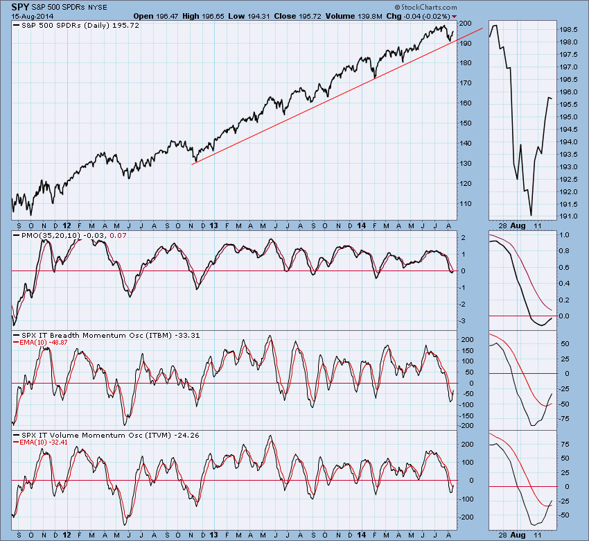
Summary: Many people have expressed interest in a daily report that will maintain a continuing focus on the broad market, sectors, and the common areas of interest of gold, oil, the dollar and bonds. The DP Daily Update fills this need for StockCharts EXTRA and higher subscribers. To view a free sample, click here.
- Carl
The NASDAQ has been powering forward off the mid-April lows and one big reason has been the semiconductor industry. The Philadelphia Semiconductor index ($SOX) rose 15% in just a seven week period from May 15th through July 3rd. From there, a severe long-term negative divergence printed and that suggested that the move to the upside - and the momentum - was slowing. In my opinion, these negative divergences are among the most significant technical indications of an impending top and, if nothing else, should suggest that risks are increasing on the long side. Check out the SOX chart as of July 7th:
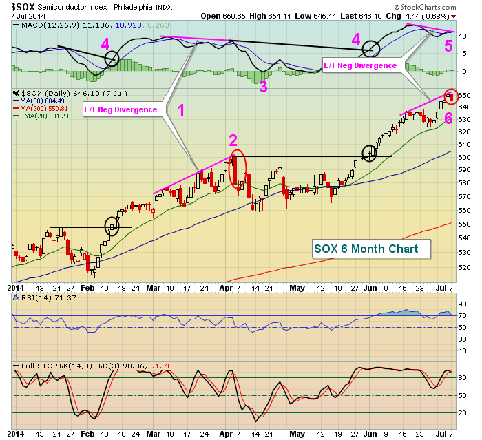
This was a picture of the SOX on July 7th and I've noted 6 different observations. Let's take a look at one at a time:
(1) In early April, we saw the price action on the SOX move higher, but with no confirmation from the MACD. In other words, our moving averages actually started to CONVERGE while prices kept moving higher. This is a long-term negative divergence and it can be quite bearish for a stock or index.
(2) Check out this bearish engulfing candle. Once I see a long-term negative divergence form, I look for confirmation of a potential top with a reversing candlestick. In this case, the bearish engulfing candlestick gave me that. The top of the reversing candle can then be used as a potential stop, defining the monetary risk on a trade (should you decide to short in this case).
(3) After the signs of slowing momentum surface, I look for what I refer to as a "MACD centerline reset" and/or a 50 day SMA test. This doesn't mean that the selling will stop once it gets there. Rather, I just look for a move down to these two levels to "reset" the issues caused by the slowing momentum. Many times a long-term negative divergence can become a long-term top, but there's no way of knowing this until we see how the market reacts after the long-term negative divergence prints.
(4) Notice in February and early June how a long-term negative divergence was technically present when each of these two breakouts occurred? But price action kept moving higher? How could that be? Long-term negative divergences are supposed to indicate slowing momentum, right? Well, a couple things here. First, just before these breakouts we saw MACD centerline tests. At that point, momentum issues have been "reset". In my opinion, it makes no sense to look back to where the MACD was on prior highs because momentum issues have already been resolved. It would have been a costly mistake to short semiconductors on these breakouts. Second, when a stock or index first breaks out to new highs, it's not unusual to see a long-term negative divergence form. But if the price keeps moving up for a few days, the MACD many times will also turn higher and eliminate the negative divergence. That's why I like to see confirmation via a reversing candlestick - especially one with high volume.
(5) This brings us to the long-term negative divergence that formed on the breakout July 1st. Note that the uptrend continued for a few more trading sessions until we saw a reversing candlestick (bearish engulfing). That combination - long-term negative divergence and reversing candlestick - can be lethal and should be respected by traders because of the INCREASED RISK - not because of any GUARANTEE that the price will head lower.
Now here's the rest of the story on the SOX since July 7th:
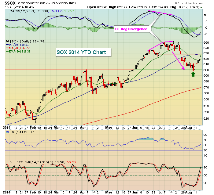
Once again, the long-term negative divergence proved to be pivotal in the subsequent action. While the MACD has moved beneath centerline support, indicative of bearish momentum, it is VERY important to note that the SOX has held price support near 600 (green arrow). If that level is violated, then one of the leading industry groups of 2014 will be on a major sell signal and that would not be good for the continuing bull market.
One day at a time.
ChartCon 2014 was a blast. I enjoyed meeting many of you who were able to take the time to join StockCharts in Seattle last weekend. Great weather, great food, great speakers and a great conference were enjoyed by all. I provided a "thank you" to all those that attended with a FREE 8 part series on Understanding the MACD, which I believe is essential to trading and to gauging momentum. I'd like to extend that offer to all ChartWatchers subscribers and readers. Simply CLICK HERE to claim your FREE video series.
Happy trading!
Tom Bowley
Chief Market Strategist
Invested Central
 It was wonderful to see so many familiar faces this past weekend at the ChartCon 2014 Conference. I know I walked away a more energized trader with a handful of new tactical options and strategies and a number of tradeable ideas I'm presently working through. Listed below are some of my favorite takeaways from the conference. They are by no means a greatest hits list of the... Read More
|
|
|
Recent StockCharts Articles You Might Have Missed
|
- Market Message - UKRAINE TENSION ON FRIDAY STALLS MARKET RALLY -- NASDAQ IS ONLY INDEX TO CLEAR 50-DAY AVERAGE August 16, 2014
- DecisionPoint - DP Daily Update: Drifting Above Resistance - August 14, 2014 August 15, 2014
- Don't Ignore This Chart! - Time To Nibble On Today's Breakout In Corn? August 15, 2014
- Market Message Videos - SPY Support, TLT and PPI, GLD, URA, CCJ, AD Line, AD Volume Line, Net New High, Economic Indicator Table August 15, 2014
- MailBag - What Indicator Can I use to Set a Trailing Stop-loss? (w/video) August 15, 2014
- Art's Charts - XLE Holds its Break Down - GLD Stalls at Resistance August 15, 2014
- Top Advisors Corner - David England: Market Tops II August 14, 2014
- Martin Pring's Market Roundup - Oversold Condition Should generate a Short-term US Equity Rally as Part of an Overall Topping Process August 13, 2014
|
|
|
Are you new to StockCharts.com?
|
|
Here are some activities that will help you learn more about our website:
Do you know someone else that would appreciate this newsletter? Please feel free to forward this to other people interested in stock charting. Thanks!
|
|
|
|
|
|
|
|
|
|
|
|
|
| |
|


 It was wonderful to see so many familiar faces this past weekend at the ChartCon 2014 Conference. I know I walked away a more energized trader with a handful of new tactical options and strategies and a number of tradeable ideas I'm presently working through. Listed below are some of my favorite takeaways from the conference. They are by no means a greatest hits list of the...