Hello Fellow ChartWatchers!
It was a fairly positive week for the markets last week following a big down move during the week before. For the month of July, the Nasdaq was the big winner rising 2.3% and the Russell 2000 was the loser falling 1.4%.
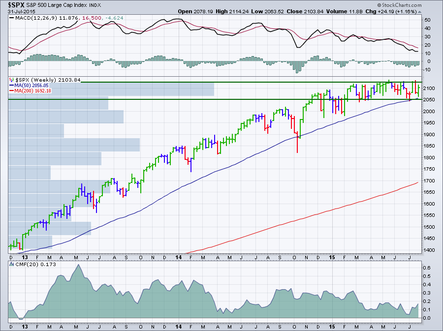
(Click the chart for a live version)
As you can see on the weekly chart above, after a long run up, the S&P 500 is now moving sideways in a range between 2050 and 2125 (green lines). The horizontal "Volume by Price" historgram bars show us that volume has now been concentrated within that range as well. Because the index is unable to move higher, it is losing momentum as shown by the falling MACD and Chaikin Money Flow (CMF) lines. Finally, the long-term moving averages are slowly closing in - the index has bounced off of its 50-week moving average twice now. Clearly, the gauntlet has been thrown down and the battleground is defined - a close above 2125 will be a major victory for the bulls; a close below 2050 will be a huge setback.
Acting on Impulse with Elder Impulse Bars
You may also notice on the chart above that they bars are colored either red, green or blue - what's up with that? Those colored bars are called "Elder Impulse Bars." They were designed by Dr. Alexander Elder. He talks about them extensively in his books. The simple explanation is "Green is good, red is bad and blue is neutral" but please read on for a more detailed explanation.
Technicians are very interested in two properties of a price chart - the stock's trend and its momentum. It is important to understand these two concepts in general. They also are key components in the Elder Impulse system, so let's take a moment and review them closely.
Trend is simple to describe and hard to quantify. Trend is the general direction a stock is moving in. Is it going up? Is it going down? And (most importantly) when does a stock's trend change direction?
Because stock prices often bounce around a lot from one price bar to the next, most technicians use various moving averages to help them determine a stock's trend and that can cause some problems. Which type of moving average should you use? How many periods should be used to come up with the average? The answer to those questions is always "It depends..." The key issue is that when you use a moving average, you introduce lag into your analysis. Your ability to detect changes in trend will be delayed somewhat which can be frustrating. Unfortunately, lag is unavoidable.
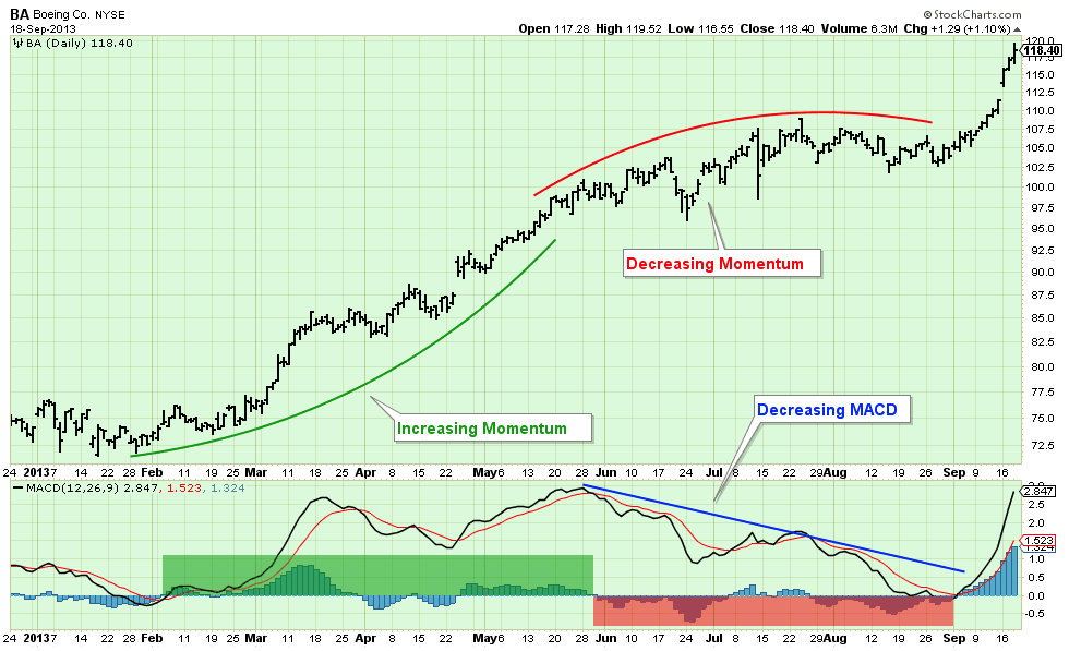
To help deal with lag, technicians turn to the concept of momentum. Momentum is the rate at which a stock is moving higher or lower. Is it moving upwards (or or downwards) quickly or slowly? And (most importantly) is it moving more or less quickly than it was yesterday? Momentum is important because before a stock can change direction, it needs to lose all of its momentum. Therefore, decreasing momentum is a leading indicator for a trend change(!).
Technicians have several indicators that can measure momentum. One of the most popular is the MACD. You can read all about how the MACD works in our ChartSchool, but the important thing to remember is that if the black MACD line is rising, the stock has positive momentum and prices are rising faster than they were before. The MACD Histogram shows the rate at which momentum (i.e. the MACD Line) is changing. The chart below shows the relationship between MACD, the MACD Histogram and momentum:
Knowing that trend and momentum are very important, Dr. Elder did some research and came up with the following simple system for determining a stock's current status:
- Trend = the Slope of the 13-period EMA
- Momentum = the Slope of the MACD Histogram
- If Trend and Momentum are both UP, color the bar GREEN
- If Trend and Momentum are both DOWN, color the bar RED
- If Trend and Momentum disagree, color the bar BLUE.
And that is what the green, red and blue bars mean on a Elder Impulse System chart. You can use it as a strict trading system or, as I do, an additional (but optional) visualization of a stock's current situation. If you do use it for trading, be sure to consider the following:
"The Impulse System encourages you to enter cautiously but exit fast. This is the professional approach to trading, the total opposite of the amateur's style. Beginners jump into trades without thinking too much and take forever to get out, hoping and waiting for the market to turn their way." - Dr. Alexander Elder
Again, you can read much more about the Impulse System in Dr. Elder's books.
You can add Elder Impulse Bars to your own charts by selecting "Elder Impulse System" from the bottom of the "Type" dropdown on the SharpCharts workbench page. That dropdown is located in the "Chart Attributes" area below the chart. Or just click here for another example. (Or just select the "Elder's Weekly" style from the ChartStyles dropdown below the chart.)
Hopefully, you will find the Elder Impulse System as useful as I have.
- Chip
SITE NEWS
RECENT ADDITIONS TO STOCKCHARTS.COM
- New Update to Gatis Roze's "Tensile Trading" ChartPack - If you have previously purchased Gatis' ChartPack and want to get the latest update, please read his latest blog post for instructions. If you don't have his ChartPack, click here to learn more about it.
- Free Offer from Dr. Tushar Chande, inventor of StochRSI - Visit ETFMeter.com to learn more about Dr. Chande's latest project. Currently, you can register for free using the button in the "Contact" tab on his website.
- Our Webinars Continue to get Rave Reviews - Have you had a chance to attend any yet? You can find the schedule and registration links in the "What's New" area of our homepage.
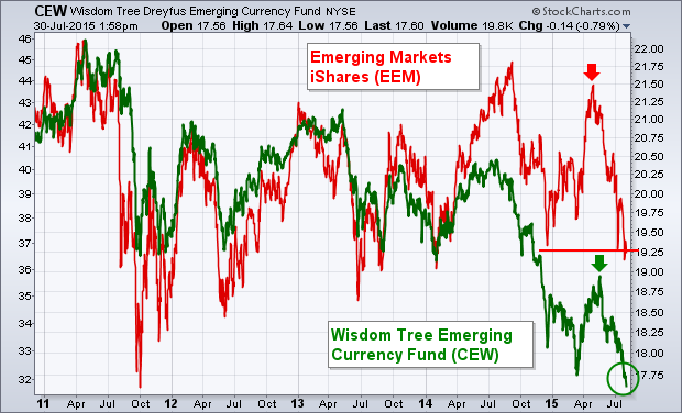
Emerging market assets are suffering from the dual threat of rising U.S. interest rates and a stronger dollar. The most direct result is seen in EM currencies. The green line in Chart 9 shows the Wisdom Tree Emerging Currency Fund (CEW) falling to the lowest level in five years. [The CEW includes a basket of emerging currencies]. That's a side effect of a rising dollar and weakening commodity prices (especially in Brazil and Russia). That's important because weaker EM currencies usually coincide with weaker EM stocks. The red line in Chart 1 shows a correlation between Emerging Markets iShares (EEM) and the CEW (green line). The EEM itself is in danger of falling to the lowest level in two years. That may increase risk for global stocks in general. China also has a lot to do with EEM weakness.
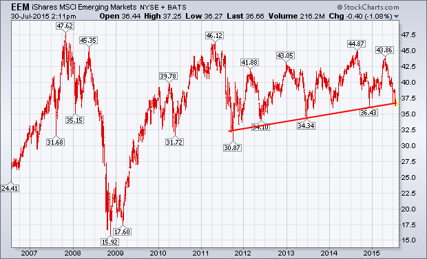
EMERGING MARKET ISHARES THREATEN SUPPORT... The weekly bars in Chart 2 show Emerging Markets iShares (EEM) in the bottom half of a trading range that started in 2011. The EEM is in danger of falling below last year's late intra-day low at 36.43 and a rising trendline extending back to 2011. That would be the first serious violation of chart support in four years. Plunging commodity prices are a big problem for EM countries that depend on commodity exports (which is made worse by a rising dollar). Rising Treasury yields also reduce the appeal of higher yielding (and riskier) EM assets. Emerging markets have underperformed developed markets for four years. That hasn't presented a major problem as long as the EEM has remained in a sideways trading range. Developed markets might not react as well to a breakdown in emerging market stocks.
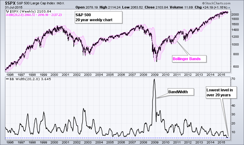
The S&P 500 is locked in a 100 point trading range (2040-2140) since March because of a serious split in sector performance. At less than 5% this is the narrowest range in several years. Note that Bollinger Bandwidth on the weekly chart reached a 20+ year low in July. This means the Bollinger Bands are at their narrowest in over 20 years. How's that for a contraction. John Bollinger theorized that a volatility expansion often follows a volatility contraction. Chartists, therefore, should prepare for significant move in the coming weeks or months. I'll highlight the key levels to watch after the jump.
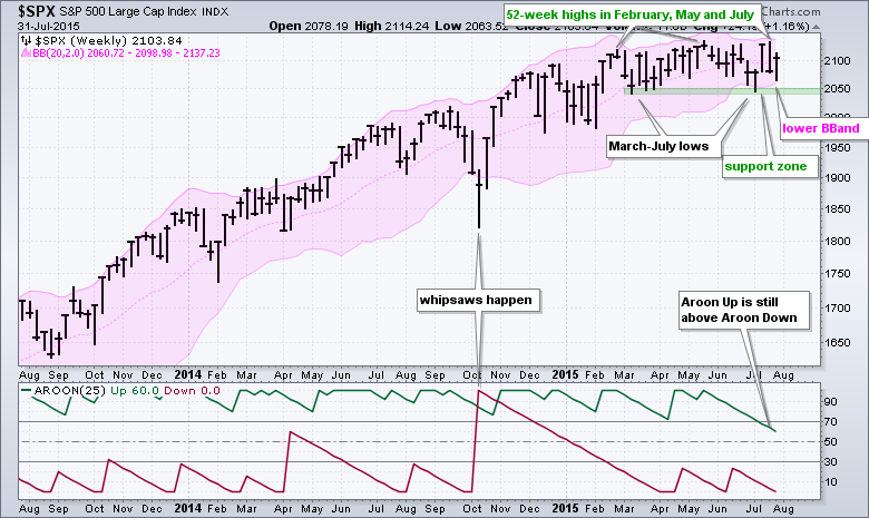
The upper and lower bands mark the first levels to watch for a directional clue. With the index hitting 52-week highs in February, May and July, the overall trend is up and this favors further upside. I would use the lower Bollinger Band and March-July lows to mark key support in the 2040-2060 area. A weekly close below 2040 would show enough selling pressure to forge a support break and suggest a trend change. Chartists can also watch the Aroon oscillators for a bearish cross to signal a trend reversal. Looking for more? Follow me on twitter (@arthurhill) or check out the recording of my webinar from Tuesday.
Thanks for tuning in and have a great weekend!
Arthur Hill CMT
WILL RETAIL RUN UP INTO CHRISTMAS
by Greg Schnell | The Canadian Technician
This time of year is on my calendar to start hunting the best in retail for Christmas. Everyone following momentum has seen the Consumer Cyclicals ETF (XLY) continue to be a top performer. I like to migrate my attention into retail like footwear, teen apparel, toys to see who the strong ones are. Amazon (AMZN) dominates the broaden retailers with three stellar quarters of outperformance. None of the other Broadline Retailers have jumped up to compete in the Revenue Run to Christmas. But there are some interesting companies running in the other industry groups already. For the most part, I've highlighted the companies that have SCTR rankings around 70 and above. You can click on the screen shots to see the live versions all the way to Christmas.
Skechers (SKX) is one of the best stocks in the entire market. Nike (NKE) is a great marketer whereas Crocs (CROX) has managed to become a real stock again after imploding as a fad from years gone by. The long term chart for CROX says this level is important. The SCTR shows that it might have enough strength to push through.

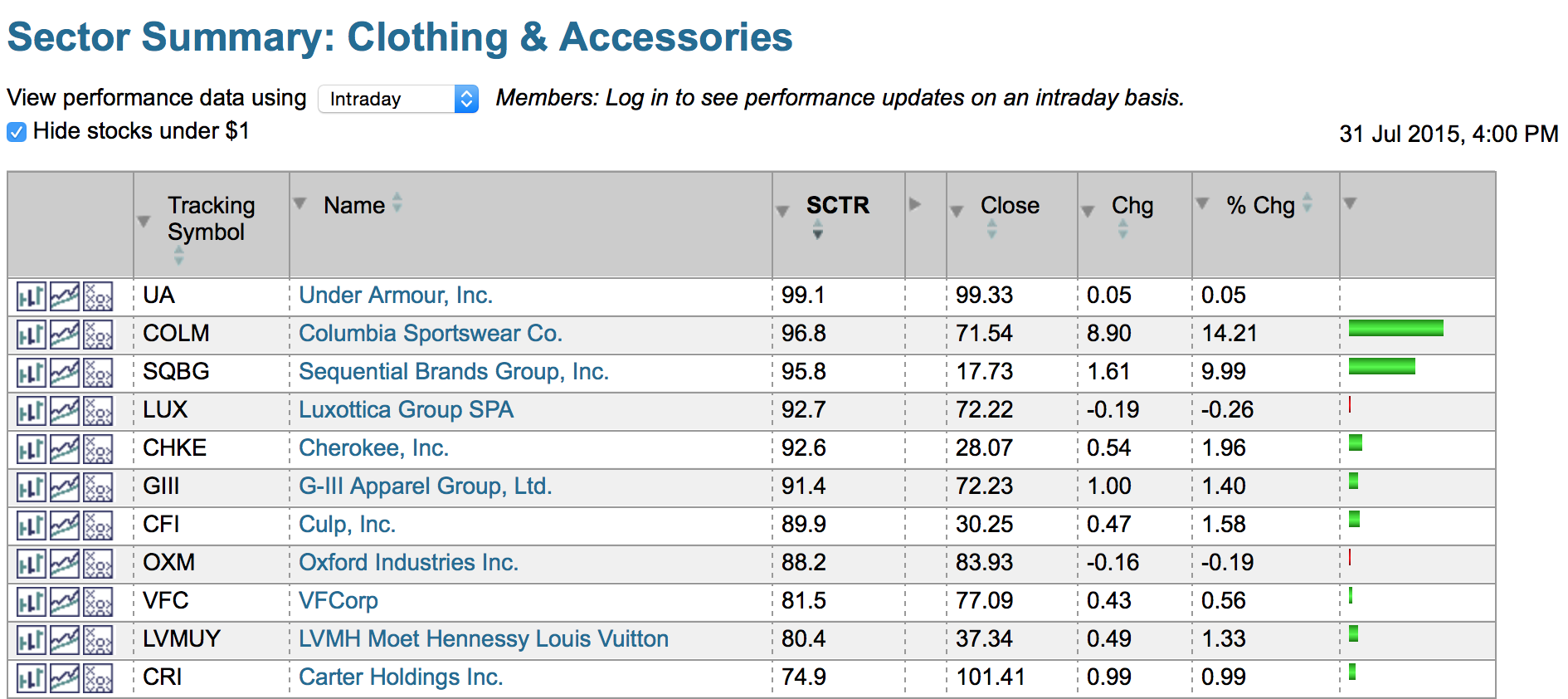
With Jordan Spieth winning a few majors this year, Under Armour (UA) has been in the spotlight. According to the SCTR ranking, its paying off.
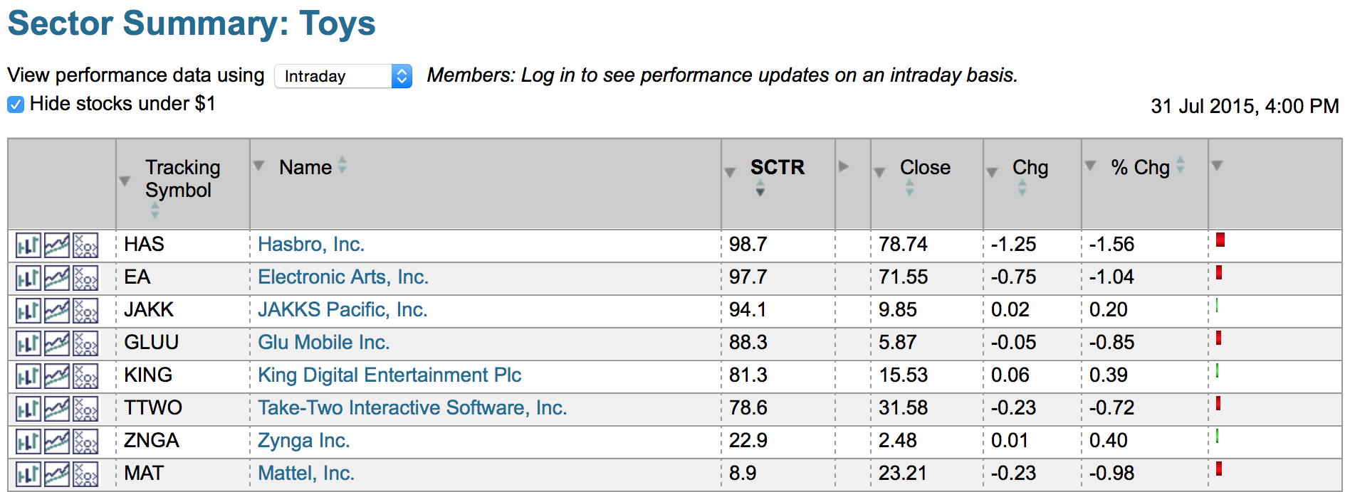
I highlighted all the way down to Mattel (MAT). With an SCTR ranking of 8.9 I won't expect much from Barbie this year unless they have some dramatic launches this fall. But the Electronic Arts (EA) chart is stunningly good.
Caleres (CAL) is the former Brown Shoes. Foot Locker (FL) tracks NKE. Boot Barn (BOOT) is a successful rising IPO. Express (EXPR) and American Eagle (AEO) are making 52 week highs.
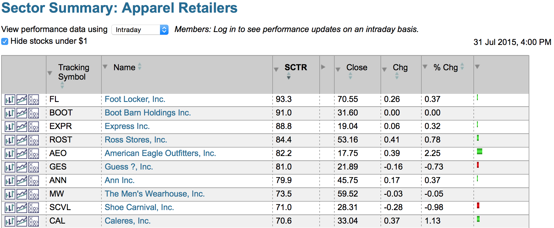
Lastly is the mixed bag called Specialty Retailers. Sportsman's (SPWH) and GameStop (GME) look stronger than Tiffany's (TIF) and Blue Nile (NILE).
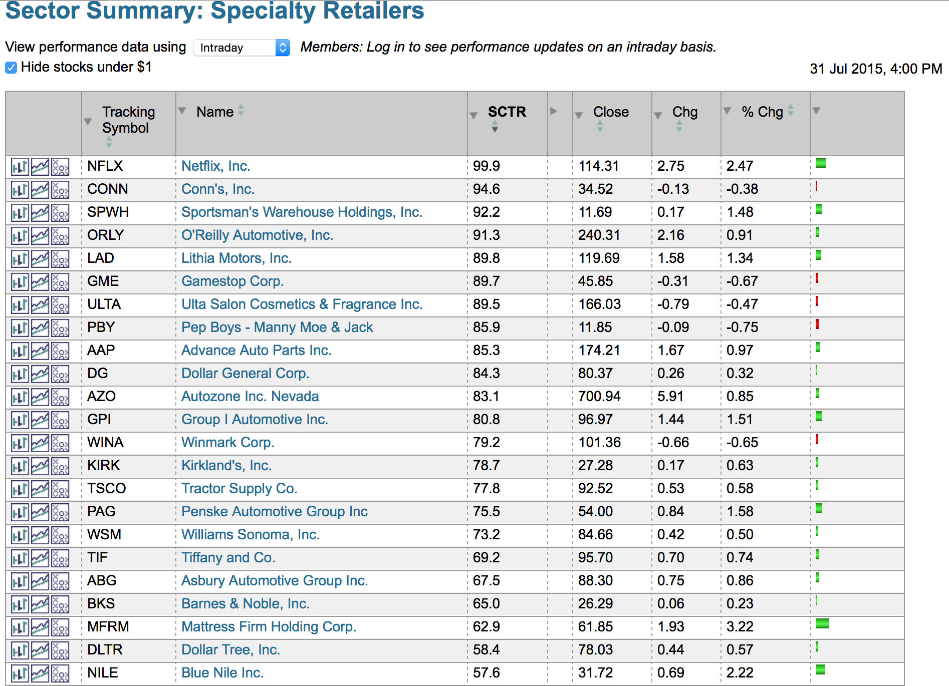
In a market where the numbers of stocks making new highs compared to new lows keeps dropping, only the best will do. This list might help set up a successful 3rd and 4th Quarter. Using the SCTR can help focus on the best.
Good trading,
Greg Schnell, CMT
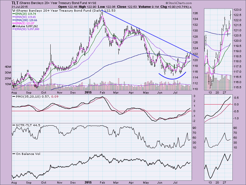
With the new Intermediate-Term Trend Model (ITTM) BUY signal on TLT and the break out for second time above the March low, I decided it was definitely time to abort the bearish Adam and Eve double-top pattern that I have been watching in earnest. Instead, I'm now seeing a rounded bottom; also known as a saucer bottom, it is a reversal chart pattern representing a long period of consolidation that turns from a bearish bias to a bullish bias (ChartSchool article on Rounded Bottoms located here). The Price Momentum Oscillator (PMO) has also been making a case to move bullish on TLT, it has continued to rise and is now in positive territory. The SCTR value is rising again and the On Balance Volume (OBV) shows that volume is behind this move (thumbnail shows that best). The recent Long-Term Trend Model (LTTM) SELL signal suggested the double-top would execute, but now it appears that signal is in jeopardy as the 50-EMA reaches out to crossover the 200-EMA.
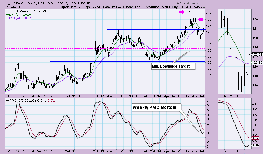
You can see the major double-top formation on the weekly chart, but we can also see that price has broken above the neckline which technically nullifies the pattern. The 17-EMA had a positive crossover the 43-EMA this week. The PMO bottomed which is always bullish. Had the double-top pattern fully executed, the minimum downside target was around $107.50. That could hold up as an area of support should price reverse, but at this point, I'm not looking for a serious decline. Price has only just popped above resistance, so a major decline could reintroduce the double-top pattern, but I believe the rounded bottom is going to override that possibility.
The monthly PMO on the 30-Year Bond was ready to top in shorter-term overbought territory, but instead it turned up. It hasn't reached overbought extremes, so it could certainly back a longer rally.
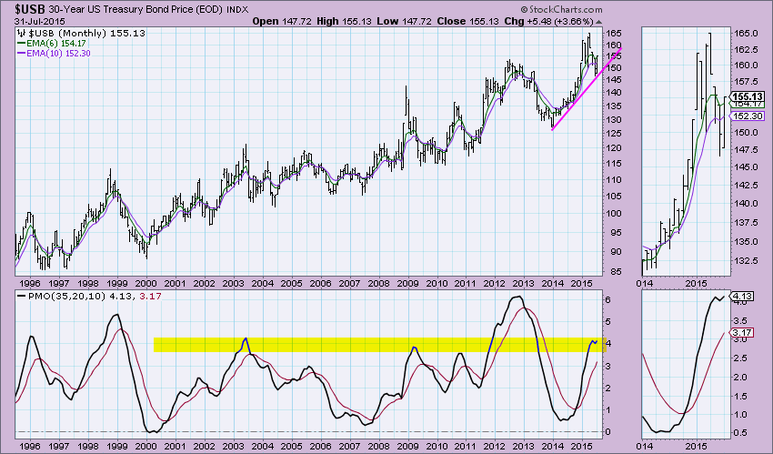
Conclusion: While the Adam and Eve double-top is still visible, the new rounded bottom pattern and the upside break above the neckline supersedes the bearish implications. A bearish outcome is possible as price has just barely closed above the old double-top neckline, but indicators and EMAs suggest otherwise.
Technical Analysis is a windsock, not a crystal ball.
Happy Charting!
- Erin
I don't think so. I'm always a bit leery of August and September because of the historical tendency for the stock market to struggle during the late summer season. Throughout the current 6+ year bull market, the Aug-Sept period has racked up gains four out of six times. But since the turn of the century, we've seen four separate 8%+ selloffs in this late summer bearish period, with the most recent being 2011. So are we setting up for another late summer swoon? Well, one of the key ingredients in any bull market is leadership from aggressive areas of the market. Last year, selling began to grip the market in September with the bottom printing in October. One of the problems last September was that the S&P 500 was making fresh new highs without leadership from three of the four aggressive sectors. On a relative (to the benchmark S&P 500) basis, only technology remained a big part of the leadership on that September high. The others - financials, consumer discretionary and industrials - were all losing ground on a relative basis. Check it out:
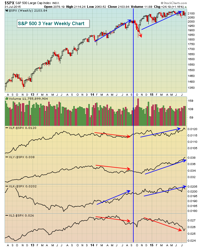
Those three red arrows at the bottom of the chart reflect relative weakness throughout much of 2014 from financials (XLF), consumer discretionary (XLY) and industrials (XLI). Technology (XLK) enjoyed a ton of relative success (blue arrow), but it wasn't enough to keep the S&P 500 from dropping close to 10%. If you again refer to the above chart, you'll see that 2015 has been different as money continues to flow into all of the aggressive sectors on a relative basis, with the lone exception being industrials. There's even a bit of good news there because industrials printed a reversing candle on its weekly chart off of its recent downtrend. Here's the weekly chart on industrials (XLI):
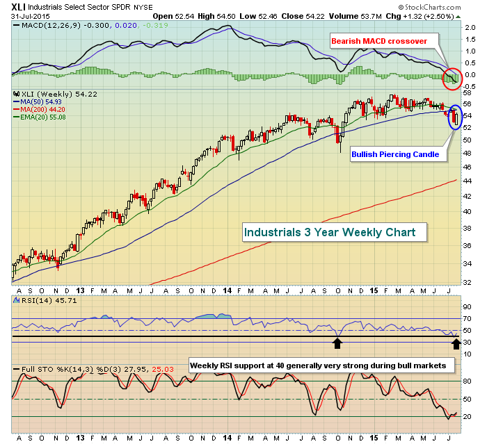
While the reversing piercing candle is a nice short-term bullish signal on the XLI, the MACD crossing below its centerline is not. The bulls will need to recapture both the 20 and 50 week moving averages to encourage additional buying. But if the industrials could begin to see renewed buying, it would make it very difficult for the bears to regain control of the overall action in the market.
So while historical tendencies make me a little nervous, the underlying action continues to suggest the bull market rages on.
Happy trading!
Tom
We are deep into earnings season at this point. There have been enough companies reporting so far to make an assessment of what the market thinks of the overall earnings picture as July comes to an end. You can read all kinds of articles and opinions of analysts as to what the market thinks but from my perspective it all comes down to what the charts are telling me.
Take a look at the chart on the S&P below. I like to look at the S&P because it represents a good sampling of companies in different sectors. Also, according to Zachs, as of July 29, 263 of the 500 companies in the S&P have reported their numbers, so a nice sampling to gauge from. What the chart is telling me is that from the "official" start of earnings season on July 8 when Alcoa reported its numbers, the S&P has risen almost 2.8%. So on the surface, one could argue that investors have been satisfied with overall earnings. On the other hand, you can see that the S&P remains almost 1.5% below its May 20 all time high of 2134. So as usual, the truth lies somewhere in between; it's not been a great reaction to earnings but it hasn't been horrid either.
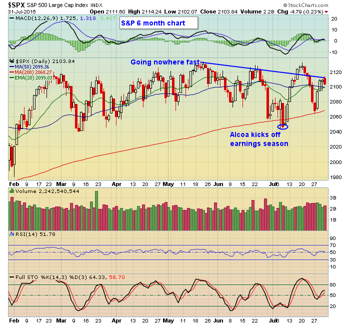
Zachs also shows that of the 263 companies in the S&P already reporting for the quarter, over 72% beat EPS estimates. That's potentially good news for traders since there are a lot of potential high reward to risk trading candidates, especially those that also show strong charts. In fact, I plan on conducting a FREE webinar next week that examines companies that beat earnings expectations plus have strong charts, a powerful combination. I will be joined in my webinar by Tom Bowley, Senior Technical Analyst at StockCharts.com, who will be sharing his observations on some of the charts that will be presented during the session. If you would like to register for this FREE event, just click here for more details.
At your service,
John Hopkins
President
Invested Central/EarningsBeats.com

Once a quarter, I update my Tensile Trading ChartPack. With such a large number of users now it was easy to poll some of these investors to ask how and why they use the ChartPack. Their reasons were enlightening, so I'm summarizing a few of their comments in this week's blog.
Simplifies the Markets: The ChartPack captures the massiveness of the whole market
Read More


 Once a quarter, I update my Tensile Trading ChartPack. With such a large number of users now it was easy to poll some of these investors to ask how and why they use the ChartPack. Their reasons were enlightening, so I'm summarizing a few of their comments in this week's blog. Simplifies the Markets: The ChartPack captures the massiveness of the whole market