 Hello Fellow ChartWatchers!
Well, it's that time of year again - time to save a bunch of money on your StockCharts membership! As long-time members know, we usually run our Holiday special during the month of December and that is usually a great time to take advantage of the end-of-year deals at StockCharts. This year is no exception. We have some great deals going on right now and I want to make sure that you are fully aware of what they are and how to take maximum advantage of them.
For those of you that are new, here's my famous (infamous?) "Decision Tree" for helping you decide exactly how to take full advantage of us:
Question #1: Are you already a StockCharts.com member?
If not, skip down to the "Not a member" section below.
Question #2: Does your current subscription expire within the next 8 months?
(If you aren't sure, log in to your StockCharts account and click on the "Your Account" link in the upper right corner of the page. Your account expiration date will appear near the top of the page.)
If your expiration date is after July 1st, 2016, you probably should skip this special and wait for our spring/summer special in 2016.
Question #3: Have you enjoyed having access to your saved charts, custom scanning, real-time data, technical alerts and premium market commentary from John Murphy, Martin Pring, Arthur Hill and the DecisionPoint team?
If so, then now is definitely the time for you to extend your account! Even if your account doesn't expire until after the end of December, you should renew now in order to "lock in" our special pricing. We'll simply add whatever additional time you purchase to the end of your current subscription. If you wait until the final day of your current subscription, you might miss out on these special prices. Here are the specifics of our current special:
- Extend your membership for 6 months and we'll give you a 7th month for free! (normally, you won't get any additional months.)
- Extend your membership for 12 months and we'll give you two additional months for free! (normally, you'd only get one additional month.)
- Extend your membership for 24 months and we'll give you four additional months for free! (normally, you'd only get two additional months.)
So, extending your membership right now could save you as much as $100 (i.e. 2 months of PRO service). Merry Christmas!
Now, if for some reason you aren't enjoying your current membership, please ask our support team for help. They are experts at helping members get the most from their subscriptions. Maybe there's a tip or trick they can share with you that will get things back on track and allow you to also take advantage of these special deals.
Not a member yet?
If you aren't a member of StockCharts yet - but you are thinking about it - now is the most cost-effective time to join! There is one important thing to remember however: When you join StockCharts.com for the first time, we give you 10 free days to try out our system. During that 10-day trial period, you have full access to all of our features and capabilities. At any time during those 10 days, you can cancel your account without any cost to you. There's even a big "Cancel my account immediately" button that you can press if you don't like what you see. However, if you signup for one of our multi-month holiday special offers, please remember that after that 10th day your credit card will be charged and we won't be able to refund that money.
Also, keep in mind that during the 10-day free trial period, you can freely upgrade and downgrade your account in order to find the right service level (Basic, Extra, ExtraRT or PRO) that works for you. After the 10th day, we will charge your card based on whichever service level your account is in at that time. Remember that after the 10th day, you'll have to pay in order to upgrade.
On last thing for current members to remember: our holiday special pricing only applies to extension orders. Unfortunately, we are not able to give discounts for upgrade orders. If you want to change your service level, you should do that before extending your account using our holiday specials.
Phew! Hopefully, that helps you decide how to best take advantage of us this holiday season. Thanks for being great customers - we really appreciate your business!
- Chip
P.S. Be sure to check out the holiday deals in our online bookstore as well!
FRIDAY JUMP KEEPS STOCKS IN UPTREND
by John Murphy | The Market Message
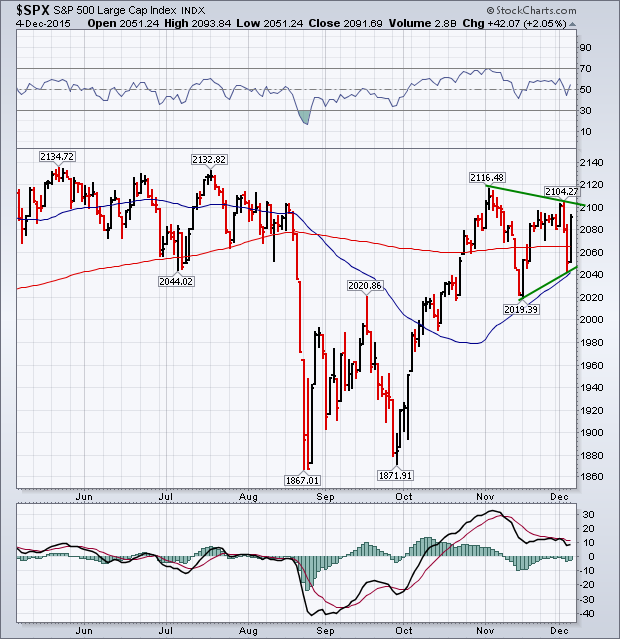
A strong rally on Friday more than erased losses from Thursday and left the market in much better shape. The chart below shows the S&P 500 ending the week back above its 200-day average after bouncing off its 50-day line on Thursday. Chartwatchers will now recognize the pattern of the last month as a "pennant" or "symmetrical triangle" which is defined by two converging trendlines. That's usually a continuation pattern and increases the odds for an upside breakout. That would fit with the seasonal tendency for stocks to end the year on a high note. The 14-day RSI line (above chart) ended above its 50 line. Daily MACD lines (below chart) look poised to turn positive. The main reason being given for Friday's surge was the strong jobs report and increased expectation for higher rates. That, combined with a big jump in bond yields on Thursday, may explain why financials ended the week on such a strong note. The plunge in the dollar on Thursday may also account for the big jump in gold and gold stocks. A drop in crude oil below $40 pushed energy shares lower. Airlines, however, got a boost from falling fuel costs. Technology was the week's strongest sector, led higher by semiconductors. Apple helped lead a Friday rally in that sector.
- John
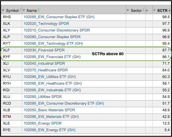
The finance sector is one of the stronger sectors right now and this is positive for the overall market. As the table below shows, the Finance SPDR (XLF) has the fourth highest StockCharts Technical Rank (SCTR) of the nine sector SPDRs and the EW Finance ETF (RYF) has the third highest SCTR of the nine equal-weight sectors. Also note that the SCTRs for both are above 85 and this means both are in the eighty-fifth percentile for performance (top 15% of our ETF universe). The finance sector is important because it accounts for around 16.5% of the S&P 500, 18% of the equal-weight S&P 500 and a whopping 25.5% of the Russell 2000. I will look at the charts for XLF and RYF after the jump. Note that the EW Finance ETF (RYF) and Regional Bank SPDR (KRE) were featured in Tuesday's webinar - click here to view - no subscription required!
On the price chart, the EW Finance ETF (RYF) broke out in October and surged over 10% from low to high. The ETF was overbought after this surge and needed some time to digest these gains (consolidate). An ascending triangle is taking shape now and a break above the recent highs would signal a continuation higher. Such a move would bode well for finance-related industry groups like big banks, regional banks, brokers and insurers.
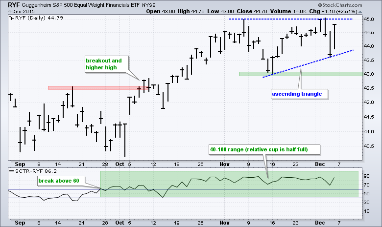
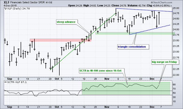
The indicator window shows the SCTR with lines at 40 and 60. A move above 60 shows relative strength and this remains the case until a move below 40. Using these levels, I basically divide the SCTR values into two groups: the 0 to 60 range means the relative performance cup is half empty and the 40 to 100 range means the relative performance cup is half full. The SCTR for RYF moved above 60 in late September, held this level in mid October and has been above 65 since October 22nd. The second chart shows the Finance SPDR (XLF) with a breakout, surge and triangle, which is a bullish continuation pattern. A break above the early December high would signal a continuation higher. Note that the EW Finance ETF (RYF) and Regional Bank SPDR (KRE) were featured in Tuesday's webinar - click here to view - no subscription required!
****************************************
Thanks for tuning in and have a good weekend!
--Arthur Hill CMT
Plan your Trade and Trade your Plan
*****************************************
WHEN MARKETS HAVE WIDER AND WIDER SWINGS
by Greg Schnell | The Canadian Technician
Wow, this market has been one for the Almanac. This week I read a commentary from a top technician saying the bull market is still intact. It was only 4 months ago that Dow Theory triggered a sell signal. Since October, the $SPX has been making higher highs and higher lows but continues to struggle at this level. Looking at the chart below, most people would have trouble calling this a bull market. It has been up a maximum of 2.84% from the one-year ago reference point and down 9.86%. The zero line just shows where prices were 1-year ago, but this is a pretty good support resistance line as well. We could all tune it more finely, but the bulls would use the July low in green and the bears would use the May-June lows in red. The highs marked by the price label software still labels a series of lower highs on the macro picture. 2.84%, 2.72%,1.83%, 1.48%. We are currently trying to break back above those levels.
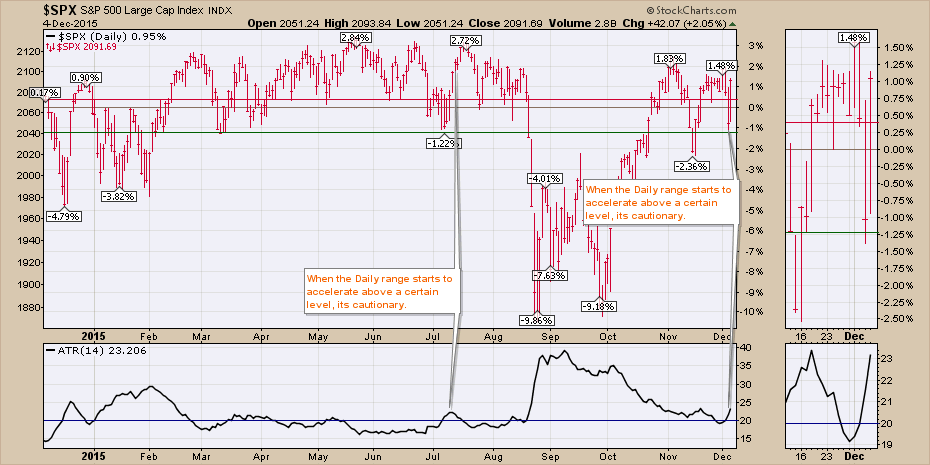
One of the other concerns has to be the escalating range of each day. The ATR indicator in the bottom box adds up the range of the intraday swing for each of the (14) days and divides by 14 to calculate the Average True Range (ATR). Considering the price has been about the same all year, look at what happens when the average range moves above 20. When the $SPX is swinging more than 20 points a day, that usually marks instability. The market has trouble making further gains. It doesn't mark the tops to the day, but it does suggest a lack of stability that soon leads to a pullback. You may notice that some of the best rallies have declining or flat ATR readings. The wide-ranging days give me cause for concern. Recently on Chart 1, the last 6 bars have bars longer than the previous day.
It is not uncommon to revisit the old highs before actually breaking down. In 2000, the official highs were in March and a retest in September. There was only one candle in March that exceeded the high in September 2000.
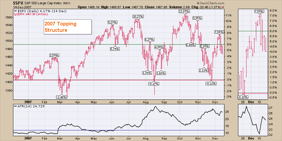
In 2007, the July highs were taken out in October for about a week, with a massive one day candle that shot well above the highs, below the lows of the previous 3 days, and ended well off the lows. That marked a change in trend in the ATR. 2007 was really trending on the ATR. Down trending ATR - bullish, up trending ATR - bearish. Notice on the zoom box, how the length of the bars (intra-day range) was very tall (about 2% -4%) in December as the market tried to get through the resistance.
My last chart shows the Bullish Percent Index ($BPSPX) as a wavy blue line, representing the percentage of stocks on a buy signal using PnF charts. The area chart in the background represents the actual $SPX. In the lower panel is the percentage of stocks above the long term 200 Daily MA ($SPXA200R). The lime green lines are the current readings so you can look back and compare to historical levels. We can see the Bullish Percent levels continue to get weaker on every rally and so far the last rally made a lower high (72%) once again. In 2007, this was the same level (70%) that the final high was made at. You will also notice similar levels in 2006. The main difference is that we did not have plunging lows preceding those $BPSPX tops in 2006 like we do now in 2014 and 2015. In my opinion, the plunging lows represent instability in the market.
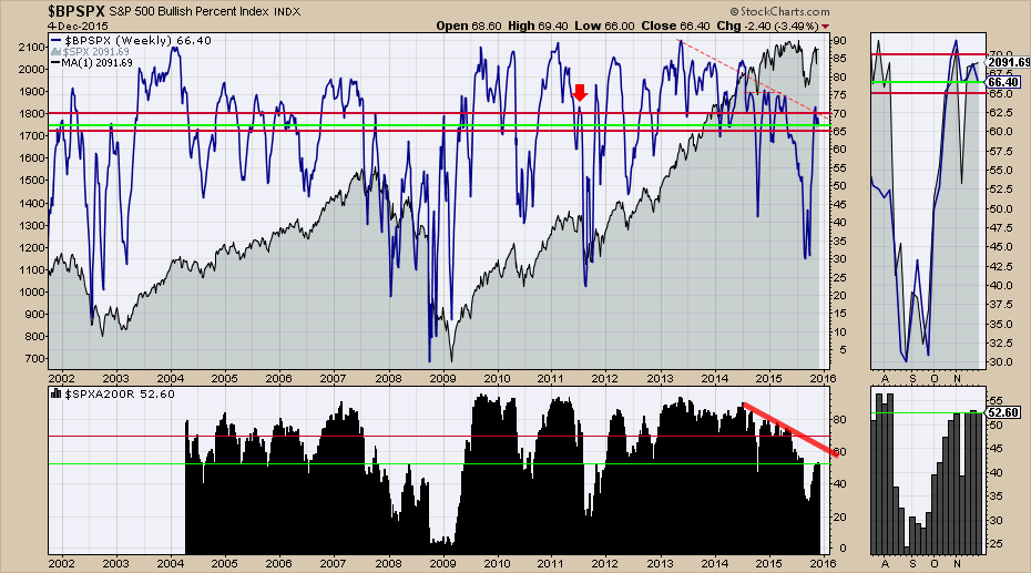
In the bottom panel, you will notice that in the bull market of 2004 to 2007, the lows that were made in terms of the % of stocks below the 200 DMA was around 50%. In 2007 and 2008, those levels got more depressed. This year currently looks more like late 2007 or early 2008. We had the same situation in 2011. However, the Federal Reserve used QE to restart the market in 2011. That currently does not appear to be on the table. The current highs around 50% for the last 5 of 6 weeks, suggests that there is not enough breadth to lift the market. You can be on a PnF buy signal for the Bullish Percent Index below the 200 DMA, but it usually means a bear market rally. Notice in 2007 and 2008, that the rallies lasted about 6-8 weeks. That's where we are now.
Can Mario Draghi's speech this week provide enough fuel to restart the bull market? I don't know if it can, but in order to get back into a bull market, we are going to need a wider swath of stocks to do the heavy lifting. Until then, this looks like a bear market map to me. The breadth, the bullish percent indexes, the junk bonds making lower lows, the trend line break in Corporate bonds, the 40-year break in the Commodities trend line, the lagging Russell 2000 and the 40 WMA ceiling on most of the major indexes around the world, all point to distress. The Mario Draghi ECB QE announcement of January 15, 2015, lifted stocks for about 6-8 weeks globally. Perhaps Friday was the start of another 2-month run. If so, these indicators will start to rise dramatically. The 40 $SPX points between here and the highs makes this zone challenging. A convincing surge to new highs would be bullish.
Good trading,
Greg Schnell, CMT
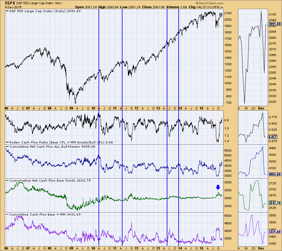
After the tug-o-war of the last two trading days, I decided it was time to look at sentiment based on the DecisionPoint Rydex Assets Analysis charts. There are two to look at and they are both available in the free DecisionPoint Rydex Funds ChartPack. You'll also find cashflow and asset analysis charts for the Rydex sector and inverse funds within that ChartPack. The beauty of measuring sentiment based on these charts is that it isn't based on a survey or question, it is based in fact, it shows exactly where the money is.
The chart below is the Rydex Assets chart. This chart tells us how many assets are currently in the bull sector funds, bear funds and money market funds. Carl Swenlin developed the Rydex Ratio which takes the total assets in the bear and money market funds and divides it by the assets in the bull funds. I've highlighted readings at major turning point tops. We look for an overabundance of bullish sentiment determined by the ratio. The more assets in the bull funds, the smaller the ratio becomes. Current readings are very overbought. Notice also the bullish sentiment measured by assets in bear and money market funds is at a low--investors are not hedged or in cash.
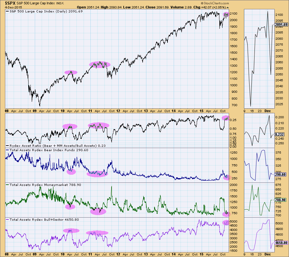
The Rydex Cashflow charts measure the amount of money moved each day into the various bull, bear and money market funds. Basically this chart is showing us how the assets in the chart above arrived at their destination. Carl developed the Rydex Cashflow Ratio to measure sentiment based on the cashflow into and out of the various funds. Currently, the ratio is very small which indicates far more money is moving into bull funds than is leaving bear and money market funds. I annotated the "blip" on the net cashflow for the bear funds. This occurred in response to the correction in August. Cashflow is flying into bull funds and leaving bear and money market funds. This expresses excess bullishness. Sentiment indicators are contrarian, so the expectation is lower prices.
Come check out the DecisionPoint Report with Erin Heim on Wednesdays and Fridays at 7:00p EST. The archives and registration links are on the Homepage under “What’s New”. Erin answers the "question of the day" and reviews all of the major markets quickly and concisely in 30 minutes.
Technical Analysis is a windsock, not a crystal ball.
Happy Charting!
- Erin
The start of every bear market is different. Sometimes it's driven by technology stocks, other times it's a financial crisis. Whatever the case, one common denominator seems to be that aggressive areas of the stock market are abandoned as final tops are made or challenged. In my last ChartWatchers article entitled "Four Reasons The Market Is Heading Higher", my third point concentrated on this idea of bull market sector rotation. As the benchmark S&P 500 moves to new highs or to challenge old highs, it's important to view what's happening "under the surface". It's not enough to simply see that the S&P 500 has moved higher. We need to focus on what's driving that strength. If it's aggressive areas of the market, it's generally a sign that the advance is sustainable because traders/investors are willing to take that greater risk. But when advances in the benchmark index occur as money moves towards defensive areas, red flags are raised and I'd be much more cautious about a continued rise.
To illustrate the flow of money away from aggressive areas of the market, take a look at what transpired in 2007 PRIOR to the start of the bear market:
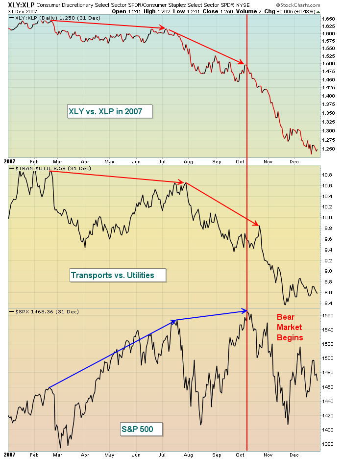
The bottom third of the chart above shows the S&P 500 making highs in July and October, but check out how money was rotating away from consumer discretionary (XLY) as the XLY:XLP ratio declined rapidly throughout 2007. A similar drop in the ratio of transports vs. utilities ($TRAN:$UTIL) also occurred. This makes little sense because a falling ratio in both of these suggests that traders are preparing for a weakening economy. The warning proved to be quite useful as the S&P 500 began a downward spiral off that October 2007 high.
At the time of my last article here, both of these aggressive ratios supported higher equity prices, but with the latest S&P 500 recovery, both ratios have begun to deteriorate. It's too early to make a bull market vs. bear market call based on the last two weeks action, but I will be watching these two ratios closely in the days and weeks ahead if the S&P 500 breaks out to fresh all-time highs. To remain bullish, I'd want to see both of these ratios climbing again, not continuing their recent decline. Here's a reprint of a chart I featured in that last ChartWatchers article:
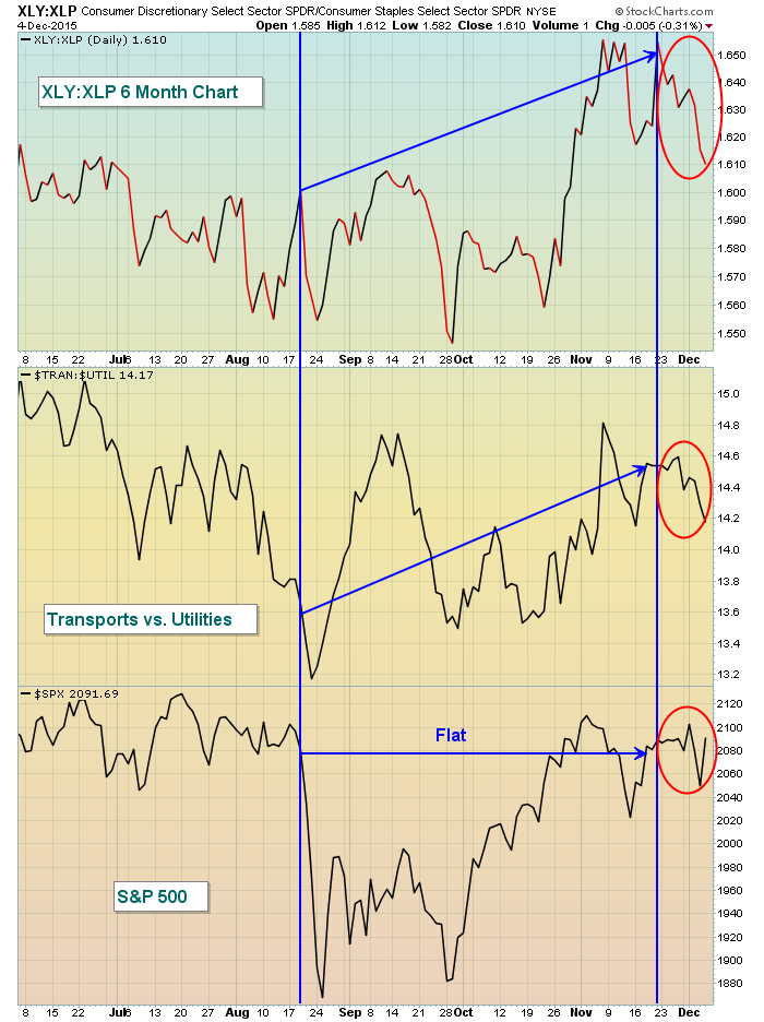
You can see that conditions have deteriorated by the red circles that I've added. Again, I'm not ready to write off the bull market based on the last two weeks, but this development bears further analysis as we move into year end and beyond.
Happy trading!
Tom
TRADING IN A SIDEWAYS MARKET
by John Hopkins | InvestEd Central
On 12-3-14 the S&P closed at 2074. On 12-3-15 (Friday) the S&P closed at 2091. That's about as flat as you can get over a 12 month period and it helps explain why many traders have had a difficult time scoring big gains over the past year.
We have certainly found it more challenging at EarningsBeats.com, especially when you get out of the blue sell offs like we saw on Thursday only to be followed by an out of the blue surge on Friday. And everything else in between!
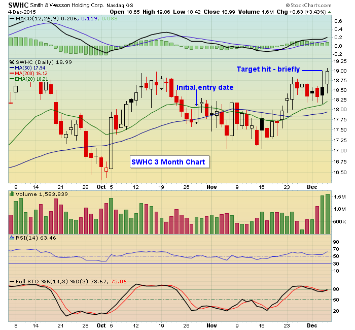
Here's an example shown below. We provided our members with a trading candidate, SWHC, on 10-28-15. This was a stock that both beat earnings expectations and had a strong chart with the stock pulling back to what we felt was a high reward to risk ratio. Our target from initial issue date was $19. If we were right it would turn out to be a quick 6% gain. But it took much longer than we thought it would to get to that $19 level which it finally did this past Thursday. But during the course of the day it quickly fell back close to our initial entry point so if you missed exiting the brief moment it touched $19 all of the gains were gone! Then the next day it moved right back to the $19 level. So a full month plus to get to our target, then over the course of two trading days, a full circle. That's rough.
We have found the market particularly challenging since the August "flash crash"; when the S&P fell from 2096 on August 18 to 1867 on August 24, an 11% drop. Why? Because during that 3 month plus period the S&P has gained exactly 4 points. And let's face it, traders have been on pins and needles during most of that period of time, fearing drops out of the blue just like we saw on Thursday, where months of work can see profits evaporate in just a matter of hours.
There are some times when trading that almost no matter what you try it is going to be tough to make money. So you either have to move completely to the sidelines, reduce the amount of capital you have at work or be prepared to incur some additional losses. This includes honoring stop losses, which is never pleasant, or risk losing even more.
At EarningsBeats.com we provide our members with trading candidates that both beat earnings and have strong charts. The theory is that these stocks will hold up better than others, no matter the market conditions. But it doesn't mean there won't be losers, and especially when the market behaves like it has the past 4 months. It's one of the reasons we almost always provide second entries at a lower price, "just in case" and to reduce the overall cost basis on a trade. And it's why we provide stop losses as well; it can always get worse.
We currently have 120 stocks that are part of our "Candidate Tracker" which includes companies that have beat earnings and have strong charts. We'll be adding another batch over the next few days. If you would like to see a sample just click here.
At your service,
John Hopkins
President
EarningsBeats.com

"Success is peace of mind which is a direct result of self-satisfaction in knowing you made the effort to become the best of which you are capable." – Dr. John Wooden Yes, it's that time of year again, and I thought I'd invite you into my trading room. I look ahead to 2016 by considering my investment efforts of 2015. My regular readers will recognize this falls into Stage 10 of my...
Read More Hello Fellow ChartWatchers!


 "Success is peace of mind which is a direct result of self-satisfaction in knowing you made the effort to become the best of which you are capable." – Dr. John Wooden Yes, it's that time of year again, and I thought I'd invite you into my trading room. I look ahead to 2016 by considering my investment efforts of 2015. My regular readers will recognize this falls into Stage 10 of my...