Hello Fellow ChartWatchers!
I know, I know. I've shown the same chart again and again recently. Well, apologies in advance, but here it is one more time:
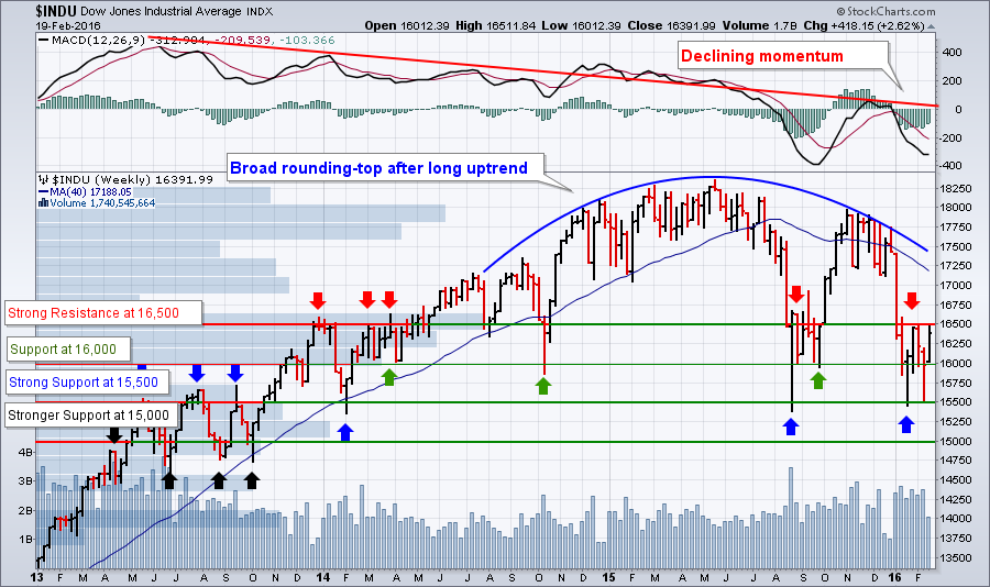 I'm showing it again because I really think it can keep you grounded in the face of emotional short-term reactions to moves that are really just part of a larger pattern. Two weeks ago, the Dow retested the 15,500 level and quickly bounced higher. Last week, it tested the 16,500 resistance level and fell back. Both moves make sense when you consider the bigger picture. To re-review:
- The market has topped and is generally moving lower based on the rounding top pattern and the downward movement of the 40-week (200-day) moving average (blue lines).
- In the shorter-term, things are moving sideways between 16,500 and 15,500. That's a pretty broad range leading to some quick, big moves both up and down.
- I still think a move below 15,500 would be bad and a move below 15,000 would be worse from a technical damage perspective.
- Assuming no big, non-technical event influences things, I'd expect the market to continue moving sideways until the 200-day moving average pulls into range. At that point, the market will feel more pressure to move lower.
The most important thing to remember at this point is that we are currently in a downtrend and we need to respect that downtrend until it is decisively broken. This will be true at least until the Dow climbs back about the 200-day moving average.
Now, don't get confused by that above analysis and think that there aren't any opportunities out there - there are! For technicians, the main point of market analysis like this is simply to set expectations and determine how aggressive to be as a trader. Given the current picture, we should keep our expectations low and our stops tight. We should be more conservative with our stock picks and watch them closely. We should be skeptical of uptrends and respectful of downtrends. Pretty much the opposite of our approach in 2013 and 2014.
So how do we find the legitimate opportunities that are still out there? Again, I'm going to sound a bit like a broken record here - look for stocks with great relative strength and increasing momentum.
Here at StockCharts, the phrase "great relative strength" is synomous with our StockCharts Technical Ranking (SCTR) system. Click here to learn more about "Scooters." Essentially, I'm saying don't even consider stocks with a SCTR value that's less than 90. Why should you? There are hundreds of stocks out there that have a SCTR ranking higher than 90 - let's focus on them.
For astute ChartWathcers, the phrase "increasing momentum" means a increasing PMO value. The PMO is an advanced momentum oscillator that has proven itself in battle as part of Carl Swenlin's DecisionPoint timing models. So I'm also saying let's piggy-back on Carl's work and further narrow down our list of candidates by only looking at stocks with PMO values that are 1.) above zero and 2.) increasing for at least the past couple of days.
For StockCharts members out there, here's what I'm talking about in "Advanced Scan-ese":
[type = stock] and [country = us] and [group is not ETF] and [close > 2]
and [sctr > 90]
and [todays sctr >= yesterdays sctr]
and [yesterdays sctr >= 2 days ago sctr]
and [2 days ago sctr >= 3 days ago sctr]
and [todays pmo line > 0]
and [todays pmo line > yesterdays pmo line]
and [yesterdays pmo line > 2 days ago pmo line]
and [2 days ago pmo line > 3 days ago pmo line]
So, what do we get when we run that scan now? I currently get 29 results from that scan. Among the candidates are:
- Alpha and Omega Semiconductor (AOSL)
- CA Incorporated (CA)
- Estee Lauder (EL)
- Franco-Nevada Corporation (FNV)
- Glu Mobile (GLUU)
- Illinois Tool Works (ITW)
- Nisource Inc. (NI)
(There are others but these are the ones that especially interest me. Just type in those ticker symbols into the "Create a Chart" bar near the top of our webpages to see why.)
Now, I'm not saying you should buy any of these stocks sight unseen. I am saying these stocks are worth your time investigating and I am using them as proof that there are opportunities in any market - bullish or bearish.
Rawr!!!
- Chip
SITE NEWS
RECENT ADDITIONS TO STOCKCHARTS.COM
- "Permalink" Is Just a Shorter Way of Saying "Linkable Version" - As we continue to revamp our website, we are updating some of the terminology we use to better reflect terms that are now commonly used on other websites. A great example of this is change from "Linkable Version" to "Permalink" that we are making right now. Don't be fooled - those two terms are synonimous.
NYSE BULLISH PERCENT INDEX TURNS UP
by John Murphy | The Market Message
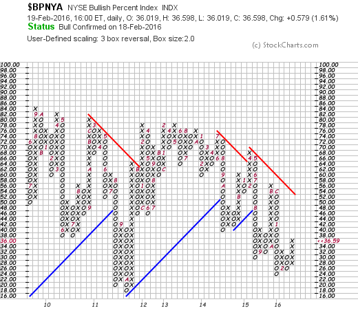
One of the widely watched gauges of market direction is the NYSE Bullish Percent Index ($BPNYA). That index measures the percent of NYSE stocks that are in point & figure uptrends. Chart 1 shows a point & figure version of that index. [P&F charts show alternating columns of Xs and Os. X columns show rising prices, while O columns show falling prices]. Readings over 70% are overbought, while readings below 30% are oversold. The index reached an oversold low of 24% during January. The chart also shows the BPNYA in a potential support zone formed during the 2011 selloff. Here's the good news. The last X column has risen to 36% and has exceeded the previous X column at 32%. That constitutes a p&f buy signal. [A P&F buy signal occurs when a rising X column exceeds a previous X column]. That's an encouraging sign.
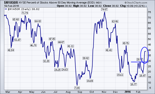
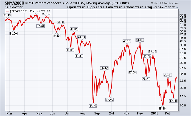
 Two other measures of market direction are the percent of NYSE stocks above their moving average lines. They too are starting to show improvement. The blue line in Chart 2 plots the percent of NYSE stocks above their 50-day average. That line reached oversold territory below 20% last August and again this January. It has risen during February to 38% which is the highest level this year. The red line in Chart 3 plots the percent of NYSE stocks above their 200-day average. It too is starting to rebound from oversold territory below 20% for the second time. It needs a decisive close above its early Febuary peak at 23% to turn its short-term trend higher. The blue line has already done that. The position of both lines suggests a stock market that is attempting to form a bottom.
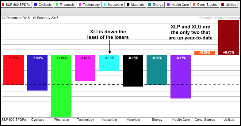
It has been a rough year for most of the stock market with seven of the nine sector SPDRs down year-to-date. The Consumer Staples SPDR (XLP) is up .69% and the Utilities SPDR (XLU) is up a whopping 6.75%. Among the seven negative sectors, the Industrials SPDR (XLI) is holding up the best because it is down the least. Thus, XLI is showing a little bit of relative strength in 2016. I will look at the chart for XLI and the three top stocks after the jump.
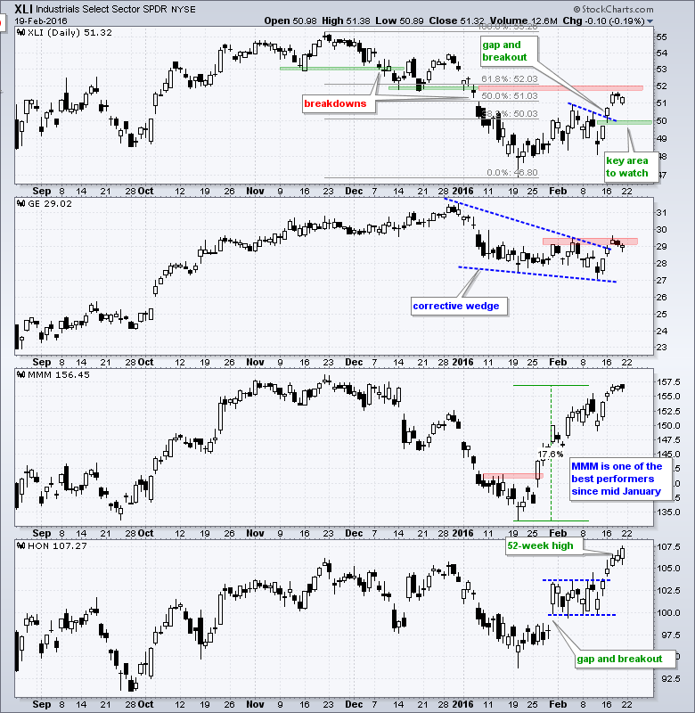
General Electric (GE), 3M (MMM) and Honeywell (HON) account for around 22% of the ETF. GE weighs in at 11.61%, MMM weighs 5.65% and HON accounts for 4.99%. XLI remains in a long-term downtrend with a 52-week low in mid-January, but the ETF is in a short-term uptrend with the recent breakout near 50. Even though potential resistance is coming into play soon, the short-term uptrend is intact as long as 49.6 holds. Within XLI, MMM and HON are the clear leaders over the last five weeks. MMM is up over 15% since mid-January and HON hit a new high this week.
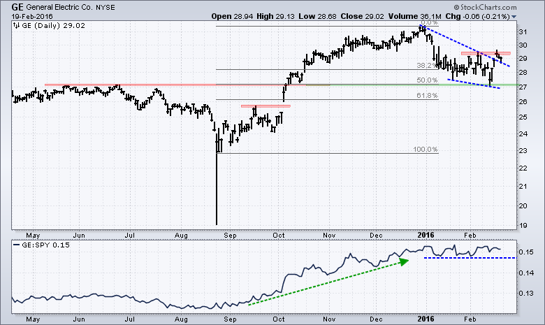
My eyes are on GE because the stock is by far the biggest component. On the price chart, notice that GE hit 52-week highs throughout November and December, and then pulled back in January-February. This pullback formed a falling wedge that retraced 50% of the prior advance and returned to broken resistance. Both the retracement amount, the wedge and the return to broken resistance are typical for corrections within uptrends. Note that I am ignoring the 25-Aug spike low because it looks like an outlier. In any case, GE broke the wedge trend line and is making a run at resistance from the early February high. A breakout here would be bullish for GE and positive for XLI.
Click here to follow me on Twitter @arthurhill - Keep up with my 140 character commentaries.
****************************************
Thanks for tuning in and have a good weekend!
--Arthur Hill CMT
Plan your Trade and Trade your Plan
*****************************************
With the announcement of the UK / European Union deal late on Friday night, we have a good reason to look at the currencies compared to the US Dollar ($USD).
A macro view of the British pound ($XBP) shown in the centre panel suggests a rising pound is generally bullish for both the $FTSE and the $SPX. Currently, the $XBP has bounced off support with a low of 141. The majority of the time shown, the pound has traded above 140 and below 170. We are at the low end of the range.
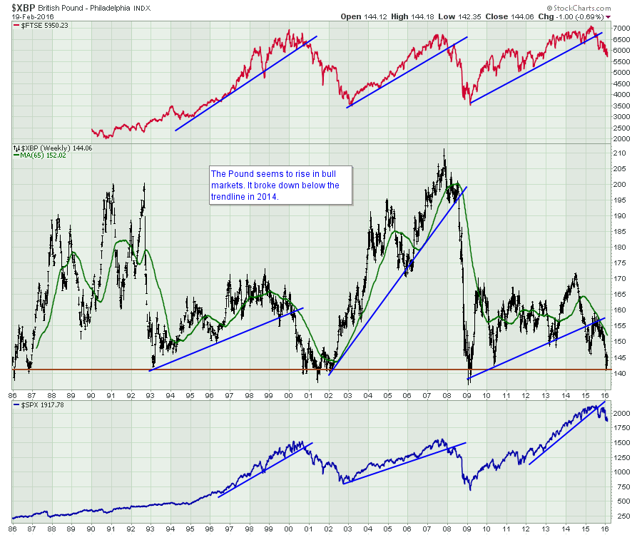 Unfortunately, the British Pound also did the best when commodities, namely oil, were in bullish trends. Below is a chart of the British Pound compared to a basket of commodities creating an index in the top panel called the Commodities Research Bureau Index ($CRB) and I have placed $BRENT crude oil in the lower panel.
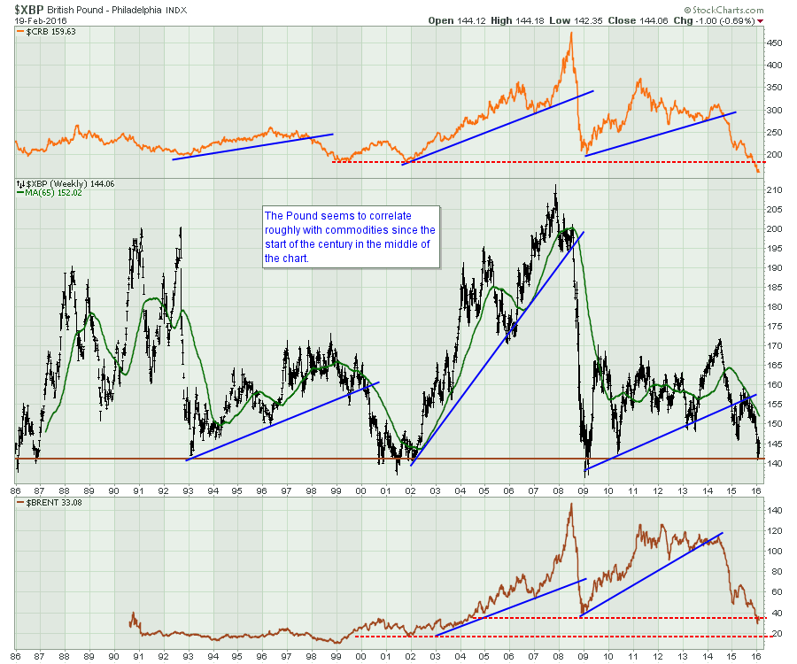 To simplify all of the above, if the Pound can bounce off these lower levels and push higher, this could be bullish for commodities as it would also suggest the $USD getting weaker.
On the chart below, the Japanese Yen ($JPYUSD) has been breaking to the upside recently, and the Euro ($EURUSD) is starting to nudge toward $1.1450. This could be a very important time for signals from the currency markets. If the British Pound ($GBPUSD) joined the parade higher, the dollar could weaken more from here.
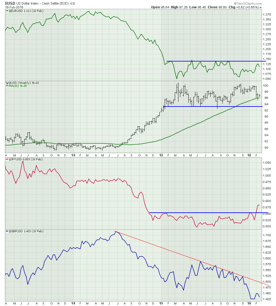 I would expect some bullish response to the David Cameron/ EU deal. Whether or not the currencies breakout to the upside is even more important. If the British Pound and the Euro both break to the upside, it could give commodities room to run as the $USD weakens. Conversely, if they don't get more momentum from here, we'll probably resume the bear market trend for commodities that has been bouncing sideways since mid-January.
To summarize:
- $EURUSD above $1.1450 would be a big trend change and push the dollar down.
- $GBPUSD above $1.50 would be breaking a trend from down to sideways. If it stalls below the $1.50 trendline level, that might mark a top in the commodities rally.
Stay tuned, this British debate just got more interesting. I also posted some highlights from the webinar on Thursday. Here is a link to the article. Gold And Silver Press. You can click through here to see more of the webinar. Commodities Countdown 20160218. The feedback was very strong. Please click on the Yes button below the articles if you are interested in getting them delivered to your email. The commodities are trying to move higher so this webinar and blog channel are getting more valuable to investors.
Good trading,
Greg Schnell, CMT
Many of my readers' and viewers' questions remind me of the Whitney Houston song, "How Will I Know?". With the DecisionPoint Scoreboards starting to move "green", it begs the question, "Is the market on its way back up?" I believe I answered part of that question in Thursday's DecisionPoint blog but I went into detail during last Wednesday's webinar. In the current market environment I don't see a quick end to this bear market. Looking at the indicator charts below confirms this.
I narrowed it down to a select few charts to watch.
Early indications would be an Intermediate-Term Trend Model BUY signal on Small-Caps and the Nasdaq 100 which are suffering more than the other indexes. This signal would be triggered by a 20/50-EMA positive crossover. Price would need to steady itself above the 50-EMA for this to be possible. Note the margin between these EMAs currently.
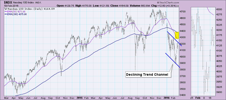
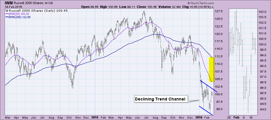
Second, the weekly Price Momentum Oscillators (PMOs) need to have a positive crossover. Look at the S&P 500 weekly PMO. It moves very slowly. It is still declining and while it appears it decelerated slightly this week, it needs powerful positive momentum to swing it the other way. Additionally, the weekly PMO is hardly oversold when you compare it to the previous bear market.
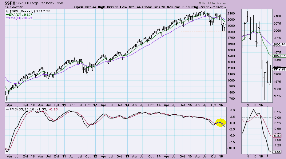
Finally, DecisionPoint deems that a bear market ends when the 50-EMA crosses back above the 200-EMA. I think it is clear from the charts below, that is a long way off. Price not only would have to rise above the 200-EMA, it would need to stay there long enough to pull the 50-EMA up and across the 200-EMA.
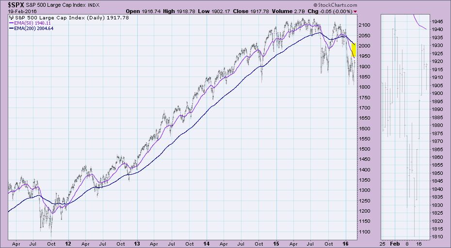
Conclusion: Clearly we are not at a turning point in this bear market. Keep an eye on the indicators and of course, join my free webinars where you'll definitely get a jump on what these indicators are up to each week.
Come check out the DecisionPoint Report with Erin Heim on Wednesdays and Fridays at 7:00p EST, a fast-paced 30-minute review of the current markets mid-week and week-end. The archives and registration links are on the Homepage under “What’s New”.
Technical Analysis is a windsock, not a crystal ball.
Happy Charting!
- Erin
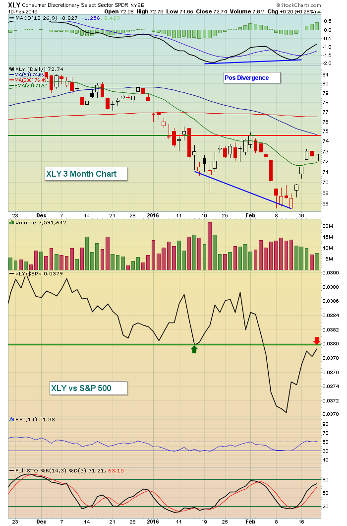
From a short-term trading perspective, last week's rally was predictable. Positive divergences flashed all over the equity map on daily charts - globally, domestically, and within sectors, industry groups, and individual stocks. So it was certainly an opportunity for the bulls to regain control of the action in the near-term and they did. Last week's leading sectors were consumer discretionary (XLY) and technology (XLK) and both showed that selling momentum was slowing on their most recent lows. Check out their charts:
XLY:
 XLK:
XLK:
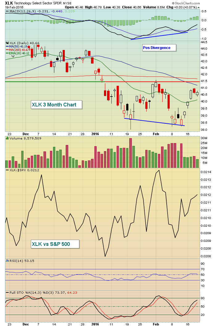 Both groups have rallied nicely off recent lows. They both printed red hollow candles (reversing candles) at their most recent lows with higher MACDs. That combination is generally quite powerful. But the recent strength has taken both ETFs close to recent highs and declining 50 day SMAs. Reaching those levels will likely lead to a battle because that added strength also would carry many indices to test their falling 20 week EMAs from underneath. And those weekly MACDs are horrendous.
Given the rally, I'd be very careful if the NASDAQ tests its falling 20 week EMA. Check this out:
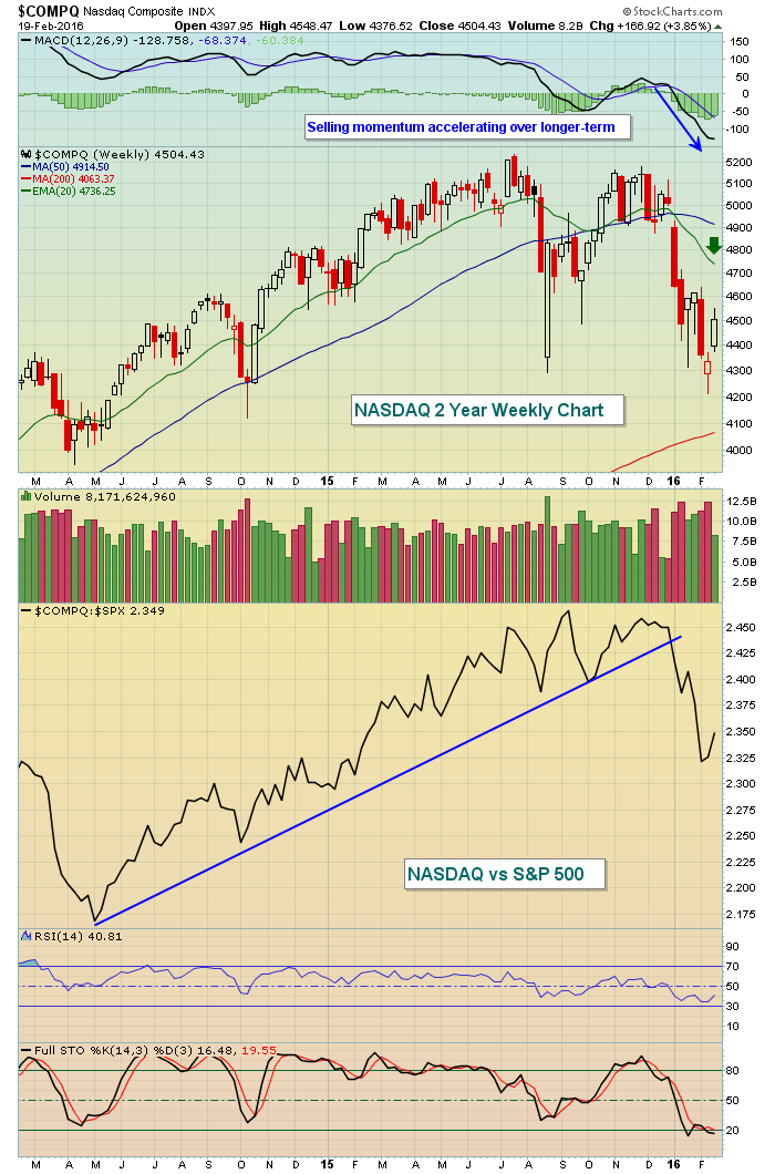 Keep a few things in mind. First, while the 20 week EMA is still close to 200 points above current price, it is falling rapidly. Second, price resistance from the recent February high will hit just above 4600 and that is likely to stall the current rally should we get there. Finally, that relative trendline break is further evidence that market participants are in a risk off mood.
With volume trends now significantly deteriorating and weekly MACDs pointing straight down, I would not be inclined to chase this rally. Instead, I'd consider shorting at price and moving average resistance.
Happy trading!
Tom
PROFIT FROM EARNINGS MISSES
by John Hopkins | InvestEd Central
Our primary focus for a long time at EarningsBeats.com has been on those companies that beat earnings expectations and have strong charts. The reason being that companies with strong numbers and strong charts provide superior reward to risk trading opportunities. But we've learned lately that companies that miss earnings expectations can also provide high reward to risk opportunities for those who are willing to short stocks.
We have found over the years that it is tougher making money on the short side than on the long side. Why is that? It's because over time the market goes up more than it goes down and shorting stocks brings with it additional risk not found when trading on the long side. For example, if I buy a stock for $10 and it goes to zero, I know the limit of my loss is $10. However, if I short a stock at $10 there is no theoretic upside to how high the stock might go and thus no limit to my losses. And this is particularly problematic when the market is in a bullish mood.
On the other hand, when the market is in a more bearish mood, just like it is right now, going short can provide an alternative for those who like to trade but realize how tough it is to make money on the long side. So this is why it makes sense to look for companies that miss earnings expectations and especially those with weak charts.
As an example, let's take a look at Amazon. They recently reported earnings and missed by a mile. As you can see below, they paid the price:
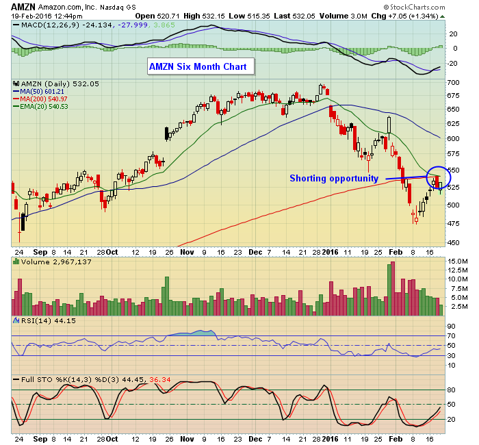 Since AMZN is such a loved company, the stock recouped some of its losses on an oversold bounce but look what happened when it tested both its 20 and 200 day moving averages from beneath; it failed, right on cue. And this is the kind of shorting opportunity you want to find if you are willing to expand your trading arsenal.
I will be conducting a webinar this Tuesday, February 23 at 4:30 pm eastern. Tom Bowley, Senior Technical Analyst at Stockcharts.com will be joining me to show some samples of companies that missed earnings. We will also cover some companies that beat earnings as well and why they could be good trading candidates. If you wish to join us just click here to register for this free event.
At your service,
John Hopkins
EarningsBeats.com

Make no mistake about it: these are internet days and news circles the globe at the speed of light. Couple that with the fact that Wall Street is the world's most sophisticated disinformation machine ever devised and you'll appreciate why I believe technical analysis is an individual investor's primary defense against the dark arts of disinformation. Okay...I'll lighten up. How about a
Read More I'm showing it again because I really think it can keep you grounded in the face of emotional short-term reactions to moves that are really just part of a larger pattern. Two weeks ago, the Dow retested the 15,500 level and quickly bounced higher. Last week, it tested the 16,500 resistance level and fell back. Both moves make sense when you consider the bigger picture. To re-review:


 Since AMZN is such a loved company, the stock recouped some of its losses on an oversold bounce but look what happened when it tested both its 20 and 200 day moving averages from beneath; it failed, right on cue. And this is the kind of shorting opportunity you want to find if you are willing to expand your trading arsenal.
 Make no mistake about it: these are internet days and news circles the globe at the speed of light. Couple that with the fact that Wall Street is the world's most sophisticated disinformation machine ever devised and you'll appreciate why I believe technical analysis is an individual investor's primary defense against the dark arts of disinformation. Okay...I'll lighten up. How about a