HAPPY START-OF-JULY HOLIDAY!
Hello Fellow ChartWatchers!
Happy Independence Day to all of our US readers (and happy start-of-July to everyone else)! I'm working hard on not working this weekend. Hopefully you are doing the same. The markets decided Brexit was a bad dream and (mostly) returned to their pre-Brexit assault on the Year-to-Date highs such as 18,000 on the Dow. I suspect that - just like before - the assault will fail and things will continue to move sideways in the long-run with continued volatility. We have other opinions for you below also. Like they say - If you don't like one opinion, keep reading until you find one you do like!
Sorry for such a short article this week but I have to get back to the grill - have a Happy 4th!
- Chip
SITE NEWS
RECENT ADDITIONS TO STOCKCHARTS.COM
NEW PAGE DESIGNS CONTINUE TO ROLL OUT - Keep your eyes peeled for more pages with our new design. We've been adding more and more each week. For instance, last week we completed the updates to
our Webinar Archives.
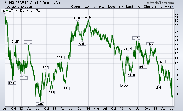
The plunge in global bond yields continues. Yesterday's statement from the Bank of England of its intention to lower rates sometime this summer pushed the British 2-year yield into negative territory for the first time, and its 10-Year to another record low further below 1%. Treasury yields continue to follow foreign yields lower. Chart 1 shows the 10-Year Treasury Yield falling again this morning and coming dangerously close to its 2012 closing low near 1.40%. The drop in yields is boosting dividend-paying stocks like consumer staples, telecom, utilities, and REITs. Falling yields are also boosting gold which is a non-yielding asset that attracts money when yields are low and falling. Falling yields may also be responsible for recent buying of higher-yielding emerging markets. Homebuilders are also getting a lift.
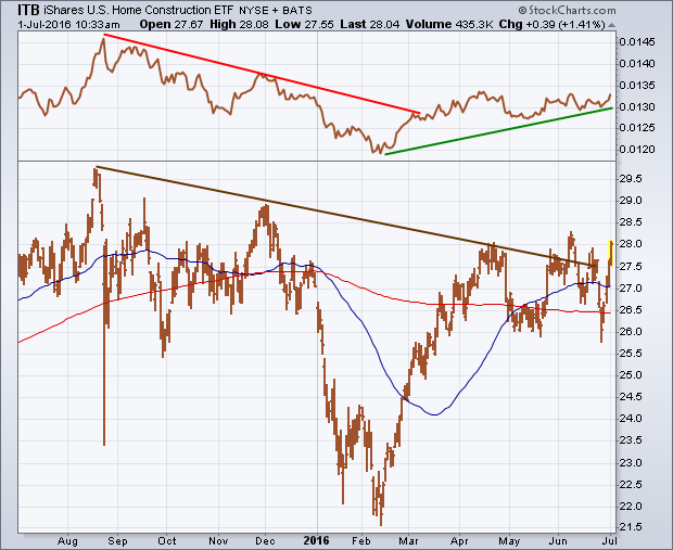
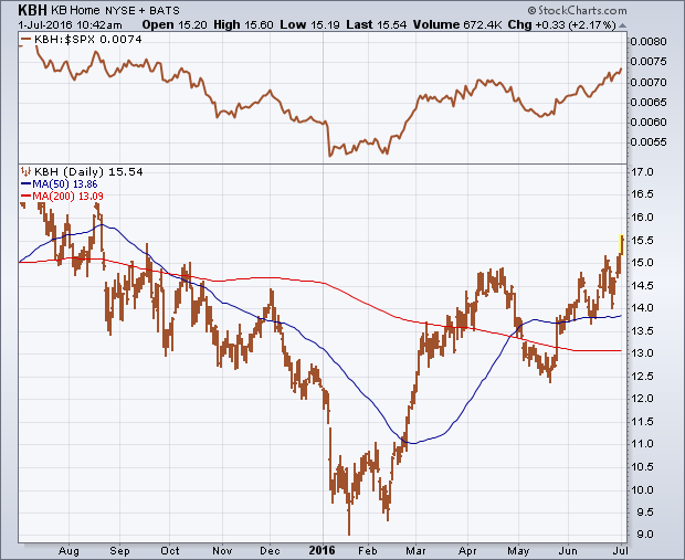
 Mortgage rates, which are tied to the direction of bond yields, are also falling. That's good news for homebuyers and homebuilders. Charts reflect that optimism. Chart 1 shows the U.S. Home Construction iShares (ITB) moving up close to a new high for the year after bouncing off chart support along its May low and 200-day average. It's also back above both moving average lines. The ITB/SPX ratio (top of chart) is also close to a new 2016 high. Chart 3 shows KB Home (KBH) already trading at a 10-month high. Other homebuilders nearing upside breakouts are PulteGroup (PHM) and DR Horton (DHI).
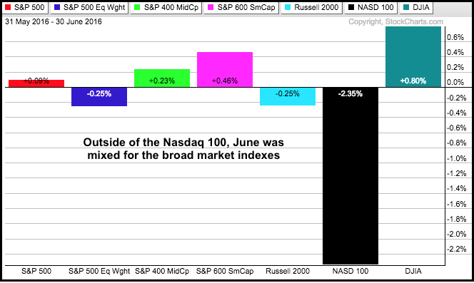
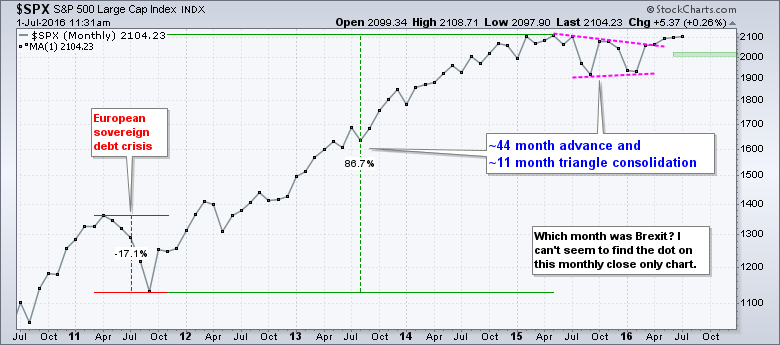
Chartists will look back at the long-term charts and try to figure out where exactly this big Brexit panic actually occurred. Was there even such an event? There is something to be said for monthly close-only charts because they filter a lot of noise, and June was definitely a month with lots of noise. Despite some volatile swings, the major indexes ended the month with little change. Outside of the Nasdaq 100, the monthly gains and losses were between +1% and -1%. The Dow Industrials led and the Nasdaq 100 lagged. In a rare divergence, the S&P Small-Cap 600 was up a fraction and the Russell 2000 was down.
The next chart shows monthly closing prices for the S&P 500. At the risk of over simplification, the trend and the pattern at work seem obvious to me. After falling some 17% in 2011, the index embarked on a 44 month advance that gained over 85%. $SPX was certainly entitled to a rest after such a strong advance and the triangle consolidation provided this rest. At 11 months, the consolidation is around a quarter as long as the prior advance, which seems reasonable. Most importantly, the index broke above the upper trend line with the April close and held this breakout the next two months. This breakout means the uptrend is resuming and the index is now less than 2% from its all time high. I would not become concerned with the long-term uptrend unless the index closes below 2000.
****************************************
Thanks for tuning in and have a good weekend!
--Arthur Hill CMT
Plan your Trade and Trade your Plan
*****************************************
After a rough week where many traders sold on the news of Brexit, a four-day climb has taken us back to the highs before Brexit. This increases the weekly range and volatility, but interestingly enough, the market shocks all seem to come from offshore these days. Let me outline a problem, and then provide a chart that looks investable.
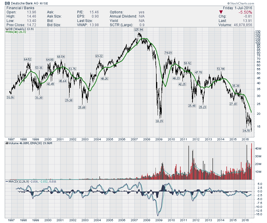
If Brexit does end up being the trigger for a systemic banking problem, you'll need to evaluate your entire portfolio. Looking at the chart of Deutsche Bank, it looks a lot like a Lehman Bros. chart in the terminal phase. When the CEO has to comment 'no need to raise cash' and on the other hand, they are failing to meet regulatory levels, the clarity is not high.
That said, the band plays on. As investors, we still need to find returns. I recently published a Don't Ignore This Chart article pointing to where the money is flowing inside the USA after the vote.
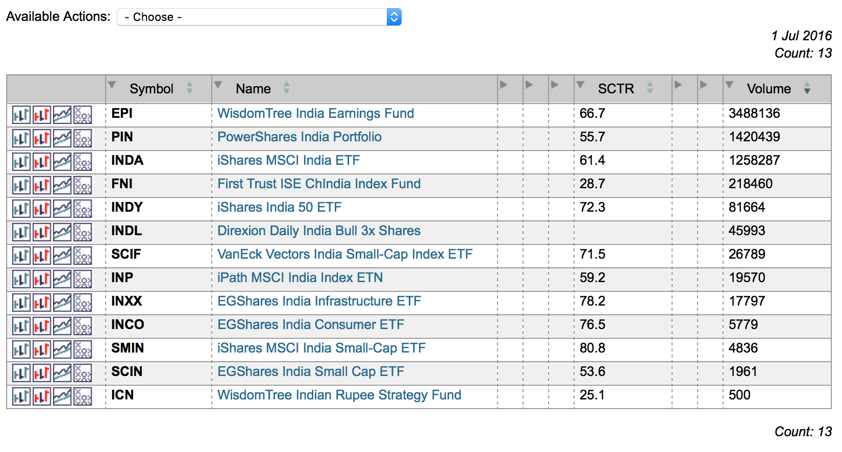
On an optimistic note, we can look for what is working smoothly. One area of the world that I always like to keep an eye on is India. The country has the world's best demographics and when their market blipped on Brexit, I was intrigued. The British influence is there in India, so I would have expected more. Running a quick scan on our US ETF Universe, I found 13 ETF's for trading India in various ways.
 Looking at the iShares MSCI India ETF (INDA), we can see a trading volume over 1 Million per day and the SCTR is 61.4. The SCTR recently rallied above 75 and pulled back while in an uptrend in price. I like that as a market that is starting to outperform. StockCharts SCTR is a ranking method that uses price action to determine which stocks are performing better than others rather than using patterns. The higher the SCTR score, the better the performance relative to peers. The weekly close was the highest close in the last 8 months, and the level of $28 was breached this week. $28 has been an important support/resistance level on this chart for 4 years. Click here for more information on StockCharts SCTR ranking system.
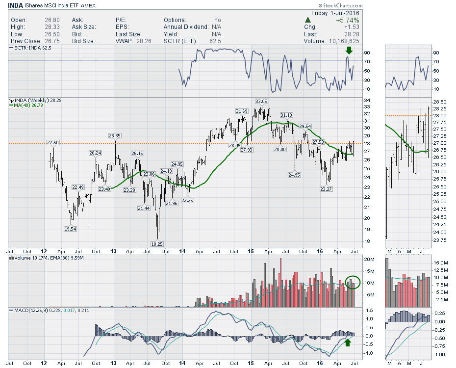 There are all sorts of technical patterns including back-to-back outside weeks and a 9-month Head/Shoulders base with a neckline at $28. We are currently bouncing off an upsloping 40 Week MA which is a technical favorite. Finding support at the 40 WMA after being below it for a long period is a good technical signal. With the volume over the last month coming in slightly above average every week, that is a good sign of interest.
This can be invested in a variety of ways. You can see there are 3 ETF's with an SCTR above 75 already in India. I chose a high volume ETF that had an SCTR in the middle of the top three volume ETF's just to illustrate the idea. I recommend looking a little deeper in India to see if there is a chart that interests you there. Amidst all the gloom around the world, the demographics in India are great. Any time the India chart looks bullish, I want to be onboard.
Good trading,
Greg Schnell, CMT, MFTA
There is no denying it, the market experienced an amazing rally this past week after the waterfall correction initiated by Brexit. Now prices are where they were before the landmark vote. The question is whether this rally will persist now that price is reaching strong overhead resistance once again.
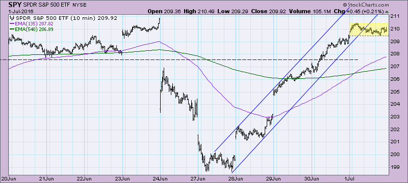
Looking at the 10-minute bar chart for the SPY, note that the rising trend was interrupted today and price consolidated, moving outside of the rising trend channel.
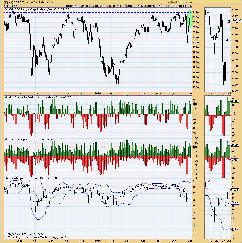
The ultra-short-term indicators are suggesting a buying exhaustion is in play. Note the climactic spikes on the CVI and Participation Index - UP. When we get 'spikes' in the readings on these indicators, we classify them as exhaustions or initiations. Yesterday's spike read as a buying exhaustion and with today's consolidation and follow-on climactic readings (that were slightly less than yesterday's), I believe the buying exhaustion is being confirmed. Remember that these indicators are in terms of hours to days, so look for more consolidation or lower prices next week.
Additional confirming evidence of a buying exhaustion appears on the short-term indicator chart. Note that all of these indicators are near the top of their range. They will be looking to decompress and the best way for that to be accomplished is consolidation or decline.
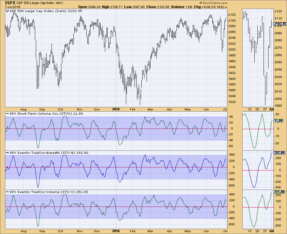
Conclusion: With price nearing overhead resistance at all-time highs once again, conditions need to be ripe for a breakout. Ultra-short- and short-term indicators are suggesting lower prices in the short term which doesn't support the idea of a rally past overhead resistance.
Come check out the DecisionPoint Report with Erin Heim on Wednesdays and Fridays at 7:00p EST, a fast-paced 30-minute review of the current markets mid-week and week-end. The archives and registration links are on the Homepage under “What’s New”.
Technical Analysis is a windsock, not a crystal ball.
Happy Charting!
- Erin
Here we go again.
It seems as though every time the S&P 500 challenges the 2100 level and its all-time high close (2131), another aggressive area of the market falls apart and the rally is not sustainable. Below is a two year weekly chart of the S&P 500 where you can visualize these relative breakdowns one by one:
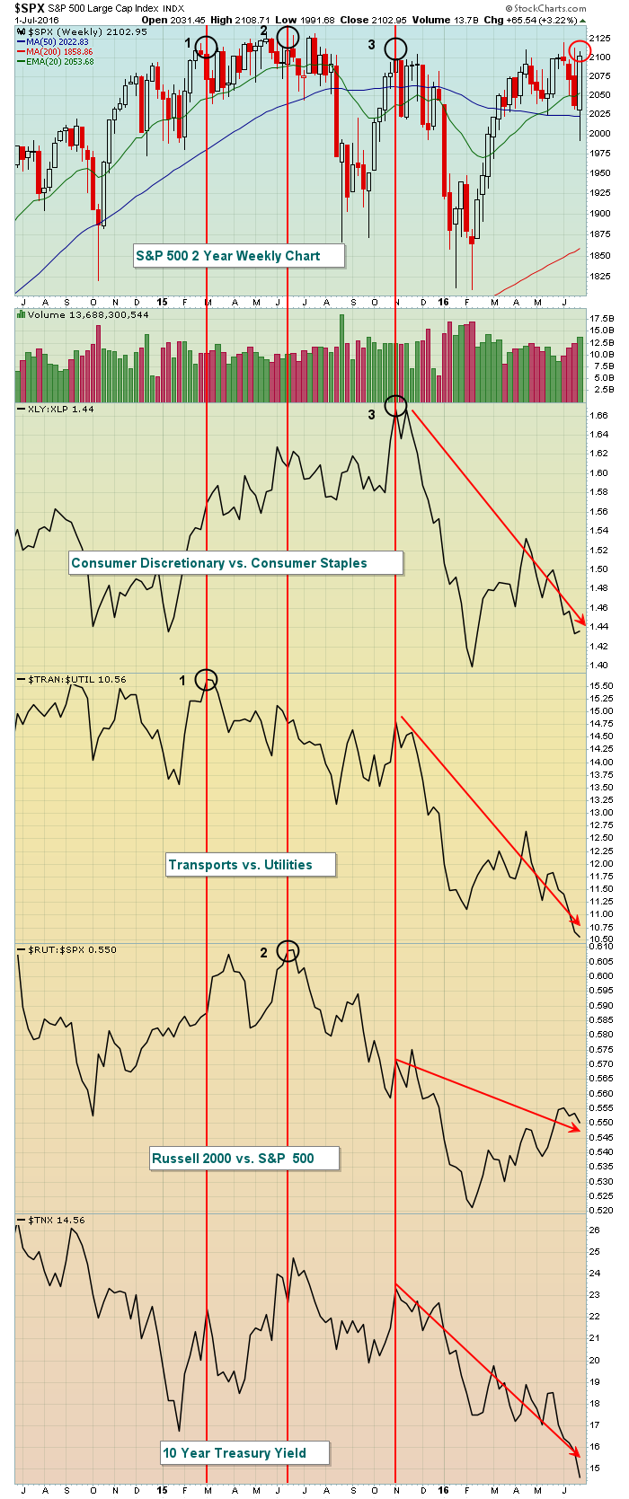 The three black circles highlight relative tops in the XLY:XLP, TRAN:UTIL and RUT:SPX at various stages of the bull market. The red circle shows the current S&P 500 price with the corresponding deterioration of nearly every aggressive aspect of the market highlighted with downtrend lines. In other words, traders are RUNNING for safety, not walking. This is not the typical market behavior that precedes a major market breakout. In fact, I'd say the opposite is true. Rotation into safety generally occurs just before a market decline.
This is how the above chart looked at the October 2007 high and prior to the last bear market:
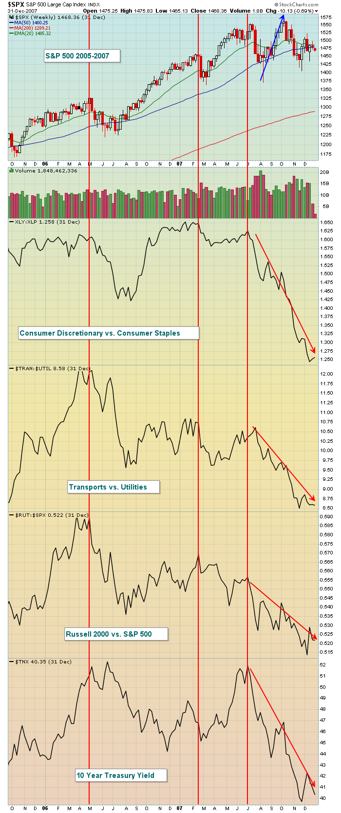 Note how the S&P 500 made a price breakout in October 2007, but there was little support for the breakout in terms of rotation towards aggressive areas of the market. In fact, look at the relative strength disintegration in the final weeks of that bull market. Traders turned to safety to lead the S&P 500 to one more final top. That looks a lot like what we're seeing in 2016. Furthermore, the worst historical period for the S&P 500 (since 1950) is from July 17th through September 27th and we're approaching that time frame.
I'm going to make a bold prediction. I believe the U.S. stock market will make a very meaningful top over the next two weeks and could potentially see a significant drop over the summer and into the presidential election. That's what market participants appear to be bracing for. Obviously, a closing high above 2131 on the S&P 500 will require a re-evaluation. Until then, however, I'd be very cautious.
Happy trading!
Tom
BIZARRE TO THE MAX
by John Hopkins | InvestEd Central
Exactly how bizarre has the market action been over the last six trading days? Let me count the ways.
First, the British voted to leave the European Union which put the market in a tailspin with the S&P losing almost 6% in just two days. But by Friday's close virtually all of the losses were recovered as though nothing had happened.
Next, the VIX spiked almost 35% in just one day as fear engulfed the market. By Friday's close the VIX had fallen almost 45% from Monday's high. Fear practically turned to elation.
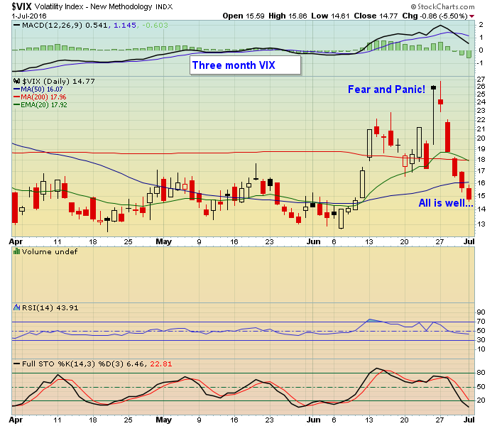 Next, the equity only put/call ratio climbed 40% in one day then fell 40% within two trading days.
While all of this was going on, the yield on the ten year US Treasury Note fell by over 16%, closing at 1.45%, a level not seen since July, 2012. And the US dollar spiked as well, going from $93.53 the day before the British vote to as high as $96.86 two days later before settling down some by Friday.
Then there was gold rising almost 7% over the course of the six trading days. And I should toss in European officials saying they will take whatever monetary easing steps are necessary to keep things from falling apart.
What makes all of this so fascinating is seeing a flight to safety (treasury bonds, gold) while at the same time seeing traders piling into riskier assets; stocks. It certainly has me scratching my head and wondering what might be next? Some experts feel the US has become a safe haven with bonds producing positive yields while stocks provide for possible appreciation. But seeing all of this going on over a week's time was something to behold and makes me extremely skeptical.
I forgot to mention that just about everyone has now come to the conclusion that there's no way the Fed will be able to raise rates this year, not with all of the economic turmoil around the world. So money is going to stay cheap for a long time and that seems to be of more interest to traders than the fact that economic troubles abound.
All of this coming a week before the monthly jobs report and with Alcoa set to report its numbers on July 11 as another earnings season gets underway. So you can be sure the market will remain extremely volatile with the bulls aiming for an all time high on the S&P while the bears will do their best to squash any attempts to take the market higher.
As part of my daily update to EarningsBeats members I include a market analysis to help guide them through the daily land mines. It includes key support and resistance levels on the major indexes as well as where I see the market heading in the very short term. If you are interested in getting my analysis for free just click here and you will be added to the list.
At your service,
John Hopkins
EarningsBeats.com

My Thesaurus lists the same two words – enhance and augment – as synonyms for both words "improve" and "more". The mantra of today's global society could indeed be "improve and more" with all the corresponding complexity that it brings with it. I merely have to look in my garage at a new BMW that is so improved with more gadgets (I use the word with tongue-in-cheek) that one must make...
Read More Mortgage rates, which are tied to the direction of bond yields, are also falling. That's good news for homebuyers and homebuilders. Charts reflect that optimism. Chart 1 shows the U.S. Home Construction iShares (ITB) moving up close to a new high for the year after bouncing off chart support along its May low and 200-day average. It's also back above both moving average lines. The ITB/SPX ratio (top of chart) is also close to a new 2016 high. Chart 3 shows KB Home (KBH) already trading at a 10-month high. Other homebuilders nearing upside breakouts are PulteGroup (PHM) and DR Horton (DHI).


 Looking at the iShares MSCI India ETF (INDA), we can see a trading volume over 1 Million per day and the SCTR is 61.4. The SCTR recently rallied above 75 and pulled back while in an uptrend in price. I like that as a market that is starting to outperform. StockCharts SCTR is a ranking method that uses price action to determine which stocks are performing better than others rather than using patterns. The higher the SCTR score, the better the performance relative to peers. The weekly close was the highest close in the last 8 months, and the level of $28 was breached this week. $28 has been an important support/resistance level on this chart for 4 years. Click here for more information on


 Next, the equity only put/call ratio climbed 40% in one day then fell 40% within two trading days.
 My Thesaurus lists the same two words – enhance and augment – as synonyms for both words "improve" and "more". The mantra of today's global society could indeed be "improve and more" with all the corresponding complexity that it brings with it. I merely have to look in my garage at a new BMW that is so improved with more gadgets (I use the word with tongue-in-cheek) that one must make...