| THIS WEEK'S ARTICLES |
| Market Roundup |
| Long-Term Picture Shows Gold Close to a Breakout |
| by Martin Pring |
Editor's Note: This article was originally published in Martin Pring's Market Roundup on Tuesday, June 4th at 2:57pm ET.
From a long-term aspect, Gold looks as though it is in the process of duplicating its action at the turn of the century by forming a huge base. Of course, it will only a base once it has completed with a decisive move above the $1350 area, an event that looks close to happening but has not done so yet.
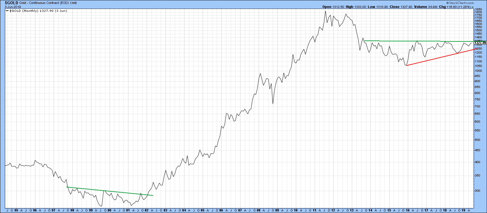 Chart 1 Chart 1
What has occurred is that the price oscillator (bottom window of Chart 2) has re-enforced its recent bullish signal by moving further away from the equilibrium line. One of the reasons why I like this indicator is that it does not generate much in the way of whipsaws. Since 1975, there have only been three whipsaws, flagged below by the one green and two red arrows. All of this increases the odds that Gold will break above that resistance sometime this year.
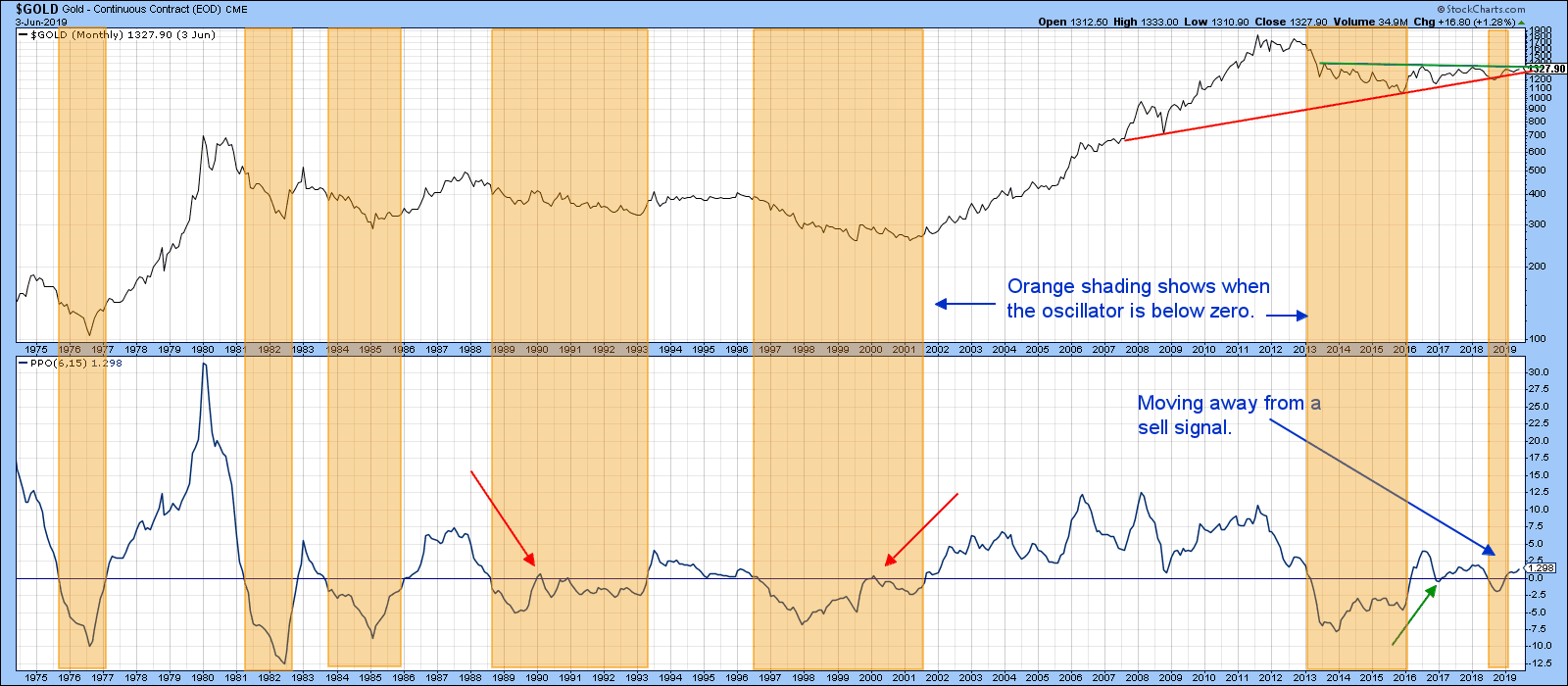 Chart 2 Chart 2
We can see how close a break may be in Chart 3, which plots the daily price action. Note that the Special K, which you can read about here, is also right on its bear market trend line, so virtually any strength whatsoever from current levels, will result in a joint breakout.
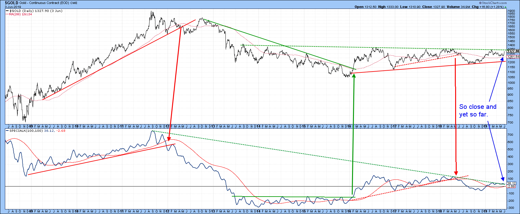 Chart 3 Chart 3
Good luck and good charting,
Martin J. Pring
The views expressed in this article are those of the author and do not necessarily reflect the position or opinion of Pring Turner Capital Group of Walnut Creek or its affiliates.
|
| READ ONLINE → |
|
|
|
| Art's Charts |
| Key Moving Average Rolls Over for S&P 500 |
| by Arthur Hill |
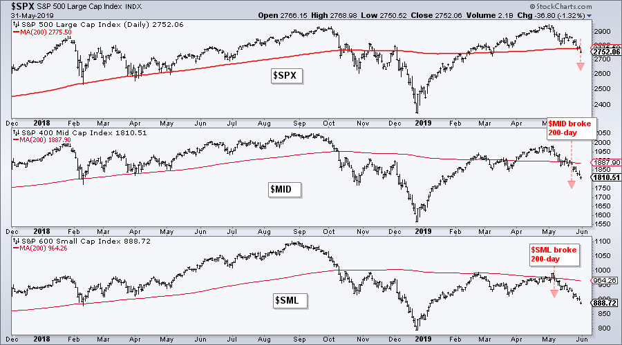
 The 200-day moving averages for the S&P Mid-Cap 400 and the S&P Small-Cap 600 are already trending lower and this key moving average for the S&P 500 turned lower over the past week. This puts all three indexes below their falling 200-day SMAs and in potential downtrends. The 200-day moving averages for the S&P Mid-Cap 400 and the S&P Small-Cap 600 are already trending lower and this key moving average for the S&P 500 turned lower over the past week. This puts all three indexes below their falling 200-day SMAs and in potential downtrends.
Chartists can use moving averages to determine the trend in at least two ways. First, the trend is up when price is above the moving average and down when price is below the moving average. The chart below shows $SML breaking its 200-day SMA on May 7th. $MID followed suit with a move below on May 22nd and $SPX closed below the 200-day on May 31st.
 Chartists can also use the direction of the moving average to determine trend. A rising moving average indicates an uptrend, while a falling moving average signals a downtrend. Moving average direction is not always easy to determine. Sometimes we need to remove the price bars and shorten the timeframe to see more detail. The chart below focuses on the moving averages by making the price bars invisible. Click the chart to open it and see the SharpChart settings. Chartists can also use the direction of the moving average to determine trend. A rising moving average indicates an uptrend, while a falling moving average signals a downtrend. Moving average direction is not always easy to determine. Sometimes we need to remove the price bars and shorten the timeframe to see more detail. The chart below focuses on the moving averages by making the price bars invisible. Click the chart to open it and see the SharpChart settings.
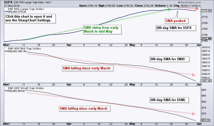 Notice that the 200-day SMAs for the S&P Mid-Cap 400 and S&P Small-Cap 600 have been falling since March and continued their fall in May. In contrast, the 200-day SMA for the S&P 500 rose from March to mid May and then turned lower over the last five days. With the SMA for the S&P 500 turning lower, all three indexes are now below their falling 200-day SMAs and in long-term downtrends. Notice that the 200-day SMAs for the S&P Mid-Cap 400 and S&P Small-Cap 600 have been falling since March and continued their fall in May. In contrast, the 200-day SMA for the S&P 500 rose from March to mid May and then turned lower over the last five days. With the SMA for the S&P 500 turning lower, all three indexes are now below their falling 200-day SMAs and in long-term downtrends.
On Trend on Youtube (Thursday, 30-May)
- SPY: Oversold at 200-day SMA
- New Lows Expand (Indexes and Sectors)
- Several Semis are Oversold at Support
- A New Play on Palladium?
- Click here to Watch.
On Trend on Youtube (Tuesday, 28-May)
- Walking Down the Lower Bollinger Band
- Sectors Above/Below 200-Day SMA
- Focus on XLV and Healthcare Stocks
- Breakdowns in Industrial and Discretionary Stocks
- FAAAM+: FB, AMZN, AAPL, GOOGL, MSFT (+NFLX).
- Click here to Watch
Arthur Hill, CMT
Senior Technical Analyst, StockCharts.com
Author, Define the Trend and Trade the Trend
Want to stay up to date with the latest market insights from Arthur?
– Follow @ArthurHill on Twitter
– Subscribe to Art's Charts
– Watch On Trend on StockCharts TV (Tuesdays / Thursdays at 10:30am ET)
|
| READ ONLINE → |
|
|
|
| The Mindful Investor |
| Banking on Bitcoin |
| by David Keller |
Yesterday, I had a great roundtable with Tom Bowley and Erin Swenlin on MarketWatchers Live, where Erin and I discussed comparisons between gold and Bitcoin.
Now, at first glance, that might seem like a bit of a spurious comparison. Gold has been around forever, while Bitcoin and other cryptocurrencies are just a couple years old. They couldn't be more different!
Not so fast.
You see, both have fanatical supporters. Both are polarizing topics; investors seem to either love them or hate them. Both have a demand that’s often driven by severe mistrust of central banks. Most importantly for investors, both are relatively uncorrelated to the equity markets.
Erin did a fantastic job outlining the case for gold in this video. But what do the charts say about Bitcoin?
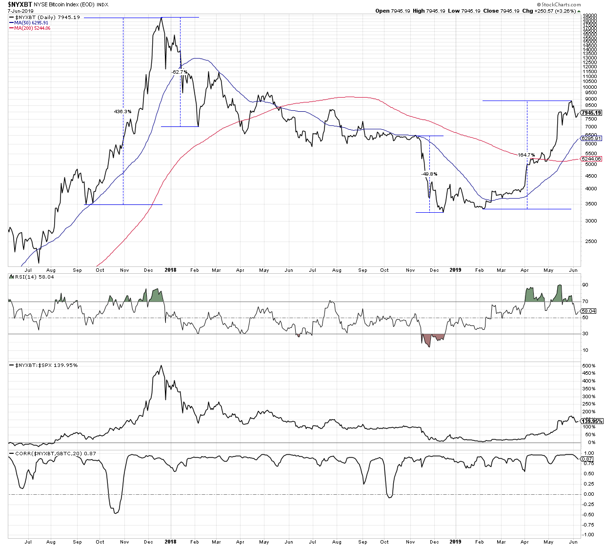 Well, the last two years illustrate the volatility at work with cryptocurrencies. Charts can often be deceiving, as the price line itself doesn’t really tell you how big the price swings really are. Here, I’ve used the Percentage Change tool to show you that the two biggest price drops in 2018 were 50-60% declines. Well, the last two years illustrate the volatility at work with cryptocurrencies. Charts can often be deceiving, as the price line itself doesn’t really tell you how big the price swings really are. Here, I’ve used the Percentage Change tool to show you that the two biggest price drops in 2018 were 50-60% declines.
After Bitcoin bottomed in early 2019, it rose over 160% to a peak just below 9000 at the end of May. So, while the price itself seems relatively straightforward, you have to realize that the price swings are indeed significant.
Further down the chart, you’ll see the relative performance of Bitcoin compared to the S&P 500. The strong up and down moves in the value of Bitcoin have resulted in periods of serious outperformance and underperformance for the cryptocurrency. Even with the recent pullback, Bitcoin has still outperformed stocks by over 80% year-to-date!
In terms of where Bitcoin is headed next, check out the RSI indicator and note the bearish divergence. As Bitcoin moved to a higher high into the end of May, the RSI put in a lower high. This bearish divergence suggests a weakening of momentum and potential downside here.
One of the ways to bet on the direction of Bitcoin without opening a crypto account is to use something like the Grayscale Bitcoin Trust.
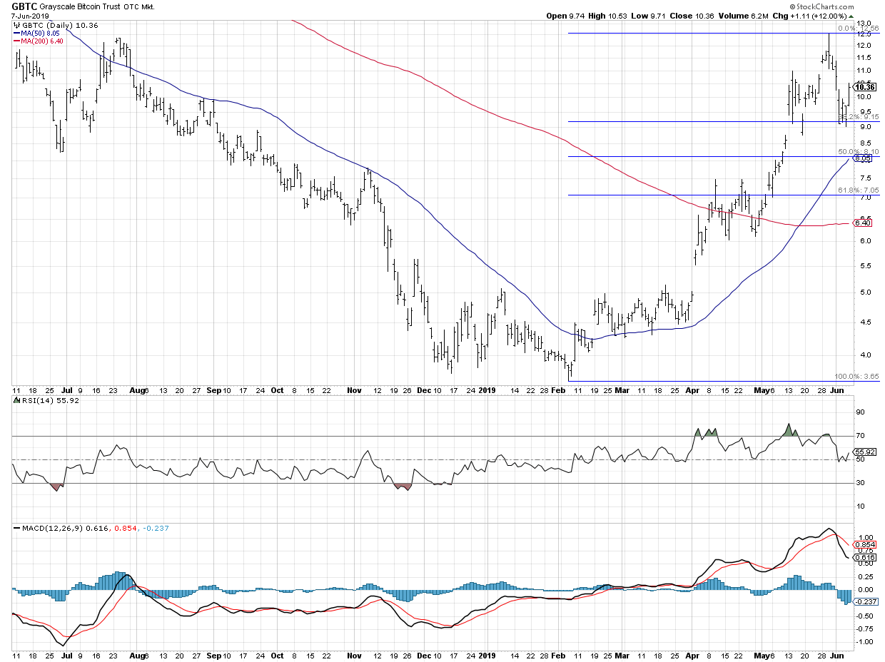 Here, we can see the up move from February to May in much better detail, as well as the bearish divergence we discussed on the Bitcoin chart. I’ve also included the MACD indicator, which confirms the recent pullback in price at the beginning of June. What’s interesting here is that GBTC has retraced 38.2% of the way back down, suggesting short-term support in play just below current levels. Here, we can see the up move from February to May in much better detail, as well as the bearish divergence we discussed on the Bitcoin chart. I’ve also included the MACD indicator, which confirms the recent pullback in price at the beginning of June. What’s interesting here is that GBTC has retraced 38.2% of the way back down, suggesting short-term support in play just below current levels.
Here, we have the short-term dilemma for Bitcoin. Was this recent pullback to Fibonacci support enough to digest recent gains and resume the uptrend? Or does the RSI bearish divergence and bearish MACD configuration mean further downside is in store?
At this point, I would say that the support level around 9.00 for GBTC is the key line in the sand. As long as the price remains above this level, the uptrend is still in place. A break below that level, however, would suggest further downside to just above 8.00.
Regardless of the short-term direction of Bitcoin, the fact it has a distinct return profile with uncorrelated returns to stocks means it could provide a good opportunity to diversify.
RR#6,
Dave
David Keller, CMT
President, Sierra Alpha Research LLC
Disclaimer: This blog is for educational purposes only and should not be construed as financial advice. The ideas and strategies should never be used without first assessing your own personal and financial situation or without consulting a financial professional.
The author does not have a position in mentioned securities at the time of publication. Any opinions expressed herein are solely those of the author and do not in any way represent the views or opinions of any other person or entity.
|
| READ ONLINE → |
|
|
|
| The Canadian Technician |
| Gold - Something To Love? |
| by Greg Schnell |
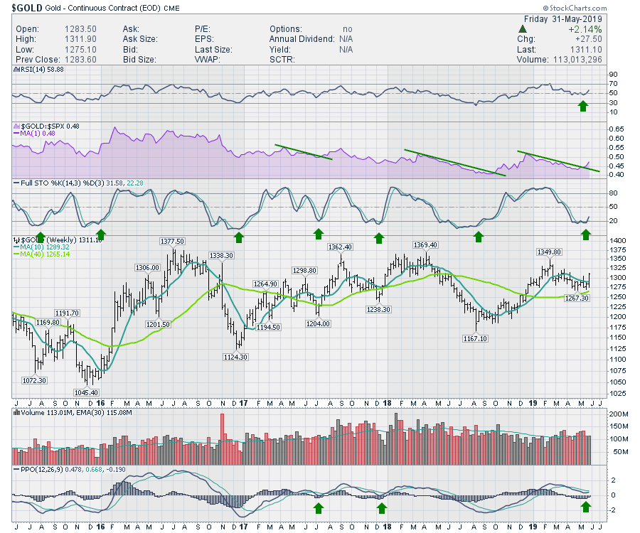
As I have mentioned in the last three Market Roundup shows (which you can find here on the StockCharts YouTube channel), the Gold-related charts have been setting up for weeks now. Friday's price action to close out the month looks like an initiation move that has more room to run. While that is hard to call on the first few days, the move was a very significant one at an important zone on the charts.
Focusing in on price, Gold has been able to hold above the 40-week moving average since the December move where price originally crossed up above it. Gold also finished at the top of the weekly price bar for the first time since February, its highest close since mid-March. There are not many asset classes in equities or commodities that finished the past week at the top of the price bar for the first time in months. Another bullish perspective is that the PPO turned up (without crossing the signal line) while above zero. In two past instances where it has crossed the signal line while above zero, the price rallied for at least a couple of months. Next week, we'll see if the price holds here as well as if the PPO finishes crossing above the signal line, as that has not happened yet. The bullish pattern is set up, but we'll need to see it play out.
The relative strength (shown in purple) is at a 3-month high for the first time since last year. Typically, that is a positive signal, as the relative strength is making higher highs ahead of price. One of the first signals on a weekly chart will be a move on the stochastics above 20, which also happened Friday.
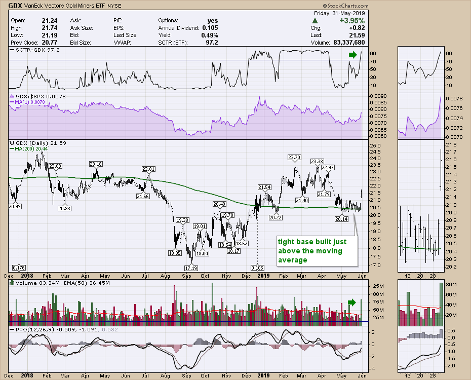
 One of the big clues regarding Gold is how well the miners outperformed the Gold price to finish the week. Gold was up 1.3% Friday, but the miners were up 3.9%, which was triple Gold's performance for the day. There are also a couple of other things on this chart that make it interesting. On the left side of the chart, the SCTR was never above 75. After surging up above 75 and going on a run, the gold miners gently pulled back and the SCTR dropped under 10. After a brief period down at 10, the SCTR has now surged back to become one of the top performing ETFs. This change in behavior compared to other stocks is important and is one of the gems that shows up in the SCTR indicator. While the relative strength did not make new three-month highs, it did pop up to new one-month highs. I'll be watching for that to keep outperforming next week. One of the reasons we have been watching Gold on Market Roundup is that the volume was getting extremely low. I have drawn a horizontal line at the May 21st volume level and May 20th was also low. Comparing that level by looking left, this was the lowest volume on the chart, including half-days around Thanksgiving and Christmas. When the volume goes eerily quiet, the behavior is changing. One of the big clues regarding Gold is how well the miners outperformed the Gold price to finish the week. Gold was up 1.3% Friday, but the miners were up 3.9%, which was triple Gold's performance for the day. There are also a couple of other things on this chart that make it interesting. On the left side of the chart, the SCTR was never above 75. After surging up above 75 and going on a run, the gold miners gently pulled back and the SCTR dropped under 10. After a brief period down at 10, the SCTR has now surged back to become one of the top performing ETFs. This change in behavior compared to other stocks is important and is one of the gems that shows up in the SCTR indicator. While the relative strength did not make new three-month highs, it did pop up to new one-month highs. I'll be watching for that to keep outperforming next week. One of the reasons we have been watching Gold on Market Roundup is that the volume was getting extremely low. I have drawn a horizontal line at the May 21st volume level and May 20th was also low. Comparing that level by looking left, this was the lowest volume on the chart, including half-days around Thanksgiving and Christmas. When the volume goes eerily quiet, the behavior is changing.
 From my Market Roundup charts, we can see what the volume profile looked like on GLD. Three of the last five weeks had the lowest volumes in three years! While we don't know how that will play out, it definitely suggests watching for a potential trend change. From my Market Roundup charts, we can see what the volume profile looked like on GLD. Three of the last five weeks had the lowest volumes in three years! While we don't know how that will play out, it definitely suggests watching for a potential trend change.
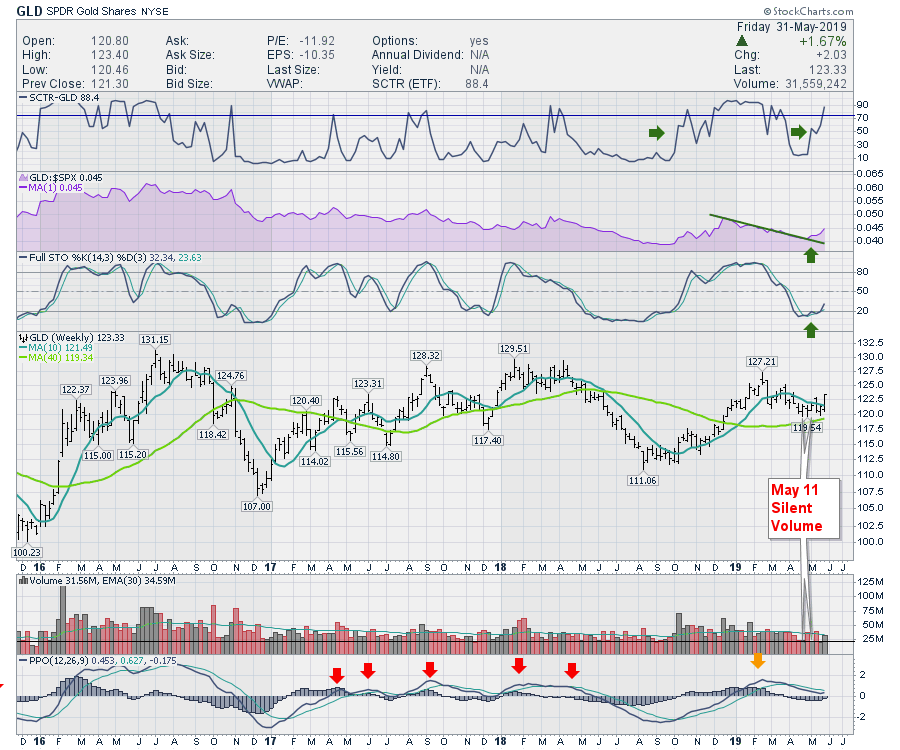 As Gold appears to be one of the bright spots this week, I'll have more information on the gold and silver setup in my Market Roundup on Saturday evening on the StockCharts YouTube channel. There are numerous other charts that I have been following to confirm the move in gold that ramped up as well. This bullish setup definitely looks promising for GDX and GLD. I would buy the miners more than the metal, as they tend to move farther and faster. I will work through the gold mining stocks on the video to point out which ones are set up nicely right now. As Gold appears to be one of the bright spots this week, I'll have more information on the gold and silver setup in my Market Roundup on Saturday evening on the StockCharts YouTube channel. There are numerous other charts that I have been following to confirm the move in gold that ramped up as well. This bullish setup definitely looks promising for GDX and GLD. I would buy the miners more than the metal, as they tend to move farther and faster. I will work through the gold mining stocks on the video to point out which ones are set up nicely right now.
Good trading,
Greg Schnell, CMT, MFTA
Senior Technical Analyst, StockCharts.com
Author, Stock Charts For Dummies
Want to stay on top of the market's latest intermarket signals?
– Follow @SchnellInvestor on Twitter
– Connect with Greg on LinkedIn
– Subscribe to The Canadian Technician
|
| READ ONLINE → |
|
|
|
| Trading Places |
| Relative Strength or Diversification? You Better Choose Carefully |
| by Tom Bowley |
I'm going to say that you need elements of both, although you're going to want a much bigger helping of relative strength. Too much diversification can be extremely unhealthy, there needs to be a balance. Let me give you a quote about diversification from one of the best investors of all-time:
"Diversification is a protection against ignorance. It makes very little sense for those who know what they're doing."
- Warren Buffett
Mr. Buffett, I completely agree with you. Conventional wisdom says to diversify, to invest in all areas of various asset classes so that stronger areas can protect you from weaker areas. But I honestly view it the other way. I believe the weaker areas are simply killing your stronger investments. Knowing that the U.S. Dollar Index ($USD) has been rising for 8 years, for example, tells me to avoid energy (XLE) and materials (XLB) stocks. There'll be a time for those stocks, but it's not now:
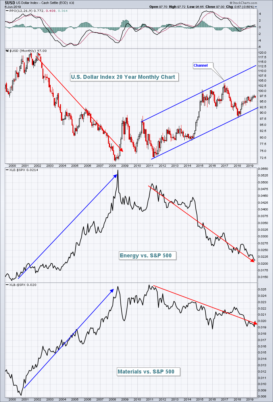 When you buy the SPY (ETF that tracks the S&P 500), you most certainly diversify. But by doing so, a significant amount of your money is being invested in energy and materials. Look at that chart above. A chunk of your money is underperforming badly. When you buy the SPY (ETF that tracks the S&P 500), you most certainly diversify. But by doing so, a significant amount of your money is being invested in energy and materials. Look at that chart above. A chunk of your money is underperforming badly.
In a day and age where we order breakfast and tell our server to "hold the potatoes" (bad example, I would never do that!) or call our cable company and ask them to cancel HBO, why can't we call our broker and say I'd like 500 shares of the SPY, but hold the energy and materials? Wouldn't that be great? Then when the XLE and XLB begin to outperform again, we could simply add them a la carte.
Honestly, it's not hard to be a better-than-average investor. But you have to be willing to gain a little knowledge and do a little homework. You don't need a PhD. You don't need 48 hours in a day. You just need StockCharts.com and a few ChartLists. Ok.....and maybe me and my fellow bloggers. I'm not kidding.
Wall Street preys on those who mindlessly buy diversified ETFs. Since part of your money is spent buying areas of the stock market that Wall Street hates, they're more than happy to short those shares. Those proceeds from shorting are then used to buy stocks in outperforming areas. They make a fortune and then preach to us to diversify.
Whatever.
Stick with what is working until it doesn't work any longer. That probably seems obvious and it is. Take a look at MSCI, Inc. and the specialty finance group ($DJUSSP):
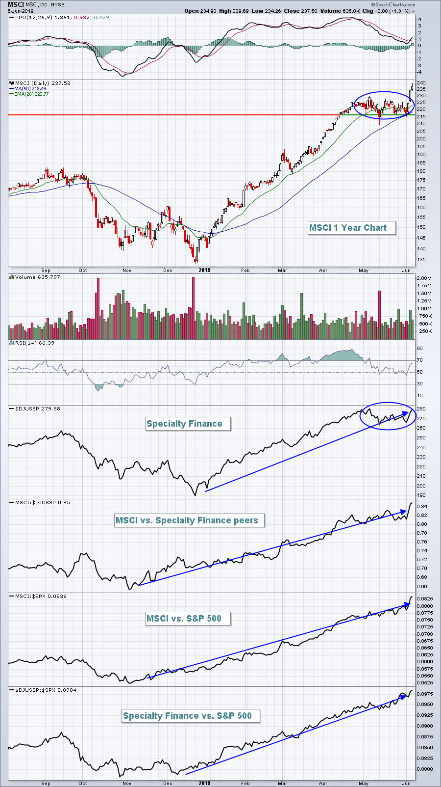 When the overall market sold off in May, both MSCI and the DJUSSP struggled and consolidated a bit, but check out that relative strength! And when the buying resumed this past week, the DJUSSP:SPX ratio and the MSCI:SPX ratio both broke out to new highs. Wall Street tells us the stocks we should own, but we're too busy diversifying to "protect" ourselves. Look at that chart again. The DJUSSP is one of the best performing industry groups relative to the S&P 500 and MSCI is one of the best performing stocks relative to its specialty finance peers. Why not own it and outperform portfolio managers everywhere? When the overall market sold off in May, both MSCI and the DJUSSP struggled and consolidated a bit, but check out that relative strength! And when the buying resumed this past week, the DJUSSP:SPX ratio and the MSCI:SPX ratio both broke out to new highs. Wall Street tells us the stocks we should own, but we're too busy diversifying to "protect" ourselves. Look at that chart again. The DJUSSP is one of the best performing industry groups relative to the S&P 500 and MSCI is one of the best performing stocks relative to its specialty finance peers. Why not own it and outperform portfolio managers everywhere?
I want you to join me for a special webinar, "The Power of Relative Strength", on Monday, June 10, 2019 at 4:30pm EST. I am going to cover every industry group and give you my opinion as to whether you should consider buying stocks in each industry. I'll also discuss a few of the stocks that are currently in my Model Portfolio, including MSCI. Since I began publicly announcing (on November 19, 2018) my Model Portfolio, which holds 10 equally-weighted and top performing stocks, check out its performance vs. the benchmark S&P 500:
S&P 500: +6.79%
Model Portfolio: +39.69%
On May 19th, when my last selections were announced, I added two additional portfolios - an Aggressive Portfolio that holds 10 of the best performing small- to mid-cap stocks and an Income Portfolio that holds large cap, more defensive and income-oriented stocks for those seeking more safety. Here's how they've performed (and compared to the S&P 500) since that May 19th webinar:
S&P 500: +0.48%
Model Portfolio: +7.35%
Aggressive Portfolio: +7.26%
Income Portfolio: +3.31%
Relative strength, as a primary focus for stock selection, works and I'll show you how on Monday.
The Monday event is being hosted by EarningsBeats.com and there's a small $7 30-day trial subscription, but it'll be well worth it. CLICK HERE to register and for more details. I'd love to have you join me!
Happy trading!
Tom
|
| READ ONLINE → |
|
|
|
|
|
| Earnings Beats |
| Strong Earnings can Fuel a Portfolio |
| by John Hopkins |
The market has been under fire for some time now as uncertainty abounds. Even a lot of stocks that had earlier reported strong earnings haven't been able to escape the recent market turmoil. However, there are also many stocks that have held up quite well, outperforming the market and reminding us that strong earnings DO matter.
As an example, we recently conducted a webinar that included unveiling 30 stocks we felt could outperform the market. These included 10 aggressive stocks, 10 "Model portfolio" stocks and 10 income/dividend stocks. 8 trading days later, the stocks have not disappointed, showing the following results through last Thursday's close:
- Aggressive portfolio - Beating SPX by 4.2%
- Model portfolio - Beating SPX by 3.62%
- Income/dividend portfolio - Beating SPX by 1.52%
Of course, 8 days is not a long enough timeframe to come to any major conclusions. However, in going back to November of last year, when we unveiled our "Top 10 Stocks," as well as May 10, just before we unveiled the latest batch of stocks, the Model portfolio was higher by almost 35%, while the S&P was higher by just over 7% during the same period of time.
I'm pointing all of this out to show that strong earnings can make a big difference no matter the market environment. Why? Because traders are attracted to companies that come up big (and why wouldn't they be?).
One thing we've done lately at EarningsBeats is reformat our "EarningsBeats Digest," which focuses on stocks with strong earnings. Friday's edition included a case study on Veeva Systems (VEEV), a stock that has performed well all year - including this past week when it released its numbers, as you can see below. This latest edition also includes a link to a recording of a webinar conducted last week, featuring StockCharts.com's Senior Technical Analyst Tom Bowley, on "What to look for in a Market Bottom." Talk about timely! If you would like to start receiving this FREE EarningsBeats Digest (including Friday's edition with the Market Bottom recording) just click here.
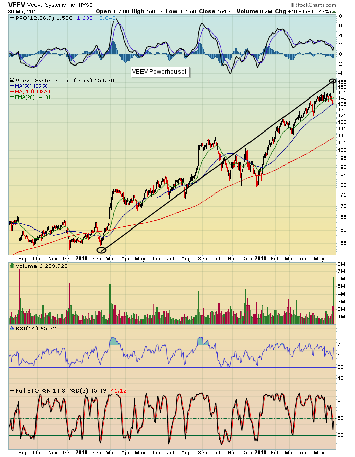 The market could remain highly volatile and, if it does, you will want to focus on stocks that are making money and headed higher for the future. These are the types of stocks traders are attracted to and should outperform the pack. The market could remain highly volatile and, if it does, you will want to focus on stocks that are making money and headed higher for the future. These are the types of stocks traders are attracted to and should outperform the pack.
At your service,
John Hopkins
EarningsBeats
|
| READ ONLINE → |
|
|
|
| The Traders Journal |
| The Best of Breed Methodology: Stage 4 - A Significant Enhancement |
| by Gatis Roze |
 A quarter century of investing yields one paramount conclusion. Venture capitalists have known this forever. Professional sports teams as well. Investors have been a little slower on the uptake. A quarter century of investing yields one paramount conclusion. Venture capitalists have known this forever. Professional sports teams as well. Investors have been a little slower on the uptake.
Venture capitalists will tell you that if you invest in one company like Netflix, Salesforce or Google, it will make up for an awful lot of losers. The New England Patriots know that drafting one Tom Brady in 2000 is why they have won six Super Bowls. Similarly, I can attest to the fact that as an investor all these years, my two main concerns were not hitting a grand slam stock pick or making zillions of dollars. I’ve said this before — if your paramount focus with investing is to pick the next Google and make millions, you’ll underachieve.
My two main concerns were always (1) to minimize my risks and (2) to acknowledge that single base hits are okay. No need to swing for the fences. Having said that, along the way, I bought stocks like Amazon, Microsoft, Visa and Mastercard — to which I held on for an exhilarating ride that paid for all my losers many times over. My point being, they happened in the normal course of business.
But these “Ten Baggers”, as Peter Lynch use to call them, don’t just walk up to you and knock at your door. It takes a lot of base hits for you to eventually hit a couple out of the park. This blog is about making certain that you have a system to regularly get on first base — which will make it possible for you to occasionally get some of those “out of the park” hits.
I should add that this best of breed approach works equally well for stocks, ETFs and mutual funds. Don’t try to tell me that individual stocks are the only way to hit it out of the park. My T. Rowe Price (PRGTX) has outperformed the market by 300% and Prime Cap Odyssey (POAGX) has outperformed by 200% which is still out of the park. Many of my readers and students have told me that my “Best of Breed” methodology is a dependable profit enhancer. I can assure you it has been for me.
To get the “Full Monty” or the most benefit from this blog, I’m going to ask you to do a little refresher course on the “Best of Breed” methodology. I’ve written three previous blogs on various aspects. Consider the prior three blogs as Stage 1, Stage 2 and Stage 3. This blog enters new expanded enhanced territory so we’ll consider this to be Stage 4. Please review Stage 1, Stage 2, and Stage 3.
Stage 4:
This Stage 4 enhancement came about from two ongoing frustrations and challenges with the “Best of Breed” methodology, as it previously existed:
- Even as a “pro” user on StockCharts.com, I could only plot ten symbols on one performance chart.
- I was constantly checking out potential new dance partners (i.e. equities) that were presented to me by other investors, the media, Morningstar, ETF.com, etc. I wanted some way to archive the fact that I had indeed checked out candidate “X” even though at the time it was not found worthy of being included in my “Best of Breed” chart (with a limit of 10 candidates). But I did want to include it in future analysis. I also wanted a way to know that a year ago, for example, I had actually considered it for inclusion. Yes, I had installed many such candidates in the notes section below each asset class chart, but that was less effective and somewhat cumbersome.
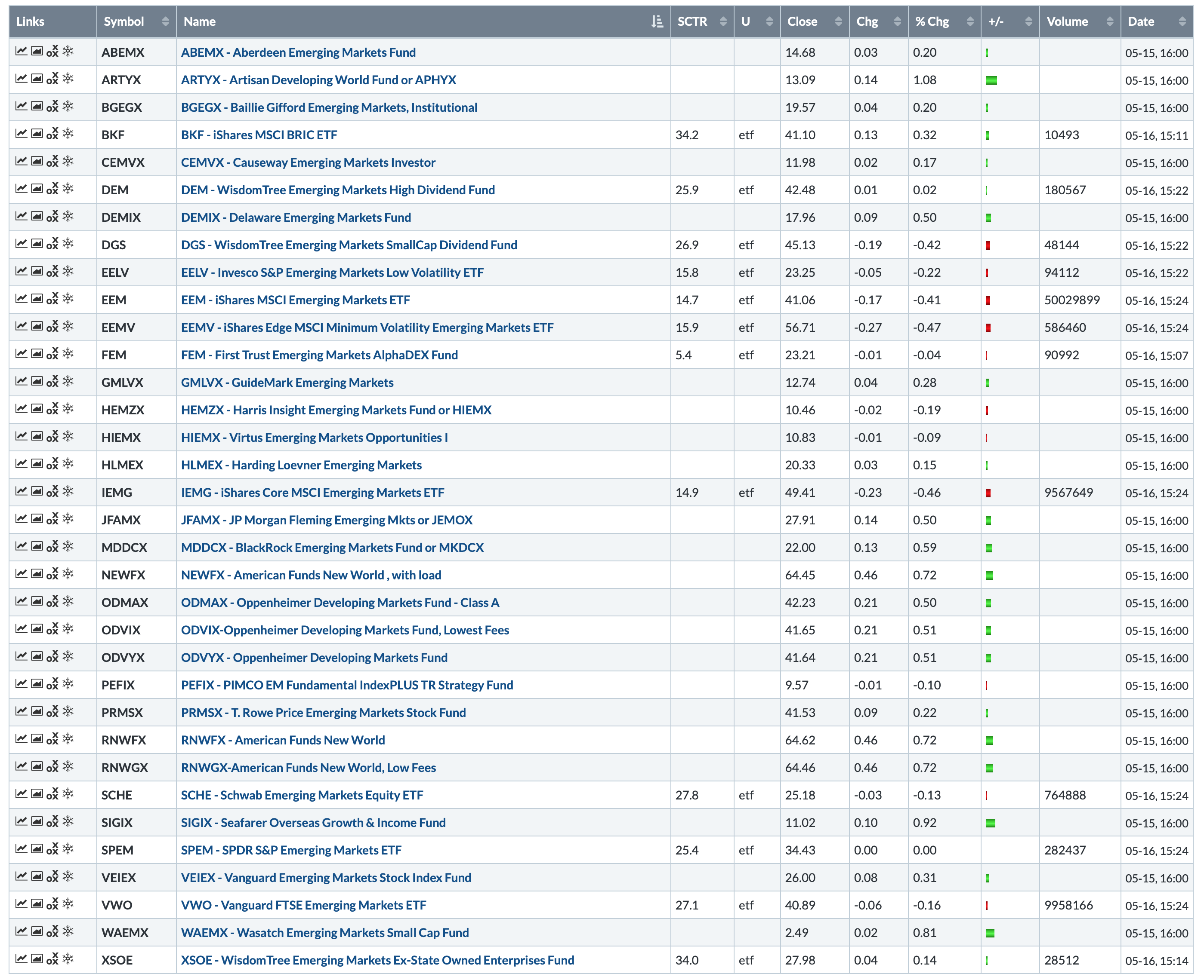
What I’ve done now is something I call “Stage 4” which works nicely. I have created a separate ChartList. I’ll use the Emerging Markets asset class as my example. I have a ChartList — 10.0 — which consists of the twenty asset classes in which I actively invest.
In the Tensile Trading ChartPack, ChartList 10.07 holds charts of all 59 asset classes from our book where we reduced the thousands of crazy asset classes out there and distilled them down to the essential 59 global asset classes. In my 10.0 ChartList, the Emerging Markets chart is labeled #34 and it looks like this. Remember, I can only plot ten symbols.

With Stage 4, I’ve installed a new ChartList 335-34 Emerging Markets, and in it, I’ll find all the candidates I’ve considered in the past as well as my present ten candidates. Adding a ticker symbol to this ChartList is quick and easy, and because it is now archived, I can reconsider it once again sometime in the future. I also don’t waste my time re-evaluating the same ticker in three months since it’s already in the ChartList and failed to make the grade. I also don’t lose a potential winner that came to my notice previously.
So with space constraints vaporized, I can archive all the Emerging Markets ETFS and mutual funds that I’ve researched so that I can revisit them easily at any time.
Trade well; trade with discipline!
- Gatis Roze, MBA, CMT
StockMarketMastery.com
|
| READ ONLINE → |
|
|
|
| DecisionPoint |
| Dissecting the Dow - New IT Price Momentum Oscillator SELL Signal |
| by Erin Swenlin |
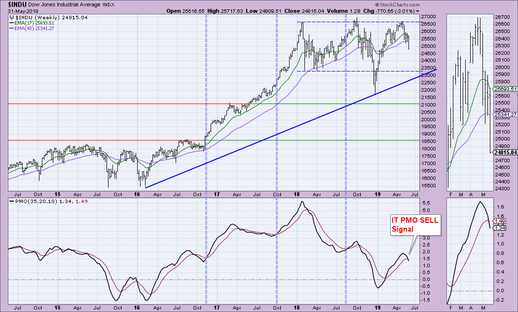
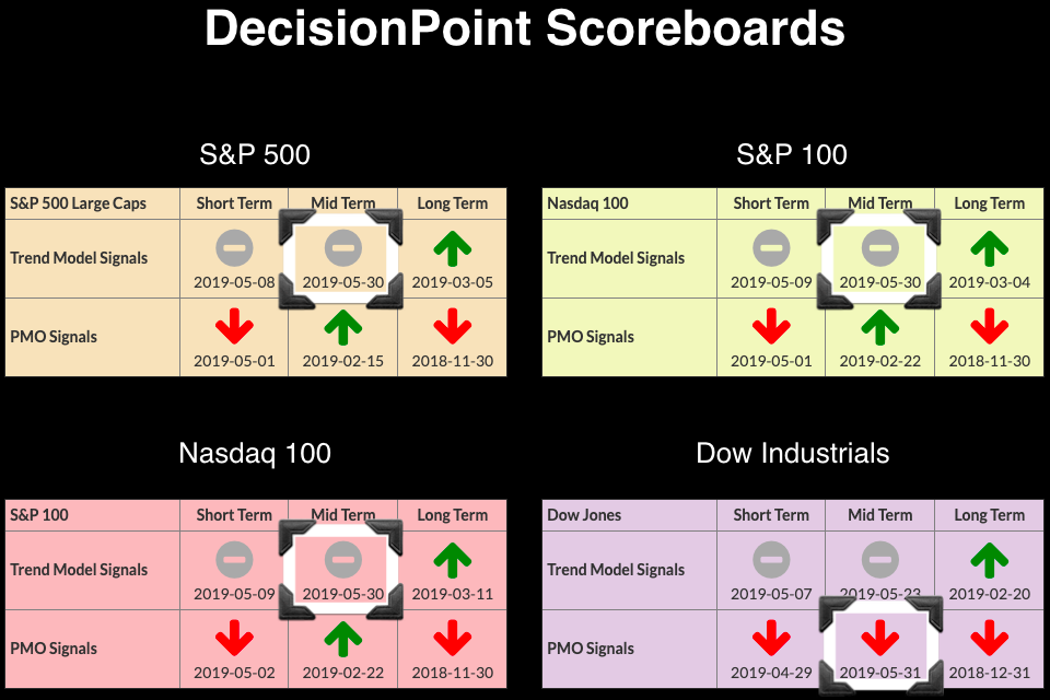
This week, all four of the Scoreboard indexes (SPX, OEX, NDX, Dow) switched to IT Trend Model Neutral signals. This is just added insult to injury, given the ST Neutral and SELL signals that posted earlier this month. Today, the Dow lost its IT Price Momentum Oscillator (PMO) BUY signal. This occurs when the PMO crosses below its signal line on the weekly chart, as seen below.
Here's a look at the DP Scoreboards. Carl wrote about the new IT Trend Model Neutral signal for the SPY in his Friday DP Weekly Wrap article. Be sure to read it, as there was also a SELL signal posted today on Oil.
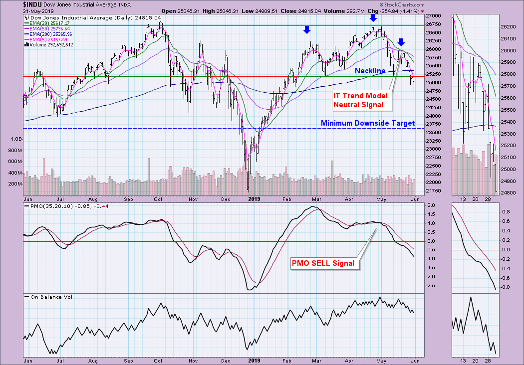
The Dow daily chart below points out the 20/50-EMA negative crossover that generated the Neutral signal. Despite a heavy-loss down day on the Dow, volume wasn't particularly climactic. I don't think this is over yet. In the chart, I've annotated a head-and-shoulders pattern. If you do the calculation by taking the length of the head to the neckline and subtracting it from the neckline, you would get a minimum downside target around 23600.
 In the free DecisionPoint Straight Shots ChartPack in the Dow ChartList, we have the Swenlin Trading Oscillators and the ITBM/ITVM charts. Notice on the STOs below that oscillation above the zero line indicates strength and accompanies rallies. When we start to see climactic moves below the zero line, it is a sign of internal weakness. There is some hope; the STOs are very oversold, which usually means we'd see a reversal. However, it is important to note that these indicators stretched much lower during the bear market and could certainly do so now. In the free DecisionPoint Straight Shots ChartPack in the Dow ChartList, we have the Swenlin Trading Oscillators and the ITBM/ITVM charts. Notice on the STOs below that oscillation above the zero line indicates strength and accompanies rallies. When we start to see climactic moves below the zero line, it is a sign of internal weakness. There is some hope; the STOs are very oversold, which usually means we'd see a reversal. However, it is important to note that these indicators stretched much lower during the bear market and could certainly do so now.
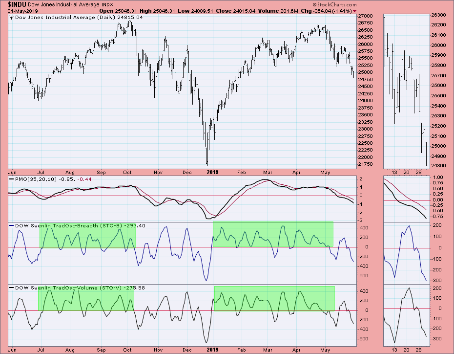
The ITBM and ITVM are very oversold for a bull market, but not so for a correction or bear market move.
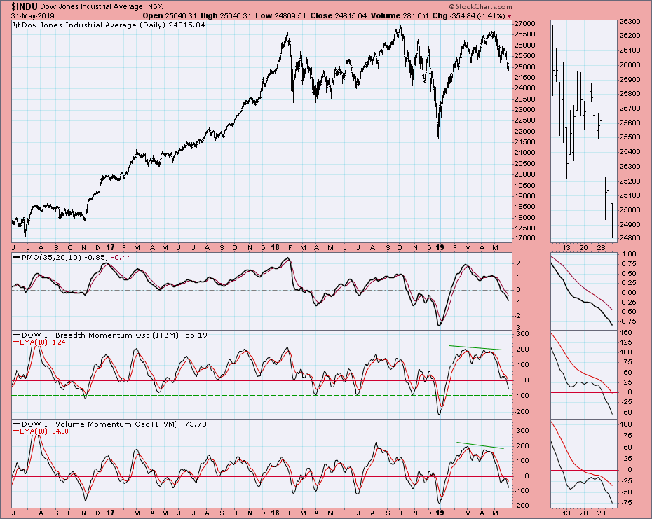
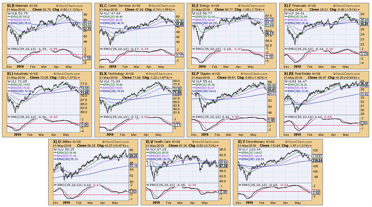
Conclusion: Indicators do not suggest a price reversal at this time. Take a look at the 20/50-EMAs on the SPDRs. We just logged ITTM Neutral signals for both XLK and XLY (aggressive sectors). The other sectors, including defensive sectors, are all headed for the same. Below is a CandleGlance. We are in correction mode now, and I don't see a price reversal on the horizon at this point.
Watch the latest episode of DecisionPoint with Carl & Erin Swenlin LIVE on Fridays 4:30p EST or on the StockCharts TV YouTube channel here!
Technical Analysis is a windsock, not a crystal ball.
Happy Charting!
- Erin
erinh@stockcharts.com
Helpful DecisionPoint Links:
Erin's PMO Scan
DecisionPoint Chart Gallery
Trend Models
Price Momentum Oscillator (PMO)
On Balance Volume
Swenlin Trading Oscillators (STO-B and STO-V)
ITBM and ITVM
SCTR Ranking
**Don't miss DecisionPoint Commentary! Add your email below to be notified of new updates"**
|
| READ ONLINE → |
|
|
|
| The MEM Edge |
| 3 Tasty Restaurant Stocks to Sink Your Teeth Into |
| by Mary Ellen McGonagle |
By all accounts, people enjoy eating out, with the National Restaurant Association projecting a record high in U.S. restaurant sales at $863 billion this year, up 3.6% from last year. From global expansion plans to technological advances, many restaurants are catering to consumer’s changing tastes while easing the delivery process. All of this has boosted same-store restaurant sales to levels not seen since 2015, with 4 successive quarters of improvement.
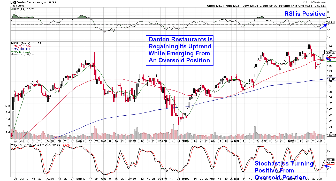
Below is a chart of the Dow Jones US Restaurants & Bars Index, which is comprised of larger, better-known companies. As you can see, the results so far this year have been impressive. It's not only heavyweight restaurant stocks that are advancing on strong growth prospects, though, as we'll cover a couple of attractive stocks not contained in this Index.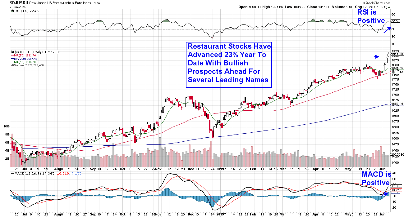 First up is Darden Restaurants (DRI), which runs over 1,500 restaurants in the U.S. and Canada. This includes the well-known eatery Olive Garden, which accounts for over half of the company’s revenues. The restaurant has seen same-store sales explode since initiating a turnaround campaign several years ago. First up is Darden Restaurants (DRI), which runs over 1,500 restaurants in the U.S. and Canada. This includes the well-known eatery Olive Garden, which accounts for over half of the company’s revenues. The restaurant has seen same-store sales explode since initiating a turnaround campaign several years ago.
Other restaurants in their portfolio are seeing solid growth as well, helping DRI report earnings that were ahead of estimates for the last 3 quarters in a row. Analysts are raising earnings estimates higher for this 2.5% yielder, which is due to report again later this month. The stock is bullishly approaching a buy point of $123.00, following a brief pullback below its 50-day moving average.
DAILY CHART OF DARDEN RESTAURANTS (DRI)
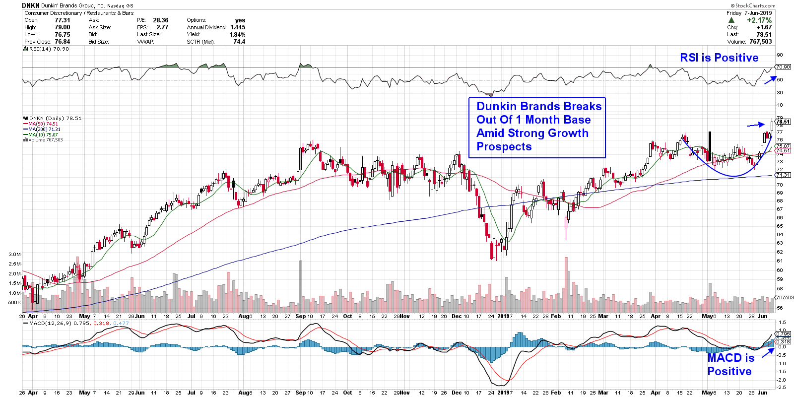
Anyone from the Northeast part of the U.S. will be familiar with this next company as Dunkin' Brands Group (DNKN) has been serving up their famous brewed coffee and donuts in the Massachusetts area since 1950. Known for their loyal customer base, the company has recently embarked on a growth campaign outside of the Northeast, with an eye toward adding 1,000 new locations throughout the U.S. by the end of 2020.
In addition to adding new locations, DNKN has seen a pickup in digital sales following the addition of new products to their menu. These initiatives have helped the company report earnings ahead of estimates for the past six straight quarters. The stock is extended following a sharp rally on Friday and can be bought on a pullback to the $77.00 level.
DAILY CHART OF DUNKIN' BRANDS GROUP (DNKN)
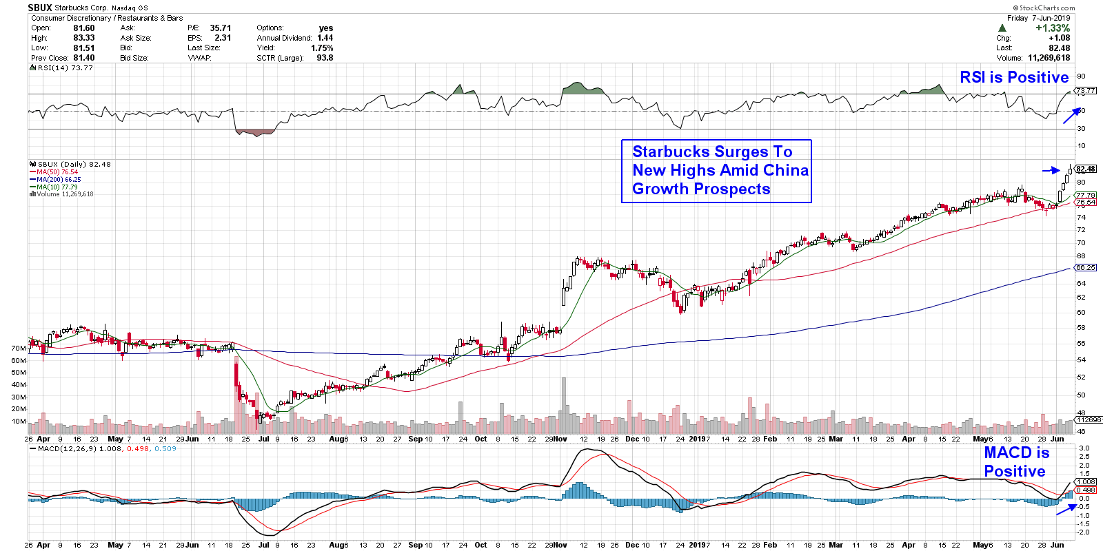
Let’s now take a look at Starbucks (SBUX). The Seattle-based coffee purveyor surged to an all-time high on Friday following bullish remarks from their CFO regarding growth prospects in China. The company has already seen strong returns from their new unit investments there and are viewing China as their lead growth market for the long term.
The company is also on firm footing in the U.S., having grown same store sales by 4% in 2018. Higher pricing and the closure of 150 underperforming stores in the U.S., coupled with continued growth in Europe, has analysts raising estimates for both this year and the next. The stock is currently extended and can be purchased on a pullback to the $79.00 level.
DAILY CHART OF STARBUCKS CORP. (SBUX)
 With technological advances that make ordering and quickly receiving hot, prepared meals as easy as a click on your iPhone, industry insiders are expecting the recent uptrend in many of these stocks to continue. The addition of new menu items such as alternative meat product Beyond Meat (BYND), as well as automated prep tools that speed up output, are also highlights that are expected to keep restaurant stocks in demand. With technological advances that make ordering and quickly receiving hot, prepared meals as easy as a click on your iPhone, industry insiders are expecting the recent uptrend in many of these stocks to continue. The addition of new menu items such as alternative meat product Beyond Meat (BYND), as well as automated prep tools that speed up output, are also highlights that are expected to keep restaurant stocks in demand.
Mary Ellen McGonagle
MEM Investment Research
|
| READ ONLINE → |
|
|
|
| SPECIAL EVENT ANNOUNCEMENT |
| For those of you in or near the Pacific Northwest – or anyone up for a trip to Seattle – we have an important announcement for you. The MoneyShow will be returning to Seattle next month, June 15th and 16th. In addition to a long list of incredible presenters, our own Gatis Roze will be a featured speaker at the event. Many of the StockCharts team members will be there as well, and we encourage you to join us. With so many experts sharing their investing wisdom and unique energy that accompanies this exciting event, we know it will be a can't-miss for 2019. Click the banner below to learn more and pre-register for next month's MoneyShow here in Seattle! |
 |
| LEARN MORE → |
|
| RRG Charts |
| Can I Have A Coke (KO) With My Big Mac (MCD) Please? |
| by Julius de Kempenaer |
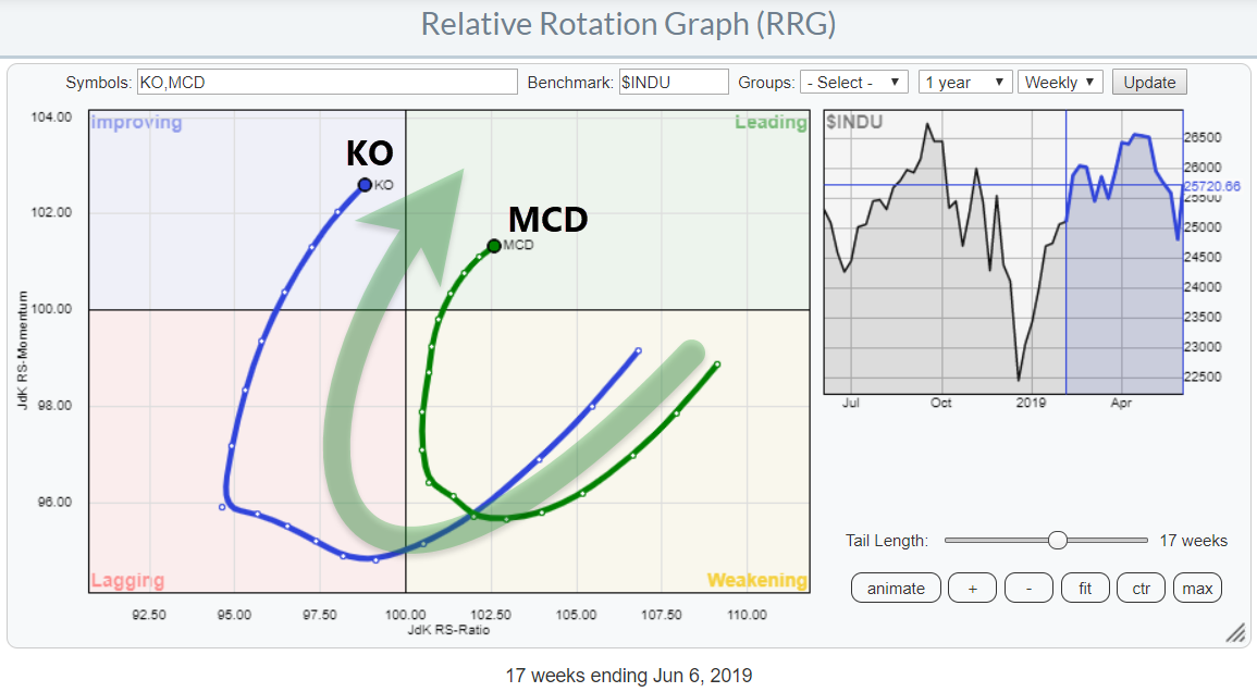
 While browsing through the stocks in the DJ Industrials index, my attention was grabbed by the tails on KO and MCD, both in a positive way. While browsing through the stocks in the DJ Industrials index, my attention was grabbed by the tails on KO and MCD, both in a positive way.
KO is making a wide rotation through lagging into improving and is now very close to crossing over into the leading quadrant. MCD, meanwhile, is already inside that leading quadrant, having completed a rotation through weakening without hitting the lagging quadrant.
When you toggle* through the tails on the RRG of the Dow 30 stocks against $INDU, you can easily notice these two tails as being of potential interest. They both have very regular rotations, they are of decent length and they are both moving at a strong RRG-Heading. These seem like reasons enough to put them on the SharpChart workbench for further inspection.
Coca Cola Co. - KO

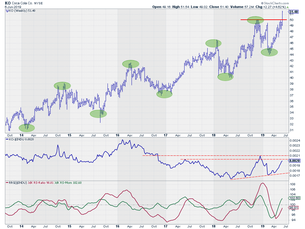
The price chart of Coca-Cola shows a series of higher highs and higher lows (green marked ovals), which means that an uptrend is in play. The only problem is that I had a hard time coming up with meaningful trend lines to mark that uptrend or contain it in a channel.
That's nothing major; it's just that the trend that is not as regular as we would like to see it. Higher highs and higher lows are good, though, and the recent break above the resistance level (around $50), coming off the last two (or three if you include the high of two weeks ago), has once again confirmed that this trend is still intact.
The relative line is a different story. From early 2016 until May 2018, KO was not able to keep up with the pace of the DJ Industrials index and was a big underperformer. This relative weakness changed during the second half of 2018; looking back, we can now detect two higher lows following the turning point in May 2018.
As a bonus, these three lows are lining up nicely, providing us with a reliable (three touch points) trend line to mark support for relative strength. A break beyond the two horizontal resistance lines (dashed) would be a confirmation of the improvement in relative strength that is underway and would provide the rally with new fuel.
The RRG-Lines are both moving higher at a pretty steep angle, providing us with the strong heading seen on the RRG. A further rotation into the leading quadrant seems to be around the corner.
McDonalds Corp - MCD

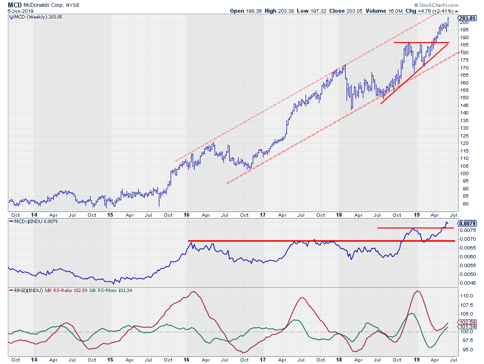
MCD is in even better shape than Coca-Cola. The price is contained inside a nice rising channel that is still in play and has room to move higher before touching the upper boundary. The recent break beyond resistance (just above $185) was a strong signal that triggered an acceleration of the rally that is currently underway.
From a relative perspective, MCD had been moving in a range since the start of 2016, only breaking out of it in October of last year. That initial break caused the RRG-Lines to move above 100 in tandem and position MCD inside the leading quadrant. After setting a new relative high, the former horizontal resistance level was successfully tested as support. During that test, the JdK RS-ratio line managed to remain above 100, putting in a new low before following relative strength higher.
This sequence of events causes a rotation at the right-hand side of the Relative Rotation Graph, which is usually a prelude to a strong relative move higher.
All in all, both stocks are looking good from a relative and price perspective in comparison to the DJ Industrials index.
So, at your next visit to MCD, you might want to consider super-sizing your meal (and adding an XL Coke). ;)
My regular blog is the RRG Charts blog. If you would like to receive a notification when a new article is published, simply Subscribe using your email address.
Julius de Kempenaer
Senior Technical Analyst, StockCharts.com
Creator, Relative Rotation Graphs
Founder, RRG Research
Want to stay up to date with the latest market insights from Julius?
– Follow @RRGResearch on Twitter
– Like RRG Research on Facebook
– Follow RRG Research on LinkedIn
– Subscribe to the RRG Charts blog on StockCharts
Feedback, comments or questions are welcome at Juliusdk@stockcharts.com. I cannot promise to respond to each and every message, but I will certainly read them and, where reasonably possible, use the feedback and comments or answer questions.
To discuss RRG with me on S.C.A.N., tag me using the handle Julius_RRG.
RRG, Relative Rotation Graphs, JdK RS-Ratio, and JdK RS-Momentum are registered trademarks of RRG Research.
|
| READ ONLINE → |
|
|
|
| MORE ARTICLES → |
|
 Chart 1
 Chart 2
 Chart 3
 The 200-day moving averages for the S&P Mid-Cap 400 and the S&P Small-Cap 600 are already trending lower and this key moving average for the S&P 500 turned lower over the past week. This puts all three indexes below their falling 200-day SMAs and in potential downtrends.

 Well, the last two years illustrate the volatility at work with cryptocurrencies. Charts can often be deceiving, as the price line itself doesn’t really tell you how big the price swings really are. Here, I’ve used the Percentage Change tool to show you that the two biggest price drops in 2018 were 50-60% declines.
 Here, we can see the up move from February to May in much better detail, as well as the bearish divergence we discussed on the Bitcoin chart. I’ve also included the MACD indicator, which confirms the recent pullback in price at the beginning of June. What’s interesting here is that GBTC has retraced 38.2% of the way back down, suggesting short-term support in play just below current levels.


 The market could remain highly volatile and, if it does, you will want to focus on stocks that are making money and headed higher for the future. These are the types of stocks traders are attracted to and should outperform the pack.
 A quarter century of investing yields one paramount conclusion. Venture capitalists have known this forever. Professional sports teams as well. Investors have been a little slower on the uptake.


 First up is Darden Restaurants (DRI), which runs over 1,500 restaurants in the U.S. and Canada. This includes the well-known eatery Olive Garden, which accounts for over half of the company’s revenues. The restaurant has seen same-store sales explode since initiating a turnaround campaign several years ago.

 With technological advances that make ordering and quickly receiving hot, prepared meals as easy as a click on your iPhone, industry insiders are expecting the recent uptrend in many of these stocks to continue. The addition of new menu items such as alternative meat product Beyond Meat (BYND), as well as automated prep tools that speed up output, are also highlights that are expected to keep restaurant stocks in demand.
