| THIS WEEK'S ARTICLES |
| Market Roundup |
| Commodities Remain on a Knife Edge |
| by Martin Pring |
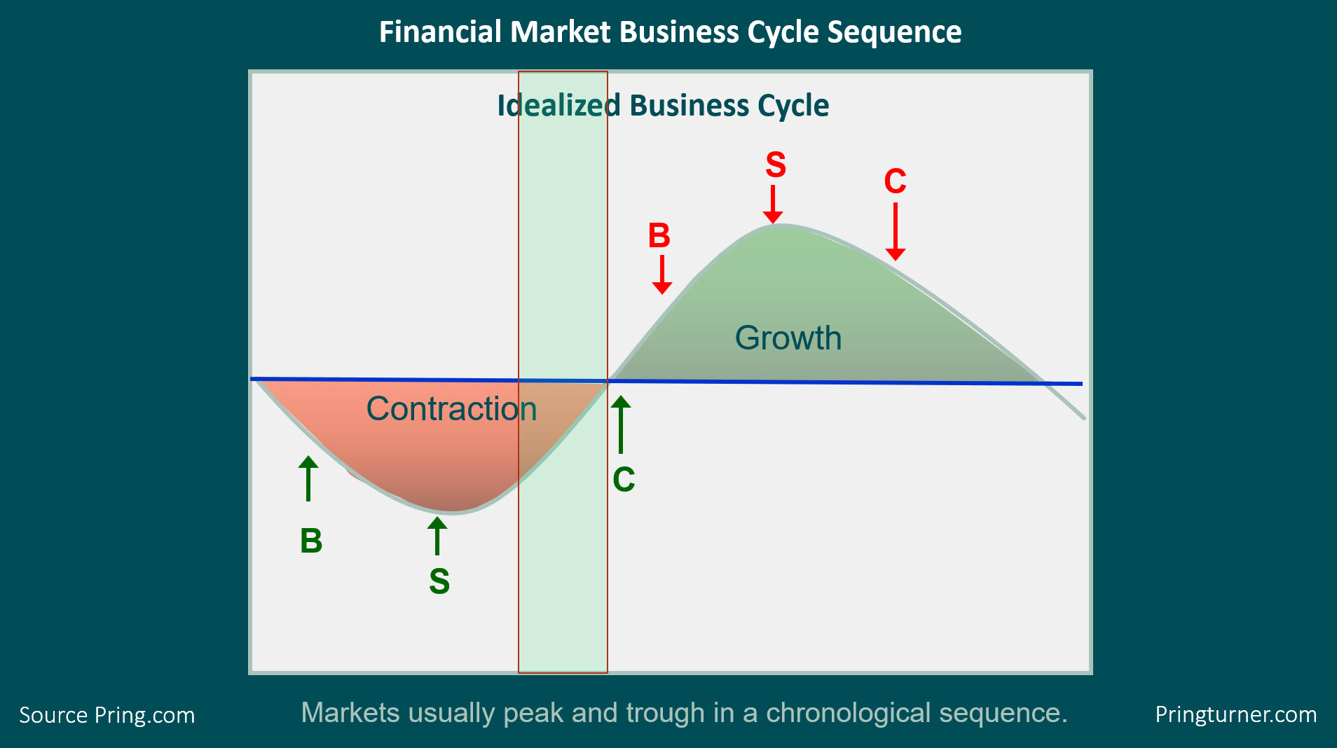
Back in December, I wrote an article pointing out that the business cycle was nothing more than a set series of chronological sequences. The importance of this observation, for investors, is that the primary trend peaks and troughs of bonds, stocks and commodities fit nicely into that chronology, as shown in Figure 1. At that time, my models for the three markets indicated that the the cycle was likely somewhere in the green-shaded area. They still do. The diagram implies that the US economy is emerging from a recession, but, clearly, that's not the case. However, since the last recession, which ended in 2009, the economy has undergone three growth slowdowns, which were all associated with that bond, stock, commodity chronological turning point sequence.

Figure 1
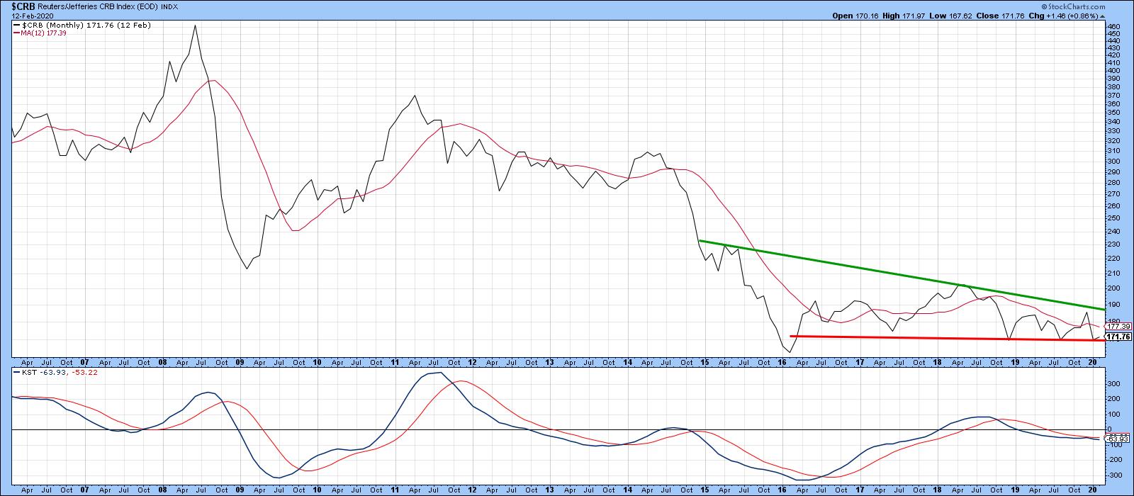
My work shows that the latest slowdown, which began around at the end of 2017, now appears to be ending. Since bonds and stocks are already in a confirmed bull market, the next event to look out for is a bottom in commodities. Last December, it seemed that commodities were just about to break to the upside, but the confirmation that I called for never happened. That confirmation was a month-end close in the CRB Composite above 190, which would have taken it above the green down trendline in Chart 1. Instead, the CRB experienced a sharp drop due to economic fears concerning the coronavirus. Now, it is back to support just above the red trendline. In the meantime, nothing has yet changed for the worse on the economic front; indeed, things have actually improved.

Chart 1
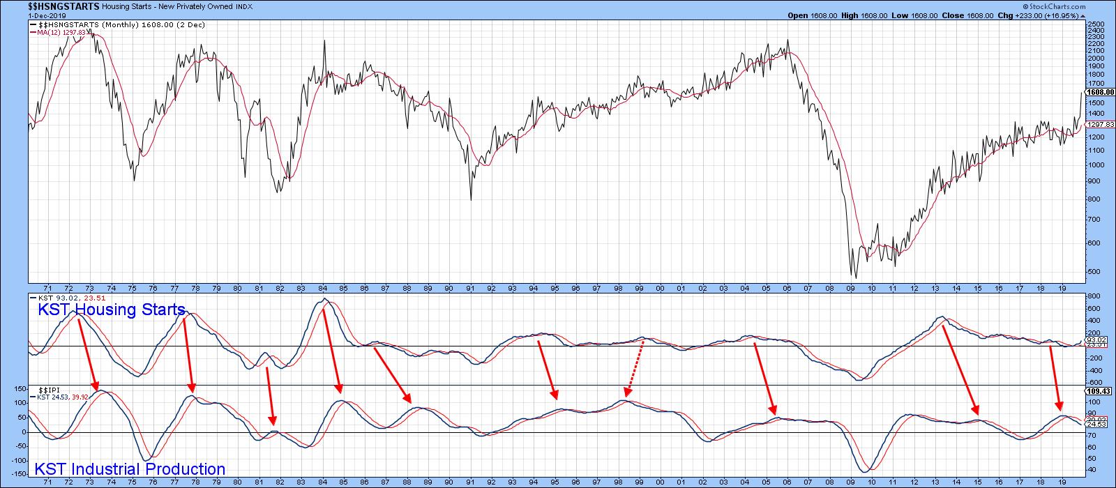
In that respect, Chart 2 shows that housing starts, a very long leading economic indicator due to their sensitivity to interest rates, literally exploded in the last couple of months. This is also reflected in its KST. This series has now reversed sharply to the upside, yet remains at a subdued level, meaning that it has plenty of upside potential until it gets to its traditional warning level. Ironically, the recent drop in commodities has had a stimulating effect on housing, since the drop was accompanied with a decline in rates themselves. Swings in the housing start numbers are not very helpful in forecasting commodity trends. However, since they are a forward-looking indicator, they are of invaluable help in forecasting trends in other parts of the economy. Chart 2, for instance, shows that housing start momentum consistently leads that for industrial production, a coincident indicator at peaks.

Chart 2
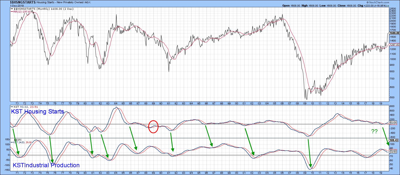
On the other hand, Chart 3 demonstrates that same leading characteristic at bottoms. If the normal sequence repeats again, I would expect to see the KST for Industrial Production soon reverse to the upside.

Chart 3
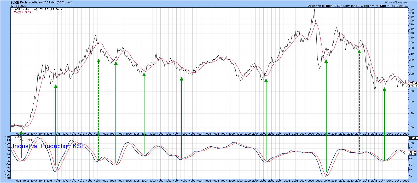
That's important for commodities, because Chart 4 tells us that upside reversals in industrial production momentum are consistently associated with major commodity buying opportunities. All indicators and relationships fail from time-to-time. The two dashed arrows show that this one is no exception, given two failed signals in 1981 and 2014. Note also that, in the majority of cases, lows in production momentum lag the actual bottom in the CRB by a few months.

Chart 4
Editor's Note: This is an excerpt of an article that was originally published in Martin Pring's Market Roundup on Wednesday, January 29th at 1:29pm ET. Click here to read the full article, which includes Charts 5-8 and a discussion of the DB Commodity ETF.
Good luck and good charting,
Martin J. Pring
The views expressed in this article are those of the author and do not necessarily reflect the position or opinion of Pring Turner Capital Group of Walnut Creek or its affiliates.
|
| READ ONLINE → |
|
|
|
| The Mindful Investor |
| Struggling Small Caps |
| by David Keller |
"How come small-caps aren't doing better when the market's making new highs?"
I've heard some version of this question many times over the last couple years, starting with the emergence of the FAANG trade. Once that subsided and the market resumed its uptrend, the resilience of the Technology sector became the story.
A number of my fellow StockCharts contributors have been highlighting this trend, most recently Greg Schnell, who remarked "What we're seeing is the market bifurcating into large-cap huddles and small-cap dispersion."
So, to answer the question "How come the market is going higher but small-caps really are not?", I would simply answer, "Because mega-cap tech names can push the S&P 500 way higher all on their own!"
But the real question is this: is the lack of participation a warning sign of sorts, or just an illustration of the dominance of mega cap stocks in this market regime? The answer, of course, is mixed.
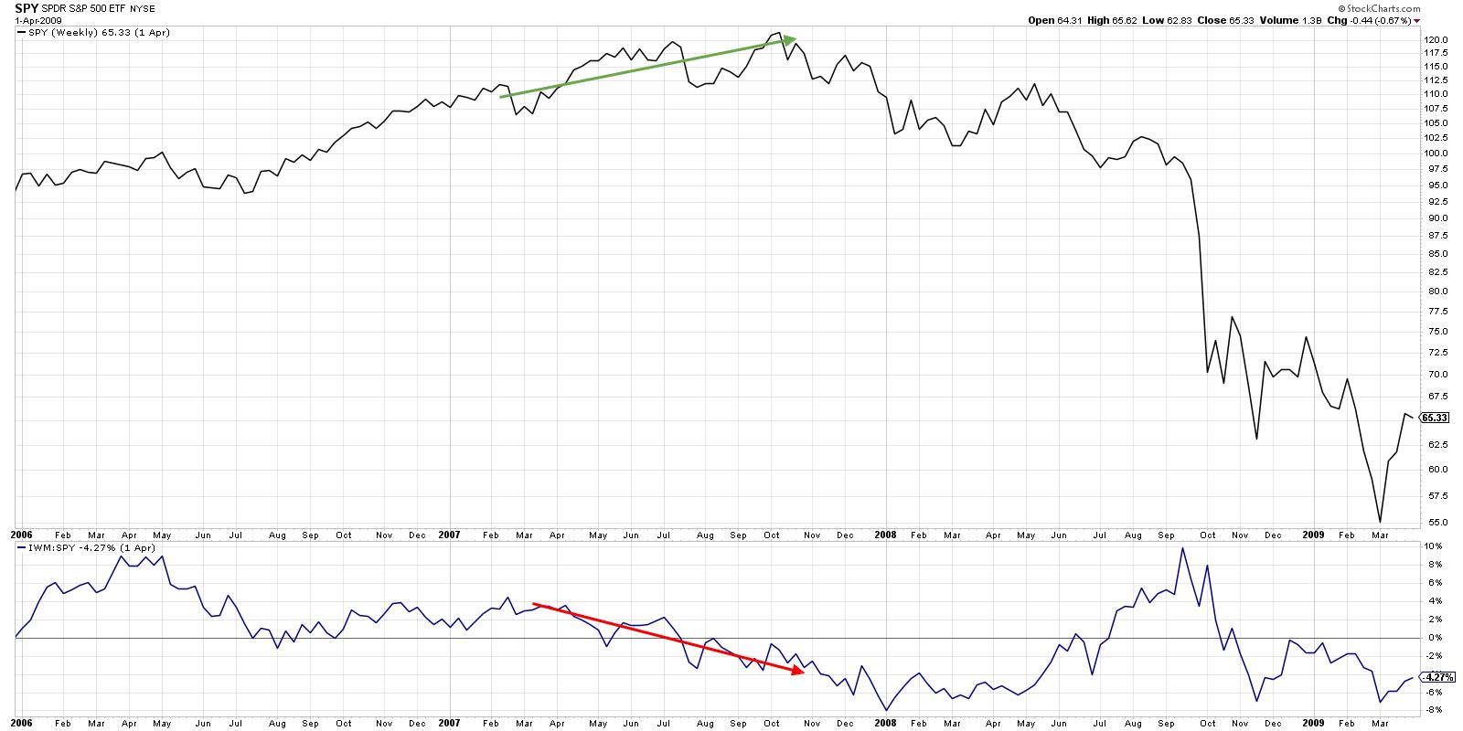
There is a precedent for small-cap underperformance at market tops. Take 2007, for example.

After a strong rally in the second half of 2006, the S&P 500 rallied strong through mid-2007. Starting in April, however, small cap stocks started to show signs of distribution. As the smaller, more speculative stocks sold off, blue chip mega-caps like PepsiCo (PEP) accelerated to the upside.
This divergence between small and large spoke to a flight to more conservative stocks as the higher beta small caps rotated lower. By the time the market finally topped out in October, small caps were testing support levels and the relative strength was quite negative.
So the market's probably ending the bullish phase because small caps are struggling, right?
Not necessarily.
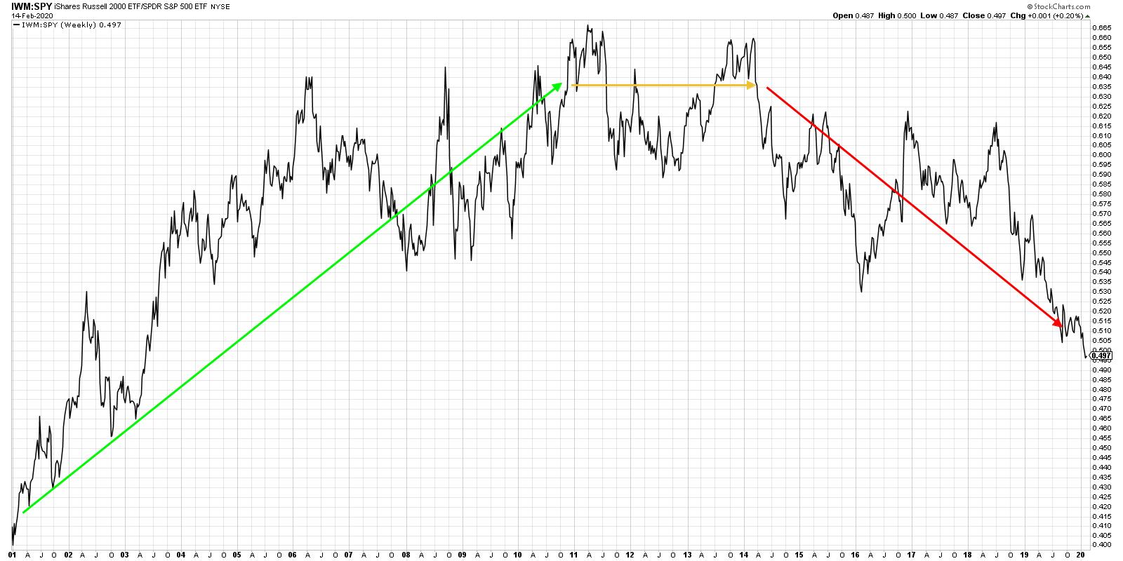
If you look at a longer-term view of the relative performance of small-cap vs. large-cap stocks, you can see that small-caps have been struggling on a relative basis for a number of years.

From 2001 to 2011, the small-cap ETF consistently outperformed the S&P 500 ETF, even with stretches of underperformance in 2007 and 2008. 2011 to 2014 essentially saw consistent performance between these two cap tiers, with large and small stocks moving relative in line with each other.
Since 2014, this ratio has been in a consistent downtrend. While there are many potential reasons for this performance phenomenon, I would speculate that the outperformance of mega-cap technology and consumer stocks put pressure on institutions to own those names. The more buying pressure that builds, the more demand for these stocks, and the higher the prices go.
What does all of this mean for the current market environment?

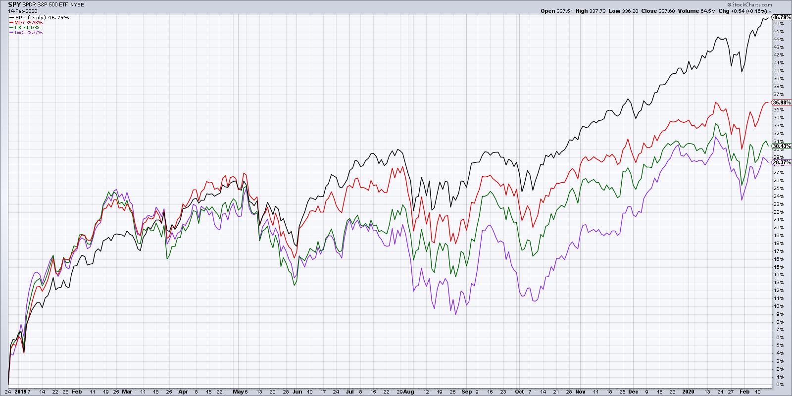
Since the December 2018 market bottom, large caps have dominated, with the S&P 500 returning almost 47%. Mid-caps were up 36% over that same time period, followed by small-caps (+31%) and micro-caps (+28%).
I'm seeing the S&P 500 breaking to all-time highs, mid-caps testing resistance, and small- and micro-caps potentially establishing lower highs. While this bearish divergence would usually suggest a negative bias due to the underperformance of the higher beta names, I would argue that it may just be a characteristic of the new market regime of mega-cap dominance.
Most importantly, until the S&P breaks down through some sort of support level, confirming a lower low, the path of least resistance is up.
RR#6,
Dave
David Keller, CMT
Chief Market Strategist
StockCharts.com
Disclaimer: This blog is for educational purposes only and should not be construed as financial advice. The ideas and strategies should never be used without first assessing your own personal and financial situation or without consulting a financial professional.
The author does not have a position in mentioned securities at the time of publication. Any opinions expressed herein are solely those of the author and do not in any way represent the views or opinions of any other person or entity.
|
| READ ONLINE → |
|
|
|
| The Traders Journal |
| Mindset Matters: Why The Long Game Is My Only Option And How I'm A Better Trader For It |
| by Grayson Roze |

I just can't do it. I just can't bring myself to short stuff – the market, an individual stock, even something as seemingly harmless as an inverse ETF. I don't do it. I can't do it. I won't do it!
Yep, I'm a "long" through and through, but you know what? I'm proud of it. I'm comfortable in that skin, confident in that self knowledge and – most importantly – I'm a better trader/investor for it. I'm not arguing with myself and never feel conflicted about my outlook. I'm consistent in my view that up is good and bullish is better. And that consistency directly translates to better trading and smarter investments.
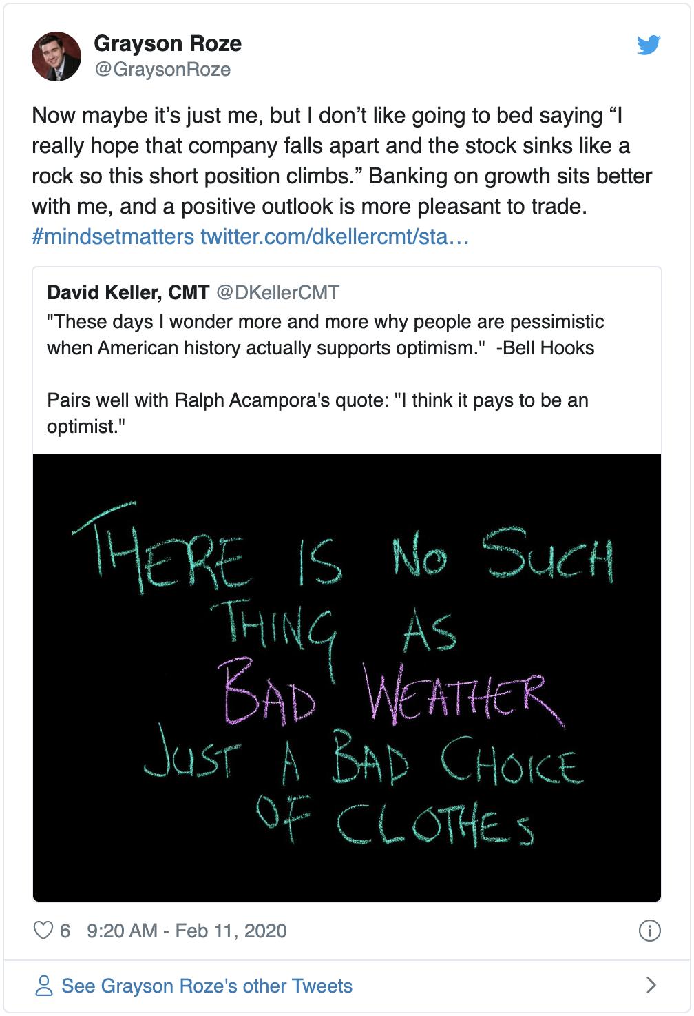
Before I keep going, let me pause and let you know where this is coming from. Yesterday, inspired by a tweet from my good friend David Keller (@DKellerCMT), I responded with the following:

That little line from my tweet yesterday really does capture it in the best way I know how. I don't like going to sleep with a negative outlook hoping that I wake up tomorrow to bad news that will help my short position.
Instead, I prefer going to bed saying, "This company has been doing incredible things lately, introducing services that are truly helping their customers or releasing new products that are adding value to their users, and I hope that growth is reflected positively in the price movement of the stock tomorrow so that my long position can grow with this company".
Doesn't that just sound like a cleaner conscience to trade with? A better mindset to live by? I think so.
Mindset Matters
True traders and successful investors will always tell you – mindset matters. Trading psychology and the mental side of money is the missing piece that most novices lack. Without experience in the markets, mindset is the easiest thing to write off, but it's the last one you should.
It's striking how often I see the very best among us emphasize the importance of things like emotional and behavioral controls, mindfulness, decision making and judgment. That's why I frequently put renowned psychologist Barry Schwartz's book, "The Paradox of Choice", on my list of recommended trading books. It's also why "The Investor Self" is the third of ten stages in my book, "Tensile Trading: The 10 Essential Stages of Stock Market Mastery". It's right up there at the beginning, well before the "Buying" stage at number seven.
With respect to the long vs. short discussion, I say to each his/her own. Find what works for you and stick to it. But regardless, for all of you across both sides of the aisle, my message remains clear: #mindsetmatters.
Money In, Eyes Open.
- Grayson Roze
VP of Operations, StockCharts.com
Author, Trading for Dummies (Wiley, 2017)
Author, Tensile Trading (Wiley, 2016)
StockMarketMastery.com
|
| READ ONLINE → |
|
|
|
| Trading Places |
| How High Might the S&P 500 Go? History Provides Us Clues |
| by Tom Bowley |
Embrace this rally.
As far as bull markets go, this is truly the Perfect Storm. Never in my lifetime have I seen a stock market environment where we're experiencing modest growth, strong jobs, lower-than-target inflation, historically-low treasury yields and a Fed that honestly should cut rates again. If you're on the sidelines, I understand the frustration of seeing the stock market go up day after day, week after week and month after month. But it ain't over. In fact, I still believe the best is yet to come. The huge gains that we've seen isn't a bubble. It's an attempt to begin to reprice stocks experiencing huge earnings growth in a very low interest rate environment. Throw out your PE analysis and historical comparisons - unless you can show me another period in history where we've seen the type of market environment that I just described above.
Yes, this secular bull market will end ugly, just as every other one has. We might be 10-15 years away from it, though. Are you prepared to sit it out?
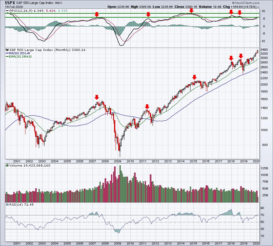
I wrote a recent article in my Trading Places blog titled "Perspective: That's What The Bull Market Naysayers Are Lacking". You might want to read that if you haven't already. I simply made the point that many technicians/analysts are comparing the current market environment to the top in 2007, which is a HUGE mistake, in my opinion. We'd be much better served comparing this secular bull market to our last secular bull market, from 1981 to 2000. Before I do that, however, let's simply take a look at the S&P 500 monthly chart and check out where the monthly PPO and RSI currently reside:

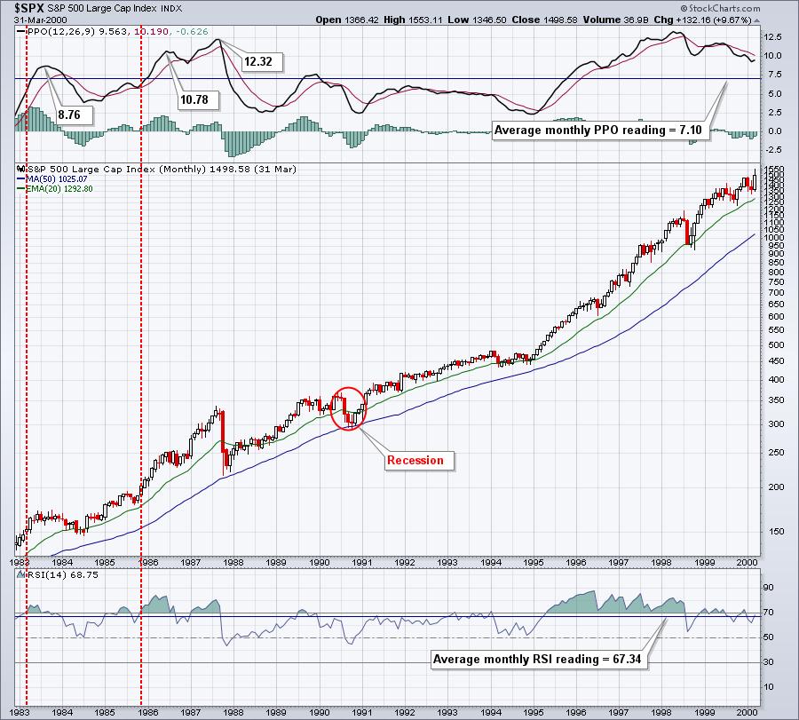
In secular bear markets, PPO readings at 6 are cause for concern. In secular bull markets, not so much. The current monthly PPO reading is 6.35. I checked the monthly PPO number for every month from January 31, 1983 to March 31, 2000. Want to know the average monthly PPO reading during that entire secular bull market? 7.10! That's the average. Of the 207 months that spanned that secular bull market, 110 months had monthly PPO readings above 6. More than half! We look at the above chart and we're trained to believe that the U.S. stock market cannot get any better than this. Well, I've got news for you. This is just the beginning.
Let's take a trip down memory lane and look at what's more typical of a secular bull market:

1983, 1986 and 1987 all posted monthly PPOs well above the current level. So, while we could be near a PPO top for this century, we're really not close to where we could go.
The monthly PPO is the percentage difference between the 12-month EMA and the 26-month EMA. The purpose of this analysis is to simply say that we could see this bullish momentum accelerate significantly from where we are. I understand that might seem unfathomable to many, but I wanted to make sure you understand the difference between overbought in a secular bull market vs. overbought in a secular bear market.
So what's the driver behind this crazy bullishness? It's earnings growth in a historically low interest rate environment. I believe our economy will grow stronger throughout 2020, with earnings growth surging in many companies. Throw in the bond market screaming at the Fed to lower rates (and they will later in 2020 - watch and see) and we have NIRVANA for U.S. equities. So how high will we go? That's honestly impossible to answer. However, I am confident about a few things. First, I'm on record saying that I believe the S&P 500 will hit 4000 in 2020. We've been on a tear and are now closing in on 3400. I'll also say this. Based on all of my historical research, and my belief that we're in a secular bull market that could last into the 2030s (with a possible recession or two along the way), I see the S&P 500 reaching 10,000, essentially tripling from its current level, before this decade ends. This is all just my opinion and, of course, I could be completely wrong, but I don't think so. I wouldn't sit this out, waiting on a bear market or a recession to hit. You might be waiting awhile.
Stock selection will be critical, however. Stick with relative strength leaders in rapidly growing industries. That's EXACTLY what our portfolios are designed to do. I've developed four portfolios - Model, Aggressive, Income, and Character Change. The latter was just started less than 3 months ago and is trailing the benchmark S&P 500 for a number of reasons, the primary one being that this portfolio is invested in small-cap and mid-cap stocks, which are badly lagging the S&P 500 over the last quarter. But the other three have performed spectacularly. Here's a quick performance analysis of each:
Model Portfolio
I began selecting 10 equal-weighted stocks in 10 different industry groups on November 19th, 2018. Since then, I've replaced the 10 stocks every three months. Each time, I do my homework to find 10 relative strength winners and I concentrate almost exclusively in industries that are outperforming the S&P 500. The results to date have been sparkling. In 15 months, my Model Portfolio has returned 58.25% while the benchmark S&P 500 has returned 25.62% over the same 15 month period.
Aggressive Portfolio
On May 19th, 2019, I added the Aggressive Portfolio, which concentrates primarily in small- and mid-caps. Despite the lagging performance of those two asset classes since May, the Aggressive portfolio has returned 21.59%, exceeding the S&P 500's return of 18.21%. I can only imagine how this portfolio might perform if small- and mid-cap stocks were to actually lead the S&P 500.
Income Portfolio
This portfolio was also established on May 19th, 2019. Its component stocks are mostly household names that typically pay dividends in the 1.50%-2.50% range. It was designed to provide our risk-averse members an alternative to the Model and Aggressive portfolios, both of which tend to move much more rapidly in both directions. Since its inception, the Income portfolio has gained 23.79%, easily outpacing the S&P 500's return of 18.21%. That's more than 5.5 percentage points in just under 9 months - not bad at all.
On Wednesday, February 19th, at 5:00pm EST, I'll be announcing the 10 stocks that will comprise each of these four portfolios for the next three months, based off their outstanding quarterly earnings results that were recently announced and their outstanding relative strength. I only want to own the best of the best. All of our members have a seat to this event guaranteed, even our trial members. If you'd like to join me and the rest of our EarningsBeats.com community, CLICK HERE for more information.
Happy trading!
Tom
|
| READ ONLINE → |
|
|
|
|
|
| RRG Charts |
| Picking Industries from Sectors with RRG |
| by Julius de Kempenaer |

Two weeks ago, I wrote a ChartWatchers article titled "RRG Suggests Aggressive Trade Setup for XLY vs. XLV." In this article, I want to show you how you can take that idea one step further and, at the same time, answer a question on how you can easily zoom in on Industries instead of staying at the sector level.
From Sector to Industry
To start with the latter: "How do we zoom in to Industries from Sectors?". Obviously, you could set up the RRG holding all Industries that belong to a sector, saving that RRG to a bookmark using the permalink button available under each RRG. Once you do that eleven times, you will have easy access to all industries per sector.
But... there is an easier way to achieve that goal.

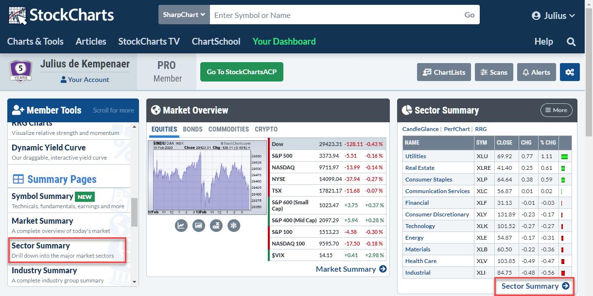
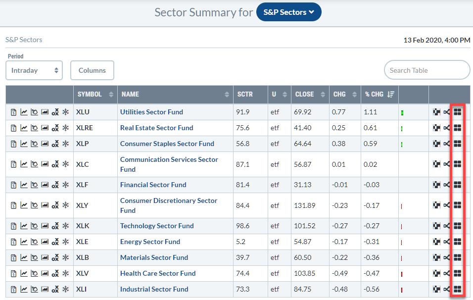
Here's what you see when you open up the Sector Summary page, which you can easily do from your dashboard.

What you get is a table with eleven rows, one for each sector. Each line holds a ton of information for that sector, as well as some icons for easy access to charting tools on StockCharts.
In front of the ticker symbol, you will find icons that will take you to single-security tools, like a SharpChart, but also the brand new Symbol Summary page or to ACP. At the end of the line, you will find the icons that lead to multi-security tools, e.g. Market Carpet and PerfCharts. The last icon on the line will take you to a Relative Rotation Graph.
Clicking on that RRG icon will open up an RRG that shows the Industry groups within the sector against SPY. Once the RRG is open, you can change the benchmark to the sector; this presents the rotation of the industries against the sector instead of the general market, which we usually use when looking at sector rotation.
Back to the markets. A few weeks ago, RRG picked up the opposite rotations for Consumer Discretionary and Healthcare, suggesting an outperformance for XLY over XLV in the weeks to follow. That move is underway now.
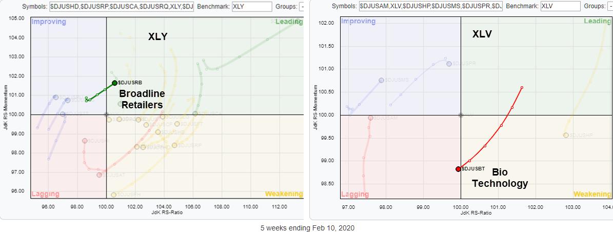
When you spot such a rotational pattern on an RRG for sectors, you could take your analysis one step further instead of stopping at the sector level. In order to do that, we need to bring up the RRGs for the industries that make up both sectors. These are shown side by side at the top of the article, but here are the full-size charts for both sectors.
Consumer Discretionary - XLY

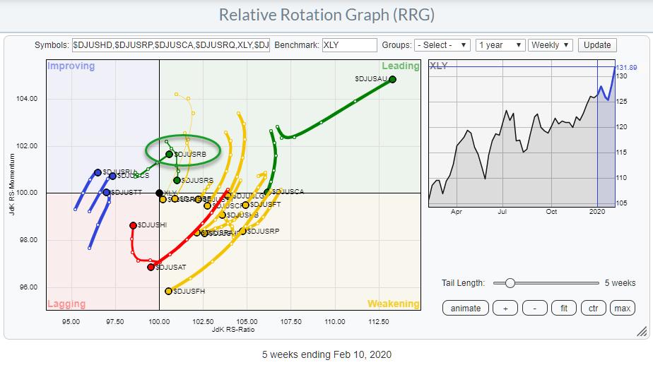
This RRG shows the rotation for 20 Industries (btw, that's a lot compared to other sectors) that make up the Consumer Discretionary sector.
The industry shooting for the stars inside the leading quadrant is the DJ US Automobiles index... I wonder why that would be? ;)
Because it has already moved far away from the benchmark, the risk to join that move is shifting the odds against us, IMHO. I look for groups that are at a positive RRG-Heading and are only just inside (or close to entering) the leading quadrant.
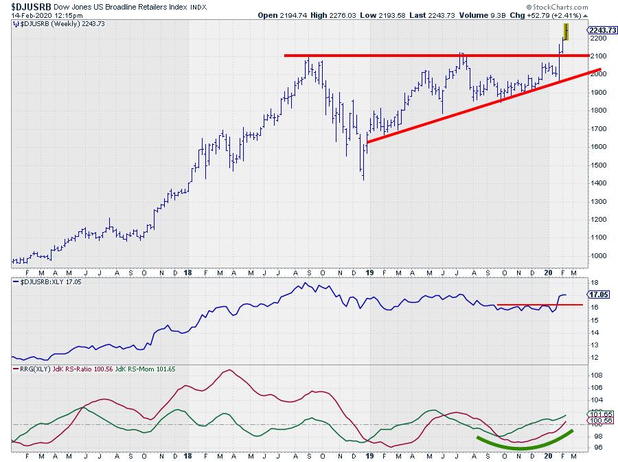
The one that I found here is $DJUSRB, the Broadline retailers index.

The break above that horizontal barrier looks very promising, and this move helped the raw RS-Line to take out a small overhead resistance level, which is sending upward impulses to the RRG-Lines. This makes US Broadline Retailers a strong industry within the Consumer Discretionary sector, which is already improving against SPY.
Healthcare - XLV

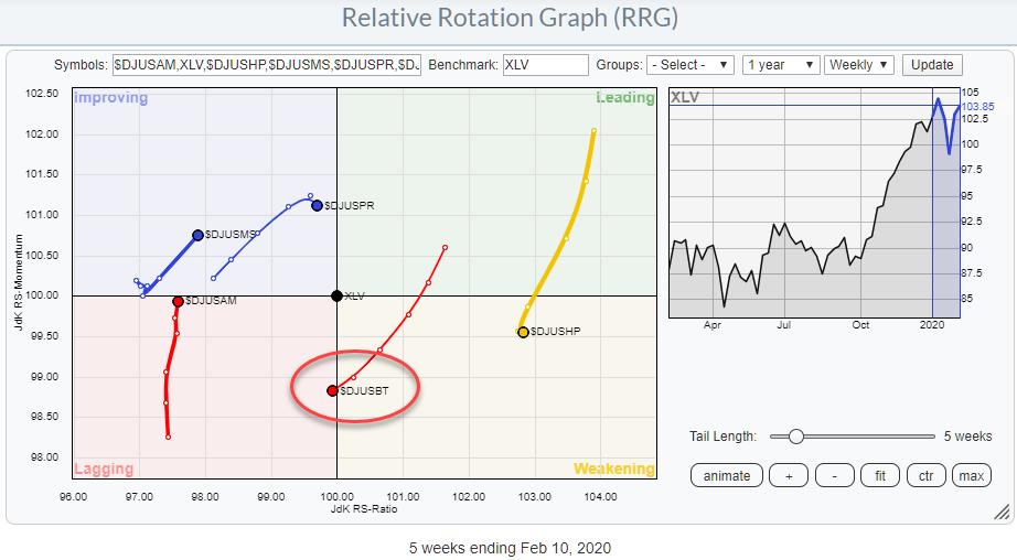
The RRG above shows the Industry groups that make up the Healthcare sector, using XLV as the benchmark.
The group that shows the clearest "signal," if you wish, is $DJUSBT, the Biotechnology index. The tail over the last five weeks moved from leading through weakening and has just now entered the lagging quadrant at a negative RRG-Heading. This makes it the only group inside the lagging quadrant that is traveling at a negative RRG-Heading.

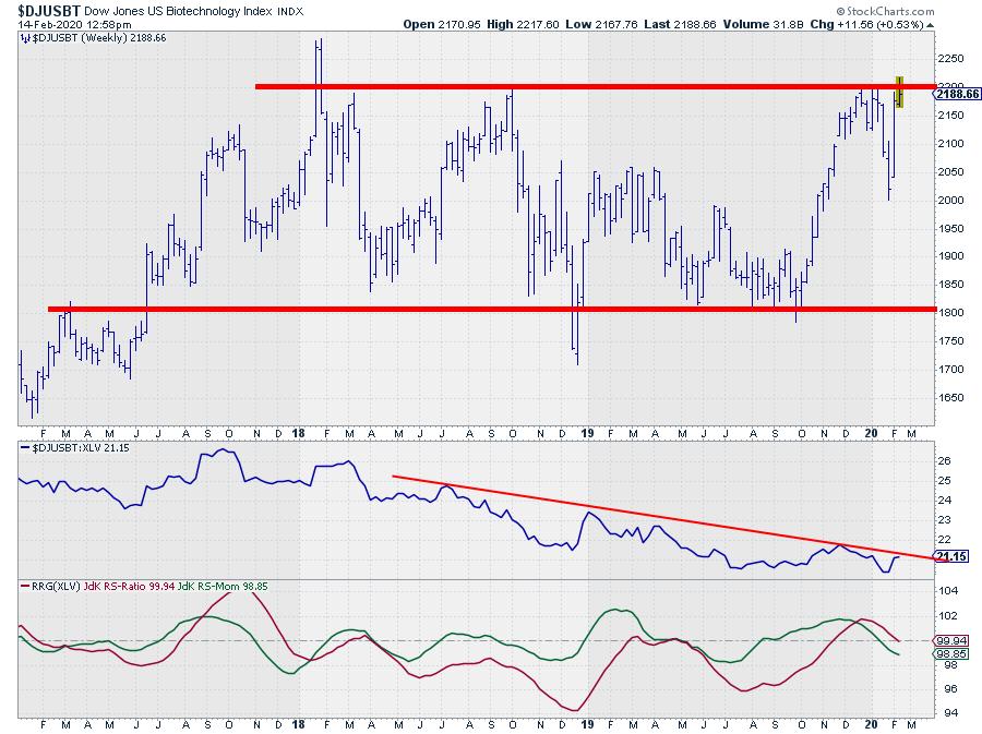
The price chart, in combination with relative strength and the RRG-Lines that drives this tail, shows a broad trading range for $DJUSBT that has been in play for more than two years already. The recent rally brought this index back to the upper boundary at the end of 2019 and the beginning of 2020. At the moment, there is another attempt to break that barrier underway.
Clearly, when that level breaks, that would be a good sign, but the weak relative strength against the sector index (which in itself is already weak against the market) makes such a break unlikely, IMHO. Beware, as this is a completely subjective judgment, but the weight of the evidence of the puzzle pieces in front of us today brings me to this interpretation.
Wrapping up
Taking the analysis from a sector level one step further down the pyramid, trying to find good (or bad) industry groups within the sector means a more aggressive approach. This inhibits extra risk, but also extra potential rewards. RRG can help you to find these opportunities in a structured manner.
From a trading perspective, the sector level is very convenient, as tradable instruments are readily available and usually pretty liquid from both the long and the short side. Trading at industry group level may throw up some challenges, as not all groups are covered by ETFs or other tradable instruments, but you may find good alternatives by looking at the big(gest) stocks in that group and using them as a proxy.
--Julius
My regular blog is the RRG Charts blog. If you would like to receive a notification when a new article is published there, simply "Subscribe" with your email address.
Julius de Kempenaer
Senior Technical Analyst, StockCharts.com
Creator, Relative Rotation Graphs
Founder, RRG Research
Want to stay up to date with the latest market insights from Julius?
– Follow @RRGResearch on Twitter
– Like RRG Research on Facebook
– Follow RRG Research on LinkedIn
– Subscribe to the RRG Charts blog on StockCharts
Feedback, comments or questions are welcome at Juliusdk@stockcharts.com. I cannot promise to respond to each and every message, but I will certainly read them and, where reasonably possible, use the feedback and comments or answer questions.
To discuss RRG with me on S.C.A.N., tag me using the handle Julius_RRG.
RRG, Relative Rotation Graphs, JdK RS-Ratio, and JdK RS-Momentum are registered trademarks of RRG Research.
|
| READ ONLINE → |
|
|
|
| The MEM Edge |
| Select 5G Stocks Will Benefit From This Week's T-Mobile/Sprint Merger – Here are 3 Stocks Poised To Trade Higher |
| by Mary Ellen McGonagle |
This week's federal court decision to allow the T-Mobile (TMUS)/Sprint (S) merger to go through has reignited select areas of the market that will be positively impacted by the boost in 5G adoption in the U.S.
This is because the judge who presided over the decision mandated that T-Mobile (TMUS) provide 5G coverage to over 97% of the U.S within 3 years and 99% coverage in 6 years. This is big news, particularly for rural areas, and while the expanded coverage may seem like a long way off, certain groundwork must be laid over the near term to ensure completion.
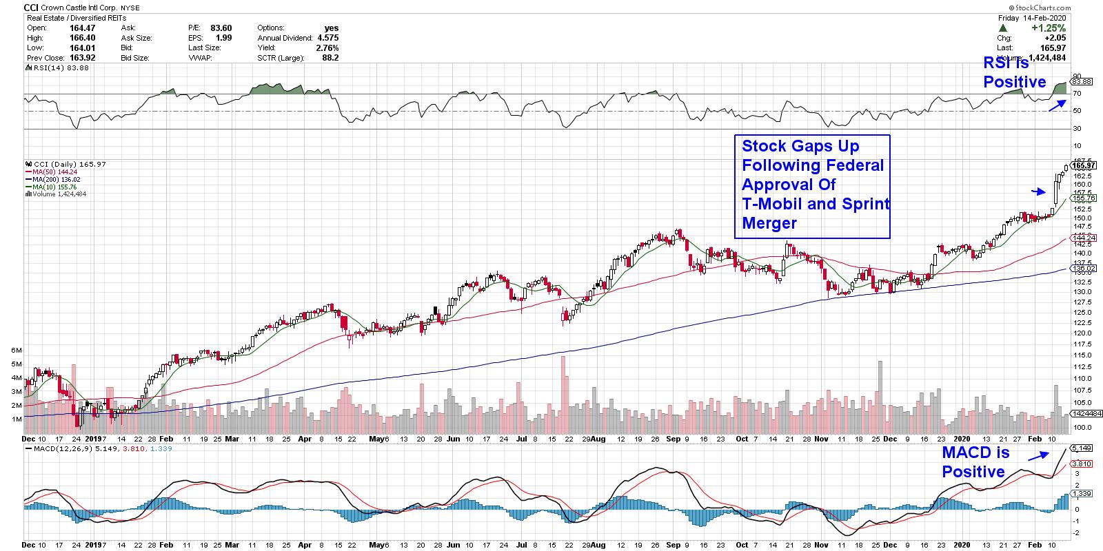
DAILY CHART OF CROWN CASTLE INT'L CORP. (CCI)


One of the first necessary components in bringing 5G to the masses is the buildout of cell towers into currently uncovered areas. Most of the needed cell towers are managed and leased by large Real Estate Investment Trust companies (REITs) such as Crown Castle Int'l Corp. (CCI), shown above.
CCI currently leases over 40,000 cell towers while operating 75,000 miles of fiber cable, which are crucial to handling the increased speeds of 5G networks. The company is in a position to continue growing at a healthy pace; management has suggested that, over the long term, they may be able to grow their dividend to as high as 8%, a significant increase from its current 4.6% annual yield.
As you can see, the stock gapped up following news of the large Telecom merger and has continued to climb. CCI is currently extended on its daily chart with an RSI that's overbought. That said, given the powerful momentum, I'd expect more upside over the very near term before a period of consolidation that may provide a better entry point.
DAILY CHART OF INTEL CORP. (INTC)

While Telecommunications REITs such as Crown Castle will provide the base stations for the expanded 5G networks, there will be a need for semiconductor chip technology to power these bases.
That's where well-known company Intel (INTC) will come in. INTC has developed a 10-nanometer Snow Ridge chip system that's already been well received by 2 large telecom equipment manufactures with whom they've secured contracts. By 2022, Intel forecasts having a 40% market share.
In the chart above, you'll see that Intel was already boosted into an uptrend following the company's release of strong earnings and sales during their 4th quarter. While growth was due to Semiconductor chip sales in the PC and data center areas, by 2020, they forecast having a 40% market share of the telecom industry.
The stock is bullishly finding support at its upward-trending 10-day moving average as it consolidates its recent gap up in price. A breakout above $69.3 on volume would be even more bullish for the near-term prospects.
DAILY CHART OF NXP SEMICONDUCTOR (NXPI)

Last up is NXP Semiconductors (NXPI), which has pivoted business towards the 5G market over the last few years. The Dutch company is the c0-inventor of near-field communication technology, which enables mobile phones to be used to pay for goods. Faster 5G networks will only spur the use of their NFC chips and the company is well-positioned to take advantage. NXPI reported earnings earlier this month that were ahead of estimates.
I'd like to have seen more volume on its recent 3-week base breakout, but, with a 56% annual EPS growth rate projected for this year, I'd be a buyer of the stock if it were to show an increase in volume while continuing to trend higher.
Each of the 3 stocks in this article was carefully curated by reviewing the components needed to build out a 5G network that's due to double its capacity in the U.S. From there, I chose select stocks with higher-than-average growth prospects with attractive charts.
If you'd like to receive stock ideas culled from a similar process in other growing areas of the economy, I urge you to trial my bi-weekly MEM Edge Report for a nominal fee. In addition to buy and sell recommendations, you'll also receive in-depth insights into the various sectors of the market not found elsewhere.
Of note, the first stock in today's article was recommended to subscribers prior to this week's 10% advance, and its in addition to other big winners. I hope you'll take advantage of this special offer by clicking here!
Warmly,
Mary Ellen McGonagle,
MEM Investment Research
|
| READ ONLINE → |
|
|
|
| MORE ARTICLES → |
|
