MailBag November 30, 2012 at 08:16 PM
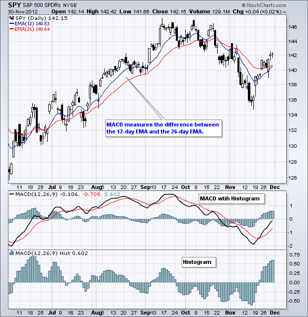
MACD consists of three components. First, there is MACD itself, which is the 12-day EMA less the 26-day EMA. Second, there is the signal line, which is a 9-day EMA of MACD. Third, there is the MACD Histogram, which plots the difference between MACD and its 9-day EMA. As an an indicator of an indicator, the MACD Histogram measures the momentum of MACD. The MACD Histogram can be used to anticipates signal line crossovers MACD because the histogram narrows as the gap between MACD and its 9-day EMA narrows. Also notice that the histogram turns up or down ahead of MACD. Overall, the histogram Read More
MailBag November 24, 2012 at 12:38 PM
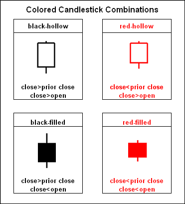
Candlestick colors and fillings tell chartists the story of the trading day. Colored candlesticks are made up of four components in two groups. First, a close lower than the prior close gets a red candlestick and a higher close gets a black candlestick. Second, a candlestick is hollow when the close is above the open and filled when the close is below the open. The table below shows the four combinations. Each candlestick reflects the day's price action. In particular, the hollow candlesticks tell us that a security moved higher after its open. A filled candlestick indicates that a Read More
MailBag November 16, 2012 at 09:46 AM
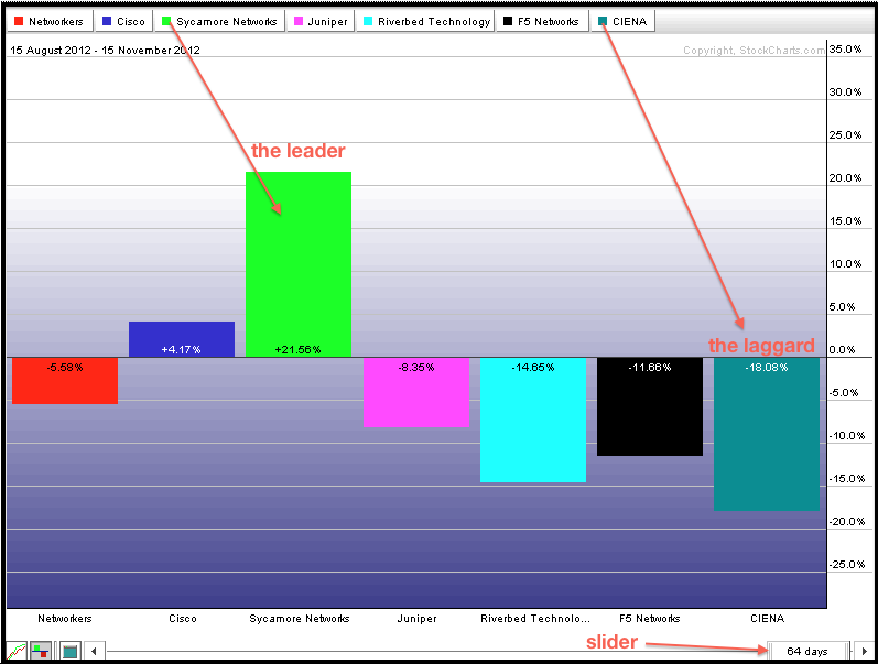
StockCharts.com users can compare stocks within an industry group using our preset PerfCharts. There is a PerfChart section at the bottom of the second column on the Free Charts page. Chartists can choose a preset industry group from the drop down list by clicking “select”. There are dozens of industry groups to choose from. The example below shows the Networking Industry with five stocks and the Networking Index ($NWX). This PerfChart shows the percentage change over a three month period. Chartists can change the timeframe by using the slider at the bottom right. Right click in the Read More
MailBag November 09, 2012 at 09:36 AM
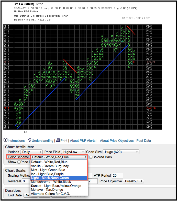
SharpCharts users are no doubt aware of the many different color schemes available for bar and candlestick charts. Many of these color schemes are also available for our P&F charts. The “Night, Neon Green” setting is one of my favorites because the price moves stand out so well. Chartists can change chart colors by using the drop down box for “color scheme”. Checking the “colored bars” box will turn the O-Columns red and leave the X-Columns green. As the chart below shows, 3M (MMM) broke the Bullish Support Line with a sharp decline in October and there is now a Bearish Resistance Read More
MailBag November 02, 2012 at 11:48 AM
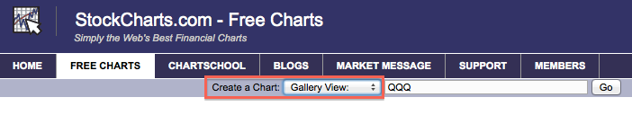
Chartists can get an instant look at different timeframes by using our Gallery View feature. Using the “create a chart” section at the top of every web page, simply select “Gallery View”, enter a symbol and press go. This will create four charts covering different timeframes for a comprehensive picture. The first is a 10-minute chart focusing on short-term price action. The second chart shows daily candlesticks to capture the medium-term trend. A third chart shows weekly candlesticks going back 30 months for a long-term view. And finally, there is a Point & Figure chart to provide a Read More