MailBag August 27, 2010 at 09:12 AM
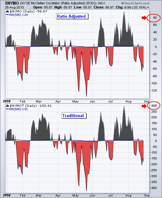
The McClellan Oscillator is a breadth indicator based on Net Advances (advancing issues less declining issues). It is computed for the NYSE and the Nasdaq. The McClellan Oscillator is the 19-day EMA of Net Advances less the 39-day EMA of Net Advances. As the difference between two moving averages, this oscillator has characteristics similar to MACD. Signals can be derived from bullish/bearish divergences, overbought/oversold conditions and centerline crossovers. *LINEBR** The traditional and ratio-adjusted McClellan Oscillators have similar shapes, but their Read More
MailBag August 20, 2010 at 08:49 AM
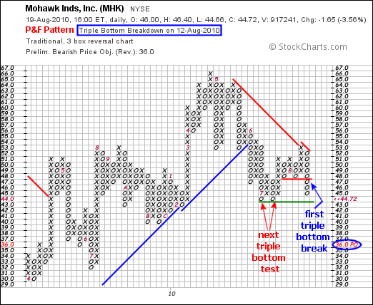
A Point & Figure triple bottom is just what it sounds like: three lows that form a triple bottom. Advances on P&F charts are marked with columns of X’s and declines are marked with columns of O’s. A triple bottom starts with two reaction lows that mark support. A reaction low forms with a column of O’s followed by a column of X’s. In the Mohawk chart below, the red arrows mark an evolving triple bottom with two reaction lows. These lows mark an important support level. A break below these two lows would forge a triple bottom breakdown, which is a bearish P&F signal. Read More
MailBag August 13, 2010 at 07:29 AM

It is that time again. With a gap down on the open and bounce to close above the open, the Nasdaq 100 ETF (QQQQ) formed a hollow candlestick on Thursday. The close was also below the prior close so the candlestick was colored red. There are two types of candlestick charts: colored or black & white. Colored candlesticks convey information on the close versus the previous close. A candlestick is red when the close is below the previous close and black when the close is above the previous close. The August 12th candlestick is both red and hollow, which means the close was below the Read More
MailBag August 06, 2010 at 08:52 AM
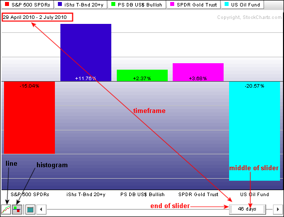
Rotation can be determined by comparing the performance of various securities over two distinct timeframes. In particular, performance metrics for intermarket related securities can shed light on risk appetite and asset class rotation. Intermarket securities include stocks, bonds, the Dollar, gold and oil. Two recent, and distinct, timeframes come to mind for comparison. Stocks declined sharply from late April until early July and then advanced sharply from early July to early August. How did the intermarket relationships change over these two timeframes? The Perfchart below Read More
MailBag August 06, 2010 at 08:52 AM
Rotation can be determined by comparing the performance of various securities over two distinct timeframes. In particular, performance metrics for intermarket related securities can shed light on risk appetite and asset class rotation. Intermarket securities include stocks, bonds, the Dollar, gold and oil. Two recent, and distinct, timeframes come to mind for comparison. Stocks declined sharply from late April until early July and then advanced sharply from early July to early August. How did the intermarket relationships change over these two timeframes? The Perfchart below Read More