MailBag November 01, 2013 at 10:51 AM
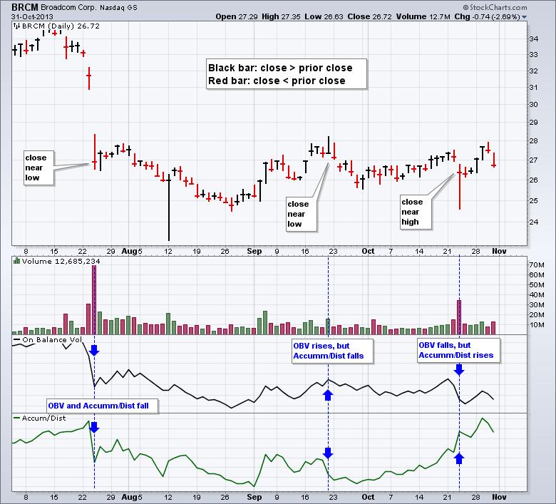
On Balance Volume (OBV) and the Accumulation Distribution Line are both volume-based indicators that combine price action and volume. On Balance Volume (OBV) compares the close to the prior close, while the Accum/Dist Line compares the close relative to the high-low range. OBV is quite simple because it adds volume on up days and subtracts volume on down days. This is the same as multiplying volume by +1 on up days and -1 on down days. The Accumulation Distribution Line creates a volume multiplier that ranges from +1 and -1. This multiplier is positive when the close is above the mid Read More
MailBag October 25, 2013 at 03:31 PM
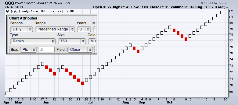
Chartists can use Renko, Kagi and Three-Line Break charts to reduce noise and volatility on a price chart. Like P&F charts, these three charting styles focus exclusively on price moves and ignore time. This means the X axis (time) will not be uniform. All three techniques come from Japan and are featured in Steven Nison's book, Beyond Candlesticks. The first chart shows a Renko plot for the Nasdaq 100 ETF (QQQ). The word "Renko" comes from "Renga", the Japanese word for "brick". The filled and hollow squares that make up a Renko chart are often referred to as bricks. Notice how the Read More
MailBag October 23, 2013 at 10:31 PM
Honestly, we rarely get feedback as positive as the letter below. I wanted to share it with everyone as a reminder that they should try out the Arms CandleVolume charts that we introduced last week for all the reasons Jaime mentions. - Chip Dear Chip, I was floored when I stumbled upon Arms Candlevolume shortly after it becameavailable on StockCharts.com over a week ago. I've been using equivolume formany years, and it is the only chart type I use. I grew up in Albuquerque,NM, where Mr. Arms is based, and I worked for a money management firmaffiliated with Dick Arms for Read More
MailBag October 18, 2013 at 10:06 AM
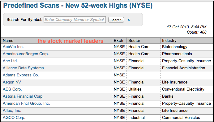
In short, chartists can find a list of market leaders by consulting the new highs list. Stocks making new highs are clearly in uptrends and performing well. Moreover, chartists can easily sort the new highs list by sector or industry group to find pockets of strength in the overall market. Simply click a column heading to sort this list. The sector sort for the NYSE list shows several stocks from the utilities hitting new highs. The industry sort shows several stocks from the steel group hitting new highs. Click these images for a live table Read More
MailBag October 11, 2013 at 09:29 AM
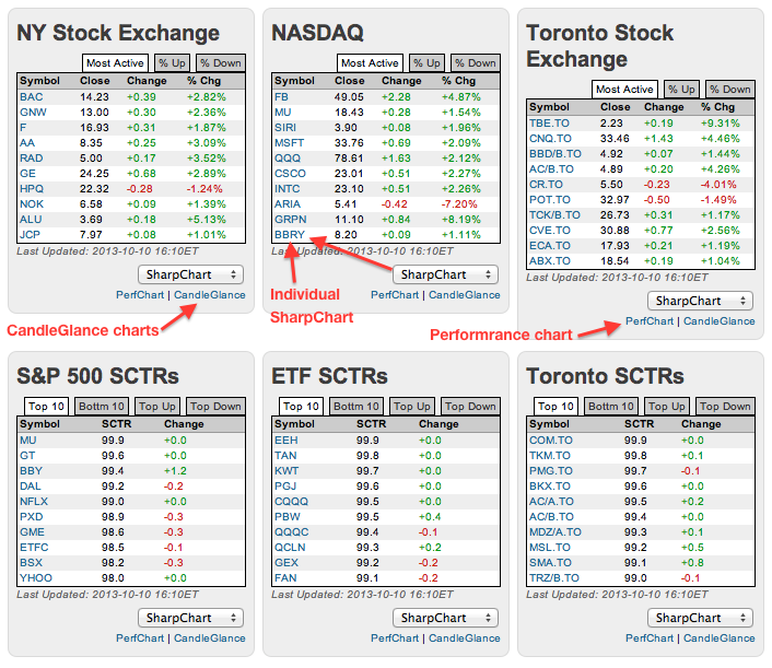
Chartists can find the most active stocks, the biggest gainers and the biggest losers right on the StockCharts home page. Simply scroll down to the middle of the page. Here you will find six boxes with two each from Nasdaq, NYSE and TSE. The first row shows the most active, the top gainers and the top losers. The second row shows the big movers for the StockCharts Technical Rank (SCTR). This is a great way to find the movers and shakers on any given day. Chartists can further explore these stocks by clicking the PerfChart link to compare performance or the CandleGlance link to see small Read More
MailBag October 04, 2013 at 08:17 AM
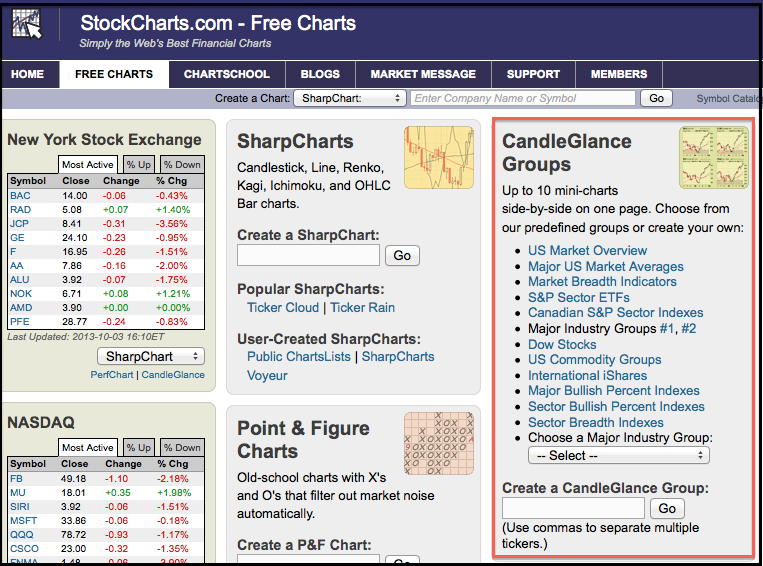
CandleGlance charts start with the CandleGlance groups on the Free Charts page. The appropriate links and dropdown menus can be found at the top of the third column. There are three options available. Chartists can click a link for one of the pre-defined groups, such as S&P Sector ETFs or Dow Stocks. Users can also choose from one of the major industry groups or enter a list of symbols to create a customized list. Once viewing the CandleGlance charts, chartists can add an indicator or adjust the chart duration by scrolling to the bottom and choosing an option. The duration can be set Read More