 Hello Fellow ChartWatchers!
Friday's jobs report threw things for a bit of a loop as the markets all moved lower on the final day of the week. But all-in-all it was a positive week for every major average with the DJIA leading the way up over 3.8%. Later in this newsletter, John Murphy will explain the implications of Friday's jobs report on the bond market and then Arthur and Greg will look at the sector consequences. On the other hand, I need to use the rest of my article to tell you about our latest major announcement...
London Calling, Part Deux
Long-time StockCharts members may recall that back in late 2010 we started providing London Stock Exchange stocks on our charting service. Unfortunately, we began offering those stocks right around the time that the Greek financial crisis deepened causing investors to lose interest in European stocks. In mid-2011 we discontinued our LSE service due to a lack of interest from customers. At that time, I promised that we'd eventually bring back LSE stocks and today, I'm thrilled to announce that we've done just that.
Like before, LSE stocks have ticker symbols that end with ".L" - so, for example, Lloyd's of London has the symbol "LLOY.L" on our website. Also, like before, we've started things off slowly by first offering LSE stocks to all of our users for free(!) but with a 15-minute delay on the quotes. In the next couple of months, we will start providing real-time LSE price charts for people that are interested in that.
We currently have all of the "major" LSE stocks in our system. If there is an LSE stock that you are interested in that we do not have, just head over to our Symbol Request form and let us know. We'll try to add any missing symbols as quickly as possible.
We have daily/weekly/monthly history for these stocks going back to 2003. In addition to those interday periods, members can also create delayed intraday charts (i.e., 1-, 2-, 5-, 10-, 15-, 30- and 60-minute charts) for LSE stocks however it will take a couple of weeks for the historical data for those bar periods to build up in our databases.
LSE stocks are also fully supported in our Scan Engine and in our Alert Engine so members can create and run technical scans and receive technical alerts for them as well. For instance, you can use "[exchange = LSE]" and "[country = UK]" in your scans now. We also have added an LSE column to our Predefined Scan Reports.
Finally, the $FTSE index has also been upgraded to support delayed intraday data updates.
Watch for us to add more LSE-specific features to the site over time including - but not limited to - London MarketCarpets, LSE Predefined Scans, FTSE Stock Lists, LSE SCTRs and more.
Again, currently all of this new data is 1.) completely free and 2.) delayed 15-minutes. For those of you that are looking for real-time LSE data, I will let you know when that becomes available - probably by the middle of the year.
Well then, pip pip! Cheerio old chap! Ta ta and what not!
- Chip
(Wait... what? They don't say those things anymore? Well, what do they say these days? Just "Goodbye"? That's bloody barmy!)
Our live webinars continue to improve and are very popular. We routinely have 200+ attendees at each one. Have you attended one yet? Be sure to review the webinars listed below and try to attend at least one during the next week. We'd love to see you in the audience!
Upcoming Webinars:
- Feb 10: Arthur Hill will review his latest Market Message postings on "Market Message LIVE" - Tuesday at 1pm EST - Click to Register
- Feb 11: Erin Heim will go over the latest timing signals on "DecisionPoint LIVE" - Wednesday at 4:30pm EST - Click to Register
- Feb 12: Greg Schnell and Martin Pring will review the latest changes in the financial markets for "Market Roundup LIST" - Thursday at 4:30pm EST - Click to Register
- Feb 14: Chip Anderson will be joined by John Murphy who will discuss the current intermarket picture on "ChartWatchers LIVE" - Saturday at 1pm EST - Click to Register
Recent Webinars You Might Have Missed:
- Feb 7: Chip Anderson talked about writing scans and then interviewed Tom Bowley from InvestEd Central for "ChartWatchers LIVE" on Saturday - Click for Recording
- Feb 5: Greg Schnell talked about his concerns with commodity prices during "The Market Roundup LIVE" on Thursday - Click for Recording
- Feb 4: Erin Heim hosted the second edition of "DecisionPoint LIVE" on Wednesday at 4:30pm EST - Click for Recording
- Feb 3: Arthur talked about the markets and analyzed viewer picks for "Market Message LIVE" on Tuesday at 1pm EST - Click for Recording
Click Here to See ALL of our Past Webinar Recordings
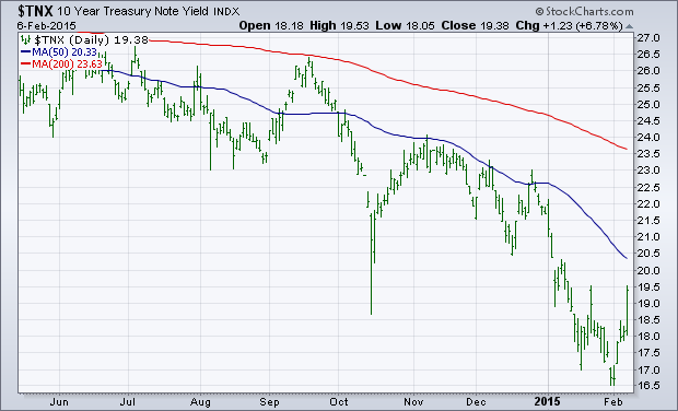
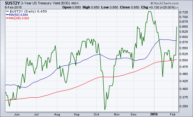
A strong jobs report on Friday pushed interest rates sharply higher all across the yield curve. The daily bars in Chart 1 show the 10-Year Treasury Note yield jumping to the highest close in a month. [Bond prices fell sharply as a result]. Short-term rates jumped even more. Chart 2 show the 2-Year Treasury Yield jumping to a monthly high as well. That big jump in rates helped banks and brokers have a strong day, but caused heavy selling in rate-sensitive groups like REITs and utilities. Higher rates and a stronger dollar also hurt gold. The stock market ended the day on the downside after trading higher earlier in the day. Energy stocks were the week's strongest sector which helped stocks during the week.
- John
The Materials SPDR (XLB) sprang to life on the price chart and three relative strength indicators broke out. On the price chart, XLB surged in October-November and then consolidated in December-January with a big triangle. Trading was certainly choppy within the triangle, but the ETF finally made a decisive break above the December-January highs. This breakouts signals a continuation of the Oct-Nov advance and projects a move to new highs. Chartists can mark first support near broken resistance (49) and long-term support in the 46.5-47 area. Within the group, note that Air Products (APD), DuPont (DD), Mosaic (MOS), Sherwin William (SHW) and Vulcan Materials (VMC) are leading with new highs this week.
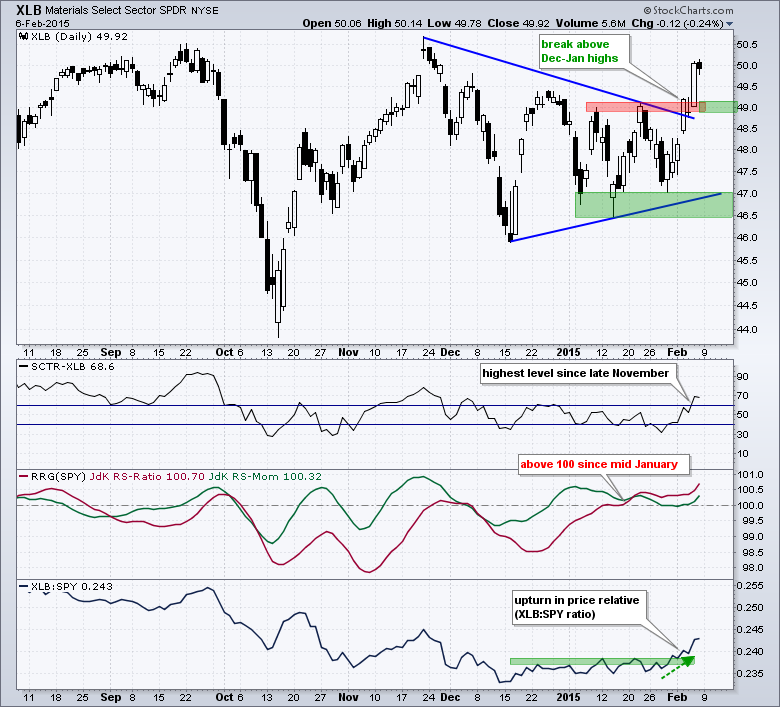
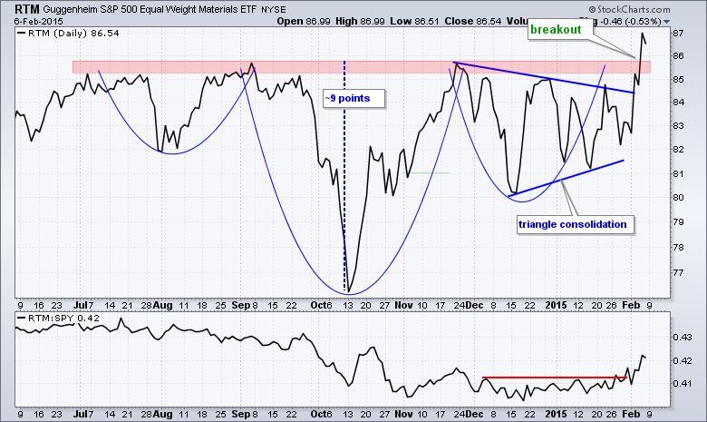
The indicator windows show the StockCharts Technical Rank (SCTR), the Relative Rotation Graph indicators and the price relative. All three measure relative performance against the S&P 500 SPDR and all three show relative strength in XLB. The SCTR moved above 60 and to its highest level since late November. The RS-Ratio line (red) moved above 100 in mid January and is at its highest level in over six months. The price relative (XLB:SPY ratio) broke above its January highs with an upturn the last two weeks. The second chart shows the Equal-weight Materials ETF (RTM) breaking above neckline resistance from a large inverse head-and-shoulders pattern. Based on traditional technical analysis, the height of the pattern is added to the breakout area and a move to the mid 90s is projected.
Thanks for reading and have a great weekend!
Arthur Hill CMT
The Utility sector has had major changes in the relative performance this week. It wasn't just Friday as there appears to be another major event that changed the focus.
First of all, let me describe the chart. When each of these are trending higher, Utilities are performing better than the other sector being compared to in each ratio. When these graphs start breaking trend lines, it is helpful to see the changes in the market. In the last week, this sector really started to let go. But the peak coincides with another major event that should be placed on every chart.
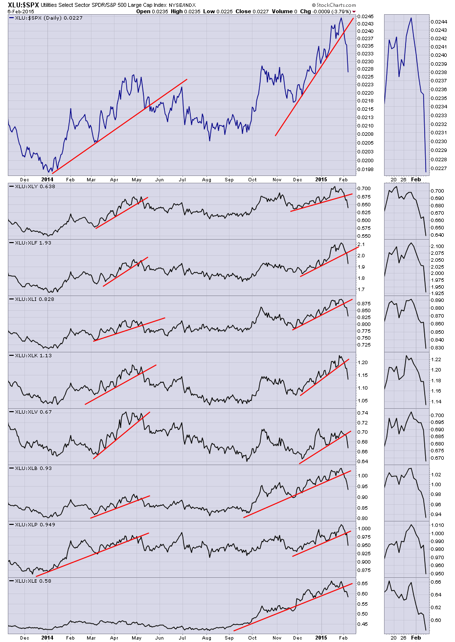
Chart 1
The major event that the peak coincides with is the new unbridled QE in Europe. This led a massive change in the sector rotation in the last two weeks. Based on my analysis of the markets this week, there is a large scale rotation away from defensive sectors similar to the move in 3rd Quarter 2012. What happened then? All the Central Banks did coordinated easing and the US went on to start QE Infinity as it came to be known. While these graphs broke before the announcement of QE, there was a lot of discussion leading into the July meeting and the Bretton Woods meeting in August.
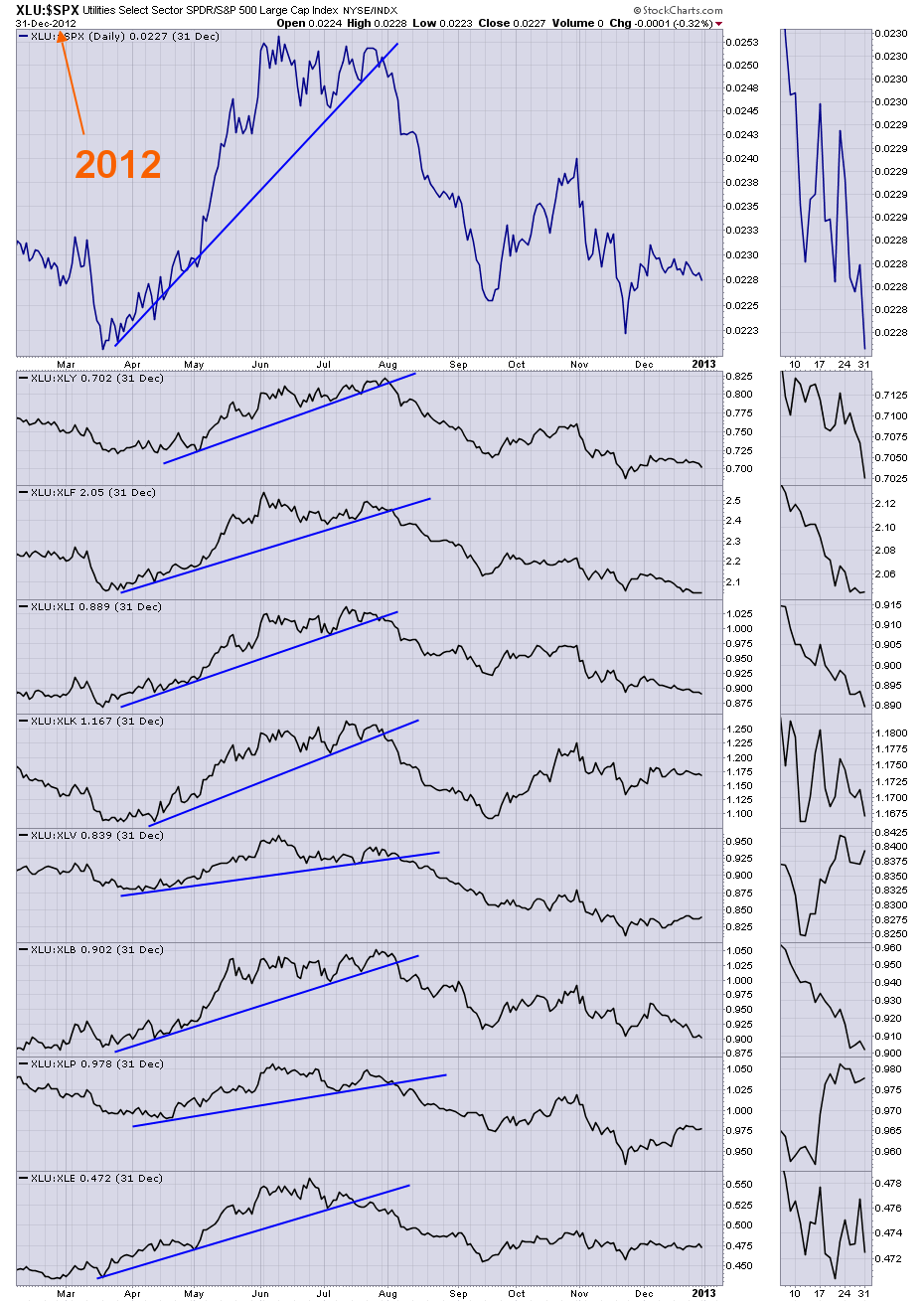
Chart 2
Lastly, how big was this trend away from Utilities that started in 2012?
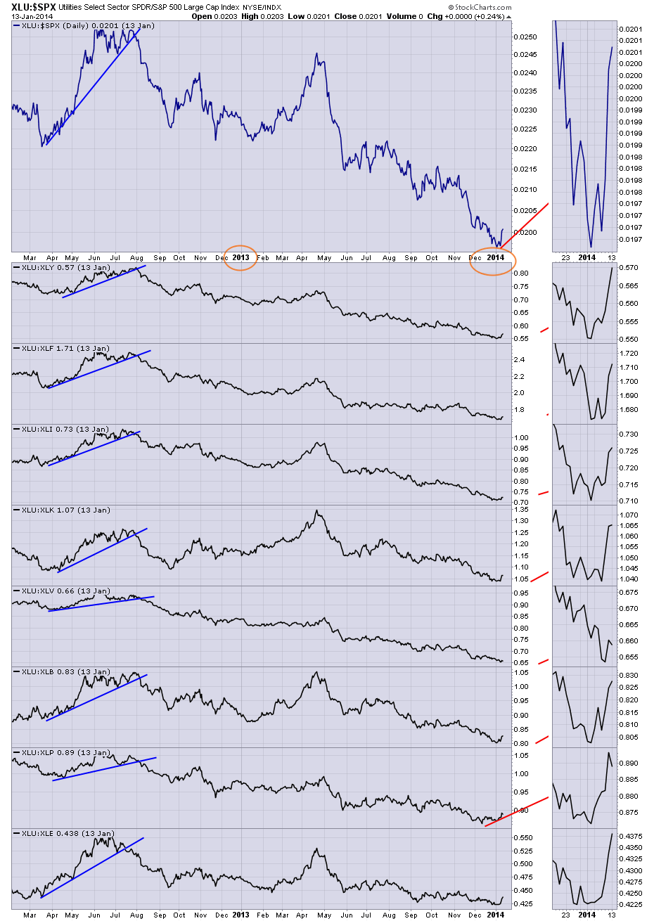
Chart 3
With the exception of April 2013, Utilities under performed almost every other sector for 2 years. The red lines just starting on the right hand side of Chart 3 are from the first chart (2014 - current) trend lines. The pinnacle top the last week of January 2015 on Chart 1 of these charts suggests a major change in trend. You may want to scroll back and look at the top chart. In the big picture, it shows the utilities trending up against most sectors in the last year. The number of Central Banks that have already eased monetary policy in 2015 is big! Zero Hedge lists off 16 Central Banks that have eased monetary policy in 2015. Be sure to check out my next article in "Martin Pring's Market Round Up" where I'll be discussing the major sector changes that are currently underway.
Good trading,
Greg Schnell, CMT
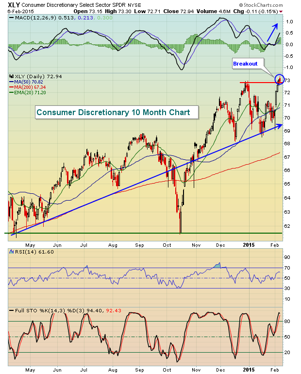
There's been much said and written about rapidly-declining crude oil prices ($WTIC). But one thing makes perfect sense to me. When American consumers save TONS of money when filling up at the pump, they tend to spend it elsewhere. It's simply what we like to do - SPEND! So it's not too surprising to me that many consumer discretionary companies are beginning to see huge benefits in terms of price appreciation. First, check out the breakout on Friday on the XLY:
The Federal Reserve, for the past several years, has been flooding the market with liquidity through its quantitative easing (QE) programs. One of their mandates has been to keep interest rates artificially low for an extended period of time to encourage the rebound of home prices and to help beleaguered home construction stocks. Their plan has been paying off. Home construction stocks ($DJUSHB) have been in a very bullish uptrend during the entire bull market run off the 2009 lows. Not only have home construction stocks been in a clear uptrend, but they also have been consolidating in a bullish ascending triangle pattern for the past two years. A critical breakout occurred on Friday above the 550 level with this pattern measuring to perhaps the 710 level. The S&P 500 tends to perform exceptionally well when home construction stocks are on the rise. Check out this chart:
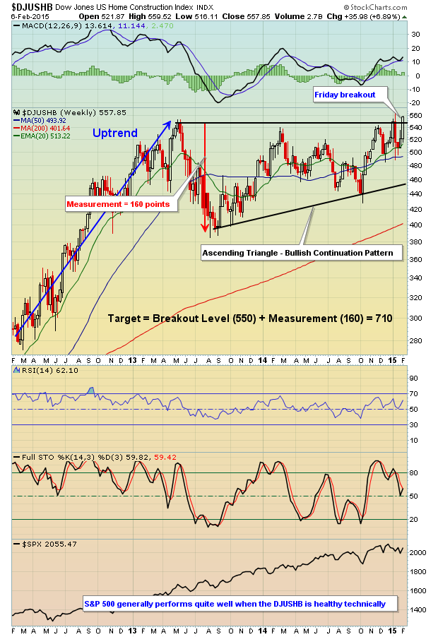
Strength in home construction stocks and the above breakout are likely to lead to outperformance in the next few months in this group. We will be adding several new stocks to our EarningsBeats.com Trading Watch Lists early next week, including one homebuilder that just blew estimates away recently. If you'd like to try our EarningsBeats service, we're offering a one-time $.97 special for a month (normally $97) - just CLICK HERE.
Happy trading!
Tom Bowley
Chief Equity Strategist
EarningsBeats.com
 Hello Fellow ChartWatchers!


 I've learned that you have to be very thick-skinned to be a trader or a blogger. Many of my blogs are lifted directly from the pages of my old trading journals, and as I write about these former trades, I am very conscious not to sugar-coat it or make it look better than it actually was. This week, I'll describe how I slipped right into a rather expensive trading mistake. At