Hello Fellow ChartWatchers!
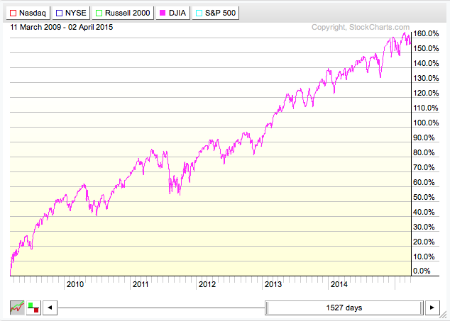
The other day I was out with my Dad and he said "Boy, the market has been really volatile recently hasn't it?" And I said "Umm, not really. Where did you hear that?" "All the cable news channels are talking about it." And then, in my whiniest voice, I said "D-a-a-a-d. I've told you again and again to be skeptical of those programs." He knew I was joking but there was some truth to it also. I pulled out my computer, brought up StockCharts and showed him this specific PerfChart:
(Click the chart for a live version)
What's happening is that the news channels hear that the Dow moved 100+ points and they decide it is a major story worth covering. What they don't understand is that these days 100 points is only 0.5682% of the Dow's current value. Barely over 1/2 of 1 percent! That's not major news and it's definitely not "increased volatility." Investors (and news stations) should only care about percentages. The chart above shows that there is nothing notably different about the Dow's current moves relative to bigger moves made in the past 6 years (since the 2009 bottom).
Dad knew to only look at percentage, but forgot in the heat of the moment. It's easy to do. He was glad that I reminded him.
Using SCTRs to Narrow Your Search for Winning Stocks
We've recently done several webinar broadcasts about scanning. Scanning is super important to technical traders. Of the 80,000+ ticker symbols in our database, which ones are worth looking at? Scanning narrows down that list to a much more manageable number. And by combining scanning with our SCTR rankings, you can quickly narrow things down to just a few stocks worth looking at.
SCTR (pronounced "Scooter") stands for "StockCharts Technical Rank." It is a number that ranges from 0 to 100 depending on how strong a stock's technicals are relative to all the other stocks in a given group. For instance, if a large cap stock has a SCTR ranking of 50.0, you can conclude that its technicals are better than 50% of the other large cap stocks that we cover. For more details on SCTRs, please see our ChartSchool article on that topic.
One of the great things about SCTRs is that they can be used in scans. By using SCTRs in your scan, you are automatically weeding out underperforming stocks and that makes your scan criteria much simpler. Let me show you...
Let's say that we are a typical investor with some cash on the sidelines and we're looking to get into the market. We'd prefer to go long (buy low, sell high) and we'd like to invest mainly in momentum plays - i.e., situations where a stock has starting moving higher again after a significant bottom.
Now, you could take time to research all of our technical indicators and work up a multi-step scan criteria with lots of ANDs and ORs and square brackets, or you can "cheat" and use SCTRs. For the purposes of this article, let's cheat. If a stock starts moving up after setting a significant bottom, its SCTR value will probably start moving up from the 10-20 point range into the 40-50 range (and hopefully even higher soon after that). So our "cheating" approach is to simply find stocks that have had SCTR values below 20 for at least the previous 3 weeks but now have SCTR value that are above 40. Here's that sentence in Scan Speak:
[5 days ago max(15, SCTR) < 20] and [today's SCTR > 40]
"What could be simpler?" (No, seriously. This is much simpler than most scans out there.) The only mildly tricky part is knowing that the "max( )" function finds the largest value over the specified number of days (15 in this case). We use a 5 day offset in front of the max( ) function so that the max( ) function starts looking at values starting 5 trading days ago (i.e. from 5 days ago to 20 days ago). Again, in English, this scan finds all the stocks that had low SCTR values over the previous 3 weeks but then had their SCTR value rise to above 40 since then.
When I run that scan right now (Saturday afternoon), I get 7 results:
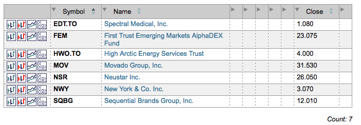
Looking at the prices, my eye immediately goes to FEM, MOV and NSR (and possibly SQBG). Those stocks have good pricing and good volume and (as we now know) good technicals! Here's the chart for Neustar for example:
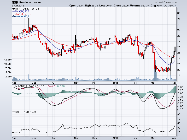
That is a very nice breakout after a low base!
And finding this stock was so simple. Notice that this scan doesn't have lots of extra clauses for price ranges or volume filters or stock groups. All that is essentially handled automatically because we used SCTR-based criteria.
Now you might be asking yourself "Can I change the numbers that I used for my scan to be more aggressive or more conservative?" Absolutely! For example:
More Aggressive:
[3 days ago max(15, SCTR) < 20] and [today's SCTR > 30]
More Conservative:
[5 days ago max(20, SCTR) < 20] and [today's SCTR > 50]
Those are just two examples. Go nuts testing other possibilities. Just remember that you'll want to test things in various market conditions - up markets, down markets, sideways, etc. (You can do that by change the "Starting ___ days ago" setting at the top of the Scan Workbench.)
SCTRs and Scanning really are two great things that go great together. (Kind of like the peanut butter I'll be spreading on my Easter chocolate tomorrow!)
Enjoy!
- Chip
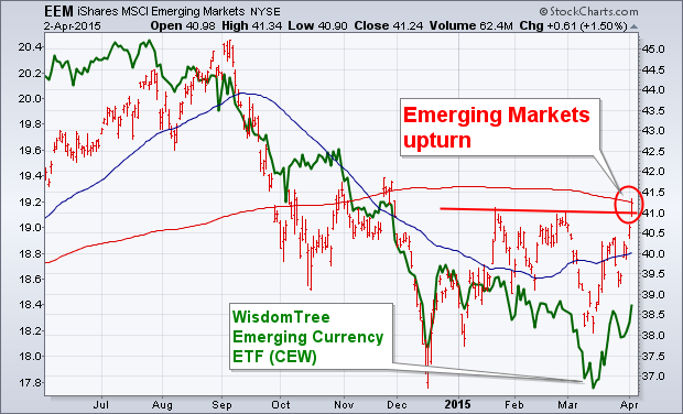
Emerging markets usually do better when Treasury yields are dropping along with the dollar. Which may help explain why emerging markets were among the world's strongest stocks this week. The red daily bars in the first chart show Emerging Markets iShares (EEM) ending the week at a new four-month high. It's also trying to clear its 200-day average. The rising green line is the WisdomTree Emerging Markets Currency Fund (CEW). It started rising with the EEM in mid-March. That suggests that a weaker U.S. dollar is part of the reason for money flows into emerging assets. [Higher U.S. rates, and a strong dollar, siphon money from higher-yielding emerging markets]. Among the biggest EEM gainers this week were Brazil and Russia. The real star, however, is China.
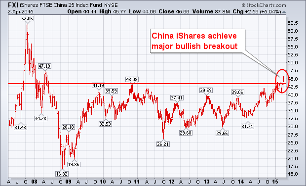
China IShares Achieve Major Bullish Breakout ... Chinese stocks have been the strongest in the world over the last year. The Shanghai Stock Index has gained 88% since last April and is now trading at the highest level in seven years. Money flows into Shanghai started last spring when the Shanghai-Hong Kong Stock Connect was first announced (and launched in November). That opened up trading of mainland Chinese stocks (A shares) to foreigners. The Hong Kong Hang Seng Index lagged behind Shanghai over the last year (gaining 14%), but it still close to a new seven-year high. The most liquid of the Chinese ETFs achieved a bullish breakout of its own this week. The chart below shows FTSE China iShares (FXI) closing above its 2010 high to reach the highest level since 2008. That's a major bullish breakout. Some newer Chinese ETFs have been started over the last year that focus on mainland stocks. The Deutsche X-Trackers Harvest 300 (ASHR) offers exposure to mainland A-shares traded in Shanghai and Shenzhen. I can't vouch for its liquidity, but the ASHR has gained 94% since last April. Chinese authorities have lowered interest rates to boost its economy, and have hinted at more monetary easing to come. That's also driving money into Chinese stocks.
I hope you'll join me on Saturday, April 18th when I'll be appearing on the "ChartWatchers LIVE" webinar with Chip.
- John
Technical analysis cuts to the chase by showing us the only thing that matters: price. Even those using fundamental analysis can benefit from technical analysis because we only make money when prices move in the desired direction. Here are four ways technical analysis can improve your investment returns.
1. All known information is already priced into the market or a stock's price. If you have read about it or heard it on the news, everyone else has as well and has already reacted. There is, therefore, little to be gained by acting on the news. Price represents the sum total of all known information, which makes price the smartest indicator out there.
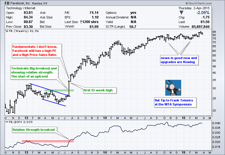
2. Price often leads the fundamentals. How many times have we seen a stock move higher ahead of an earnings beat, an analyst upgrade or improving fundamentals? The markets are forward looking beasts and usually lead the news. The chart above shows Facebook breaking out with a big move in July 2013 and recording the first of many 52-week highs. Fundamentally, it seemed like an expensive stock at the time. Technically, big bullish breakouts on the price chart and price relative suggested that prices were embarking on an uptrend.
3. Prices trend, and trend for extended periods. The single best thing we can do as chartists is to respect the big trend and trade accordingly. Look for bullish setups in uptrends. Look for bearish setups or move to the sidelines in downtrends. As the chart below shows, we have seen at least four big moves in the last fifteen years. Just catching the middle of the two big uptrends would have paid off handsomely.
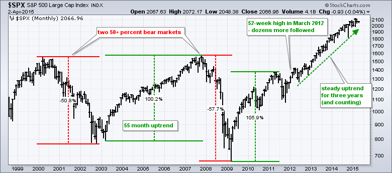
4. Bear markets happen, and they can be avoided. As the chart above shows, there have been two big bear markets in the last 15 years. Notice that the first decline was 50.7% and it took a 100% gain to get back to the 2000 levels. The second bear market was more than 50%. Using a simple trend-following strategy, chartists could have moved to the sidelines after a relatively small decline and avoided most of the carnage. Note that Saturday's Market Message (members only) features insights gained from the MTA Symposium in NYC.
Thanks for reading and have a great weekend!
Arthur Hill CMT
I use this ChartPack during every trading day. It is absolutely invaluable and a "must-have" for any of you who tend to find yourself glued to StockCharts when the market is open. The beauty of this ChartPack, it is only one ChartList, so for any of you that are running short on List space, this one won't really cut into your space like some of our more indicator rich ChartPacks.
The DecisionPoint Intraday ChartPack can be downloaded quite easily from "Your Account" page. For more detail on downloading and installing a DecisionPoint ChartPack, you can read the blog article I wrote with step-by-step instructions.
Below is a partial list in summary view of what is included in this ChartPack:
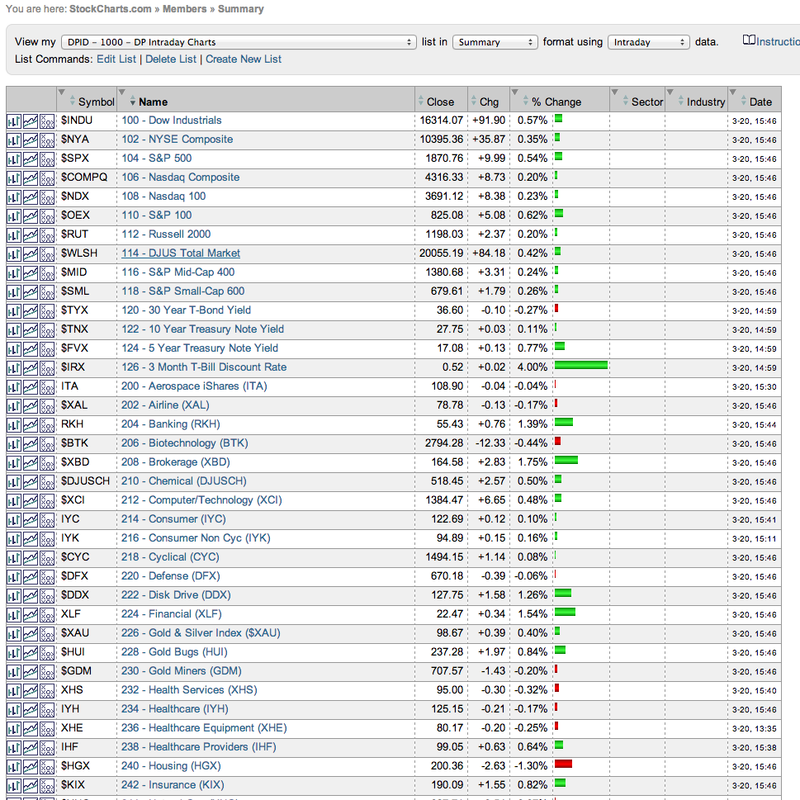
Why do I use the intraday list so frequently? It is a complete up to the minute picture of all of the major indexes and sectors in one place. This ChartPack contains a 10-minute bar chart for a period of the last six trading days for each chart. A horizontal line is drawn at the previous day's close so you can quickly see the health of that index or sector. I open it in a 10-per page view for quick analysis. Below are a few sample charts.
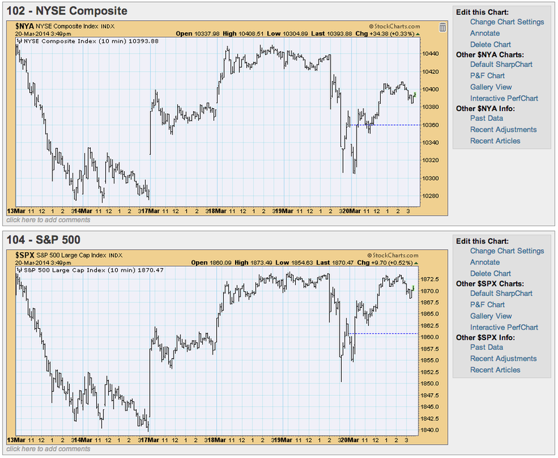
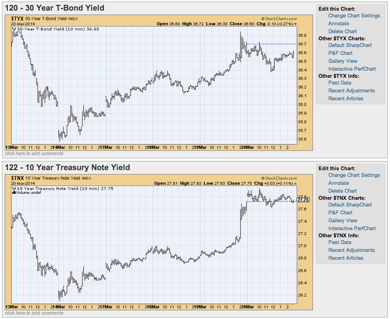
You can see how this gives you an even better visual of ultra-short-term market trends than a table. The market summary page, while useful just can't show you more than today's change.
I usually keep the Intraday ChartList open in a tab in my browser that I can refresh and look at constantly as the data is updated. These charts are extremely valuable if you are watching market action throughout the day. Plus these are much easier to follow than the ticker tape and side summaries on your favorite financial channel!
Don't miss this ChartPack! And remember, if you aren't as enamoured of it as I am, you can uninstall the ChartPack quickly and easily.
Happy Charting,
Erin
Two months ago, there weren't many better looking industry groups than the Dow Jones US Electrical Components & Equipment Index ($DJUSEC). The breakout above price resistance was clear, but after a continuing advance of another 10% into mid-March, the DJUSEC ran into technical issues. Take a look at the daily chart:
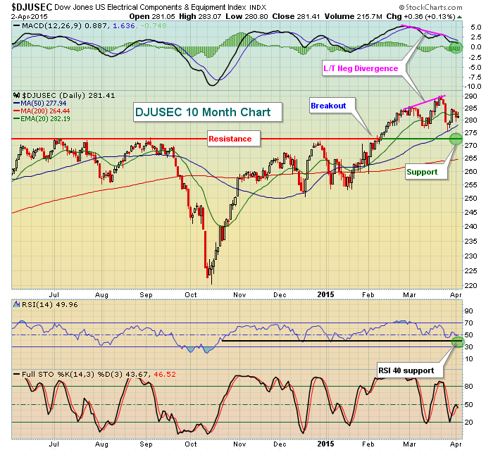
The 272 price resistance was formidable as we had seen several tops at or near this level before finally making the breakout to begin February. Now fast forward to check out the technical problems in mid-March. A long-term negative divergence had formed on the MACD, indicative of slowing momentum. Our other momentum oscillators - RSI and stochastic - both were either overbought or nearly overbought as well. Finally, we had not moved lower to retest the area of the breakout. A pullback over the next couple trading sessions to couple weeks could set up very nice opportunities in this space because there was a continuation pattern in play here. When we see breakouts of a continuation pattern, we can determine a potential measurement and set a target for a stock (or an index in this case). A continuation pattern requires a prior trend, either higher or lower. That trend and the continuation pattern are not evident from this 10 month daily chart, so let's take a longer-term view of a 3 year weekly chart. Check this out:
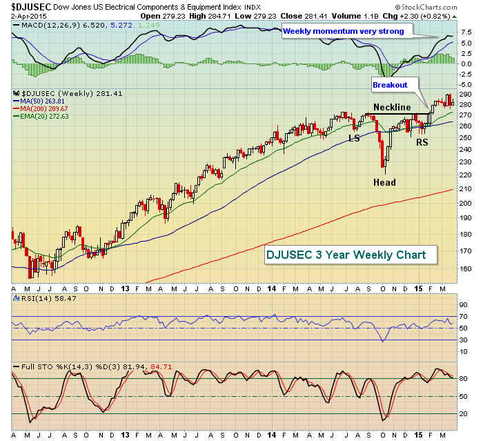
The continuation pattern is the inverse head & shoulders. These follow a solid uptrend and give the index time to pause before another leg higher. While daily momentum (daily MACD from first chart) is questionable at best, the weekly MACD is very strong now so any weakness is likely to be short-lived. I'd look for the rising 20 week EMA, currently at 272, to hold as support. That happens to coincide with price support from the daily chart at 272 as well. The beauty of this pattern is that the measurement can be added to the breakout level of 272. The measurement is determined by the distance between the neckline and the inverse head - in this case roughly 50 points. Therefore, I'd look for a measurement to the 320-325 area in time, although short-term weakness to test the support level mentioned would provide a solid reward to risk entry into stocks within this space.
Happy trading!
Tom
Trading stocks is never for the faint of heart. It requires great skill and discipline to consistently succeed. For those who believe technical analysis is an important part of trading, learning to read and interpret charts is a very important part of the equation.
Understanding technical analysis alone does not guarantee positive results. In fact, one could argue that some traders spend too much time trying to perfect their chart reading skills while ignoring everything else that must be considered in order to make a successful trade.
For example, you might be superb at identifying key support and resistance levels, but what good does it do you if you constantly ignore honoring stop losses that then lead to substantial losses?
Take a look at the chart below on Intel. Imagine you decided to take a long position when the stock pulled back to its 50 day moving average in early January. You did this because you felt the 50 day provided solid support and liked the risk/reward potential and you committed to yourself that if the stock closed back below the 50 day you would exit the trade without much of a loss. But the stock kept dancing around at the 50 day so you decided to give it just a little more wiggle room so you wouldn't exit "prematurely." But you waited just a little bit too long, missed another very important negative technical development as the 20 day crossed below the 50 day, and watched the stock drop significantly as it then tested its 200 day moving average. By that point you were down big so you decided to adjust your stop down to the 200 day moving average as you believed it would provide great support. But when the 200 day failed to hold, you finally had enough, cried uncle and exited the position with one big, fat loss.
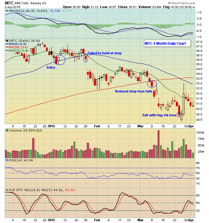
So you see, your original analysis was correct; the 50 day was a critical level of support; you had nailed it. And if you had exited there as you had committed in the first place, it would have been an acceptable loss. You then had a second chance to exit at your revised stop, but you ignored that as well. Instead, your losses kept mounting to the point where you finally threw in the towel, pretty much making your original analysis worthless.
Of course it didn't need to end that way and you can see how important it becomes to remain disciplined at all times. This is the very good news! You can fix something like this by trusting your good work and sticking with your original game plan. Honestly, it's as simple as that.
Speaking of spotting key technical developments that can be used to your advantage, our Chart of the Day for Monday, April 6 is an major index chart that's at a "Make or Break" point. If you're not already getting our FREE Chart of the day, just click here to sign up and I'll send you a new annotated chart every morning before the opening bell.
Committed to helping you succeed,
John Hopkins
Invested Central


 There's nothing like teaching a seminar to fifty sharp investors on this topic and having them demand more clarity and specifics to encourage one to do the same for my blog readership. To bring you up to speed, please read my previous blog on this subject.