Hello Fellow ChartWatchers!
Over the past couple of weeks, we been revamping our Point & Figure charting tool. The new version was released last week. It has several key improvements including:
- You can now add up to 6 chart overlays per chart
- You can save your settings as the "Default" P&F settings and they will be used for all new P&F charts you create
- The parameter boxes for the various Scaling options now only appear when the corresponding Scaling option is chosen
- Price Objectives are control by the "Price Objective" dropdown. You can also turn off Price Objectives if you want
- Intraday P&F Charts no longer are forced to use the "ATR" scaling method
- Several predefined P&F ChartStyles are now available via the ChartStyles dropdown
- ..and much more.
Overall, the new P&F Workbench now has a "look & feel" that is very similar to the SharpCharts workbench. If you are familiar with using that page, using the P&F workbench should be pretty straightforward.
Last Saturday, the ChartWatchers LIVE webinar was dedicated to demonstrating P&F Charts in general and the new workbench in particular. If you haven't see the video of the webinar and you want to learn about P&F charting, I strongly encourage you to review that particular video. In it, you'll see why Point & Figure charts is one of my favorite analysis tools.
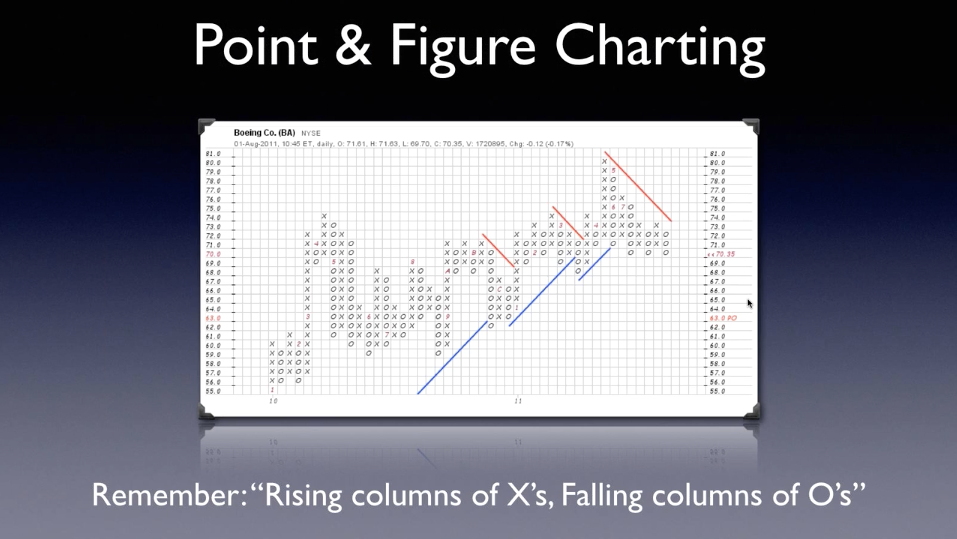
(Click on the image above to watch the video.)
Enjoy!
- Chip
SITE NEWS
RECENT ADDITIONS TO STOCKCHARTS.COM
- WIN THREE FREE MONTHS OF SERVICE! - We're running a contest to find the "perfect" Head & Shoulders pattern. To enter, send a link to a chart with a completed, symmetrical, volume-confirmed Head & Shoulders reversal to contest@stockcharts.com for the end of this week. The best entry will be featured in an upcoming blog article and immortalized in our ChartSchool! For more details, click here.
- MORE INDIA-ORIENTED FEATURES - In addition to the 1000+ Indian stocks from the NSE exchange to our database, we now have intraday data for the NSE exchange's benchmark index - $NIFTY. Later this week we'll be adding around 20 additional India-oriented indexes to the site as well. We now also have our Scan Engine and Alert Engine updating during India's market hours.
- DOUBLE THE SIZE OF YOUR LOYALTY COUPON! - Take the SCU ChartWatchers Certification Exam and prove to everyone that you know your stuff when it comes to Technical Analysis. In addition, when you pass, you will be rewarded by having your annual StockCharts Loyalty Reward percentage doubled! For more details, click here.
CHINESE ETFS DROP 5% ON FRIDAY
by John Murphy | The Market Message
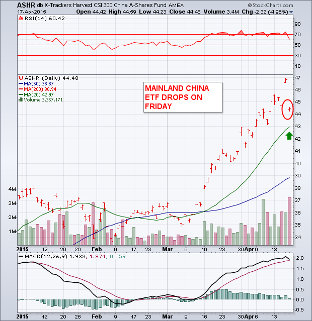
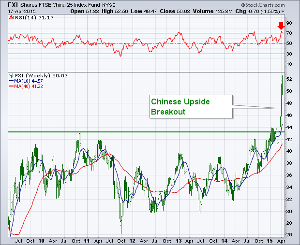
Chinese stocks have been on a tear over the last year. Mainland stocks are up 25% just this year. They were probably due for a pullback and they got one on Friday. Chinese authorities tightened rules on margin selling (and made it easier to do short selling). But they did it after the Chinese stock market had closed. That explains why the Shanghai market showed gains on Friday. The selling was reflected in Chinese ETFs which trade all day. Chart 1 shows the CSI 300 China A-Shares Fund (which tracks stocks in Shanghai and Shenzen) tumbling 5% in heavy trading. The ASHR, however, still remains above its 20-day moving average (green line). China iShares (FXI) lost 4% on the day. The weekly bars in Chart 2 show the FXI suffering a downside weekly reversal (losing 1.5%) on the week. The FXI recently hit a new seven-year high. Its 14-week RSI (top of chart) had reached overbought territory over 70 which also suggested that a pullback was due. Even with this week's selling, its uptrend is still very much intact.
- John Murphy
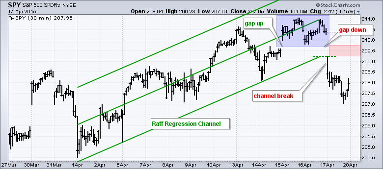
With a gap up and a gap down, the S&P 500 SPDR (SPY) formed an island reversal over the last four days. This is short-term bearish, but not enough to affect the longer trend, which is still up. To emphasize the short-term nature of this reversal, I am going to start with a 30 minute bar chart. The Raff Regression Channel defines the short-term uptrend extending up from April 1st to April 16th. SPY gapped up on April 15th, held this gap for two days, and then gapped down on April 17th. The blue zone represents a price island above both gaps. Traders establishing long positions on the island are now trapped with losses. The short-term uptrend clearly reversed as SPY broke the lower line of the Raff Regression Channel as well. Broken support and the gap zone become first resistance in the 209.50 area.
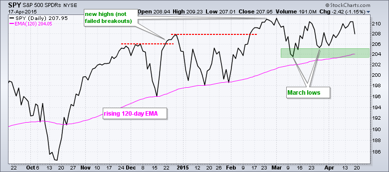
Now let's put this decline into perspective. The second chart shows closing prices for SPY over the last seven months. Even though Friday's decline was enough to reverse the short-term uptrend, the long-term uptrend remains in place and SPY is still less than 1% from its all time closing high. SPY is also above the rising 120-day EMA, which marked support in December and January. The ETF is currently consolidating with support in the 204-205 area and resistance in the 210-211 area. As with the January consolidation, this looks like a consolidation within an uptrend. In other words, a mere rest within the uptrend. The March lows and rising 120-day EMA mark the first support zone to watch for signs of significant selling pressure.
- Arthur Hill
The Canadian Technician
Greg Schnell is on hiatus this time. Please visit The Canadian Technician for more articles by Greg Schnell.
Carl presented his chart that illustrates typical market cycles at our DecisionPoint LIVE! Webinar last Wednesday (Here is a link to that broadcast). (P.S. Don't miss the next episode! Watch for the link on the homepage this week under "What's New"') As Carl said during the webinar, I should have a picture of him to accompany this chart with his hands thrown up in the air, eyes watering and his tousled hair sticking straight out from pulling on it while attempting to create the chart!
Cycle analysis like technical analysis is an art, far from a science. Nailing these cycles down today is especially difficult. Market cycles represent the ebb and flow of market action and seasonality. While this was difficult enough in the past, now it requires even more creativity given the meddling of the Federal Open Market Committee (FOMC) with their interest rate suppression and bond buying activities of Quantitative Easing.
An easy to read example of a long-term cycle is in the monthly chart below where you can see the shape and clarity of previous bull and bear market cycles of the last 20 years. Yet, with the help of the FOMC we can see that a bear market has been avoided and price broke out of the cycle pattern.
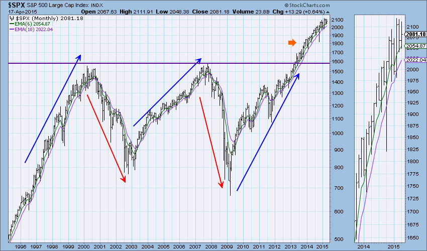
This is only an example, as many of us know that before 1997 there were factors that muddied the water and disrupted the flow then too.
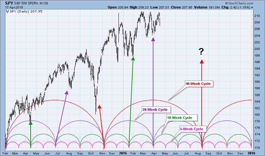
Below is the cycle chart that Carl created (and I added a few annotations to). The areas where all of the cycle lows intersect are of great interest since a cycle low is due for all. The last time this happened was in October 2014 and while it came in late, it was still pretty close. The next time this happens is in August.
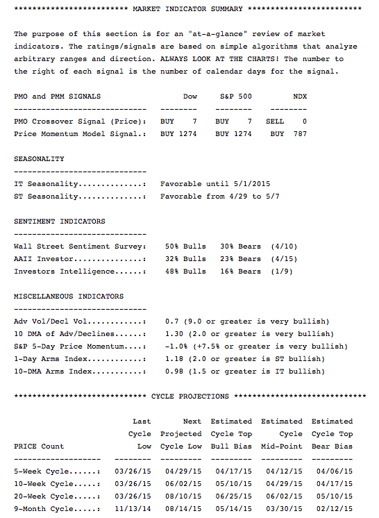
Studying cycles can be frustrating. It is one of those technical tools that is easier to see and "fit" after the fact. You will find the table of our seasonality and cycle dates in the DP Alert Daily Report found in the member DP Reports blog. Here is an excerpt:
Happy Charting (or hair pulling)!
Erin
I know looking at one industry group is taking a very small sample of the entire stock market, but throughout much of history the stock market has performed strongest when financial stocks, especially banks, at least go along for the ride. Let me show you a long-term chart of the S&P 500 and break down its performance based on bank performance relative to the S&P 500. Check this out:
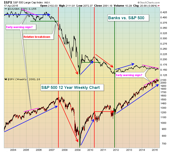
Generally, the S&P 500 tends to perform best when we see leadership from banks. Banks don't need to be the "leader" but they need to at least perform as well as the overall S&P 500. When banks go through periods of relative underperformance (red arrows), we normally see the S&P 500 either consolidate or decline. Back in 2005, we saw a type of negative divergence where banks began lagging rather badly on a relative basis while the S&P 500 continued to pushing higher. In fact, that S&P 500 strength continued for nearly two more years after that warning sign appeared. But check out the woeful relative performance of banks from mid-2006 to mid-2007. There was actually a relative breakdown in banks in mid-2007, just a few short months before the S&P 500 topped for 6 long and volatile years. Since the end of 2011, the S&P 500 has risen approximately 75%, but relative strength in banks seemed to end in early 2014. Is this a warning sign? Well it could be but I wouldn't be overly concerned until we begin to see actual price breakdowns.
So let's look at the current technical picture of banks using a daily chart:
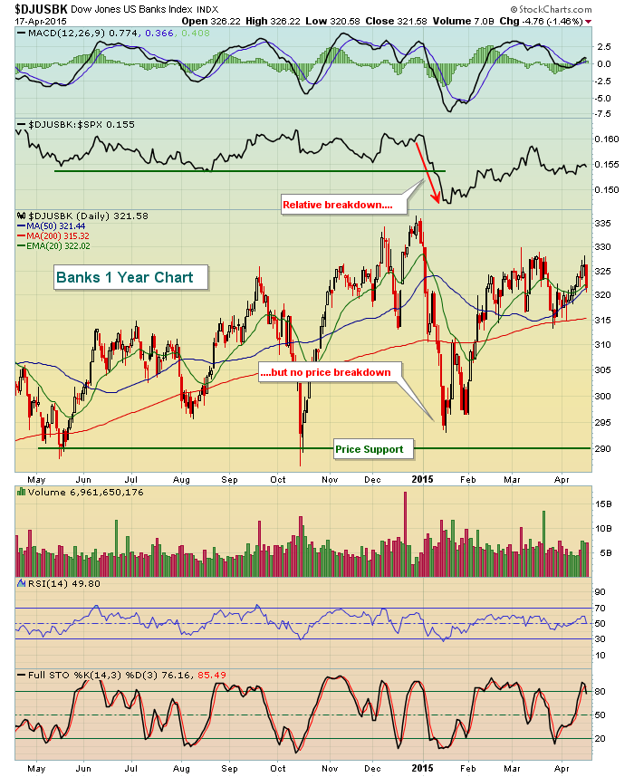
Banks saw a relative breakdown to open 2015, but never lost its price support level during that time. Yes, the relative weakness is a bearish development, but nothing is more important than the combination of price/volume. In this case, banks have continued to hold onto price support near 290. A loss of support there would, in my opinion, begin to send a much more significant warning sign. Until then, I'd consider the relative weakness in banks as nothing more than normal stock market rotation and I'd remain bullish the group, expecting a further rally down the road.
Happy trading!
Tom
DECISIVE TO A FAULT
by John Hopkins | InvestEd Central
As traders we are faced with multiple decisions each day. This could include deciding when to enter a trade, deciding if what we see on a chart is valid, deciding what a reasonable price target might be and deciding where to place a stop loss in case a trade goes against us. And these are just a few examples, let alone having to be ready to quickly change strategies without much warning if necessary.
The decision making process is made much easier if we feel confident with our work. For example, if am confident in my technical analysis skills, it gives me an advantage over those who might still be learning. So if I see a stock is closing in on a major level of support, that the stock is technically oversold and that the stock has formed a positive divergence, I know right away that the odds are in my favor. Thus, if I decide to take a position, it's because I feel strongly that there's a good chance I will be on the winning side of the trade.
Of course, as we all know, the market has a way of thwarting even the very best of plans. So, before I even enter a trade I need to have a back up plan, in case it goes against me. This requires me to set a stop loss, and one that is "defensible"; that is, I can confidently defend the reason I set a specific stop loss; no guessing allowed.
For example, take a look at the chart on Cisco below and let's assume I had been watching CSCO for a while and I liked the fact that it had recently closed back above both its 20 and 50 day moving averages so I take a position right at the end of the day on April 16 at an entry price of 28.60. And also assume that I had decided before I entered the trade that I would allow it 7% to the downside - just "because" I didn't want to lose more than 7% - so I set my stop loss at 26.60. The question becomes, what on the chart shows that 26.60 is a good place to set a stop? And the answer is, it doesn't. But if I had decided to set my stop at a close below the 20 day moving average of 27.86, it would have been because I knew it would be important for CSCO to hold a key technical level or it could move lower.
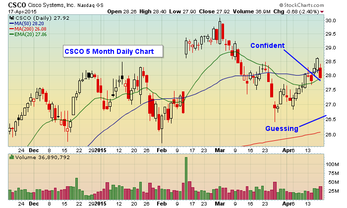
The point to all of this? If you are going to put your precious capital at risk, you need to feel confident that are capable of making good decisions, because if you are confident in your decision making you will be in a better position to execute along the path of a trade. In fact, you should strive to be "decisive to a fault" so when the time comes to push the buy or sell button it comes easily instead of worrying if what you are about to do is the right thing to do.
By the way, I will have a new and free "Chart of the Day" that will be released on Monday before the market opens that will be worth checking out so just click here if you want to be added to the list.
Committed to helping you succeed,
John Hopkins
President
Invested Central

Trading camaraderie provides inspiration and motivation, but it does not always emanate from fellow traders. The quest to become a consistently profitable trader demands ongoing discipline, and I often find that it unlikely places. I spent half my life being a business entrepreneur and the last 25 plus years engaging that same set of mind skills as an entrepreneurial trader...
Read More


 Trading camaraderie provides inspiration and motivation, but it does not always emanate from fellow traders. The quest to become a consistently profitable trader demands ongoing discipline, and I often find that it unlikely places. I spent half my life being a business entrepreneur and the last 25 plus years engaging that same set of mind skills as an entrepreneurial trader...