Hello Fellow ChartWatchers!
Last time I reviewed our PE Ratio symbols for several major indexes (!PEDOW,!PESPX, !PEOEX, and !PENDX) and promised that this time around I'd show you the PE Ratio symbols we have for the nine S&P Sectors. Promise fulfilled!
(click for live version)
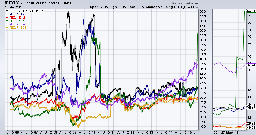
This chart contains P/E lines for 6 of the 9 S&P sectors. You can see their symbols in the legend of the chart. Note that I added these indexes to this chart using the "Price (Same Scale)" _overlay_ instead of the "Price" indicator. That ensures that they are all plotted using an identical vertical scale and can be correctly compared visually.
Just like in the index-based PE charts, you can also see that the Financial Crisis in 2008 and 2009 has played havoc with several of these indexes - first the black Discretionary (Cyclical) sector, then the blue Technology sector, and finally the green Energy sector. Even though each of those sectors "exploded" at different times, it is interesting to see how they all "calmed down" around the same time - May of 2010.
On the right half of the chart, we see that the purple Healthcare sector has been gradually increasing since 2012 and, since around October of last year, it's increases to have accelerated. Finally, on the right edge of the chart (and in the Zoom Thumbnail area on the right side of the chart) we see that Energy P/Es have doubled in less than a month(!).
Something else that is very important to understand is less noticeable on the chart above but much more noticeable on the chart below:
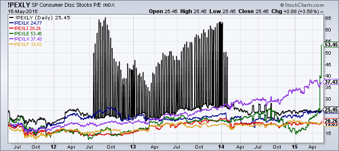
Yikes! What is that? That is what happens when our various vendors can't agree about which stocks below to which sectors. We are actually working on cleaning up that data and trying to prevent this kind of anomaly from happening again but it will take some time. In the mean time, it is important for everyone to understand that our PE indicators can contain unexpected surprises and should be used with both caution and common sense.
- Chip
SITE NEWS
RECENT ADDITIONS TO STOCKCHARTS.COM
- SPRING SPECIAL IS NOW IN EFFECT THROUGH THE END OF THE MONTH! - Join or Renew NOW to take advantage of our Spring Special. Sign up for 6 months and get a 7th month for FREE! or... Sign up for 12 months and get TWO MORE MONTHS FREE! Don't delay however, this special ends soon! Click here to get started.
Q: I'm already a member and my account doesn't expire for a while. How can I take advantage of the special?
A: If your account expires before the end of 2015, you should take advantage of this special. Use the "Extend" button on the "Your Account" page to extend your subscription at these great rates. We'll simply add the time to your existing expiration date and you'll be good to go!
Q: I just subscribed/renewed very recently. Can I get the special rate?
A: Check your receipt closely - you probably already got the special rate without knowing it. If not, remember that you can extend your account right now at these special rates and we will simply tack on the additional time. Finally, keep in mind that we typically run these specials two or three times each year. If you are a long-term subscriber, another special will probably roll around before your current account expires.
.
- NEW WEBINAR SCHEDULE! MORE MARKET OPINIONS, MORE CHART ANALYSIS, MORE OF YOUR QUESTIONS ANSWERED! - We've just expanded our Webinar schedule to give you more information, more education and more analysis! Tom Bowley will now be "on air" for 2 hours on both Wednesdays and Fridays. Greg Schnell's and Chip Andrerson's shows have expanded to 90 minutes. And Erin Heim's DecisionPoint Live show has moved into the 7pm "After Dark" timeslot. For more details, check out the "What's New" area of the homepage.
.
- NEW DECISIONPOINT ALERT BLOG! - Based on reader feedback, we have created a new Blog for members called the "DP Alert" blog which contains an easy-to-read daily summary of all of the DecisionPoint signals and indicators updated every day after the market closes. You can see the first couple of examples from this new blog by clicking here. The DecisionPoint approach to analyzing the market and analyzing individual stocks is very straightforward and helpful to both new and veteran investors. We strongly encourage all of our members to read these new articles and attend the new DP After Dark webinars on Wednesdays.
NOTE: To make room for this new blog, the old "DP Trackers" blog has been consolidated into the "DP Reports" blogs. Links to all of the DP Tracker spreadsheets can now be found in the DP Reports (and DP Alert) blog area.
.
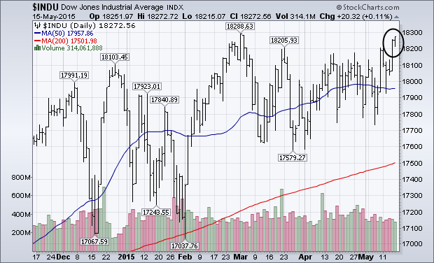
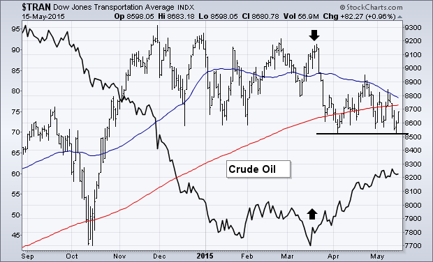
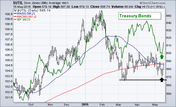
I've been writing about the continuing discrepancy between three Dow Averages. But things may be starting to improve. Chart 1 shows the Dow Industrials closing at a three-month high and just shy of its early March peak. [The S&P 500 ended at a record close]. All of this is good. Volume, however, didn't pick up much which shows a certain lack of enthusiasm. I've been suggesting that the industrials are being held back by much weaker action in transportation and utility stocks. Chart 2 shows the Dow Transports trading below its 200-day moving average and near the bottom of its 2015 trading range. Rising crude oil (black line) is a big reason why fuel-sensitive transports have been so weak. [A weaker dollar has also been part of the problem since it's supporting the price of oil]. Chart 2 shows the TRAN bouncing off its early April low. But it has to climb back above its moving average lines to improve its chart picture. It's hard to imagine the industrials climbing strongly without some help from the transports. Chart 3 shows an even weaker picture for the Dow Utilities which is also below its 200-day moving average. Weak utility performance is tied to a weak bond market (green line). The correlation between the two is pretty apparent. The good news there is that the UTIL is bouncing off its March low with some help from bonds (more on that shortly). A move above its April high is necessary, however, to signal a bottom. That would also help the rest of market, and rate sensitive stocks in particular.
- John
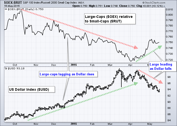
The falling Dollar is boosting large-caps and they are outperforming small-caps. This makes sense because large-caps are typically multinational companies that derive a good portion of their revenue abroad. The Financial Times estimates that companies in the S&P 500 generate around 40% of their revenues abroad. These foreign earnings must be converted to Dollars and a strong Dollar translates into lower earnings. A weaker Dollar, on the other hand, helps the bottom line for companies that generate revenues abroad.
Chartists can see this relationship in action by comparing large-cap performance against the Dollar. The first chart shows the S&P LargeCap 100 relative to the Russell 2000 using the price relative ($OEX:$RUT ratio). $OEX outperforms when this ratio rises and underperforms when this ratio falls. As the chart shows, large-caps underperformed small-caps as the Dollar rose from October to March. This performance ratio reversed in April and turned up as the Dollar turned lower. Notice that large-caps have been outperforming small-caps as the Dollar moved lower the last five weeks.
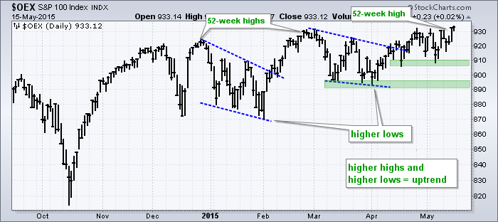
The second chart shows the S&P LargeCap 100 hitting new highs on Thursday and Friday. $OEX was the first of the major stock indices to hit new highs in May and this confirms large-cap leadership right now. Note that the S&P 500 hit a new closing high on Friday. Large-cap outperformance is likely to persist as long as the Dollar weakens so chartists should keep an eye on the old greenback.
Thanks for reading and have a great weekend!
Arthur Hill CMT
Natural Gas ($NATGAS) has had a flickering pilot light since February 2014. During November, 2014, Natural Gas finally got back above the 200 DMA only to lure in buyers and then starting falling. By February it had lost 40% so this is always a market that having a stop in is essential. As we head into Air Conditioning season, this can be a good time in the market for Natural Gas.
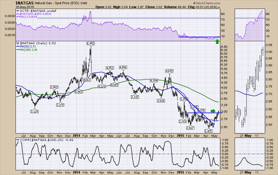
Chart 1
On the lower part of Chart 1, I show the correlation of Natural Gas to the US Dollar ($USD). They correlate poorly. So it would appear it does not matter which direction the $USD goes, Natural Gas can do its own thing. Natural Gas is also not correlated to the $SPX so this makes it a nice risk management tool. The Natural Gas area usually trades independent of the broader stock market.
The chart of Natural Gas over the longer term also looks inviting to me. Chart 2 is a 6 year view that I have been following for a while. Starting with the RSI, a move above 50 would be helpful. You can see these basing patterns take time to resolve comparing the length of the shaded areas. It would appear that the current base is similar in time. I really like the wide frame head/shoulders base over 6 years. That is setting up to be very bullish. The market made a low in 2009 and rallied up to the $5 area. In 2012 it made a lower low and tested 10 year extremes. The intraday price reaching back to 2001 -2002 levels. That test of the 10 year lows was important and it held. Then, in early 2014 the Natural gas price flared up to $6.20 briefly. It came all the way back down and tested the $2.50 level. I was starting to get bullish at the $2.57 low in early February 2015, but it was early. The positive divergence between the MACD and the price is very important. This sets up well.
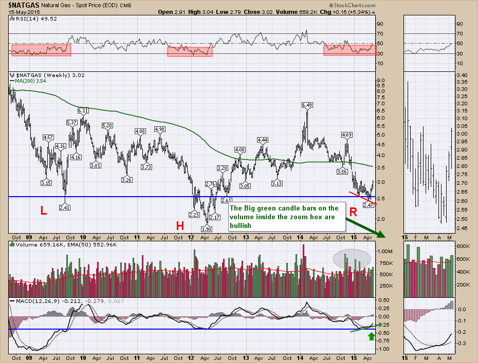
Chart 2
So I am starting to watch the Natural Gas stocks here. I recently wrote about Encana on Friday. Here is the link to that article. Encana. I will focus on some of the Natural Gas companies in the upcoming weeks on my Canadian Technician blog. If you click on the link to the Encana article, you can subscribe to an email or RSS feed. I will also cover Natural Gas stocks in the webinar on Thursday, May 21. The link to all the webinars are in the What's New section of the homepage. Here is the link to my specific webinar this week. Market Roundup Live May 21, 2015. As I mentioned in the first few sentences, trading Natural Gas is volatile and risk management is very important.
Good trading,
Greg Schnell, CMT
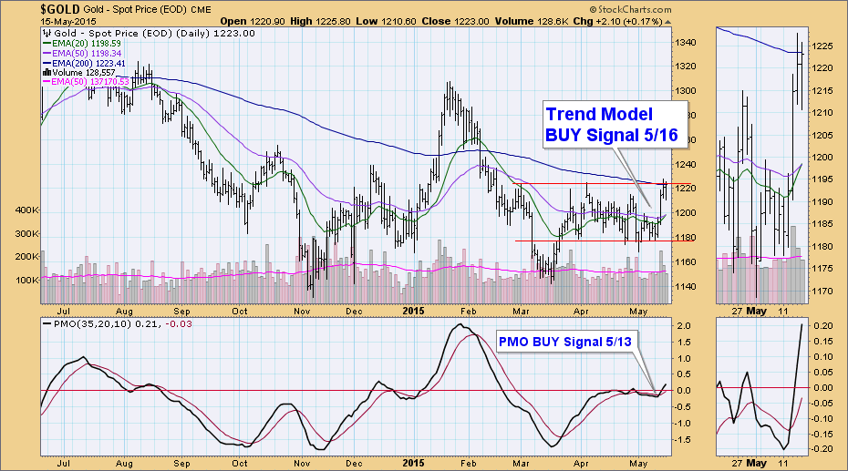
As of 5/16/2015 Gold is on a Trend Model BUY signal. The 20-EMA crossed above the 50-EMA triggering the new intermediate-term Trend Model to initiate a BUY signal. The long-term Trend Model, which informs our long-term outlook, is on a SELL signal as of 2/15/2013, so our long-term posture is bearish. The long-term Trend Model is dependent on the location of the 50-EMA and 200-EMA. Simply put, when the 50-EMA is above the 200-EMA it's in a "bull market" and when the 50-EMA is below the 200-EMA it's in a "bear market".
Gold is teasing us. Wednesday it nearly reached overhead resistance. Thursday it poked through and Friday it closed above. That sounds great, but overhead resistance has not been broken in a significant way. There's still plenty of time as the dollar doesn't appear ready to get its strength back any time soon. Additionally, the May 13th Price Momentum Oscillator (PMO) crossed above its signal line and generated a PMO BUY signal.
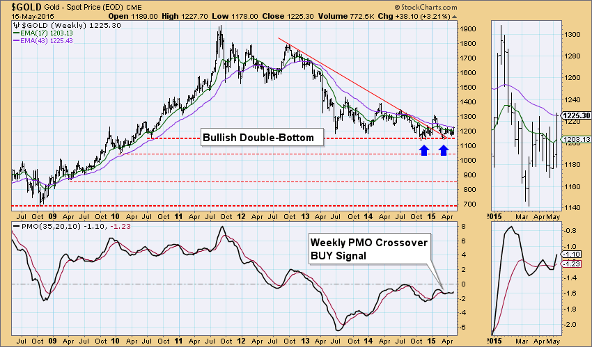
The weekly picture is still bright with a double-bottom formation that hasn't quite aborted yet. The Weekly PMO switched gears and had a positive PMO crossover generating a weekly PMO BUY signal.
Everything is lining up for Gold right now. It has an excellent opportunity to break out, given the weakness in the dollar. A Trend Model BUY signal combined with a PMO BUY signal makes Gold especially attractive right now.
Happy Charting!
Erin
Over the past month, the Consumer Electronics Index ($DJUSCE) has fallen close to 9%, which ranks it as the third worst performing industry group. Only gambling stocks (-12.64%) and business training & employment agencies (-15.68%) - two consumer discretionary industry groups - have performed worse. Normally, I tend to steer clear of underperforming areas of the market, but many times in a rotating bull market they can provide some of the best opportunities. Earlier in 2015, I wrote about two areas of technology that were lagging badly - computer services and semiconductors. But they both were testing support in bullish wedges. The short-term charts were weak, but the longer-term charts suggested there was likely to be a reversal. In both cases, we saw recoveries. In February, in the consumer discretionary space, it was the footwear stocks that also lagged for a few months until support was challenged. Check it out:
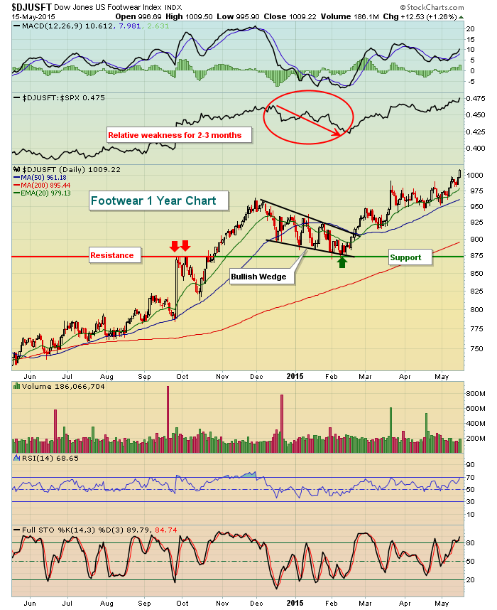
While footwear was an absolute and relative leader throughout the latter stages of 2014, that changed as we opened 2015 and footwear fell to relieve overbought conditions and the group lagged badly. An incorrect conclusion could have been drawn that footwear was an area we should avoid. Instead, the pullback provided a great opportunity to trade a group primed to outperform once again.
So back to consumer electronics. Which type of pullback are we watching? Is the group simply underperforming for a brief period before resuming its relative uptrend? Take a look at the chart:
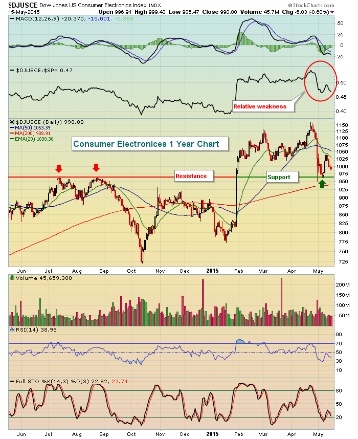
It's difficult to say if consumer electronics will follow the lead of footwear, but the recent selling certainly has improved the reward to risk for entry into this space.
Enjoy your weekend and happy trading!
Tom
InvestEd Central
John Hopkins is on hiatus this time. Please visit InvestEd Central for more articles by John Hopkins.

After many years of writing The Traders Journal, I thought it was time to revisit how investors can best maximize the takeaways from these weekly blogs. First and foremost, the reader should understand that my perspective is somewhat irreverent since it is based on the past 25 years of trading my own account full-time unburdened by the distraction of clients. Some have described my blogs
Read More


 After many years of writing The Traders Journal, I thought it was time to revisit how investors can best maximize the takeaways from these weekly blogs. First and foremost, the reader should understand that my perspective is somewhat irreverent since it is based on the past 25 years of trading my own account full-time unburdened by the distraction of clients. Some have described my blogs